The Layout Maestro
A message from the author!
In this new article about my rebuilding a layout, I’m exploring TechCrunch. I had a quick look at it and thought it would be interesting to dive in and see how modern CSS can make things better.
First, I will analyze the layout and think aloud with you about the decisions that the team made. Once that is finished, it will be the time to dive in and share my thoughts and ideas on how to approach the current design with modern CSS.
Table of contents
View table of contents
- Analyzing the main layout
- A look at how the main layout CSS
- Building the main layout today
- The middle section grid layout
- The news component
- Event promo component
- Other ideas
- Conclusion
- Further resources
Here is a video that showcases the thing that I’m digging.
Analyzing the main layout
I started by looking at the main layout and how it works on different viewport sizes.
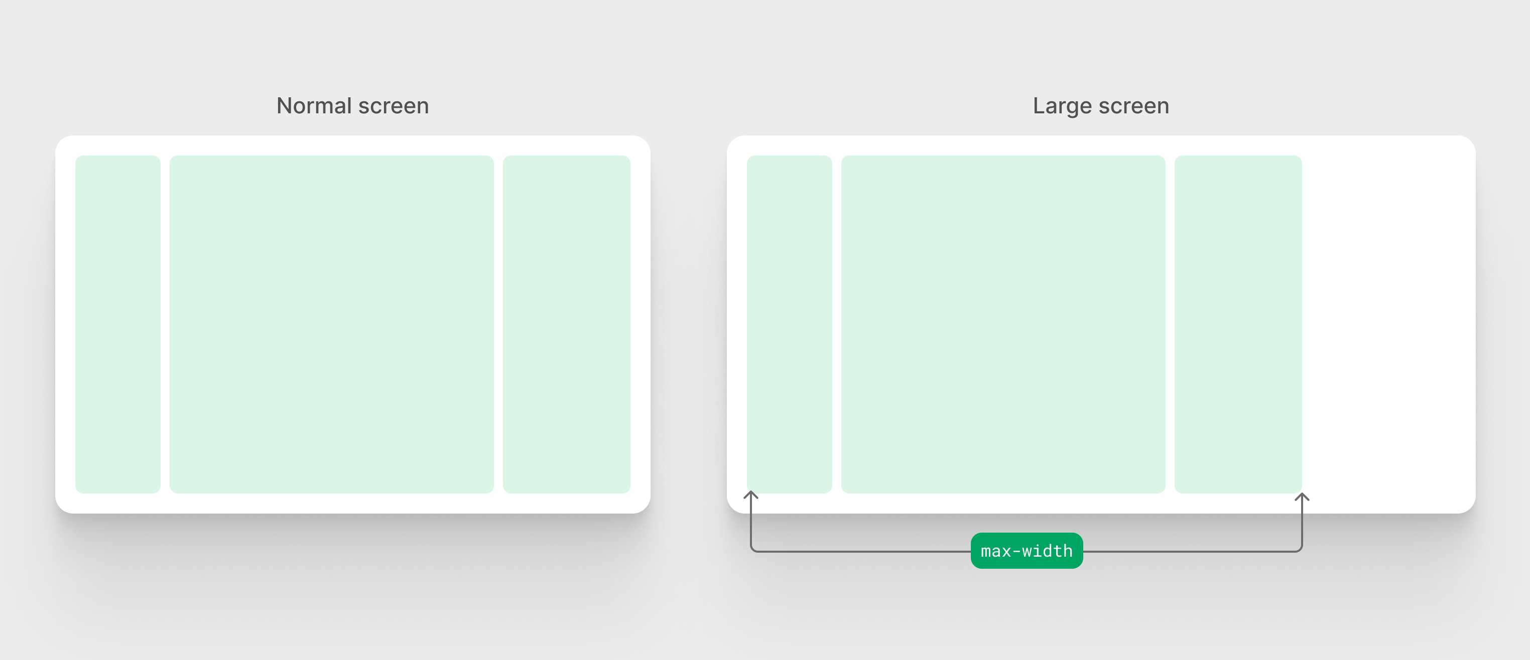
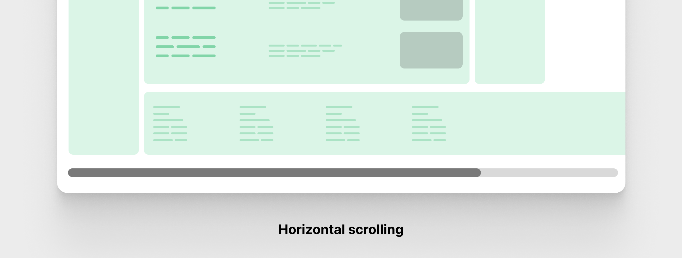
It contains three columns and will become one as the viewport size gets smaller. Typical layout, right? Not really.
On a large screen, the 3-column layout has a max-width and will be left-aligned. I rarely see that behavior on websites. We tend to center a layout instead of keeping it on either side of the viewports.
At first, I thought that the whole layout was wrapped into a container and that container had a max-width. Turned out it was more than that.
<header class="navigation"></header>
<div class="main-content">
  <div class="content-wrap">
    <div class="content content--feature-island"></div>
  </div>
  <div class="content-wrap">
    <div class="content"></div>
  </div>
</div>
<footer class="site-footer">
  <div class="wrap"></div>
</footer>
Let’s take a closer look at the layout.
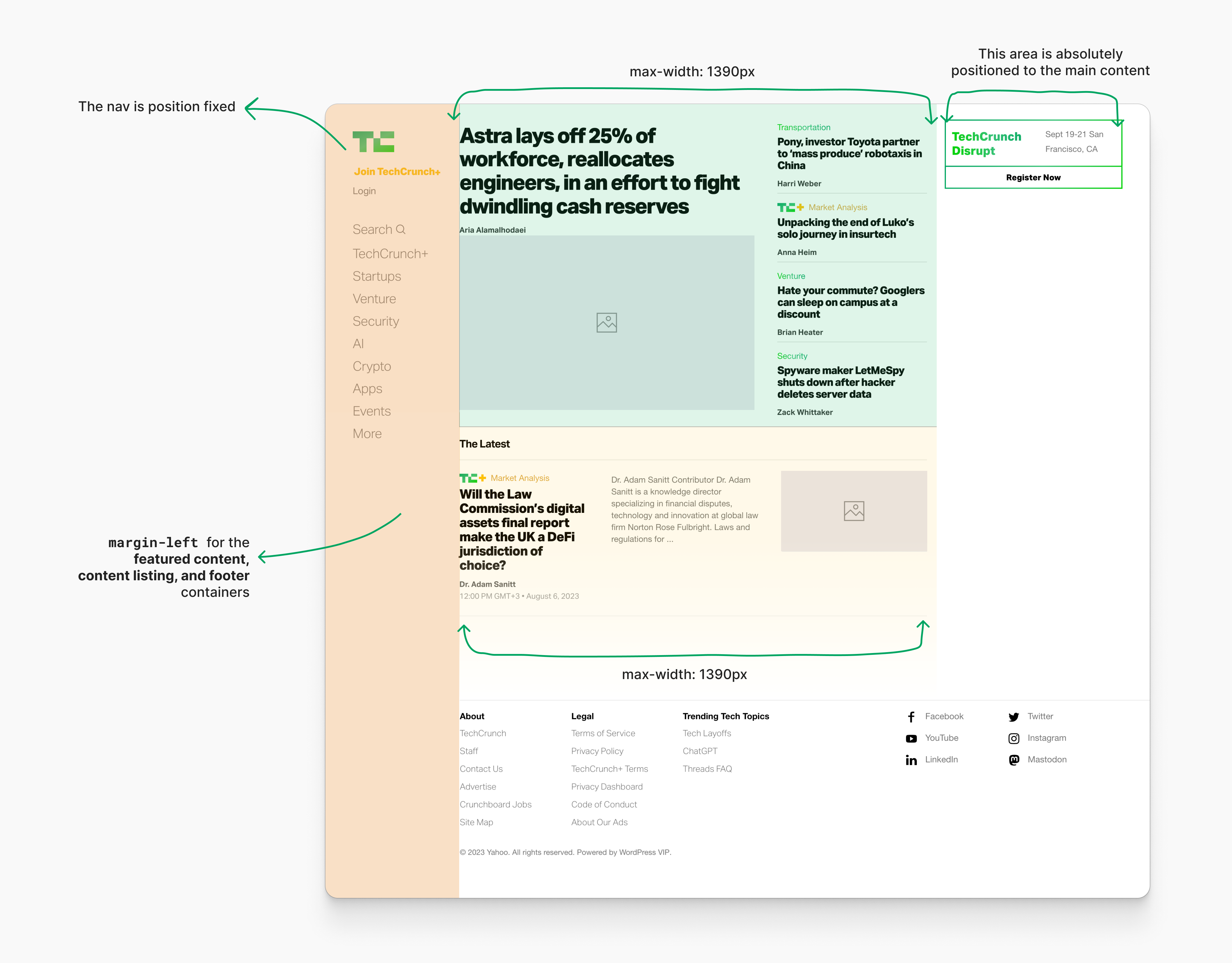
The way the layout is built is a bit unusual and a bit hacky.
- The navigation has
position: fixwith a fixed with. - To compensate for the navigation space, both the direct Childs of
main-contenthavemargin-leftthat is equal to the navigation width. - The footer has a
margin-leftas well.
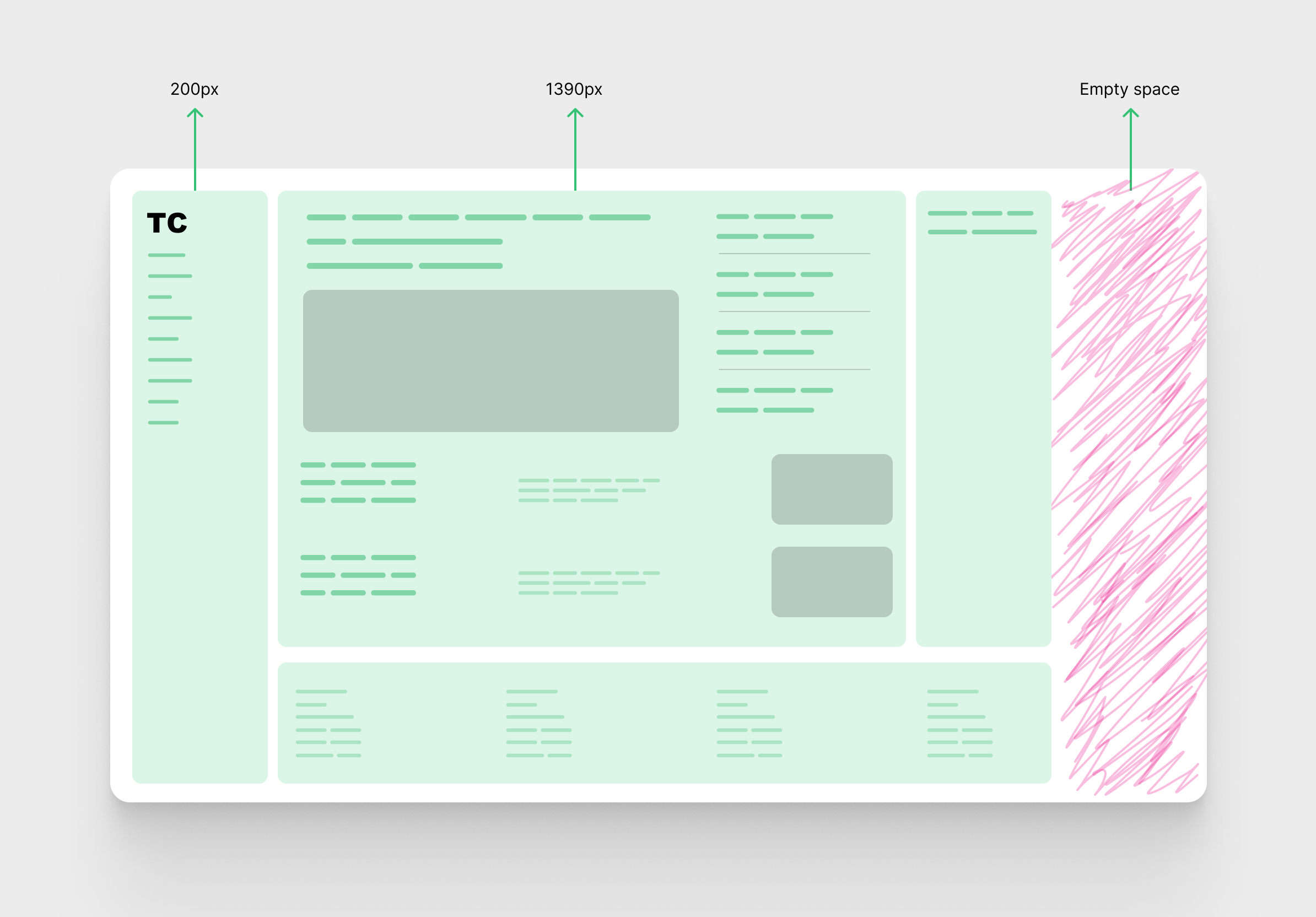
On large screens, the layout continues to grow until the maximum width for the main content, which is 1390px.
Here is how it looks:
Notice how when max-width for the main content is taking effect, there is a space on the right side.
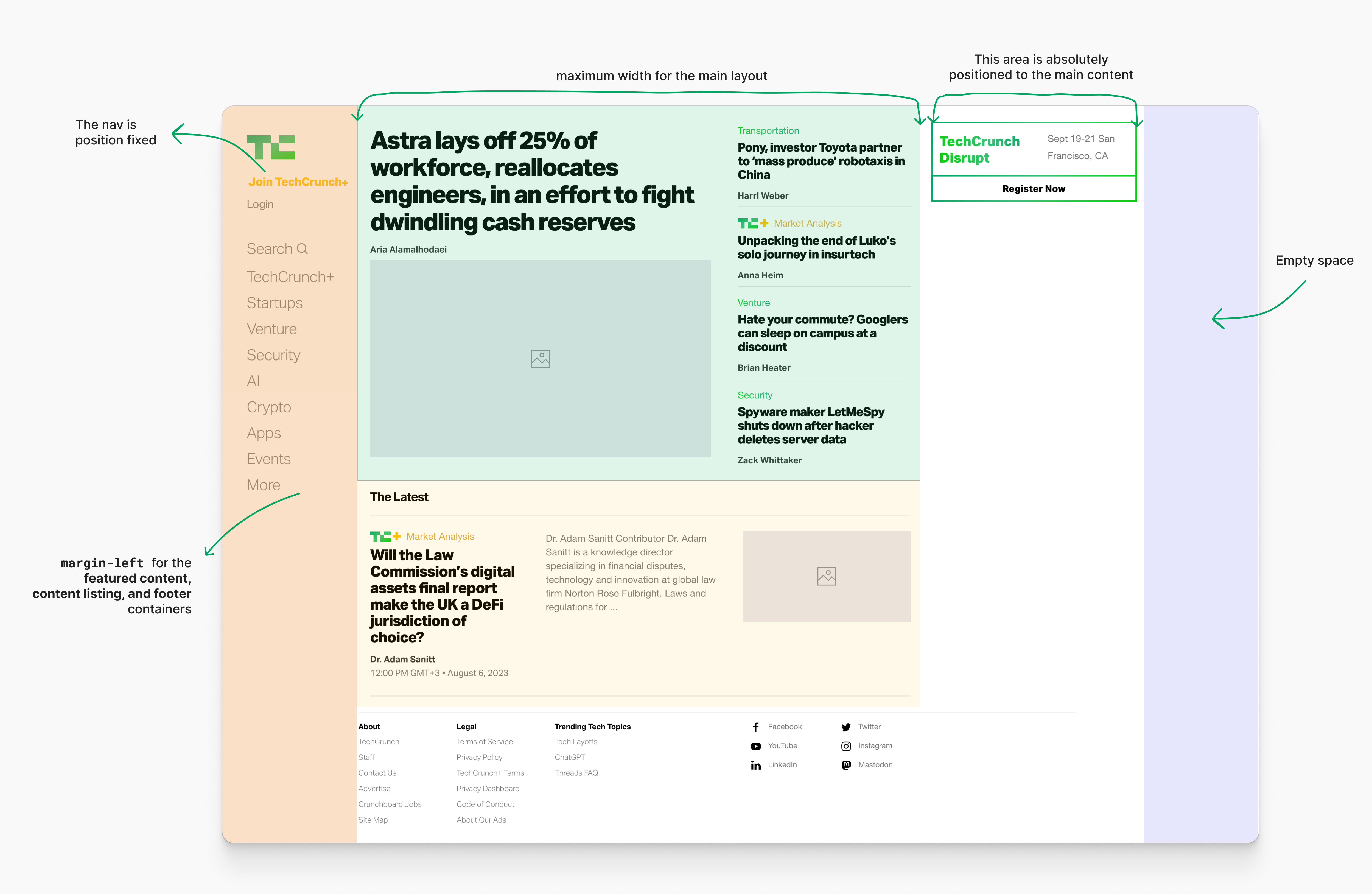
A look at how the main layout CSS
The following is how the CSS was written to handle the main content layout and other stuff.
.content:not(.mce-content-body) {
  width: 90% !important;
  margin-left: 5%;
}

@media (min-width: 1100px) {
  margin-left: 250px;
  width: calc(100vw - 250px - 360px) !important;
  max-width: 1390px !important;
}

@media (min-width: 1440px) {
  margin-left: 250px;
  width: calc(100vw - 250px - 360px) !important;
  max-width: 1390px !important;
}
My analysis:
- Using
width: 90%for the main content on mobile is just a hack to add a padding of5%on each side. I don’t know why, but padding could’ve solved the problem (unless I’m not aware of a specific issue). - Lots of not needed
!importants - The width property value is like (viewport width - navigation - aside).
- When the viewport is equal to or greater than
1440px,max-widthis activated.
This was built in late 2018. At that time, flexbox was a very popular choice for layouts and components. CSS grid was still new (released in Chrome, Firefox & Safari in March 2017).
In the following section, I will show you my thinking on how I would approach and think about such a layout today.
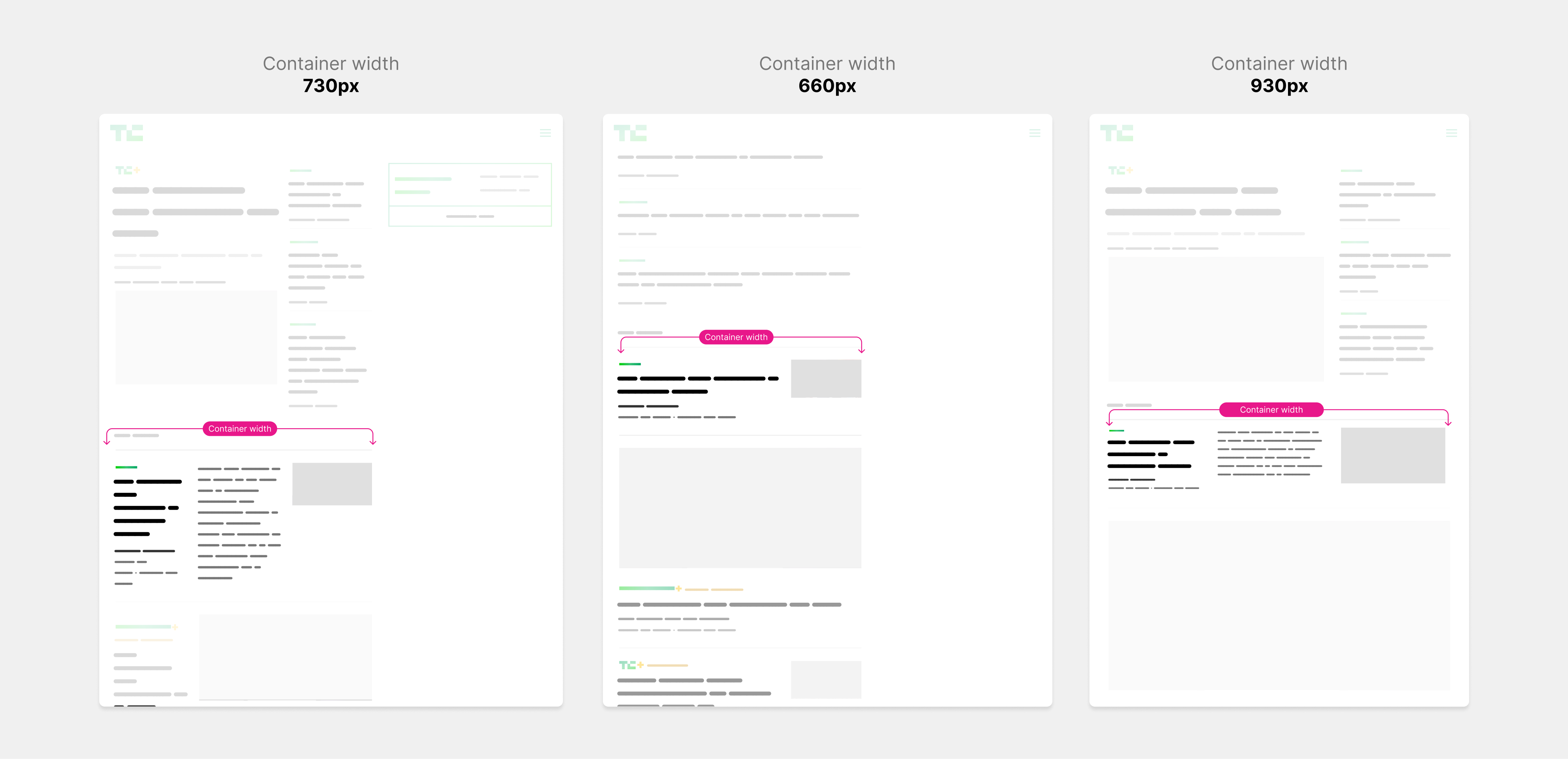
Building the main layout today
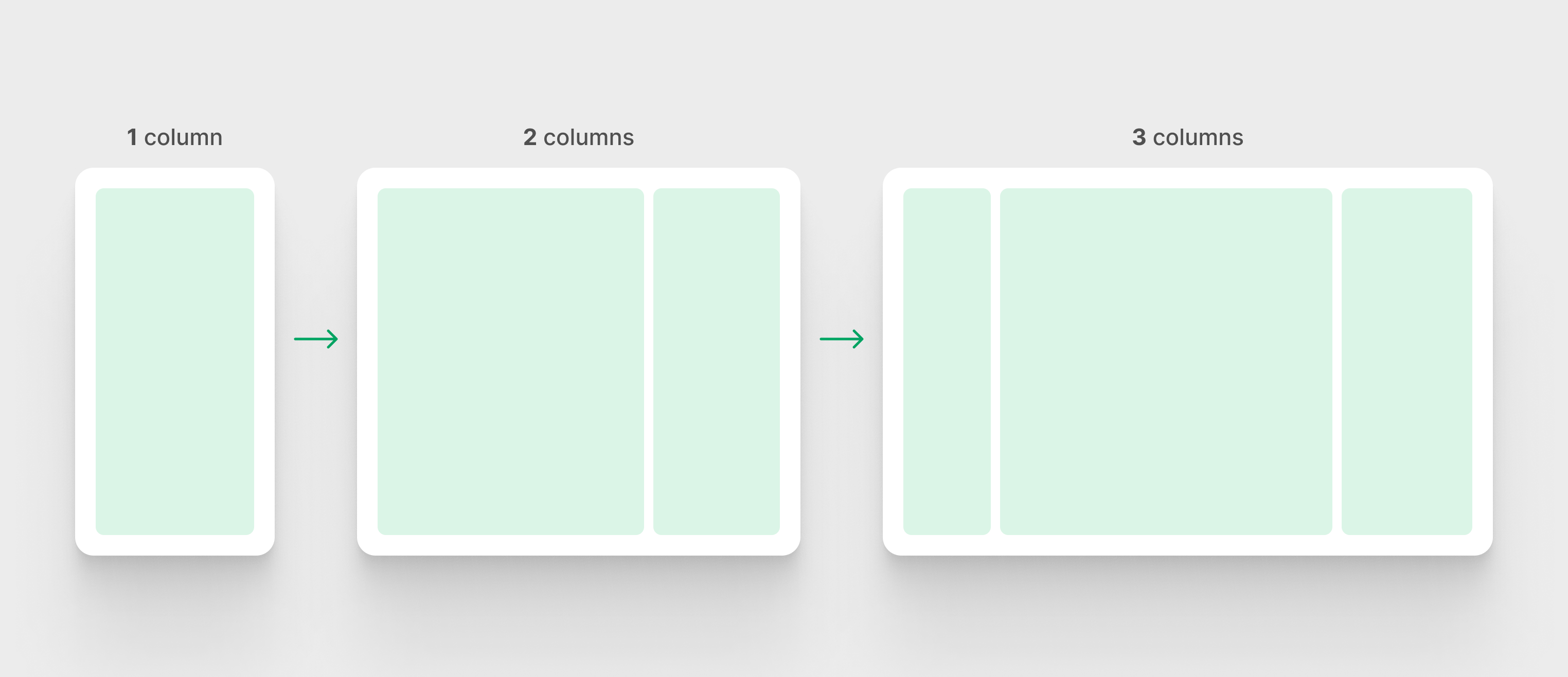
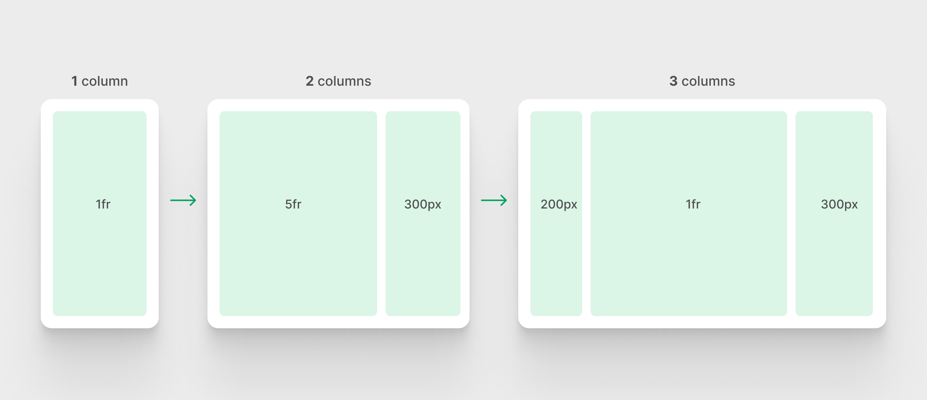
First, let’s look at the design requirements. In the following figure, notice how the layout gradually changes from one column to three.
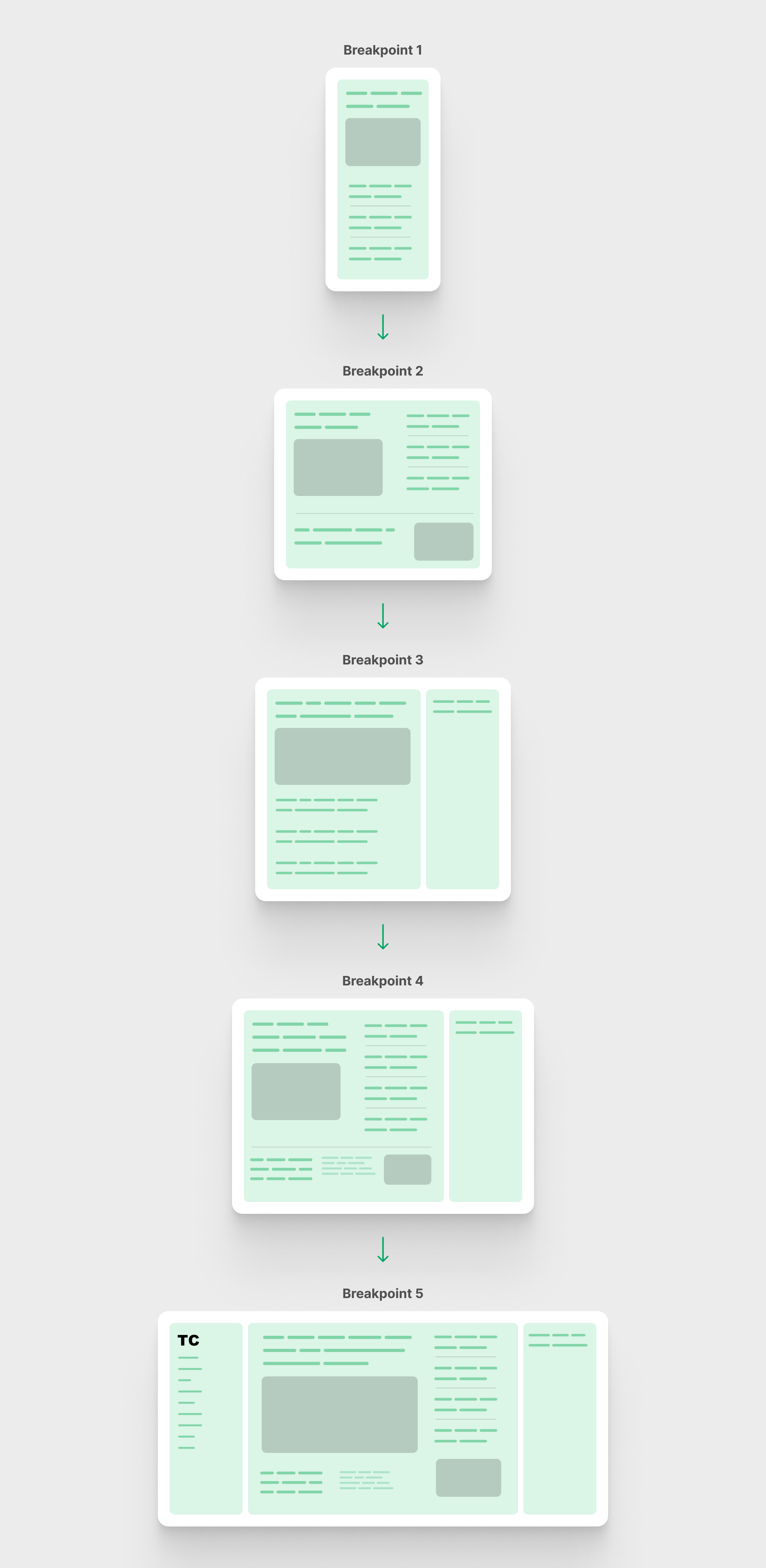
Let’s focus on the main layout only.
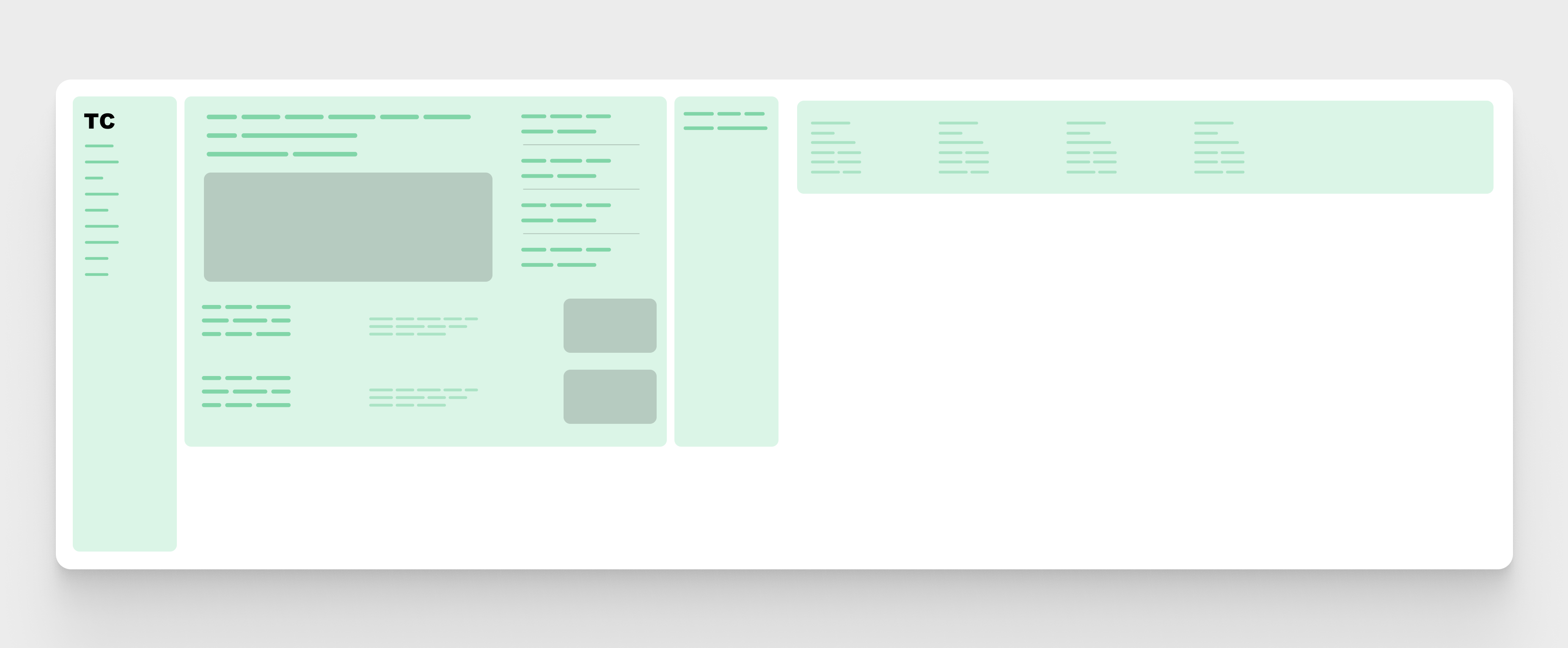
Some of the columns have minimum or maximum width or both. See the following figure:
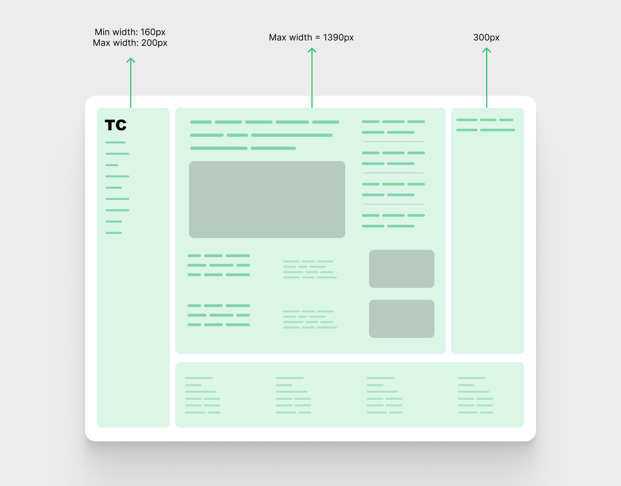
- Left column: minimum width of
160pxand maximum width of200px. - Middle column: maximum width of
1390px - Right column:
300pxwidth
I’m not a fan of using left or right for naming in CSS. Given that we have logical properties, their names will be start and end, respectively. I used left and right for clarity purposes.
On a large screen, the whole website is left aligned while all the column’s width are maxed-out.
First try: Using CSS Flexbox
The first thing I thought about was using flexbox. Let’s look at the HTML:
<div class="layout">
  <header class="navigation"></header>
  <div class="main-content">
    <div class="content-wrap">
      <div class="content content--feature-island"></div>
    </div>
    <div class="content-wrap">
      <div class="content"></div>
    </div>
  </div>
  <aside class="sidebar"></aside>
  <footer class="site-footer"></footer>
</div>
For the main layout, I used flexbox and the default direction is column for mobile.
.layout {
  display: flex;
  flex-wrap: wrap;
  flex-direction: column;
  gap: 1rem;

  @media (min-width: 720px) {
    flex-direction: row;
    align-items: start;
  }
}
The .layout element is now a flexbox container. The next step is to define the width or max-width of each child column.
For the header, I’m using clamp() to help with the minimum and maximum width.
.navigation {
  position: sticky;
  top: 1rem;
  flex: 0 0 100%;

  @media (min-width: 720px) {
    flex: initial;
    width: clamp(160px, 15vw, 200px);
  }
}
For the middle column, I used a mix of max-width and flex: 1.
.main-content {
  max-width: 1300px;
  flex: 1;
}
Finally, the aside element is hidden by default and will be shown if the width is equal to or greater than 720px.
.sidebar {
  display: none;
  width: 300px;

  @media (min-width: 720px) {
    display: block;
  }
}
Note: The media query values I use are not the same as in TechCrunch’s CSS.
Handling the footer for this layout technique is not straightforward.
Now to the most hacky part of this layout technique. Since the flex-direction is set to row, we need to force the footer to take the full width of its wrapper.
In the TechCrunch implementation, I expected that the footer width would be equal to the middle content, but turned out it’s somewhere between the middle content and the sidebar.
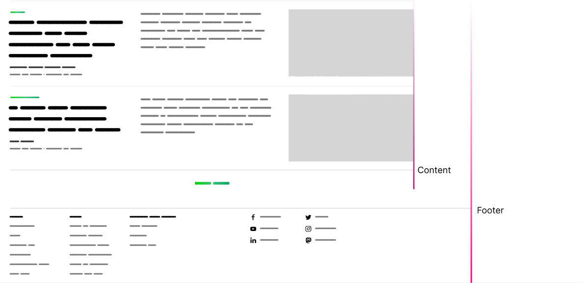
Since I’m using flexbox, I aim to have the footer aligned with the content.
.site-footer {
  flex: 0 0 100%;
}
In flexbox, using 100% for flex-basis will force a flex item to wrap into a new line and take the full width. This works only when we have flex wrapping active.
Next step, we need to add a left margin that is equal to the dynamic width of the navigation.
.site-footer {
  --navWidth: clamp(160px, 15vw, 200px);
  flex: 0 0 100%;
  margin-left: calc(var(--navWidth) + 16px);
}
The 16px is accounting for the gap between the columns.
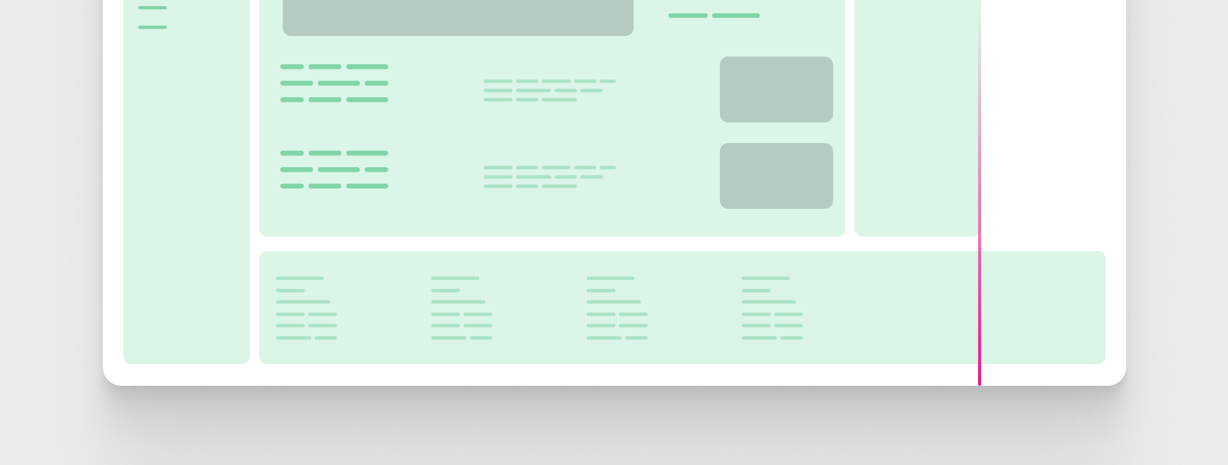
That isn’t enough. It will cause horizontal scrolling because the footer width is 100% and we added margin-left.
The fix to that is to deduct the margin from the width of the footer. I included the navigation width in a CSS variable to make it a little easier to read.
.site-footer {
    --navWidth: clamp(160px, 15vw, 200px);
    flex: 0 0 calc(100% - var(--navWidth) + 16px));
    margin-left: calc(var(--navWidth) + 16px);
}
Now the footer takes the full width of the viewport minus the margin-left.
The next step is to include some math to have the final flex-basis value. See the following CSS:
.site-footer {
  --navWidth: clamp(160px, 15vw, 200px);
  --maxVal: calc(100vw - 1300px - 200px - 300px - 32px - 32px);
  flex: 0 0 calc(100% - calc(var(--navSize) + 16px) - max(0px, var(--maxVal)));
  margin-left: calc(var(--navWidth) + 16px);
}
As soon as I moved forward with this solution, I found that it breaks when the viewport is very large (2500px+).
I have to use some complex math to deduct from the flex-basis value. Here is an analysis of the above CSS:
- 1300px: middle column width
- 200px: navigation width
- 300px: sidebar width
- The rest is spacing on both sides
The reason that this solution breaks is because of flex-wrap: wrap. As soon as there is enough space for the footer to be next to its sibling, the browser will do that.
That is too much. I didn’t like that solution.
What if simply I add a max-width to the layout wrapper, and then make the footer fill the full width minus the navigation? It’s much easier to do & understand.
Here is the CSS:
.layout {
  --navSize: clamp(160px, 15vw, 200px);
  display: flex;
  flex-direction: column;
  max-width: 1800px;
  gap: 1rem;

  @media (min-width: 720px) {
    flex-wrap: wrap;
    flex-direction: row;
    align-items: start;
  }
}

main {
  flex: 1;
}

.navigation {
  position: sticky;
  top: 1rem;
  flex: 0 0 100%;

  @media (min-width: 720px) {
    flex: initial;
    width: var(--navSize);
  }
}

.site-footer {
  flex: 0 0 100%;

  @media (min-width: 720px) {
    flex: 0 0 calc(100% - calc(var(--navSize) + 16px));
    margin-left: calc(clamp(160px, 15vw, 200px) + 16px);
  }
}
Pros of using this solution
- Doesn’t have any
position: absoluteorposition: fixed. - Great browser support for flexbox and comparison functions.
Cons of using this solution
While that works (kinda), a lot is going on that I don’t like:
- Adding the
widthdirectly to the child elements. I would prefer to have a grid shell that handles that, and the inner items will just react to it. - Having a responsive layout with flexbox requires us to change the CSS for each child item.
- If an item is spread across the full viewport width, like the footer, you need to work around that or separate it from the layout.
Second try: Using CSS Flexbox spacer element
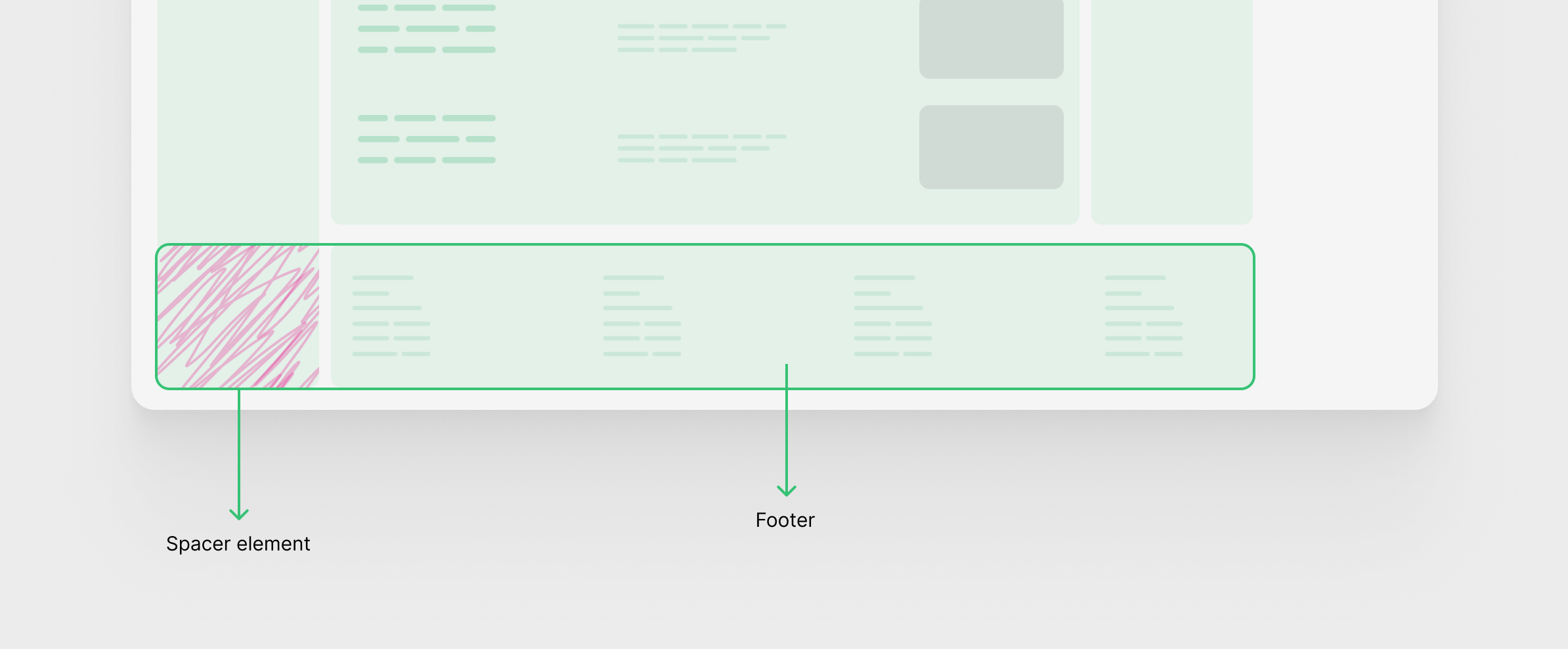
In this solution, the HTML should be tweaked a bit. The footer needs an additional wrapper, I named it site-footer-wrapper.
<div class="layout">
  <header class="navigation"></header>
  <div class="main-content">
    <div class="content-wrap">
      <div class="content content--feature-island"></div>
    </div>
    <div class="content-wrap">
      <div class="content"></div>
    </div>
  </div>
  <aside class="sidebar"></aside>
  <div class="site-footer-wrapper">
    <footer class="site-footer"></footer>
  </div>
</div>
.site-footer-wrapper {
  display: flex;
  gap: 1rem;
  /* Make the footer take the full width*/
  flex: 0 0 100%;
}

.site-footer {
  flex: 1;
  max-width: 1300px;
}
Now to the solution. It’s about using a flexbox spacer element.
The new wrapper is a flexbox container with gap: 1rem. This reminded me of the CSS subgrid. The footer itself has flex: 1 to fill the remaining space with a maximum width of 1300px (same as the main content wrapper).
With the above CSS, we’ll have a result like this:
Notice that the footer is left aligned. The next step is to add the spacer element on the left.
@media (min-width: 720px) {
  .site-footer-wrapper:before {
    content: "";
    background-color: pink;
    width: var(--navSize);
  }
}
Cool, but the footer should span the width till the end of the grid (the sidebar). We can do that by adding the gap and sidebar width to the maximum width of the inner footer.
.site-footer {
  flex: 1;
  max-width: calc(1300px + var(--gap) + var(--sidebarWidth));
}
Third try: Using CSS Flexbox and margin
The flexbox layout is still the same as the previous example, but it’s a different technique. The idea is to add margins on both sides of the footer.
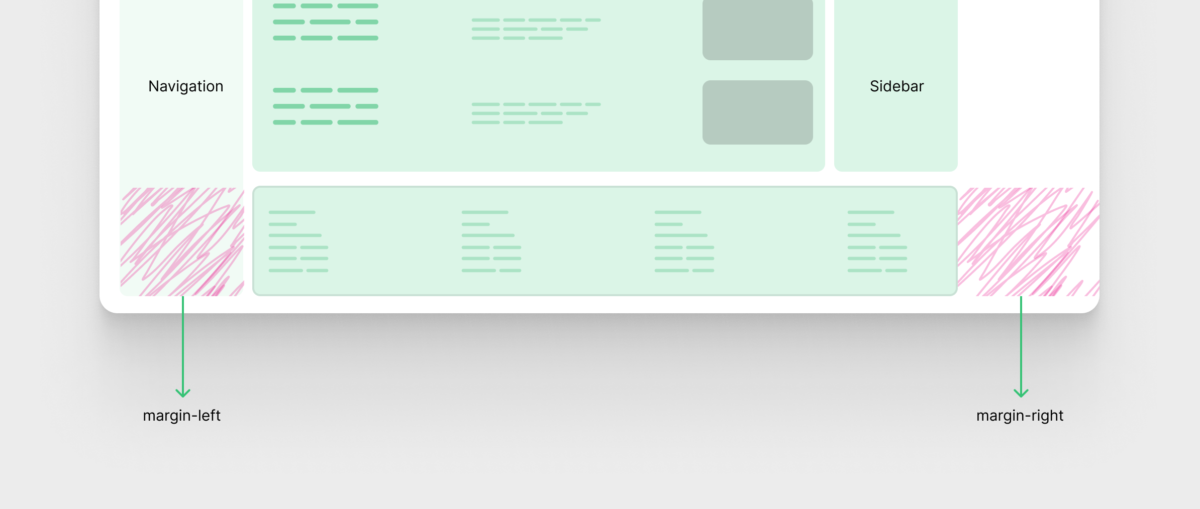
Okay. We already know the size of the navigation, so the margin-left will be the same as the navigation width.
What about the margin-right? Well, it needs some math. That margin is dynamic, as it depends on the viewport size. It will be larger when the screen is large.
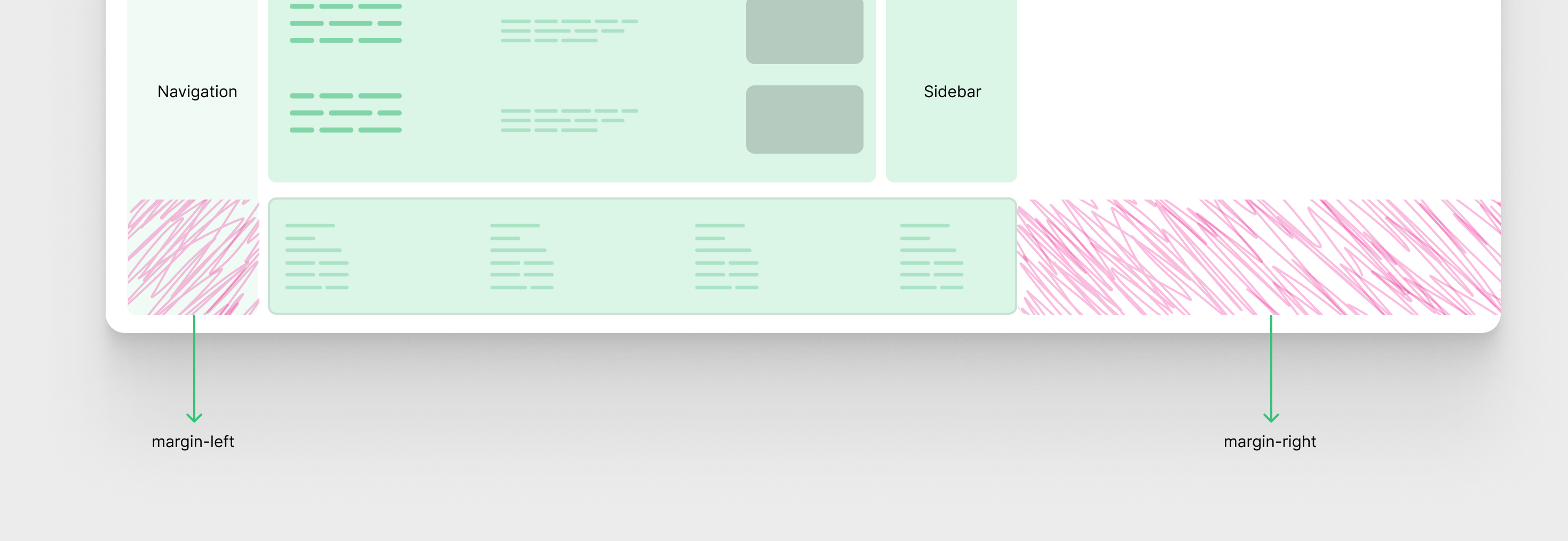
Solution requirements
- The margin value should be dynamic when there is enough space
- The margin should become
0when there is no space - Since the footer
flex-basisis100%, the value should change based on the margin
Here is the solution:
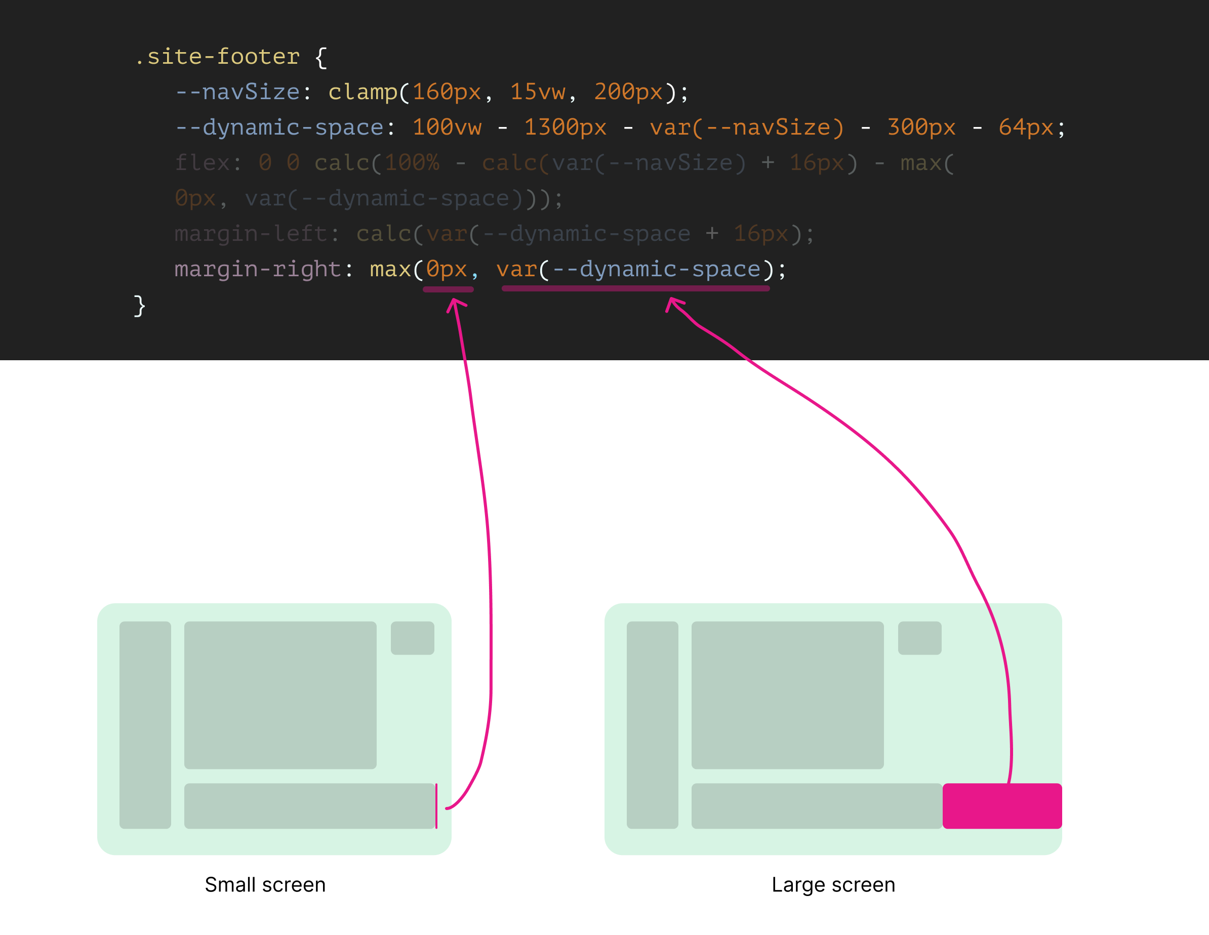
.site-footer {
--navSize: clamp(160px, 15vw, 200px);
--dynamic-space: calc(
100vw - 1300px - var(--navSize) - 300px - 64px
);
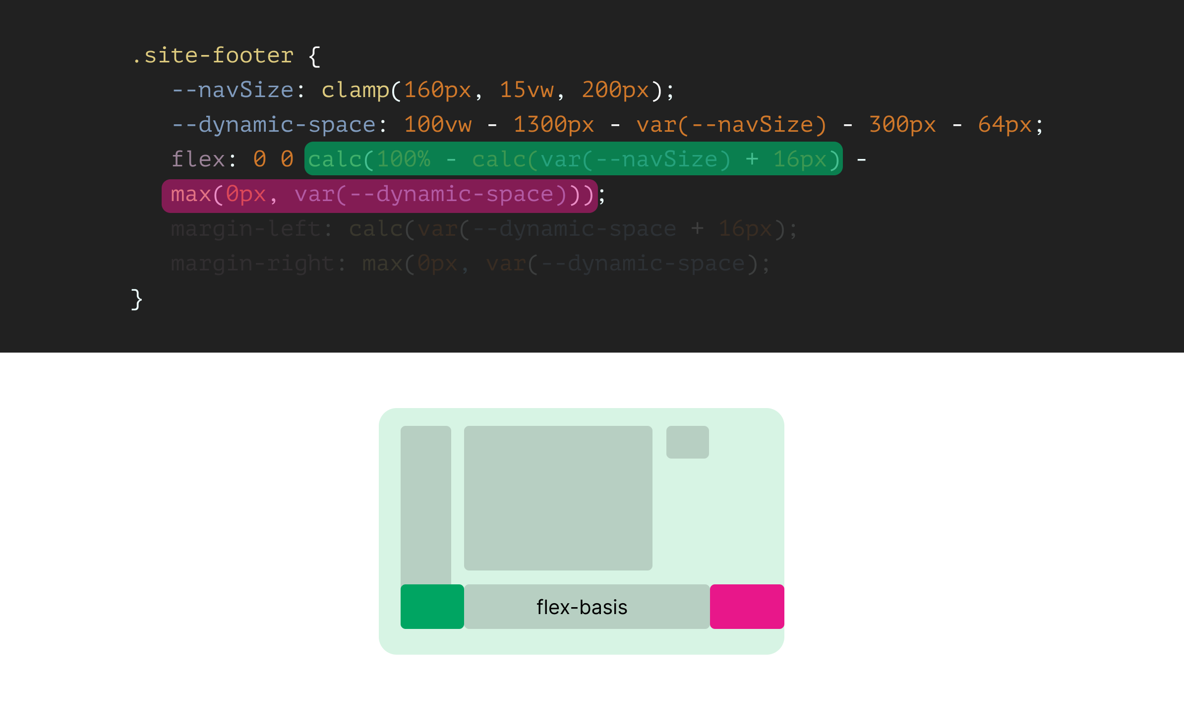
flex: 0 0 calc(100% - calc(var(--navSize) + 16px) - max(0px, var(--dynamic-space)));
margin-left: calc(var(--navSize) + 16px);
margin-right: max(0px, var(--dynamic-space));
}
First, let’s break down the --dynamic-space CSS variable.
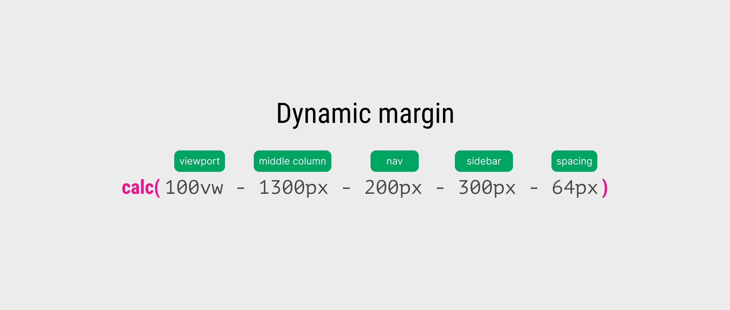
The dynamic margin on the right side is equal to the result of the following:
dynamic margin = viewport width - middle column - nav - sidebar - spacing
By combining that with the CSS max() comparison function, the value can be either 0 or the var(--dynamic-space), depending on the viewport size.
When the viewport size is large, the dynamic margin is larger than 0px. Otherwise, the dynamic margin is negative and thus the 0px is larger.
The max() comparison function doing its job here.
For the flex value, the width of the footer is dynamic and is calculated based on both margins.
Pros of using this solution
- Works great on all screen sizes
Cons of using this solution
- It’s hard to understand it if you refer back to it in six months. It’s even not easy to understand others.
- It might become useless if the layout changes for some reason.
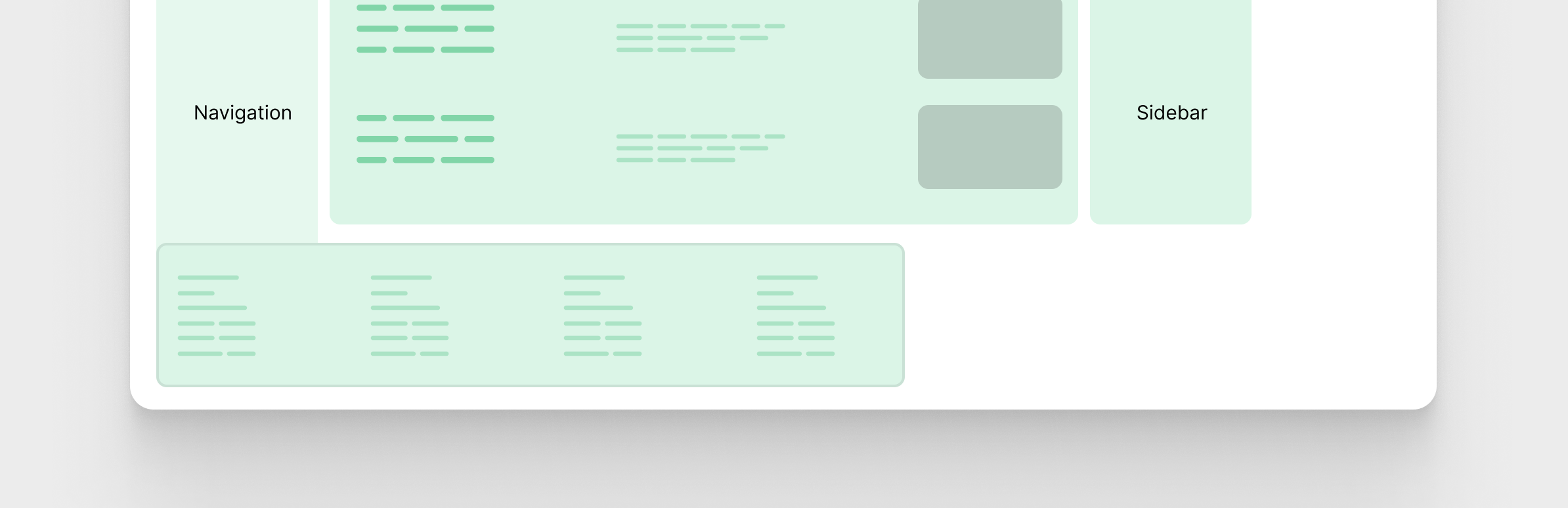
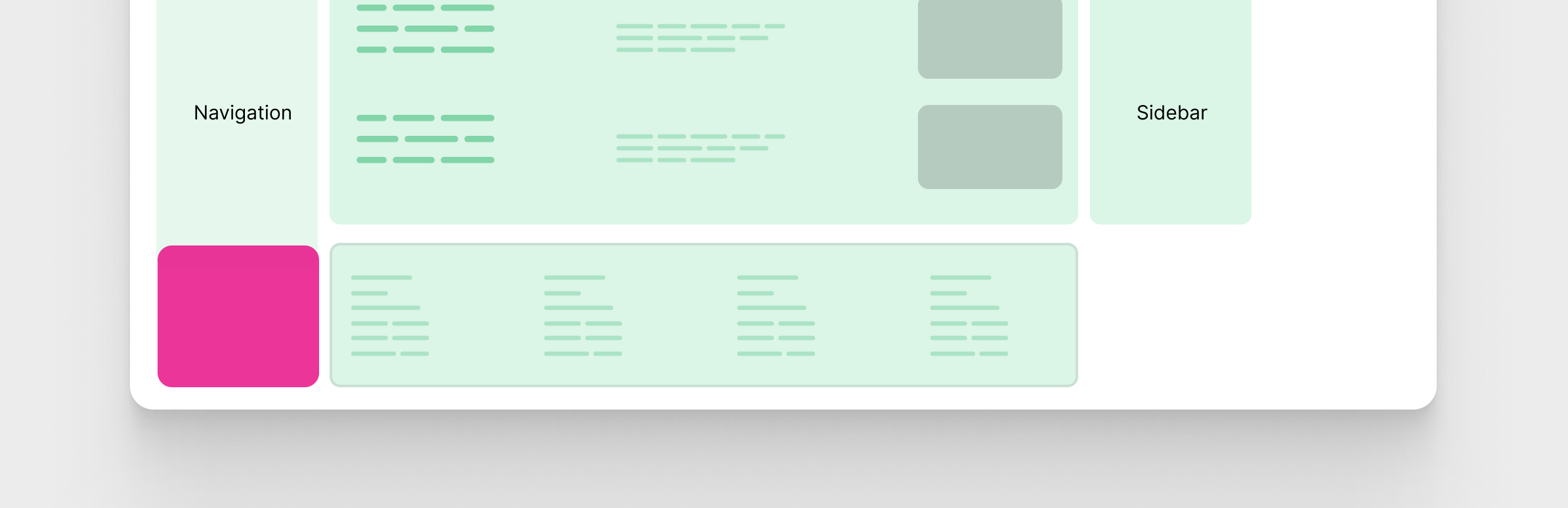
Fourth try: Using CSS Grid - Take 1
This solution is about using CSS grid. We need to have 1 column on mobile and 3 columns when the space is enough.
Here is the initial solution with the CSS grid technique.
.layout {
  --cols: 1fr;
  display: grid;
  grid-template-columns: var(--cols);
  align-items: start;
  gap: 1rem;
  max-width: 1800px;

  @media (min-width: 720px) {
    --cols: 5fr 300px;
  }

  @media (min-width: 1020px) {
    --cols: 250px 5fr 300px;
  }
}
A few notes:
- I used
1frfor the grid columns on mobile to get the benefit of thegapbetween elements. - The
align-itemsis important to make the sticky positioning work with CSS grid. - The
--colsCSS variable is changed on different breakpoints.
Next, we need to position both the navigation and the footer as below:
header {
  position: sticky;
  top: 0;
  grid-column: 1 / -1;

  @media (min-width: 1020px) {
    grid-column: 1 / 2;
  }
}

.site-footer {
  grid-column: 1 / -1;

  @media (min-width: 1020px) {
    grid-column: 2 / -1;
  }
}
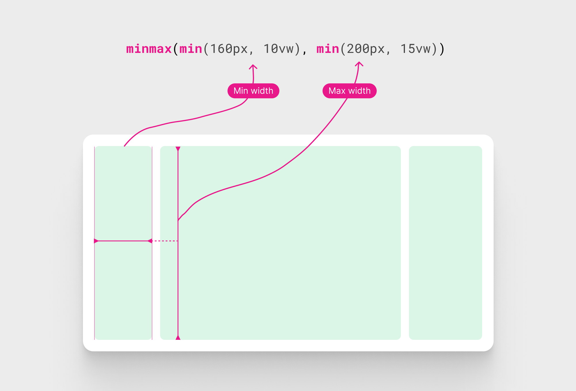
While this works, the first column width is fixed. I need it to range between 160-200px. How to do that while CSS grid minmax() function can’t add dynamic values?
Consider the following CSS:
.layout {
  /* other styles */
  grid-template-columns: minmax(160px, 200px) 5fr 300px;
}
This won’t work. Let’s take a look at a different solution.
Fifth try: Using CSS Grid - Take 2
I got the idea to use CSS Comparison functions inside the minmax() function and it worked. The idea is to use a min() function and have a fixed value and a dynamic one.
Let’s take a simple example.
.layout {
  --dynamic-col: minmax(min(160px, 10vw), min(200px, 15vw));
}
It works! We now have a dynamic column within CSS grid. Here is the rest of CSS:
.layout {
  --cols: minmax(min(160px, 10vw), min(200px, 15vw)) minmax(
      min(1200px, 0px),
      min(1390px, 100%)
    )
    300px;
}
Pros of using this solution
- Great browser support
- Easy to implement and control the columns
- We can benefit from subgrid to have a better alignment for the UI. I will explain about that later.
Cons
- None
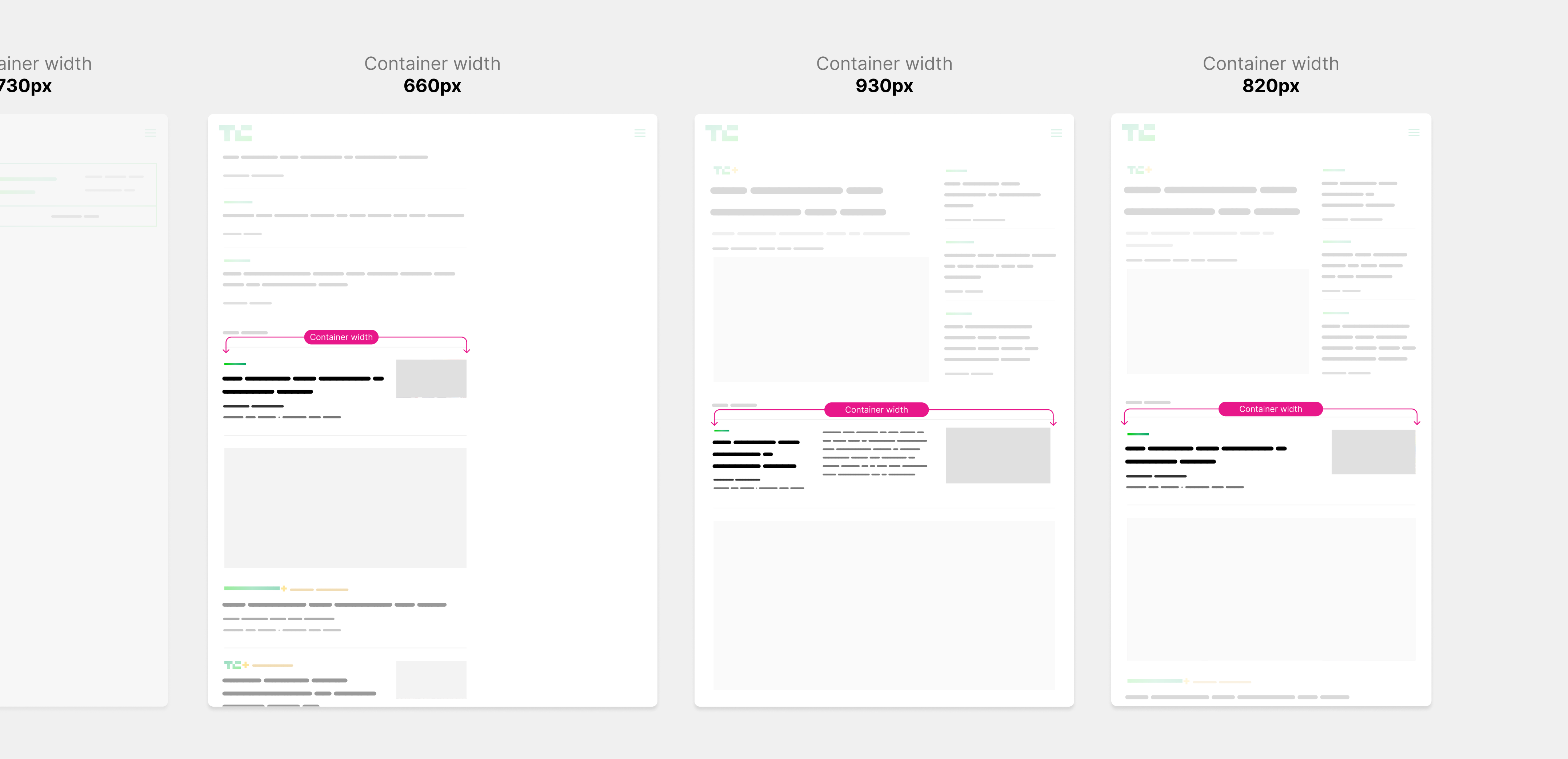
The middle section grid layout
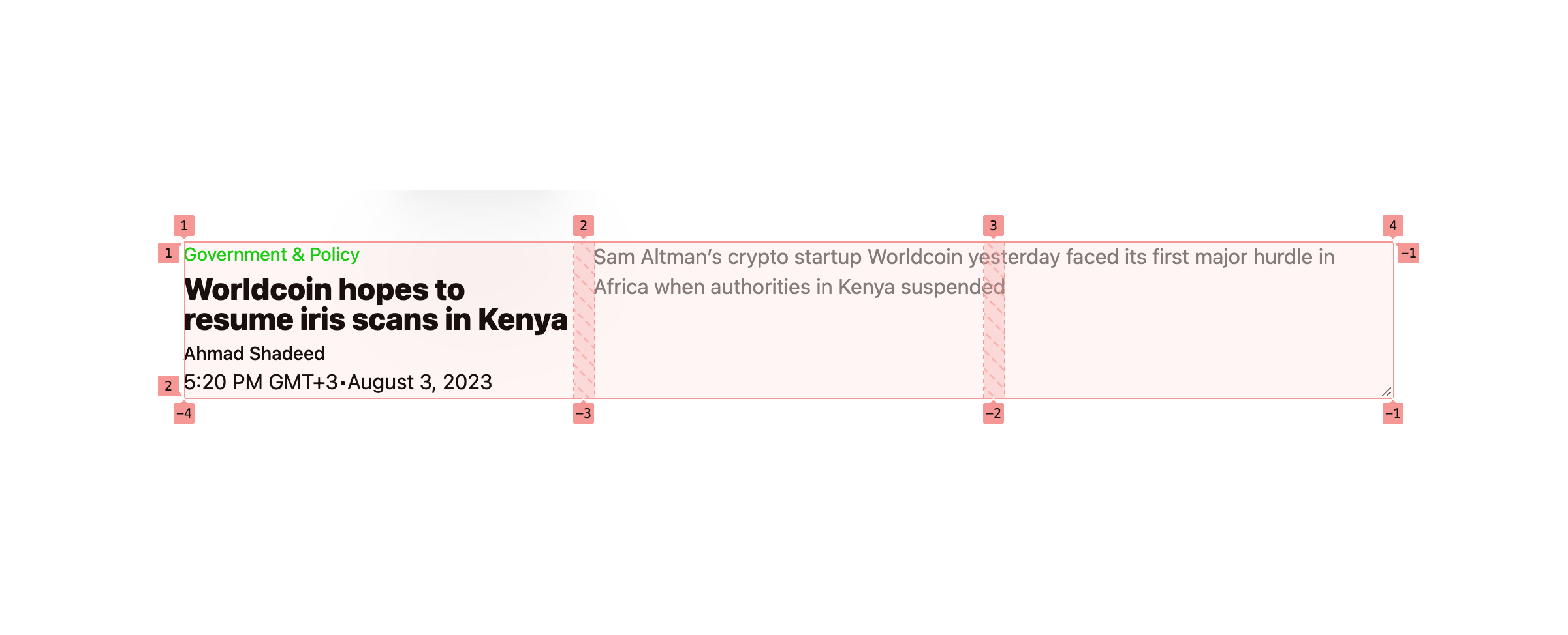
I found the layout of this section to be a bit buggy. Notice how it behaves differently on 3 different breakpoints, with a 1px difference between each one.
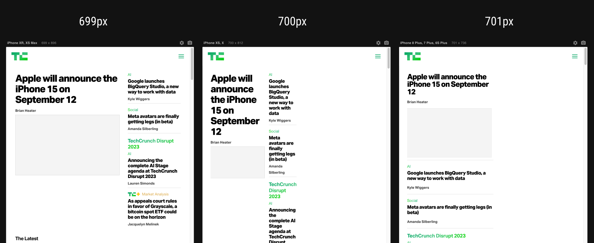
I would build that with CSS grid and won’t go into the details, as there are more important stuff to cover.
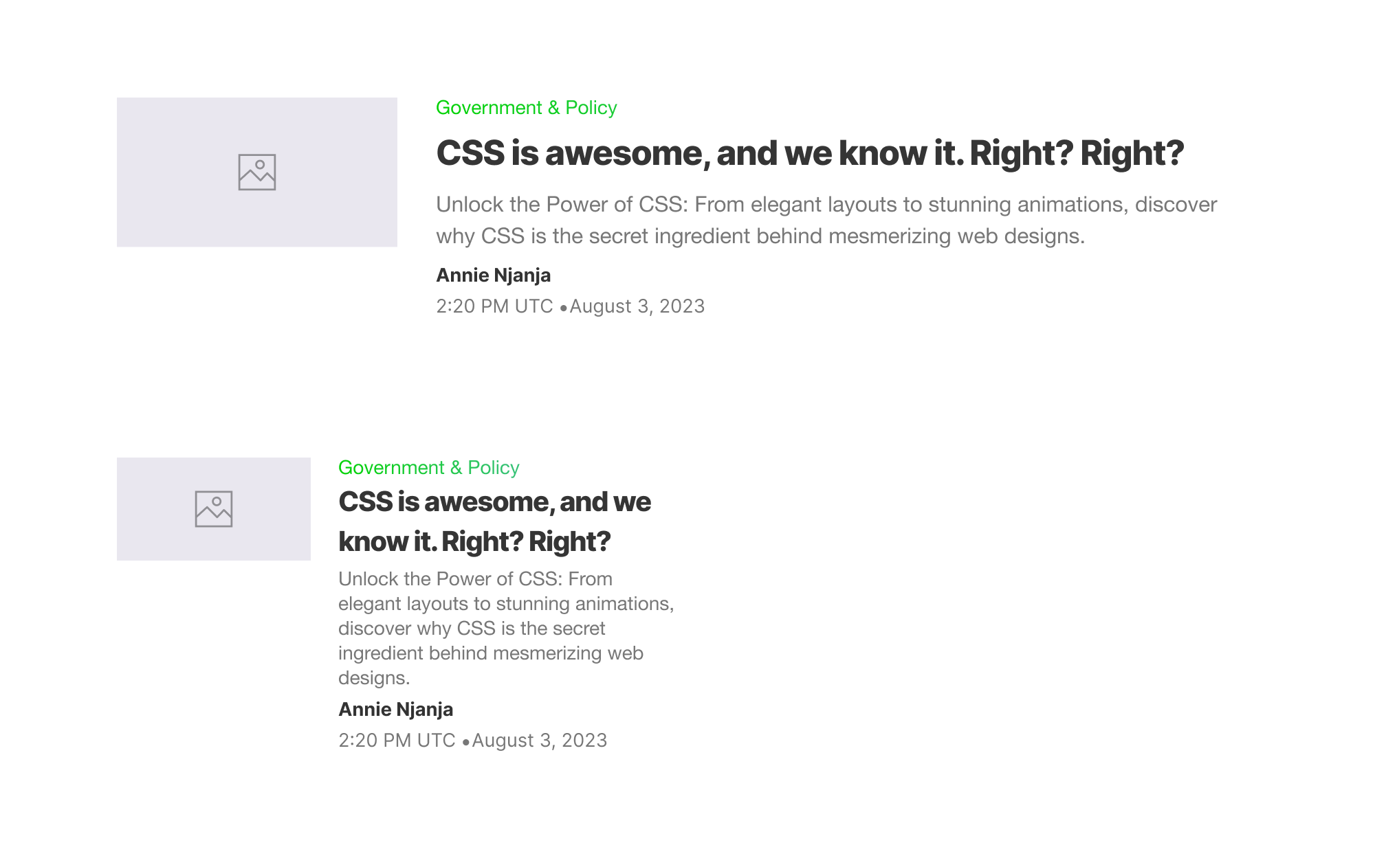
The news component
Since this TechCrunch redesign was done a few years ago, it’s expected to see heavy use of media queries and duplication for some of the styles or elements.
Let’s take an example of why using media queries isn’t a good idea.
In the following component variation, notice how the layout of the component is changed based on the viewport width, not its container.
From the left, the description text is shown, when the viewport size gets smaller, it’s hidden. Then, when the layout is 1-col only, the component has much more space again but stays at the mobile-y layout.
With container queries, we can simply show the description in that case, as there is enough space. All of that can be done by querying the container for the width. Here is a look at the expected result:
Now, when the viewport (or container width) is smaller, the component will just react based on that. The browser will choose what’s best.
In the current TechCrunch implementation, each component variation has its HTML markup. Let me show you a simple example of that:
That’s not good, and there is a big potential to just use one title for all the variations and rely on fluid sizing.
By the way, the same applies to spacing and other components. It’s not just the title.
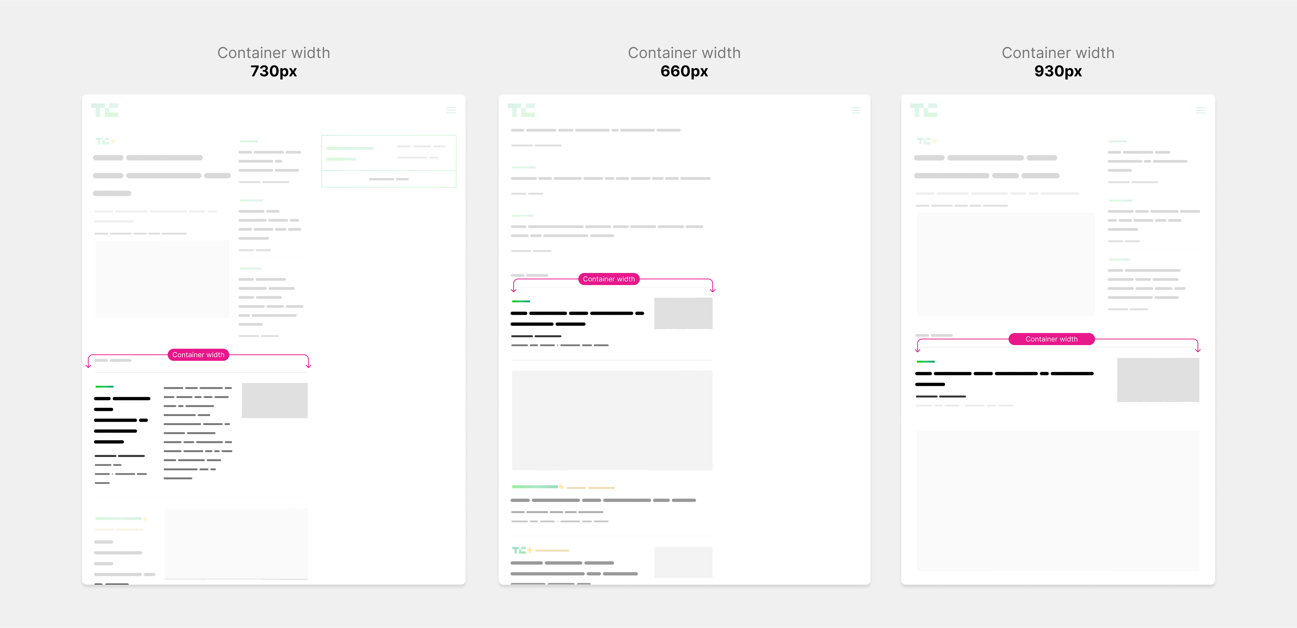
Now that we have the main grid, the next step is to tackle the news component. I’m very excited to rethink building this because I can already see a good potential for modern CSS.
Let’s take a look at the new component. The pink outline represents the container width.
This is a broad view of the news component with one variation only. That variation can extend to different other ones. It’s a process of resizing, moving things around, and adding or hiding things.
Let’s look at the variations of the news component.
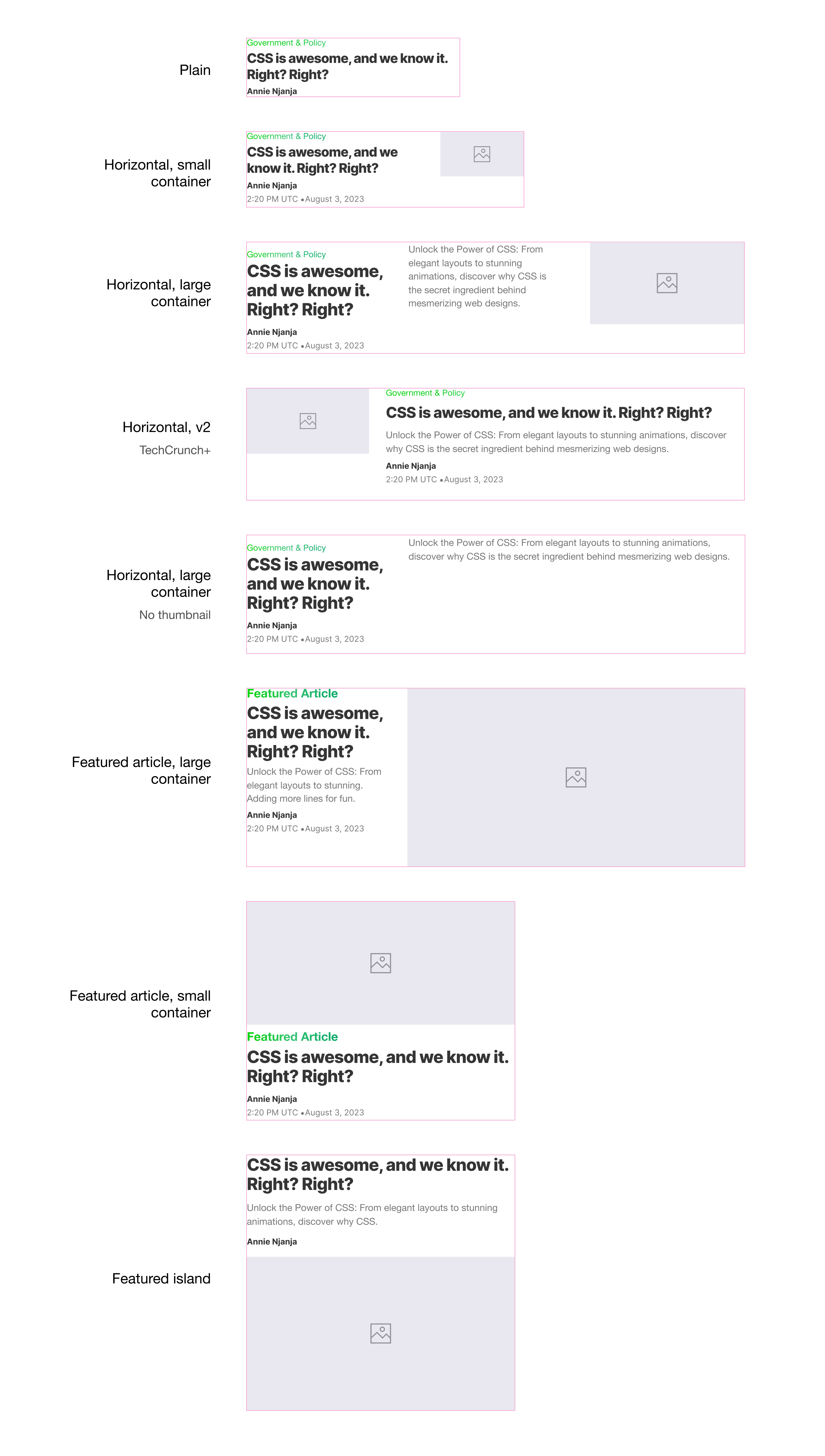
Keep in mind that each variation should work with all viewport sizes. Let’s explore building the component variations with modern CSS.
The initial solution
At first, I thought about minimal wrapping as possible. That means the component won’t have wrappers to group elements.
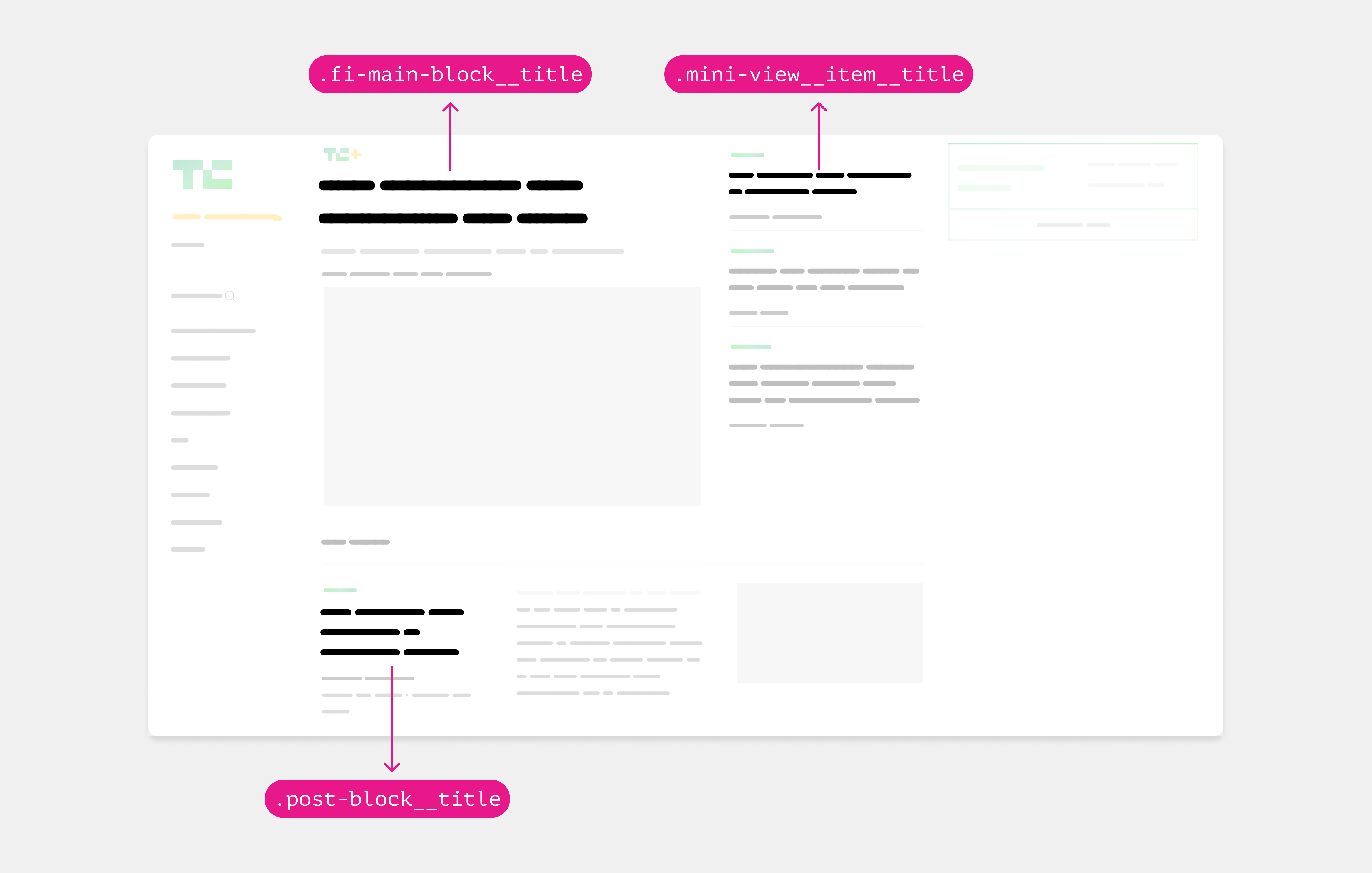
<article class="post">
  <div class="category">...</div>
  <h3 class="title">...</h3>
  <div class="meta">
    <p>Ahmad Shadeed</p>
    <time>...</time>
  </div>
  <div class="desc"></div>
  <figure class="media"></figure>
</article>
I used CSS grid and placed the items individually in their column and rows.
.post {
  display: grid;
  grid-template-columns: 1fr 1fr 1fr;
  grid-template-rows: max-content max-content 50px;
  column-gap: 1rem;
}

.title {
  grid-column: 1/2;
}

.meta {
  grid-column: 1/2;
}

.desc {
  grid-column: 2/3;
  grid-row: 1/-1;
}

.media {
  grid-row: 1/-1;
  grid-column: 3/4;
}
Here is the result:
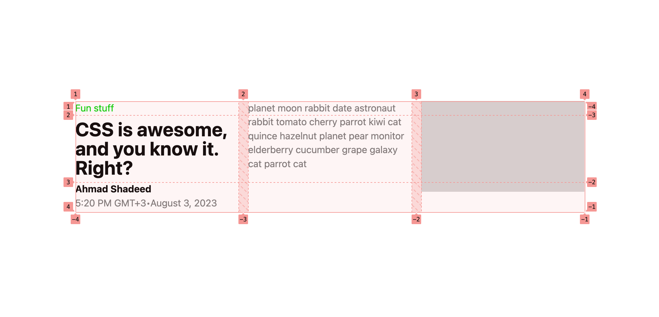
While that works perfectly as it seems from the visual, there is an issue that can happen.
In CSS grid, the height of grid items per row is consistent. If there is a very long description text, there will be a large spacing around the main title.
You can also try it yourself in this interactive demo.
That’s not good and there is no way (as per my knowledge) to solve that in CSS grid. It’s just how it works.
Update 1 Sep 2023
It turned out that there was a solution to the issue. Eric Meyer kindly shared a simple solution which is to replace 50px with 1fr and the CSS grid will work just fine.
.post {
  display: grid;
  grid-template-columns: 1fr 1fr 1fr;
  grid-template-rows: max-content max-content 1fr;
  column-gap: 1rem;
}
Check out the interactive demo here.
I admit that I overlooked that solution. Anyway, it’s a great feeling to get your work corrected by a CSS master like Eric Meyer.
Second round: updated HTML markup
As a result, I modified the markup and wrapped the category, headline, and meta in a .post-content element as the following.
<div class="post-wrapper">
  <article class="post">
    <div class="post-content">
      <div class="category">...</div>
      <h3 class="title">...</h3>
      <div class="meta">
        <p>Ahmad Shadeed</p>
        <time>...</time>
      </div>
    </div>
    <div class="desc"></div>
    <figure class="media"></figure>
  </article>
</div>
Based on that markup, I will use CSS grid to layout the post items.
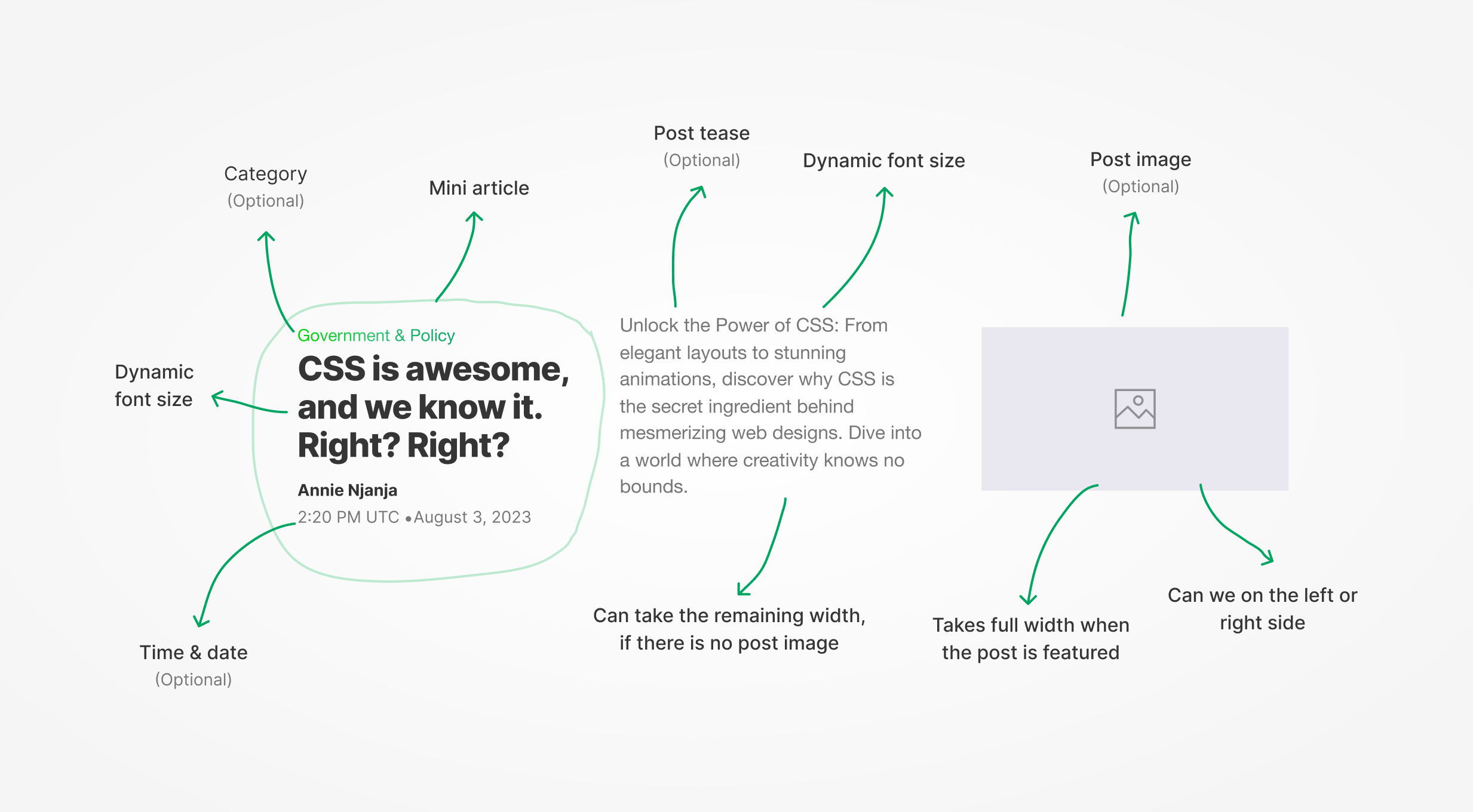
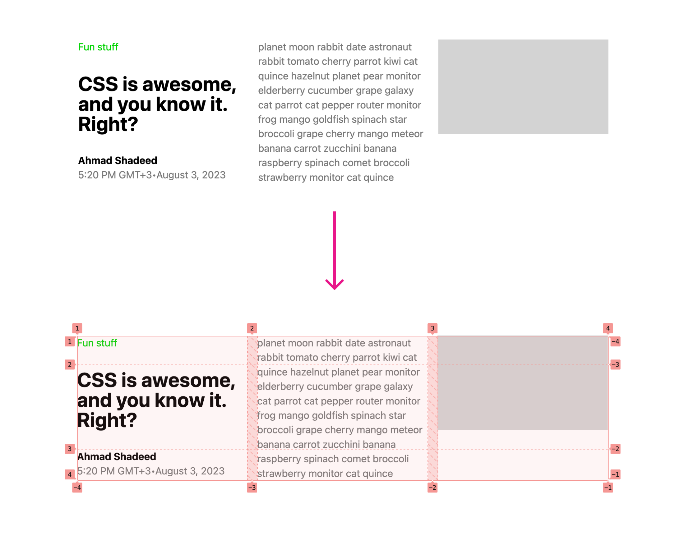
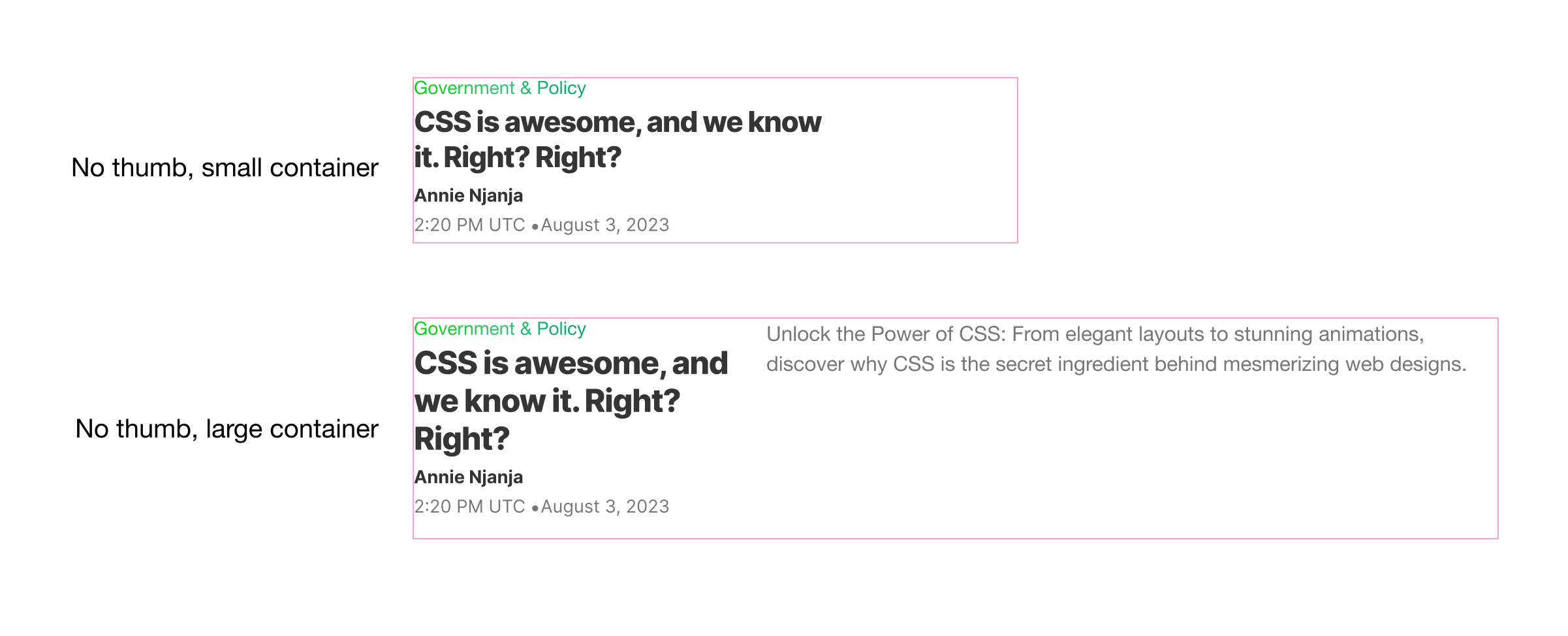
Variation 1: Horizontal with thumb
I started working on the following variation.
While writing the CSS, I need to take the following into account:
- Dynamic grid that can easily be changed.
- Fluid headline
font-sizebased on the container width. - Hide the description when the container width is small.
- Fluid spacing.
First, I wrote the CSS needed for the grid.
.post {
  --cols: 2fr 1fr;
  display: grid;
  grid-template-columns: var(--cols);
  gap: 1rem;
}
That will change when the container width is large enough. Before changing the grid, I need to define a container.
.post-wrapper {
  container-name: post;
  container-type: inline-size;
}
With that, I can change the grid layout based on the container width. Here is the full CSS:
.post-wrapper {
  container-name: post;
  container-type: inline-size;
}

.post {
  --cols: 2fr 1fr;
  display: grid;
  grid-template-columns: var(--cols);
  gap: 1rem;

  @container post (min-width: 450px) {
    --cols: 1fr 1fr 1fr;
  }
}
Cool. Next, I need to handle the thumbnail. On small containers, it’s hidden.
I added the CSS variable --thumb: true to indicate that this component variation has a thumbnail.
<div class="post-wrapper" style="--thumb: true;">
    <article class="post">
        <div class="post-content">
            <div class="category">...</div>
            <h3 class="title">...</h3>
            <div class="meta">
                <p>Ahmad Shadeed</p>
                <time>...</time>
            </div>
        </div>
        <div class="desc"></div>
        <figure class="media"></figure>
    </article>
</div>
Then, I need to check if the --thumb: true is added to the container, and hide the description by default. If the container width is large enough, then the description is shown.
This CSS is made thanks to Style container and Size container queries.
/* If the post has a thumb, hide the description text by default and show it only if the width is 450px or more. */
.desc {
  @container style(--thumb: true) {
    display: none;

    @container post (min-width: 450px) {
      display: block;
    }
  }
}
Please note that style queries are in Chrome Canary and there is an intent that Safari will prototype them soon (h/t @bramus).
Finally, the spacing between the category, title, author, and meta is being handled by the gap property.
.post-content {
  display: flex;
  flex-direction: column;
  gap: max(2px, 0.5cqw);
}
I’m using the max() comparison function to handle a fluid spacing.
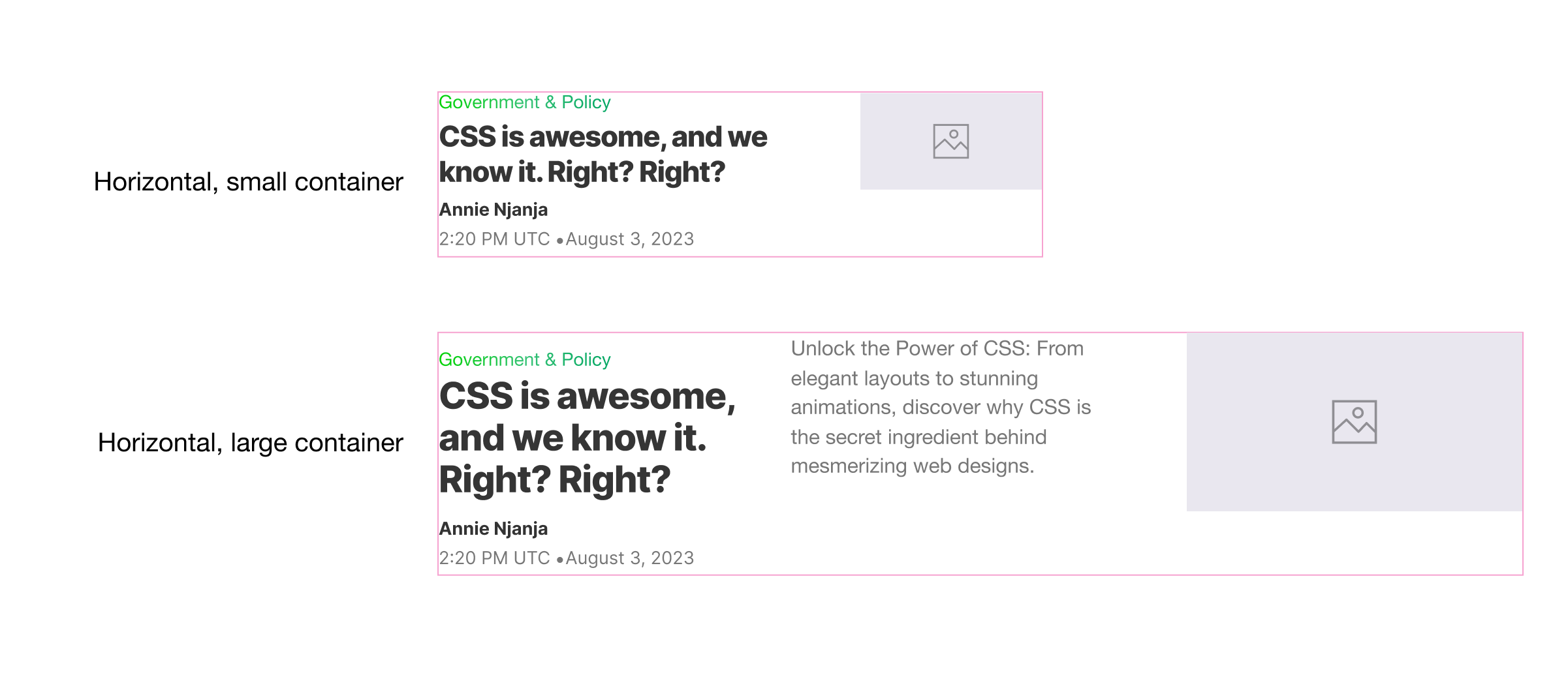
Variation 2: Horizontal without thumb
This is similar to the above, but it doesn’t have a thumbnail. The description spans the width of the second and third columns.
That is possible with CSS :has and size container queries. Using :has is a conditional CSS pattern.
.post:not(:has(.media)) {
  /* [1] */
  display: block; /* [2] */

  .desc {
    display: none; /* [3] */
  }

  @container post (min-width: 450px) {
    display: grid; /* [4] */

    .desc {
      display: block; /* [5] */
      grid-column: 2/4; /* [6] */
    }
  }
}
Let’s go through the CSS:
- If the post doesn’t have a media element, apply those styles.
- Disable CSS grid by changing the
displaytoblock - Hide the description text by default.
- Add
display: gridback to activate the already added grid stuff from the previous variation. - Show the description text.
- Make the description text span 2 columns.
Here is how the CSS grid looks under the hood:
For the title, it changes between the small and large containers. In the TechCrunch implementation, this is done manually (a fixed value for each viewport size).
Thanks to container query units, we can have a fluid font size based on the container width.
See the following CSS. I’m using the CSS max() comparison function and it chooses between 1rem or 2.5cqw. The 2.5cqw here is equal to 2.5% of the container width.
.title {
  font-size: max(1rem, 2.5cqw);

  @container style(--thumb: true) {
    font-size: clamp(1.25rem, 3cqw, 2rem);
  }
}
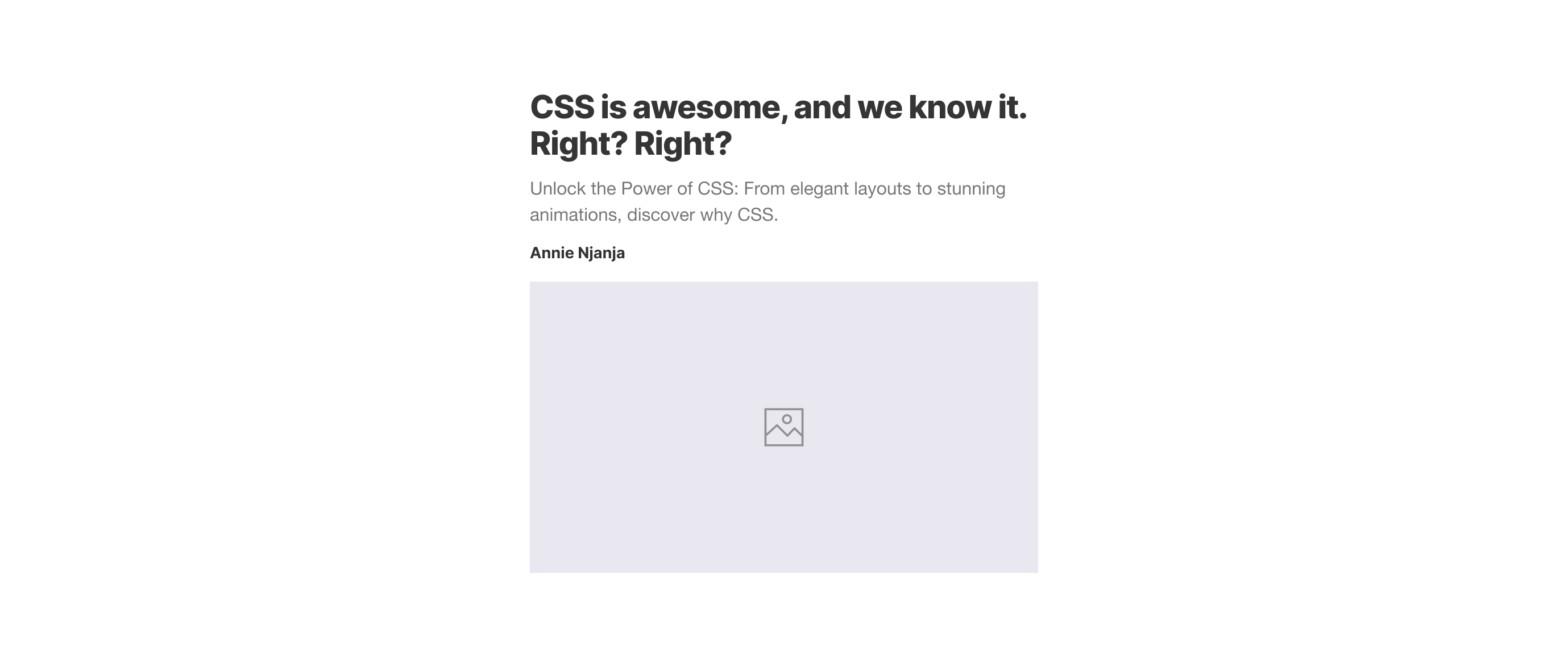
Variation 3: Featured v1
In this style, the post content and media are displayed next to each other. The columns are one for the content and two for the media.
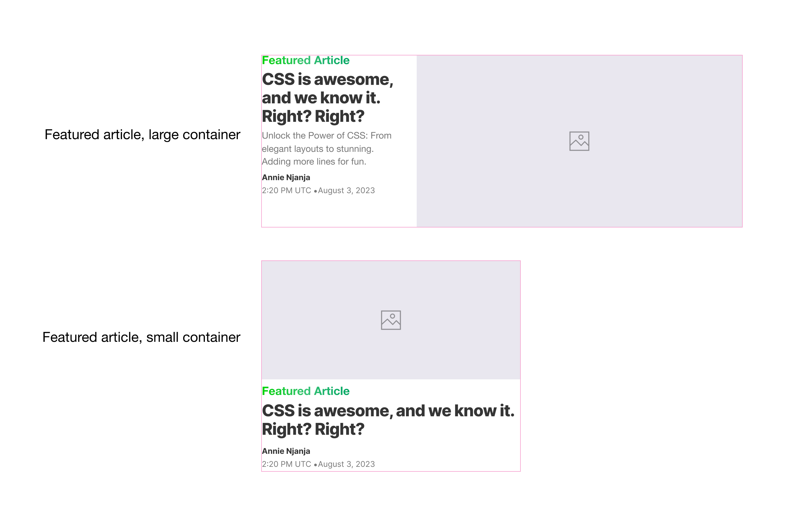
We will use the foundation of the .post CSS we have but with a few modifications to the main layout and inner items.
Here is what I need to do:
- Make the
.posta flex container on small containers to get the benefit of thegapproperty. - Add a fluid size for the headline.
- Add the “Featured article”.
- Hide the description and category by default. In a real-life scenario, those won’t be added to HTML at all.
@container style(--featured-1: true) {
  .post {
    display: flex;
    flex-direction: column;
    column-gap: 0.5rem;
  }

  .title {
    font-size: min(28px, 6cqw);
  }

  .post-content {
    &:before {
      content: "Featured article";
      /* other styles */
    }
  }

  .desc {
    display: none;
  }

  .category {
    display: none;
  }
}
Then, I need to nest a size container query within the style query. Here is what I did:
- Revert the CSS grid and 3-col layout.
- Position the post content to span 1-col.
- Position the media to span 2 columns.
@container style(--featured-1: true) {
  /* prev styles */

  @container (min-width: 600px) {
    .post {
      display: grid;
      grid-template-columns: 1fr 1fr 1fr;
      column-gap: 2rem;
      row-gap: 0;
    }

    .post-content {
      grid-column: 1/2;
      grid-row: 1;
    }

    .media {
      grid-column: 2/-1;
    }
  }
}
That’s it. Do you see how easy it is to build variations?
Variation 4: Featured v2
In this variation, the post will become a stacked card. We will need to reorder some of the items.
First, I used a style query to check if the container has --featured-2: true variable. If yes, the post will become a flex container with gap.
@container style(--featured-2: true) {
  .post {
    display: flex;
    flex-direction: column;
    gap: 0.5rem;
  }
}
Cool. With Flexbox, we got a stacked card but there is an issue. I want to be able to reorder all the elements with the order property, but some of them aren’t a direct child of .post flex container.
Let’s review the HTML again:
<div class="post-wrapper" style="--featured-2: true;">
    <article class="post">
        <div class="post-content">
            <div class="category">...</div>
            <h3 class="title">...</h3>
            <div class="meta"></div>
        </div>
        <div class="desc"></div>
        <figure class="media"></figure>
    </article>
</div>
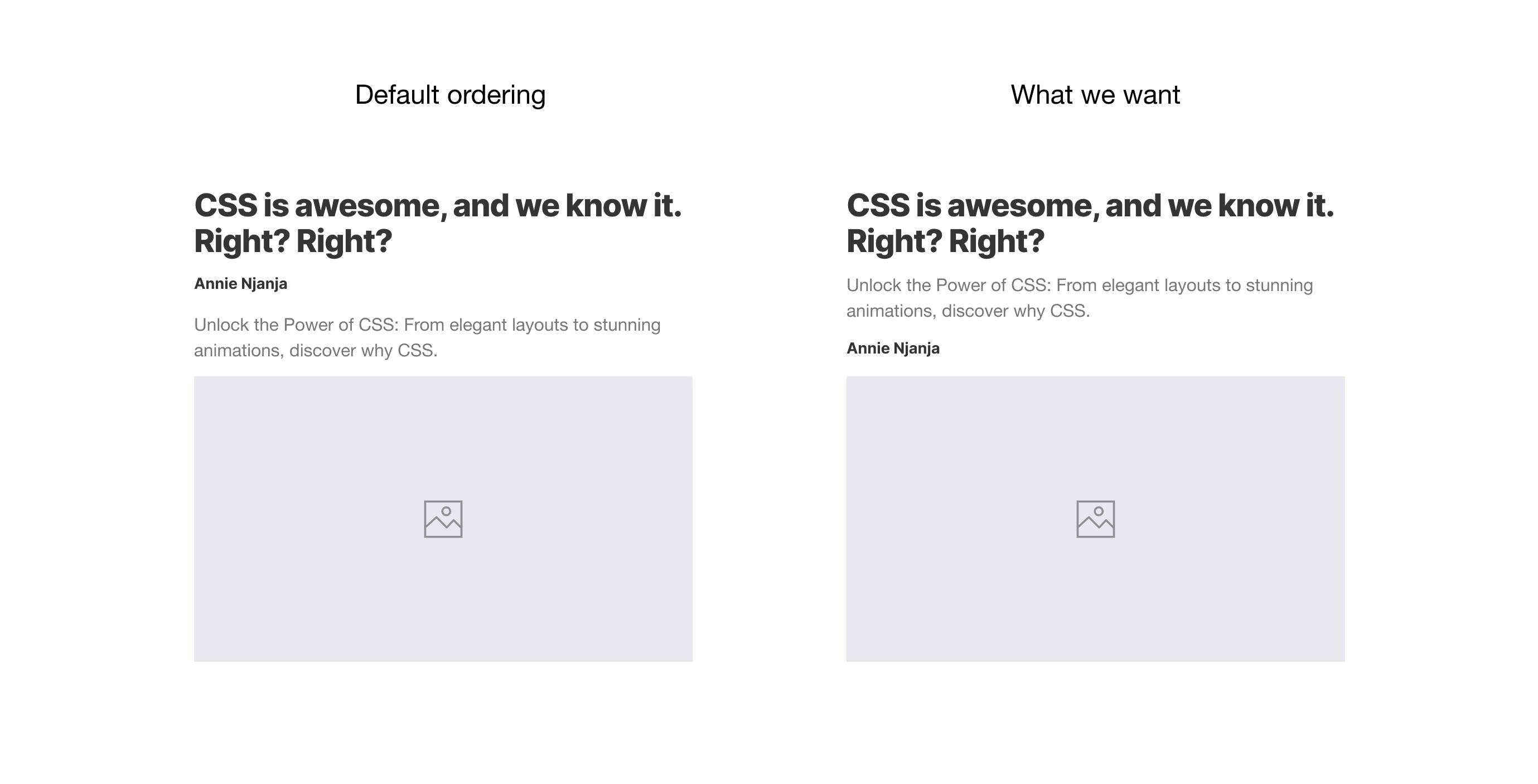
Here is a visual that shows how the elements are stacked versus how they’re ordered in HTML.
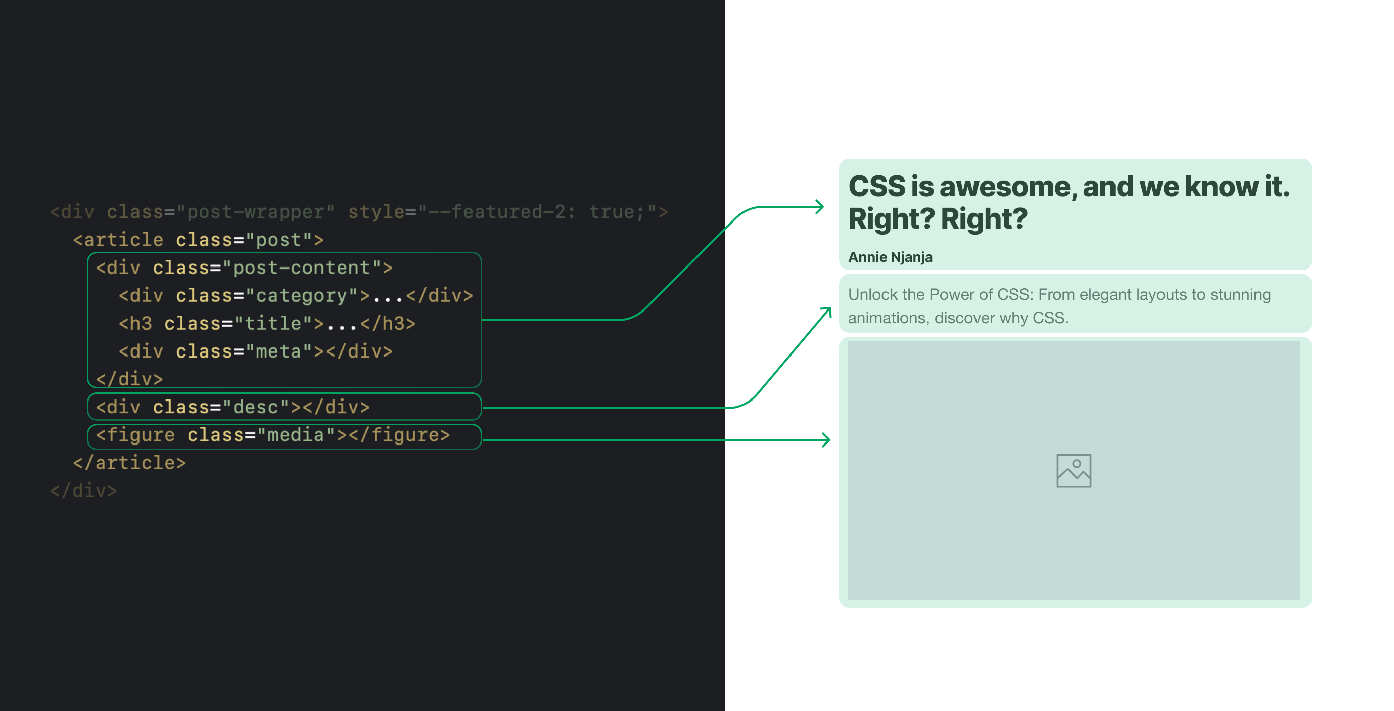
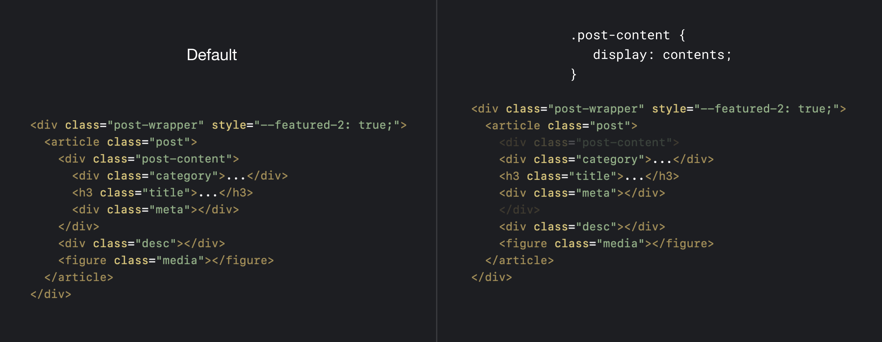
To solve that, I need a way to make the elements within .post-content a direct child of the .post flex container.
Thanks to display: contents, I can remove the .post-content element and make its child elements direct ones of .post.
@container style(--featured-2: true) {
  /* prev styles */

  .post-content {
    display: contents;
  }
}
With that, the browser sees the HTML like this now. Notice that the category, title, and meta are direct child elements of .post.
<div class="post-wrapper" style="--featured-2: true;">
    <article class="post">
        <div class="category">...</div>
        <h3 class="title">...</h3>
        <div class="meta"></div>
        <div class="desc"></div>
        <figure class="media"></figure>
    </article>
</div>
The next step is to use the order property to render the elements and the rest of the CSS for hiding elements and fluid sizing.
@container style(--featured-2: true) {
  .post {
    display: flex;
    flex-direction: column;
    gap: 0.5rem;
  }

  .post-content {
    display: contents;
  }

  .meta {
    order: 2;
  }

  .media {
    order: 3;
  }

  .title {
    font-size: clamp(1.5rem, 6cqw, 2.8rem);
  }

  .desc {
    font-size: clamp(1rem, 3cqw, 1.5rem);
  }

  .category,
  time {
    display: none;
  }
}
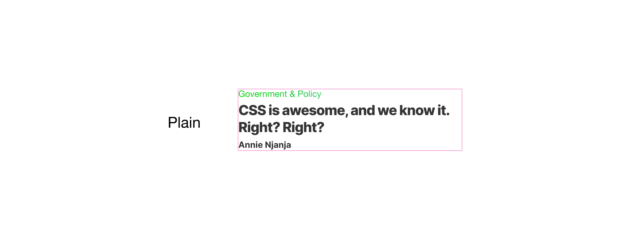
Variation 5: Plain
The plain variation is the simplest one. We need to hide the description, time, and media. In a real-life scenario, those won’t be added to HTML in the first place, but I added them just in case.
@container style(--plain: true) {
  .post {
    display: block;
  }

  .desc,
  time {
    display: none;
  }

  .title {
    font-size: clamp(1rem, 3cqw, 1.5rem);
  }

  .media {
    display: none;
  }
}
I did the following:
- Removed the CSS grid container by adding
display: block. - Adding a specific
font-sizefor the headline.
Variation 6: Flipped
Finally, the last variation is the “flipped”, that’s how I called it without thinking too much about the naming.
To accommodate that variation, I did the following:
- Updated the columns.
- Replaced the
.post-contentand.mediaelements. - Added a description text inside the
.post-content, since it’s not possible with the initial HTML structure.
@container style(--flipped: true) {
  .post {
    grid-template-columns: 0.3fr 1fr;
    row-gap: 0;
  }

  .post-content {
    grid-column: 2/3;
    grid-row: 1;
  }

  .media {
    grid-column: 1;
  }
}
Here is an interactive demo on Codepen where I showcase all the news component variations (Best viewed in Chrome Canary).
And a demo where I showcased the components within the main layout.
Finally, a demo that show all the component variation at once (Without tabs).
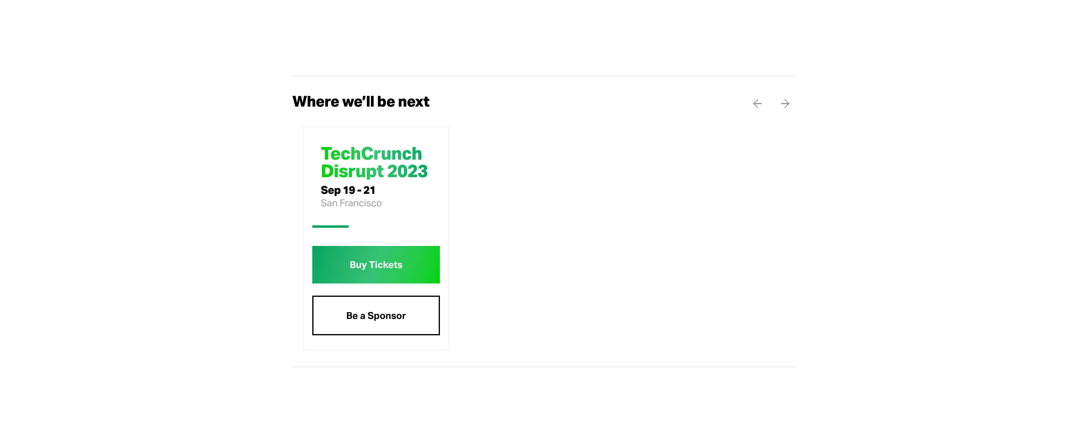
Event promo component
The promo component is displayed twice. Once in the aside and the other between the news listing.
Here is a look at its sizes/variations.

I don’t like the following:
- Using two different HTML for those components, just because each lives in a different wrapper.
- Having three call to action: Register Today, Buy Now, Register Now. I’m interested to learn if this is a reason for changing the button’s copy when the viewport size is smaller.
We can build that component easily with size and style container queries.
I won’t go into the detailed styling, but I will highlight a few details that matter to me. First, I defined the container on the .event-promo-wrapper element.
.event-promo-wrapper {
  container-name: promo;
  container-type: inline-size;
}
I added fluid styles to avoid changing sizes when the container size changes.
@container promo (min-width: 800px) {
    flex-direction: row;
    gap: clamp(2rem, 8cqw, 4rem);
  }
Used nested queries to apply the outlined style only when 1) viewport is 350px or less and has the CSS variable --aside: true.
.homepage__event-promo {
  @container promo (max-width: 350px) {
    @container style(--aside: true) {
      /* styles for the outlined variation. */
    }
  }
}
Again, use fluid sizing to avoid setting different values for font-size.
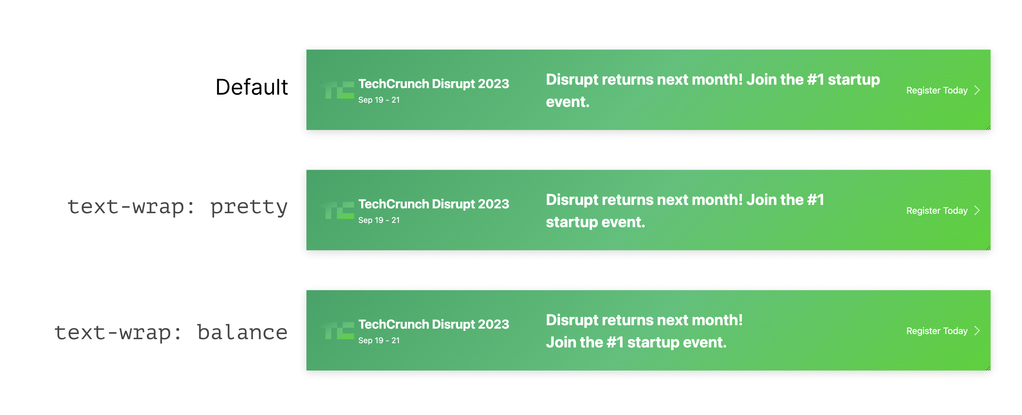
.event-promo__content__description {
  font-size: clamp(1rem, 2.5cqw, 1.68rem);
  text-wrap: pretty;
}
I used text-wrap: pretty for the description element so that the text can wrap nicely. We can use balance, but it will leave a lot of space on the right edge. I wrote about text wrap balancing but still didn’t get the chance to update for text-wrap: pretty (as it’s pretty new).
Check out the Demo
Other ideas
If I want to continue this article, I can write 10K words. For now, I will mention a few stuff for the rest of the stuff that has the potential to be improved with modern CSS.
The event listing section
When there is only one event, why not change the layout to feature that event?
.event-listing {
  --lonely: true;
}

.event-listing(.event:nth-last-child(n + 2)) {
  /* If the listing has 2 or more items, ignore the lonely style. */
  --lonely: false;
}

@container style(--lonely: true) {
  /* Style the event when it's the only child. */
}

Cool, right?
The newsletter form
In the newsletter form, there is a good chance to use a conditional grid based on the number of items.

/* default grid */
.newsletter-form {
  --item-size: 200px;
  display: grid;
  grid-template-columns: repeat(
    auto-fit,
    minmax(var(--item-size), 1fr)
  );
  gap: 1rem;
}

/* If the grid has 3+ items, change the --item-size width to 150px */
.newsletter-form:has(.input-group:nth-last-child(n + 3)) {
  --item-size: 150px;
}
This is just a basic idea. Check out this demo from my lab.
Logical Properties
Of course, using logical properties will ensure a smooth transition from LTR to RTL layouts. Using flexbox and grid will ensure an even better LTR to RTL experience, as they will flip automatically based on the page’s direction.
Conclusion
This was a very lengthy article, I know. It took me almost a month of hard work to get this done. I really, really enjoy working on these types of case studies. It’s a great way to learn and re-learn things.
I hope you’ve enjoyed it, and if you reached here, you are amazing. Thank you so much for reading the article.
