The Layout Maestro
Have you ever wished there is a native way in CSS to make two lines headlines consistent in the number of words per line? As a designer, I spot that a lot when dealing with varying content lengths while designing a website or a UI.
Such a thing can make the UI you’re working on feels unbalanced, or missing something. Here is what I mean:

The highlighted word is a single word that lives on its line. From a visual perspective, this looks odd. It’s breaking the visual
While I design in a tool like Figma, I intentionally move that last word to the previous line, just to avoid that inconsistency.

That looks better, right?
In code, if balancing is important, we can do that manually by using a <br>, or dividing the other part of the content with a <span>. There are ways to give hints to the browser on when to break a word by using the <wbr> element, but not a sentence.
There is a React component called React Wrap Balancer that make the text balanced dynamically on resize.
Text balancing in CSS
Luckily, we now have experimental support for text-wrap: balance in Chrome Canary. The browser will automatically calculate the number of words and divide them equally between two lines.
All we need is to apply the text-wrap: property.
.c-hero__title {
  max-width: 36rem;
  text-wrap: balance;
}
With that, the title content will be balanced and we won’t have a single word in its line.

Let’s explore this in more detail.
Text balancing with max-width set on the element
It’s important to keep in mind that using text balancing won’t affect the width of the element.
Consider the following figure.
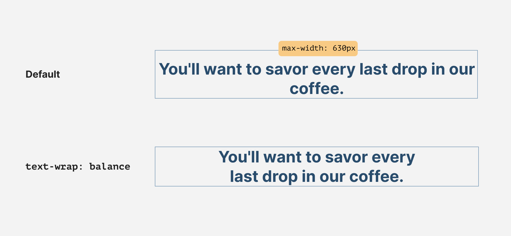
The maximum width of the headline is 630px. When text-wrap: balance is there, it will align the number of words per line, and the max-width won’t be affected.
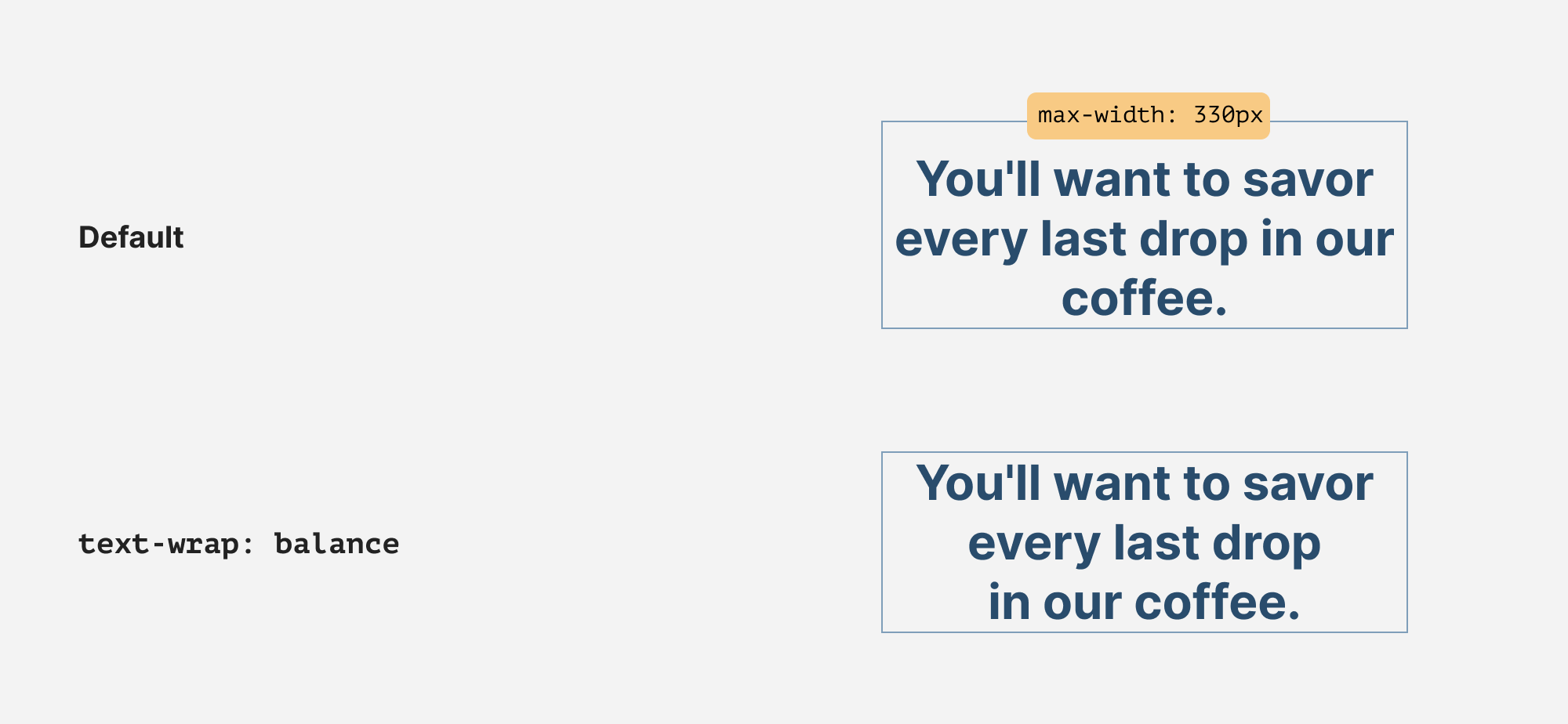
The same thing also happens when the container is small, like a card title. It will just affect the words within their container.
Use cases & examples
Let’s explore where text-wrap: balance can be useful.
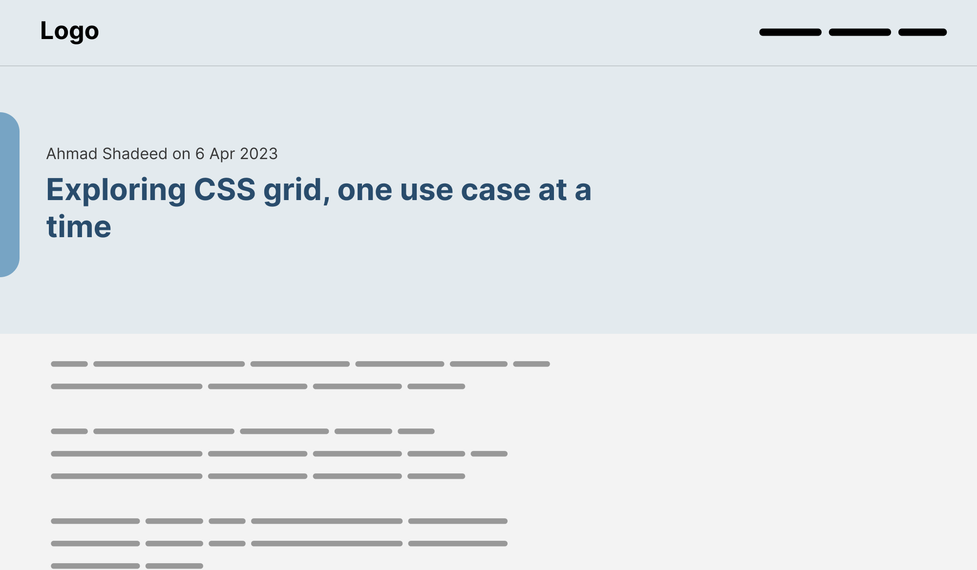
Page title
A page title is the first thing that might catch the user’s eye. Here is an example without balancing:
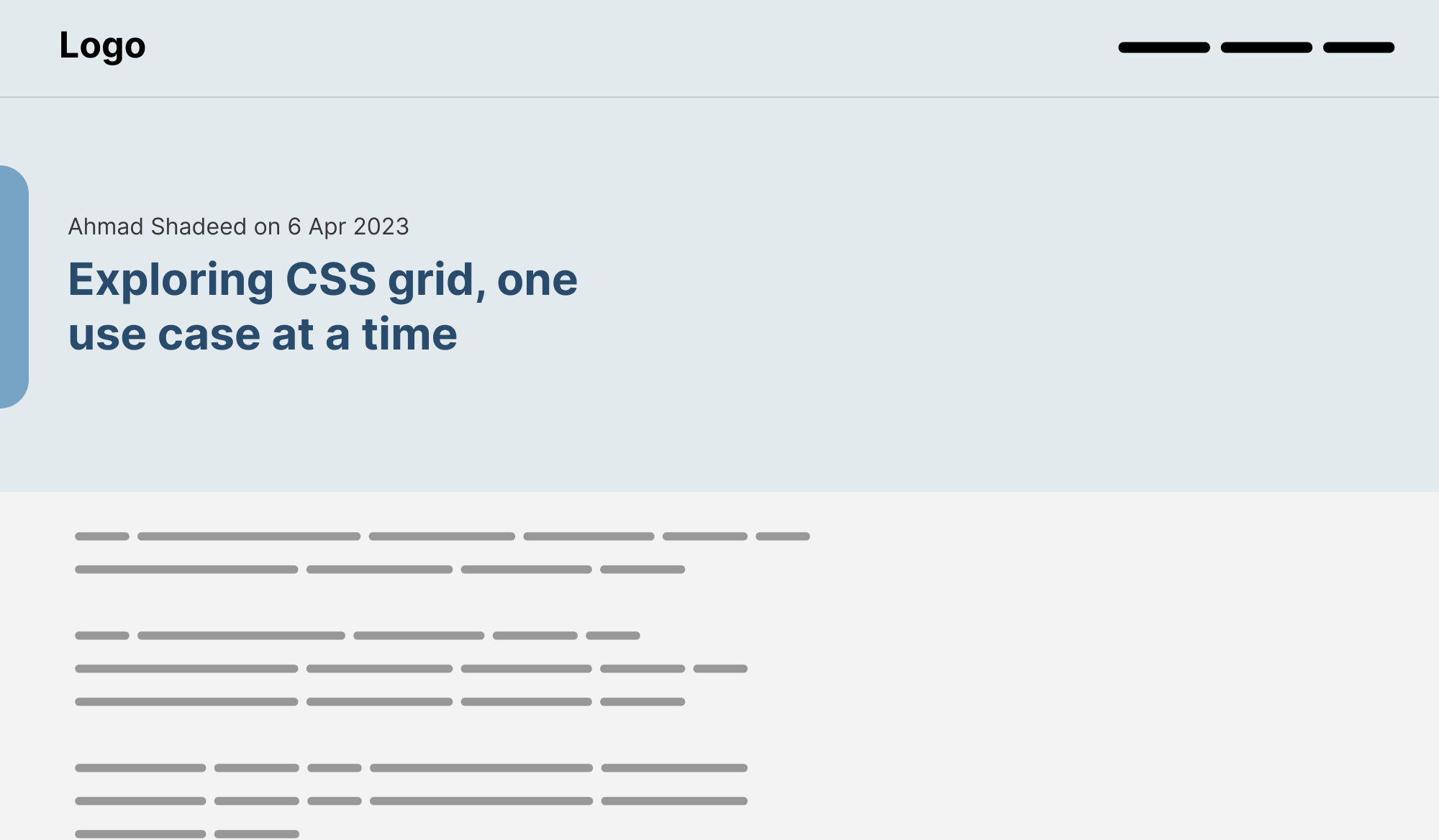
Balanced text:
Card title
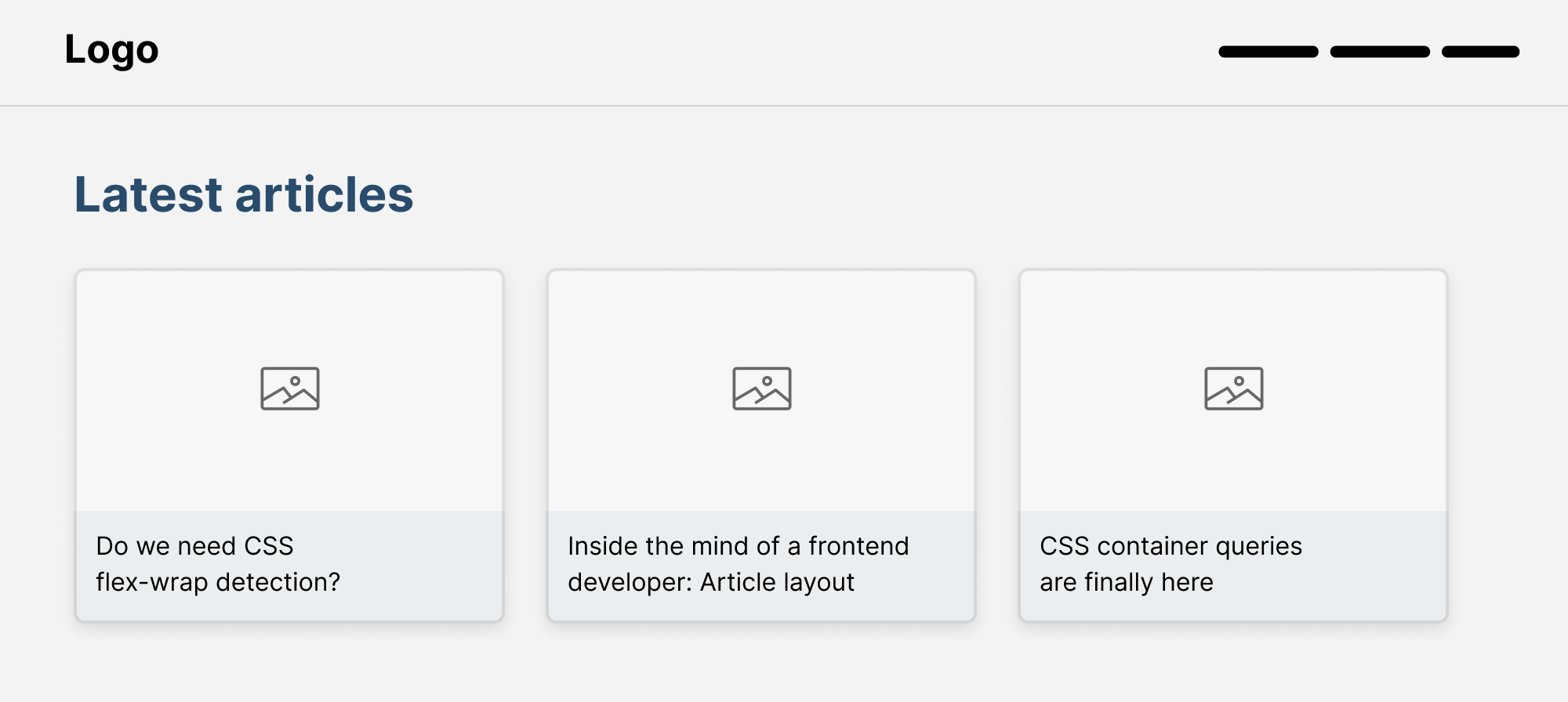
This is a common pattern where you might spot a list of articles with different titles.

With text balancing in CSS, that can be solved easily:
.card__title {
  text-wrap: balance;
}
Tooltip
We often use a tooltip to show important information to the user. It might be a few words or multiple lines.
Here is a tooltip where a single word lives on its line.

The fixed version with text-wrap: balance.
.tooltip p {
  text-wrap: balance;
}

Modal
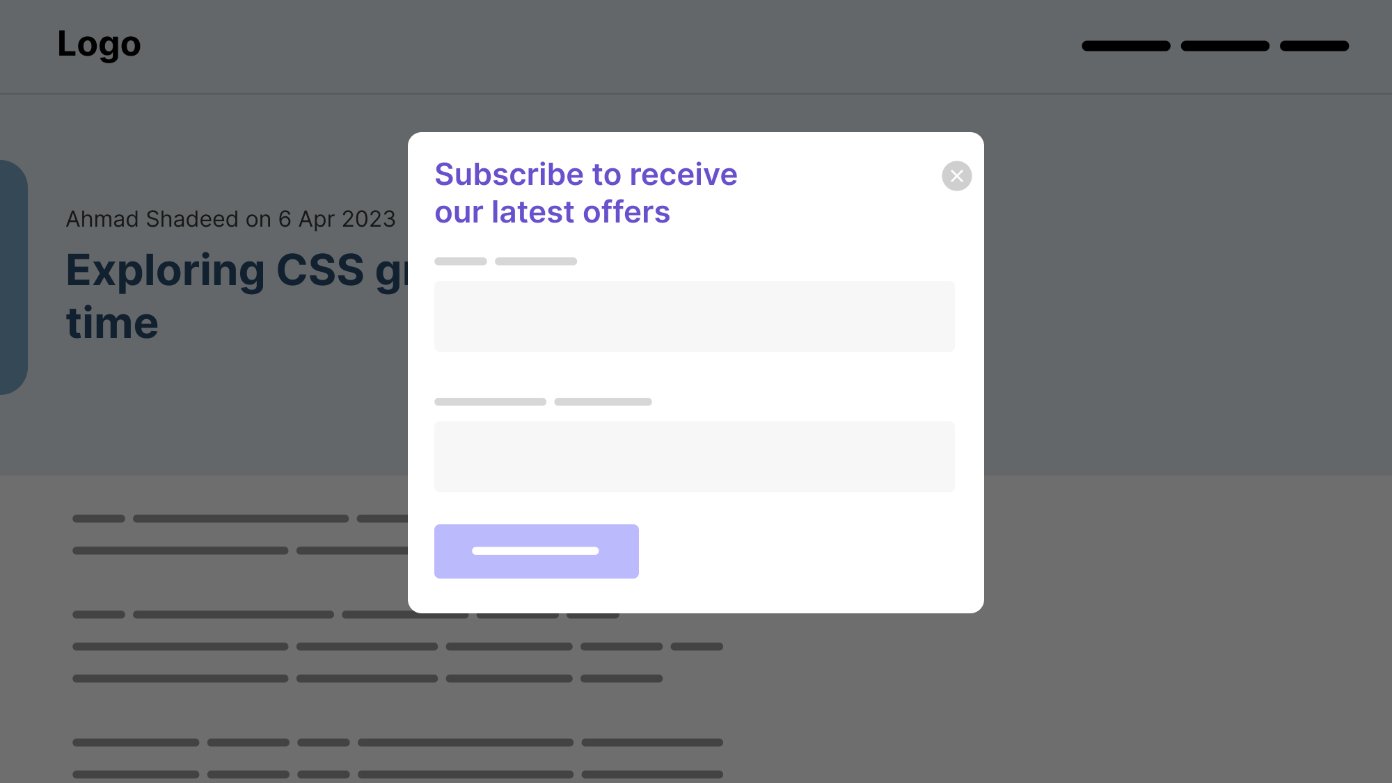
Oftentimes, we might have a modal title that is spanning into multiple lines. It can be visually annoying to see a single word on its line.
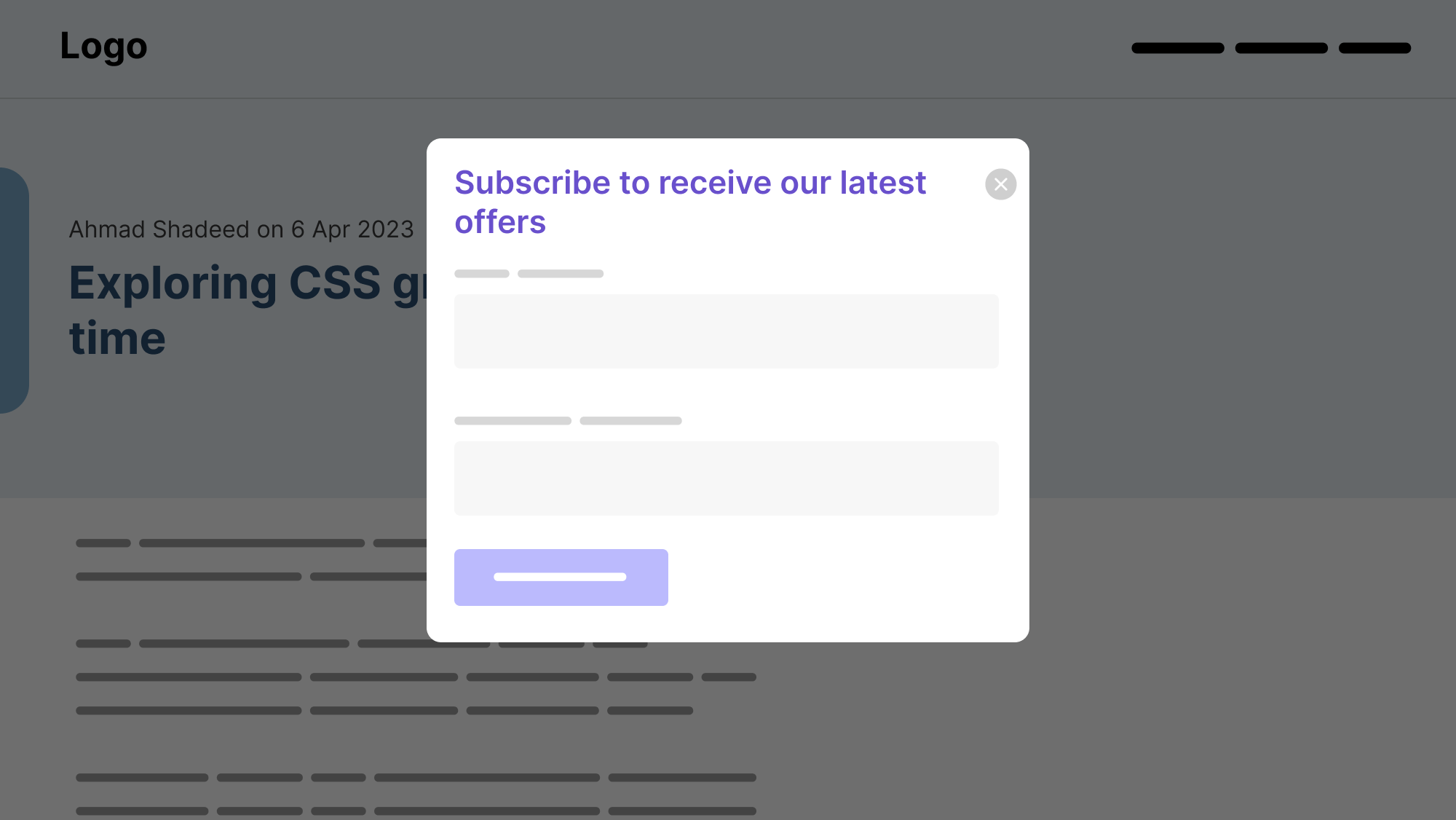
With text balancing, it will look better:
.modal__title {
  text-wrap: balance;
}
FAQ
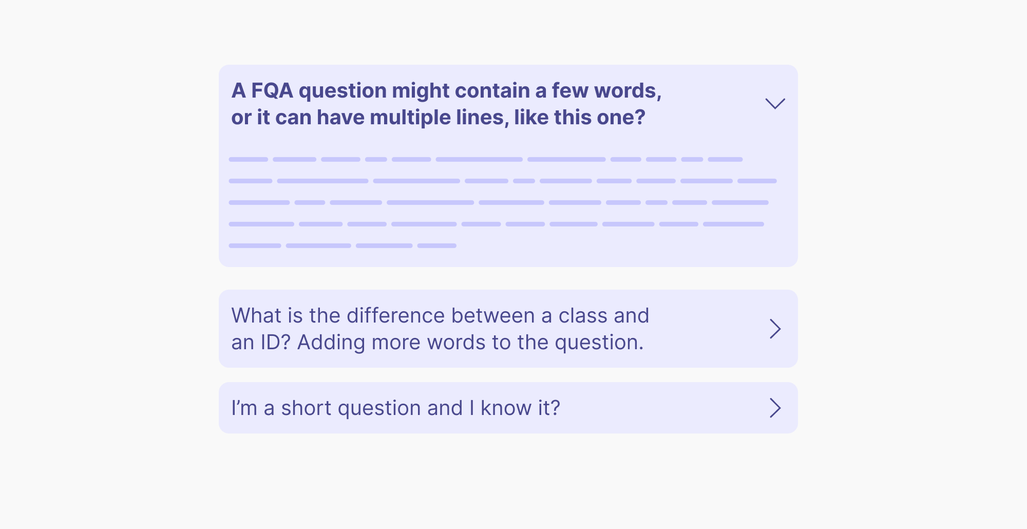
Another example where I see a good potential for text-wrap: balance is in a FAQ list.
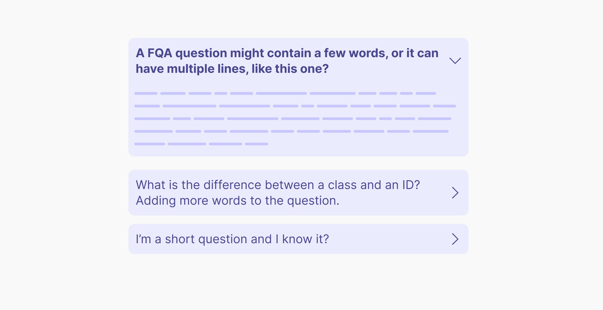
After text balancing:
Text balancing won’t affect the element’s width
I’m not sure about using text-wrap: balance when it can’t control the element width. In certain designs, it can leave a big space that makes the design even worse in my opinion.
Consider the following figure:
.blockquote {
  max-width: 20rem;
}

.blockquote p {
  text-wrap: balance;
}
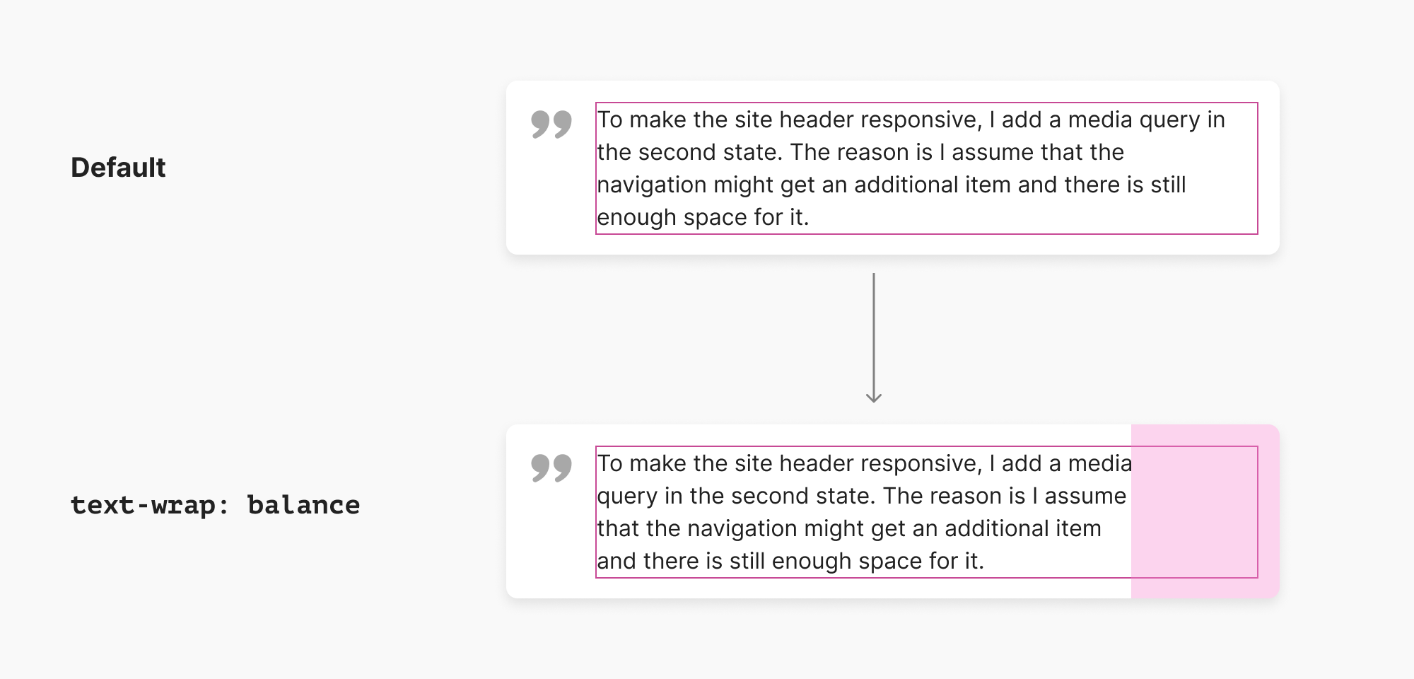
Notice how the width of the text in the pink outline. When text balancing is applied, the width will stay as is and only the text will be reordered.
Here is a similar problem from the tooltip example that I showed:
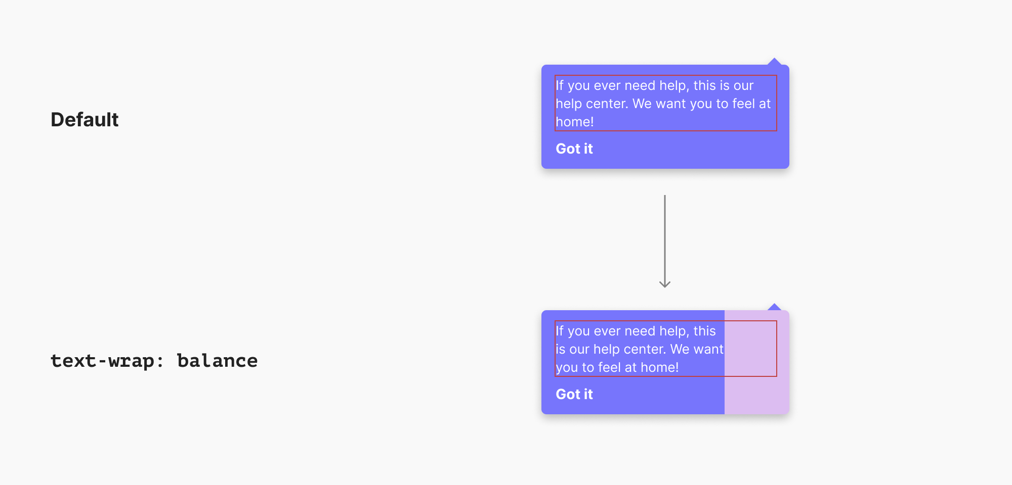
I can tell you from past experiences that this won’t please designers. This is a big white space that makes the design feel unbalanced.
What if, for example, we can turn on an option to let text-wrap: balance affect the element’s width?
.element {
  text-wrap: balance;
  width: fit-content;
}
The keyword fit-content will force the element width to match the new balanced text, but this is just an idea. I’m sure that this idea might be replaced with something better, but you got it.
Performance limits
Currently, the feature is limited to 4 lines only. That means, it can mainly be used for headlines or paragraphs with a few lines.
Further resources:
- CSS text-wrap: balance by Adam Argyle
- CSS Text Module Level 4

