The Layout Maestro
A message from the author!
I can’t contain my excitement while writing the first few words for this article. Ladies and gentlemen, CSS container queries are finally here! Yes, you read that right. They’re currently supported in Google Chrome (105) and soon in Safari 16. This is a huge milestone for web development. For me, I see it just like when we started building responsive websites via media queries, which is a game changer. Container queries are equally important (from my point of view, at least).
When I wrote the first article on container queries back in April 2021, the syntax changed several times, and I see this as a chance to write a fresh article and keep the previous one for reference. In this article, I will explain how container queries work, how we can use them, and what the syntax looks like, and share a few real-life examples and use cases.
Are you ready to see the new game-changer CSS feature? Let’s dive in.
Introduction
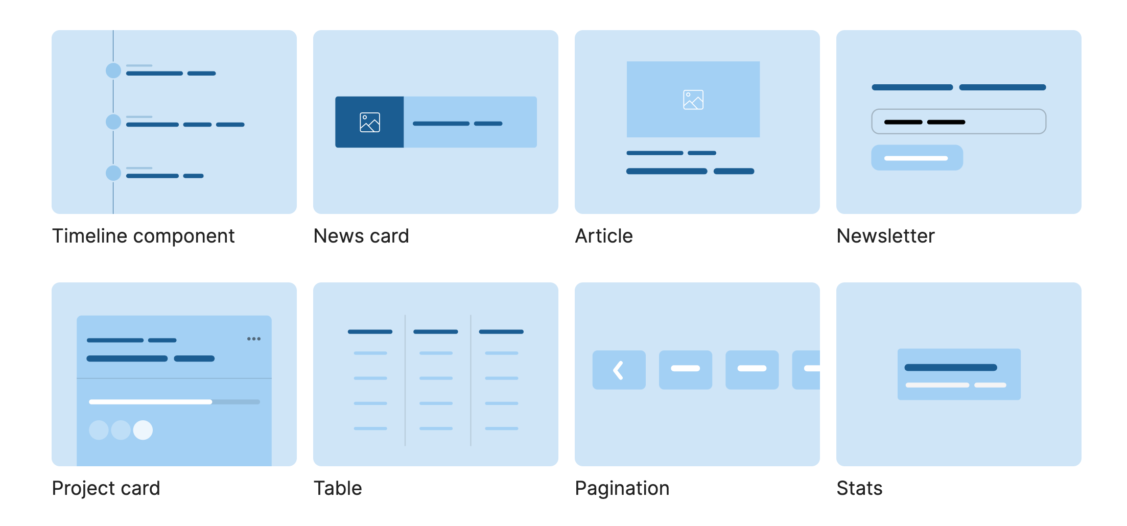
When designing a component, we tend to add different variations and change them either based on a CSS class, or the viewport size. This isn’t ideal in all cases and can force us to write CSS based on a variation class or a viewport size.
Consider the following example.
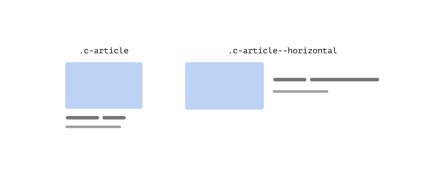
We have a card component that should switch to a horizontal style when the viewport is large enough. At the first glance, that might sound okay. However, it’s a bit complex when you think about it more deeply.
If we want to use the same card in different places, like in a sidebar where the space is tight, and in the main section where we have more space, we’ll need to use class variations.
.c-article {
  /* Default stacked style */
}

@media (min-width: 800px) {
  /* Horizontal style. */
  .c-article--horizontal {
    display: flex;
    align-items: center;
  }
}
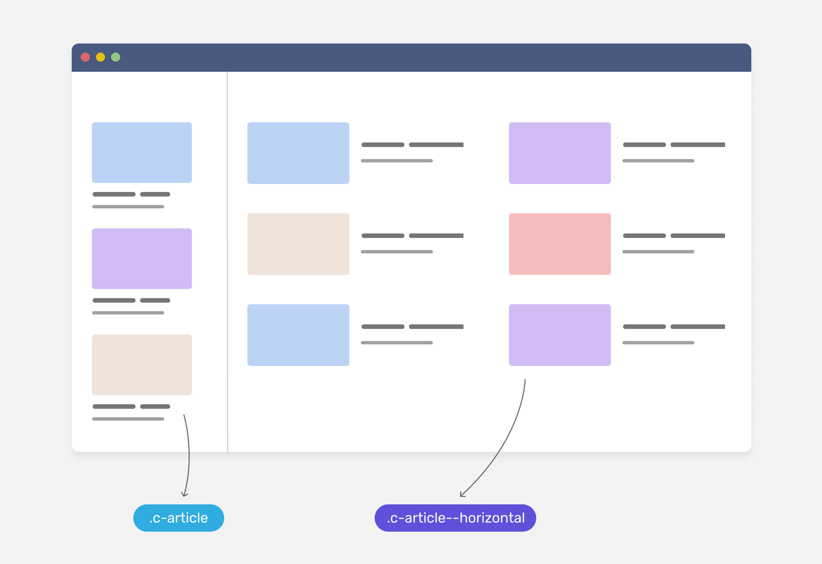
If we don’t apply the variation class to the card component, we might end up with something like the following.
Notice how the card component in its stacked version is too large. For me, this doesn’t look good from a UI perspective.
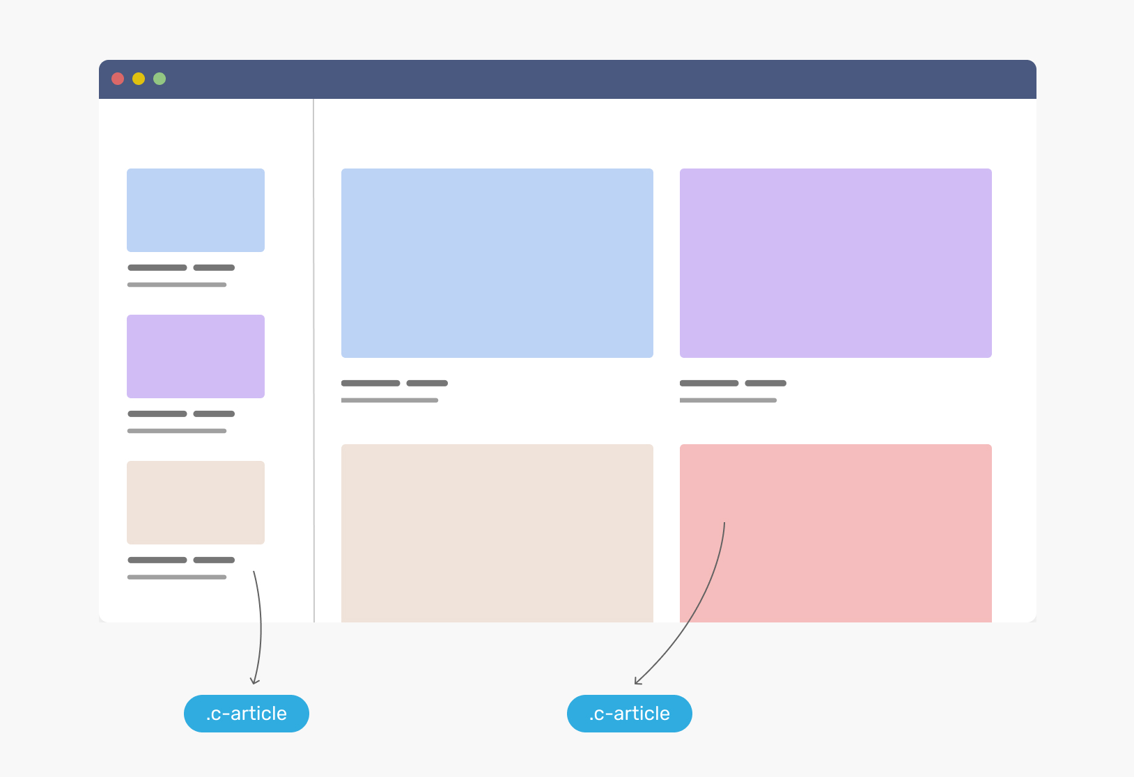
With container queries, we can simply write CSS that responds to the parent or container width. Consider the following figure:
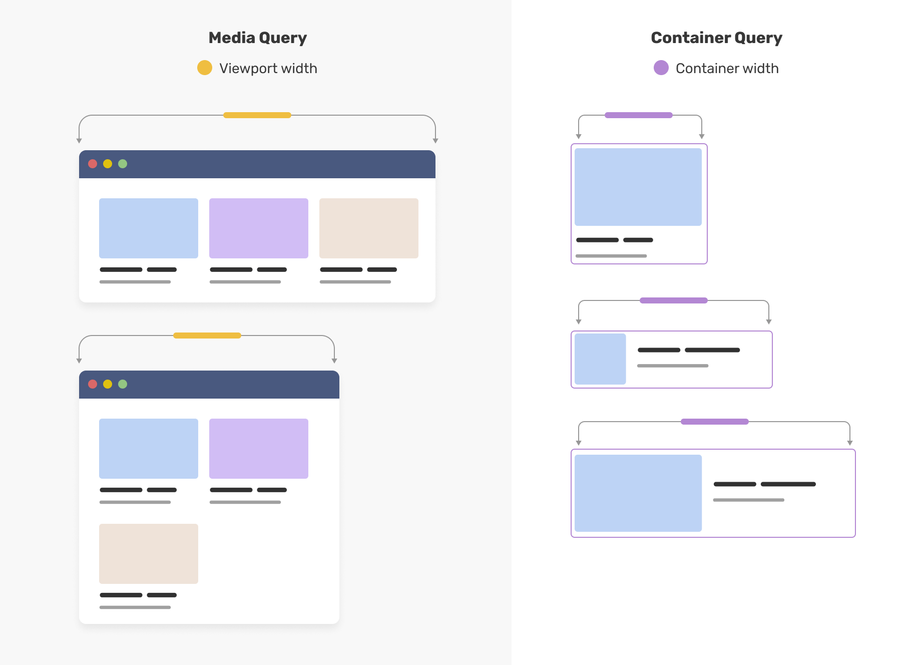
Notice how in a media query, we query a component based on the viewport or the screen width. In container queries, the same happens, but on the parent level.
What are container queries?
A way to query a component against the closest parent that has a defined containment via the
container-typeproperty.
That’s it. It’s just how we used to write CSS in media queries, but for a component level.
Container queries syntax
To query a component based on its parent width, we need to use the container-type property. Consider the following example:
.wrapper {
  container-type: inline-size;
}
With that, we can start to query a component. In the following example, if the container of the .card element has a width equal to 400px or larger, we need to add a specific style.
@container (min-width: 400px) {
  .card {
    display: flex;
    align-items: center;
  }
}
While the above works, it can become a bit overwhelming when having multiple containers. To avoid that, It’s better to name a container.
.wrapper {
  container-type: inline-size;
  container-name: card;
}
Now, we can append the container name next to @container like the following:
@container card (min-width: 400px) {
  .card {
    display: flex;
    align-items: center;
  }
}
Let’s revisit the initial example and see how we can get benefit from container queries to avoid having multiple CSS classes.
.wrapper {
  container-type: inline-size;
  container-name: card;
}

.c-article {
  /* Default stacked style */
}

@container card (min-width: 400px) {
  /* Horizontal style. */
  .c-article {
    display: flex;
    align-items: center;
  }
}
Browser support
Container queries are now supported in Chrome 105, and soon in Safari 16.
You can check them from this link. Happy resizing!
Outro
This is a big day for CSS, and I can’t wait to see what you will create with CSS container queries.
I wrote an ebook
I’m excited to let you know that I wrote an ebook about Debugging CSS.
If you’re interested, head over to debuggingcss.com for a free preview.
