The Layout Maestro
A message from the author!
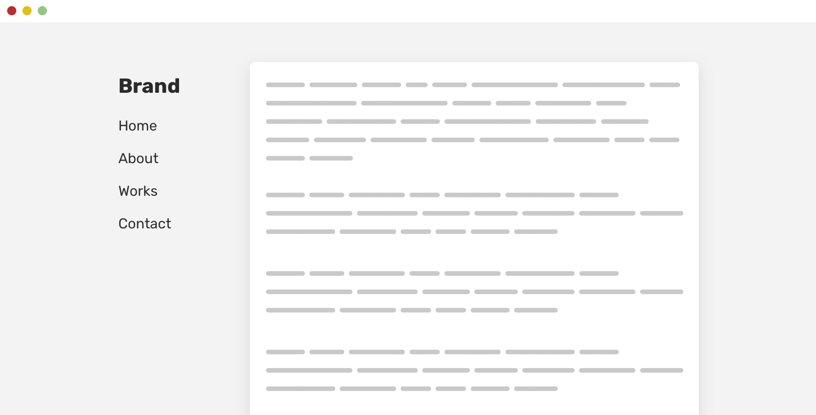
Have you ever come across a case where position: sticky isn’t working as expected with a child of a grid container? A few days ago, I was helping a friend in fixing that exact problem and wanted to finally write about it.
Introduction
That problem isn’t actually something buggy or wrong. In fact, that’s the effect of a default CSS behavior. Why and how? Let’s see the following example.
<div class="wrapper">
  <aside></aside>
  <main></main>
</div>
.wrapper {
  display: grid;
  grid-template-columns: 250px minmax(10px, 1fr);
  grid-gap: 1rem;
}
We have a grid that makes the aside take 250px of width, and the rest of the available space is for the main section. Simple, right?
Now, we want to add position: sticky to the aside element to make it fixed while scrolling.
aside {
  position: sticky;
  top: 0;
}
Oops. It’s not working? Why is that? Let’s find out.
The default behavior of align-items
Adding a background to the aside element will show that its height is equal to the main section.
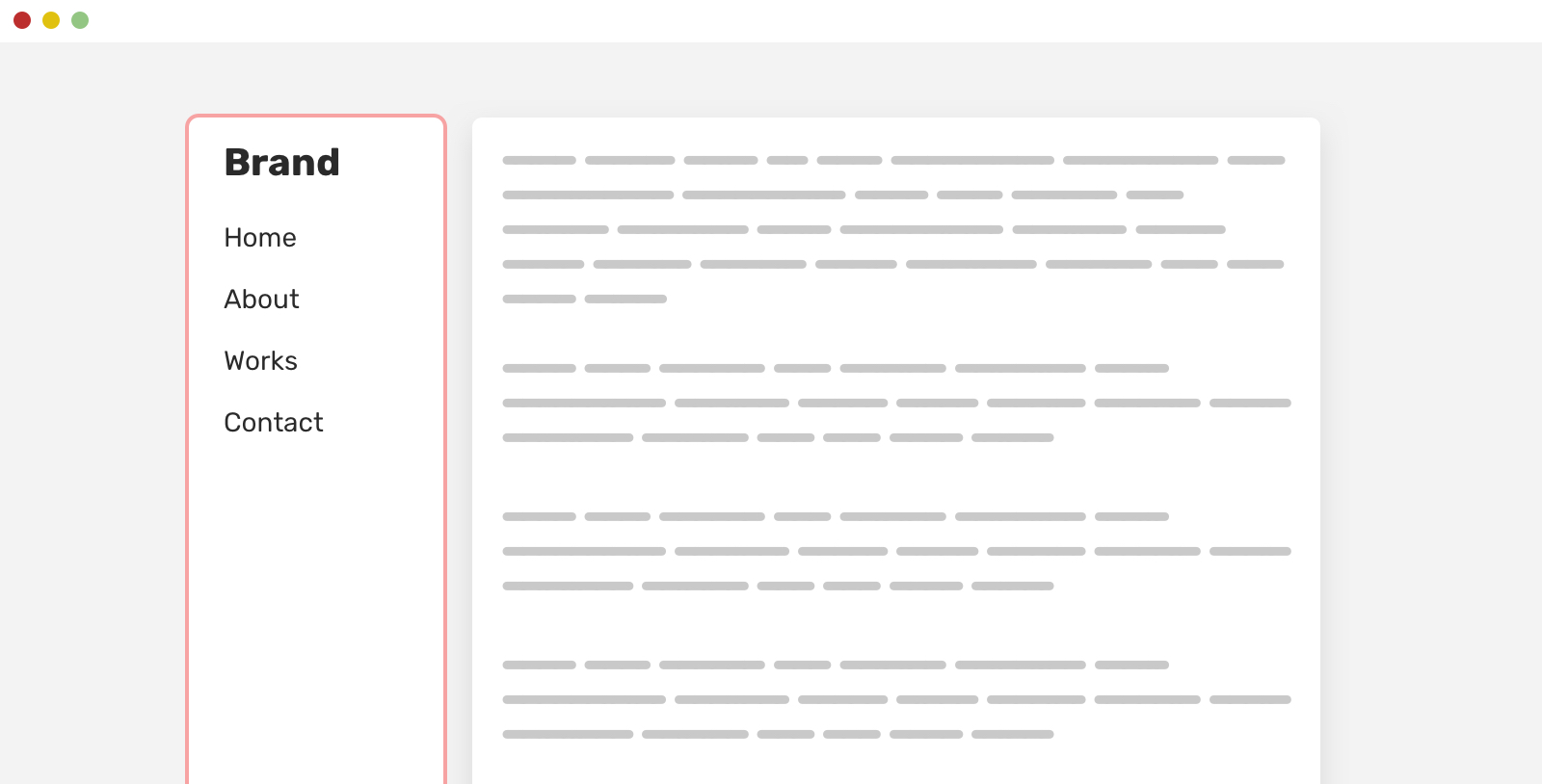
This is the default behavior of the align-items property. It defaults to stretch. As a result, a column will stretch in height to match the largest column in the grid.
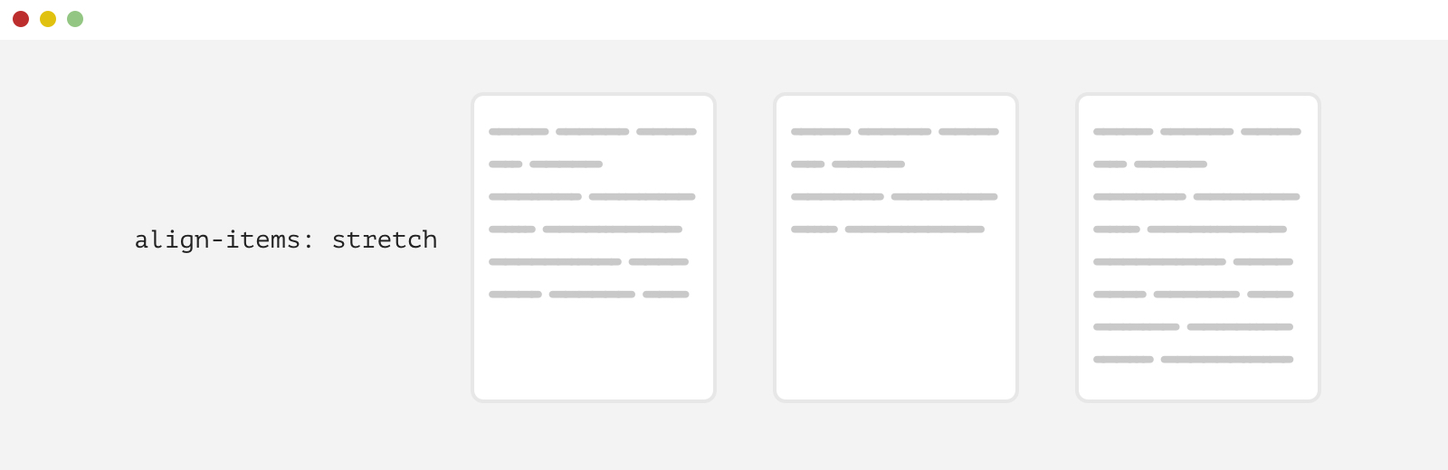
Let me show you another example that will help in illustrating the problem better. We have a simple grid container.
.cards__list {
  display: grid;
  grid-template-columns: 1fr 1fr 1fr;
  grid-gap: 1rem;
}
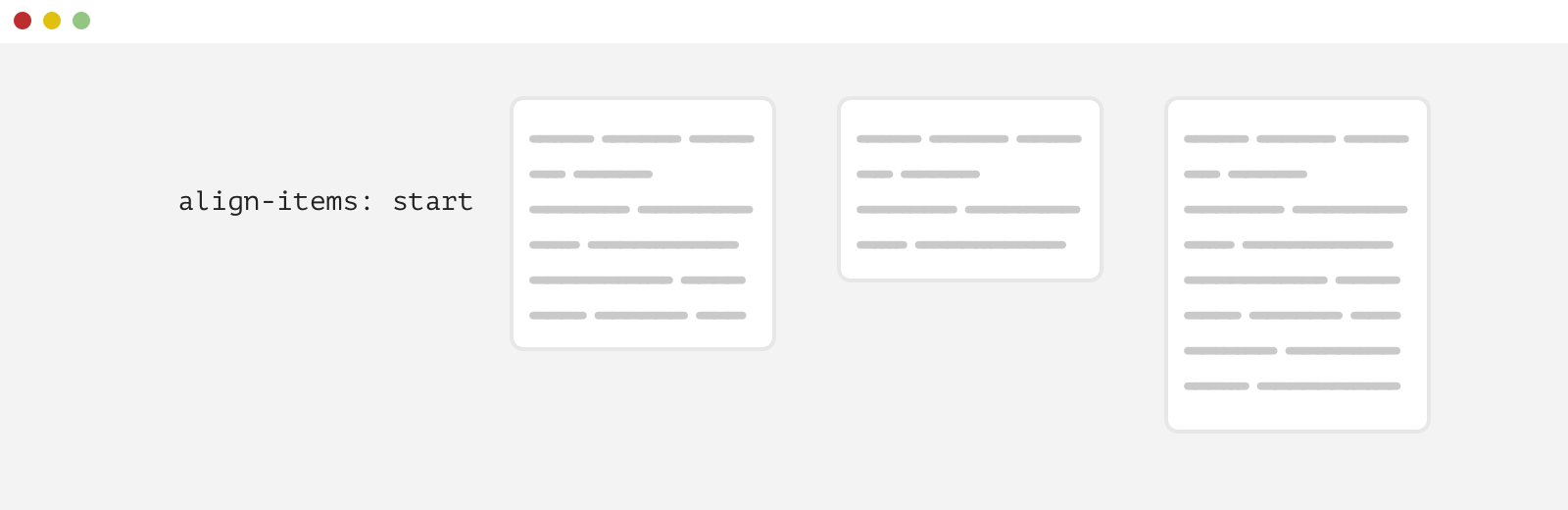
By default, the cards will stretch to match the largest card (The first one from the right). To override that behavior, we need to change the align-items value to start.
.cards__list {
  display: grid;
  grid-template-columns: 1fr 1fr 1fr;
  grid-gap: 1rem;
  align-items: start;
}
Back to the original example. To show the problem, even more, I added a background to the aside section. Try to toggle the checkbox in the following demo and notice how the sidebar height changes.
See the Pen Sticky: eg 1 - debug by Ahmad Shadeed (@shadeed) on CodePen.
To make the sidebar sticky, we need to override the default stretching behavior and make the aside height equal to the content. We can either use align-self on the aside element:
aside {
  align-self: start;
}
Or to use align-items on the parent, which will affect all child items.
.wrapper {
  display: grid;
  grid-template-columns: 250px minmax(10px, 1fr);
  grid-gap: 1rem;
  align-items: start;
}
Picking between the two depends on your use case. You might have more than two columns and you only want to align one of them.
See the Pen Sticky: eg 1 by Ahmad Shadeed (@shadeed) on CodePen.
Another example
A very similar example that can share the same default behavior of CSS grid is a team listing page.

On scroll, we want the “Design” to stay fixed so we can be certain that the current team listing is for “Design”. Without using align-self: start on the heading, it won’t work as expected.
.section {
  display: grid;
  grid-template-columns: 100px 1fr;
  grid-gap: 2rem;
}

.section__headline {
  position: sticky;
  top: 1rem;
  align-self: start;
}
See the Pen Sticky: eg 2 by Ahmad Shadeed (@shadeed) on CodePen.
Conclusion
The problem/issue is a feature, not an actual issue. That is an example of a CSS feature that we developers might get benefit from in some cases, and override to another value (Just like in this article).
It turned out that there is an article about the same topic (That’s what nice about the web community, which is to hear the same topic from different voices, right?). I found this great write-up by Melanie Richards. Make sure to give it a read!
