The Layout Maestro
A message from the author!
Introduction
While I was working on a recent article on the gap property, I needed to place a box between two words and keep it aligned. I thought about a way to size the box to be equal to the capital letter height. After some research, I found the cap unit and it worked as expected. In this article, I will demonstrate the problem and how I solved it.
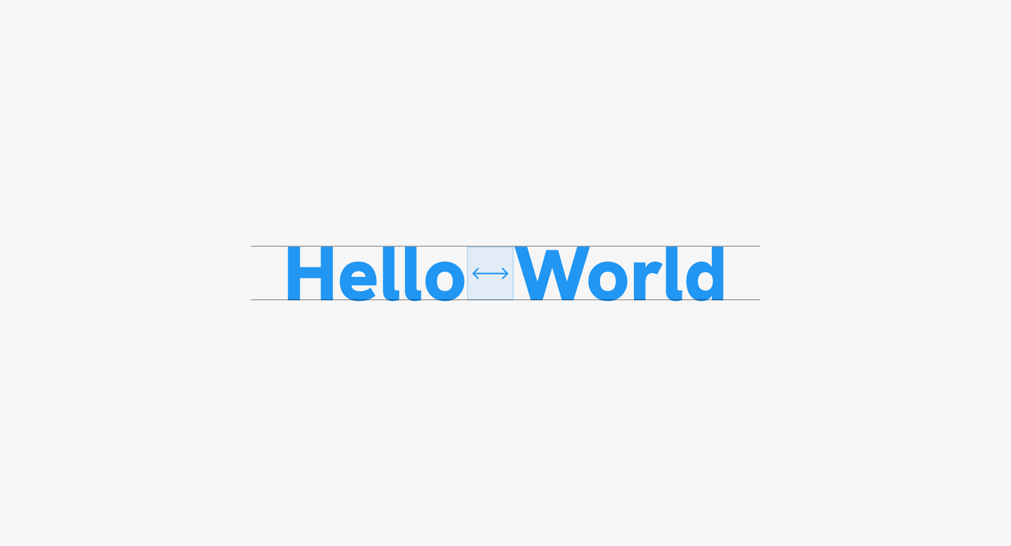
The problem
In the following figure, I have a box between the words. I need to make its height equal to the uppercase letters (H and W).
Solution 1: Fixed size
The first thing I thought about was to divide each word into an element and use Flexbox to handle the layout.
<p class="title">
  <span>Hello</span>
  <span class="spacer"></span>
  <span>World</span>
</p>
.title {
  display: flex;
  gap: 0.5rem;
}
HelloWorld
Cool. The next step is to add the spacer styling. As a start, I did this:
.spacer {
  --size: 2rem;
  width: var(--size);
  height: var(--size);
  background-color: var(--brand-1);
}
Here is the result.
HelloWorld
At first glance, it looks like we solved it. Let’s try to change the font size a bit and see what happens.
HelloWorld
This isn’t good. I need to make the square height equal to the uppercase letter.
Solution 2: The ex unit
In this iteration, I tried using the ex CSS unit which is equal to the lowercase letter height.
.spacer {
  --size: 1.55ex;
  width: var(--size);
  height: var(--size);
  background-color: var(--brand-1);
}
Try to resize the text below.
HelloWorld
It works! Yay. At this stage, I wasn’t sure if this was the best solution. The only downside is that you need to play with the ex value to a point where it’s equal to the uppercase letter height.
Solution 3: The cap unit
At this point, even though it was solved, I thought about researching for a CSS unit that is equal to the uppercase height. I remember seeing an announcement on Twitter but couldn’t recall it.
A quick Google search revealed the cap and rcap units that were first released in Firefox (Feb 2022), Chrome (Sep 2023) and Safari (Dec 2023).
.spacer {
  --size: 1cap;
  width: var(--size);
  height: var(--size);
  background-color: var(--brand-1);
}
HelloWorld
One word to describe this. Perfection. With that, I used the cap unit for a real-life use case that I’m happy with.
Solution 3: cherry on top
Now that I found the perfect solution, is it possible to make it even better?
The last issue I noticed is that when I add an outline to the title, there is a space at the top and bottom.
HelloWorld
What if I added height: 1cap to the title?
.title {
  height: 1cap;
  outline: solid 1px;
}
HelloWorld
Better, right?
Aligning text and icon
Another way to use the CSS cap could be to keep an icon aligned with the adjacent text.
.button {
  /* Other styles */
  padding-block: 1cap;
  display: flex;
  align-items: center;
  justify-content: center;
  gap: 0.5cap;

  svg {
    --size: 1.65cap;
    flex: 0 0 var(--size);
    width: var(--size);
    height: var(--size);
  }
}
In the demo below, play with the slider to change the font size.
Outro
That’s it for this article. Do you have other use cases for the CSS cap unit? If yes, I would love to hear from you on Twitter (X), Mastodon or Threads.
Enjoyed the read? If you'd like to support my work, consider buying me a coffee. This interactive guide took 6 weeks, which translates to 54 coffee cups. Thanks a latte!