I came across an interesting bit while working on the hero section of my z-index guide. I needed a way to apply an opacity for the background.
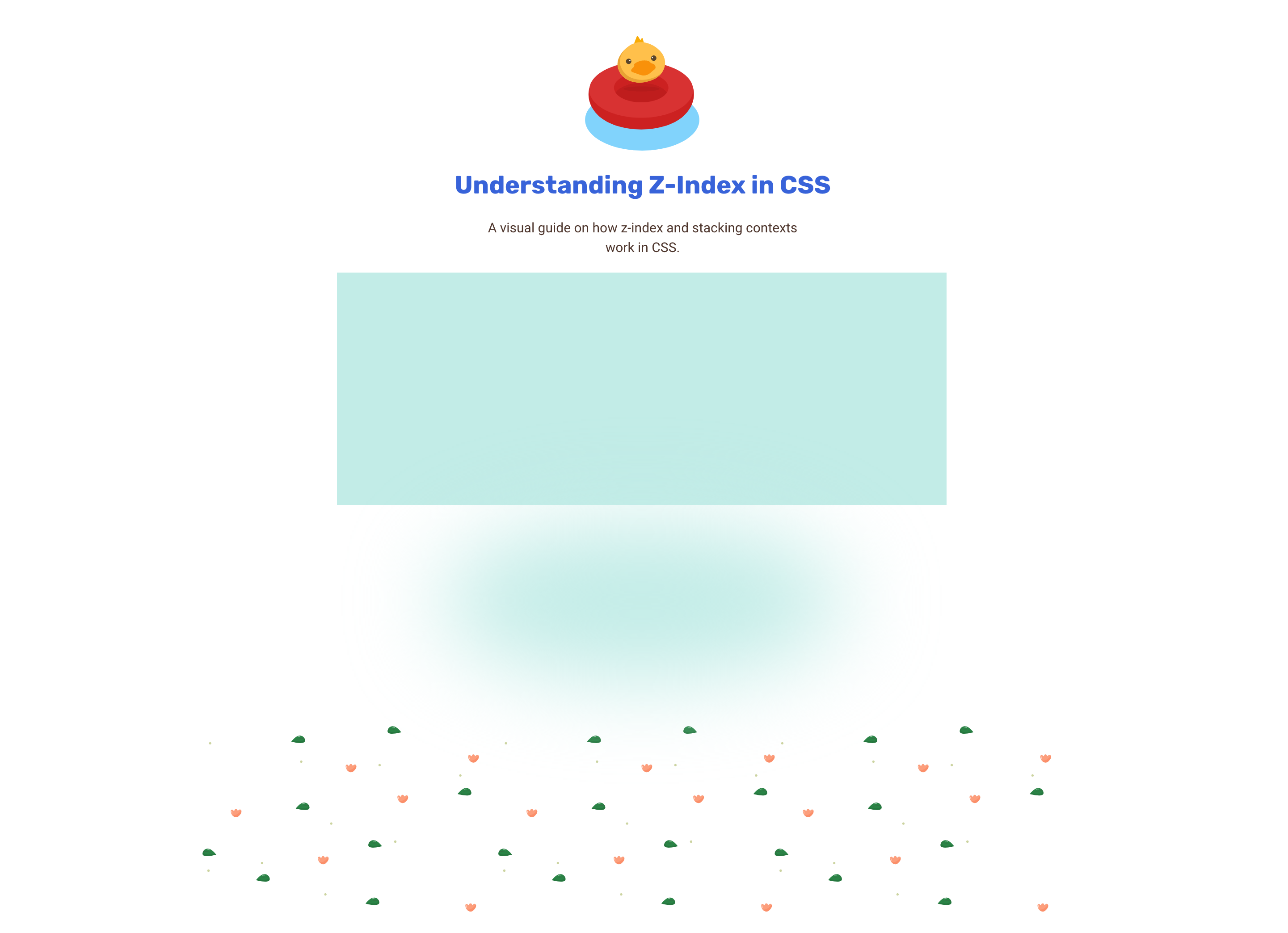
Here is the final result I want to achieve..

At the first glance, it might be tempting to say that it’s easy. However, it’s a bit more detailed. Let’s dig into the details of it.
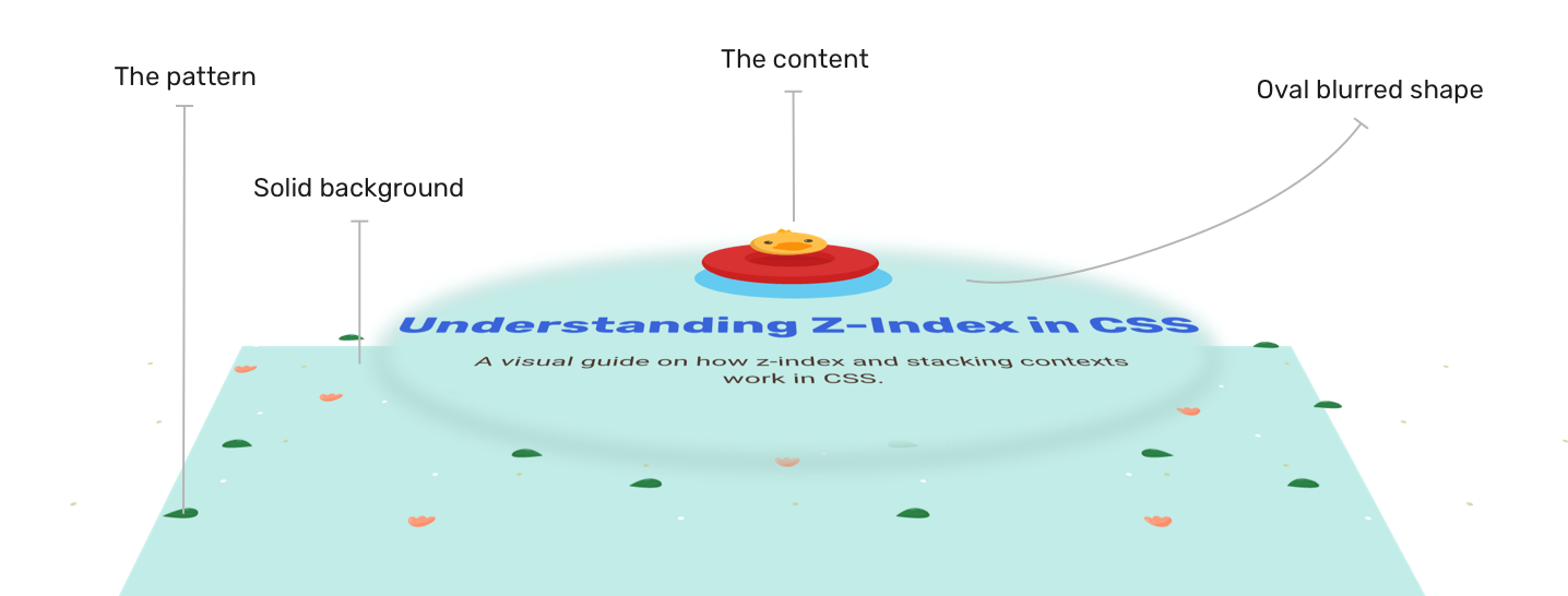
The layers
- Solid background
- Pattern image
- Oval blurred shape: to make it easier to read the text content.

For me, 3D is a good way to imagine how to stack the layers. I also made a video to make it more clear.
If you’re not into 3D, it’s totally fine. Here is a normal view of all the layers.

The requirements
- I need a dynamic way to fake an opacity for the pattern image.
- I shouldn’t use an additional HTML element for this job.
- It should be responsive.
To implement that, we can use multiple CSS gradients. Here is how I did it:
:root {
  --oval-w: 50%;
  --oval-h: 70%;
  --base-color: rgba(194, 236, 231, 0.8);
  --pattern: url("hero-bg.svg");
}

.hero {
  min-height: 400px;
  background: linear-gradient(var(--base-color), var(--base-color)),
    radial-gradient(#c2ece7 25%, transparent) center/50% 90% no-repeat,
    var(--pattern) center/cover no-repeat;
}
Code explanation
- What comes later in the gradient is displayed the last (The opposite of the stacking order).
- In CSS gradients, using the same value for a linear gradient will result in a solid color. I like using this method. The solid color with
rgba()will fake the opacity for us. - The oval shape is created with a radial gradient.
- I used percentages for the oval shape, so it can resize based on the screen size.
With that, I used the pattern image as it is without altering its opacity manually. I can change the background color the way I want without using a design program in case I changed the pattern.
What do you think about my solution? Do you have a better idea of how to tackle this? If yes, please feel free to tweet me @shadeed.

