The Layout Maestro
A message from the author!
While working on my new website design, I needed to add two lines. One of them is horizontal, and the other is vertical.
Notice them in the below design mockup:
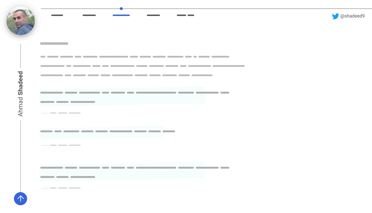
Both of them need to expand from left to right, and top to bottom. In this article, I will discuss the various ways to build them in CSS.
Vertical Line
It’s starting from the top to the end of the page. It should have a height that is equal to the page height. In other words, it should be dynamic.
Option 1: CSS Grid
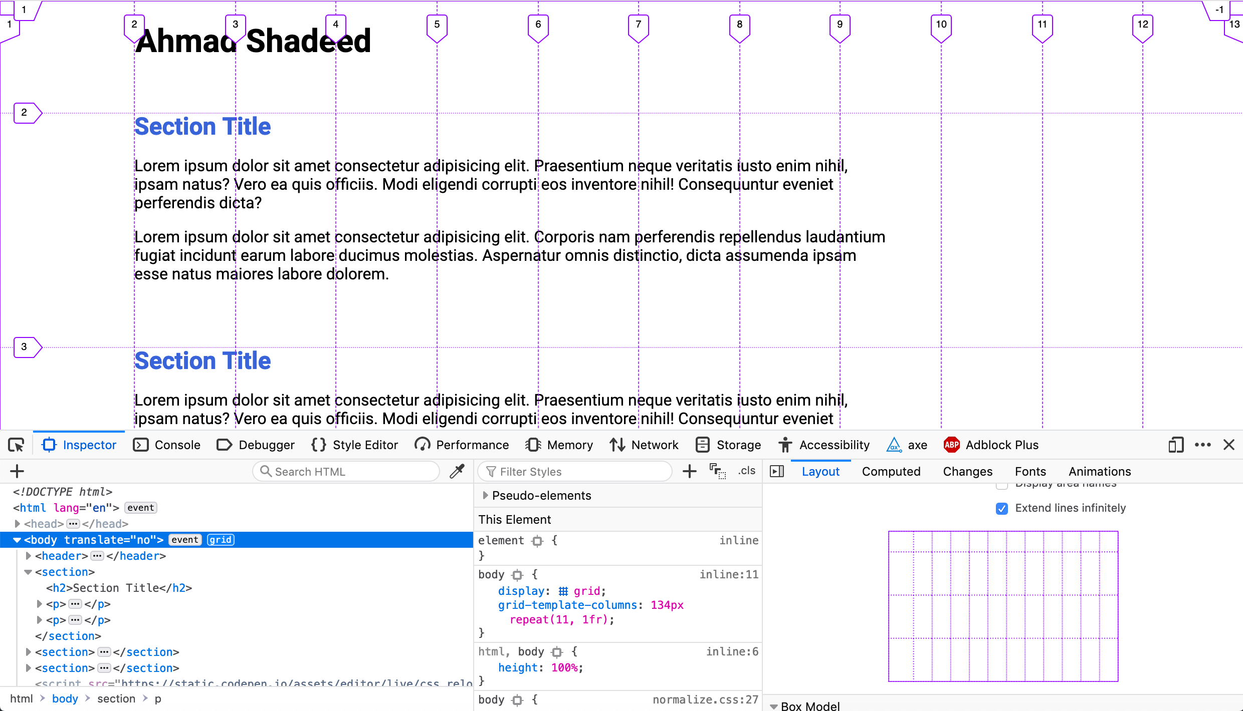
I thought about CSS Grid for this use case. I divided the page into 12 columns and ordered the header and section as below.
<header>..</header>
<section>..</section>
<section>..</section>
<section>..</section>
body {
  display: grid;
  grid-template-columns: 134px repeat(11, 1fr);
}

header {
  grid-column: 1 / 13;
}

section {
  grid-column: 2 / 13;
}
With that, here is the current result as inspected in Firefox Grid tool.
Let’s add the line!
The first thought I got is to add a pseudo element for the <body> element and make it expand with grid-row.
body:before {
  content: "";
  width: 2px;
  grid-column: 1 / 2;
  grid-row: 1 / -1;
  /*Other styles*/
}
Unfortunately, this didn’t work as expected. The line is not expanding from top to bottom.
It turned out that grid-row: 1 / -1 works only with implicit grids. Which means, I should define the number of rows manually. In my case, this won’t work as the number of sections should be dynamic and not tied to fixed amount of rows.
In order to fix this, I need to use a hack similar to the flex-grow: 9999 one. It will be like grid-row: 1 / 50. Where 50 is a big number for the rows, which mostly won’t be reached.
See the Pen Vertical Line - 1 by Ahmad Shadeed (@shadeed) on CodePen.
Option 2: CSS Gradients
It’s possible to add a gradient to the body element and have a 1px stop color to represent the line.
body {
  background: linear-gradient(
    to right,
    transparent 80px,
    #cbcbcb 0,
    #cbcbcb 81px,
    transparent 0,
    transparent 100%
  );
}
What I don’t like about this solution is that it’s not 100% robust. If I need to change the width of the line, the start and end stop values should be tweaked. The same applies to its color.
Whereas in the CSS Grid solution, changing the width and color is easier and straightforward.
See the Pen Vertical Line - 2 by Ahmad Shadeed (@shadeed) on CodePen.
Option 3 - Fixed Positioning
By using position: fixed, it’s possible to achieve the same result without any side-effects (At least for my use case).
body:before {
  content: "";
  position: fixed;
  left: 80px;
  top: 0;
  bottom: 0;
  background: #cbcbcb;
  width: 1px;
}
See the Pen Vertical Line - 3 by Ahmad Shadeed (@shadeed) on CodePen.
However, at the end of the day, you should pick the solution that works best for you. A solution might be right for your design, but it could be wrong for mine.
Horizontal Line
Next, I’m going to build the horizontal line that is expanded from the left to right above the navigation items.
For this one, I will use the same concept as the vertical line, but it will be a pseudo element added to the <header> element.
header {
  display: inherit;
  grid-template-columns: inherit;
  /* The inherit keyword is meant to inherit the grid styles from the body element */
}

header:before {
  content: "";
  height: 1px;
  background: #b9b9b9;
  grid-column: 1 / 13;
  margin-top: 16px;
}
See the Pen Horizontal Line - 1 by Ahmad Shadeed (@shadeed) on CodePen.
The End
I hope you found the article useful. I try to always think about multiple solutions and weigh them depending on the use case I have.
Did I miss anything? Please feel free to ping me on @shadeed9. Thank you for reading.
