
I like to call this too early responsive design because that’s what it literally means. It’s too early to switch from a good looking design, to a design variation that doesn’t make sense.
If I see that, I’d assume you either don’t care, or don’t have the CSS skills to build a responsive design that is truly responsive.
What does “Too Early Breakpoint” even mean?
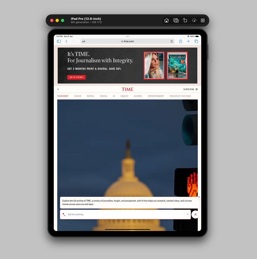
Let’s take an example of a real design. We have a hero section with content and an image. When I resize the viewport a bit, the design instantly switch to the mobile design.
While that sounds that the developer/designer who built this care about responsive web design, it implies that they don’t care that much, too, about the details.
Hot chocolate at home.
A detailed guide into making the best hot chocolate at home.

We can do better than that.
Why switch when we have too much space? In this scenario, we can change the design, and then switch to the smallest design that covers the full width when we really have to.
Let’s look at a few examples.
Examples from around the web
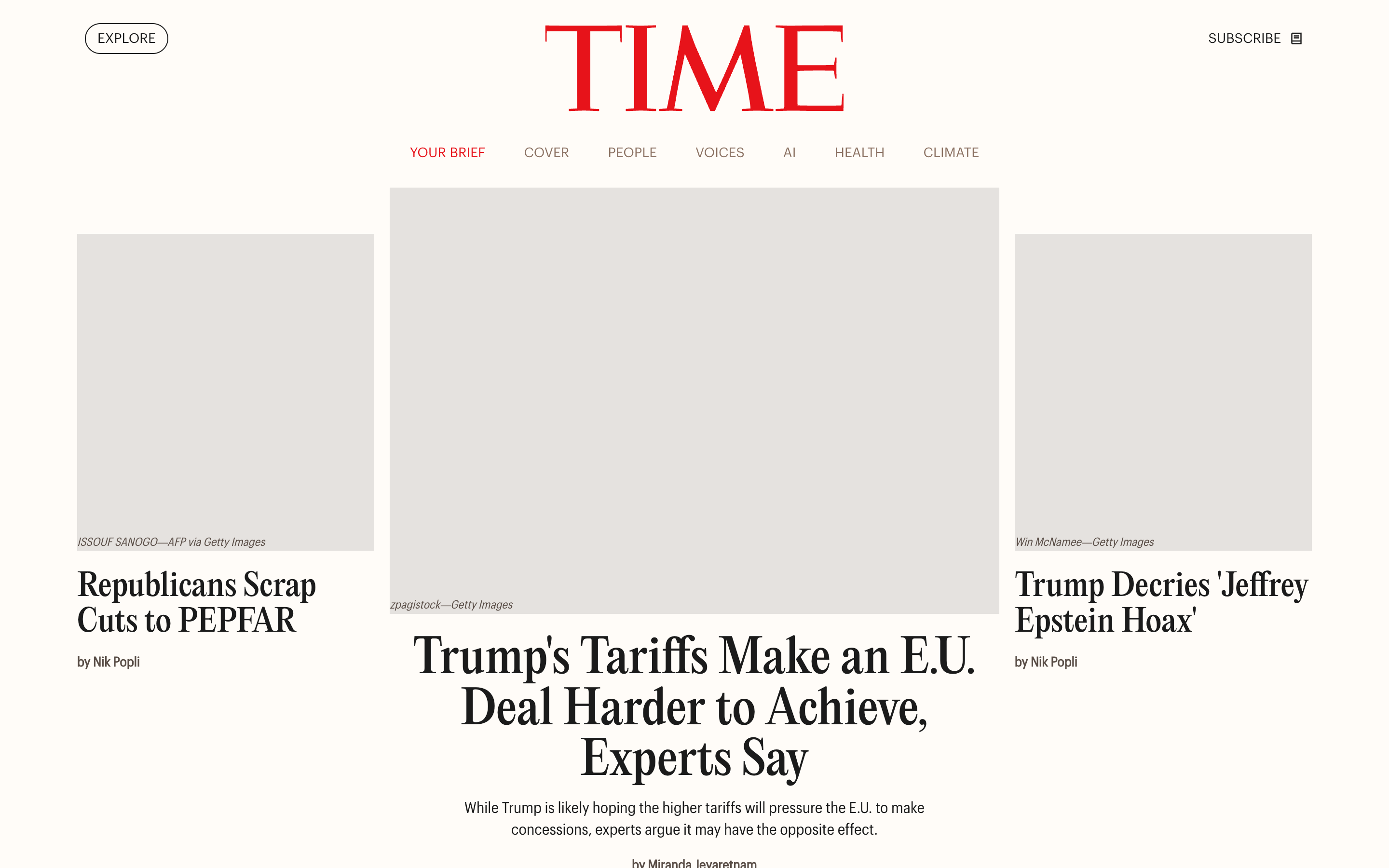
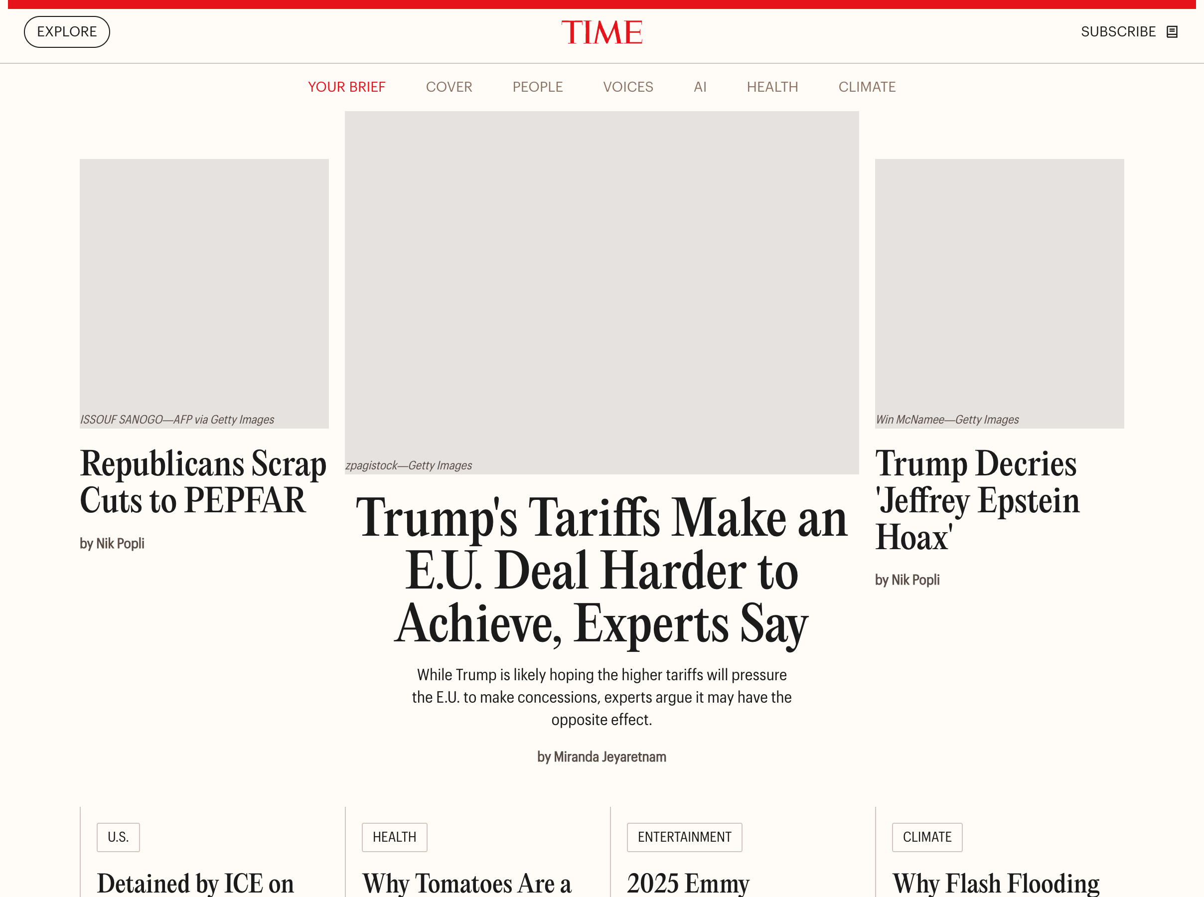
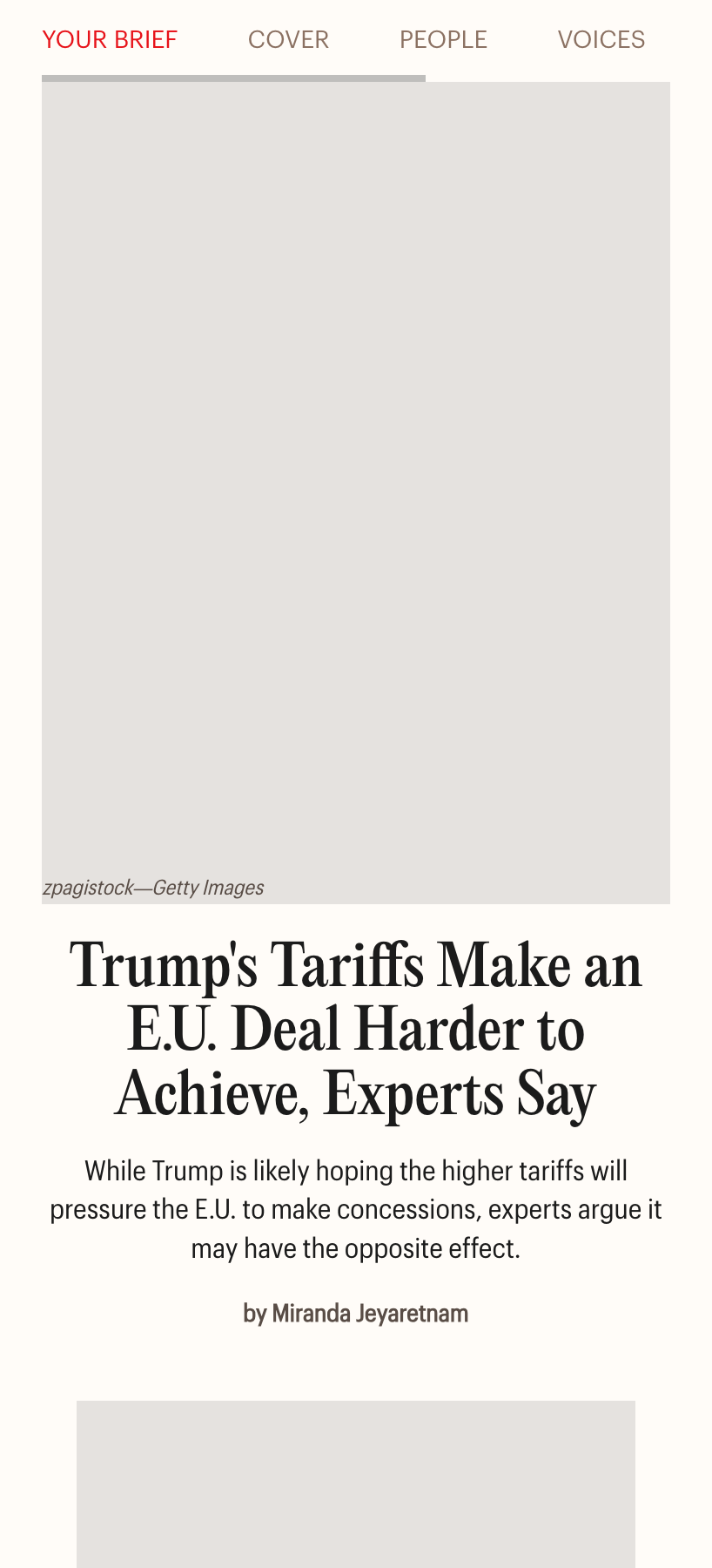
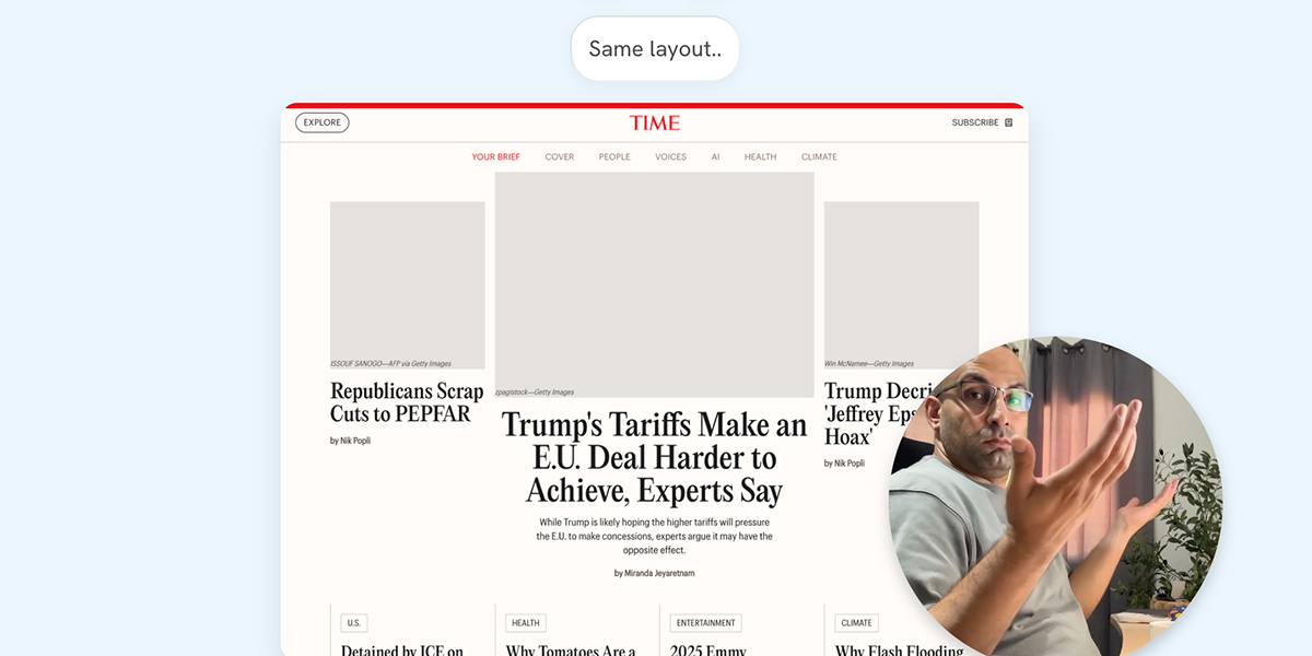
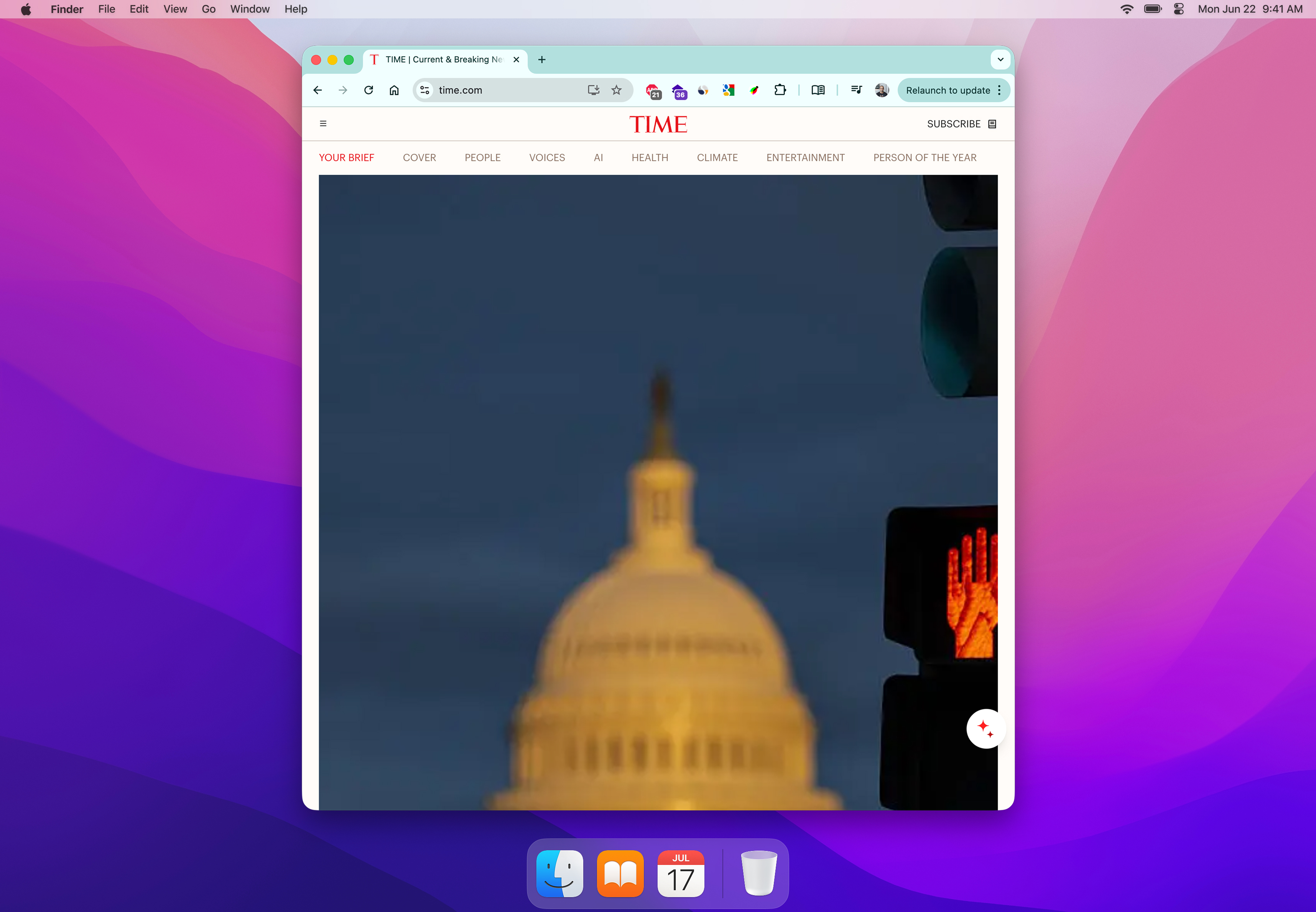
Time.com
In the hero section, the switch from the grid to full-width design happens too early, causing the design to look weird.
Take a look at the video below:
See the below interactive demo and reaction video. Note that you’ve to wait till the video at the bottom right plays to move to the next breakpoint.
Largest size
This is not good, isn’t it? If you want to see how I rebuilt it from scratch, I have a complete article about that.
Switching too early isn’t good, for many, many reasons.
TechCrunch
In TechCrunch layout, it’s almost the same as Time’s. See the following video:
You might be thinking that this might be intentional? I’m not sure, but either ways it’s incorrect and can be better.
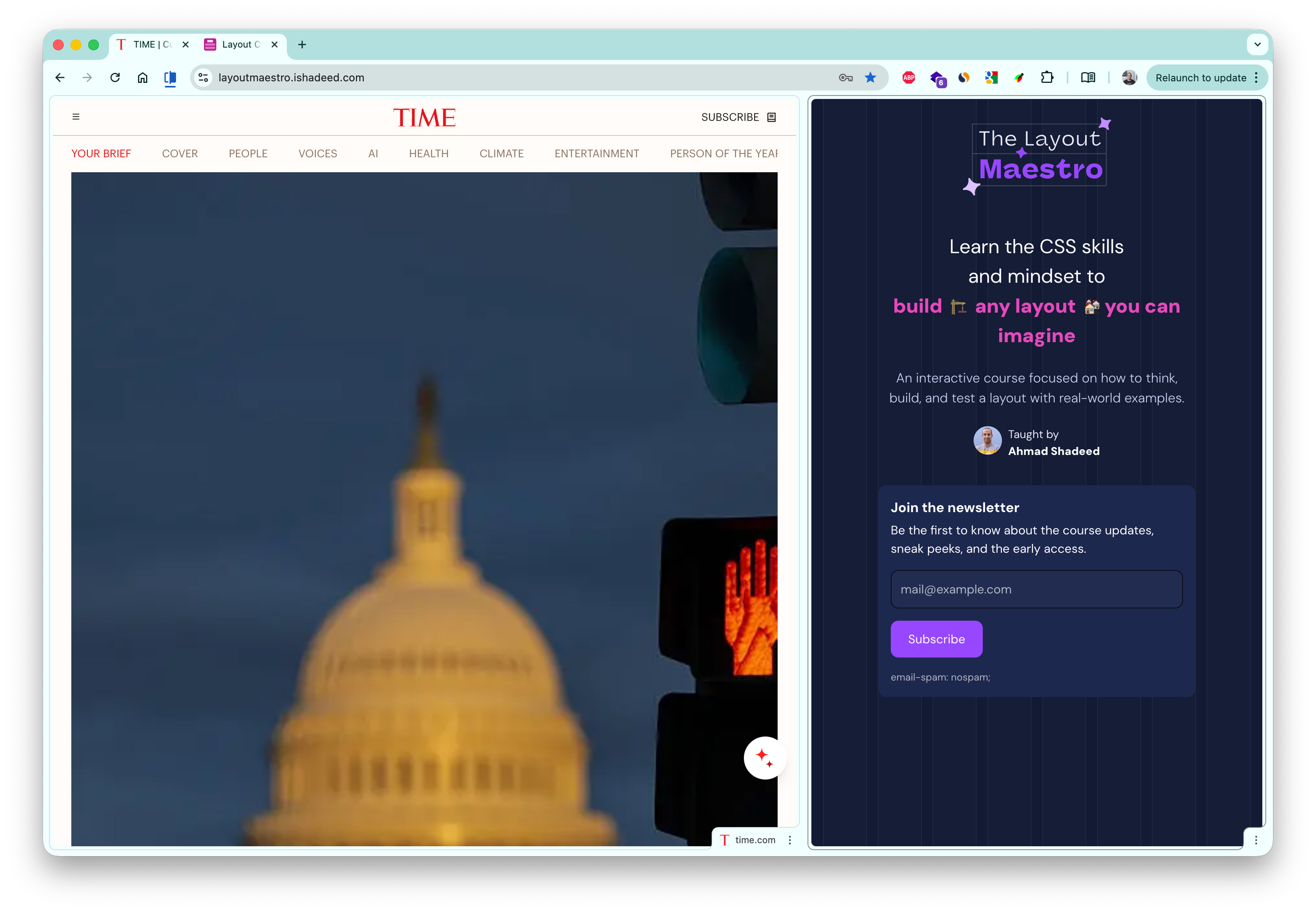
I rebuilt TechCrunch-like home layout in my upcoming course, The Layout Maestro!
Why to account for those edge cases
I might resize the browser
It’s common to resize the browser window to do a task on the computer, like taking notes, or maybe opening a documentation, or whatever.
Here is an example of resizing a browser window on macOS.
I might split screens
The user might open the page in a split view. Here is an example from Google Chrome.
I might browse on a tablet
Simply, I might open the website on an iPad.
I might use iOS Link preview
On iOS, we can tap and hold to preview link, this is a use-case where the viewport size might make the design look odd.
How we can do better?
- Talk with the designer about having more breakpoints in between
- Design with container queries in mind
- Make the design dynamic at its core, meaning that it can change based on the number of items
- Leverage well supported features like Grid and Flex
Here is an example of how I would build the Time.com hero section layout.
New Study Reveals Benefits of Morning Exercise
By Michael Chen
Tech Companies Announce Major AI Breakthrough
By Emily Rodriguez
Health Officials Urge Caution as Heat Wave Intensifies
A new study finds that late-night screen time is linked to sleep problems.
By Sarah Johnson
Please don’t switch to the smallest layout too early, you can do better.
The Layout Maestro
Building layouts can be a challenging task, specially if you don’t know the core mental model of CSS layouts. You don’t have to worry about that anymore. I’m building a complete CSS course, and I called it, The Layout Maestro.
You can sign up in the link below.
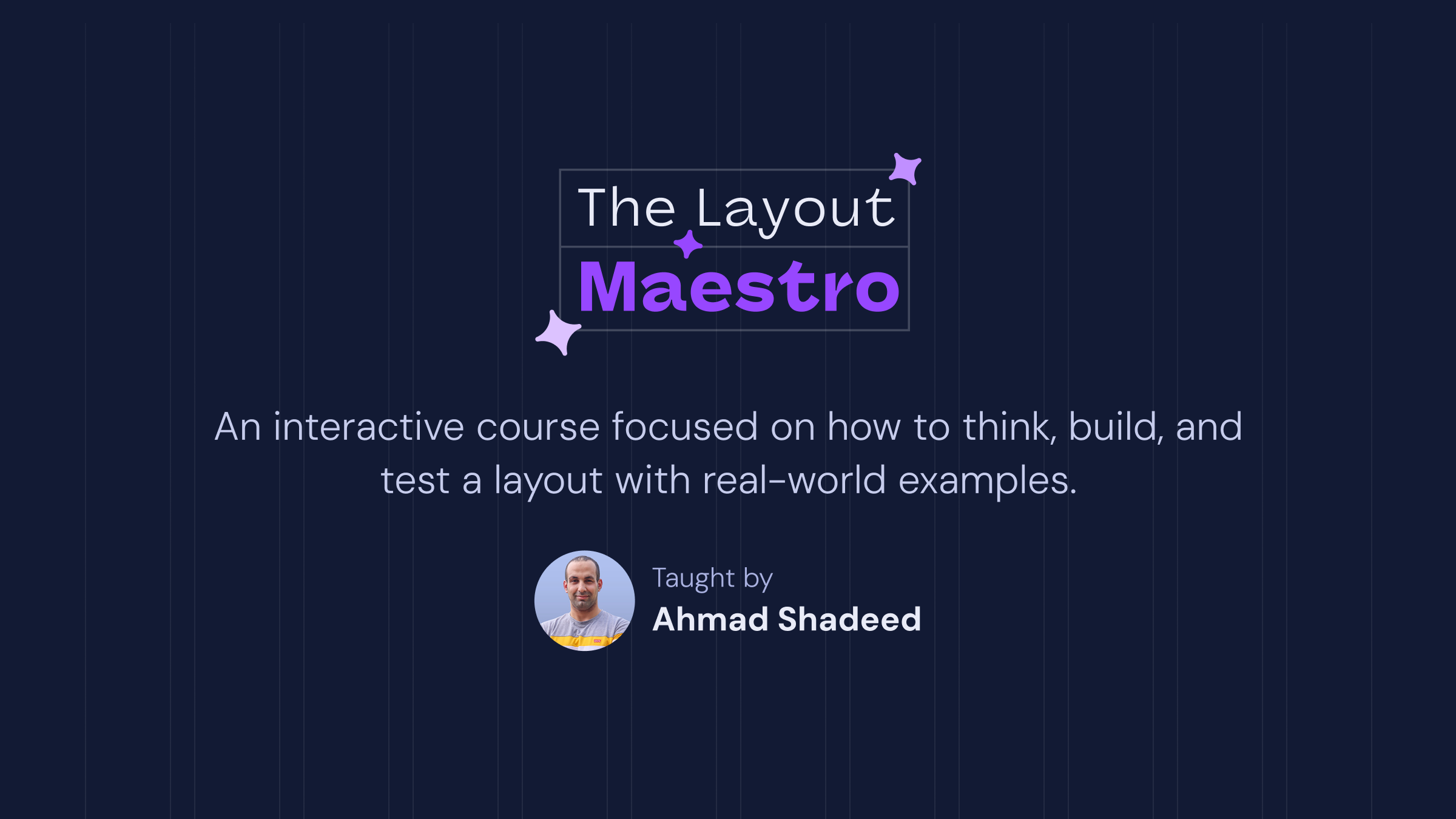
It’s a fully interactive course that explains modern CSS layout. This very article that you just read is just a small taste of what the course will offer. If you are interested, you can sign up below for updates.
Thank you for reading!