The Layout Maestro
It has never been easier than now to use modern CSS features as an enhancement. When I use a CSS feature that is not fully supported in all major browsers, I tend to have a baseline that works with non-supporting browsers, and an enhanced version for modern browsers.
When a new CSS feature is supported in a specific browser, say Chrome, some replies on Twitter will be like “This isn’t supported in Edge or IE, I can’t use it”. In this article, I will explore some examples where I use CSS features without causing any harm to browsers that don’t support them.
Examples of tiny enhancements
Intrinsic Sizing
In a recent client project, I designed a widget that can be added to the article body. It includes a link to another related article, and we needed to make it obvious and engaging.
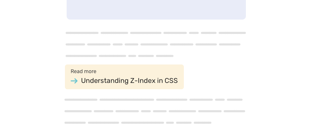
The widget width should be equal to its content. We can solve this problem by using different methods:
- An
inline-blockelement. - Using intrinsic sizing with
width: fit-content
I don’t like the inline-block solution that much since it doesn’t feel safe for me. What if another widget is there? They will be beside each other. The widget must be a standalone element.
For that reason, I lean towards using the intrinsic sizing solution.
<p class="widget widget--more">
  <a href="#">Understanding Z-Index in CSS</a>
</p>
.widget--more {
  width: fit-content;
}
The support for fit-content is not perfect. What will happen when it’s not supported? Since the <p> is a block-level element, the widget will take the full width of its parent element.
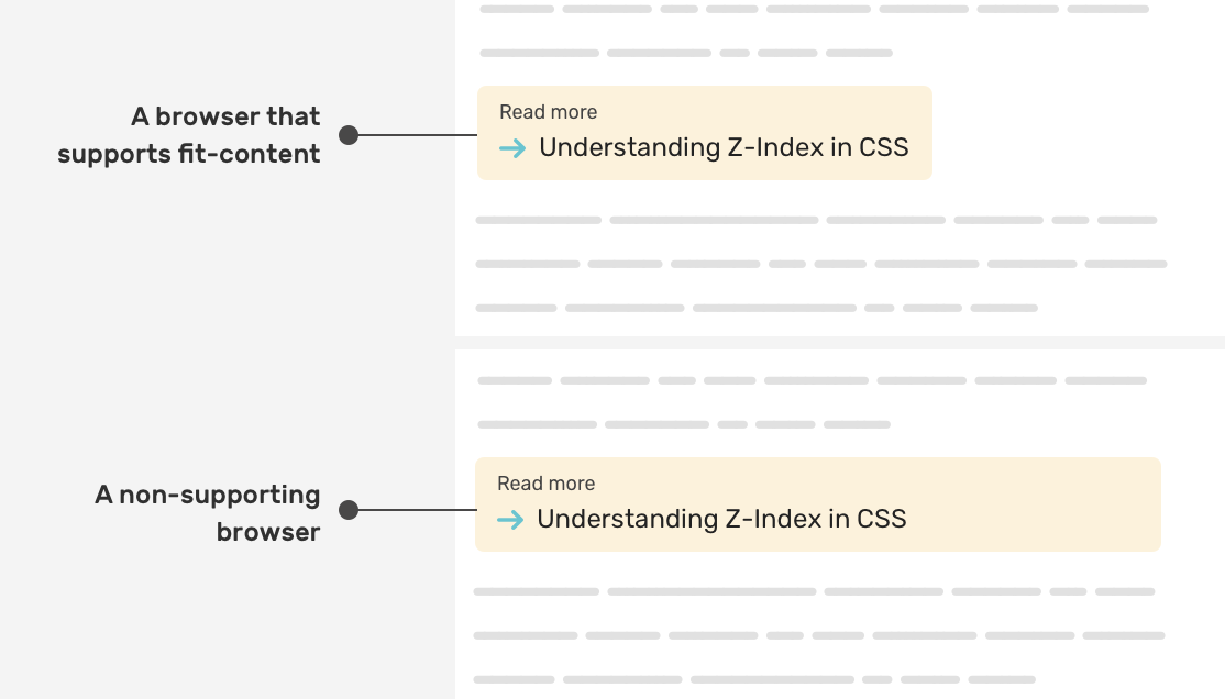
While the width: fit-content is not supported, there is no harm to the user experience. The widget is working as expected.
Learn more about intrinsic sizing in CSS.
Clip Path
I love working on 404 page designs that are aligned with the brand and the tone of voice of a product. In this example, we have a 404 shape, and the “0” character has eyes that should roll to the left and right.

<div class="eyes">
  <div class="eyes__item"></div>
  <div class="eyes__item"></div>
</div>
I needed a way to use clip-path in the following way:
- If it’s supported, there will be rolling eyes.
- If not, the eyes will be solid without animation.
To do that, I need to create base eyes and then add the rolling eyes above each as a duplicate. The rolling will take effect on the duplicate ones.
.eyes__item {
  position: relative;
  width: calc(10px + 0.75vw);
  height: calc(20px + 0.75vw);
  background-color: #4b4d65;
  border-radius: 50%;

  &:after {
    content: "";
    clip-path: ellipse(12px 12px at 58% 100%);
    animation: rollingEye 4s infinite;
    /* Other styles */
  }
}

This is a simple usage of a CSS property, and how it will look on a non-supporting browser.
Learn more about CSS clip-path in this article.
CSS Marker
The CSS ::marker pseudo-element can help us to change the color and size of a list bullet or number. We can use it as an enhancement, and if not supported, it’s fine.
.list li::marker {
  color: #fcf2db;
  font-size: 1.2em;
}
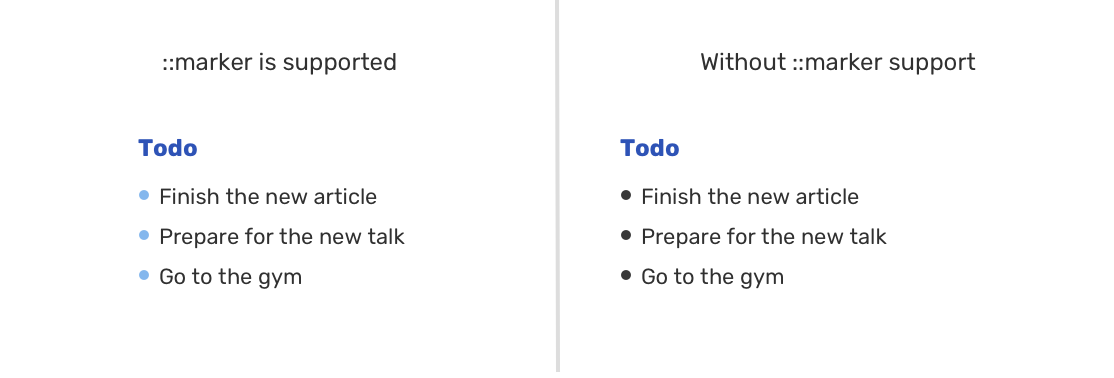
Read more about the marker pseudo-element.
Tiny enhancements don’t work for all CSS properties
Not all CSS properties can fallback to an acceptable solution. Let’s take flexbox gap as an example.
The CSS gap is useful to add spacing between flexbox child items. If you use gap without a fallback, you will get something like the following.
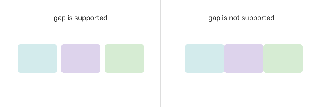
We can use JavaScript to detect support for gap and to provide a fallback using margins.
.flex-wrapper {
  display: flex;
  flex-wrap: wrap;
}

.flex-wrapper .item {
  flex: 0 0 calc(33.33% - 1rem);
  margin-left: 1rem;
  margin-bottom: 1rem;
}

/* If flexbox gap is supported, do the following */
.flexbox-gap .flex-wrapper {
  gap: 1rem;
}

.flexbox-gap .flex-item {
  margin-left: 0;
  margin-bottom: 0;
}
In closing
As you’ve seen, we can use modern CSS features and if they’re not supported, the browser will do the job. However, this doesn’t work for all use-cases, so you need to be careful of the CSS property you’re using.
I wrote an ebook
I’m excited to let you know that I wrote an ebook about Debugging CSS.

If you’re interested, head over to debuggingcss.com for a free preview.

