The Layout Maestro
A message from the author!
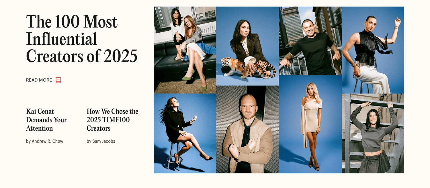
In this article series, I plan to choose layouts from popular websites and see how I can rebuild them better in CSS. This time, it’s the top news section in Time.com’s layout.
Let’s take a look.
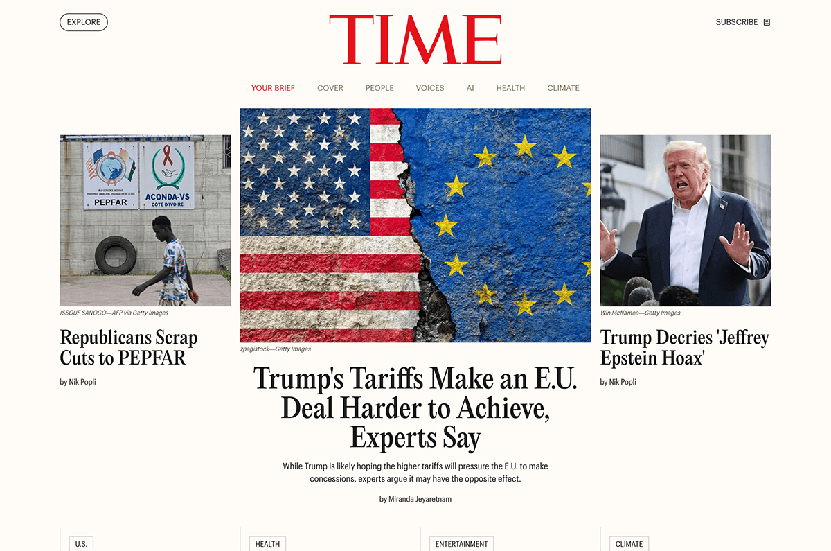
We have a header and a main news section. At first glance, it looks like a typical layout, right? Here is a video of me resizing the viewport.
Notice how the layout switches from the 3-col to 1-col on mobile very early, causing the featured news item to take and cover almost 100% of the viewport space. Is that right? To me, it’s a big no. Let’s pretend that time.com hired me to fix it!
What’s my plan? How will I approach this in the first place?
The current layout
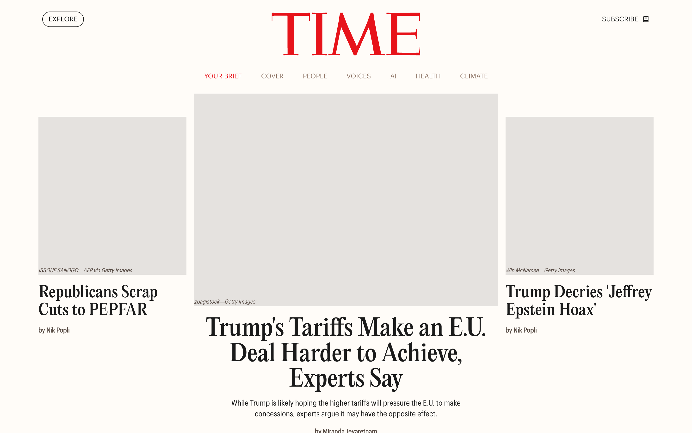
Here is a walkthrough of the major breakpoints. Notice how the design switches too early for the mobile size, which makes it look odd.
I attached a reaction video when I was resizing the viewport. You can see my reaction on each step.
Largest size
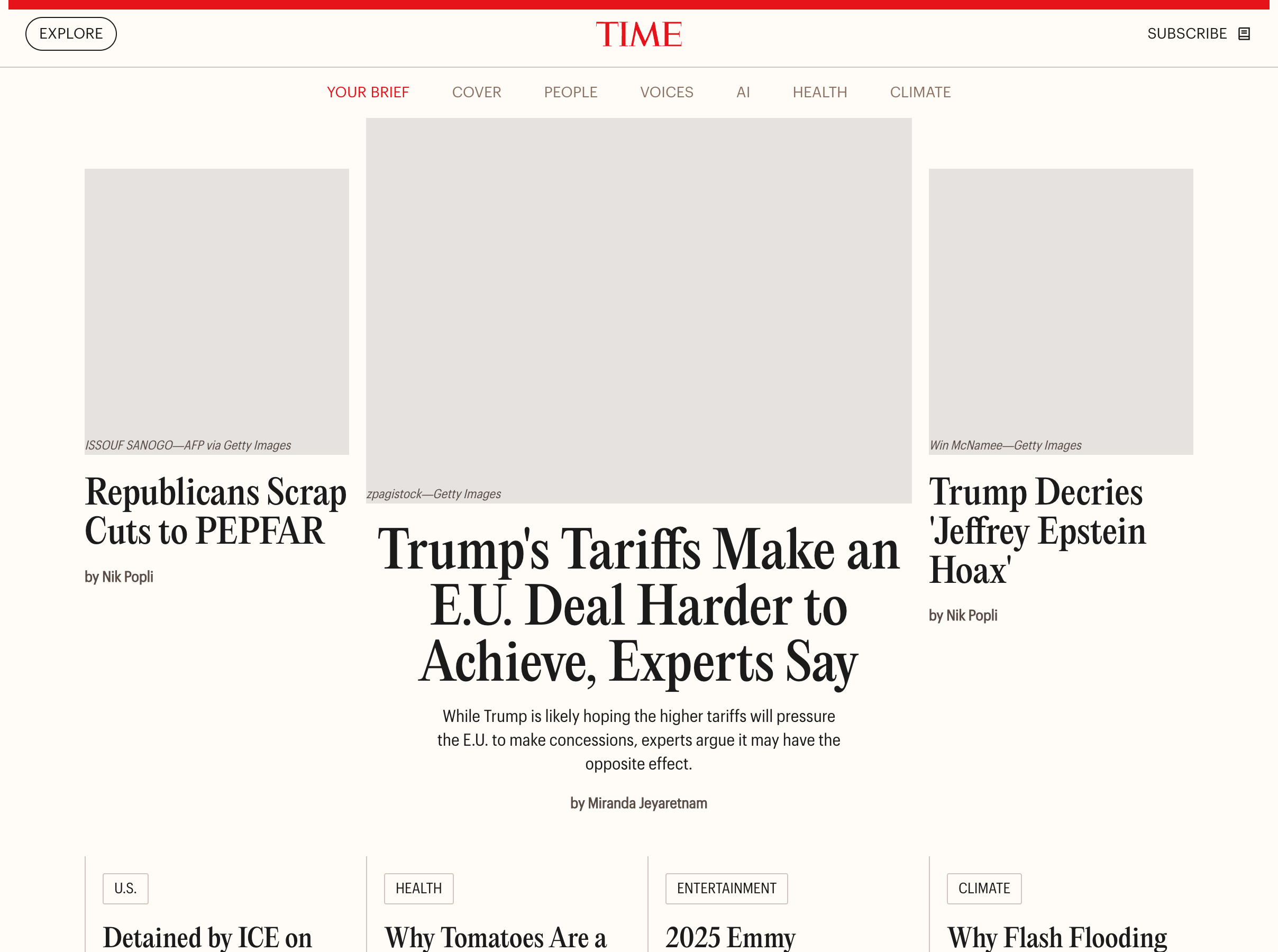
In the mobile-tablet-ish size, we still have a lot of space to show the content. Showing the featured article image like this is not a good idea, at least for me.
OMG, still the same!?
This doesn’t look good. Let’s see what we can do.
Analyzing the design
Before diving into CSS, I like to write down what I need to build first:
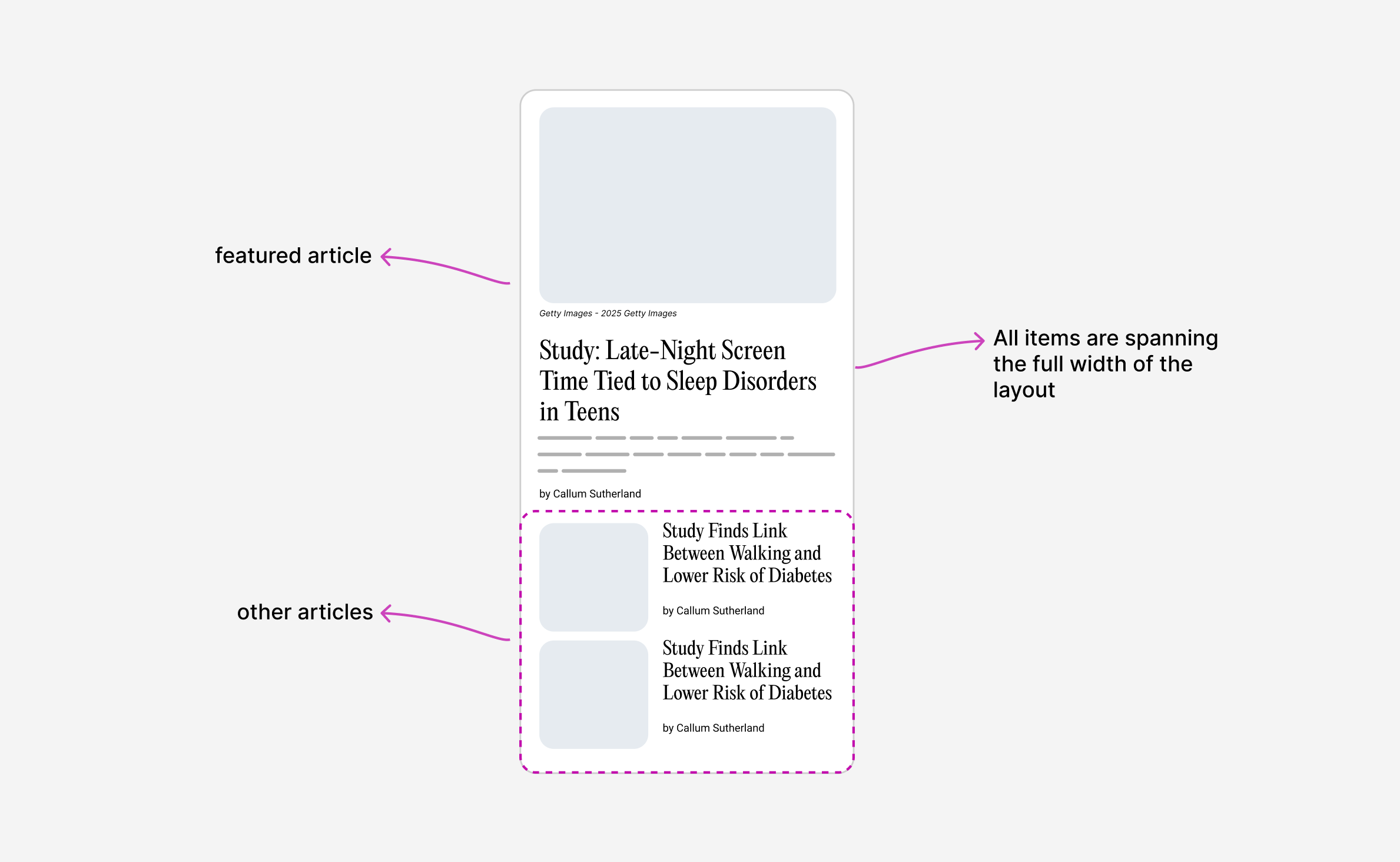
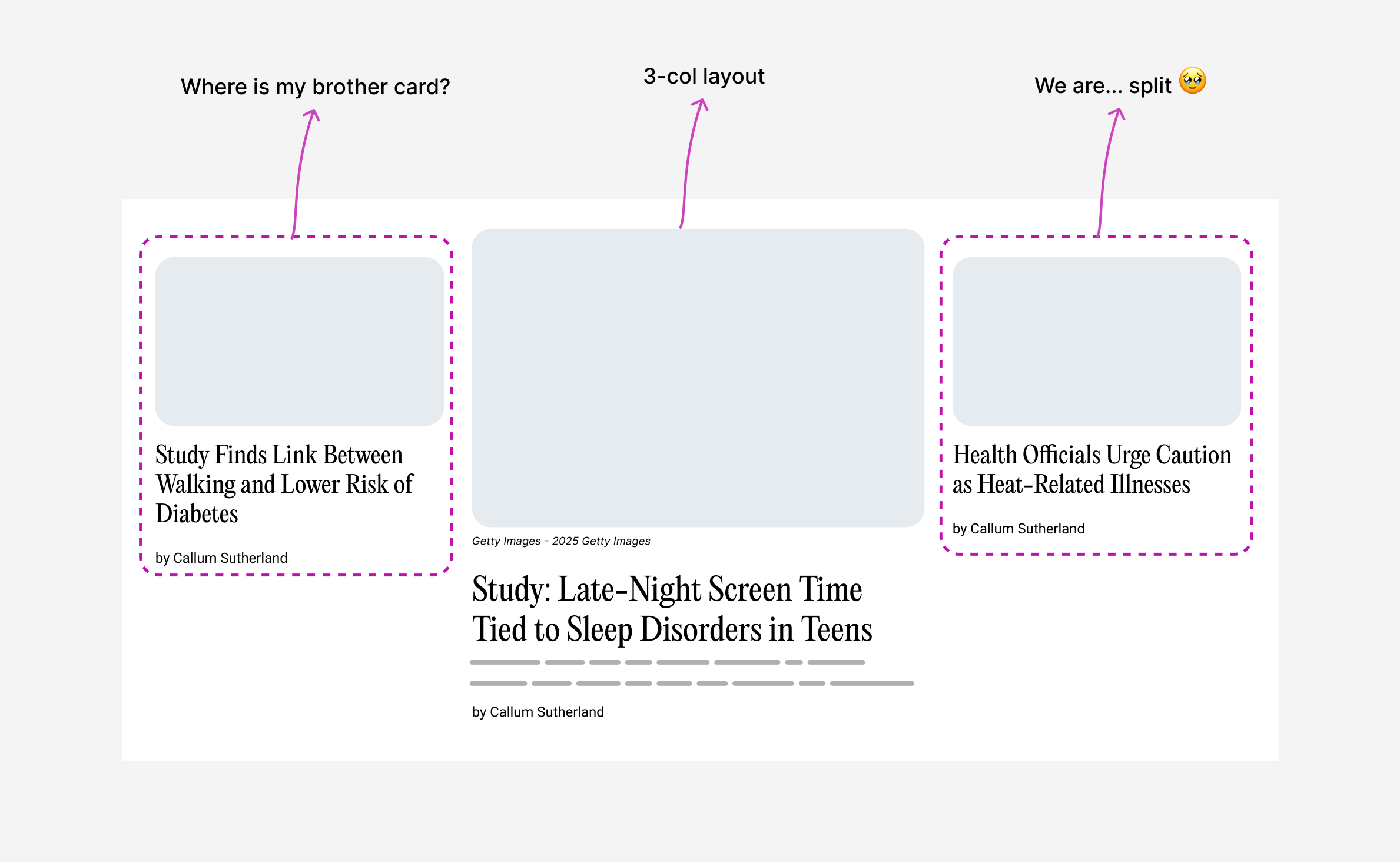
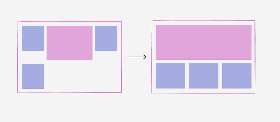
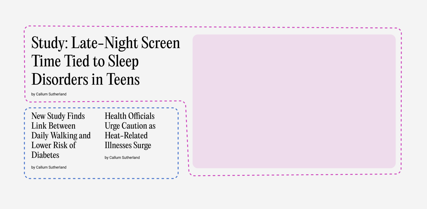
- We have a three-column layout
- The middle one is the featured one, hence it’s the largest
- The other two are displayed in a stacked style
Here is a figure that illustrates what I thought about.
Smallest size, 1-col layout
In short, I need to make the layout flexible and avoid too much control over it. I want the content to be the factor that decides the suitable layout.
First, we have the default layout. All items span the full width of their container.
When there is a bit more space, I want the cards to be displayed in a 2-column grid, and each one should convert to the stacked style.
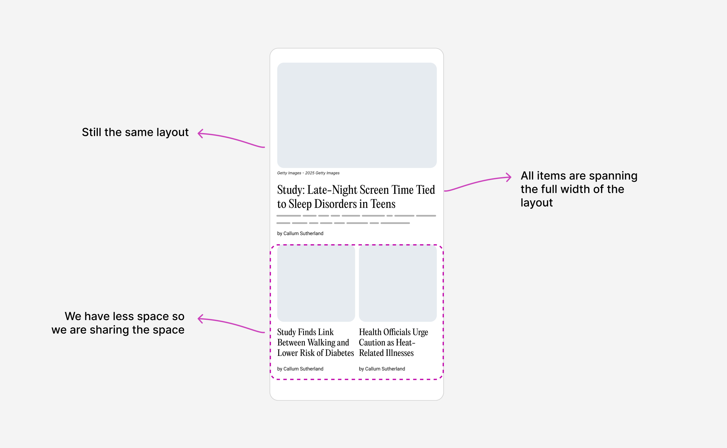
We now have more space, so the 2-col grid works. The other articles span a row each.
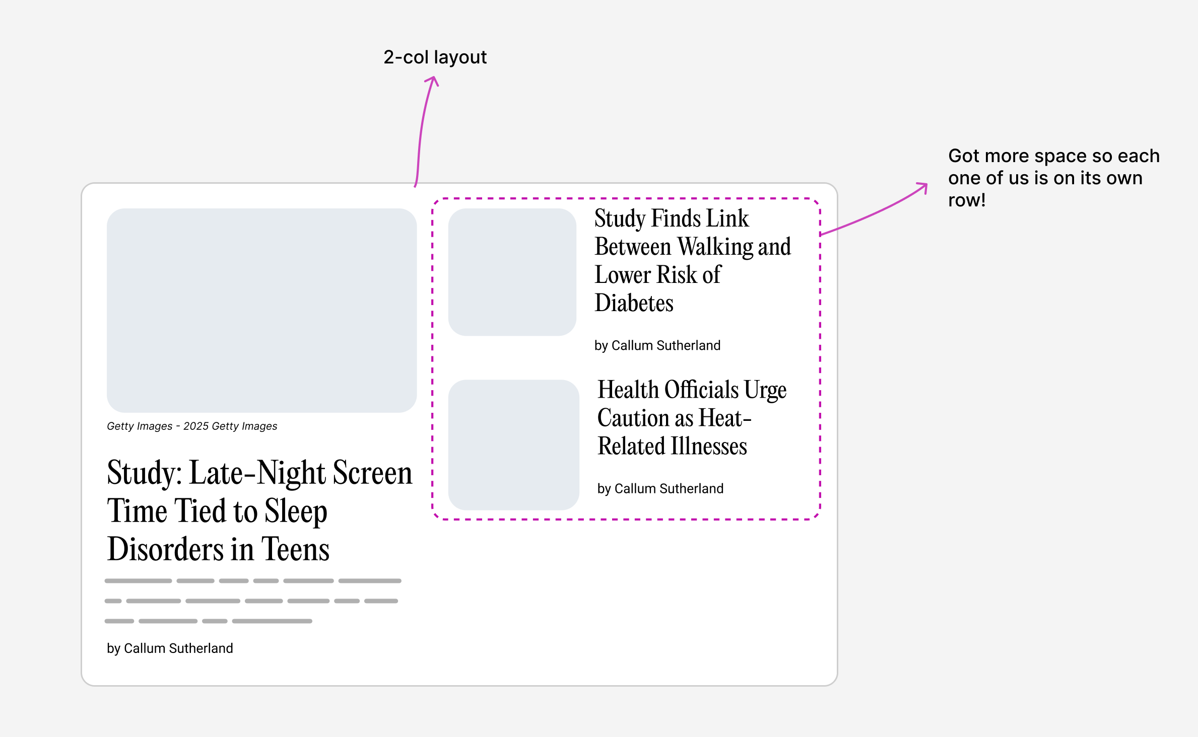
We got more space, so I want the featured item to take the full width of the container. The other group is also taking the full width of the container.
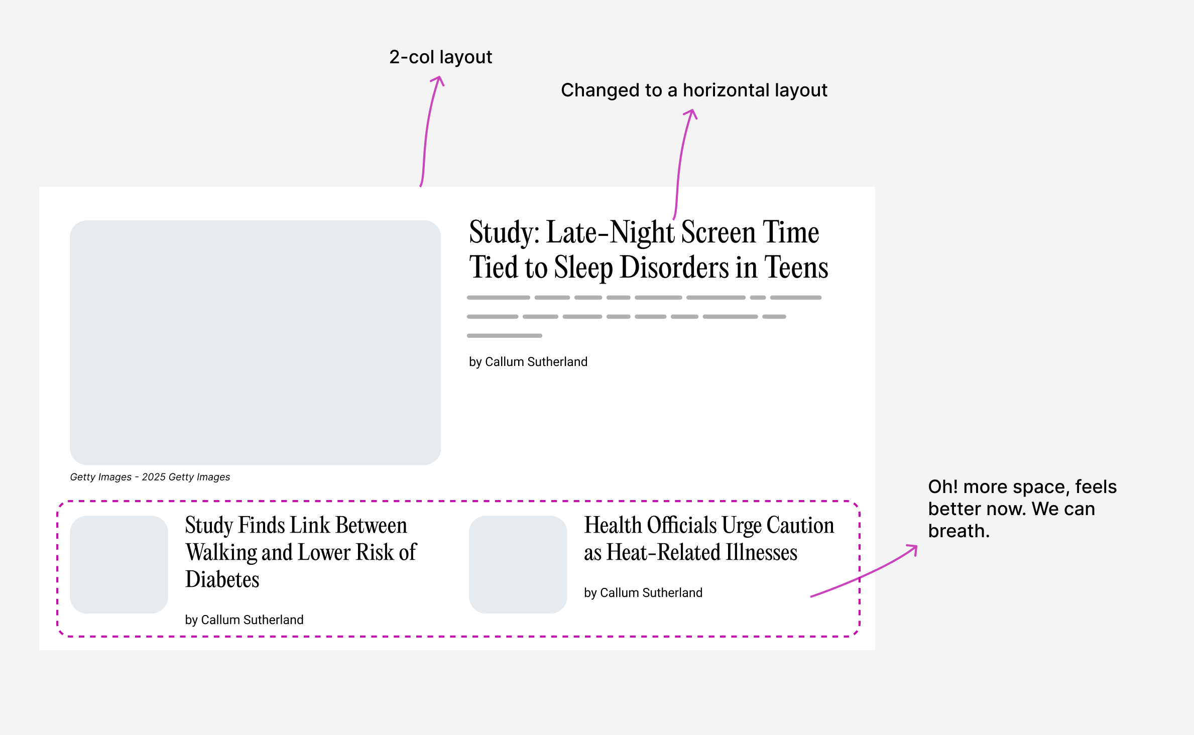
Now it’s time to display a 3-col grid. The other articles are split; each one lives on a side.
Now that we know what we should do, let’s get into building the layout.
Building the layout
First, I wrote the markup for the initial layout. We might be tempted to have a markup like this:
<div class="layout">
  <article class="card"></article>
  <article class="card"></article>
  <article class="card"></article>
</div>
Wrap each article in a container
While that works, it will be limiting as we move forward. We need to wrap each article in a container.
<div class="layout">
  <div class="layout-item">
    <article class="card"></article>
  </div>
  <div class="layout-item">
    <article class="card"></article>
  </div>
  <div class="layout-item">
    <article class="card"></article>
  </div>
</div>
Why is this better?
- Useful for container queries.
- Having a better separation of container-based styles vs component-styles.
The outer grid layout
First, I like to work on the outer grid layout. This helps me solve the problem at its core, then I can focus on the inner content.
.layout {
  display: grid;
  grid-template-columns: 1fr 2fr 1fr;
  gap: 1rem;
}
Here is a demo that shows the outer grid. Try to resize the wrapper so you can see how the grid reacts to different viewport sizes.
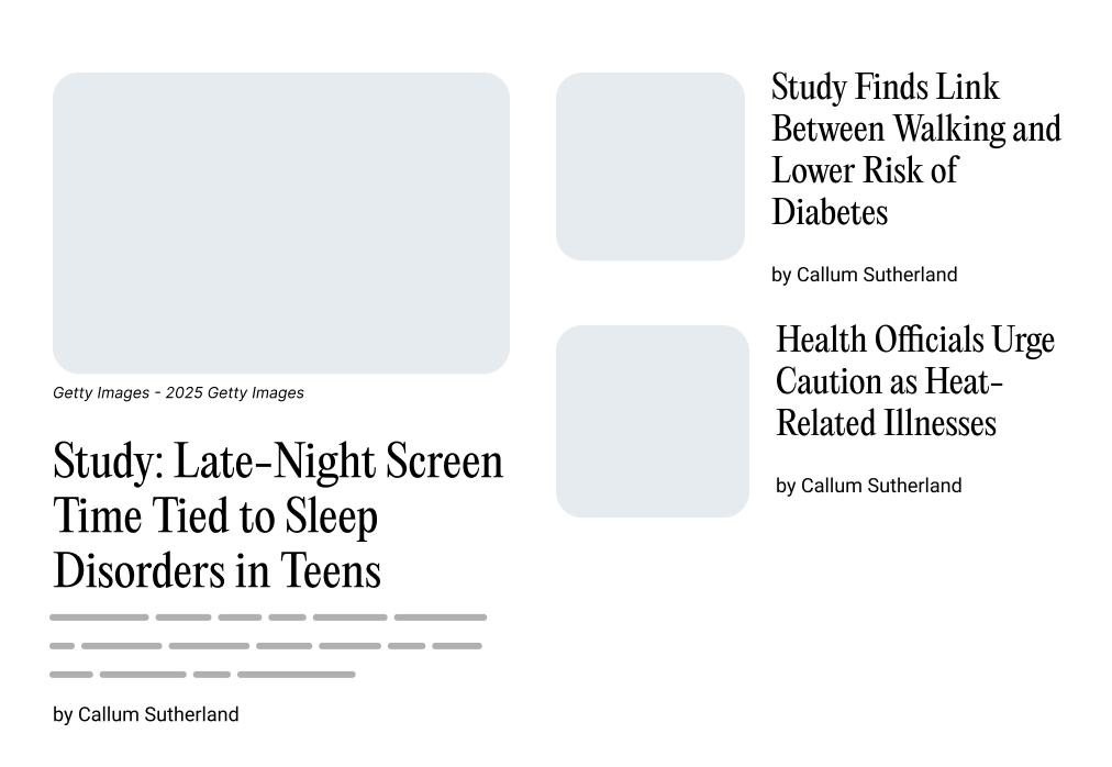
Link Between Daily Walking and Lower Risk of Food
By John Smith
Late-Night Screen Time Tied to Sleep
A new study finds that late-night screen time is linked to sleep problems.
By John Smith
Health Officials Urge Caution as Heat
By John Smith
I used grid-column and grid-row to position the items in the grid, like so:
.layout-item:nth-child(1) {
  grid-column: 1 / -1;
  grid-row: 1;

  @media (min-width: 800px) {
    grid-column: 1 / 2;
  }
}

.layout-item:nth-child(2) {
  grid-column: 2 / 3;
  grid-row: 1;
}

/* and so on*/
Now that the basic styles are ready, let’s add the content.
Adding the content
Here is the layout with the actual content. What I did here is place the cards in the grid. Nothing too special (yet!).
Take a look. Try to resize the container to see how the grid reacts to different viewport sizes.
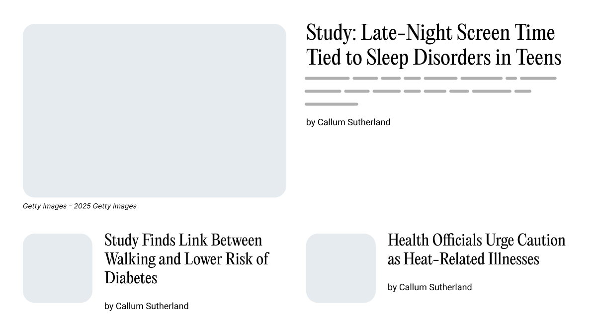
Link Between Daily Walking and Lower Risk of Food
By John Smith
Late-Night Screen Time Tied to Sleep
A new study finds that late-night screen time is linked to sleep problems.
By John Smith
Health Officials Urge Caution as Heat
By John Smith
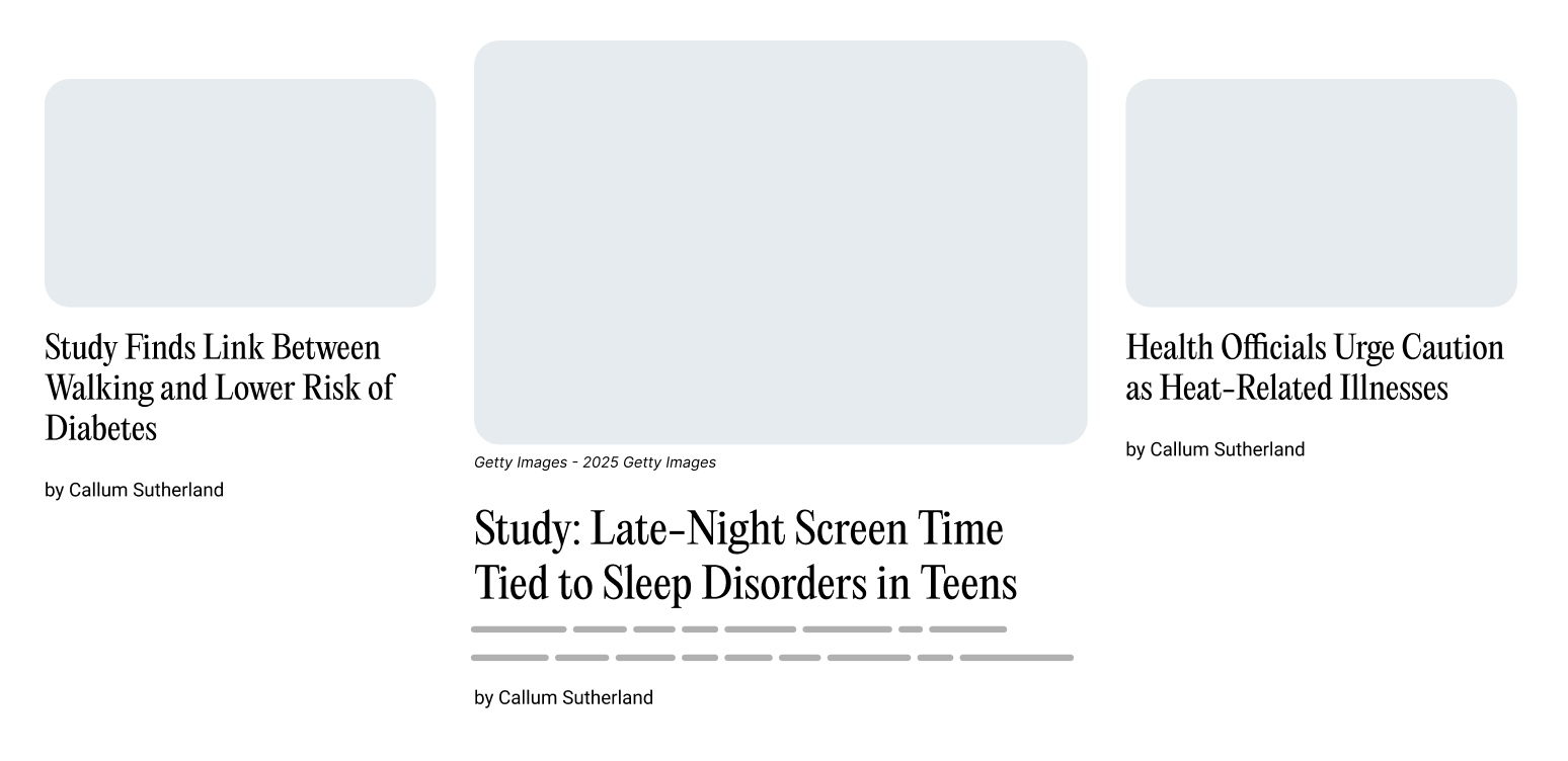
Because the card style is always stacked, it can get odd at some breakpoints. Notice how the card is too big in the following demo:
Link Between Daily Walking and Lower Risk of Food
By John Smith
Late-Night Screen Time Tied to Sleep
A new study finds that late-night screen time is linked to sleep problems.
By John Smith
Health Officials Urge Caution as Heat
By John Smith
Size container queries to the rescue
We need to change the card style based on its container width. In this particular case, we need the card layout to become horizontal. Meaning that the image will be on the left and the content on the right.
.layout-item {
  container-name: card;
  container-type: inline-size;
}

.card {
  @container card (min-width: 400px) {
    display: flex;
    flex-direction: row;
  }
}
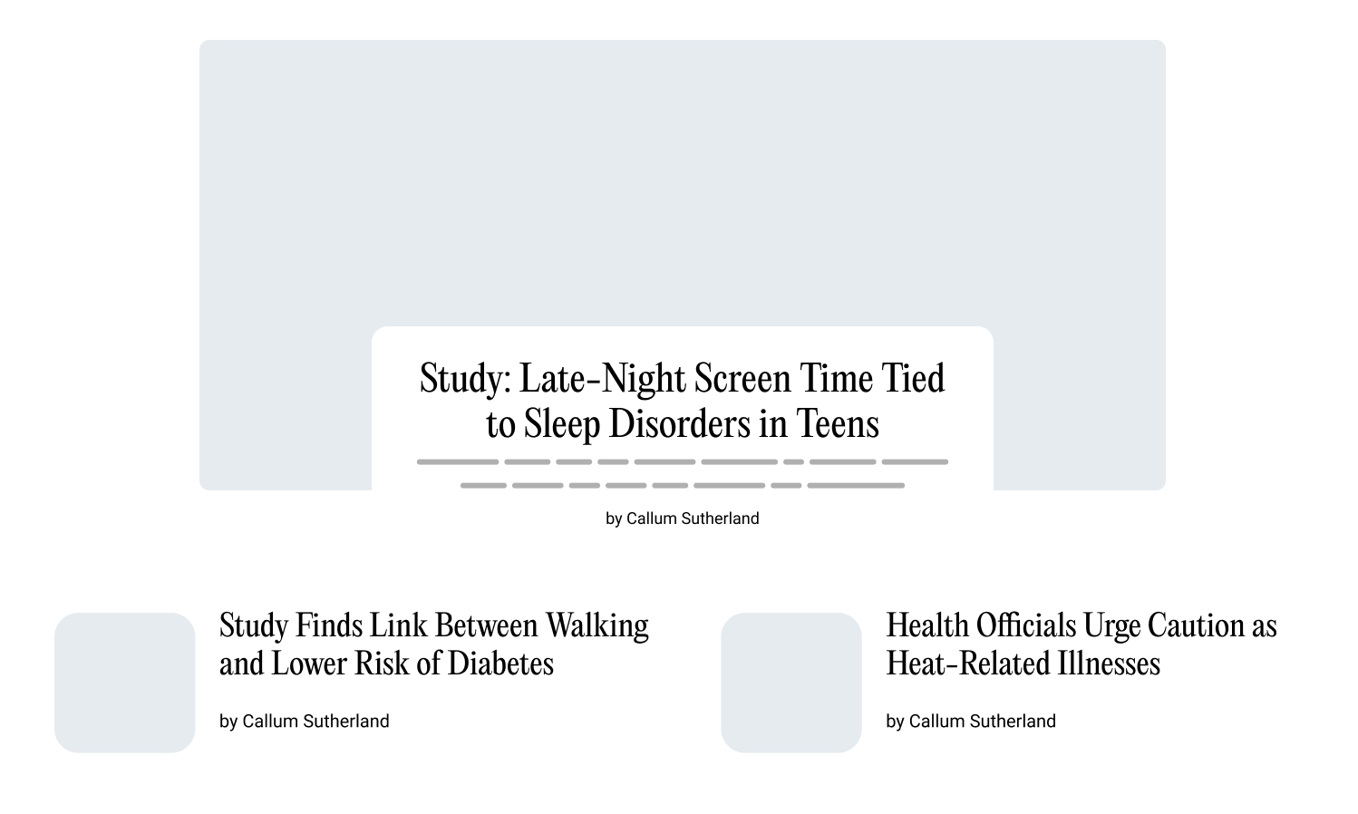
To see the solution in action, click on the CQ toggle and see what happens.
It’s like magic, right?
Link Between Daily Walking and Lower Risk of Food
By John Smith
Late-Night Screen Time Tied to Sleep
A new study finds that late-night screen time is linked to sleep problems.
By John Smith
Health Officials Urge Caution as Heat
By John Smith
If you want to learn more about container queries, I wrote a complete interactive guide on them.
A downside of using CSS grid
In the following example, there is a problem that might not be obvious at first. Take a closer look at the other articles on the right. Noticed something?
Link Between Daily Walking and Lower Risk of Food
By John Smith
Late-Night Screen Time Tied to Sleep
A new study finds that late-night screen time is linked to sleep problems.
By John Smith
Health Officials Urge Caution as Heat
By John Smith
Take a moment to think. You can reveal the problem in the following demo.
Link Between Daily Walking and Lower Risk of Food
By John Smith
Late-Night Screen Time Tied to Sleep
A new study finds that late-night screen time is linked to sleep problems.
By John Smith
Health Officials Urge Caution as Heat
By John Smith
In CSS grid, the row height is set based on the content. For this case, this means that each of the normal articles (on the right) lives in a row. The article’s total height is smaller than its row, thus creating an unwanted vertical space between the two articles.
If this is the only design variation we have, it could be solved with wrapping the two articles in a group and then positioning the group on the right.
<div class="layout">
  <!-- Featured card -->
  <div class="layout-item">
    <article class="card"></article>
  </div>

  <!-- Normal cards -->
  <div class="layout-group">
    <div class="layout-item">
      <article class="card"></article>
    </div>
    <div class="layout-item">
      <article class="card"></article>
    </div>
  </div>
</div>
Something like this:
.layout-item {
  grid-column: 1 / 2;
}

.layout-group {
  grid-column: 2 / 3;
}
This will not work if we have another design variation, just like in our case as we need to have a centered featured article and two other articles on the sides.
Take a look at the following figure. How can we position the two other articles on the sides when they are in a group?
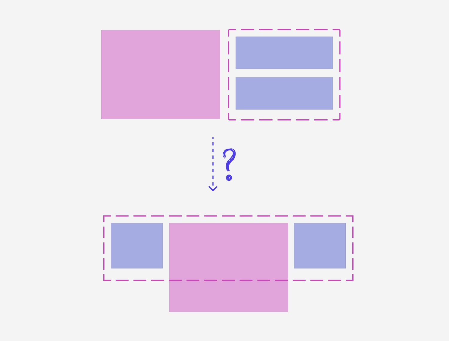
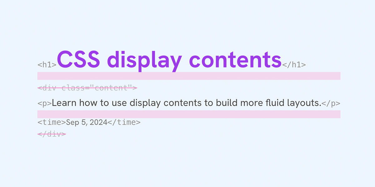
Thankfully, we can solve that with display: contents. Let’s take a closer look.
Using display: contents
In the following demo, I used display: contents to remove the outer group and make the two other cards part of the grid.
Click on the ungroup and see what happens.
display: flexNew Study Reveals Benefits of Morning Exercise
By Michael Chen
Tech Companies Announce Major AI Breakthrough
By Emily Rodriguez
Health Officials Urge Caution as Heat Wave Intensifies
A new study finds that late-night screen time is linked to sleep problems.
By Sarah Johnson
Adding display: contents to the .layout-group element will make its child elements part of the grid.
By having the ability to ungroup or group the items when we need, we will have much finer control over the layout.
For example:
- We can use CSS grid for the group, along with
minmax()to have a dynamic layout for the items within the group. - When needed, we can ungroup the container and let the cards join their sibling, acting just like they are part of the grid.
- that group can inherit the grid via CSS
subgrid, this will let its child elements join the grid, too.
Using display: contents gives us a good starting point. We can now focus on the featured item.
Style queries
To make the centered item featured, we need to:
- assign the CSS variable
--featured: trueto the featured element container. - Use the
orderproperty on the last item in the group.
/* Target the first direct child of .layout,
to avoid targeting from the group */
.layout > .layoutItem:nth-child(1) {
  --featured: true;
}

@container card (min-width: 400px) and style(--featured: true) {
  /* Featured styles */
}

.layoutGroup .layoutItem:nth-child(2) {
  order: 3;
}
That way, we can have the featured style only when the CSS variable is set. This gives us full control over when to show the featured style.
New Study Reveals Benefits of Morning Exercise
By Michael Chen
Tech Companies Announce Major AI Breakthrough
By Emily Rodriguez
Health Officials Urge Caution as Heat Wave Intensifies
A new study finds that late-night screen time is linked to sleep problems.
By Sarah Johnson
The layout is still not fully working yet, as I focused on a few core things at first.
Conditional layouts
We can use multiple CSS features to make the layout handle different content types. For example:
- 2 other articles, 1 featured
- 5 other articles, 1 featured
- 10 other articles, 1 featured
How can we make the layout so flexible to handle all of that?
Using grid areas
Editorial layouts can get too complex pretty fast. To cope with that, we can use CSS grid areas. It’s useful because it gives us a visual representation of the grid within the CSS code.
Consider the following example:
.layout {
  grid-template-areas:
    "featured"
    "group";

  @media (min-width: 400px) {
    grid-template-areas:
      "featured item-1"
      "featured item-2";
  }

  @media (min-width: 800px) {
    grid-template-areas: "item-1 featured item-2";
  }
}
We are changing the columns and rows for the layout by just defining the grid areas. Visually, it will look like this.
Play with the following example and try to resize the container.
Interesting, right?
With that concept in mind, we can build any layout we want. Here is the Time.com layout.
New Study Reveals Benefits of Morning Exercise
By Michael Chen
Tech Companies Announce Major AI Breakthrough
By Emily Rodriguez
Health Officials Urge Caution as Heat Wave Intensifies
A new study finds that late-night screen time is linked to sleep problems.
By Sarah Johnson
You can take a closer look at the code below:
layout {
  /* Default layout */
  grid-template-columns: auto;
  grid-template-areas:
    "featured"
    "item-1"
    "item-2";

  > .layoutItem {
    --featured: true;
    grid-area: featured;
  }

  .layoutGroup {
    .layoutItem:nth-of-type(1) {
      grid-area: item-1;
    }

    .layoutItem:nth-of-type(2) {
      grid-area: item-2;
    }
  }

  @container viewport (min-width: 220px) {
    grid-template-areas:
      "featured group"
      "featured group";

    .layoutGroup {
      grid-area: group;
    }
  }

  @container viewport (min-width: 350px) {
    grid-template-columns: 1fr 2fr 1fr;
    grid-template-areas: "item-1 featured item-2";

    .layoutGroup {
      display: contents;
      grid-area: initial;
    }
  }
}
While that might be a bit long, it’s very flexible. Here is the interactive demo with a visual of each grid area.
New Study Reveals Benefits of Morning Exercise
By Michael Chen
Tech Companies Announce Major AI Breakthrough
By Emily Rodriguez
Health Officials Urge Caution as Heat Wave Intensifies
A new study finds that late-night screen time is linked to sleep problems.
By Sarah Johnson
I wrote an interactive guide on CSS grid areas.
CSS :has()
One of the most useful additions to CSS recently is :has(). With it, we can build truly conditional and dynamic CSS layouts.
In our case, we need to count the number of articles in the group. Based on that, the layout will change accordingly.
Here is an example of how we can know when an item has at least an n number of siblings.
.layout:has(.layoutItem:nth-last-of-type(n + 3)) {
  outline: 5px solid red;
}

.layout:has(.layoutItem:nth-last-of-type(n + 5)) {
  outline: 5px solid rgb(0, 255, 8);
}

.layout:has(.layoutItem:nth-last-of-type(n + 7)) {
  outline: 5px solid rgb(255, 0, 195);
}
Play with the demo below and try to add or remove items.
Items: 2
New Study Reveals Benefits of Morning Exercise
By Michael Chen
Tech Companies Announce Major AI Breakthrough
By Emily Rodriguez
Health Officials Urge Caution as Heat Wave Intensifies
A new study finds that late-night screen time is linked to sleep problems.
By Sarah Johnson
As we now have a way to know how many items we have, we can help the browser decide what to do next.
CSS :has + grid areas
As we now know how many items we have, we can change the layout accordingly. Here is an interesting example. When we have two items, each item is placed on a side.
When we have 3+, we don’t want to position them alone. We want to group the items back and let them have their own grid.
.layout:has(.layoutItem:nth-last-of-type(n + 3)) {
  grid-template-areas: "featured featured featured" "group group group";

  .layoutGroup {
    display: grid;
    grid-template-columns: repeat(auto-fit, minmax(180px, 1fr));
    gap: inherit;
  }
}
In the following demo, try to increase the number of items and see what happens.
Items: 2
New Study Reveals Benefits of Morning Exercise
By Michael Chen
Tech Companies Announce Major AI Breakthrough
By Emily Rodriguez
Health Officials Urge Caution as Heat Wave Intensifies
A new study finds that late-night screen time is linked to sleep problems.
By Sarah Johnson
This is what conditional layouts mean, and this is just the tip of the iceberg. We can do a lot with :has() and CSS grid!
Query units
To get the most out of container queries, we can’t do that without using Query Units. For our case, I’m interested in the cqw unit. A value of 1cqw equals 1% of the container width. We can use that for font sizing and spacing.
1cqw = 0.00px
New Study Reveals Benefits of Morning Exercise
By Michael Chen
Tech Companies Announce Major AI Breakthrough
By Emily Rodriguez
Health Officials Urge Caution as Heat Wave Intensifies
A new study finds that late-night screen time is linked to sleep problems.
By Sarah Johnson
Now that we know how cqw works, let’s use it to make the font size fluid.
.layoutItem {
  container-name: card;
  container-type: inline-size;
}

.cardTitle {
  font-size: clamp(1rem, 1rem + 2cqw, 2rem);
}
See the following demo. You can pick a title and see how it changes.
Container width: 0px, font-size:
New Study Reveals Benefits of Morning Exercise
By Michael Chen
Tech Companies Announce Major AI Breakthrough
By Emily Rodriguez
Health Officials Urge Caution as Heat Wave Intensifies
A new study finds that late-night screen time is linked to sleep problems.
By Sarah Johnson
Have you noticed something odd if you resized the container? When all items are taking the full width of the container, the featured and normal articles’ font size is the same.
Take a look.
Container width: 0px, font-size:
New Study Reveals Benefits of Morning Exercise
By Michael Chen
Tech Companies Announce Major AI Breakthrough
By Emily Rodriguez
Health Officials Urge Caution as Heat Wave Intensifies
A new study finds that late-night screen time is linked to sleep problems.
By Sarah Johnson
What can we do in CSS to fix that? One idea is to introduce a --ratio CSS variable. For an article that is featured, we can use a higher ratio.
/* Default ratio */
.layout {
  --ratio: 1.5;
}

/* A specific item that is featured */
.layout > .layoutItem {
  --featured: true;
  --ratio: 2;
}

.cardTitle {
  font-size: clamp(0.8rem, 0.7rem + var(--ratio) * 1cqw, 1.5rem);
}
Here is how it should look. The font size of the other articles is now smaller.
Container width: 0px, font-size:
New Study Reveals Benefits of Morning Exercise
By Michael Chen
Tech Companies Announce Major AI Breakthrough
By Emily Rodriguez
Health Officials Urge Caution as Heat Wave Intensifies
A new study finds that late-night screen time is linked to sleep problems.
By Sarah Johnson
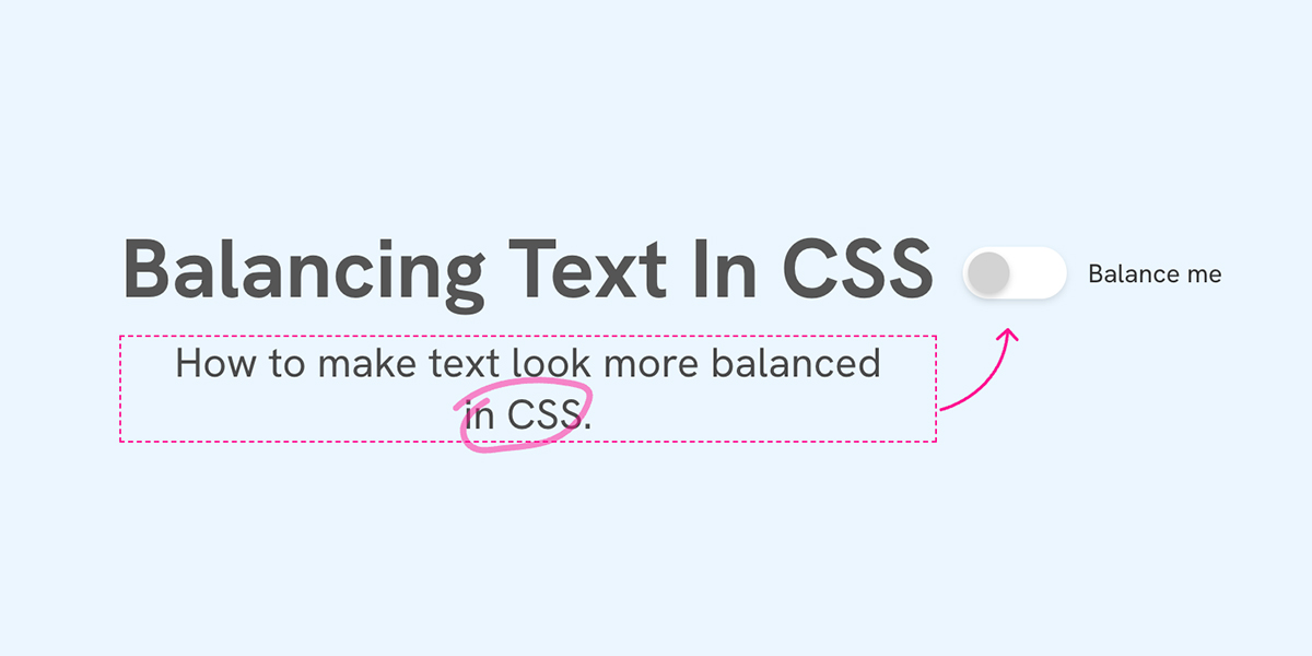
Text wrapping
We can also use text-wrap: pretty to make the titles more balanced. I avoid using balance because it’s too much balancing.
Toggle the text wrap and see what happens to the titles.
New Study Reveals Benefits of Morning Exercise
By Michael Chen
Tech Companies Announce Major AI Breakthrough
By Emily Rodriguez
Health Officials Urge Caution as Heat Wave Intensifies
A new study finds that late-night screen time is linked to sleep problems.
By Sarah Johnson
Another layout variation
I noticed that Time.com has another layout. The featured article is taking the full width, but what’s interesting here is that the other two articles are placed just under the featured content.
Time.com did that with a similar HTML structure.
<div class="layout">
  <div class="featured-content"></div>
  <div class="featured-thumb"></div>
  <div class="article-1"></div>
  <div class="article-2"></div>
</div>
While that works, it doesn’t look good to me because the HTML structure is based on the design, not the content.
How can we do that in CSS?
Here is my plan:
- Use CSS grid areas to define the layout I want
- Ungroup the featured article into: content and thumbnail
- Ungroup the normal articles
- Position each element into its designated area
.layout {
  /* 1. Define the grid areas */
  grid-template-columns: 1fr 1fr 1fr 1fr;
  grid-template-areas:
    "featured-content featured-content featured-thumb featured-thumb"
    "item-1 item-2 featured-thumb featured-thumb";

  /* 2. Ungroup the featured article */
  > .layoutItem {
    --featured: true;
    display: contents;

    /* 3. Ungroup the content and thumbnail */
    .card {
      display: contents;
    }
  }
}
Now that the featured article and its container are ungrouped, we can position each element in its designated area.
/* 4. Ungroup & position the normal articles */
.layoutGroup {
  display: contents;

  .layoutItem:nth-of-type(1) {
    grid-area: item-1;
  }

  .layoutItem:nth-of-type(2) {
    grid-area: item-2;
  }
}
Here is the result.
New Study Reveals Benefits of Morning Exercise
By Michael Chen
Tech Companies Announce Major AI Breakthrough
By Emily Rodriguez
Health Officials Urge Caution as Heat Wave Intensifies
A new study finds that late-night screen time is linked to sleep problems.
By Sarah Johnson
Only the Start
In this article, I went through a layout that looks simple at first, and took it further to make it more dynamic with CSS. Having this flexibility is a game-changer as it will allow you to build fluid and conditional layouts, with less CSS.
For example, being able to combine CSS :has() and grid-area is a powerful combination! Add container querie to it, and magic will happen.
Building layouts can be a challenging task, specially if you don’t know the core basics of CSS. You don’t have to worry about that anymore. I’m building a complete CSS course, and I called it, The Layout Maestro.
It’s a fully interactive course that explains modern CSS layout. This very article that you just read is just a small taste of what the course will offer. If you are interested, you can sign up below for updates.

Thank you for reading.