The Layout Maestro
A message from the author!
While building websites, there are many cases where we want to make sure if a design component will work under different conditions. The just in case mindset aims to educate designers and developers to think ahead of time of some possible failure scenarios for a component. I called it just in case because that’s literally what it means. Just in case the title got longer, do this. Just in case this element has a sibling next to it, do that. It’s all about accounting for some edge cases.
In this article, I will discuss some common design use-cases, and how to handle them just in case the content got longer or different than what’s expected. You’re in for a treat, let’s dive in!
Learning The “Just In Case” Mindset
The whole concept of Just in case is all about accounting for the unknown. Following this mindset will at least reduce the issues you might encounter. The difference between a bad and a good use-case might be one line of CSS. In the following examples, I will show how you can easily implement such good practices.
Use Cases
Title and Icon
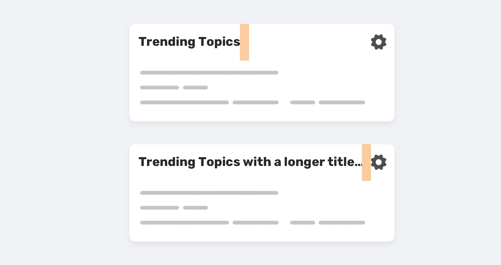
For this component, the title can be one word or multiple ones. To avoid the title being stuck to the icon on the right, it’s better to add margin-right: 1rem, just in case the title got longer.
Buttons
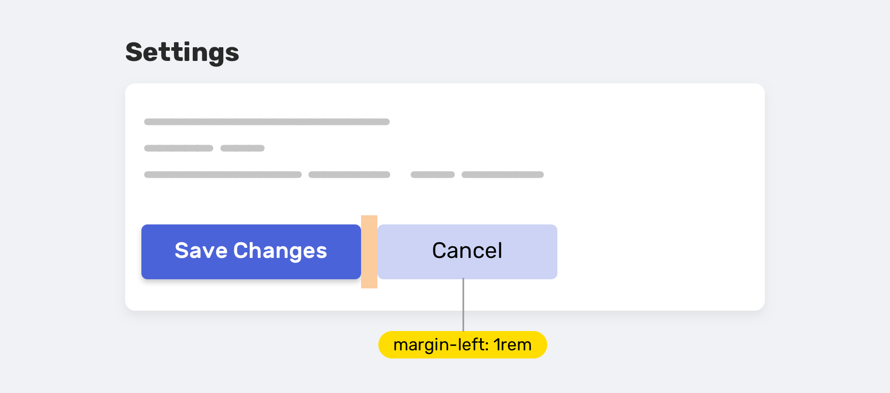
There are cases where you need to have two buttons, side by side. How can we account for that case, without adding margin to a button by default?
Thanks to the adjacent-sibling combinator, this is easy to do. It’s saying: “If a button is next to another button, add a left margin to the second one, just in case”.
.button + .button {
  margin-left: 1rem;
}
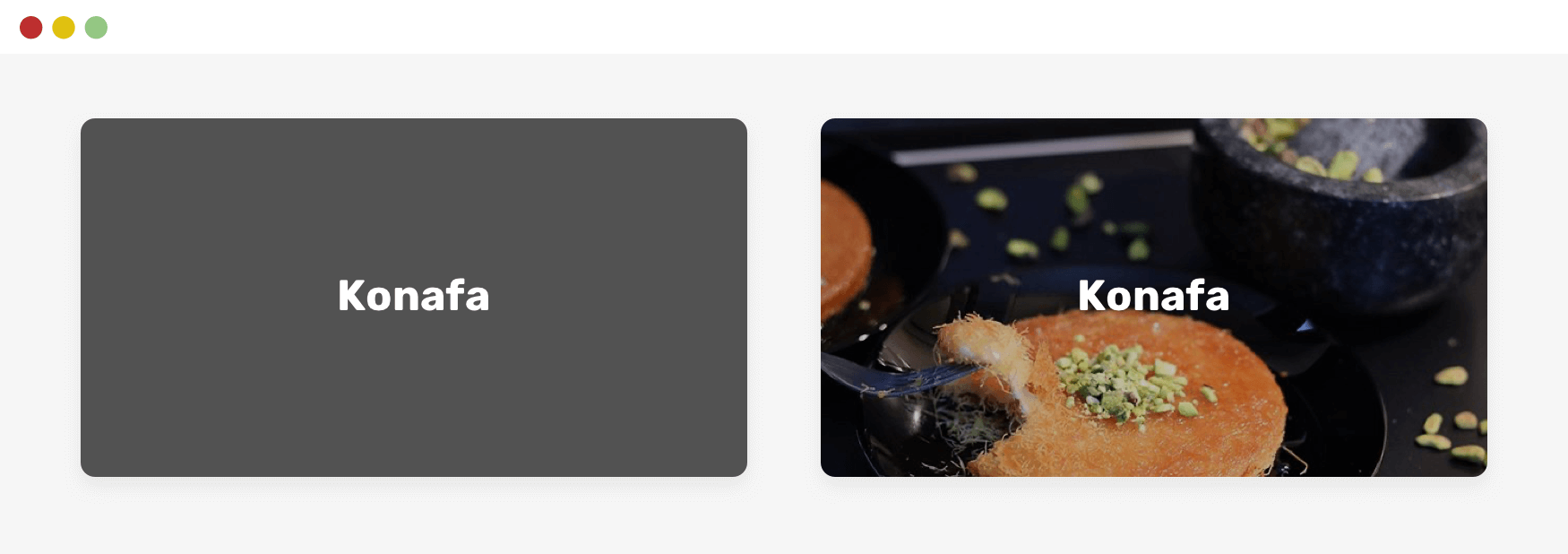
Category Tag
For a card component, you might need a category tag for it. How you will handle the different variations of content? Consider the following figure.
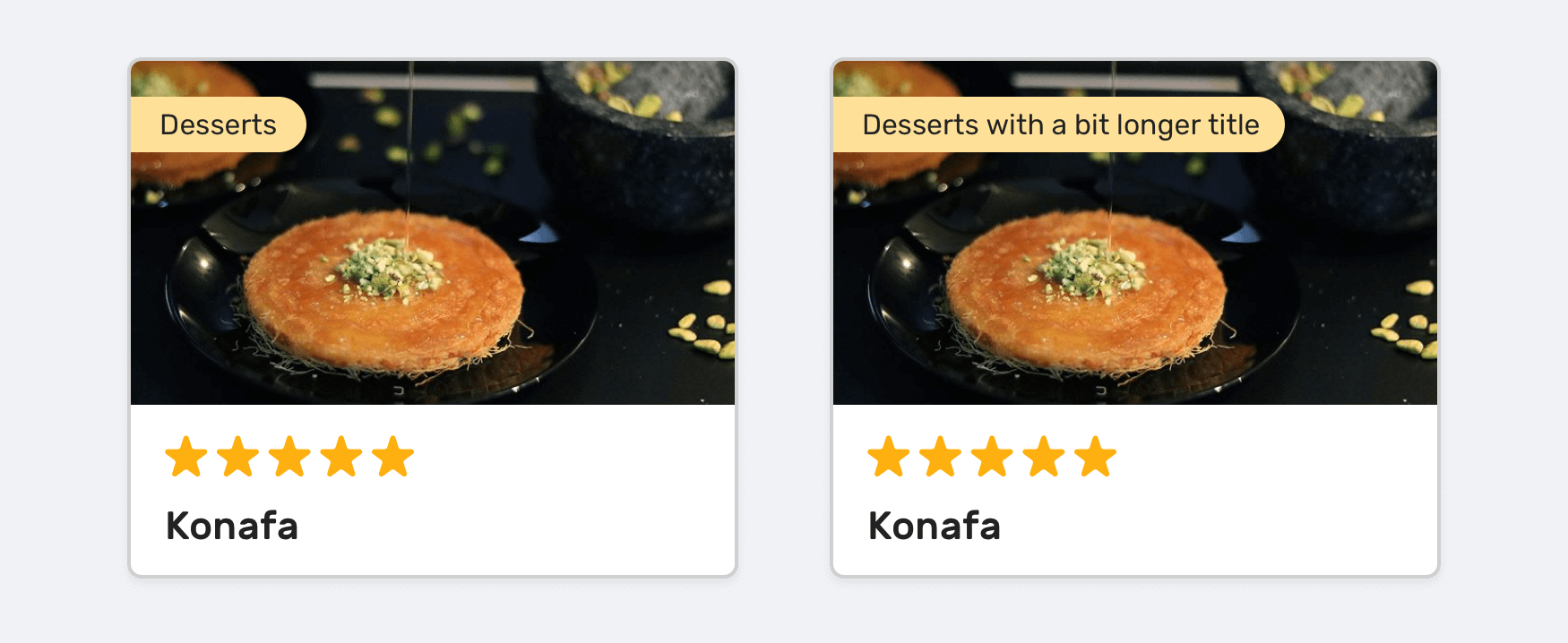
The right card has a long title, and that doesn’t look good as it covers a big part of the thumbnail. For food websites, imagery is very important.
Here are some possible solutions, just in case the tag label became longer.
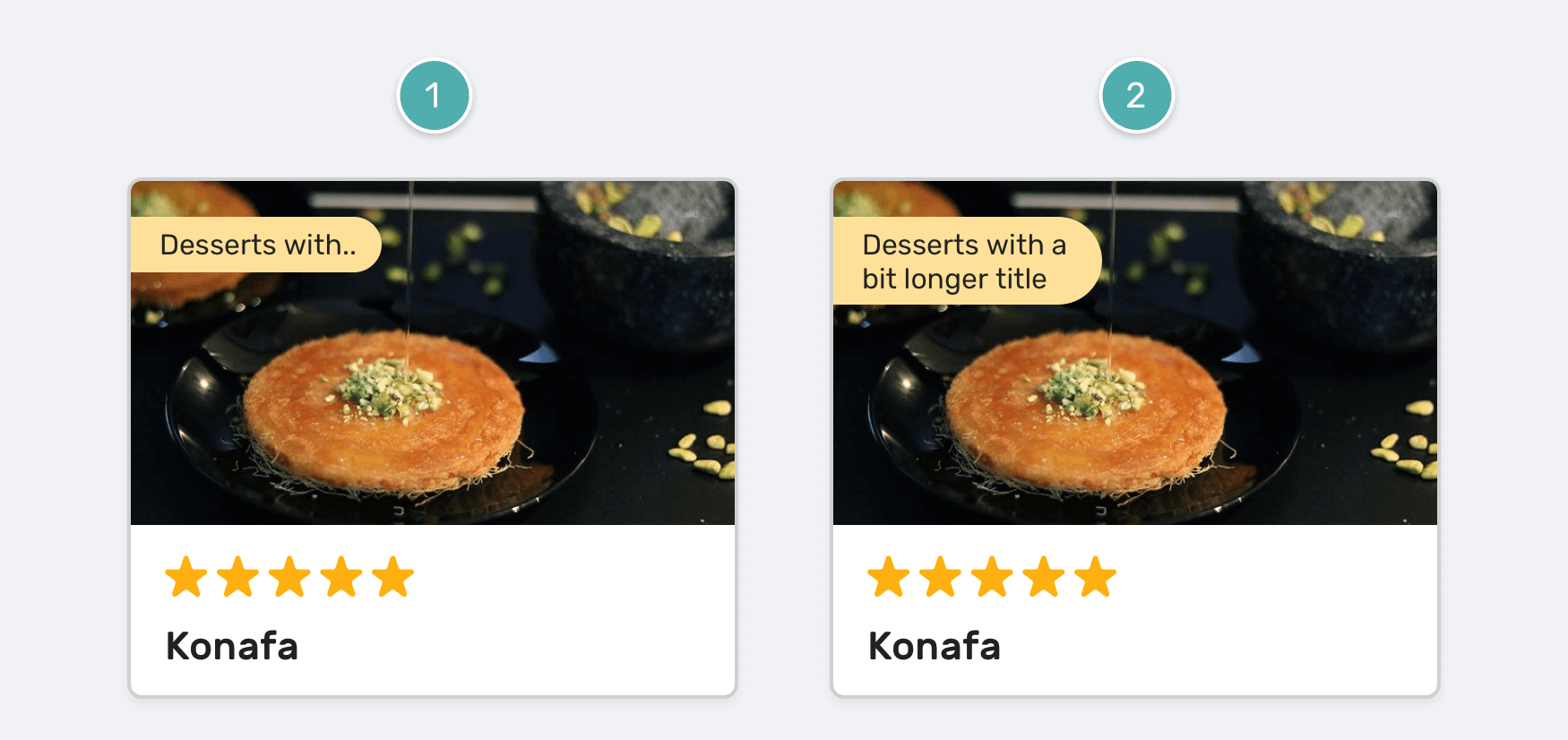
The first solution is using the text truncation technique, with a max-width in CSS. The second one is only using max-width, but it can fail in case the tag has a really long text.
.tag {
  max-width: 6.25rem;
  text-overflow: ellipsis;
  overflow: hidden;
  white-space: nowrap;
}
Scrollable Element
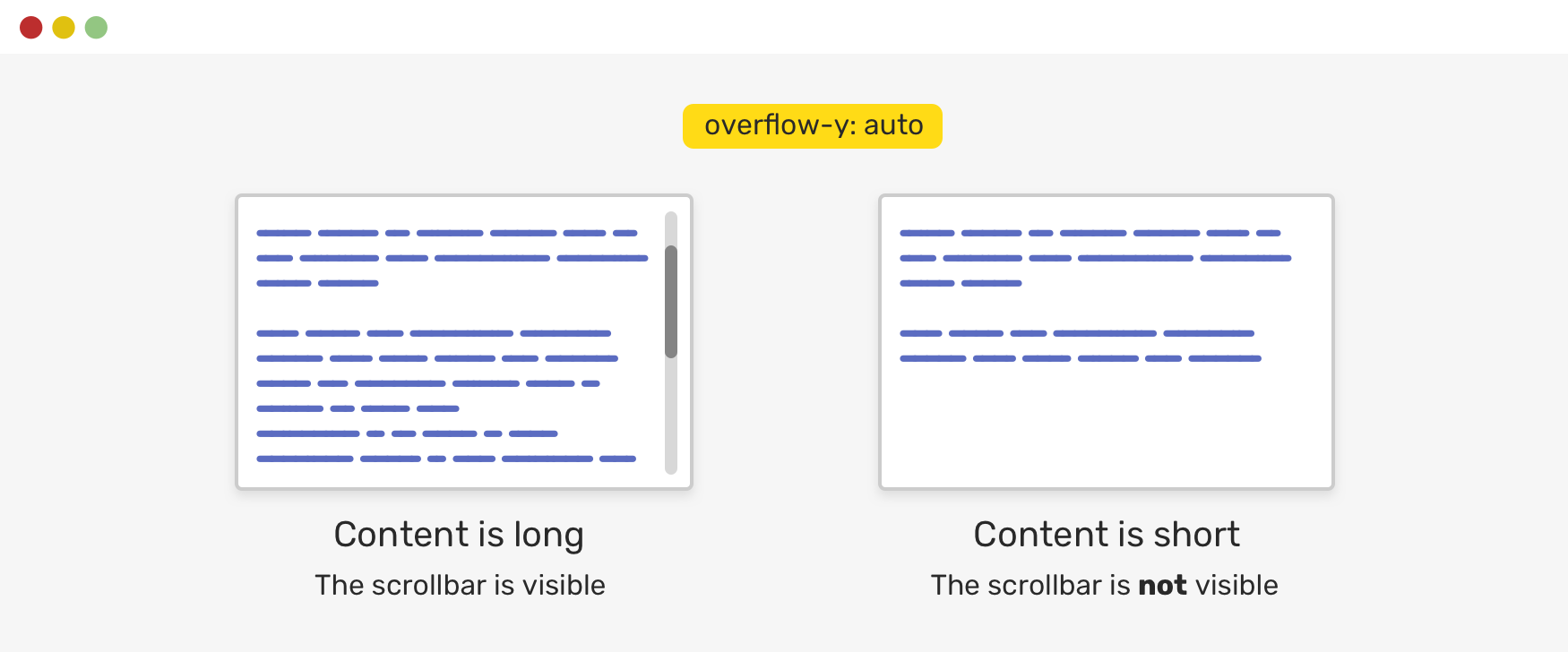
When you need to make an element scrollable, it might be tempting to do the following:
.element {
  height: 20rem;
  overflow-y: scroll;
}
The problem with this approach is that it will always show the scrollbar, even if the content is not long enough to be scrolled. What’s better is to use the auto keyword. That way, it can pass the just in case concept.
.element {
  height: 20rem;
  overflow-y: auto;
}
HTML Image Fallback
In cases where you are using an <img> as a background for a hero section, it could fail to load for some reason. In that case, what if there was a fallback?
img {
  background-color: #525252;
}
Just in case the image failed to load, the background-color will work as a fallback.
Avatar Image
This is a very common use-case where an avatar might look stretched or compressed.
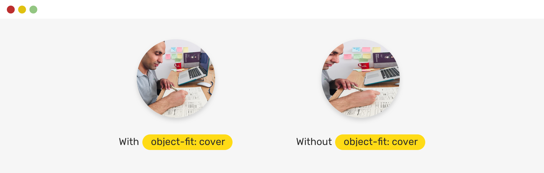
It can be avoided by using object-fit: cover. It will act as a just in case thingy. Without it, the image will look bad.
Conclusion
As you just saw, all of the examples account for specific use-cases where content goes beyond what’s expected. Make sure to incorporate the just in case mindset in your work. Do you have a comment or a suggestion? Please feel free to ping me on @shadeed9.
Thank you for reading.
I’m writing an ebook
In that regard, I’m excited to let you know that I’m writing an ebook about Debugging CSS.
If you’re interested, head over to debuggingcss.com and subscribe for updates about the book.
