
Intro
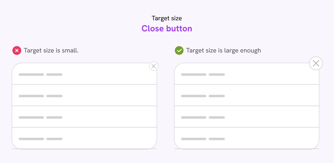
As a user, you need to interact with clickable UI elements like buttons, links, cards, and more.
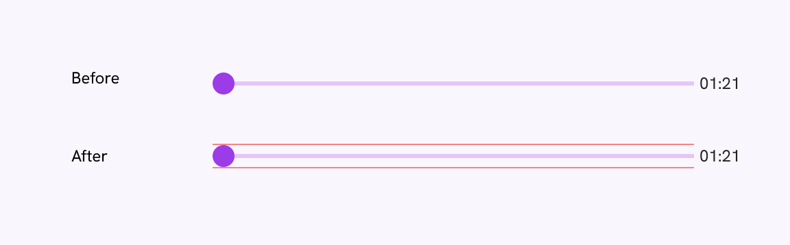
If an action has a small target size, it will be harder for the user to click, or they might click an adjacent action element by mistake.
Let’s take a look at the following example.
Try to hover on an item ☝️
Notice the small target size? We can address this by increasing the target size.
When the target size is increased, it becomes easier for a user to click and interact with an element.
Hover over the menu and toggle the checkbox to observe the difference between small and large target sizes.
What is a target size?
The specific region within a user interface element where a user clicks, touches, or taps to trigger an action.
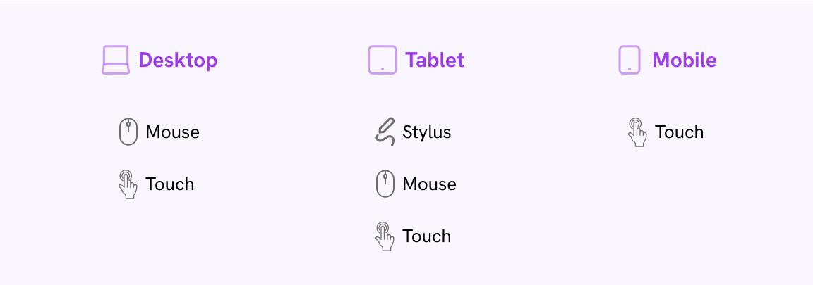
Today, users interact with a UI in various ways; it’s not solely about clicking an element with a mouse.
Below is a table illustrating how multiple input types can function on the same device.
That thing caused to have many names for the topic:
- Apple calls it a hit target
- Google Material calls it a Touch target
- WAI call it a target size
- Google Lighthouse test call it a Tap target
- Clickable area: used in the design community
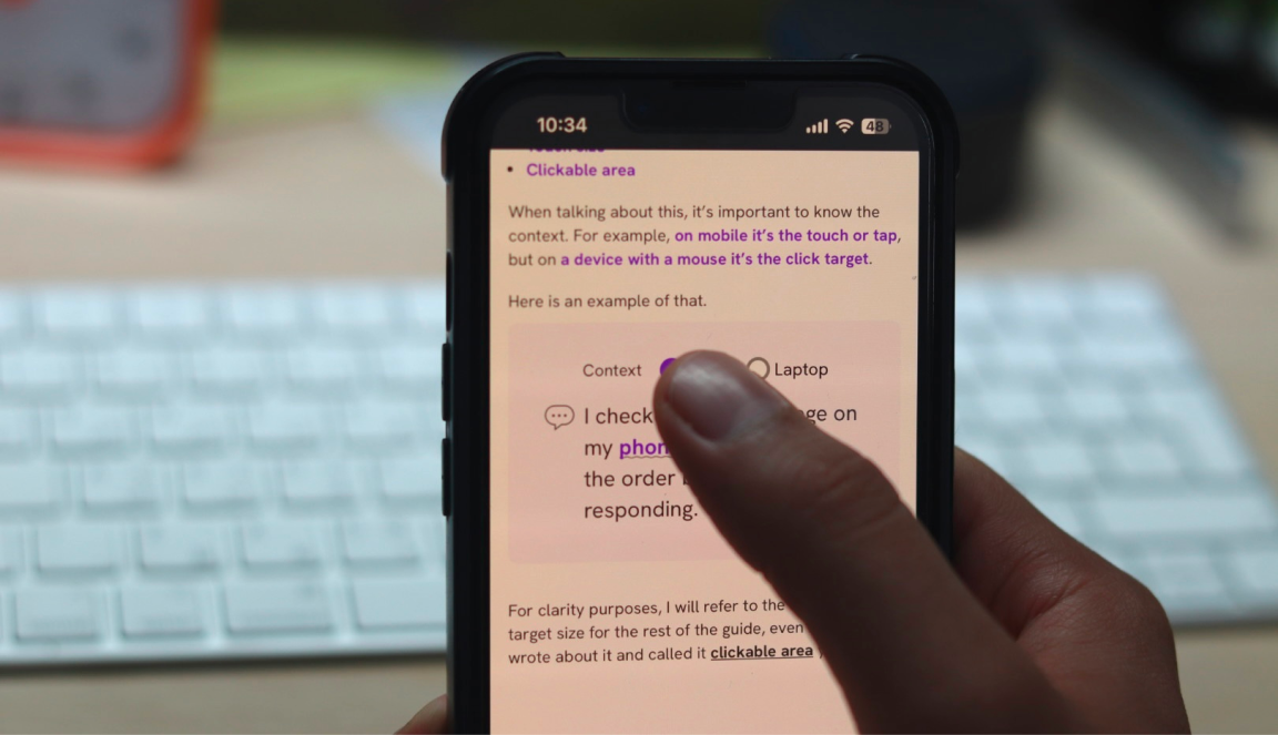
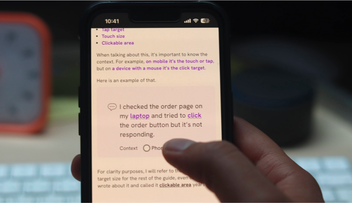
When talking about this, it’s important to know the context. For example, on mobile it’s the touch or tap, but on a device with a mouse it’s the click target.
Here is an example of that.
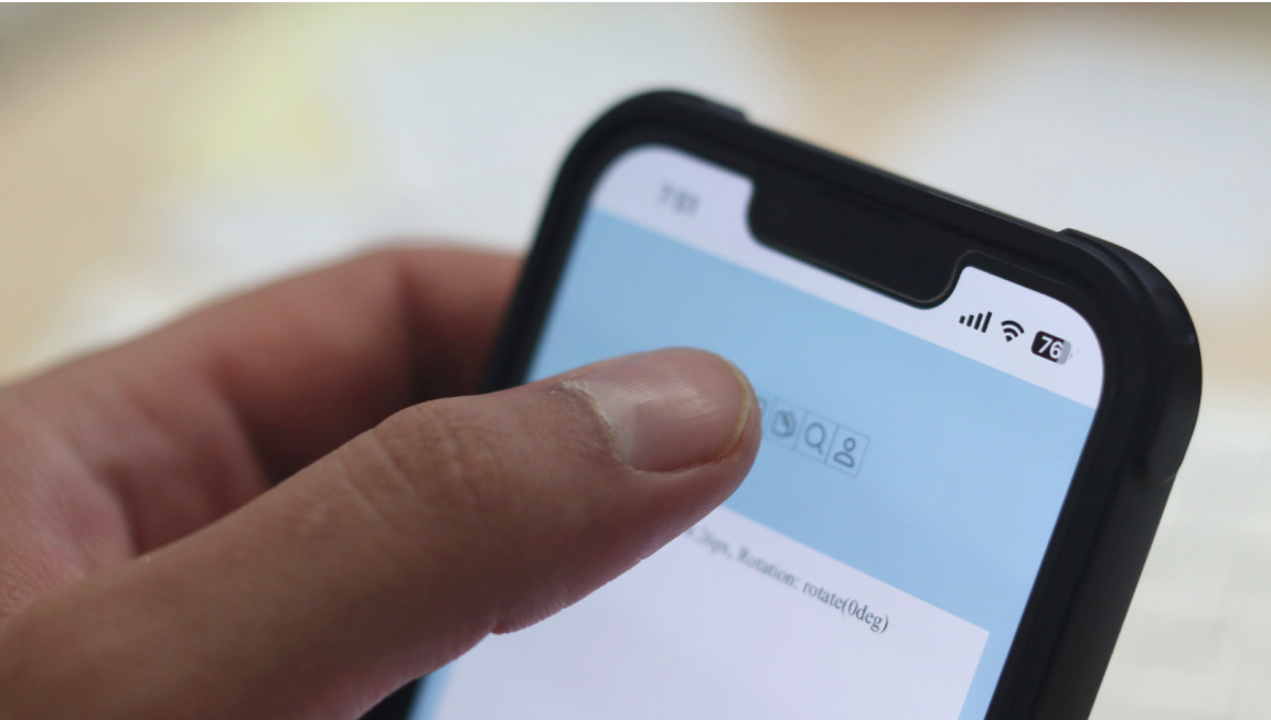
I checked the order page on my phone and tried to tap the order button but it’s not responding.
For clarity purposes, I will refer to the concept as target size for the rest of the guide, even though I wrote about it and called it clickable area years ago.
Inclusive target size
Minimum target size
According to the WCAG 2.5.5, Target Size (Enhanced) (Level AAA) guidelines, the target size must at least be 44 by 44 CSS pixels.
Let’s take the following example. We have a mobile menu. The size of the icon is 24 by 24 pixels.
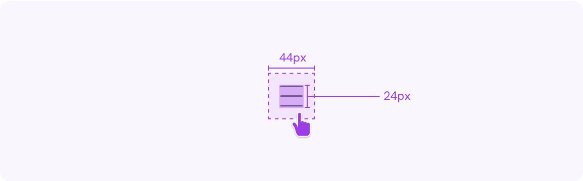
The target size is 44 by 44 pixels. This is the area where the user can hover or tap.
The recommended size differs from one platform to another. For example, Material for Android recommends a 48 by 48 pixels target size.
As per the WCAG 2.5.8, Target Size (Minimum) (Level AA), for a target size to pass, it should have a minimum of 24 by 24-pixel target size and it shouldn’t overlap with other targets.
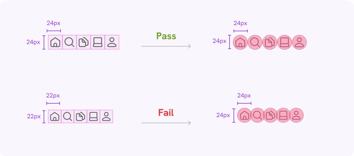
Notice when the target size is less than 24 by 24 pixels, the circles overlap.
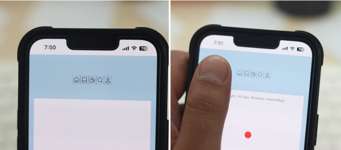
Left: the actions compared to the screen size. Right: the actions compared to my thumb finger.
A side view of how my thumb covers 2-3 icons at a time.
My recommendation is to have a target with a minimum size of 44 by 44 pixels, at least. This is per the WCAG 2.5.5.
As per Google Design for Driving guidelines, the minimum touch target size is 76dp * 76dp.
While driving a car, you have a very short time to tap something, so it should be large enough. This feels related to Fitts’s Law (below), where the size of a target should be larger if the time to tap is short.
Android Auto UI that shows the target sizes. Source
It’s beneficial to have specific rules, but it doesn’t mean they should be followed blindly. It’s crucial to consistently test the UI targets.
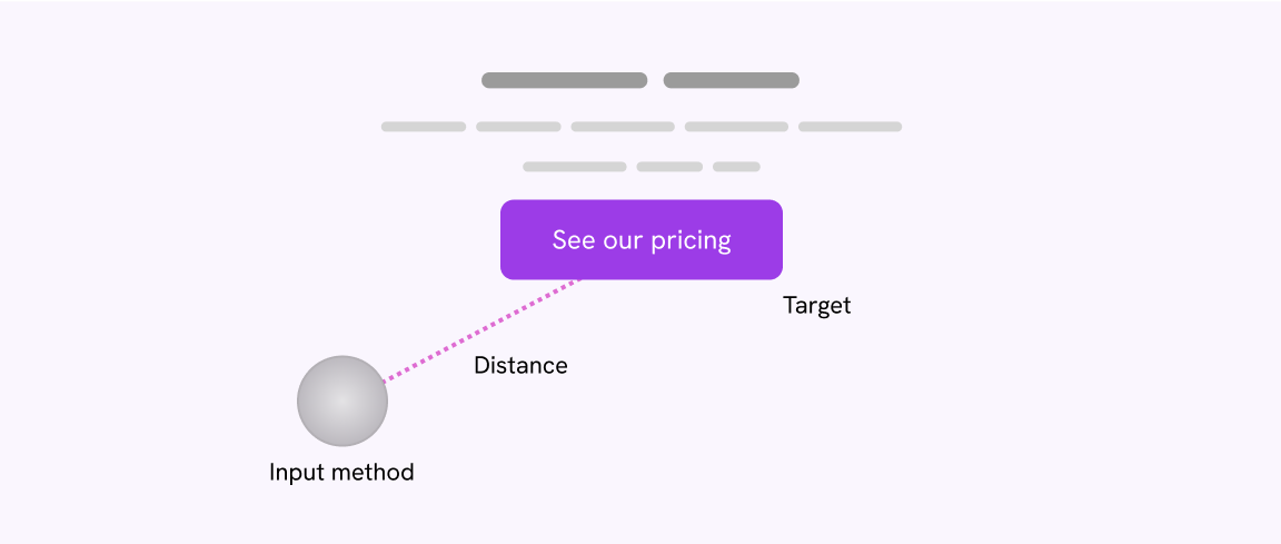
Applying Fitts’s Law
It's a principle that says it's faster to click or touch bigger objects that are closer to you.
From a UI perspective, that means the bigger a call to action, the better for the user.
In the following example, notice how much the distance between the input method and the button.
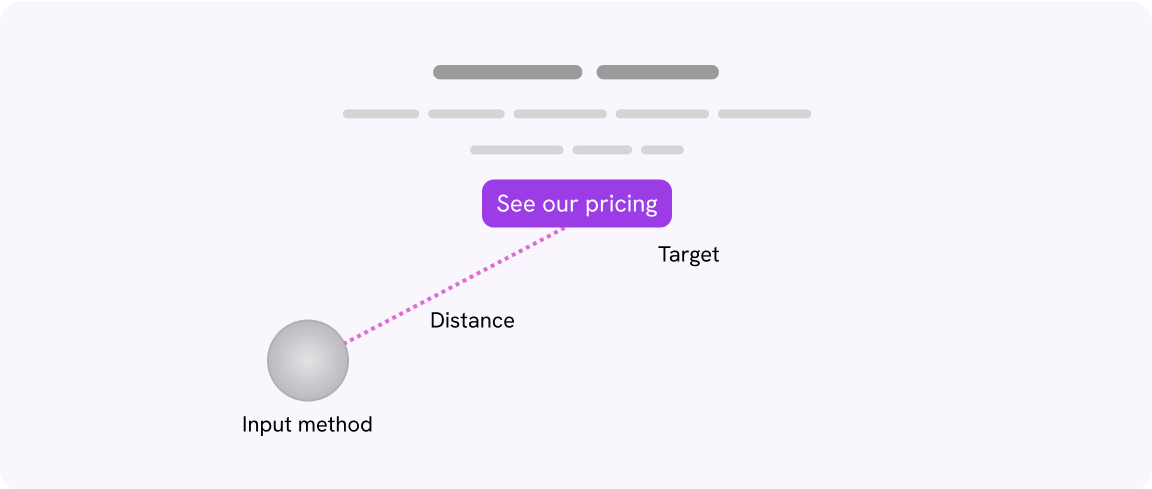
With a larger button, the distance and time required for both the initial and final movements decrease.
What are the initial and final movements? As per Wikipedia:
- Initial movement: a fast but imprecise movement towards the target.
- Final movement: slower but more precise movement to tap or click the target.
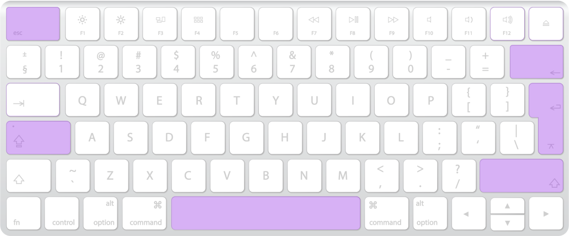
We can compare this to a real-life case. Imagine a physical keyboard. The buttons that need to be used the most (Enter, Esc, Space, Shift) are larger and closer to the user’s fingers than the rest of the buttons.
Or even better, we can see that in action. In the previous section, I mentioned how the target sizes should be larger for car UIs, and how how that is somehow related to Fitts’s law.
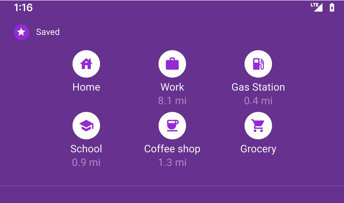
Home
Coffee
Toggle between the options and see how the target size changes.
Spacing around the targets
Make sure that the spacing between each target is enough and prevent clicking or tapping a target by mistake.
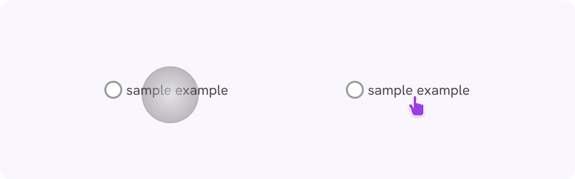
Consider the following example. We have three buttons, and the target size for each of them is 44 by 44 pixels.

When the user tries to tap an action on mobile, the average thumb size is large, thus might result in tapping an action item by mistake.
In the following figure, the circle represents a thumb. Notice how it touches two target items.

According to a study by the MIT Touch Lab of human fingertips, the average size of the index finger is 1.6 to 2 cm, which translates to a width of 45 - 57 pixels.
To apply that, we need to increase the spacing between the items.

Now it’s less likely that the user will tap a target by mistake.
Visual target feedback
When hovering over or tapping a target, displaying visual feedback is beneficial, as it enhances the time to action.
This is useful for elements without clear boundaries. For example, a link or an icon-only button.
Try to hover over one of the buttons below.
Adding visual feedback sets expectations for the user. It’s like a hint that lets them know the target area boundaries.
Here is another example of a menu.
Multi-input sources
A target size that works well with a mouse might be hard to tap on mobile. Make sure the target size is big enough.
An example of that would be to compare how clicking a target with a mouse versus tapping with a finger.
In this example, the radio button is small compared to the user’s finger, but it’s almost the same size as the computer pointer. The idea here is to make sure a target size works with multiple input sources.
What to consider
Touch size differs based on finger size
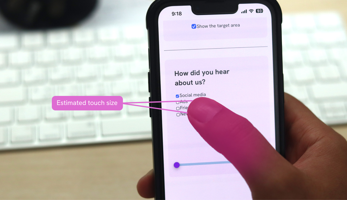
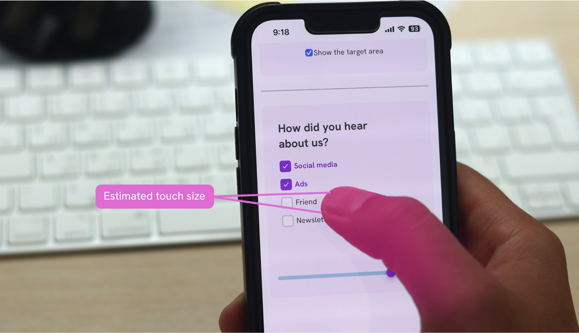
There is a common term which is “fat finger problem”. It means that the user’s finger is too big to accurately tap on the touch targers. In this case, I can blame the small touch targets only.
To demonstrate that, I made the following interactive playground that helps in visualizing your finger touch size.
Please note that the following demo works on mobile only. Not on mobile, no problem! See the video tab.
I used the snippet shown on the MDN website. While this might not be perfect, at least it’s useful to demonstrate the concept.
We need to get the radiusX and radiusY, then multiply them by 2.
box.addEventListener("touchstart", getTouchSize)
function getTouchSize(e) {
const touch = e.changedTouches.item(0)
elm.style.width = `${touch.radiusX * 2}px`
elm.style.height = `${touch.radiusY * 2}px`
}
We can take this further and show what the target size looks like on your phone. Once you tap on the cross area, the UI will get your finger size and append it to the question.
Notice how the target size is compared to the radio button.
Interesting, right?
Touch size differs based on the touch angle
It’s important to keep in mind that the user might use the touch in two different ways:
- Touch with fingertip
- Touch with the finger pad
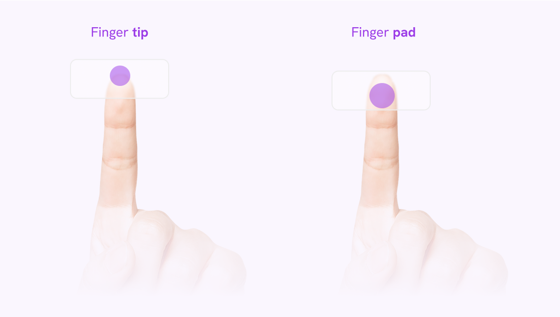
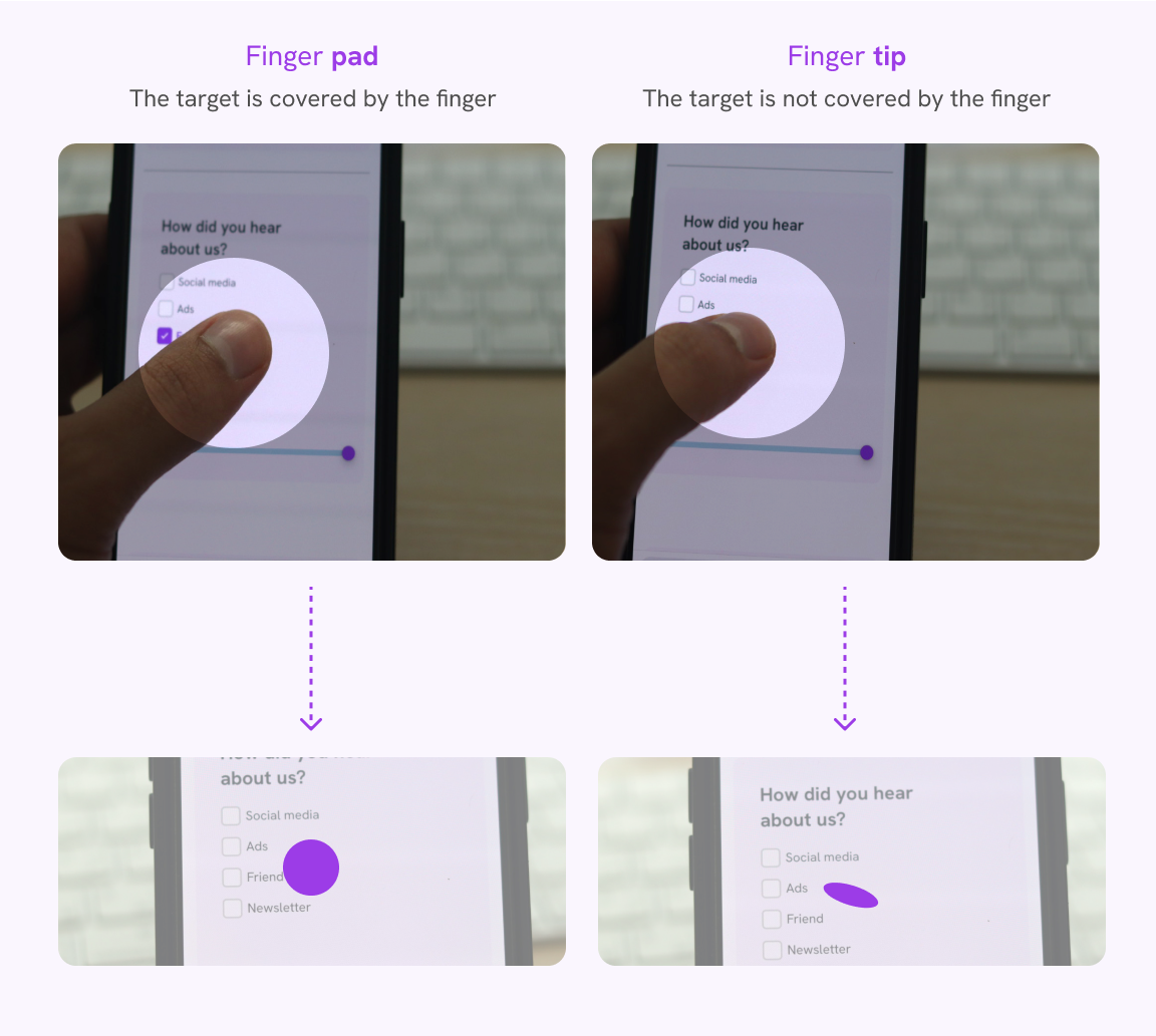
Fingertip
When using the fingertip, the finger is titled with an angle.
Finger pad
When using the finger pad, the finger isn’t tilted, but this can increase the issue of the target being hidden while the user’s finger is above it.
In the following illustration, notice how the search icon is still visible when the user is using their fingertip.
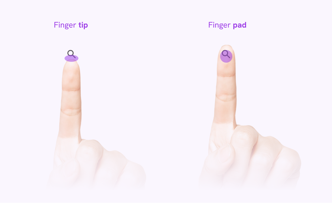
Small touch targets make users work harder because they require more accuracy to hit. Users need to reorient their finger, from finger pad to fingertip, to hit the target with clear visual feedback. Using the finger pad would cover the entire target, making it impossible for users to see the target they're trying to hit.
The touch with the finger pad is often at an angle, which makes it shape like an oval. The touch with the finger pad is larger but often hides the target you’re tapping.
Here is a figure that shows a comparison.
Small touch sizes are hard to use in shaking environments
When a user is trying to tap a small target size, it isn’t that they are sitting in a perfect environment and just staring at the screen. People are busy and they want to achieve their goals fast.
In the following interactive demo, I tried to simulate how a shaking environment makes using a small target much harder.
- Turn on the “Stimulate shaking” toggle.
- Try to select one of the icons.
⚠️ Motion warning: this example may affect people with visual sensitivities.
Try to tap on one of the navigation items
This is how it feels to navigate small target areas with a shaking device. Not cool, right?
A simulation of how a mobile can shake in situation like being in public transportation, or driving on bumpy roads.
It’s annoying, isn’t it? I hope the demo gave you the vibes of when you tap something by mistake.
Using touch with the fingers covered
A user might wear a glove in the winter and is trying to tab on a UI. This is a common and expected thing. In this case, if the target sizes are small and close to each other, the user will find a hard time trying to tap on an item.
Here is a mocked comparison between the natural touch and the touch with gloves. Notice that it got slightly bigger with gloves. This is important to take into consideration.
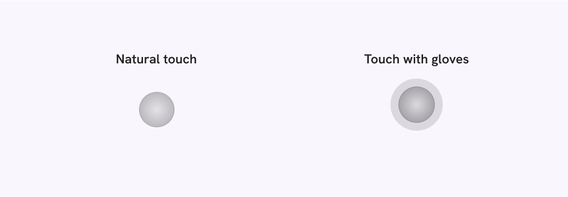
In the following example, try to switch the context between “Natural touch” or “Touch with gloves” and notice how it becomes harder to select a target.
This is similar to what a user with gloves on experience.
Try to tap on one of the navigation items
This is a demo that shows the size of your finger when wearing a glove.
The touch size interferes with the two actions.
Spacing
There are exceptions for a target size like inline elements or when there is a small target but it has a large spacing around it.
According to the WCAG 2.58:
Undersized targets (those less than 24 by 24 CSS pixels) are positioned so that if a 24 CSS pixel diameter circle is centered on the bounding box of each, the circles do not intersect another target or the circle for another undersized target;
Links
For example, a link that is part of a paragraph is excluded from the target size recommendations.
See the following example.
As per this article, it's recommended to stay calm at all times.
The target size for the link is the same as the line height. No need to make it larger.
However, that doesn’t mean we shouldn’t care about links. It’s equally important to a regular target area.
Don’t do this. The line height is too small.
As per this article, it’s recommended to keep calm at all times. If you need help, feel free to get in touch for an appointment.
It can get worse if there are multiple links in the same paragraph:
Don’t do this. The line height is too small.
As per this article, it’s recommended to keep calm at all times. If you need help, feel free to get in touch for an appointment.
Instead, we should increase the line height in CSS:
p {
  line-height: 1.4;
}
As per this article, it’s recommended to keep calm at all times. If you need help, feel free to get in touch for an appointment.
More spacing for small targets
If there are multiple actions on mobile and their size is 48px or less, then it makes sense to have more spacing between them.
If the spacing is small, then the small targets will fail. Here is a figure on how they will look like.
I have a real-life example that is very convincing. In Instagram, the comment’s like button is very small, but it works well because the spacing around it is large enough.
See the following figure:
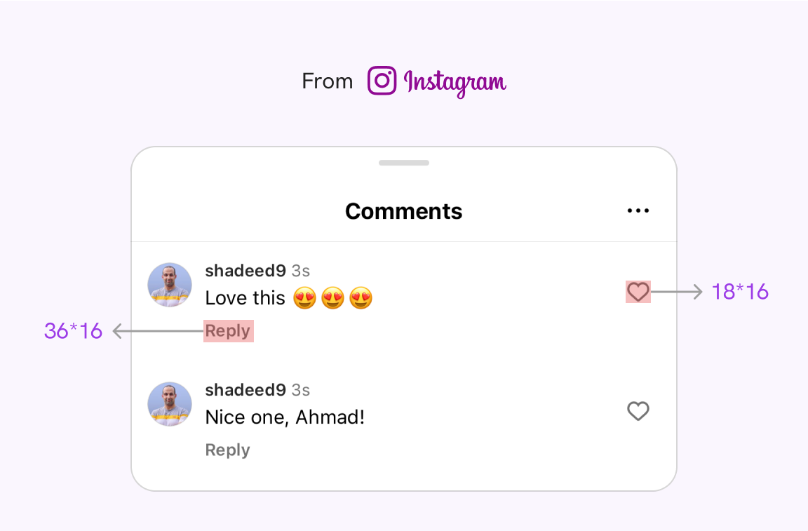
The target sizes are below the minimum, but they work very well because the surrounding space is large enough.
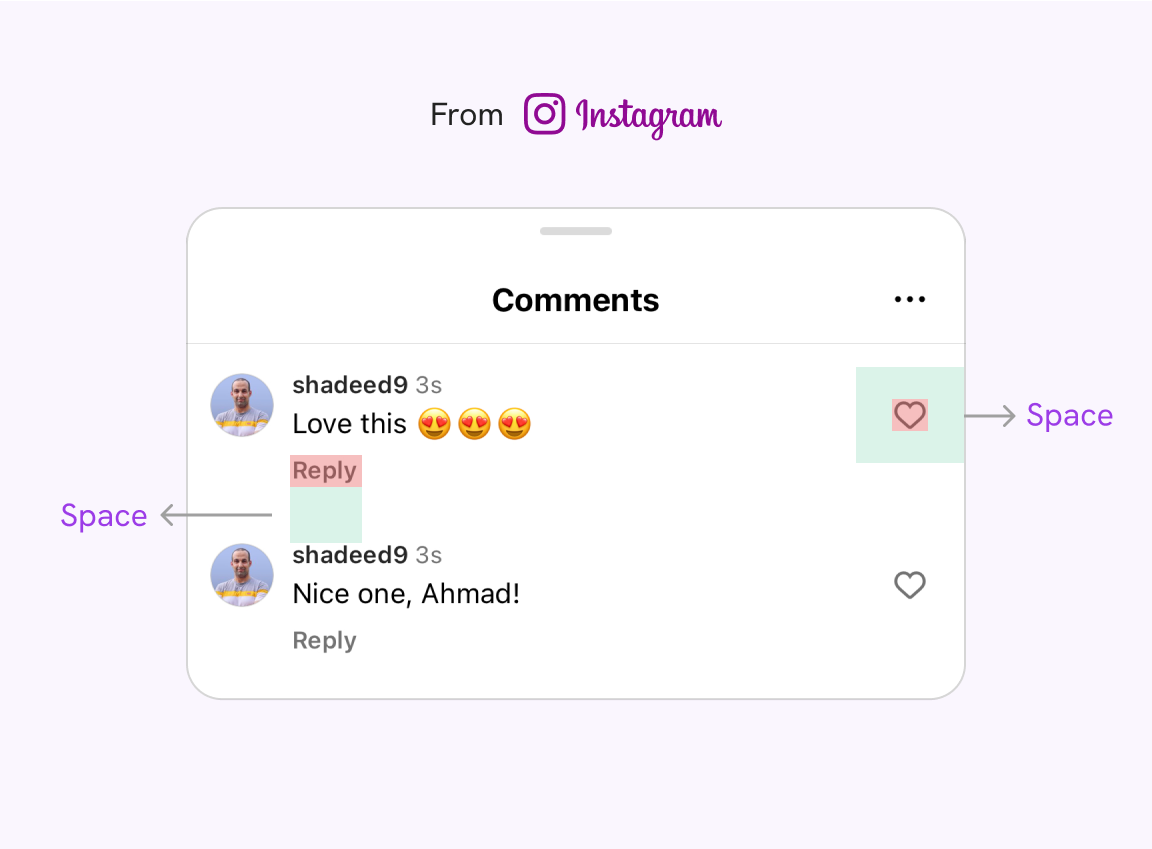
See the following figure for the highlighted space. The green highlight is just the space around the target.
Less spacing for large targets
In the following examples, the spacing between the targets is zero, but due to their large size, it’s fine to have less or no spacing at all.
Target size that grows with the system font size
I did a test on Apple iOS to see if the system icons grow when I change the font size from the accessibility settings, and it did. If the user wants a bigger font, then the target size should grow proportionally for that.
It’s not like we should do that for all apps, but it makes sense to think about it.
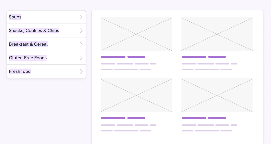
Target size examples
As a front-end developer, it’s important to know the techniques to build an accessible target size.
Let’s explore that in the following examples.
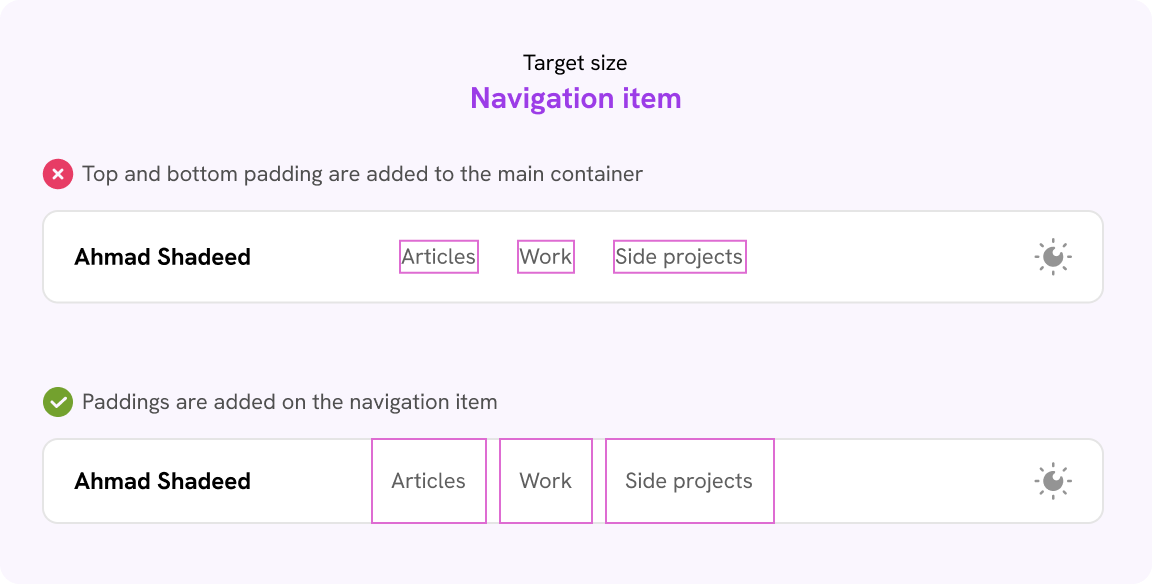
Website navigation
In this example, try to hover over a navigation item.
Notice how the clickable area is small? That happened because that spacing is added to the outer container, not the link itself.
Let’s take a look at the CSS.
.nav {
  display: flex;
  gap: 1.5rem;
  padding-top: 0.75rem;
  padding-bottom: 0.75rem;
}
Notice that there is a:
- Gap between each nav item
- Vertical padding on the parent
This isn’t good. We need to remove both and use padding on the individual navigation item.
.nav {
display: flex;
}
.nav__item a {
padding: 0.75rem 1rem;
}
Hover over a navigation item to see the difference.
Dropdown toggle
In this example, the target size is only on the label, not the whole menu container.
Try to hover on a menu ☝️
The target area is only on the text, and it’s trimmed. To fix that, we need to expand the target area of the whole container.
I added the padding to the <select> menu itself, instead of the outer wrapper.
.dropdown__content {
  padding: 1.5rem 0.5rem;
}
Here is the enhanced example.
Better, right?
It’s just about adding the padding to the appropriate HTML element.
Navigation bar
Here is an example where we have a bottom navigation for a website. Try to hover over an item to see its boundaries.
Try to tap on one of the navigation items
This is a demo that shows the size of your finger when wearing a glove.
Try to hover on an item ☝️
Notice how the boundaries are small, compared to the space around the item itself.
We can fix that in CSS by forcing each navigation item to fill the available width. To do that, we need to apply flex: 1 on the navigation item.
.nav {
display: flex;
}
.nav__item {
flex: 1;
}
Try to tap on one of the navigation items
This is a demo that shows the size of your finger when wearing a glove.
Much better now.
Icon buttons
Another example where having a large target size is important is an icon button.
As a designer, you might need to use an icon only due to cases like not having enough space, for example, or if the icon is too common.
In the following demo, try to hover over one of the icons and notice how the thumb size overlaps between them. For larger thumbs, the probability of tapping by mistake is high.
CSS is awesome
To fix that, we need to do the following:
- Increase the spacing between the two buttons
- Increase the target size area
.header-actions {
display: flex;
gap: 1rem;
}
.action__item {
padding: 1rem;
}
CSS is awesome
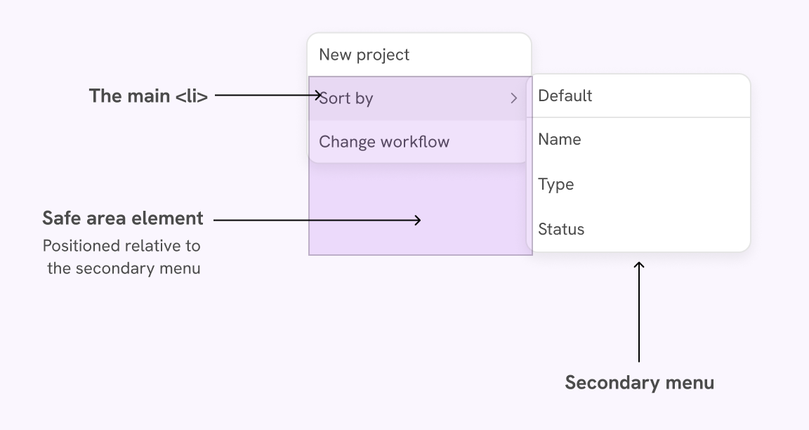
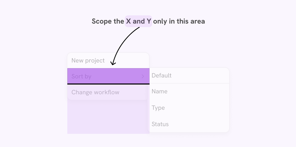
Safe triangle target areas
It’s common to find multi-level menus on large websites like e-commerce apps, for example. Oftentimes, I find it hard to select an item from a multi-level menu, because the target area for the secondary menu is small.
Let’s take the following example.
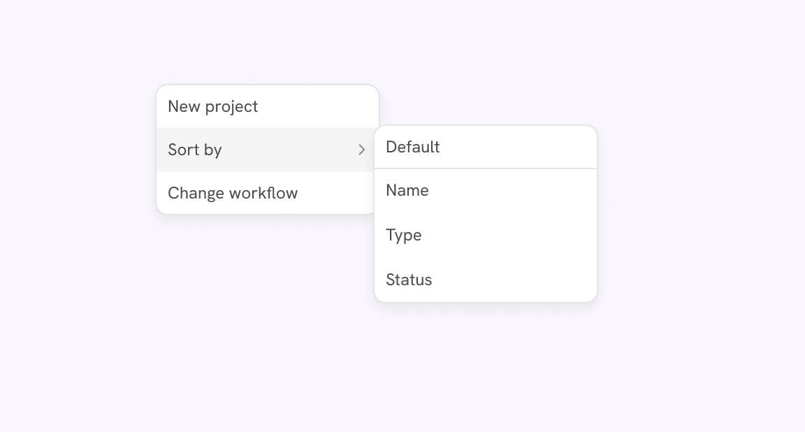
Try to hover over any of the menu items with an arrow. Notice how the secondary menu appears only when you hover on its parent. If the mouse goes out of that area, the secondary menu will disappear.
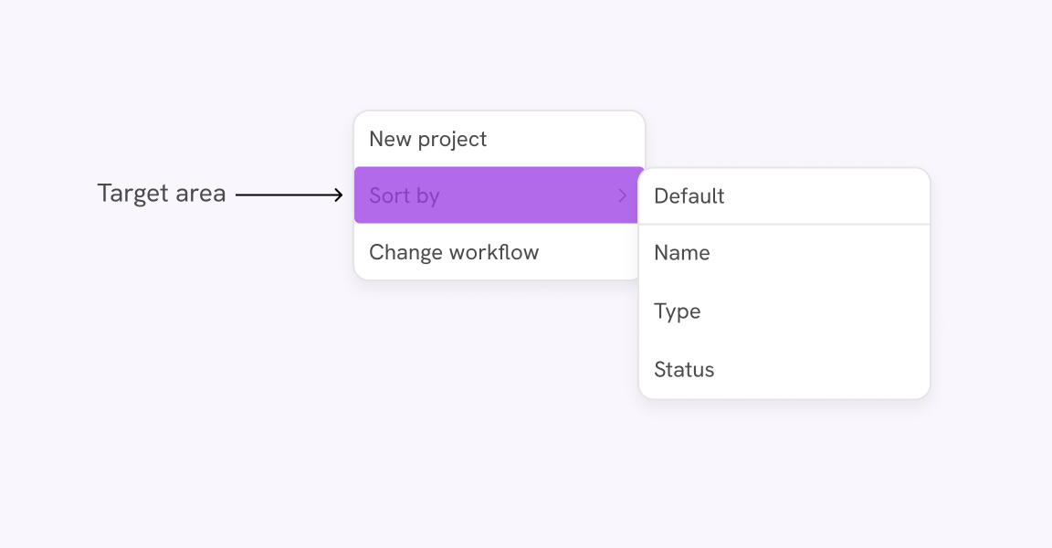
To fix that, we need to follow the safe triangle method that was seen first on Amazon.
The idea is that instead of the highlighted target area, there will be a triangle attached to the sub-menu that will create a larger target size.
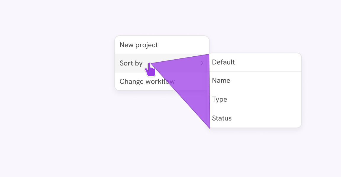
How does that work in code? Let’s break this down.
- The submenu has a rectangle that is attached to it.
- That rectangle has clip-path, and the visible part of it is the triangle.
- Any area outside the triangle won’t receive pointer events due to its being clipped.
The problem
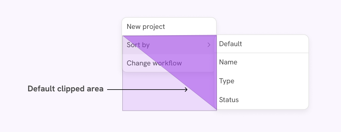
We will use clip-path to create a triangle from the safe area element. That means we will need three points.
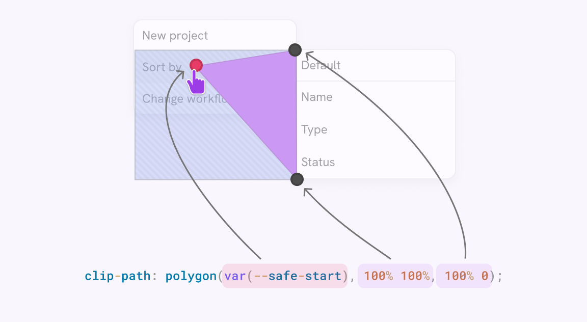
The point that is close to the hand cursor is the dynamic one that we need to get. The other two points are static.
.safeAreaElement {
  clip-path: polygon(var(--safe-start), 100% 100%, 100% 0);
}
The solution
The markup for this UI is as follows. We have a list item that contains a secondary menu. I wrote this in React, that’s why there are className and ref={}.
<li className="hasSub">
  Sort by
  <div className="subMenu">
    <ul>
      <li>Default</li>
      <li>Name</li>
      <li>Type</li>
      <li>Status</li>
    </ul>
    <span className="safeAreaElement" ref="{submenuSafeAreaRef}">
    </span>
  </div>
</li>
In CSS, I did the following:
- Added
position: absoluteto position the secondary menu to the right of its parent<li>item. - Positioned the safe area element on the opposite side of the secondary menu.
- Added a default value of
clip-path.
.hasSub {
position: relative;
}
.subMenu {
--safe-start: 0% 0%;
position: absolute;
left: calc(100% - 8px);
top: -2px;
z-index: 1;
width: 200px;
}
.safeAreaElement {
position: absolute;
top: 0;
bottom: 0;
right: 100%;
width: calc(100% - 8px);
clip-path: polygon(var(--safe-start), 100% 100%, 100% 0);
}
To make sure we’re on the same page, here is the annotation of the HTML parts.
Also, here is what the default clipped area looks like.
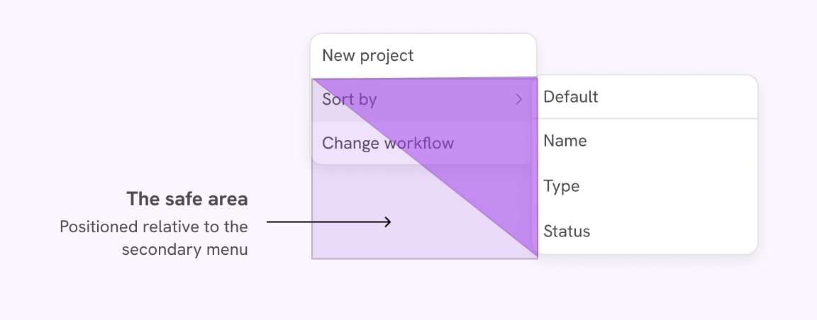
The safe triangle area
The safe area is positioned relative to the secondary menu. It’s like an extension to the menu.
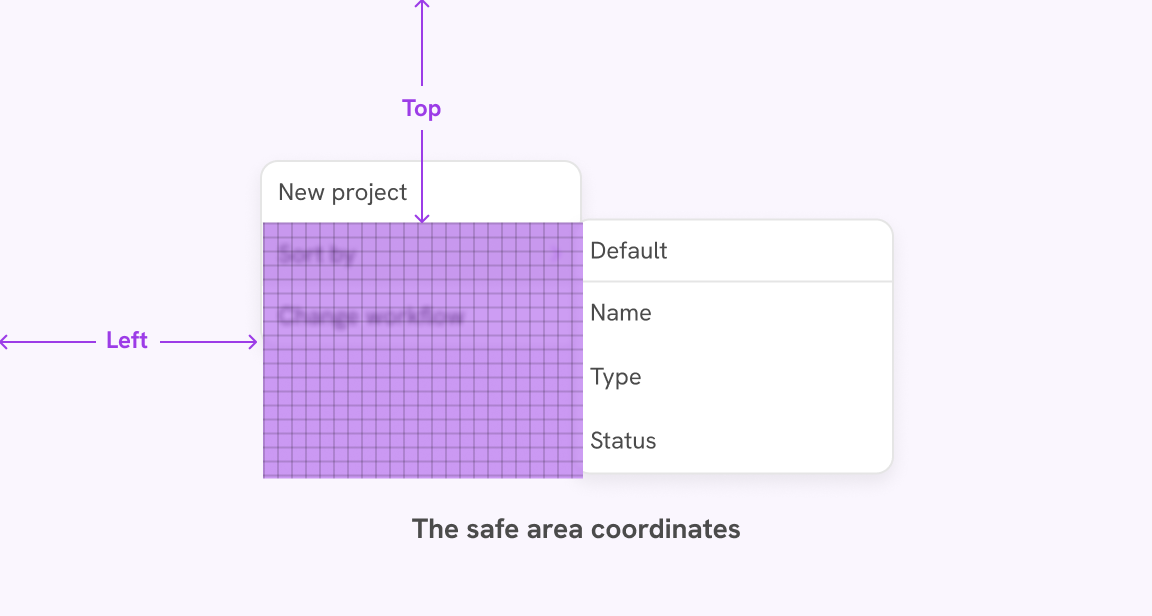
Get the mouse X & Y coordinates
When the user hovers in the safe area, we need to get the mouse X & Y coordinates. In Javascript, we get the X & Y values for the whole page, so we need to scope them for the safe area element only.
/* This is a React code. */
/* Getting the width and height of <li> */
const {
width: menuItemWidth,
height: menuItemHeight,
} = hasSubRef.current.getBoundingClientRect()
/* Getting the left, top, width, and height of the safe area */
const {
left: safeAreaLeftPos,
top: safeAreaTopPos,
width: safeAreaWidth,
height: safeAreaHeight,
} = submenuSafeAreaRef.current.getBoundingClientRect()
/* Scoping the mosue X and Y for the safe area */
const localX = mouseX - safeAreaLeftPos
const localY = mouseY - safeAreaTopPos
In the code, we got:
- Width and height of the
<li> - Left and top position of the safe area relative to the page
- The mouse X and Y then subtract the safe area left and top from each, respectively.
This will give us the local coordinates scoped to the safe area.
Given the data we have now, we need to do a few more steps to get the X
and Y percentage values to use in the clip-path.
- Any X value that is larger than the safe area element width isn’t needed
- Any Y value below the main
<li>isn’t needed (the black line) - Convert those X and Y values into percentages by dividing them with the width and height of the safe area element, respectively.
Take a look at the Javascript.
/* This is a React code, that's why there is submenuRef.current */
if (
localX > 0 &&
localX < menuItemWidth &&
localY > 0 &&
localY < menuItemHeight
) {
const percentageX = (localX / safeAreaWidth) * 100;
const percentageY = (localY / safeAreaHeight) * 100;
submenuRef.current.style.setProperty(
"--safe-start",
`${percentageX}% ${percentageY}%`,
);
}
The magic here happens because clip-path disables pointer events for clipped areas. When we hover under the menu, it disappears as expected.
Explore the interactive demo below and try to move the dynamic path point.
Let’s explore a demo that uses the safe triangle method. First, try to hover with the default state, then change it to the safe area.
Mobile search
While researching, I found an interesting target size issue in a couple of websites. When the search is active, there are no clear boundaries for it. That causes the user to guess where to tab.
In the following example, the search is shown once the mobile menu is toggled. However, it’s not clear where the boundaries of the search are.
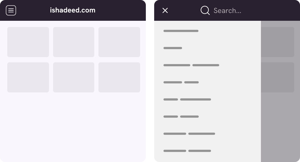
It’s not a good idea to let the user “guess” where the target area is. In this design, here is a comparison between my expectation and the actual target size.
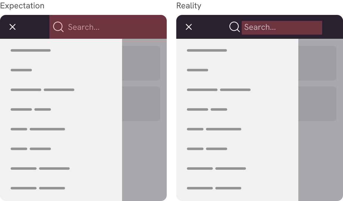
See the following demo. It’s confusing.
Random title
This is a sample text. CSS is awesome.
Toggle the checkbox and see how the search makes you think that it spans to the far right.
To solve that, we need to expand the target area and make it fill the rest of the space.
.search-form {
  position: absolute;
  top: 0;
  bottom: 0;
  right: 0;
}

.search-form input {
  width: 100%;
  height: 100%;
}
Random title
This is a sample text. CSS is awesome.
The search is positioned absolutely to the header with a limited width.
Active Navigation border
This is an example of a navigation where the hovered item shows a bottom border. When you see that, you assume that the whole area is clickable.
Try to hover on an item ☝️
However, when you try to hover over another item, you will discover that the target area is only for the text. The border is just for visual purposes. Notice the outline around the inner item.
The problem is that there is horizontal padding on the <li> element, and the <a> has vertical padding only.
.nav-item {
padding-left: 1rem;
padding-right: 1rem;
border-bottom: 4px solid transparent;
}
.nav-item a {
padding-top: 1rem;
padding-bottom: 1rem;
}
.nav-item:hover {
border-bottom-color: red;
}
To fix that, we need to add all the padding to the <a> element.
.nav-item {
border-bottom: 4px solid transparent;
}
.nav-item a {
padding: 1rem;
}
.nav-item:hover {
border-bottom-color: red;
}
See it yourself in the following demo.
Try to hover on an item ☝️
Much better. Now the whole link is interacive.
Player UI
In this example, we have an audio player UI.
The target area is limited to the bar height only.
We need to fix that by extending the target size to cover at least the playhead (the little circle) height. In the following figure, the target size should be within the top and bottom red lines.
A simple thing to do is to wrap the progress in a container and extend the height of it. That way, the progress height will remain the same, but the clickable area will get bigger.
See the following HTML:
<div class="progress">
  <div class="progressBar"></div>
</div>
Please note this HTML is just for demo purposes. There are a lot of things missing like the current progress bar value.
Here is the CSS:
.progress {
  flex: auto;
  display: flex;
  align-items: center;
  height: 16px;
  cursor: pointer;
}

.progressBar {
  flex: auto;
  height: 4px;
  background-color: color-mix(in srgb, #9c3ce7, white 70%);
}
It’s much better now. Try to click anywhere on the progress bar. Play with the checkbox to see the before & after.
Avoid dead target areas
A dead area is when there are multiple ways to do the same action. This can apply to a label and an icon.
In the following example, there are two target areas (label + icon). Between them, there is a dead target area; when clicked or tapped, the action won’t be triggered.
Try to hover between the label and icon
When the same target areas refer to the same action, it’s good to keep them as one target, or at least to remove the gap between them.
In the following demo, I just removed the gap and the issue is fixed. Unless there is no real need for that, I would recommend combining them as one action.
Slider buttons
This is an interesting example that I saw first on Facebook a long time ago. The slider buttons on their own are small, so we can extend the clickable area via pseudo-element.
See the following demo:
Hover over one of the slider buttons
We can extend the target size by adding a pseudo-element to each button.
.sliderButton {
  position: absolute;
  top: 0;
  bottom: 0;
  width: 30px;
  transform: initial;
}
Play with the toggle and see the before and after.
Extend target size with pseudo-elements
This is a useful technique that can increase the target size without changing the object size or padding. Here is a summary:
- Add a pseudo-element to the target
- Make it size larger than the target
- Done! 🥳
In the following example, we have a simple link. Notice that the target area is highlighted.
Try to hover on the link
The hover effect is simple. Try to hover and see it.
When we add a pseudo-element to the link, it will take the same target area as its parent. That means we can extend the target area in a very dynamic way.
Try to hover over the purple square, and notice how it will trigger the hover effect on the link (its parent).
.link {
  position: relative;
}

.link a:after {
  content: "";
  position: absolute;
  left: 160%;
  top: -40px;
  --size: 3rem;
  width: var(--size);
  height: var(--size);
  background-color: rgb(194, 170, 216);
  border-radius: 15px;
}
Try to hover on the purple square. It will trigger the link.
Interesting, right? We can take this even further and have two pseudo-elements (:before and :after).
This technique can be extended to create more interesting interactions. See the following example.
👋I wrote a book on Debugging CSS and coined the Defensive CSS methodology.
When you hover over one of the links, its thumbnail will be triggered. Interesting, right?
Here is how I did it:
- There is a
<p>element with two links. - Each link has a thumb that is positioned to the right side.
- There is a large padding on the right to accommodate the thumbs.
- When the link is hovered, its pseudo-element will be scaled and positioned on top.
p a:after {
  content: "";
  position: absolute;
  --size: 150px;
  right: 0;
  width: var(--size);
  height: var(--size);
  background-color: red;
  transition: 0.3s ease-out;
}

p a:hover:after {
  transform: scale(1.3);
}

p .debugging:after {
  right: 0;
}

p .defensive:after {
  right: 200px;
}
With that in mind, let’s explore a few examples of using pseudo-elements to increase the target size.
Card block link
A common confusion that happens on the web is that you have a certain expectation for where the target area for a card is, and when you try to interact with it, it’s not as per your expectations.
Using this solution will make the text hard to select. Use with caution and when necessary only.
Consider the following example. Try to hover on the card and notice that only the title is clickable.
The clickable area is only in the title.
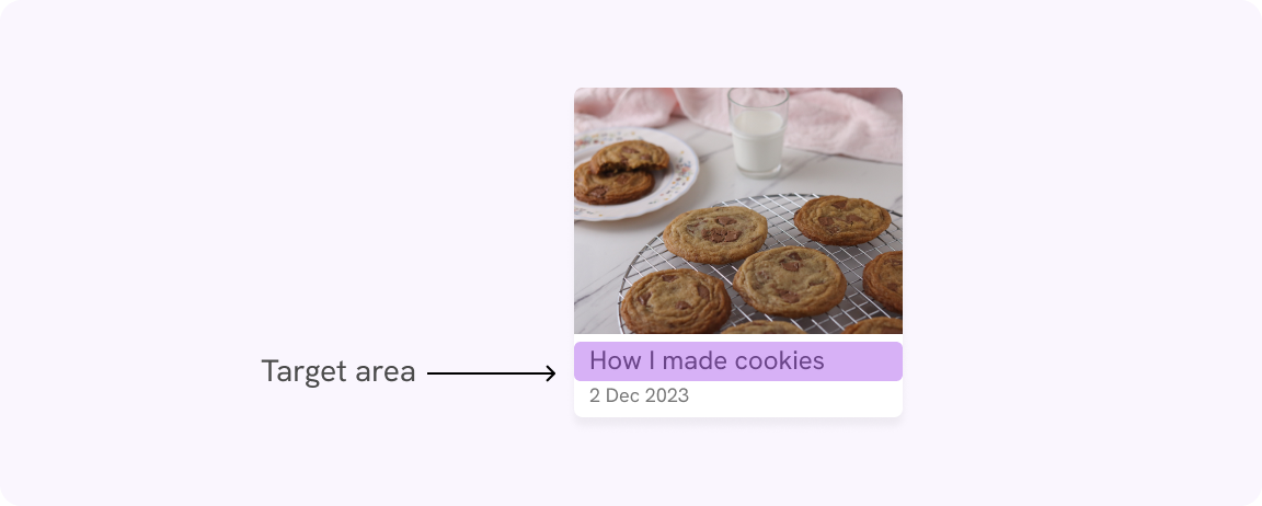
Here is the card’s HTML markup.
<article class="card">
  <img src="cookies.jpg" alt="" />
  <div>
    <h3><a href="#">How I made cookies</a></h3>
    <time>2 Dec 2023</time>
  </div>
</article>
Notice that the link is inside the <h3> element, so that’s why the target area is there only.
We can add a pseudo-element to the <a> element, and position it to cover the card. Try to hover over the card, now all the cards are clickable.
.card {
position: relative;
}
.card h3 a::after {
content: "";
position: absolute;
inset: 0;
}
In this example, there is not much text, so the accessibility concern of text being not selectable might not be valid.
However, I would be careful to use this solution if there is too much text in the card (e.g.: title, description, author name.. etc).
Mobile menu
Another use case for increasing the target size via pseudo-element is a mobile menu. I already showed a similar example but solved it via padding.
See the following demo.
iShadeed
The target size is small. You need to point the cursor or your finger exactly at the menu. We can add a pseudo-element that is larger than the menu, and it will solve the problem.
.menu:after {
  content: "";
  position: absolute;
  inset: 0;
  z-index: -1;
  transform: scale(1.5);
}
Easy and straightforward, right? Play with the demo below and see the difference.
iShadeed
Modal dismiss button
A model dismiss button is an important action that needs to be considered while building the UI.
If the target size is too small, it will be hard to dismiss the modal, especially on touch devices.
Title
title in here
a few description text just for the demo purpose.
What are the solutions that we can do?
- Increase the size of the dismiss button.
- Increase the target area only by adding a pseudo-element
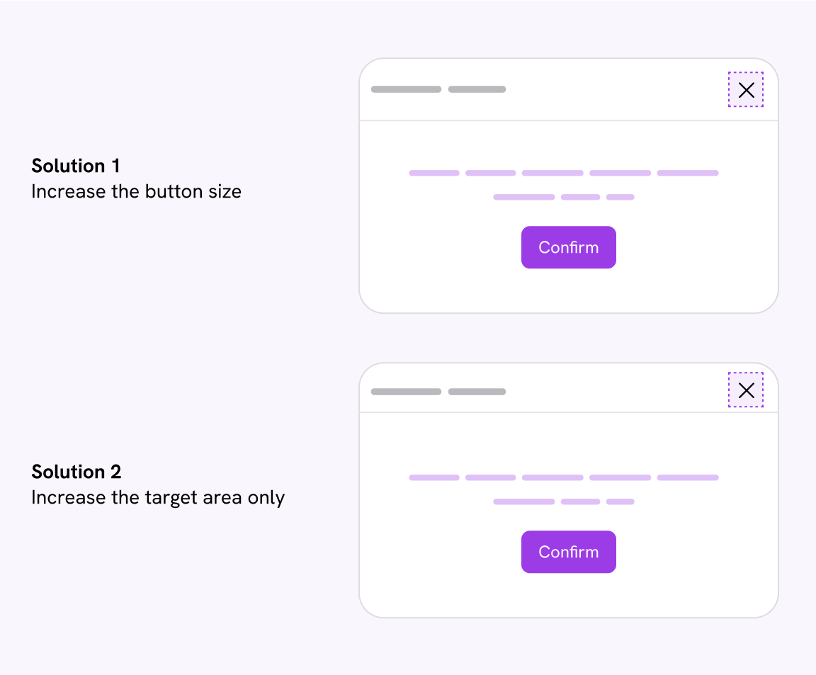
The first solution works, but it increases the size of the header, which isn’t needed. Also, designers won’t like that 😉.
Instead, we can add a pseudo-element to the dismiss button and it will increase the size without affecting the modal header.
.button:after {
  content: "";
  position: absolute;
  inset: 0;
  z-index: -1;
  transform: scale(1.5);
}
Title
title in here
a few description text just for the demo purpose.
Fixed 🥳
Section header
An example of having a large target size is a section header. There is a link that redirects the user to the full content.
At first glance, the arrow looks fine. Try to hover on the arrow link. Notice how the target area is small.
The spacing around the arrow is padding for the section header.
To fix that, we have two options:
- Remove padding from the header and add it to the arrow button.
- Keep the padding on the header and use a pseudo-element to increase the target size.
I will opt-in for the pseudo solution. Feel free to do the solution that works best for your use-case.
.section__more:after {
  content: "";
  position: absolute;
  inset: 0;
  z-index: -1;
  transform: scale(1.5);
}
Search component
Oftentimes, we add an icon to the search component. It’s recommended to give it a enough target size.
In the above example, the filter button size is constrained to the icon only. We can increase the size via padding, sizing the icon, or expanding the target area with an additional element.
.search__filter:after {
  content: "";
  position: absolute;
  inset: 0;
  z-index: -1;
  transform: scale(2);
}
Much better.
Profile menu
In a profile menu toggle, having the action only on the arrow icon isn’t a good practice. It forces the user to laser-point their mouse to open the menu.
Brand
Instead, the target size should be on the whole block (name, avatar, and icon). To do that, we can use a pseudo-element to extend the target size.
.siteHeaderActions {
  position: relative;
}

.button:after {
  position: absolute;
  inset: 0;
}
Brand
Even better, we can add a background and make it more clear that all of the block is clickable.
Brand
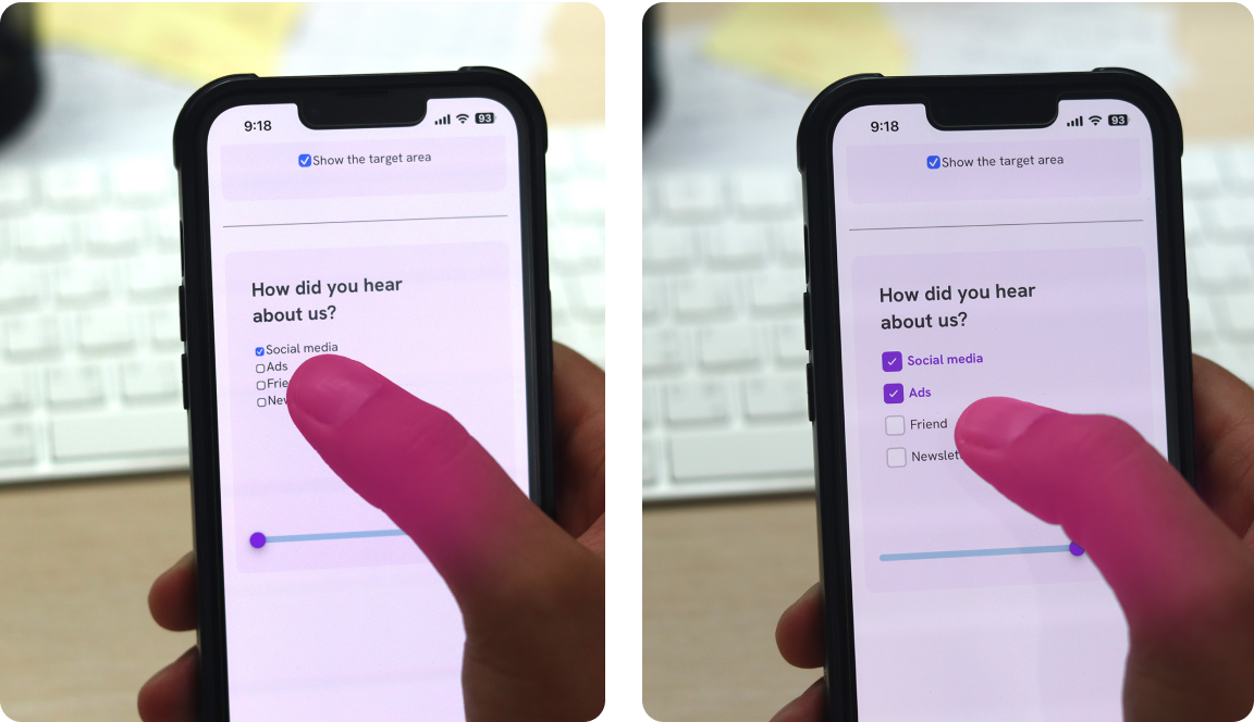
Checkboxes and radio buttons
Let’s highlight something here. The default styling for checkboxes and radio buttons on the web isn’t accessible for touch users. I guess the reason is because these controls weren’t designed for touch in the first place.
I experimented to validate that. In the following photo, see how the tip of my thumb is almost the size of three checkboxes. It’s very hard to choose an option. This is the default style for checkboxes.
Let’s explore how to make this much better.
Link the input with the label
Before diving into this solution, let’s highlight the issue it prevents.
Say that we have the following HTML: an input and a label.
<input type="checkbox" name="feedback" id="feedback1" />
<label>Social media</label>
The target area will be only on the checkbox (the highlighted area).
To fix that, the input ID must be used in the for attribute of the label. Such a quick fix with a big impact on the user experience and accessibility.
<input type="checkbox" name="feedback" id="feedback1" />
<label for="feedback1">Social media</label>
Make the checkbox bigger
The next step is to increase the checkbox size. To make things easier, I will do a custom checkbox and hide the default one. This is better to have a consistent experience across different browsers and devices.
- Hide the default input. I used the
sr-onlysolution to hide it only visually. - Styled a custom element for the label.
<input
  class="”sr-only”"
  type="checkbox"
  name="feedback"
  id="feedback1"
/>
Social media
<label for="feedback1"> </label>
Add padding
Increasing the padding around the checkbox will make the target area even larger.
label {
  padding-block: 3px;
}
Increase spacing between each row
You might be wondering, the article is about increasing the target size, but the checkboxes are too close to each other. Let’s fix that.
.form-group {
  gap: 8px;
}
Make the labels equal to the largest one
Currently, the width of each option is equal to its container. This is a large target area that can get even larger if the container is taking the full width.
See the following example.
This is a very large target area that isn’t needed in my opinion. What we can do instead is to limit the width of all options to the largest of them.
We can get the benefit of max-content in CSS. When we add it to the options container, its width will be equal to the longest option.
.form-group {
  width: max-content;
}
On mobile, we can increase the spacing between the checkbox items. We might not need that. Please make sure to test them.
I made a final demo that show the process of enhancing the UI. Move the slider to see the gradual enhancement.
With that, here is the enhanced target size with an actual larger thumb using them (Hey there!).
From the photo, I can see that my thumb tip is being able to tap a specific checkbox without worrying about checking one by mistake.
Since humans like visuals more, here is a side-by-side comparison of the before and after.
Notice how the difference is clear. Always make sure to have a large target size. See the following video for me trying to use the checkboxes.
Action buttons
Buttons are a foundational component of the web. On every website you visit, you might need to interact with a button. When built right, they can be effective and easy to use for the user.
In the given example, two buttons are present. It’s possible to tap the wrong button due to their small size and minimal spacing.
Try to change the thumb size and notice how the touch indicator can easily overlap the buttons at once. This isn’t good.
We have two options to fix that:
- Increase button size and spacing
- Display each button it a new line with full width
I won’t discuss which solution is the best, but the idea is that we want to increase the target size. In both solutions, it’s harder to overlap or tap a button my mistake.
.button-group {
display: flex;
gap: 0.5rem;
}
.button {
/* More padding */
padding: 0.5rem 1rem;
}
Or..
.button-group {
display: flex;
flex-direction: column;
gap: 0.5rem;
}
.button {
/* More padding */
padding: 0.5rem 1rem;
}
For the sake of this example, I will go with the first solution.
Text buttons
Text buttons are often used to give more focus to the surrounding content, or to use them as a secondary button.
In the following demo, the text button “learn more” looks like it has a good target size. Toggle the outline and see it.

The simplest fix is to add padding around the button itself.
.button {
  /* Other styles */
  padding: 8px;
}
Better, right?
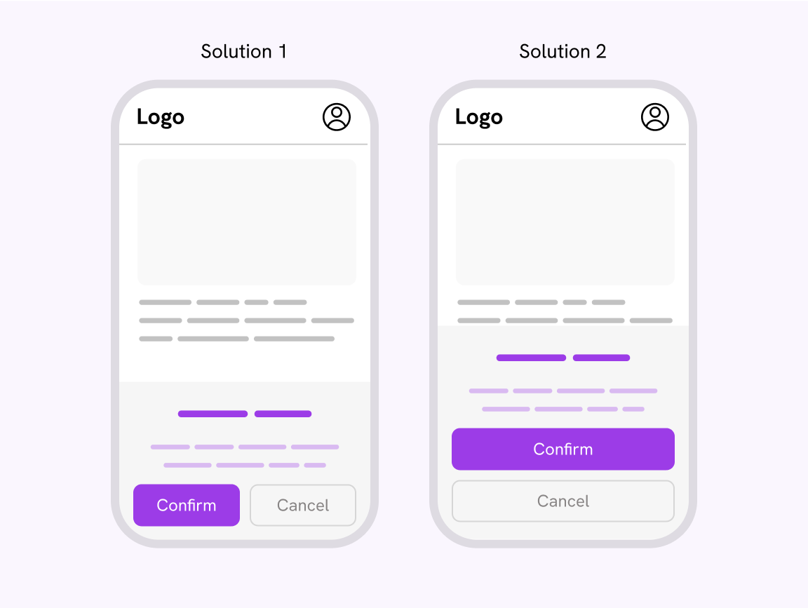
Another example where text buttons can be used is in a group of buttons. Say we have a modal with a confirm and cancel button.
To fix that, we need to make sure that the text button has padding around it.
Pagination component
The pagination is often used to organize large amounts of content so the user can access them easily.
Let’s explore a pagination example that looks fine from a visual perspective, but raises important questions when it comes to the target area size.
Notice the target area when it’s highlighted.
- Target size is small
- Spacing is large
The spacing made look like the target size is large.
To fix that, we need to:
- Reduce the spacing
- Add more horizontal (inline) padding to each pagination item
.pagination {
  display: flex;
  gap: 4px;
}

.pagination__item {
  padding: 0.5rem;
}
Vertical navigation
In a previous Twitter design, the navigation was as follows. Each nav item size depends on its content.
This is a confusing behavior as the user might expect the full navigation element to be clickable.
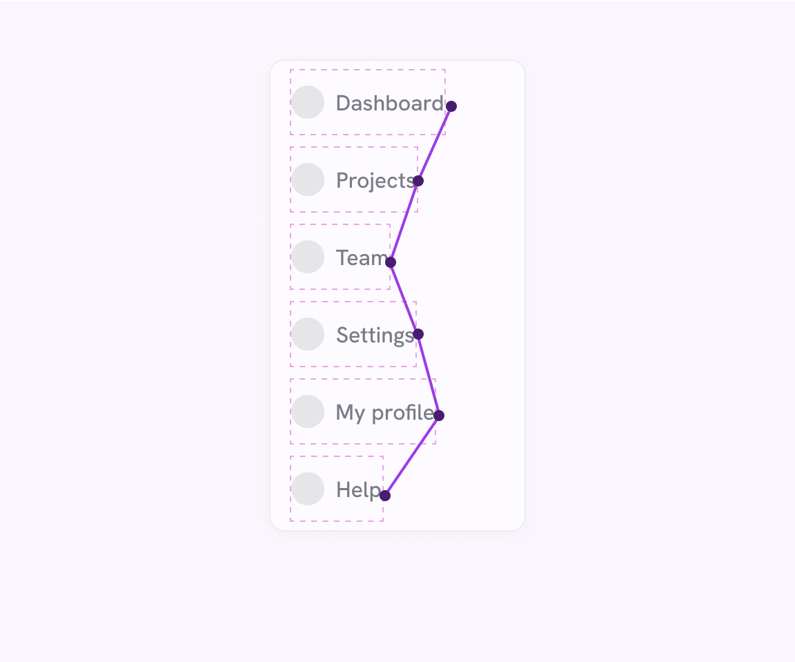
Here is a version with each navigation item taking the full width. Much better.
Category list
In the following example, the target size is on the label only. The spacing around the labels is padding added to the <li> element, not the <a> element.
To fix that:
- Move the icon inside the
<a>element. - We need to remove the padding from the
<li>and add it to the<a>element, and force them to take the full width.
.nav-item a {
  /*Other styles*/
  padding: 0.8rem 1rem;
  display: flex;
}
Toggle the checkbox. This demo is using a pseudo-element for interactivity purposes.
Scrolling container
On mobile, having a great scrolling experience is crucial to let the user explore more content. The other day, I was browsing Amazon on my mobile and noticed an interesting behavior.
In the following figure, the scrollable section “You might also like” isn’t only on the cards, but also on the highlighted area underneath.
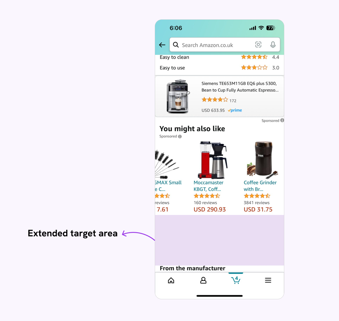
In CSS, we can do such a thing by extending the bottom spacing. If we’re
using CSS Scroll Snap, we need to add padding-bottom only.
See the following demo.
You might also like
Chocolate Cake
Rich and moist chocolate cake with a velvety smooth ganache.
Strawberry Cheesecake
Creamy cheesecake topped with fresh strawberries and a sweet glaze.
Apple Pie
Flaky crust filled with cinnamon-spiced apples, baked to golden perfection.
Tiramisu
Classic Italian dessert with layers of coffee-soaked ladyfingers and mascarpone cream.
Mango Sorbet
Refreshing sorbet made with ripe mangoes, perfect for a tropical treat.
Another section in here
This is a random desc in here, just to show that there is another section under the scrollable one.
Try to scroll the section on mobile, and you will notice that the scrollable area is within the content only.
We can extend that by increasing the bottom padding.
.section {
  /* other styles */
  padding-bottom: 4rem;
}
You might also like
Chocolate Cake
Rich and moist chocolate cake with a velvety smooth ganache.
Strawberry Cheesecake
Creamy cheesecake topped with fresh strawberries and a sweet glaze.
Apple Pie
Flaky crust filled with cinnamon-spiced apples, baked to golden perfection.
Tiramisu
Classic Italian dessert with layers of coffee-soaked ladyfingers and mascarpone cream.
Mango Sorbet
Refreshing sorbet made with ripe mangoes, perfect for a tropical treat.
Another section in here
This is a random desc in here, just to show that there is another section under the scrollable one.
Try to scroll the container on mobile.
This is better. Some may say there’s a big spacing under the section, and I agree. However, sometimes it’s okay because the benefits outweigh the drawbacks.
Placement of target items
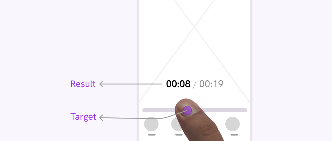
In cases where there is an action item at the top and a result at the bottom, the user’s finger on mobile might cover the result, making it annoying to see the change when for example, changing tabs, or toggling an option from a list.
This example is from this article.
I checked the order page on my phone and tried to tap the order button but it’s not responding.
At first glance, the positioning of the radio buttons might seem okay. On mobile, it’s something different.
Notice how my thumb is covering the result. It’s hard to see the changes while my thumb is choosing an option.
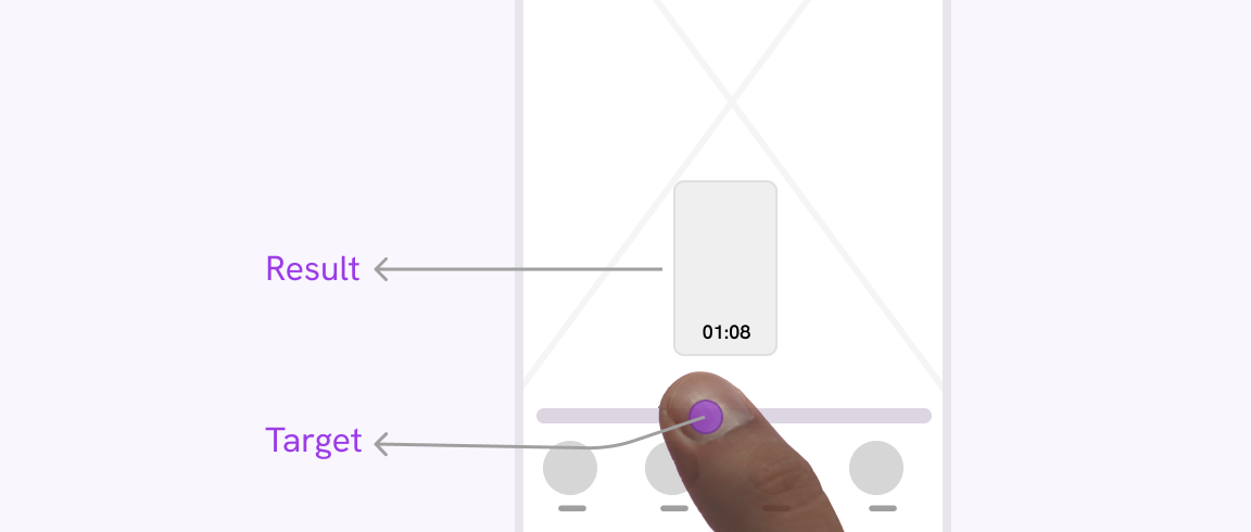
The fix is simple. The placement of the options should be at the bottom.
I checked the order page on my phone and tried to tap the order button but it’s not responding.
A real-life example of this is a UX detail I like on TikTok. When you tab the progress bar of the video, the timing will be shown above in a large size.
This is a great UX detail, as it doesn’t show the timing under my finger or next to it. See the following figure:
If the time were displayed on the progress bar itself, it would be harder for the user to spot it. Placing it at the top is better.
On Instagram, it’s similar, but they also add a preview of the video.
Dominant hand of the user
Making it easy for the user to tap a target is not only about its size, but also it’s location. The following is an experiment based on a React hook by Kitty Giraudel called “dhand”.
The idea is to guess what’s the dominant hand for the user and update the UI based on it.
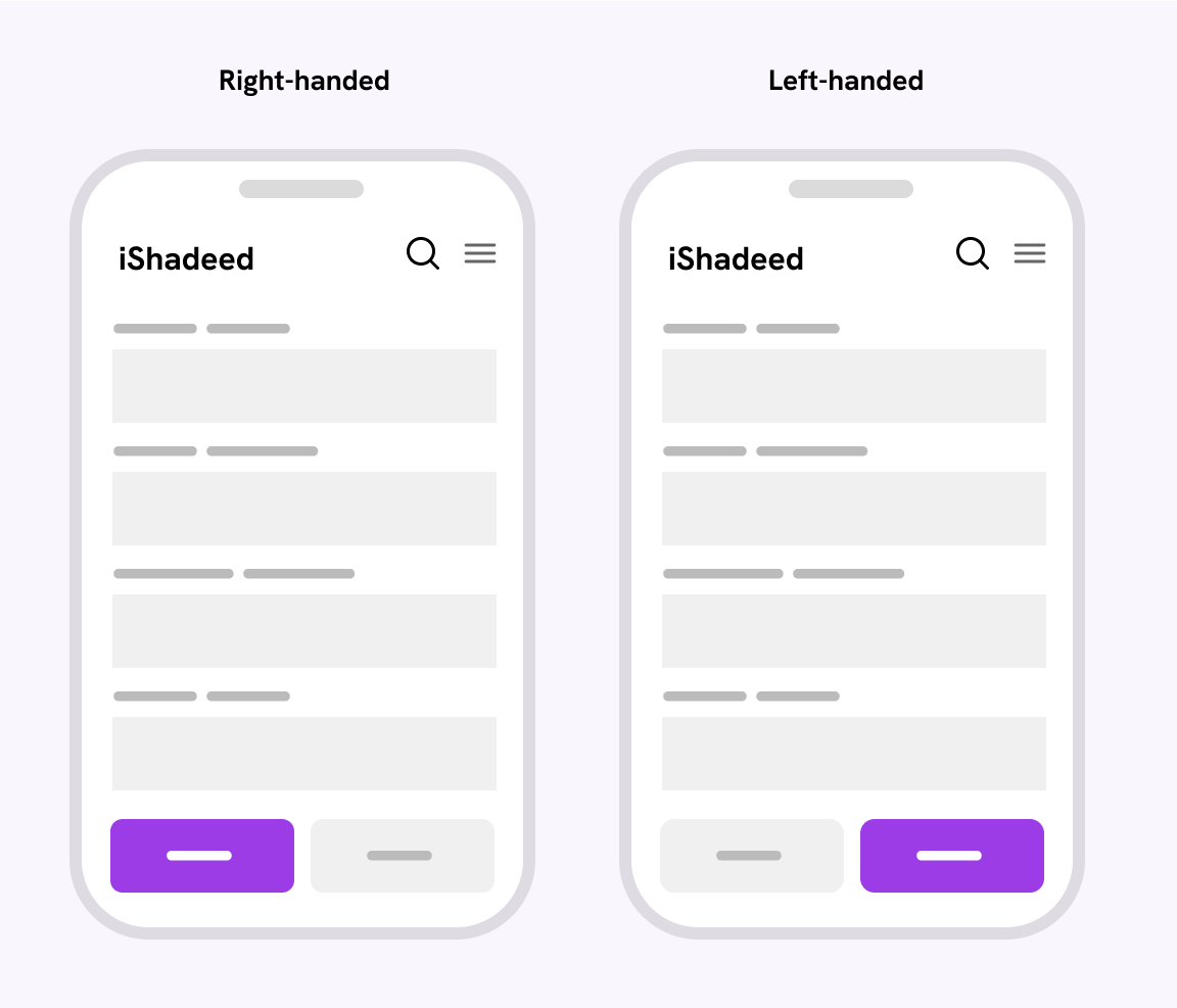
The assumption that this experience is based on is that a left-handed user will more likely tap on the far right of the UI. On the other hand, a right-handed will tap on the left side.
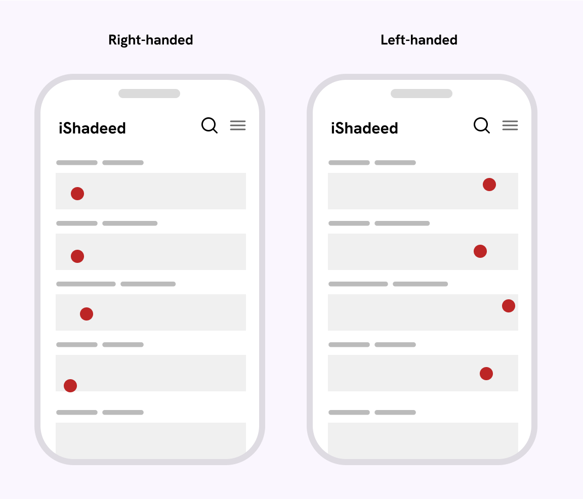
With that info in mind, we can make decisions about what’s the dominant hand. It’s an interesting experience. If I can learn one thing from this, it’s that target area isn’t only about size, but also the location.
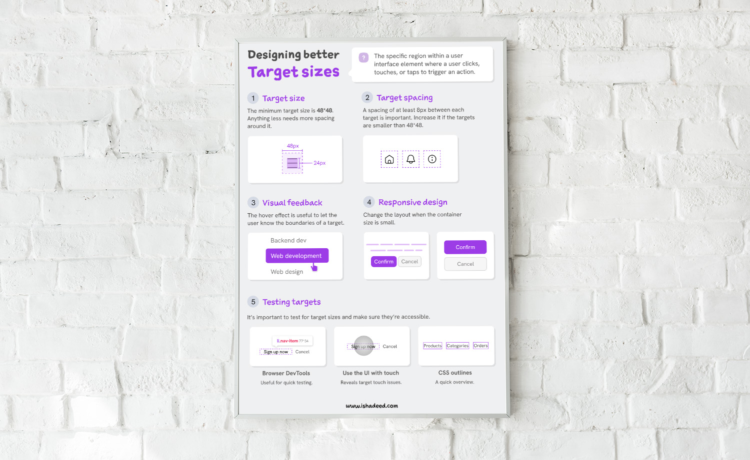
Testing target sizes
Spending time on a UI without testing it is a waste of time and effort. We should test the target sizes early on and keep an eye on them throughout the product building.
To achieve that, we need to do testing in both the design and development. Let’s start with the design aspect first.
For designers: delivering a clear target size spec
As a designer, it’s important to have clear documentation or a spec that explains the target size throughout the system.
While this might not be needed for elements like buttons, it’s important for stuff like icon buttons, cards, tabs, mobile menus, you name it!
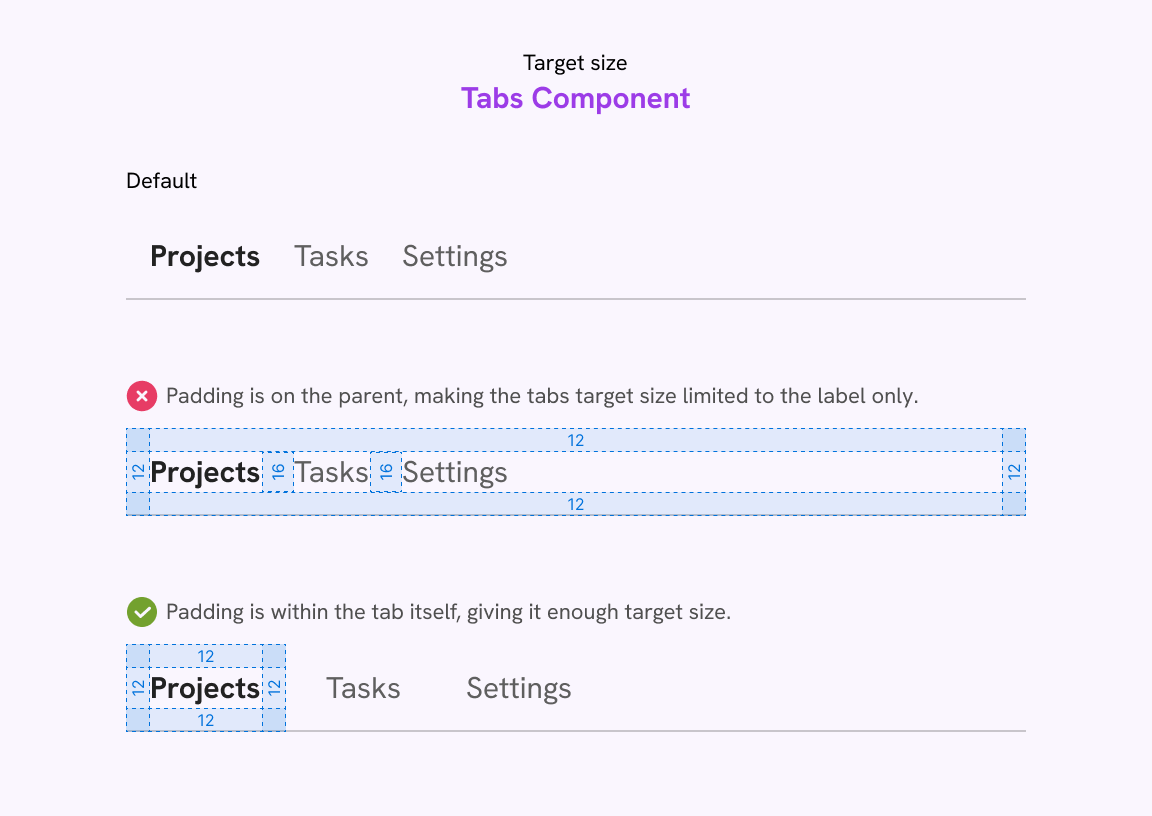
Tabs component
In a tabs component, the spacing should be around the tab item itself, not built from the outer padding of the parent.
Slider navigation
This is a great example of keeping the UI as is, but expanding the target size to make it easier for the user to control the slider.
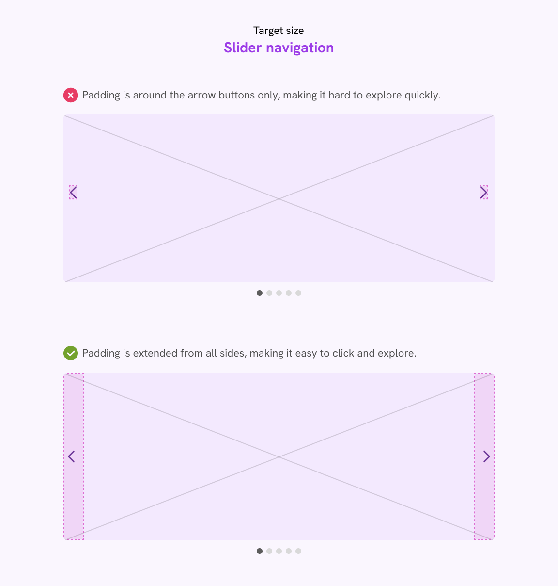
As a designer, thinking about those UI decisions upfront is important to deliver a great UX.
I knew that pattern from Meta (Facebook) a few years ago. Great one!
Icon buttons
This applies to different cases and examples. Here is one for a modal dismiss button.
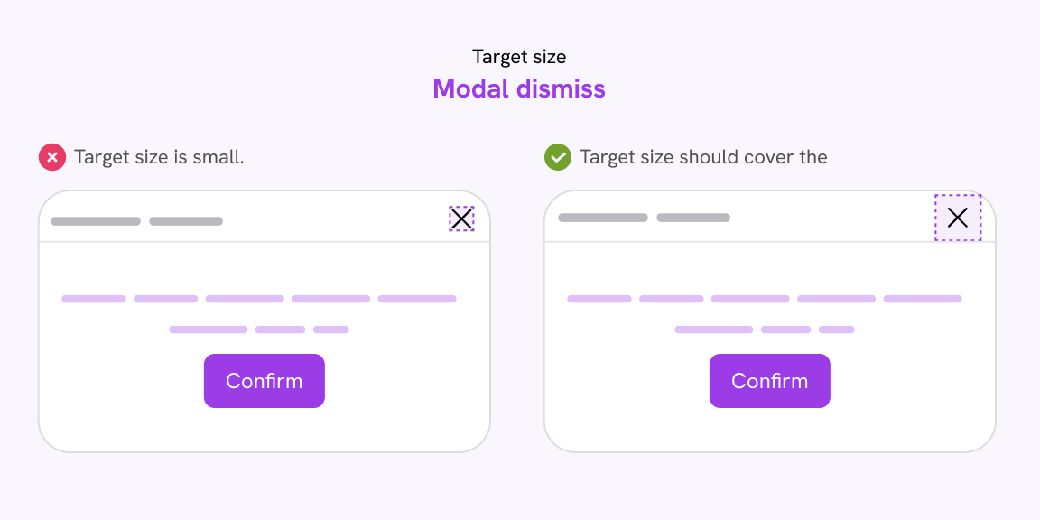
And this is for a close pattern that is placed at the top-right corner. Generally speaking, this pattern isn’t recommended.
I spotted this in the tags menu in Threads by Meta.
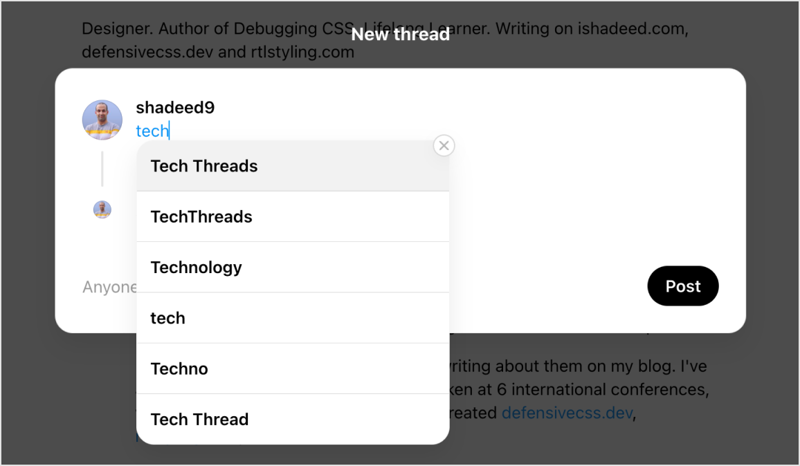
Here is my recommendation.
Website navigation
In a design tool like Figma, we sometimes forget the touch size details when we quickly mock up a UI. In this example, it’s a website header.

In this design, the navigation items target size is only on the text. This isn’t good. Don’t make the developer think twice like:
- Did the designer mean to have them like this?
- What if the user clicked
3pxabove a navigation item?
An experienced developer will fix that themselves, or ask the designer first. But we can’t assume that all developers are aware of this as people have different levels of knowledge, which is fine.
Provide a target size component
Let’s suppose that you worked on a modal design and used an icon for a close button.
In Figma, the close icon doesn’t have any boundaries other than the icon itself, thus indicating to the developer that it should be that way.
In the following example, I placed the icon within a Target component. I can use this component anywhere in the design.
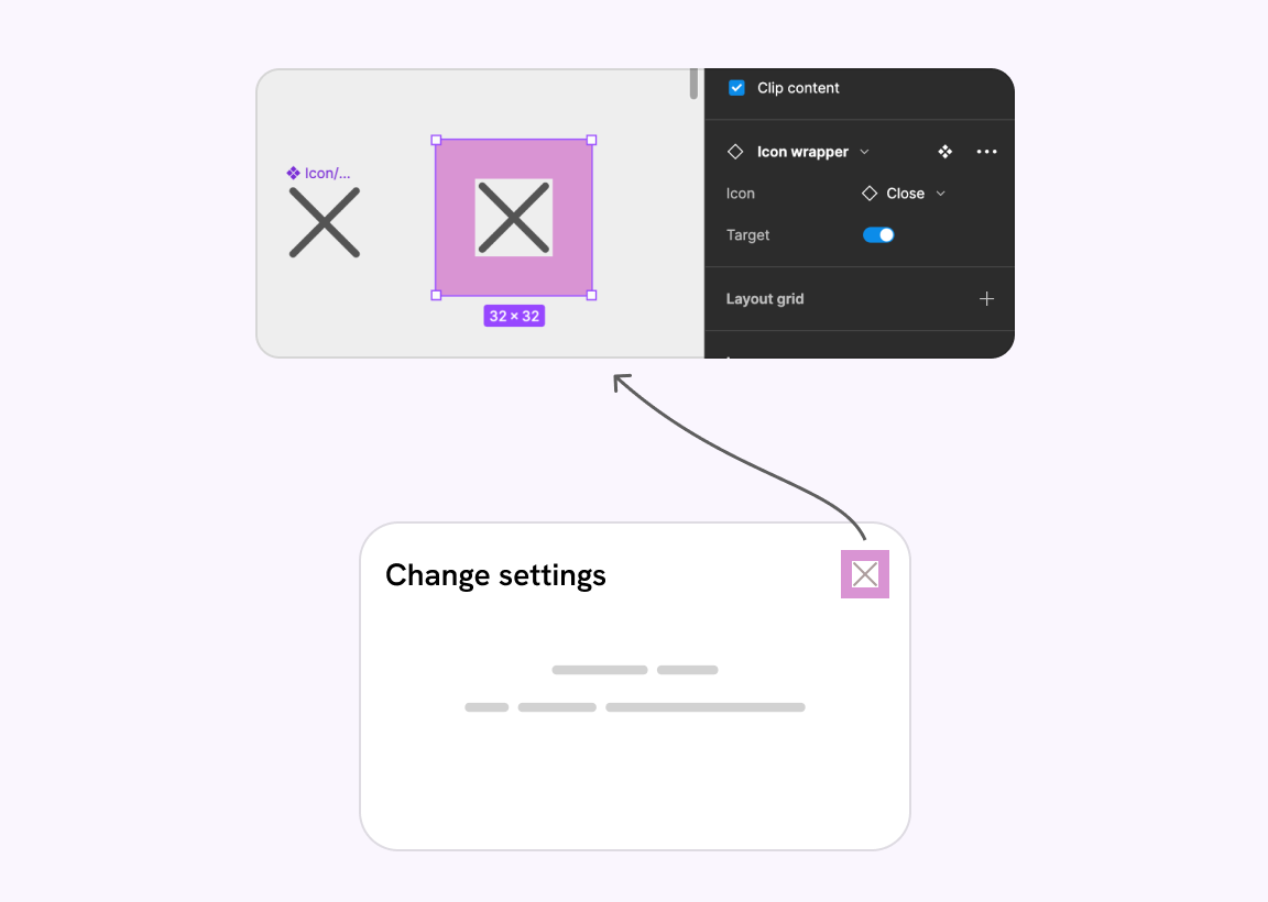
Making this clear in the design is important for both the designer and the developer. If they know it, it’s a friendly reminder. If not, then they’ve learned something new!
For developers: testing target sizes
Once the design we have is well documented for target size rules, it’s time to test the UI for any small target sizes.
Check the size in DevTools
The browser DevTools is a powerful way to detect and spot target size issues. The simplest thing you can do is to check the width of a target size by inspecting the element.
This is good for testing a simple UI, but for a UI with lots of details, you will need to automate that somehow.
Use CSS outline to have a look at the target size
Applying a CSS outline to every link and button on the page is a good mechanism. It helps you to see the outer box for every interactive element on the page.
I worked on a proof of concept snippet that adds an outline to every button and link on the page plus showing the size of each.
See it in the demo below:
Use a tool to automate the target size testing
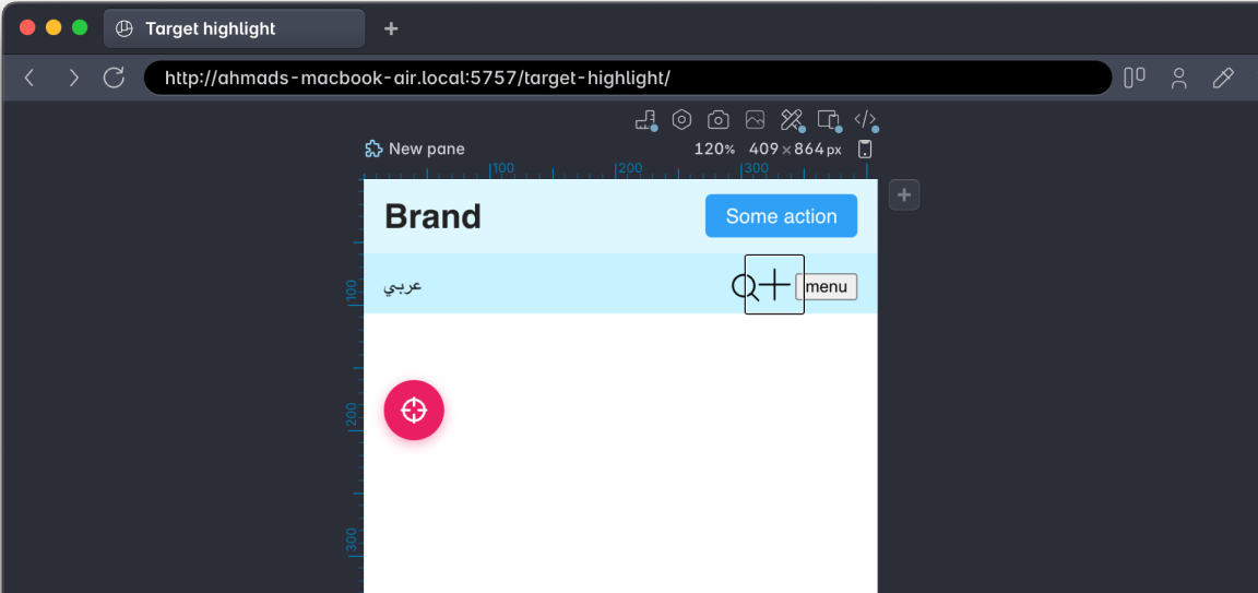
Polypane browser by Kilian Valkhof is a great browser for testing and debugging websites. There is a “Target size” debug feature that lets you pick a size for the cursor.
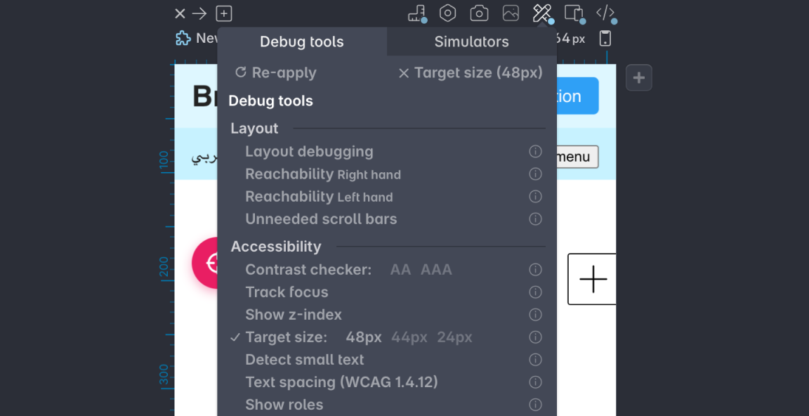
Once you pick the target size (48, 44, or 24), the cursor will become the size of the selected option. It’s useful to spot UI elements that will interfere with each other.
Here is an example in testing my headers-css project, the search and menu buttons should have more spacing between each other.
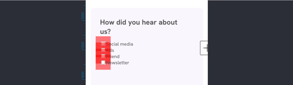
Another detail that I liked in Polypane is highlighting small target areas and how they interfere with each other. Here is an example of the default HTML checkboxes:
Real-life examples
You can’t make an article on a UX topic without showcasing a practical example. Let’s explore examples that I spotted on the web and how to fix them.
Twitter spaces
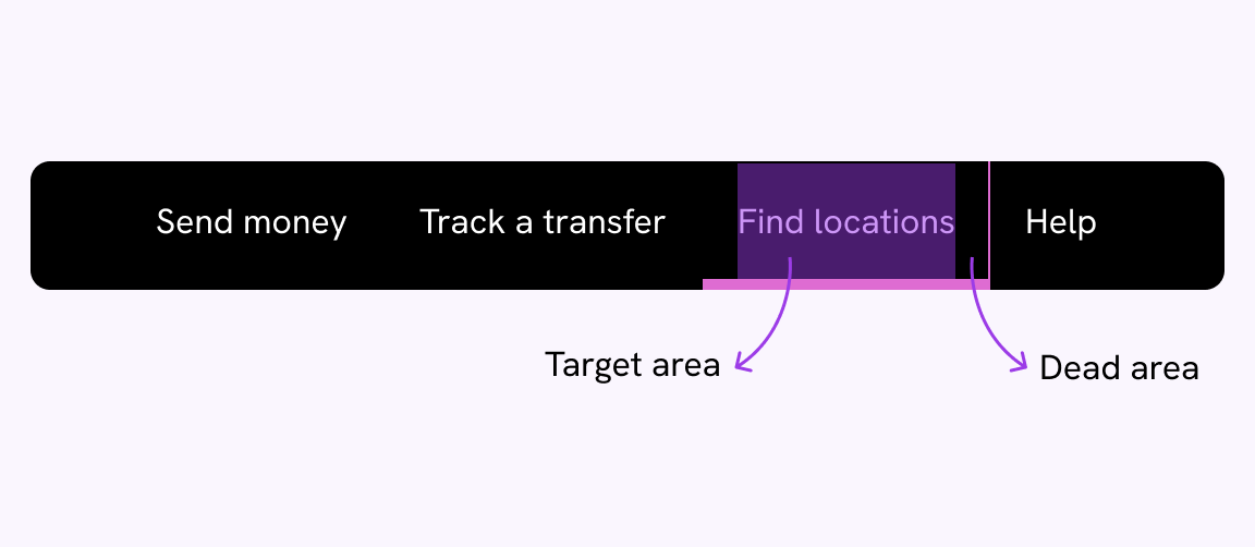
The other day, I was listenting to a Twitter space, and I was about to leave the space by mistake because the “Leave” button is overlapping with the context menu (AKA the dots icon).
Try to hover on the Leave button or the dots menu.
Did you notice that the dots and “leave” buttons overlap? Let me make it more clear.
This isn’t good. To fix it, we simply need to add spacing between the icons buttons and the “leave” button.
.header {
  /* other styles */
  gap: 1rem;
}
Much better.
Adobe Fonts tags
While looking at a font in Adobe Fonts, I noticed an issue in the target size of the tag component.
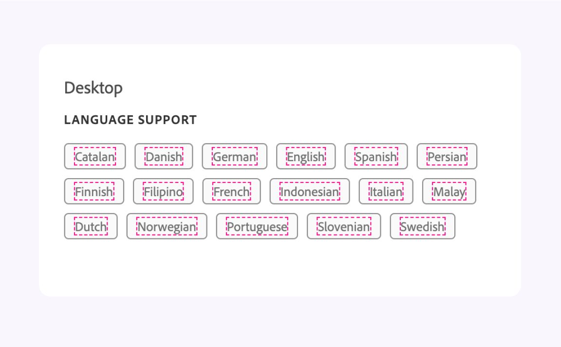
The target size of the tag is on the text only. As a user, you will expect that all of the tags is clickable. This is not good. I’m surprised to see that by Adobe.
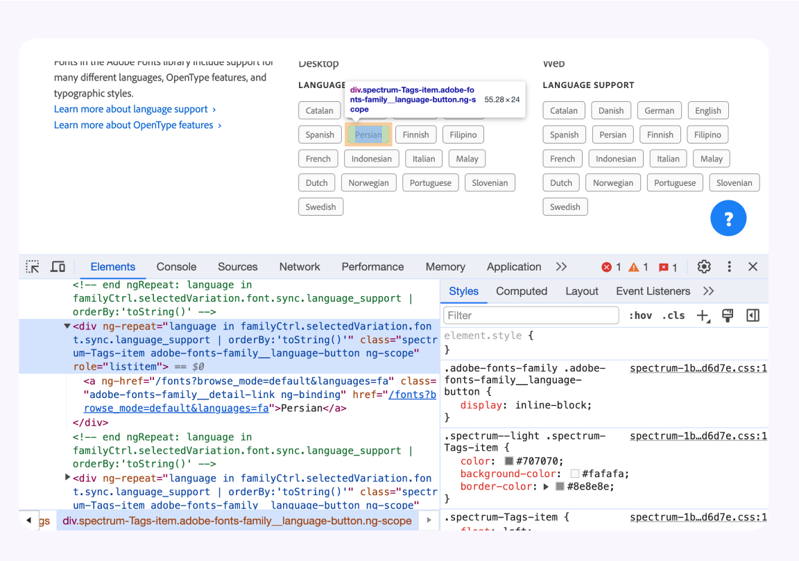
Here is the CSS for the component:
<div class="spectrum-Tags-item" role="listitem">
  <a href="#">English</a>
</div>
.spectrum-Tags-item {
  display: inline-flex;
  align-items: center;
  padding: 0 9px;
  height: 24px;
  border: 1px solid;
  border-radius: 4px;
  /* I removed the rest of the CSS for the sake of simplicity.] */
}
To fix that, we need to:
- The padding should be added to the
<a>instead. - Remove the fixed height Using a fixed height isn’t recommended. See Fixed sizes on Defensive CSS.
.spectrum-Tags-item a {
  display: inline-flex;
  align-items: center;
  padding: 4px 12px;
  border: 1px solid;
  border-radius: 4px;
}
Here is a video that compares the before and after change:
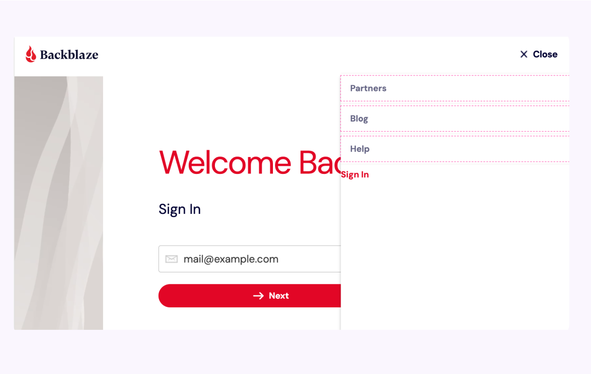
Backblaze navigation
I use Backblaze to back up my data and noticed something on the login page. The target size for the menu items is only on the text.
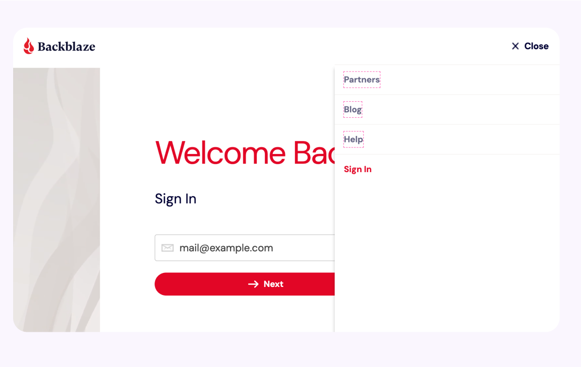
In the UI, it indicates that the whole item is clickable because there are top and bottom borders.
Again, the fix is similar to the previous Adobe example. We need to add the padding to the <a> element.
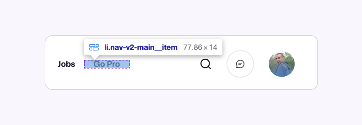
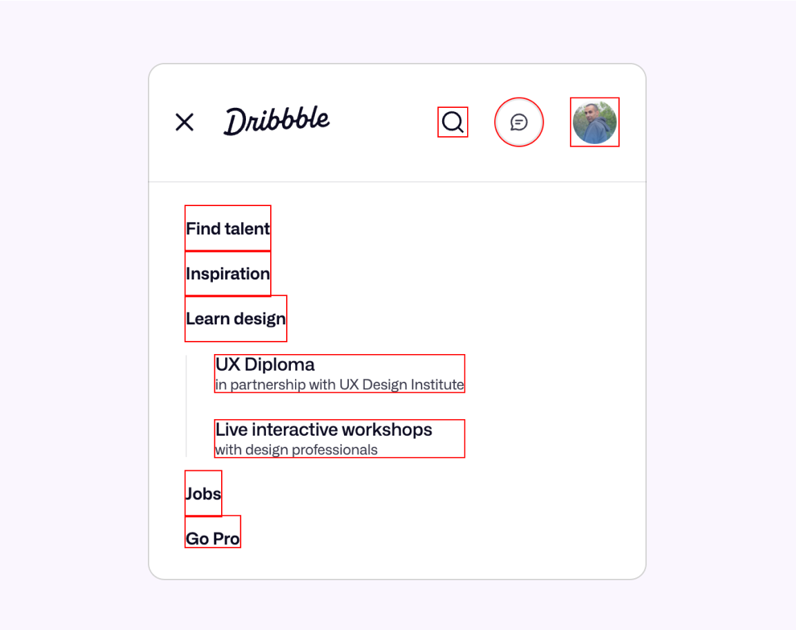
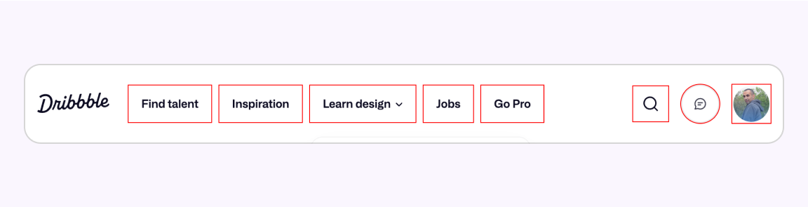
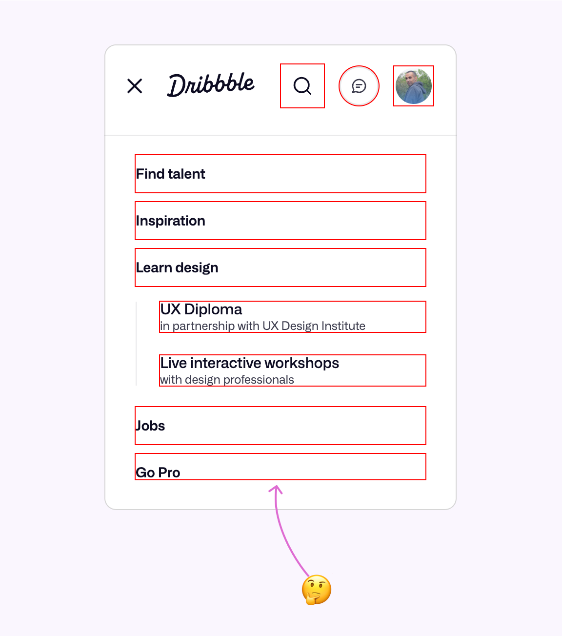
Dribbble navigation
Yes, Dribbble! I found lots of interesting target size issues, so why not fix them? Even though Dribbble is full of beautiful but useless UIs with lots of shadows and trendy gradients.
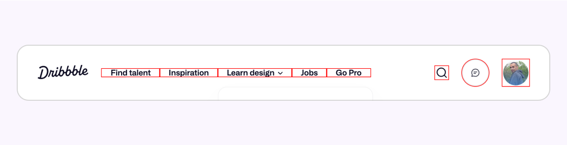
I added a CSS outline and noticed the following issues:
- Navigation item target size is too small
- There is zero spacing between the navigation items. This isn’t good.
- The search button is very small & inconsistent with the messages and profile size.
On mobile, it’s even worse. The width of each navigation item is dependent on the content length.
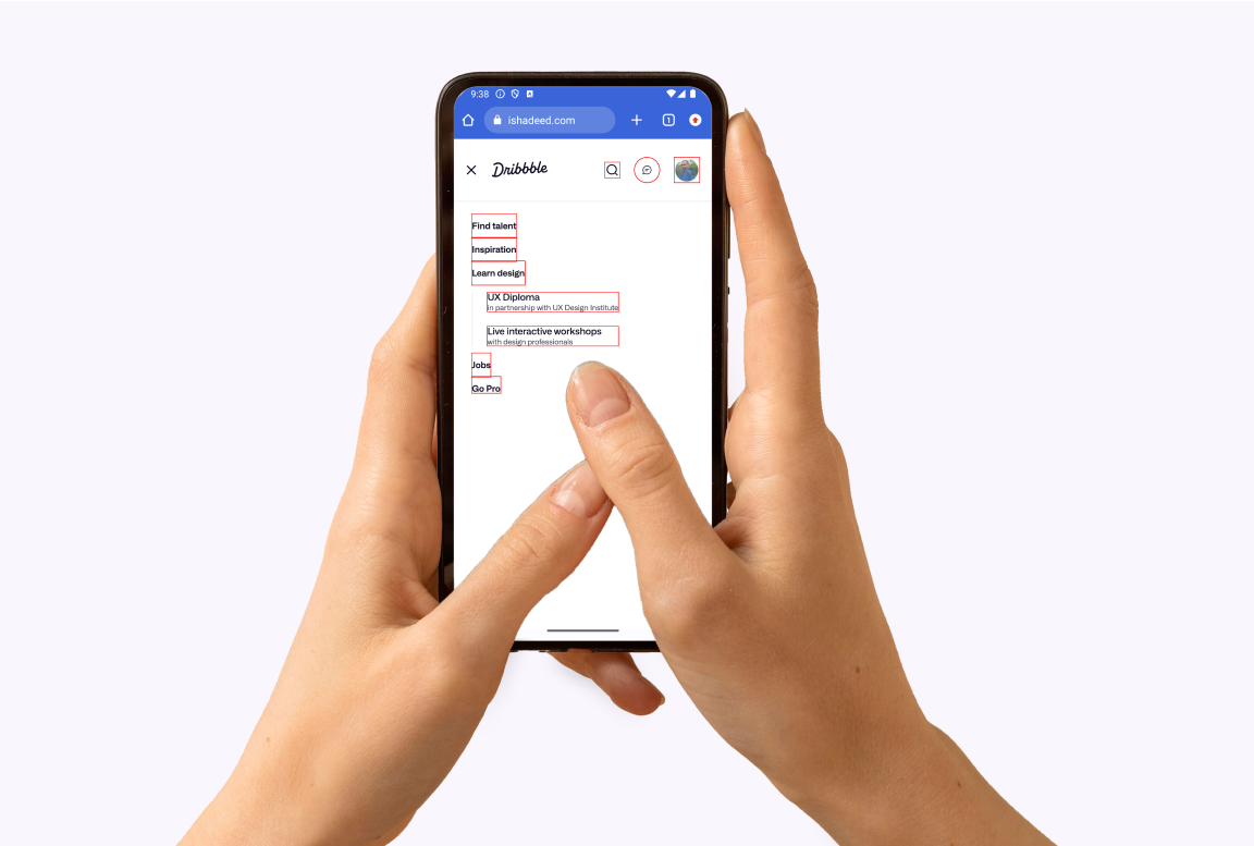
I took it further and mocked up how this UI can be viewed compared to human fingers.
Since the CSS is written via Flexbox, I was able to increase the CSS gap
and force the flex items to align normally.
The web version:
And the mobile version:
But wait… why the “Go Pro” item doesn’t have a padding from the bottom? It’s because of this CSS:
@media (max-width: 949px) {
  .nav-v2-main__item:last-child a {
    padding-bottom: 0;
  }
}
This is not good. It’s a bad practice. Just keep the padding, please.
Dribbble checkbox component
Another example of Dribbble is the checkbox component. The target size is limited to the checkbox height only, while its container is large and is indicated with a border.
You might argue that this is just a container. For me, as a user, I assumed that the whole area was clickable.
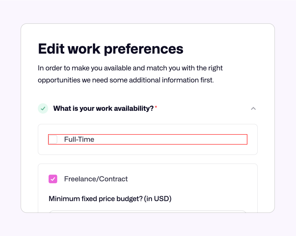
What I did is that I removed the padding from the outer container and added it instead to the checkbox itself.
.checkbox-toggle-content {
/* padding: 24px */
}
.checkbox-radio-label {
padding: 24px;
}
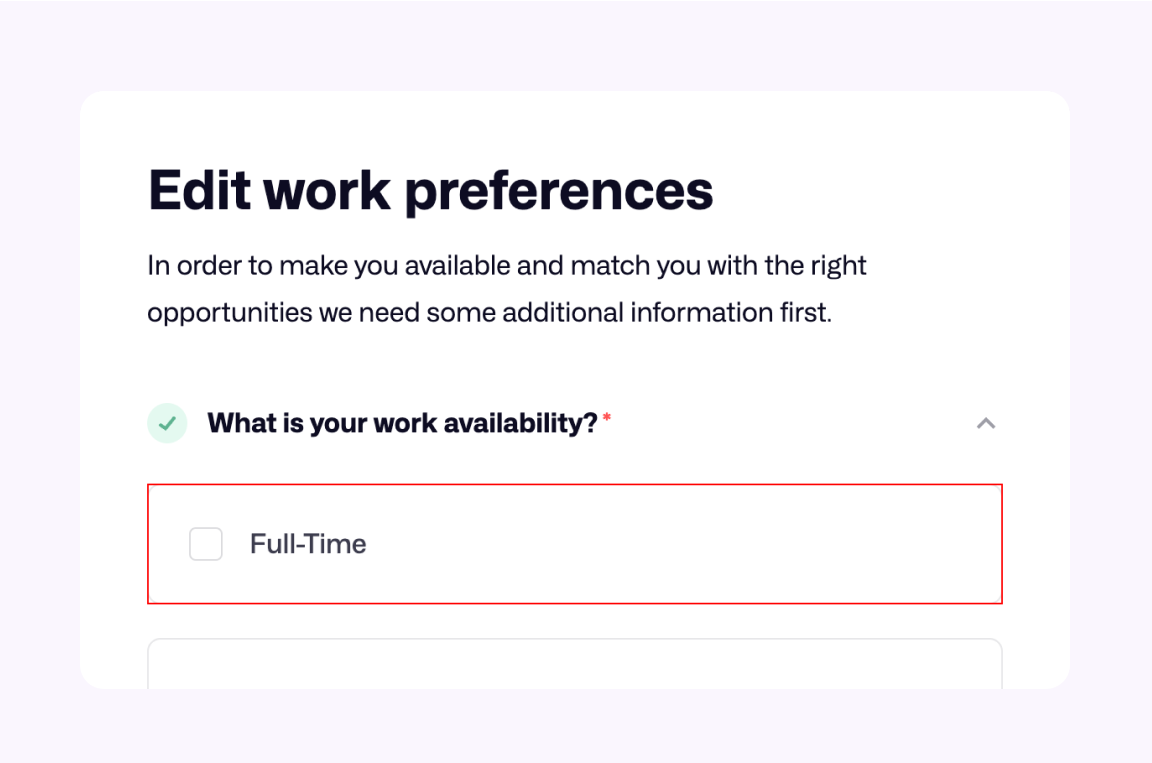
Much better.
Target size cheatsheet
I worked on a simple A4 cheatsheet that summarize the most important points in the guide. It’s only for 7.00 USD and you can purchase it as a support for this guide.
Outro
When I started working on this article, I hadn’t expected it to grow that large. I initially wanted to make an interactive guide about the clickable area, but after a lot of research, I decided to call it “Target size”.
I already published about this topic five years ago, but felt the need to do it again, and I’m glad for that.
Thank you
- Thanks to my wife and partner, Kholoud, for her great support throughout the creation of this guide. I asked her about it every day for the past 6 weeks, and she didn’t kick me out of our home.
- Florens Verschelde for shedding the light on the initial and fast movement of Fitts’s law.
- The useMousePosition hook by Joshua Comeau
- Astro table of contents by Kevin Drum
- This article by Costa Alexoglou on Smashing Magazine inspired me to the solution of safe triangles, but I used a clip-path instead.
Resources
- Accessible Target Sizes
- Target Size and 2.5.5
- Foundations: target sizes
- Touch Targets on Touchscreens
- Finger-Friendly Design: Ideal Mobile Touchscreen Target Sizes
Enjoyed the read? If you'd like to support my work, consider buying me a coffee. This interactive guide took 6 weeks, which translates to 54 coffee cups. Thanks a latte!