It’s one of the most used elements on the web. <button></button> can be used to activate certain interactions like showing data, open modals, submit forms.. etc. In this article, I will walk you through the fine details of a button element and how to style it perfectly to ensure that it works great on all browsers.
Adding on that, I will explain how to style the most common button styles, and shed light on some pitfalls we face while building them.
Table of Contents
- The Default Styles
- Basic Button Design
- Button With An Icon
- Button With Multiple Lines
- Anchor Link
<a>Vs<button> - A
<button>Doesn’t Need To Look Like A Button - Dealing With Outline Buttons
- Gradient Buttons
- Using Height Vs. Padding, Which is better?
- Wrapping The Button’s Content In A Span
- Buttons Inside a Flexbox or Grid Container
- Using Em Units
The Default Styles
Ok, this might sound easy but it’s interesting. Here is the default styling from Google Chrome’s user agent style sheet.
.c-button {
  -webkit-writing-mode: horizontal-tb !important;
  -webkit-appearance: button;
  border-color: rgb(216, 216, 216) rgb(209, 209, 209) rgb(186, 186, 186);
  border-style: solid;
  border-width: 1px;
  padding: 1px 7px 2px;
  text-rendering: auto;
  color: initial;
  display: inline-block;
  text-align: start;
  margin: 0em;
  font: 400 11px system-ui;
}
Here is how the default button looks without resetting any styles:
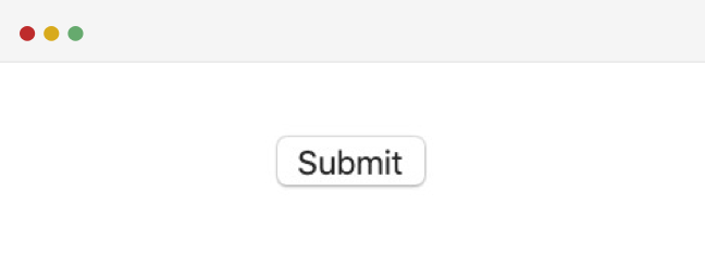
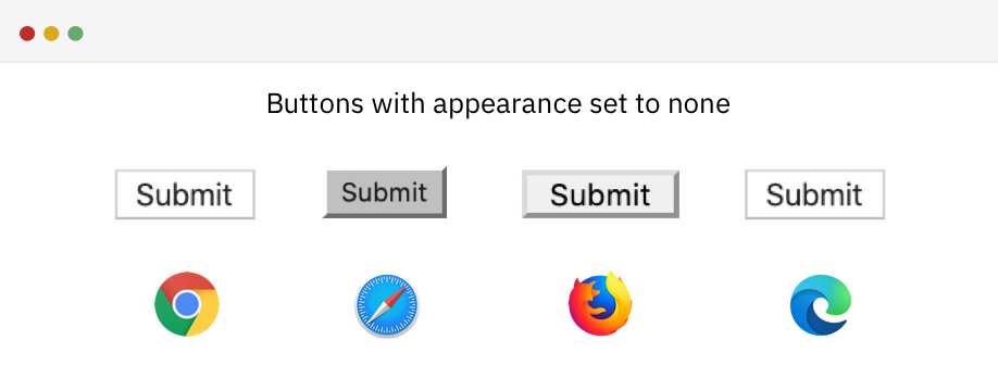
First, we need to override the appearance property. It’s used to provide a platform-native styling that is based on the user operating system (OS).
.c-button {
  -webkit-appearance: none;
  -moz-appearance: none;
  appearance: none;
}
With that, here is the difference in how the button is looking at Chrome Vs. Firefox:
Next, a couple of resets is needed before we start with the actual styling for the button. For example, border, background, and roundness.
.c-button {
  -webkit-appearance: none;
  -moz-appearance: none;
  appearance: none;
  border: 0;
  border-radius: 0;
  background: #ccc;
}

Now that we’ve reset the default style for the button, it’s time to move on to the next sections where I will explain how to do different styles for a button based on a design provided.
Basic Button Design
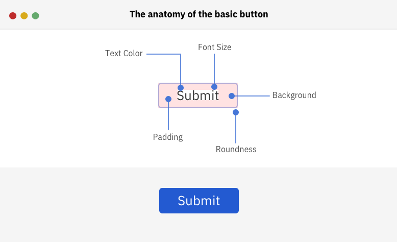
As a basic example to get the ball rolling, I will start by working on a simple button design. Here is the anatomy of the button:
.c-button {
  appearance: none;
  border: 0;
  border-radius: 5px;
  background: #4676d7;
  color: #fff;
  padding: 8px 16px;
  font-size: 16px;
}
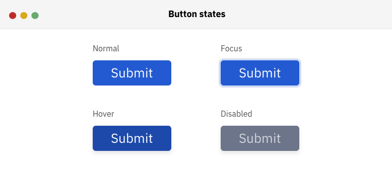
By having the above CSS, we can get a result similar to the button design we have. Next, I will take care of other states of the button: hover, focused, and disabled styles.
Hover and Focus Styles
To give the user an indication when the button is hovered, it’s important to add a style for that interaction. The same concept applies to the focus style for a keyboard user.
As per this article by Ire Aderinokun, The order of adding the hover and focus pseudo-classes matter.
When the hover style is added before the focus one, each style works correctly. However, the issue lies in when focus is placed before hover. When the element is clicked with the mouse, the focus style won’t appear at all, and only the hover style will be visible.
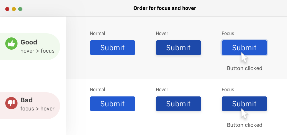
Here is how the correct order should be:
.c-button:hover {
  background: #1d49aa;
}

.c-button:focus {
  outline: none;
  box-shadow: 0 0 0 4px #cbd6ee;
}
Minimum width for the button
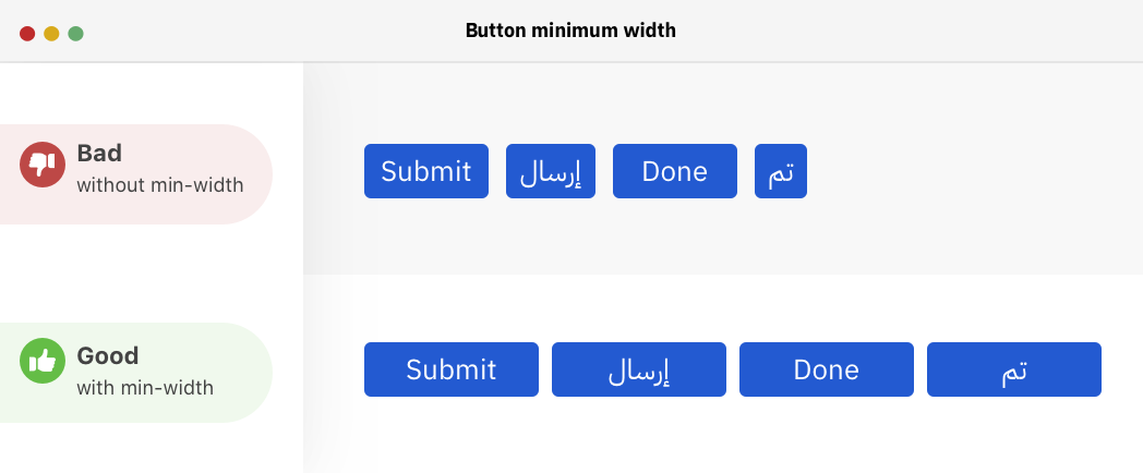
To ensure that the button has a proper width, it’s important to think ahead of that and accounts for short or long button content. Thanks to min-width, it can help in establishing a minimum width for the button. Here is a detailed article on min-width and similar properties by yours truly.
Take the figure below, where there are some buttons with varying content length, in both English and Arabic. Without a minimum width, the button width can get too small if the text is short. It’s better to avoid that by using min-width.
.c-button {
  min-width: 100px;
  /* other styles */
}
Don’t Forget Padding
It might be tempting to not add horizontal padding for the button since it has a width and there is enough spacing on both sides, correct? No, this might be incorrect in case the content changed.
Consider the below figure.
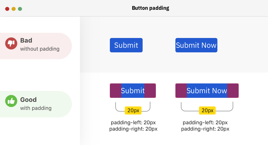
Notice how the button content is close to the edges when there is no padding. Even though it has a min-width. In the correct example, there is padding + min-width, which is more guaranteed when the content is unexpected.
Button’s Font Family
By default, form elements don’t inherit the font family that is being applied to the <html> or <body> element.
Fun fact: I wrote 70% of this article and realized that I didn’t change the button’s font nor wrote a section about it.
To solve that issue, the font-family property should be set to inherit.
.c-button {
  font-family: inherit;
  /* other styles */
}
Disabled state
To indicate that a button is disabled, we can add the disabled attribute to it and then style that with CSS.
<button disabled></button>
.c-button[disabled] {
  color: #d2d5db;
  background: #6c7589;
  cursor: not-allowed;
}
When a button is disabled, it can’t be focused on the keyboard and it’s removed from the accessibility tree.
Cursor On Hover
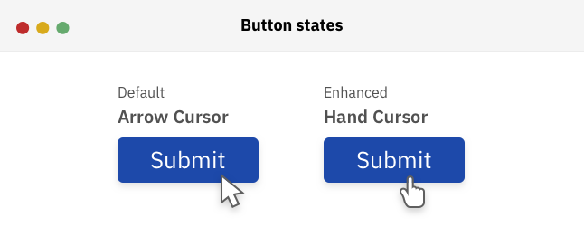
The default cursor for the button element is the pointing arrow. I liked this answer on Stackoverflow:
Buttons are a traditional desktop software UI control - a context where the hand pointer has never been used before the advent of the internet. When web pages started to use the same control, they just kept the button as it was in a desktop environment.
To override that behavior, it’s recommended to change that default cursor into a hand pointing one.
Now, we are done with the basic button styles. Here is the complete CSS:
.c-button {
  min-width: 100px;
  font-family: inherit;
  appearance: none;
  border: 0;
  border-radius: 5px;
  background: #4676d7;
  color: #fff;
  padding: 8px 16px;
  font-size: 1rem;
  cursor: pointer;
}

.c-button:hover {
  background: #1d49aa;
}

.c-button:focus {
  outline: none;
  box-shadow: 0 0 0 4px #cbd6ee;
}
In the next sections, I will explain about the different styles and types for a button that you can use for your own project.
Button With An Icon
Sometimes, we need a button with an icon to make it look more prominent or to communicate a specific message. It’s important to implement that inaccessible way.
![]()
In the example below, we have a button with an icon, and I added an aria-hidden attribute for the icon so it can be hidden from the accessibility tree. I also added focusable=false to avoid the icon being focused in IE.
Notice that I used vertical-align: middle to align the icon vertically with the button content.
<button class="c-button">
  <svg
    aria-hidden="true"
    focusable="false"
    width="24"
    height="24"
    viewBox="0 0 24 24"
  >
    <!-- Icon code -->
  </svg>
  Add to fav
</button>
.c-button svg {
  display: inline-block;
  vertical-align: middle;
  fill: #fff;
  width: 20px;
  height: 20px;
  margin-right: 0.25rem;
}
The above might work until we need to hide the text and make it an icon button only. How to? First, I need to wrap the text in a span element for example, and then I will test and enhance it further.
<button class="c-button c-button--icon">
  <svg
    aria-hidden="true"
    focusable="false"
    width="24"
    height="24"
    viewBox="0 0 24 24"
  >
    <!-- Icon code -->
  </svg>
  <span>Add to fav</span>
</button>
It might be tempting to hide the span and call it a day:
.c-button--icon span {
  display: none;
}
While the above hides the text and keeps the icon, it’s very bad for accessibility. The button is no longer accessible by screen readers. For example, VoiceOver on macOS announced it as Button only. How to solve that? Well, we have a couple of solutions.
Using SVG Icons
While I prefer the icons used to be SVG, it’s recommended to combine all the SVGs into one file, and then to call each icon with the <use> element in SVG. See below example:
<svg class="c-icon" width="32" height="32" viewBox="0 0 20 20">
  <use xlink:href="icons.svg#facebook"></use>
</svg>
In the example above, the SVG icon with the ID #facebook is called. By doing that, we can reduce the code duplication.
How To Size The Icon Button
Since the button’s text is no longer visible and we have min-width, the button’s width won’t shrink to the size of the icon. To account for that, it’s better to set a custom width for the icon button.
![]()
.c-button--icon {
  min-width: initial;
  text-align: center;
  padding: 10px 14px;
}
Hiding The Text Visually
By using the popular .sr-only class, the element can be hidden visually from the screen, but still accessible to screen readers.
<button class="c-button c-button--icon">
  <svg
    aria-hidden="true"
    focusable="false"
    width="24"
    height="24"
    viewBox="0 0 24 24"
  >
    <!-- Icon code -->
  </svg>
  <span class="sr-only">Add to fav</span>
</button>
.sr-only {
  border: 0;
  clip: rect(0 0 0 0);
  -webkit-clip-path: polygon(0px 0px, 0px 0px, 0px 0px);
  clip-path: polygon(0px 0px, 0px 0px, 0px 0px);
  height: 1px;
  margin: -1px;
  overflow: hidden;
  padding: 0;
  position: absolute;
  width: 1px;
  white-space: nowrap;
}
Setting Font Size To Zero
By setting the font-size to zero, the span element won’t take any space. So it’s actually hidden!
.c-button--icon span {
  font-size: 0;
}
However, I will lean towards the sr-only solution since it appears more logical for me. The font-size kinda looks like a hack, maybe?
Using Aria Label
If there is no a <span> element in the button, then there should be a way to substitute that. One way is to use an aria-label attribute, either on the <button> or the <svg> element.
<button class="c-button c-button--icon" aria-label="Add to fav">
  <svg
    aria-hidden="true"
    focusable="false"
    width="24"
    height="24"
    viewBox="0 0 24 24"
  >
    <!-- Icon code -->
  </svg>
</button>
If you want to dig more in icon buttons, here is a detailed article by Sara Soueidan.
Button With Multiple Lines
In some cases, we might need to have a button with two lines of text. See the figure below:
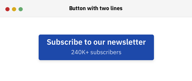
We have a button for a subscription form, with a supporting text. How to build that in an accessible way? Let’s see how to handle that.
<button class="c-button">
  <span>Subscribe to our newsletter</span>
  <span>240K+ subscribers</span>
</button>
A screen reader will announce that button as “Subscribe to our newsletter 240K+ subscribers”. When a user hears that, it’s confusing because there is no break between any of the two texts. See the screenshot below from Chrome’s accessibility inspector:
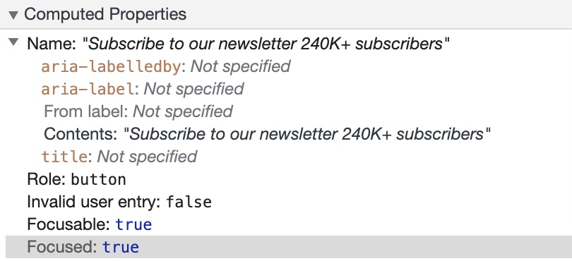
To avoid that confusion, I would prefer to hide the second text from screen readers. We can do that by using an aria-hidden attribute on the span element.
<button class="c-button">
  <span>Subscribe to our newsletter</span>
  <span aria-hidden="true">240K+ subscribers</span>
</button>
If you can’t change the HTML markup for some reason, there is a way to add a secondary text for the button. There is a solution that caught my eyes (Seen on Smashing Magazine’s website) for this problem is to place the content with pseudo-elements. That way, screen readers won’t read it. See the CSS below:
.c-button--multiple span:after {
  content: "240K+ subscribers";
  display: block;
  font-weight: 400;
  margin-top: 0.25rem;
}
Anchor Link <a> Vs <button>
When to use an anchor link <a> or a <button> element? First, let’s distinguish between them.
An Anchor Link
It represents a hyperlink that redirects to another page on the website or to link sections on the same page. The four pseudo-classes :hover, :focus, :active, and :visited can be used with it. From an accessibility perspective, the link can be accessed by the enter keyboard key, and screen readers announce it as well.
A Button Element
The <button type="button"> element does nothing until we specify its job with JavaScript. The pseudo-classes :hover, :focus, and :active can be used with it. From an accessibility perspective, the button can be accessed by the enter or space keyboard keys, and screen readers announces it as well.
From a design perspective, it happens that a web page contains buttons with the same style, and they are different in terms of HTML. To account for that, our .c-button class CSS should be done in a way that makes it works for <button> or <a> elements. Consider the example below:
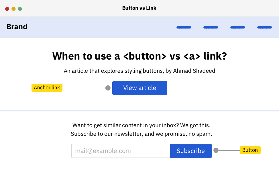
Notice that we have “buttons” with the same style. However, the first one is an anchor link <a>, and the second one for the newsletter is a <button> element. That means it’s not necessary that a button should be a <button> in HTML.
There are two additions to the .c-button class, which are text-decoration, and text-align: center. By default, links have an underline with them, and we want to reset that with the class we have. Adding on that, it’s important to center the button’s content in case it wasn’t a <button> element.
.c-button {
  /* other styles */
  /* Works only for anchor links */
  text-decoration: none;
  text-align: center;
}
A <button> Doesn’t Need To Look Like A Button
I liked this example by Scott O’Hara which implements an accessible accordion pattern. At first, the markup looks like the below (Assuming that JavaScript is not available):
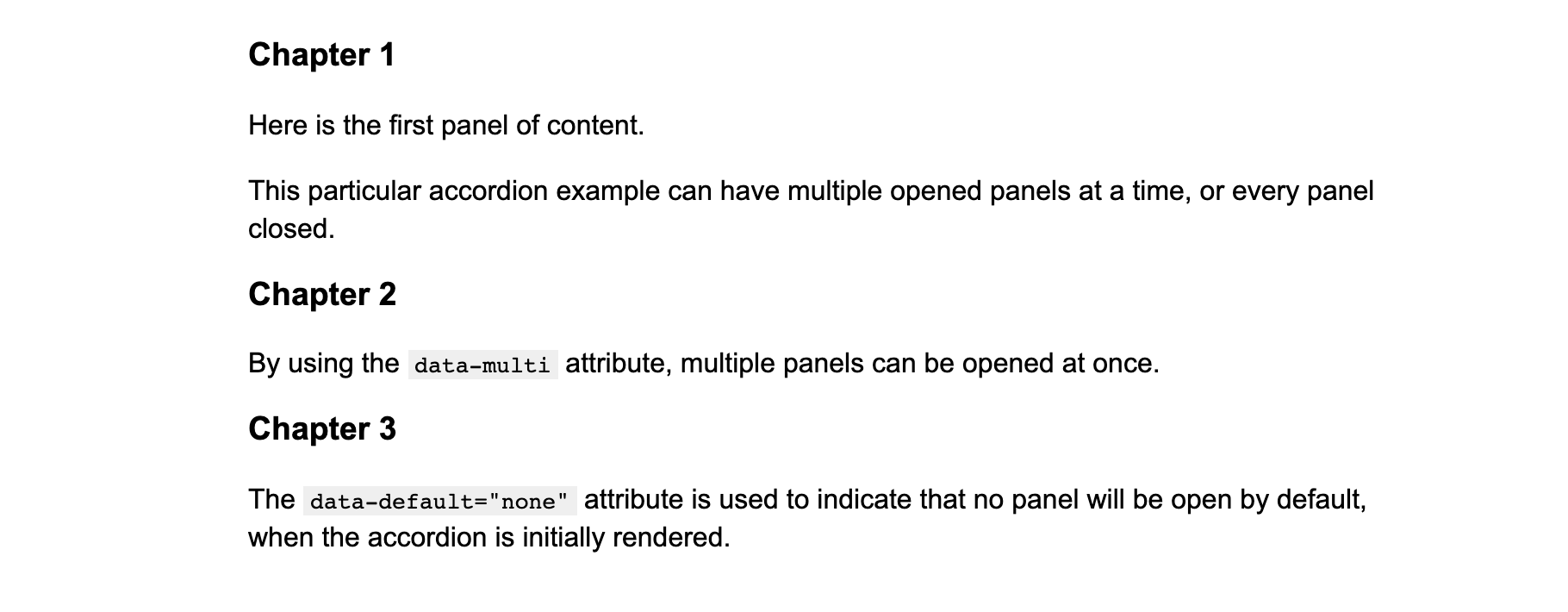
<div class="accordion" data-aria-accordion>
  <h2 data-aria-accordion-heading>Heading of my panel</h2>
  <div data-aria-accordion-panel>
    <p>Content goes here</p>
  </div>
</div>
In case JavaScript is available, the markup above will be converted into an expand/collapse functionality by creating a <button> and appending it inside the <h2> element.

In that case, using a <button> is the right choice since it does expand/collapse the details content.
Download Button
When we have a document of any kind and want to have a downloadable link for it, what would you use? Anchor link for the rescue! By adding the download attribute to the link, it can trigger a download when clicked.
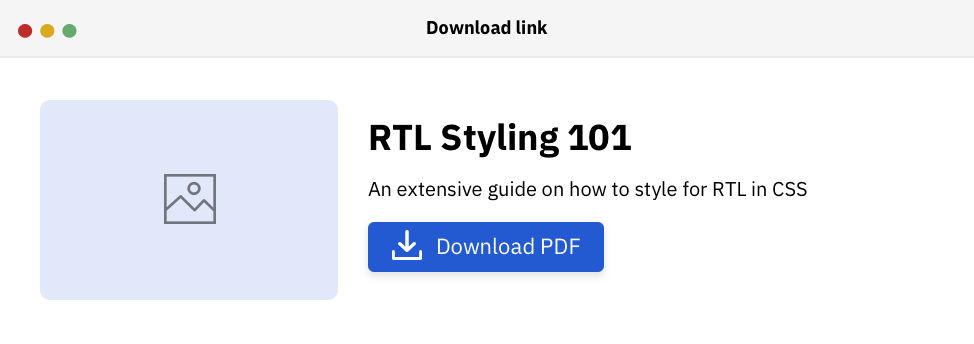
<a href="rtl-101.pdf" download>Download PDF</a>
That way, we can have a link, styled as a button and does its job in a semantic way.
Dealing With Outline Buttons
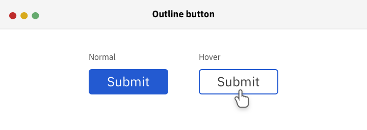
In the figure above, we have a button that becomes outlined on hover. How to do it in the best possible way? First, the border should be added by default with a transparent color. By doing that, it will prevent the border to be painted on hover.
.c-button {
  border: 2px solid transparent;
  /* other styles */
}

.c-button:hover {
  background: transparent;
  color: #222;
  border-color: #4676d7;
}
With that, we have a button that turns into an outline style when it’s hovered.
Gradient Buttons
While working on my article about CSS positioning, I needed to have a button with a gradient fill.
I wanted to have the result as below:

There are two variations of the buttons, a gradient and an outline one. To achieve that, I need to have a transparent border for the base button (Gradient one). That border will be shown for the outline button only.
.c-button {
  display: inline-block;
  color: #fff;
  background: linear-gradient(to bottom, #00acee, #0072e0);
  font-size: 18px;
  font-weight: 500;
  padding: 12px 26px;
  border-radius: 100px;
  /* A transparent border added for the outline button variation */
  border: 3px solid transparent;
  text-decoration: none;
}

.c-button--outline {
  background: transparent;
  color: var(--color-brand-primary);
  border-color: var(--color-brand-primary);
}
However, I got a weird issue and I asked about it in a tweet. See the screenshot below that shows the issue:
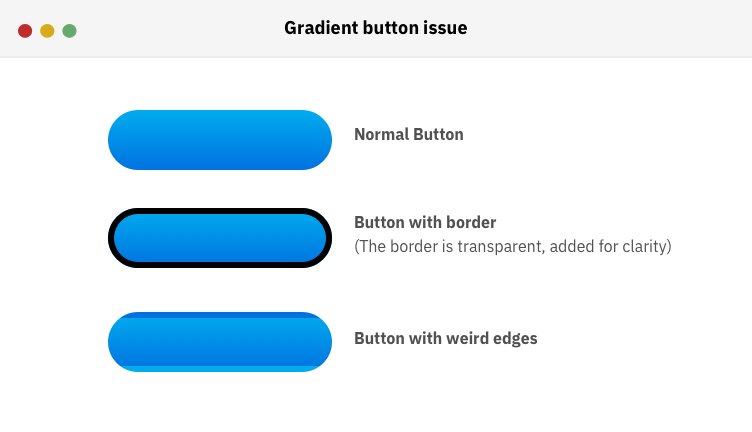
Now that you have an idea about how the gradient button looks when it has a transparent border, let me explain the technical reason behind that issue.
Each element has a default background-origin with the value padding-box. What it does is that it resizes the gradient to fit within the boundaries of the border.
I added a large border value to see how the result will become. Notice that the gradient is repeated and its size is equal to the padding of the button element.
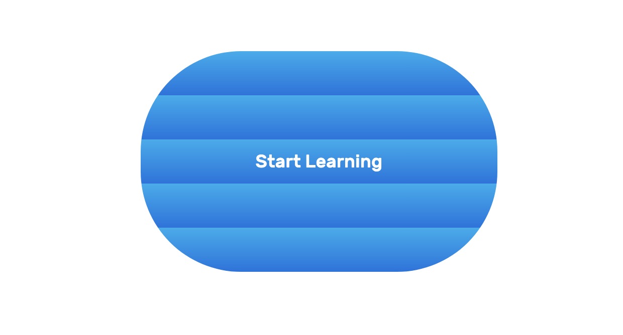
To solve the issue, the origin of the background should on the border-box, instead of the padding-box:
.c-button {
  /* other styles */
  background-origin: border-box;
}
Using Height Vs. Padding, Which is better?
Each button has a height which could be added by using an explicit height value, or by using padding for the top and bottom sides. Note that the below issues are mostly for anchor link <a> elements.
Fixed Height
Let’s suppose that we have the following button.
.c-button {
  /* other styles */
  min-width: 120px;
  height: 45px;
}
With that, the text is not centered. It looks like the below figure:
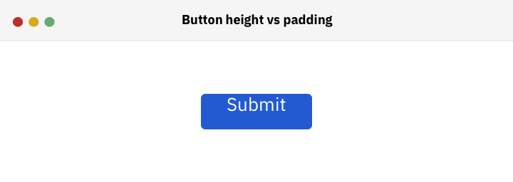
To fix it and center the text, we can either add padding or use line-height property. By setting line-height with equal or close value to the button’s height, the text will be centered.
.c-button {
  /* other styles */
  min-width: 120px;
  height: 45px;
  line-height: 45px;
}
However, the downsides of this method are:
- It’s not guaranteed that the button’s text will be always centered. It can be off if the font changes.
- When the
font-sizeis increased, theline-heightvalue needs to be tweaked. - The
line-heightmight not work consistently in case the website is multilingual. - It can’t work if we have a button with two lines of text.
Vertical Padding
By adding an equal value of padding-top and padding-bottom, the button’s content is expected to be centered. Correct? Well, it depends.
There are fonts that do really well in centering, and others are not. Sometimes, one of the padding values needs to be tweaked a bit. Consider the below button:
.c-button {
  /* other styles */
  min-width: 120px;
  padding: 16px 14px;
}
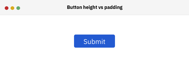
In that case, the button’s content looks off-centered. The top padding should be decreased a bit.
.c-button {
  /* other styles */
  min-width: 120px;
  padding: 14px 14px 16px 14px; /* Top, Right, Bottom, Left */
}
Wrapping The Button’s Content In A Span
While researching, I noticed that Adobe’s buttons are a bit off-centered. See the screenshot below:

I inspected them and noticed an interesting pattern. The content is wrapped in a <span> element with a fixed height for the button.
<button class="c-button-adobe">
  <span>Save Changes</span>
</button>
For a <button> element, the <span> is centered by default. When the height is changed, the content is centered automatically, without padding or anything. See below GIF:
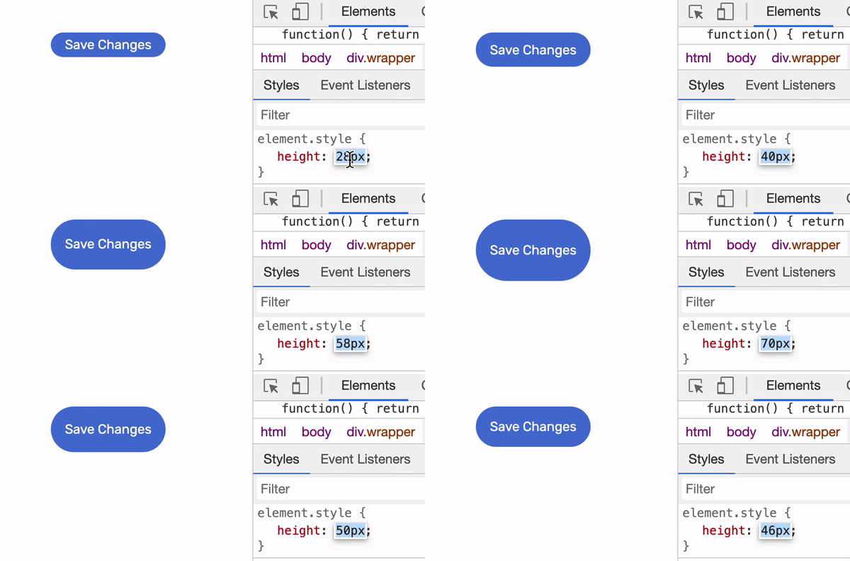
However, if there is a link that looks like a button, then the <span> needs to be centered. To account for that, we can use flexbox.
.c-button {
    /* other styles */
    display: inline-flex; *To keep the button inline, and flex container at the same time*
    align-items: center;
    justify-content: center;
}
That’s it. I want to credit this while working on that section.
Buttons Inside a Flexbox or Grid Container
You might be wondering, what the heck is the relation between buttons and flexbox/grid? Well, let me tell you.
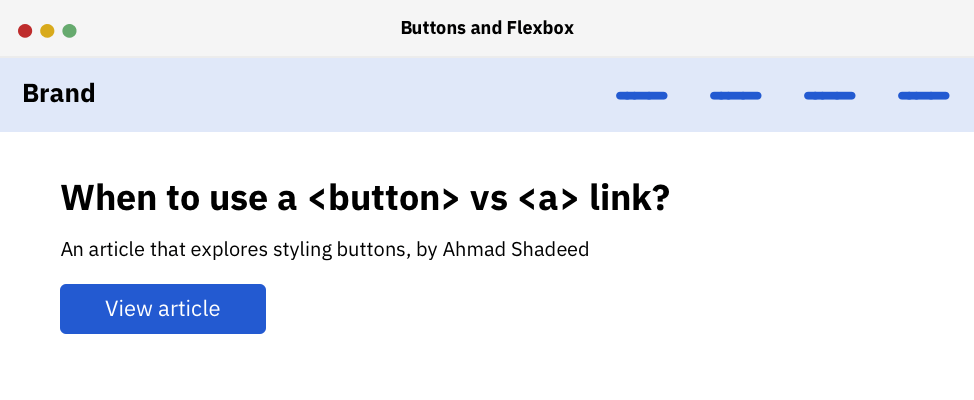
I was working on a hero section for a project and wanted to vertically center its content. So I used flexbox as below:
.c-hero {
  display: flex;
  flex-direction: column;
  justify-content: center;
}
..and I was a bit surprised with the below result:
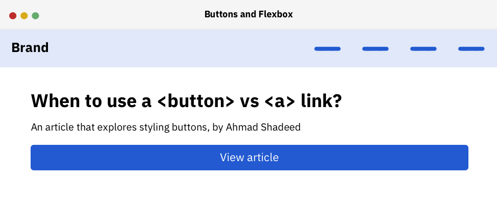
By default, each flex item is stretched within its parent width and that’s what happened to the button element. To avoid such issues, we need to reset the alignment of it:
.c-button {
  /* other styles */
  align-self: flex-start;
}
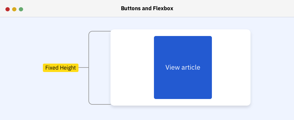
Another common issue is when the button is wrapped in a flex container, with flex-direction: row as the default. The button height will stretch to its parent height. To avoid that, we should use align-self property on the button, or align-items on the flex parent.
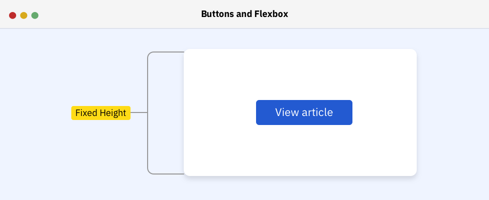
.c-button {
  align-self: center;
}
By setting the alignment of the button to the center of its wrapper, the issue is solved. Here is how it looks:
Using Em Units
To size buttons properly, em units can be used for that purpose. They’re powerful and very helpful for that job. An em unit is equal to the font-size of the element (px or rem). Consider the below example:
.element {
  font-size: 16px;
  padding: 0.5em;
}
The padding value is equal to 16 * 0.5 in that case.
Let’s suppose that we have three sizes of a button: normal, medium, and large. When em is used for padding, width/height, and margins, it can create a fluid button that can be easily resized. Consider the below example:

I extracted the CSS that uses em unit.
.c-button {
  /* other styles */
  font-size: 1rem;
  min-width: 6.25em;
  border-radius: 0.3125em;
  padding: 0.625em 1em;
}

.c-button svg {
  width: 1.25em;
  height: 1.25em;
  margin-right: 0.25em;
}
And for the buttons, we need to create a class for each type, with different font sizes.
.c-button--md {
  font-size: 22px;
}

.c-button--lg {
  font-size: 30px;
}
See the Pen Styling Buttons - Em Unit by Ahmad Shadeed (@shadeed) on CodePen.
I wrote about that in detail for CSS-Tricks. Make sure to give it a read!
Animation and Transitions
To provide a better experience, it’s important to add a transition when the the button is hovered. The simplest thing is to do a transition on the background color. See the next section of the transition I added.
Final Button
See the Pen Styling Buttons - Final Button by Ahmad Shadeed (@shadeed) on CodePen.
Final Words
I enjoyed working and researching for this article. It has been a long due for over a year and I’m happy that it’s out now. Hope you like it!
Related Articles
- Anchors vs Buttons By Ire Aderinokun
- Styling buttons, the right way By Florens Verschelde
- A Complete Guide to Links and Buttons By CSS-Tricks
The End
That’s a wrap. Do you have a comment or a suggestion? Please feel free to ping me on @shadeed9.

