The Layout Maestro
If two or more elements are close, then the user will assume that they somehow belong to each other. When grouping multiple design elements, the user can decide how they relate to each other by the amount of space between them. Without spacing, it will be hard for a user to skim a page and know what items that are related and what are not.
In this article, I will cover everything you need to know about spacing in CSS, the different ways of achieving that, and when to use a padding or margin. Let’s dive in!
Table Of Contents
- Types Of Spacing
- CSS Grid Gap
- CSS Flexbox Gap
- CSS Positioning
- Use Cases And Practical Examples
- Using Abstracted Components
- Spacer Components
- CSS Math Functions: Min(), Max(), Clamp()
Types of Spacing
Spacing in CSS has two types, one that is outside an element, and the other is inside it. For this article, I will call them outer and inner. Let’s suppose that we have an element, the spacing within it is inner, and the spacing outside it is an outer spacing.
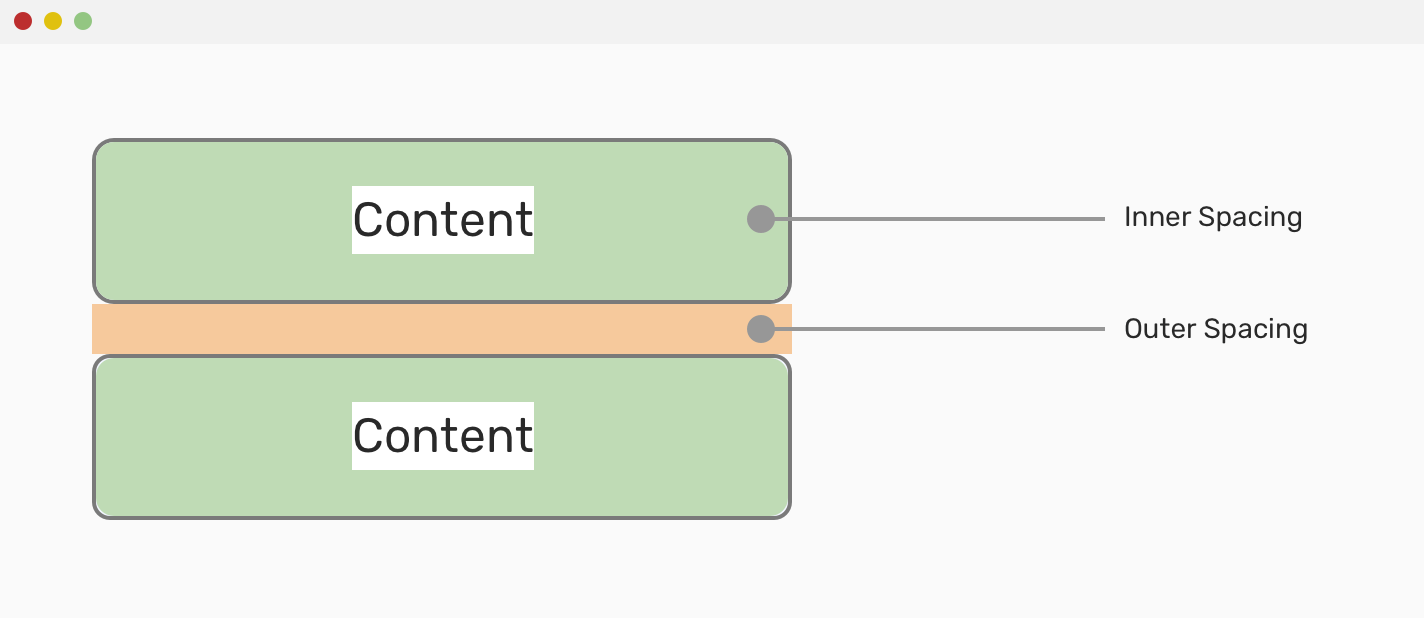
In CSS, it’s possible do the spacing as below:
.element {
  padding: 1rem;
  margin-bottom: 1rem;
}
I used padding for the inner spacing, and margin for the outer one. Quite simple, isn’t it? However, this can get more and more complex when dealing with components that have a lot of details and child elements.
Margins - Outer Spacing
It’s used to add spacing between an element and another. For example, in the previous example, I added margin-bottom: 1rem to add vertical spacing between the two stacked elements.
As margin can be added in four different directions (top, right, bottom, left), it’s important to shed light on some basic concepts before diving in with example and use cases.
Margin Collapse
In simple words, margin collapse happens when two vertical elements have a margin, and one of them has a greater margin than the other. In that case, the greater margin will be used, and the other will be ignored.
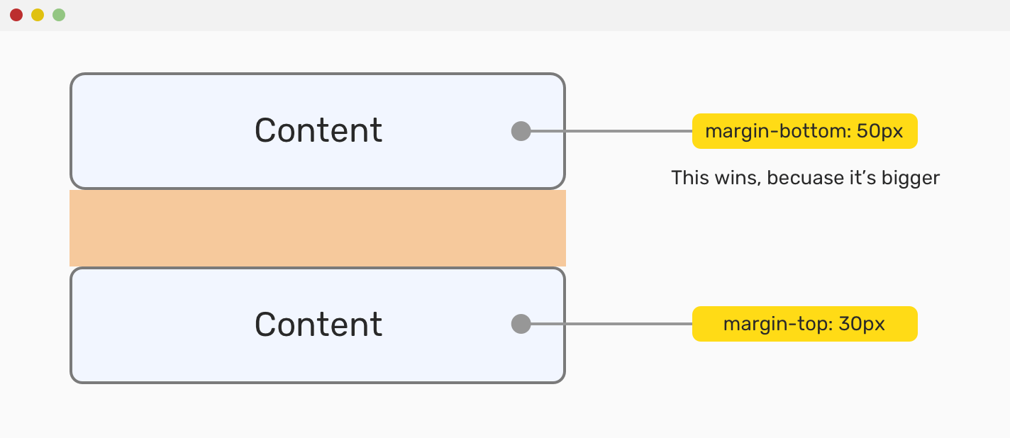
In the mockup above, one element has margin-bottom and the other has margin-top. The element with greater margin wins.
To avoid such an issue, it’s recommended to use a single-direction margin as per this article. Even more, CSS Tricks did a poll between margin-bottom and margin-top. 61% of the voters prefer margin-bottom over margin-top.
See how the issue is fixed below:
.element:not(:last-child) {
  margin-bottom: 1rem;
}
With the :not CSS selector, you can easily remove the margin from the last child to avoid unneeded spacing.
Another example that is related to margin collapse is the child and parent. Let’s suppose the following:
<div class="parent">
  <div class="child">I'm the child element</div>
</div>
.parent {
  margin: 50px auto 0 auto;
  width: 400px;
  height: 120px;
}

.child {
  margin: 50px 0;
}
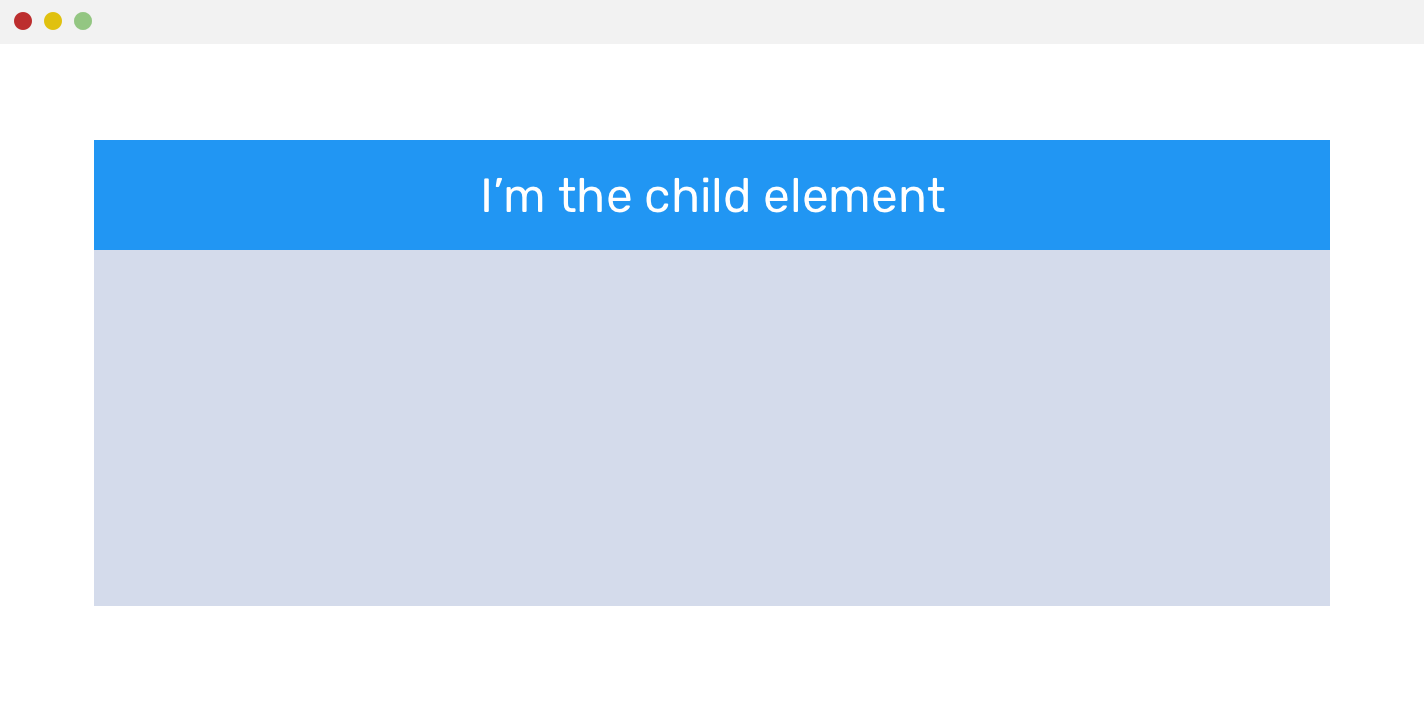
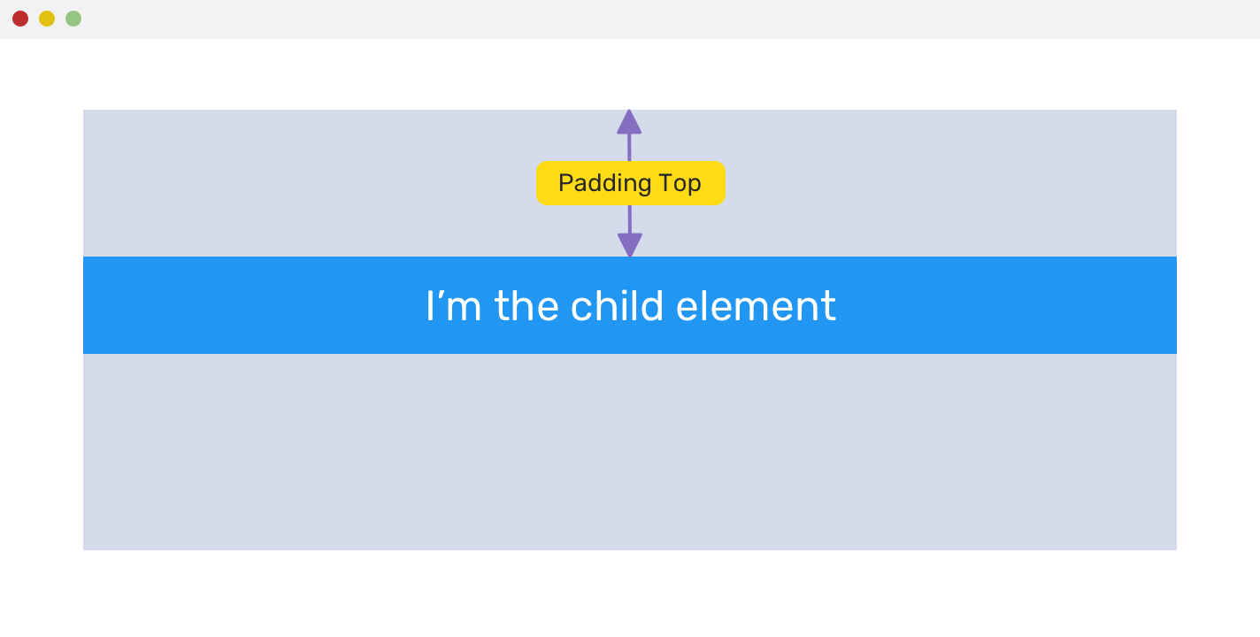
Notice that the child element is stuck to the top of its parent. That because its margin is collapsed. As per W3C, here are some solutions for that issue:
- Adding a
borderto the parent element - Changing the child element display to
inline-block
A more straightforward solution will be to add padding-top to the parent element.
Negative Margin
It can be used with the four directions for margin, and it’s very useful in some use cases. Let’s suppose the following:
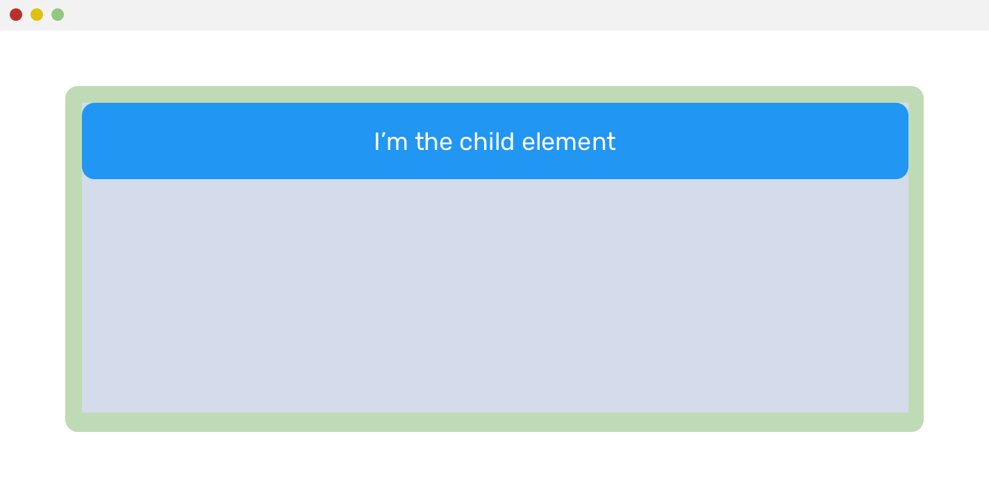
The parent has padding: 1rem, which caused the child to have offset from the top, left, and right. However, the child element should stick to the edges of its parent. Well, negative margins to the rescue!
.parent {
  padding: 1rem;
}

.child {
  margin-left: -1rem;
  margin-right: -1rem;
  margin-top: -1rem;
}
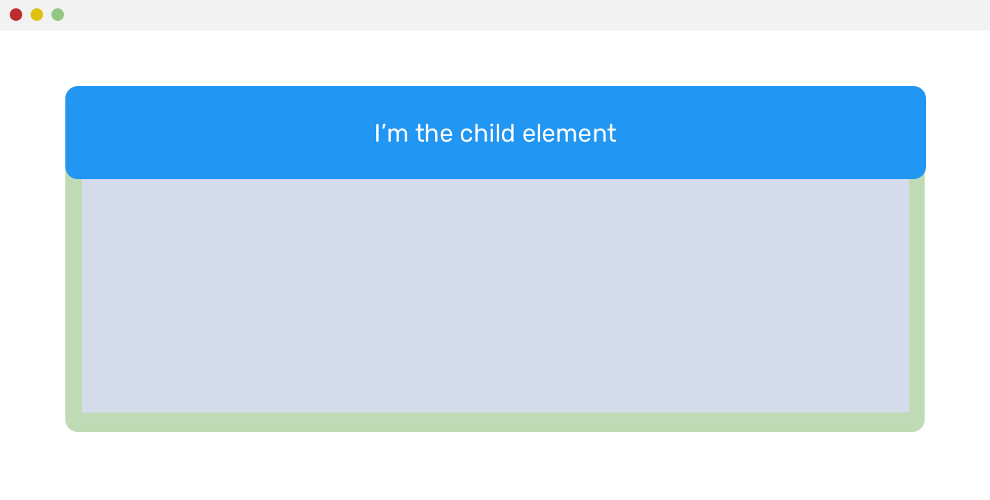
If you’re interested to dig more in negative margins, I recommend this article by Peter-Paul Koch.
Padding - Inner Spacing
As I mentioned previously, padding adds an inner spacing inside an element. The goal of it can vary depending on the case used.
For instance, it can be used to increase the spacing around links, which will result in a larger clickable area for the link.

Padding Is Not Working
It’s important to mention that vertical padding doesn’t work with elements that have display: inline, like <span> or <a>. If padding is added, it won’t affect the element and the padding will override other inline elements.
This is just a friendly reminder that the display property should be changed for inline elements.
.element span {
  display: inline-block;
  padding-top: 1rem;
  padding-bottom: 1rem;
}
CSS Grid Gap
In CSS grid, it’s possible to add spacing between columns and rows easily with the grid-gap property. It’s a shorthand for the row and column gaps.
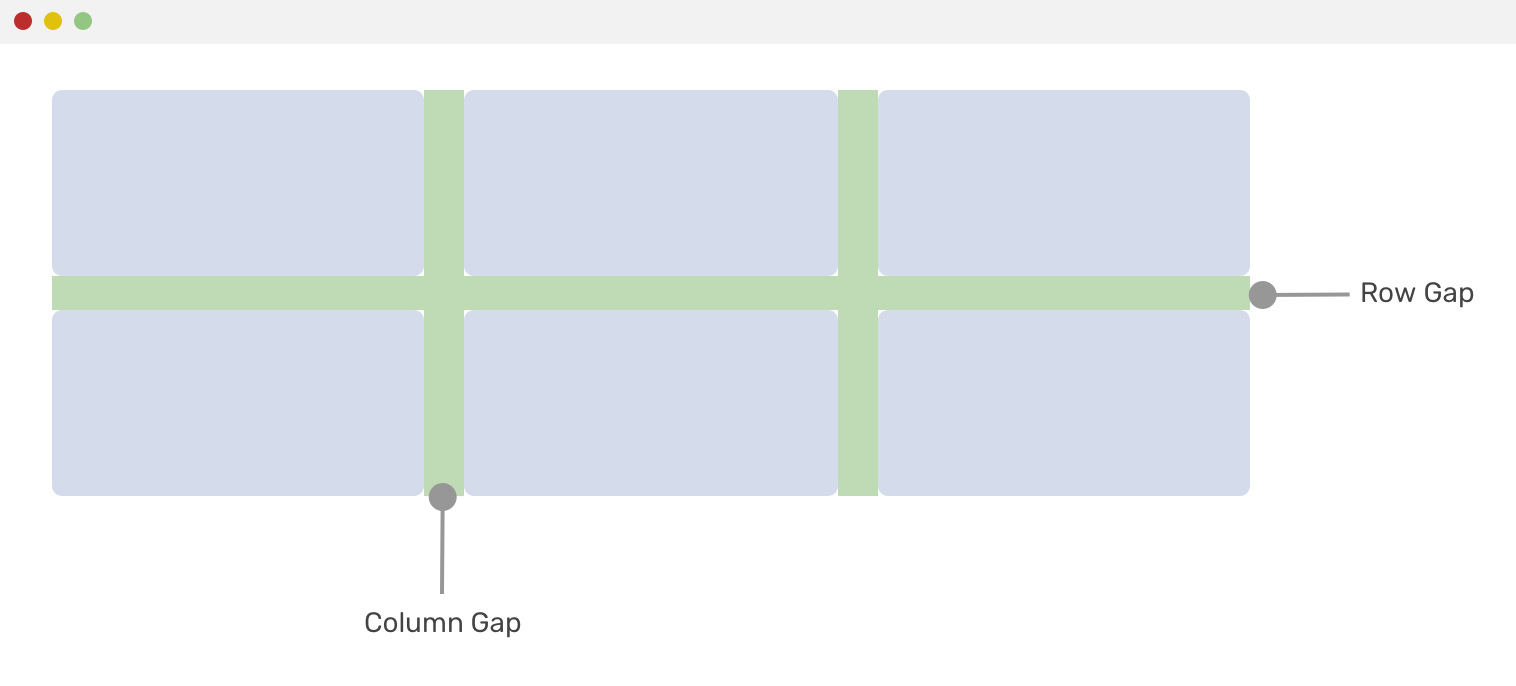
.element {
  display: grid;
  grid-template-columns: 1fr 1fr;
  grid-gap: 16px; /* Adds gap of 16px for both rows and columns */
}
The longhand properties for gap can be used as below:
.element {
  display: grid;
  grid-template-columns: 1fr 1fr;
  grid-row-gap: 24px;
  grid-column-gap: 16px;
}
CSS Flexbox Gap
gap is a proposed property that will be used for both CSS grid and flexbox. The downside that it’s supported only in Firefox at the time of writing this article.
.element {
  display: flex;
  flex-wrap: wrap;
  gap: 16px;
}
Adding on that, it’s not possible to use it with CSS @supports to detect if it’s supported or not and enhance based on that. If you like it, please vote to help in bringing it to Chrome.
CSS Positioning
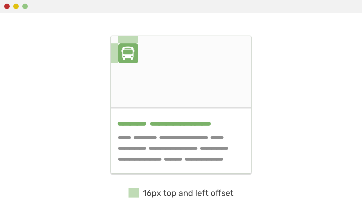
It might not be a direct way of spacing elements, but it plays a role in some design cases. For example, an absolutely positioned element that needs to be positioned 16px from the left and top edges of its parent.
Consider the following example. A card that has an icon which should be spaced from the top-left edge of its parent. In that case, the following CSS is being used:
.category {
  position: absolute;
  left: 16px;
  top: 16px;
}
Use Cases and Practical Examples
In this section, you will go through different use cases that you will encounter during day-to-day work while working on CSS projects.
A Header Component

In this case, the header has a logo, navigation, and user profile. Can you guess how the spacing should be done in CSS? Well, let me add a skeleton mockup for you.
<header class="c-header">
  <h1 class="c-logo"><a href="#">Logo</a></h1>
  <div class="c-header__nav">
    <nav class="c-nav">
      <ul>
        <li><a href="#">...</a></li>
      </ul>
    </nav>
    <a href="#" class="c-user">
      <span>Ahmad</span>
      <img class="c-avatar" src="shadeed.jpg" alt="" />
    </a>
  </div>
</header>

The header has padding on the left and right sides. The purpose of this is to prevent the content from sticking to the edges.
.c-header {
  padding-left: 16px;
  padding-right: 16px;
}
For the navigation, each link should have enough padding from the vertical and horizontal sides, so its clickable area can be big, which will enhance accessibility.
.c-nav a {
  display: block;
  padding: 16px 8px;
}
And for the spacing between each item, you can either use margin or change the display of the <li> to inline-block. Inline block elements add a little space between its sibling, due to the fact that it treats elements like characters.
.c-nav li {
  /* This will create the spacing you saw in the skeleton */
  display: inline-block;
}
Finally, the avatar and the user name have a margin to their left side.
.c-user img,
.c-user span {
  margin-left: 10px;
}
Notice that if you’re building a multilingual website, it’s recommended to use CSS logical properties as below.
.c-user img,
.c-user span {
  margin-inline-start: 1rem;
}

Notice that the spacing around the separator is now equal. The reason is that the navigation items don’t have a specific width and instead, they have padding. As a result, the navigation items width is based on their content. Here are the solutions:
- Set a minimum width for the navigation items
- Increase the horizontal padding
- Add an additional margin on the left side of the separator
The easiest and better solution is the third one, which is to add a margin-left.
.c-user {
  margin-left: 8px;
}
Spacing In Grid Systems - Flexbox
Grids are one of the most used cases that for spacing. Consider the following example:

The spacing should be between the columns and rows. Consider the following HTML markup:
<div class="wrapper">
  <div class="grid grid--4">
    <div class="grid__item">
      <article class="card"><!-- Card content --></article>
    </div>
    <div class="grid__item">
      <article class="card"><!-- Card content --></article>
    </div>
    <!-- And so on.. -->
  </div>
</div>
Usually, I prefer to keep components encapsulated and avoid adding a margin to them. For that reason, I have the element grid__item, where my card component will live in.
.grid--4 {
  display: flex;
  flex-wrap: wrap;
}

.grid__item {
  flex-basis: 25%;
  margin-bottom: 16px;
}
With the above CSS, four cards will be in each row. Here is one possible solution to add the space between them:
.grid__item {
  flex-basis: calc(25% - 10px);
  margin-left: 10px;
  margin-bottom: 16px;
}
By using CSS calc() function, the margin is deducted from flex-basis. As you see, this solution is not that easy. What I prefer is the following:
- Add
padding-leftto the grid item - Add a negative
margin-leftwith the samepadding-leftvalue to the grid parent.
I learned the solution above from CSS Wizardy years ago (I forgot the article title, if you know it please let me know).
.grid--4 {
  display: flex;
  flex-wrap: wrap;
  margin-left: -10px;
}

.grid__item {
  flex-basis: 25%;
  padding-left: 10px;
  margin-bottom: 16px;
}
The reason I used a negative margin-left, is because the first card has padding-left while in reality it’s not needed. So it will push the wrapper to the left and cancel that unneeded space.
Another similar concept is to add padding to both sides, and then a margin is negative. Here is an example of Facebook’s stories:

.wrapper {
  margin-left: -4px;
  margin-right: -4px;
}

.story {
  padding-left: 4px;
  padding-right: 4px;
}
Spacing In Grid Systems - CSS Grid
And now, to the exciting part! With CSS grid, you can add spacing very easily with grid-gap. Also, you don’t need to care about the grid item width nor the bottom margin thing. CSS Grid does everything for you!
.grid--4 {
  display: grid;
  grid-template-columns: 1fr 1fr 1fr;
  grid-gap: 1rem;
}
And that’s it! Isn’t that much easier and straightforward?
Gap on Demand
What I really like about CSS grid is that the grid-gap is applied only in case it’s needed. Consider the following mockup.
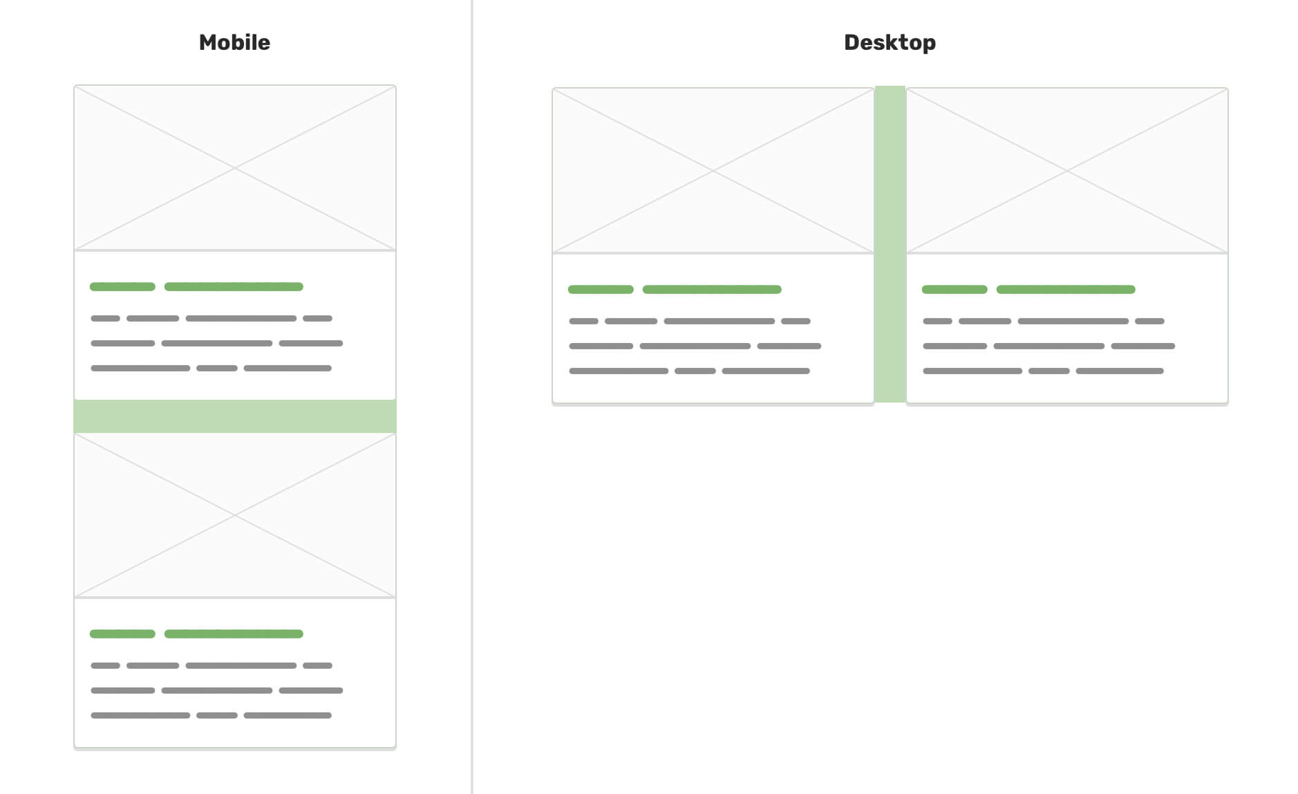
I have a section with two cards. On mobile, I want the spacing to be below the first one, and on desktop, the spacing will be between them. It’s not possible to have this flexibility without CSS grid. First, see below:
.card:not(:last-child) {
  margin-bottom: 16px;
}

@media (min-width: 700px) {
  .card:not(:last-child) {
    margin-bottom: 0;
    margin-left: 1rem;
  }
}
Not comfortable, right? What about this one?
.card-wrapper {
  display: grid;
  grid-template-columns: 1fr;
  grid-gap: 1rem;
}

@media (min-width: 700px) {
  .card-wrapper {
    grid-template-columns: 1fr 1fr;
  }
}
And it’s done! Much, much easier.
Dealing With Bottom Margin
Let’s suppose that the following components stack. Each component has a bottom margin.

Notice that the last element has a margin. This is incorrect as margin should only be between elements.
It could be fixed using one of the solutions below:
Solution 1 - CSS :not Selector
.element:not(:last-child) {
  margin-bottom: 16px;
}
Solution 2 - Adjacent Sibling Combinator
.element + .element {
  margin-top: 16px;
}
While solution #1 is tempting, it has the below drawbacks:
- It causes CSS specificity issues. It’s not possible to override it until
:notselector is used. - It won’t work in case the design has more than one column. See the figure below.

Regarding solution #2, it doesn’t have a CSS specificity issue. However, it will only work with one column stacks.
A better solution is to cancel the unneeded spacing by adding a negative margin to the parent element.
.wrapper {
  margin-bottom: -16px;
}
Here is what happens. It pushes the element to the bottom with a value equal to the bottom spacing. Be careful to not go over the margin value as it will overlap its sibling elements.
Card Component
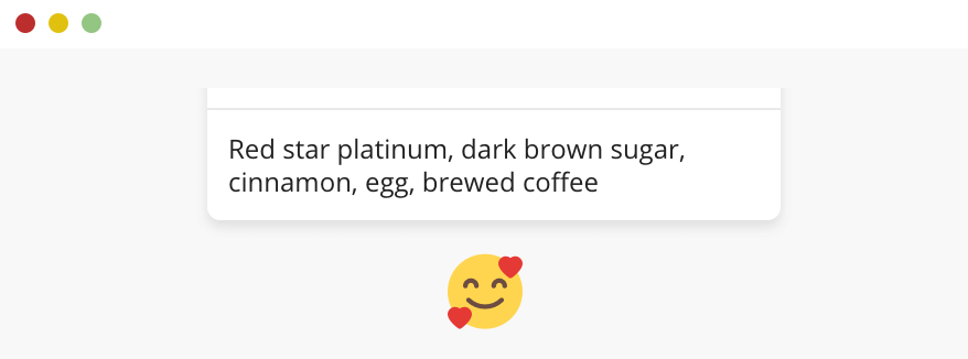
Oh, If I want to go in all details for the card component spacing, I might end up with a book. I will highlight a general pattern and see how spacing should be applied.
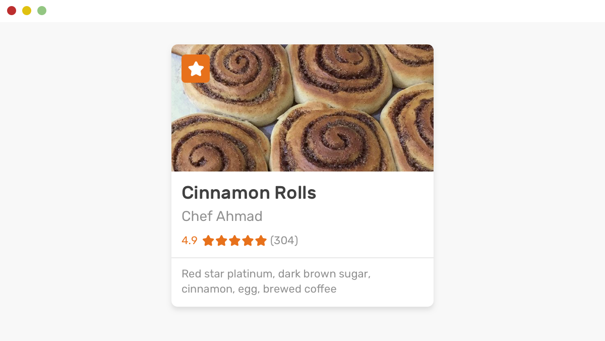
(Sorry, if you’re hungry)
Can you think of where spacing will be used in this card? See the figure below.
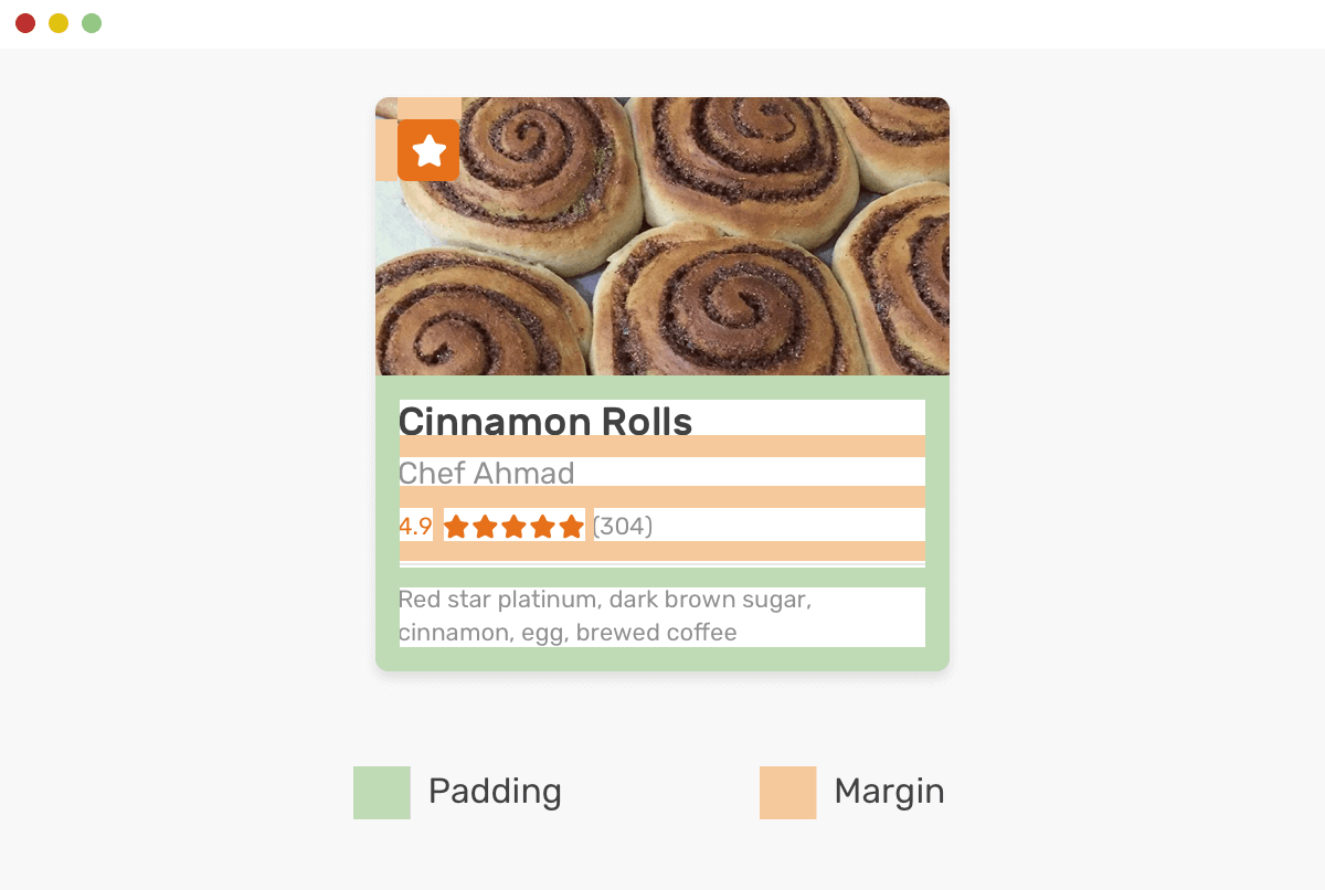
<article class="card">
  <a href="#">
    <div class="card__thumb"><img src="food.jpg" alt="" /></div>
    <div class="card__content">
      <h3 class="card__title">Cinnamon Rolls</h3>
      <p class="card__author">Chef Ahmad</p>
      <div class="card__rating"><span>4.9</span></div>
      <div class="card__meta"><!-- --></div>
    </div>
  </a>
</article>
.card__content {
  padding: 10px;
}
The padding above will add an offset to all child elements within it. Then, I will add all margins.
.card__title,
.card__author,
.card__rating {
  margin-bottom: 10px;
}
For the separation line between the rating and the card meta, I will add it as a border.
.card__meta {
  padding-top: 10px;
  border-top: 1px solid #e9e9e9;
}
Oops! The border is not sticking to the edges because of the padding applied to the parent element .card__content.
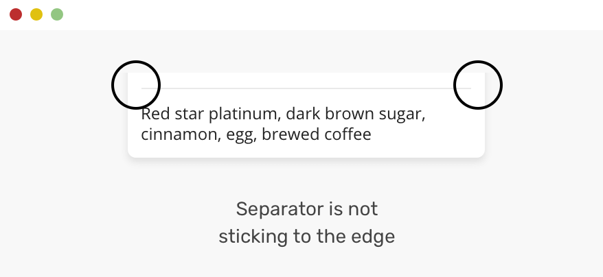
Yes, you guessed it! Negative margin is the fix.
.card__meta {
  padding-top: 10px;
  border-top: 1px solid #e9e9e9;
  margin: 0 -10px;
}
Oops, again! Something is wrong. The content is stuck to the edges!

To solve the issue, the content should be padded (Oh, looks like padded is a new word) from the left and right edges.
.card__meta {
  padding: 10px 10px 0 10px;
  border-top: 1px solid #e9e9e9;
  margin: 0 -10px;
}
Article Content
I believe this is a very, very common use case. Since an article content is coming from a CMS (Content Management System) or is generated automatically from a markdown file where it’s not possible to add classes for the elements.
Consider the following example which contains a mix of headings, paragraphs, and images.
<div class="wrapper">
  <h1>Spacing Elements in CSS</h1>
  <p><!-- content --></p>
  <h2>Types of Spacing</h2>
  <img src="spacing-1.png" alt="" />
  <p><!-- content --></p>
  <p><!-- content --></p>
  <h2>Use Cases</h2>
  <p><!-- content --></p>
  <h3>Card Component</h3>
  <img src="use-case-card-2.png" alt="" />
</div>
To make them look good, the spacing should be consistent and used carefully. I borrowed some styles from type-scale.com.
h1,
h2,
h3,
h4,
h5 {
  margin: 2.75rem 0 1.05rem;
}

h1 {
  margin-top: 0;
}

img {
  margin-bottom: 0.5rem;
}
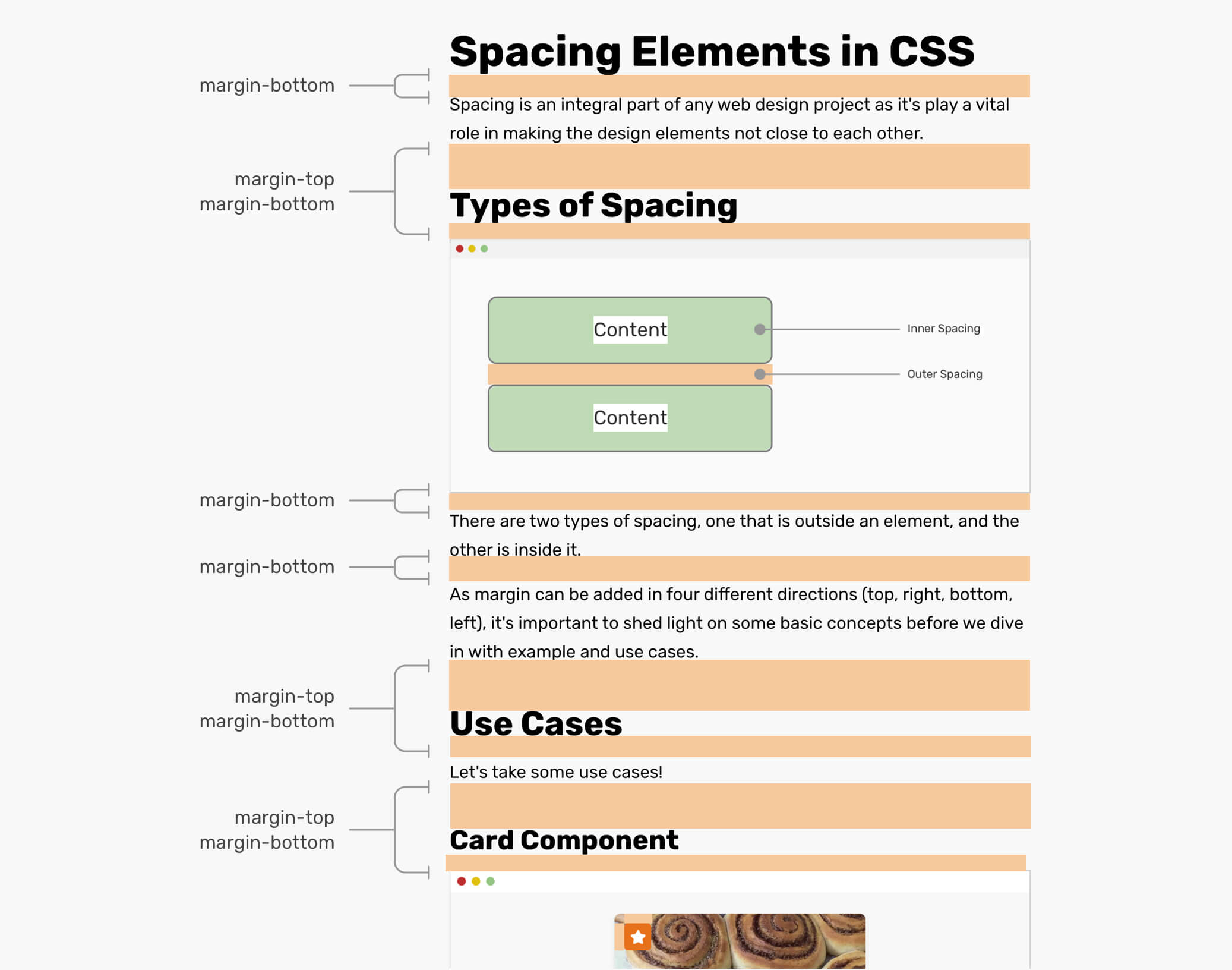
If a <p> is followed by a heading, for example, “Types of Spacing”, the margin-bottom of the <p> will be ignored. You guessed it, that’s because of margin collapse.
Just In Case Margin
I like to call this “Just in case” margin, because that what it means, literally. Consider the below mockup:
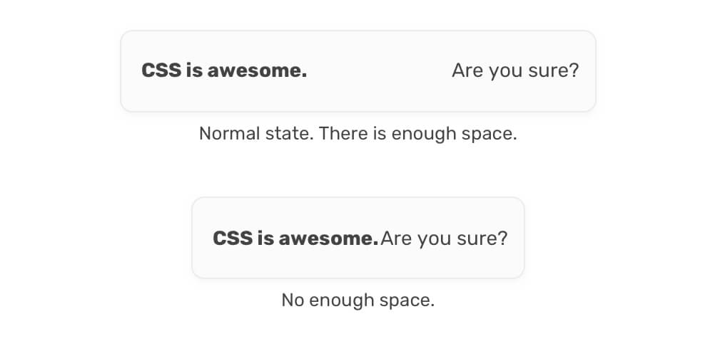
The elements doesn’t look good when they’re close to each other. I built them with flexbox. This technique is called “Alignment Shifting Wrapping” which I learned about its name from CSS Tricks.
.element {
  display: flex;
  flex-wrap: wrap;
}
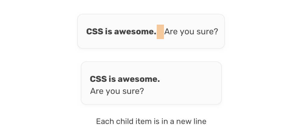
They do end up in a new line when the viewport size is smaller. See below:

What needs to be solved is the in-between design state, where the two items are still next to each other, but the spacing between them is zero. In that case, I prefer to add a margin-right to the element, so it prevents them from touching each other, which will make the flex-wrap work faster.
CSS Writing Modes
As per Mozilla Developer Network (MDN):
The writing-mode CSS property sets whether lines of text are laid out horizontally or vertically, as well as the direction in which blocks progress.
Have you ever thought about how margin should behave when it’s used with an element that has a different writing-mode? Consider the following example.
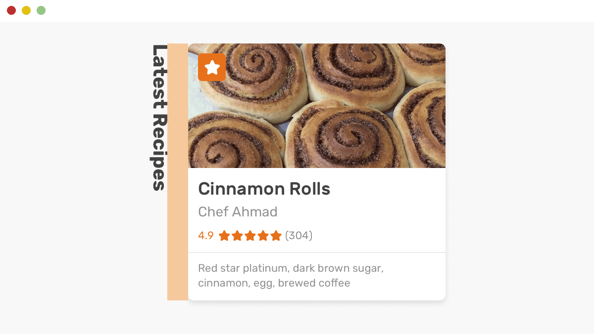
.wrapper {
  /* To make the title and the recipe in the same line */
  display: flex;
}

.title {
  writing-mode: vertical-lr;
  margin-right: 16px;
}
The title is rotated 90 degrees, and there should be a space between it and the image. It turned out that margins works perfectly based on the writing-mode.
And I think that’s enough for the use cases. Let’s move on to some interesting concepts!
Components Encapsulation
A large design system contains so many components. Is it logical to add margins directly to them?
Consider the following example.

<button class="button">Save Changes</button>
<button class="button button-outline">Discard</button>
Where the spacing between the buttons should be added? Should it be added to the left or right button? Maybe you might use the adjacent sibling combinator as below:
.button + .button {
  margin-left: 1rem;
}
This is not good. What if there is a case with one button only? Or, how this will work on mobile when it’s stacked vertically? Lots and lots of complexities.
Using Abstracted Components
A solution to the above issue is to have abstracted components with the goal of hosting other components. As Max Stoiber said it, it’s kind of moving the responsibility of managing the margins to the parent element. Let’s rethink the previous use-case with this mindset.
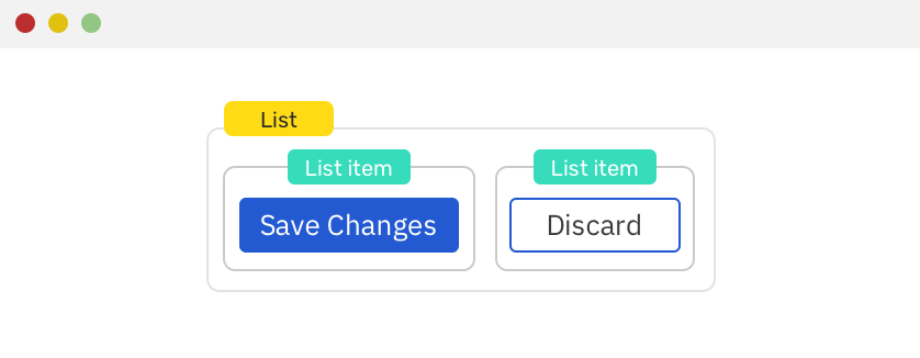
<div class="list">
  <div class="list__item">
    <button class="button">Save Changes</button>
  </div>
  <div class="list__item">
    <button class="button button-outline">Discard</button>
  </div>
</div>
Notice that I added a wrapper, and each button now is wrapped in its own element.
.list {
  display: flex;
  align-items: center;
  margin-left: -1rem; /* Cancels the left margin for the first element */
}

.list__item {
  margin-left: 1rem;
}
And that’s it! Even more, it’s fairly easy to apply these concepts in any JavaScript frame work. For example:
<List>
  <button>Save Changes</button>
  <button outline>Discard</button>
</List>
And the JavaScript tool you’re using should wrap each item in its own element.
Spacer Components
Yes, you read it correctly. I was pointed to this article that discusses the concept of avoiding margins and to use spacer components instead of them.
Let’s suppose that a section needs a 24px margin from the left, with those restrictions in mind:
- Margin can’t be used directly to the component, because it’s an already built design system.
- It should be flexible. The spacing might be on X page, but not in Y.
I first noticed this while inspecting Facebook’s new design CSS.
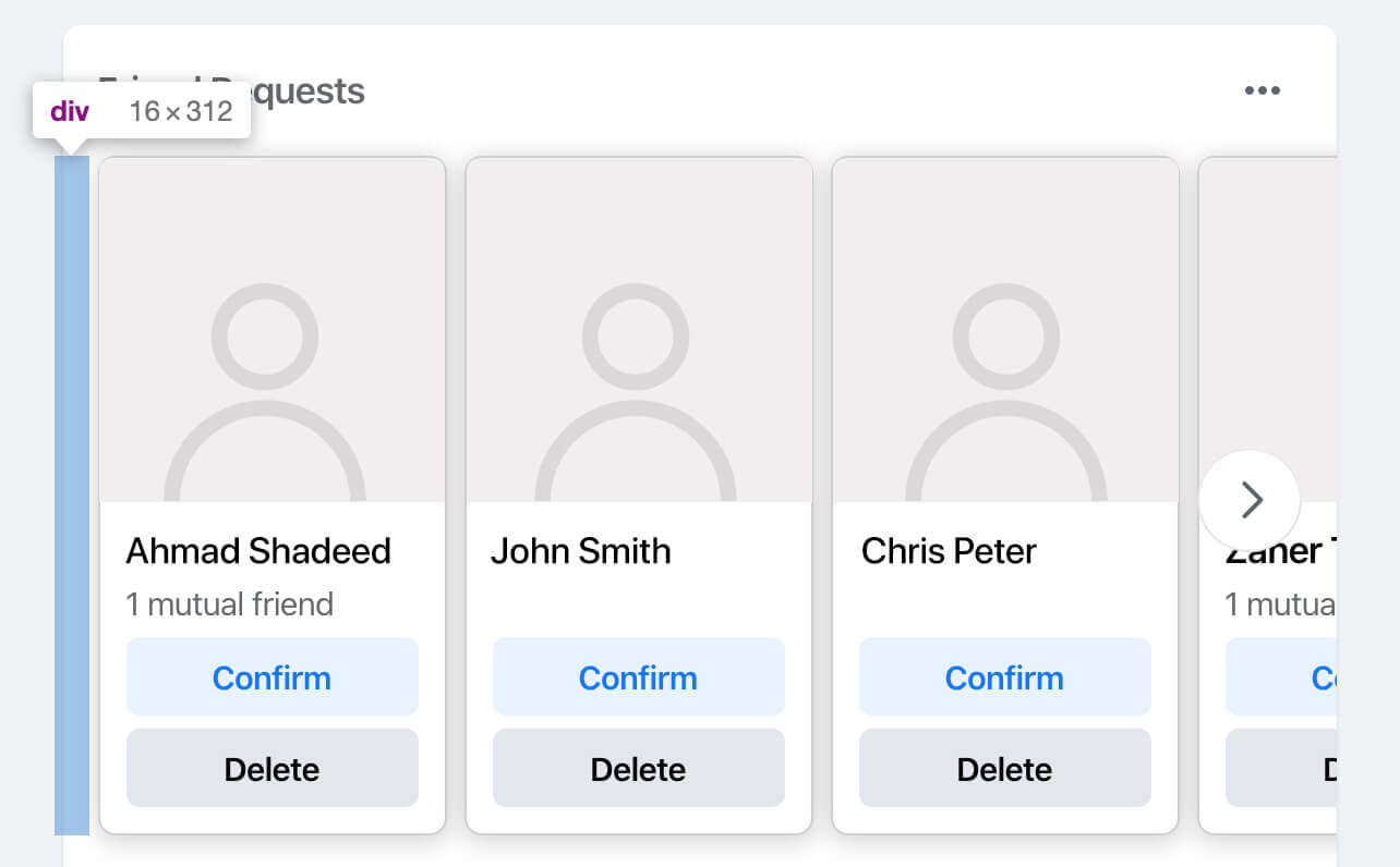
That’s a <div> with an inline style width: 16px. Its only purpose is to add a space between the left edge and the wrapper.
Quoting from this React playbook:
But in the real world, we do need spacing outside of components for composing them into pages and scenes. And this is where margin creeps into component code: for spacing compositions of components.
I do agree. For a large design system, it’s not scalable to keep adding margins to components. This will eventually result in a creepy code.
Challenges with Spacer Components
Now that you got the idea of spacer components, let’s dig into some expected challenges when using them. Here are some questions that I thought about:
- How a spacer component will take its width or height inside a parent? How it will work in horizontal vs. vertical layouts? Eg: A spacer inside a stack Vs a spacer that adds a left space.
- Should we style them based on their parent’s display type (Flex, Grid)
Let’s tackle the above questions one by one.
Sizing Spacer Components
It’s possible to create a spacer that accepts different variations and settings. I’m not a JavaScript developer, but I think they call it Props. Consider the following from styled-system.com:
We have a spacer between a header and a section.
<Header />
<Spacer mb={4} />
<Section />
While this is a bit different. A spacer that creates an auto spacing between the header logo and navigation.
<Flex>
  <Logo />
  <Spacer m="auto" />
  <Link>Beep</Link>
  <Link>Boop</Link>
</Flex>
You might think that making this with CSS is fairly easy by adding justify-content: space-between. What if the design needs to be changed? Well, in that case, the styling should be changed.
See the below. Do you see the flexibility there?
<Flex>
  <Logo />
  <Link>Beep</Link>
  <Link>Boop</Link>
  <Spacer m="auto" />
  <Link>Boop</Link>
</Flex>
Well, in that case, the styling should be changed. Do you see the flexibility there?
For the sizing part, a spacer could be sized based on its parent. For the above, maybe you can make a prop called grow which computes to flex-grow: 1 in CSS.
<Flex>
  <Spacer grow="1" />
</Flex>
Using Pseudo Elements
Another idea that I thought about is to use pseudo-elements for creating a spacer.
.element:after {
  content: "";
  display: block;
  height: 32px;
}
Maybe we can have an option to add the spacer via a pseudo-element instead of a separated element for it? For example:
<Header spacer="below" type="pseudo" length="32">
  <Logo />
  <Link>Home</Link>
  <Link>About</Link>
  <Link>Contact</Link>
</Header>
Until today, I haven’t used spacer components in my projects, but I look forward to use-cases that I can use them.
CSS Math Functions: min(), Max(), Clamp()
Is it possible to have dynamic margins? For example to set a margin that has a minimum and maximum value based on the viewport width. The answer is YES! We can. Recently, CSS math functions got supported in Firefox 75 which means that they are supported in all major browsers as per CanIUse.
Let’s recall the grid use-case to see how dynamic spacing can be used within it.
.wrapper {
  display: grid;
  grid-template-columns: repeat(3, 1fr);
  grid-gap: min(2vmax, 32px);
}
Here is what min(2vmax, 32px) means: use a gap equal to 2vmax but it shouldn’t go above 32px.
Having such flexibility is really amazing and gives us a lot of possibilities to build even more dynamic and flexible layouts.
The End
That’s a wrap. Do you have a comment or a suggestion? Please feel free to ping me on @shadeed9.
I wrote an ebook
I’m excited to let you know that I wrote an ebook about Debugging CSS.

If you’re interested, head over to debuggingcss.com for a free preview.

