When you think about building fluid layouts these days isn’t about having fixed-width breakpoints anymore. Instead, the layouts we build today need to work on nearly any device size. To my surprise, I still see websites follow the adaptive design pattern, where it has a container that gets a new max-width value as per the viewport width.
The term “responsive” means a lot of things now. We have media queries that check for user preferences, and modern CSS features that help us make a fluid layout without even using a media query. Responsive is different nowadays. It’s an exciting time, indeed!
Table of contents
- Introduction
- Responsive design over the years
- Responsive design and boring websites
- Responsive design in 2023 and beyond
- How do I think about responsive design now
- A basic example
- Modern ways to build responsive layouts
- Conclusion
- Further reading
Introduction
When I hear the term “responsive design”, the first thing that I think about is different device sizes. It’s just there in my subconscious mind. I bet some of you might be thinking the same, too. Currently, responsive design means a lot of different things.
I talk with clients and designers who think responsive design is simply having a web page designed with two versions: one for desktop, and the other for mobile. This is considered an old, outdated way of dealing with the web nowadays.
Consider the following design. We have a typical layout that needs to be responsive.
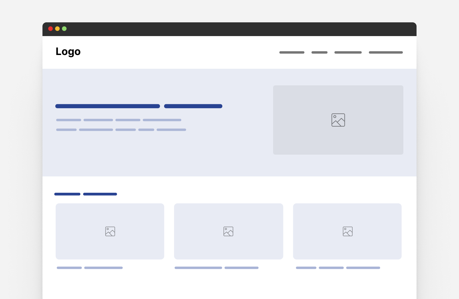
The typical response from a designer is like this:
- wrap the hero to a new line,
- reduce the font size,
- and stack the cards.
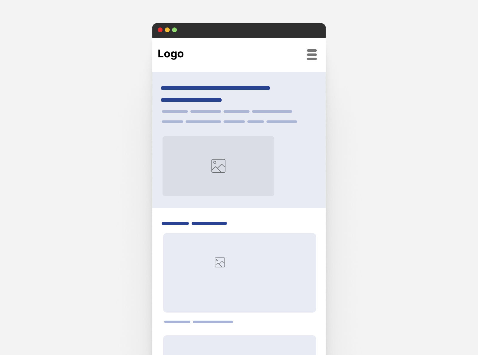
Here you go! This is a responsive design. I wish it that’s simple, but there are a lot of things that we need to take into account. If I look at the desktop design, as a designer and a frontend developer, I will have lots of questions:
- When should the hero items (content and image) wrap into a new line?
- Is the font size fluid? Or it’s just a fixed value being changed manually?
- Do we need to use responsive images?
- Do we need fluid spacing?
- Cards listing
- Is there a different variation of the card that should be displayed between the mobile and desktop sizes? (Hello, size container queries)
- Does the card image has a specific aspect ratio?
- User preferences: are there any UI details that will change based on the user - Reduced motion - Theming/color scheme
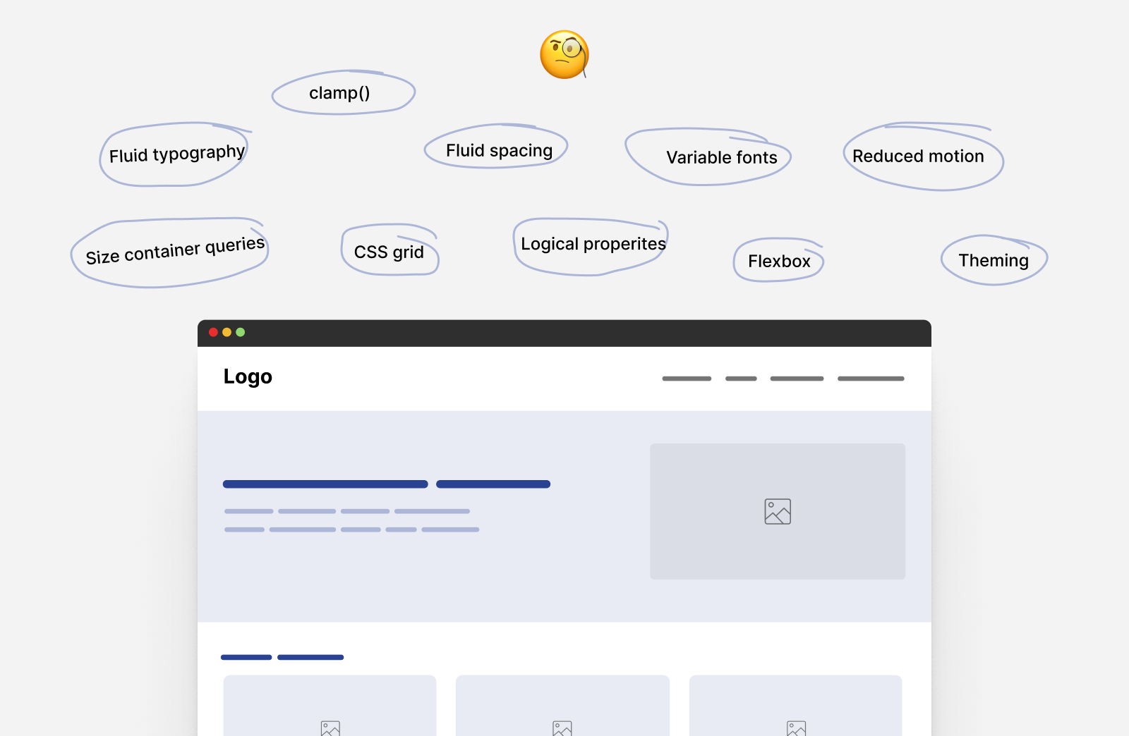
Considering this example, we can think in a way similar to the following:
Using modern CSS
- The typography is responsive to the viewport width via
clamp()function. - The spacing is responsive to the viewport width via
clamp()function. - The hero section is responsive to its content via flexbox wrapping.
- The cards grid is responsive to the available space with
minmax(), no media queries. - The card component is responsive to its wrapper via size container queries and style container queries.
- The margins and paddings are responsive to the websites language via logical properties.
Using media queries
- The site navigation is responsive to the viewport width.
- The theming is responsive to the user preferences in their operating system.
- The card hover effect is responsive to what the user is using (touch vs mouse).
In the above list, the theming and navigation are done via media queries. The rest is about modern CSS features like clamp() comparison function and container queries.
Over time, media queries will be used for components that are tied to the viewport width like the site navigation and footer. The use of modern CSS features can help us in building layouts and components that are responsive to their container, or the user preference.
Responsive design isn’t about media queries anymore.
Unfortunately, there is a mindset that I find wrong. Lots of newcomers to the web think that “Enter framework name” is the way to build a responsive website. I once had an argument with a client that we don’t need “Enter framework name” to build responsive websites. I told them that we can use CSS media queries as it’s the building blocks for the framework they mentioned.
In my country, we speak Arabic, but the word “Responsive” has become Arabized, meaning we speak it as if it’s an Arabic word, just like “Google it” became an English word. That is good, but it’s time to share more awareness that responsive design isn’t just about fixed-width breakpoints and making a website work on mobile, tablet, and desktop.
Responsive design over the years
My journey with web development started in mid-2014. At that time, responsive design was a hot topic and everyone was talking about it.
Bootstrap framework
As a newcomer to the web, I learned about Bootstrap framework, which was very popular. I thought it was the best way to make responsive layouts. One day, I decided to remove the Bootstrap CSS and write my own CSS media queries. I was surprised, as it didn’t seem as hard as I expected.
Media queries
Thinking about Bootstrap-is-easier made me think that CSS media queries are hard and are still living today with some front-end developers I meet. For them, responsive equals bootstrap. I can’t ignore the fact that Bootstrap is one of the best and most popular CSS frameworks out there, created by Mark Otto.
A lot of the front-end developers were using Bootstrap for its powerful navigation bar and grid system. I remember the times when I would inspect a website and instantly know that it was built with Bootstrap (I called it “bootstrap smells” back then).
The fixed-width breakpoints mindset
Using frameworks forced a lot of developers to think that responsive is about three breakpoints: mobile, tablet, and desktop. The rest or in-between doesn’t matter.
One thing I personally dislike is having a fixed width for a container element that changes based on the viewport width.
@media (min-width: 576px) {
  .container {
    max-width: 540px;
  }
}

@media (min-width: 768px) {
  .container {
    max-width: 720px;
  }
}

@media (min-width: 992px) {
  .container {
    max-width: 960px;
  }
}

@media (min-width: 1200px) {
  .container {
    max-width: 1140px;
  }
}
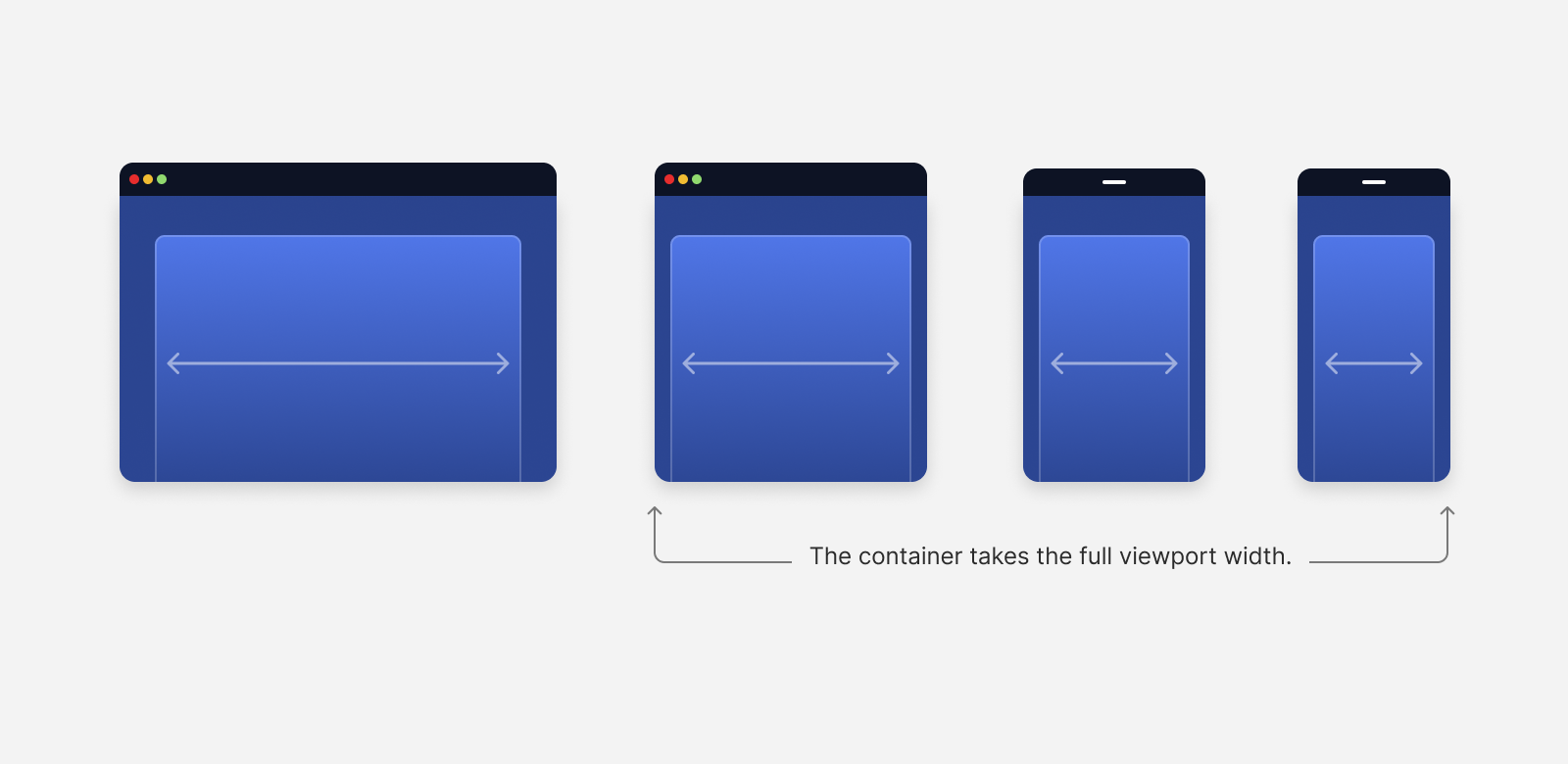
Using the above will always restrict the space that the .container have. Consider the following figure:
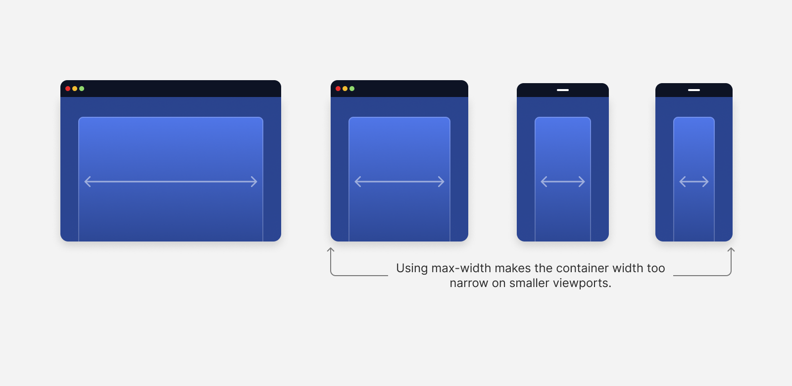
When the viewport width gets smaller, the max-width will force the container to be in a width that is smaller than the viewport. In this case, it will be much better to make the container span the full width of the screen.
We will only need one max-width to avoid having a very large container on wide screens.
@media (min-width: 1200px) {
  .container {
    max-width: 1140px;
  }
}
Let me show you a more detailed example of that problem.
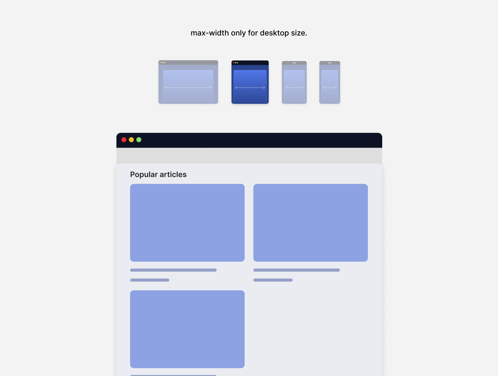
Suppose that we have a grid of cards. In the first case, they live within a .container that changes its max-width multiple times.
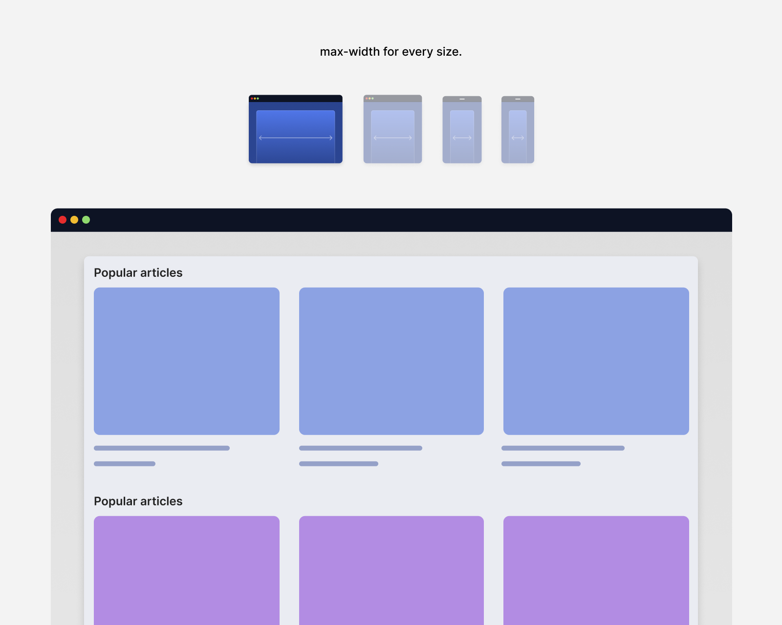
In a tablet-like view, the container will be constrained by its max-width, leaving a good chunk of empty space.
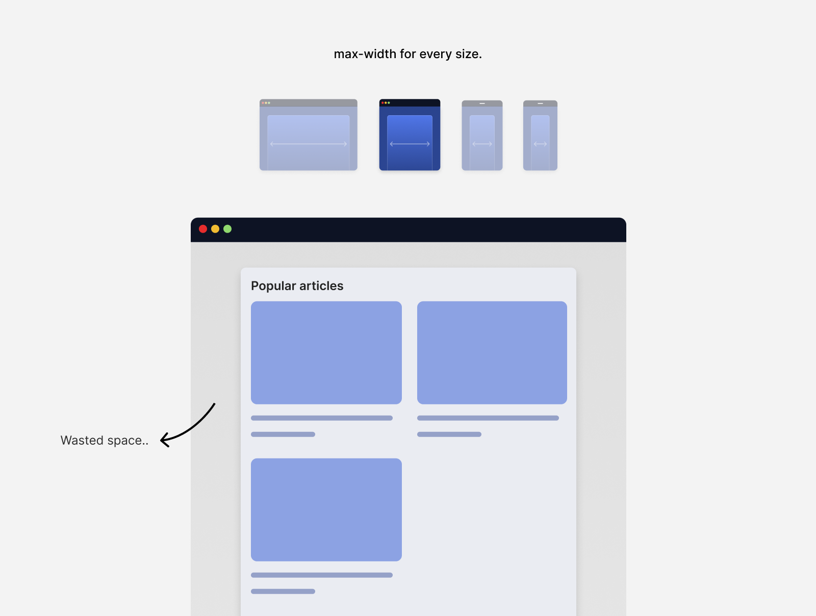
Notice the big white space on both sides. Isn’t it better to use that for the container? Considering we’re viewing that on a tablet size.
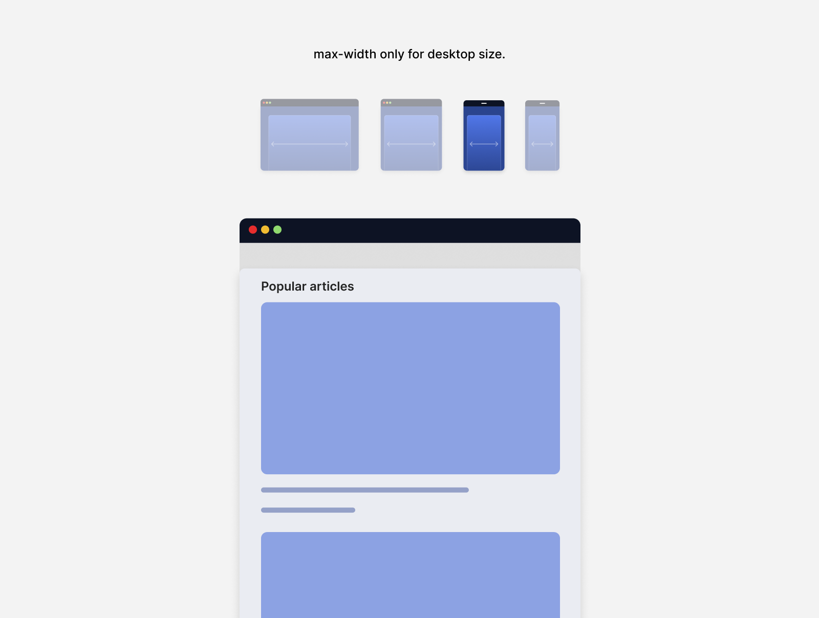
When viewing the design on an even smaller viewport, it will still have white space on both sides.
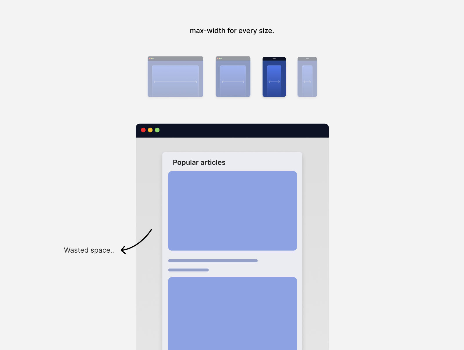
Can we do better? That’s a good amount of space that is wasted. I just can’t find a valid reason for implementing that in 2023.
Removing the max-width for smaller viewports will result in the container taking the full viewport width.
And for smaller sizes:
Responsive design and boring websites
I can’t ignore the fact that responsive design has a relation one or another with creating boring, similar-looking websites. This applies to building themes based on the Bootstrap theme.
Lots of websites started to look the same. Early 2016, I saw a tweet that just reflected the “responsive design” back then. In my opinion, this is due to the popularity CSS Bootstrap.
which one of the two possible websites are you currently designing?
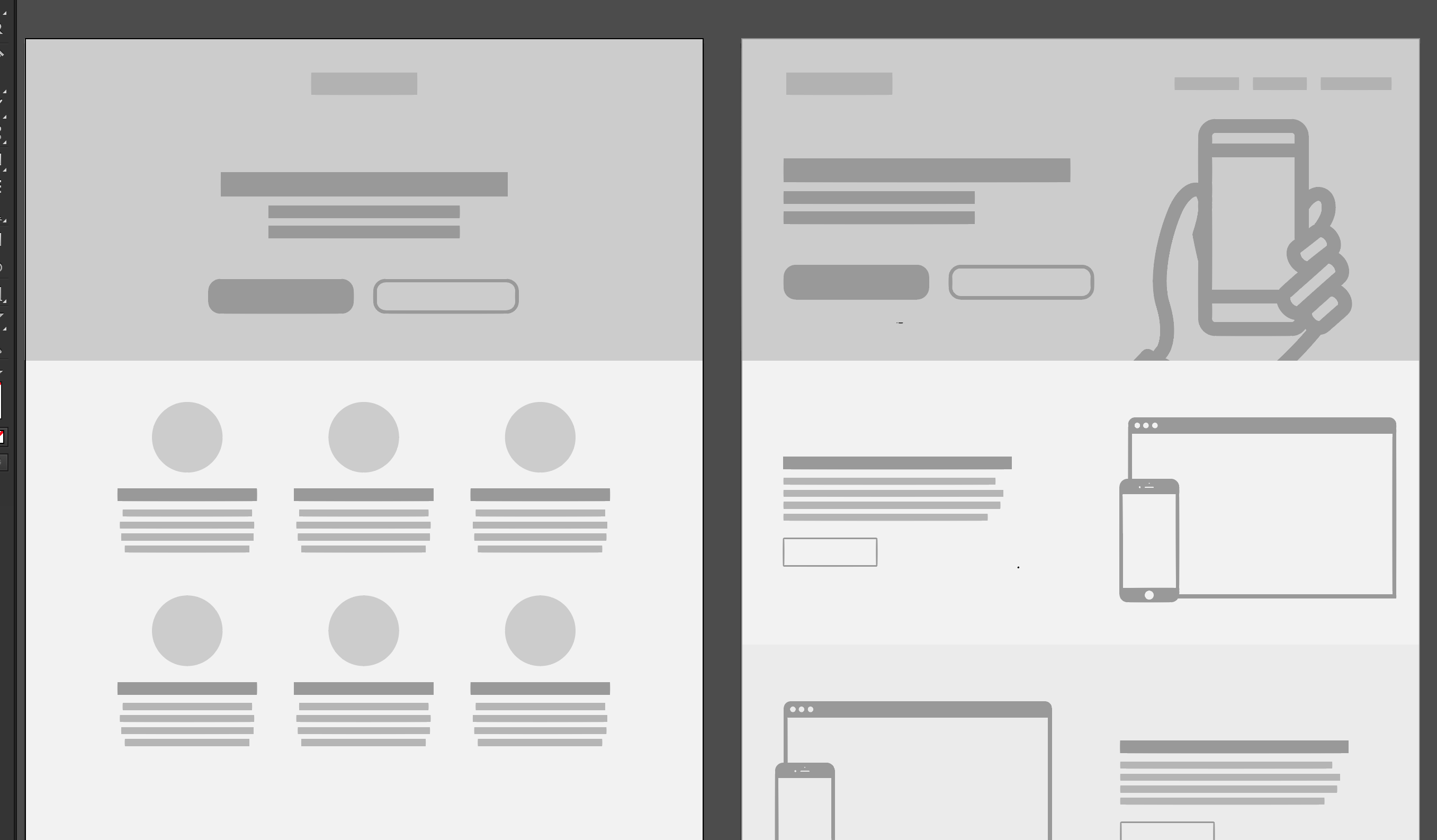
Funny, but realistic, isn’t it?
This made responsive design looks like an easy and predicted process. I was one of the designers who was affected by that style too. It’s just weird remembering those days now.
The current CSS features we’ve been powerful to the point that makes anything possible on all screen sizes.
Ready to explore responsive design from another perspective? Let’s go.
The web is responsive by default
First things first, right? For me, I consider that the web is responsive by default. When you think about it, adding a bunch of HTML elements without any CSS, works on any screen size.
Here is an example of adding a headline, paragraph, and list.
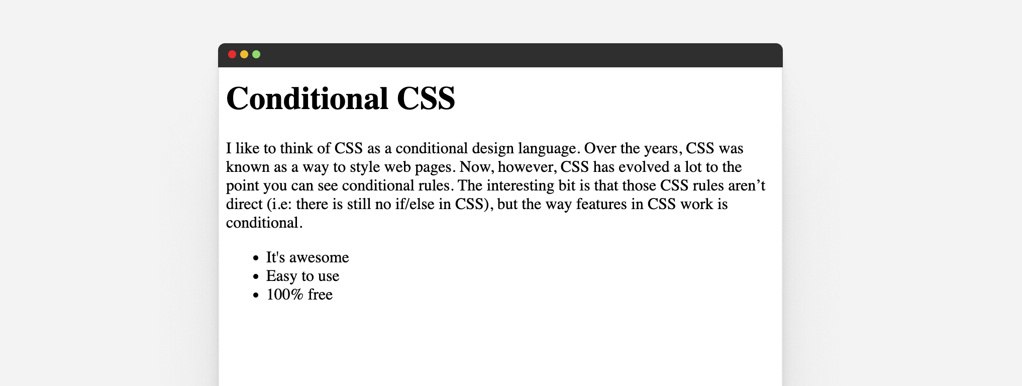
It’s responsive by default until we decide to move things next to each other. Let’s assume that I added the following CSS:
body {
	display: grid;
	grid-template-columns: 1fr 2fr;
	grid-gap: 1rem;
}

ul {
	grid-column: 2/3;
	padding-left: 1rem;
}
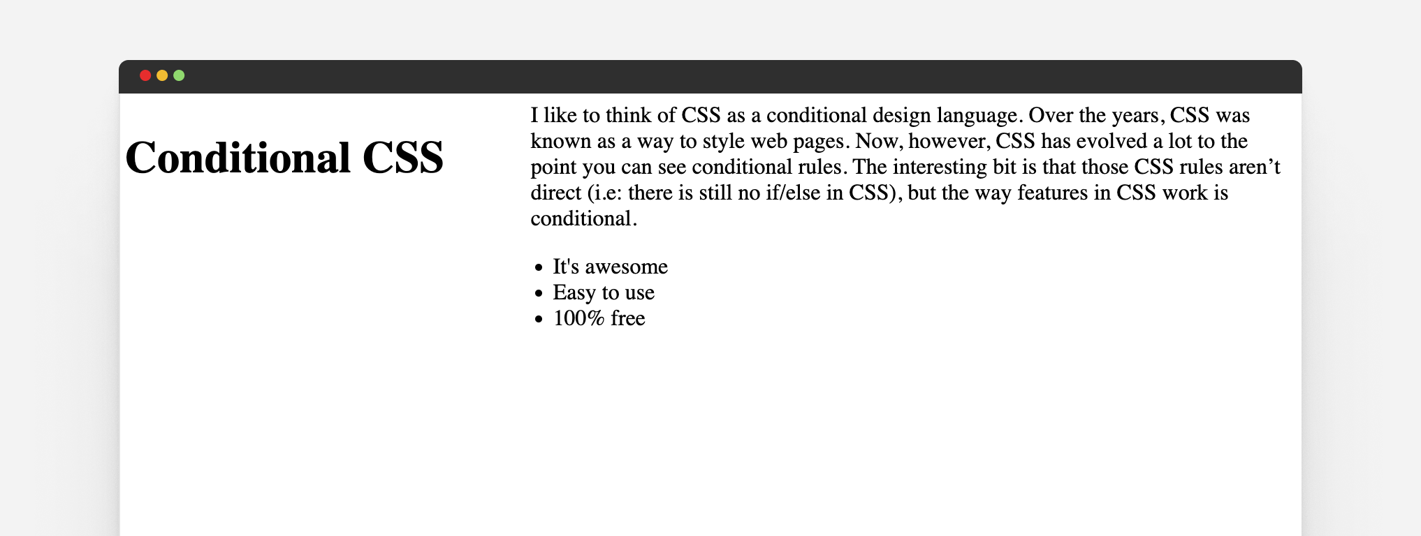
It looks good in the figure above, right? But when we resize it to a smaller size, the fun will start.
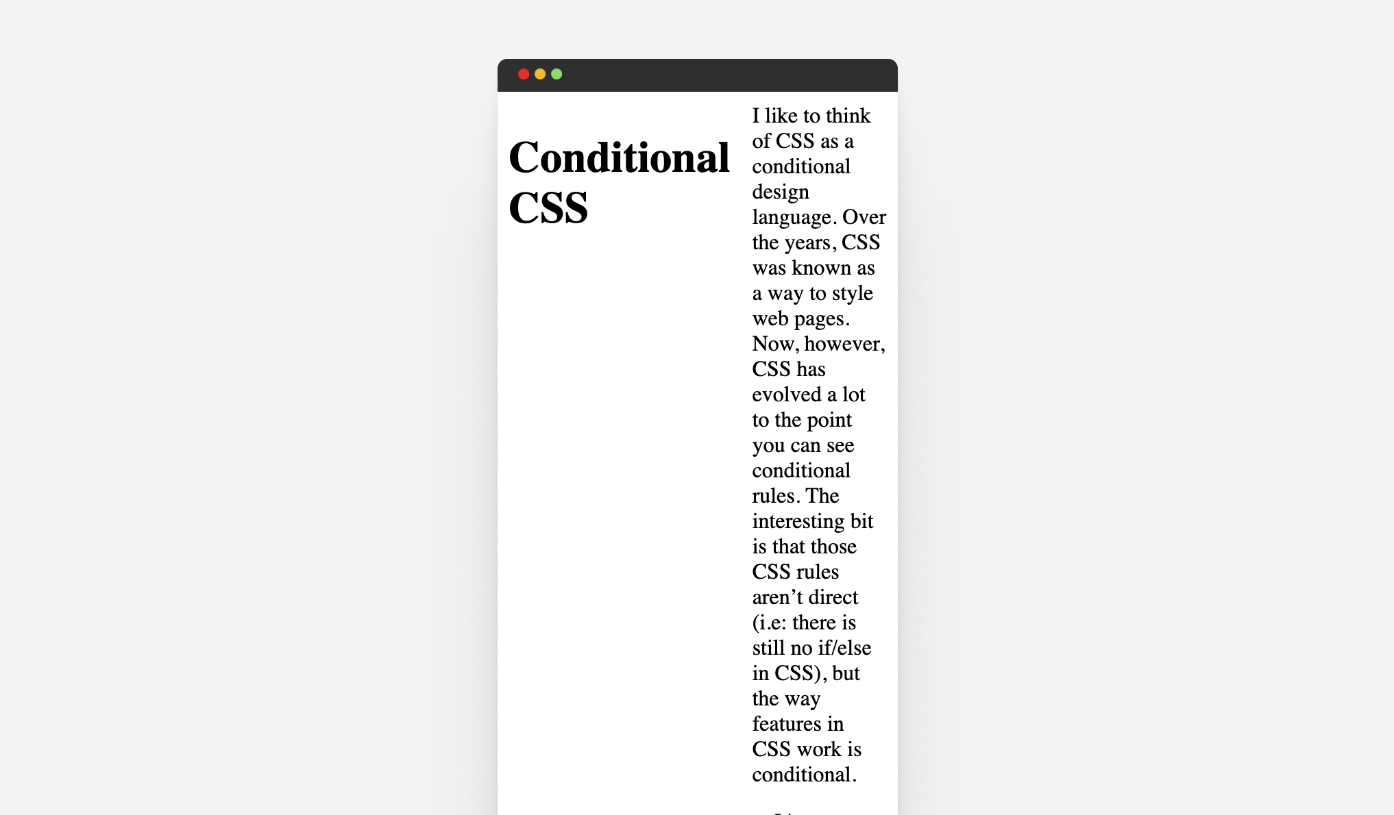
So, the web is responsive by default, unless we start getting creative in designing our layouts.
Responsive design in 2023 and beyond
Instead of thinking about responsive design in terms of media queries, I like to think of responsive design in these categories.
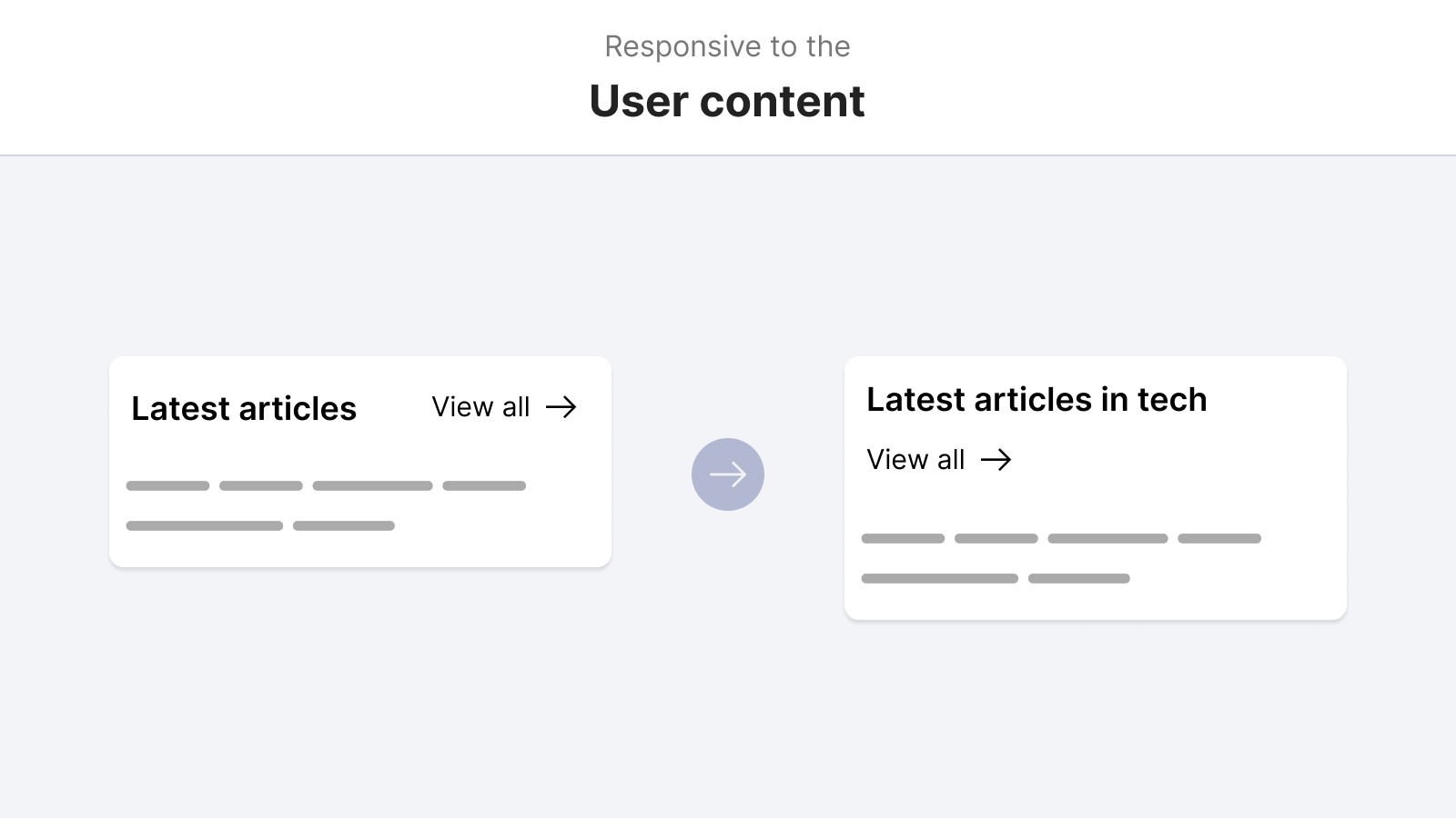
Responsive to the content
By writing CSS that can handle different content lengths, we can ensure that a UI will work and won’t break just because the user added different content.
Responsive to the viewport
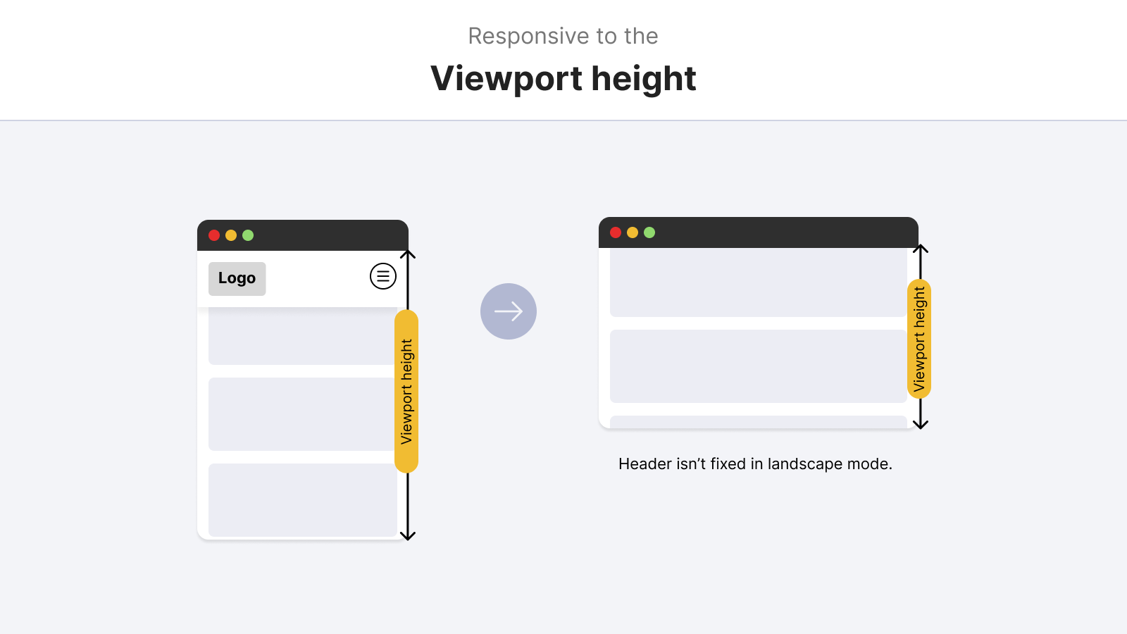
Does the component need to work based on the viewport only? This can apply to the site header, footer, and full-width sections. They need to work as per the viewport size.
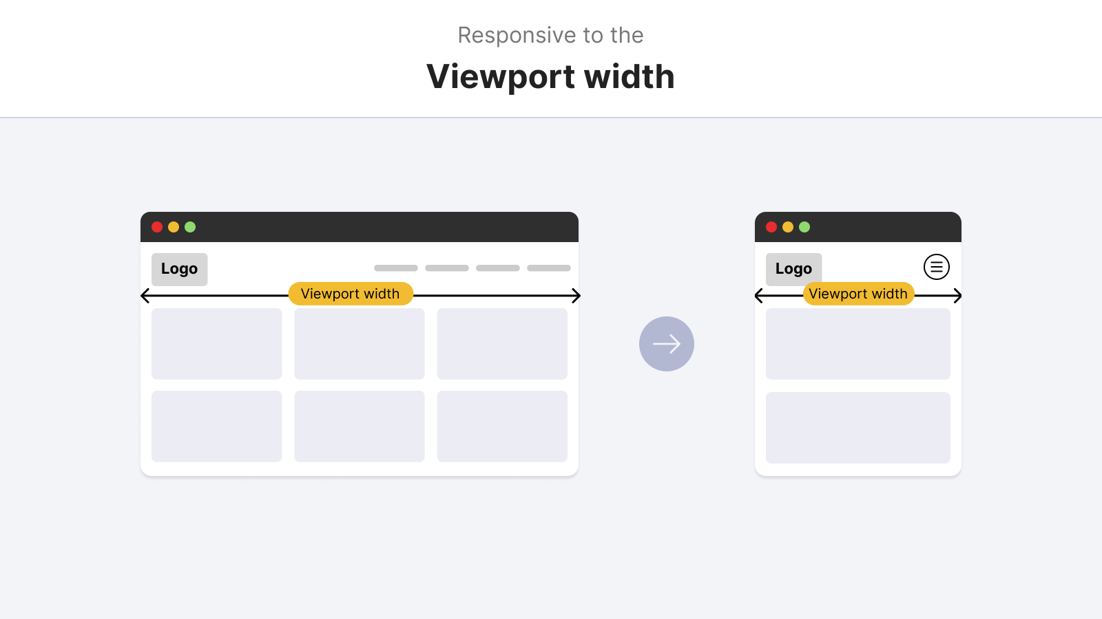
And the viewport isn’t only about the width. We also need to query the height in some cases.
@media (min-height: 700px) {
  .site-header {
    /* position: fixed or position: sticky */
  }
}
Responsive to the container
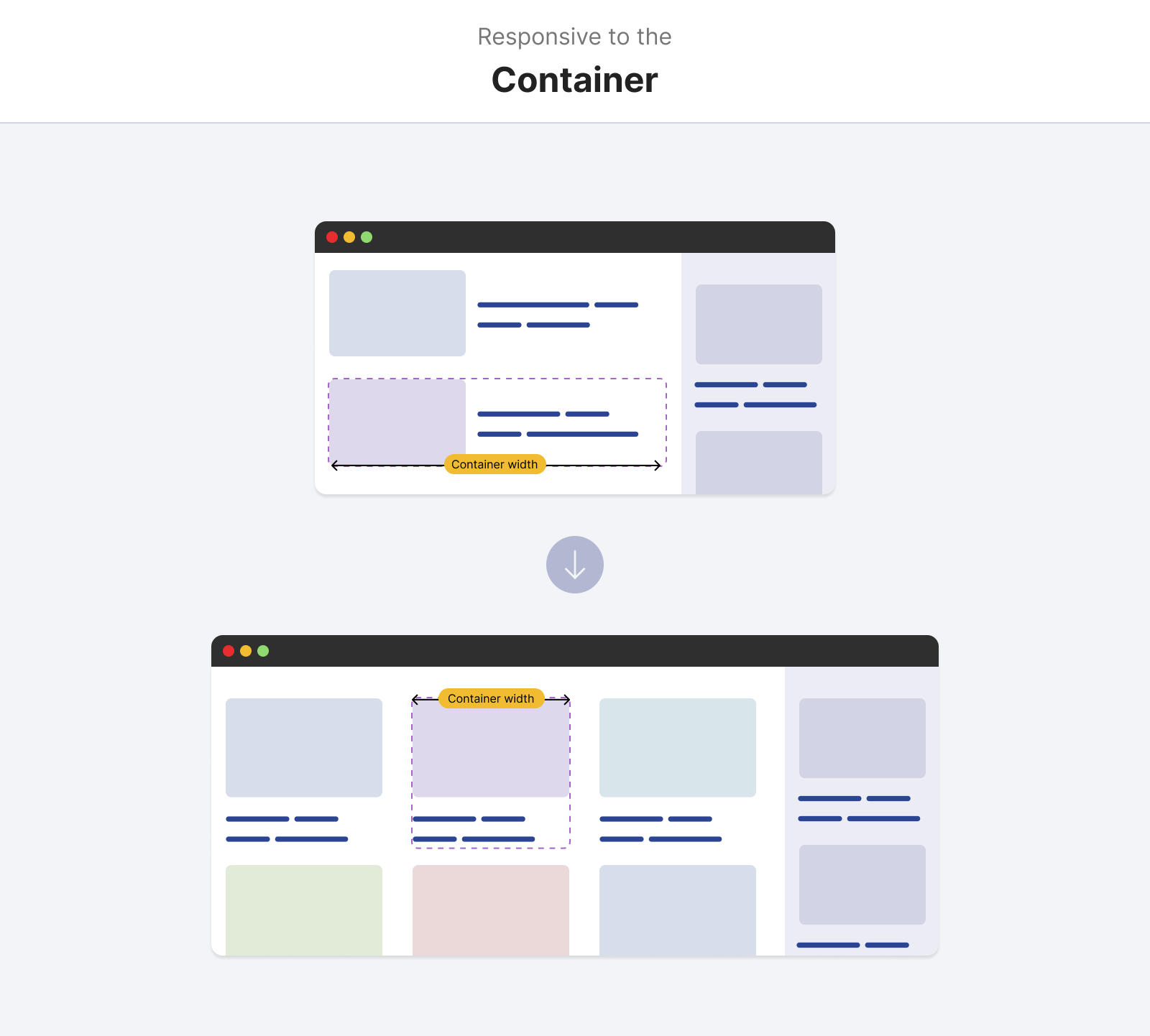
When a component needs to change its style based on where it lives in the document, this is where container queries come in handy.
Responsive to the user preferences
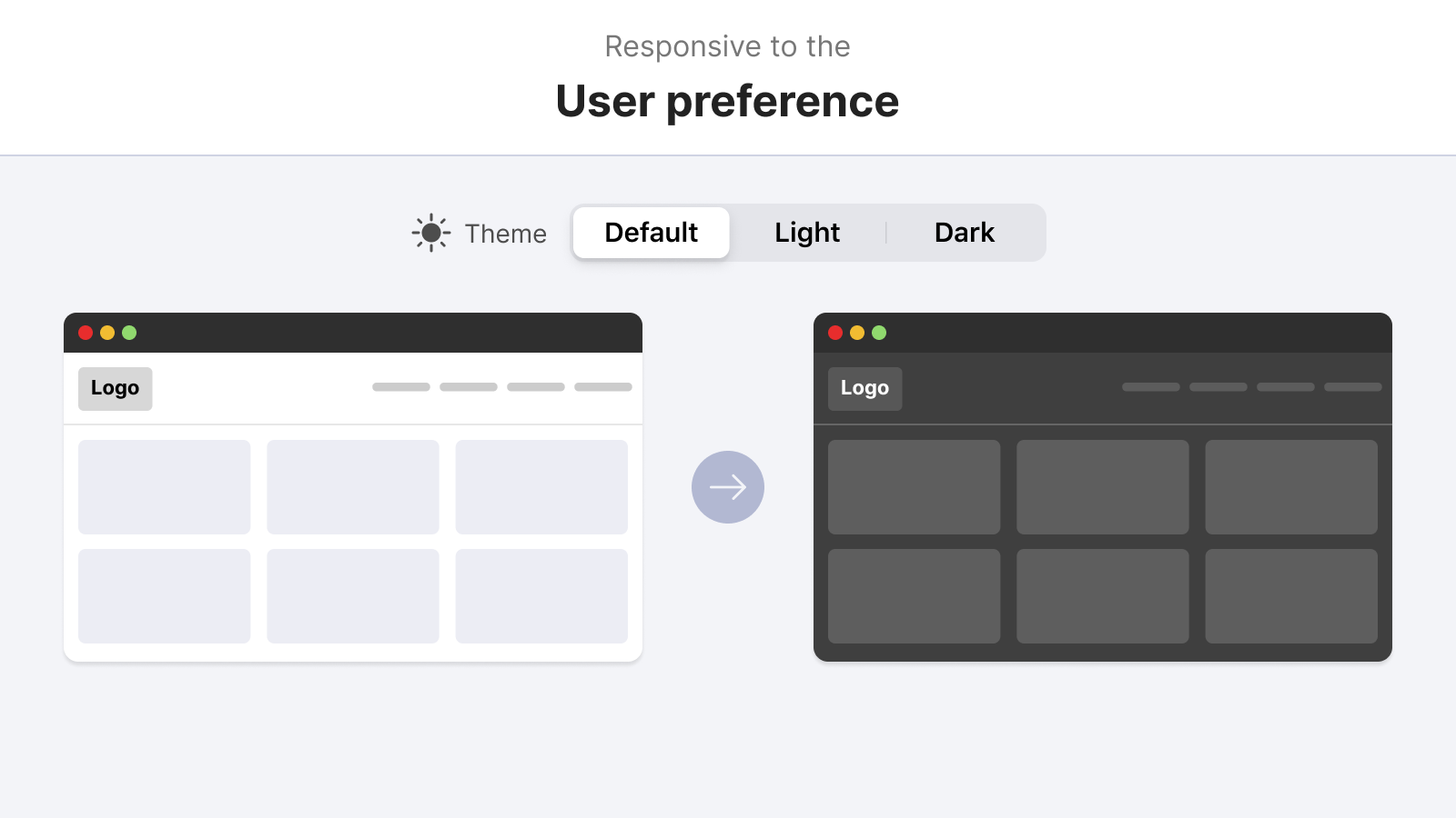
Does the component need to change based on specific user preferences? For example: changing the theme, font size, contract, and reduced motion.
How do I think about responsive design now
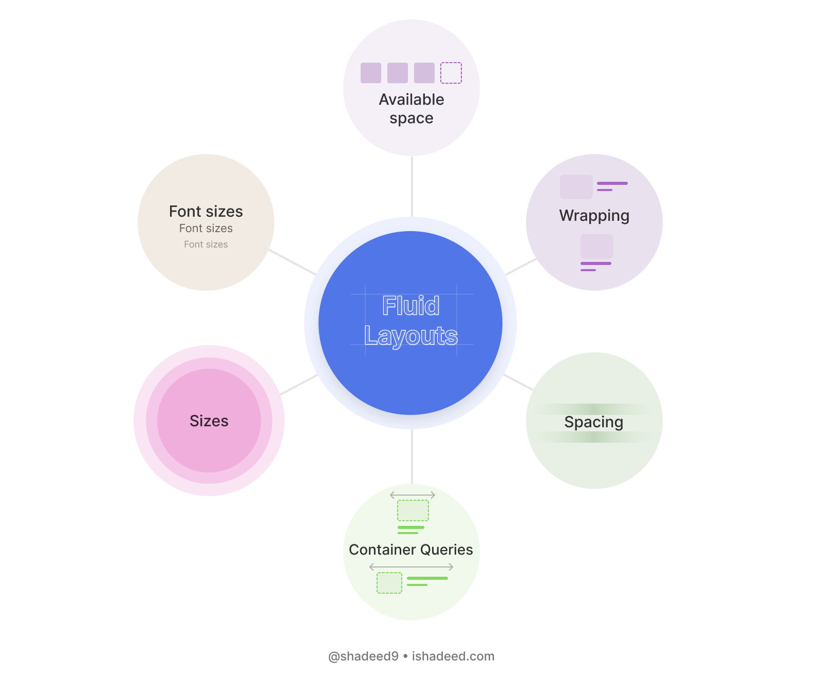
Building a responsive website is all about making them fluid at its core. Fluid means too many things:
- Container queries
- Wrapping
- Element Sizing
- Font sizes
- Spacing
- Available space
- Logical properties
With CSS features like the flexbox, grid, and clamp() comparison function, we can instruct the browser on what to do in certain situations. We don’t have to manually tackle every single detail in a design.
While building a component, I prefer to keep a fluid mindset while working on it. Let’s take an example.
A basic example
Modern CSS provides us with ways to write responsive styles without relying completely on media queries. For example, the flex-wrap property is useful to allow the wrapping of siblings when there is enough space.
.reaction-button {
  display: flex;
  flex-wrap: wrap;
  align-items: center;
  justify-content: center;
  gap: 0.5rem;
}
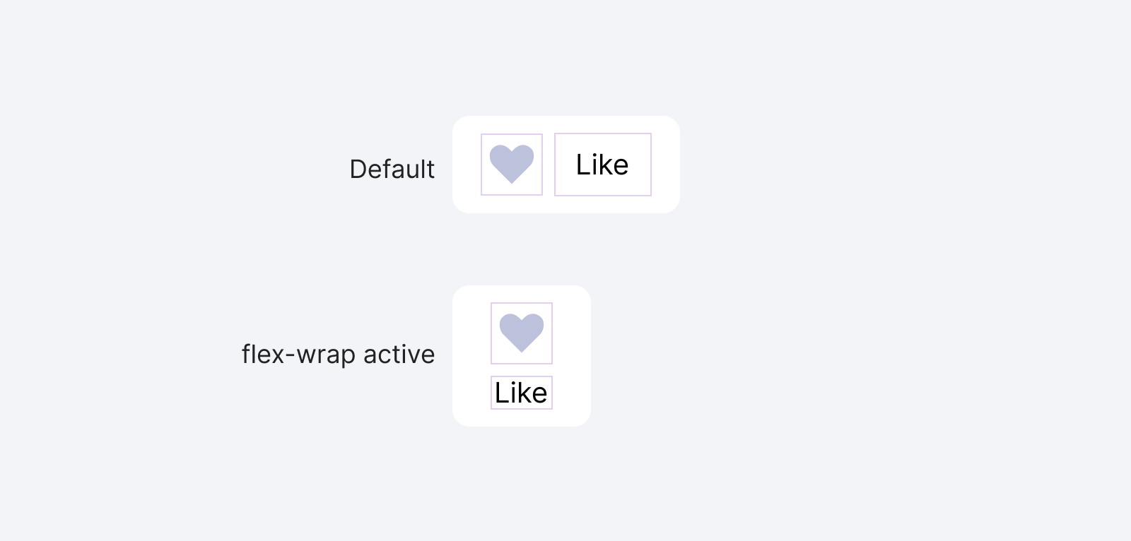
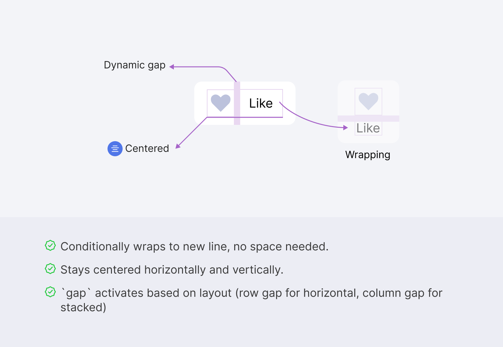
There are three nice details here:
- It wraps to a new line conditionally. No space? Fine, wrap the items.
- Stays center in both the horizontal and vertical styles.
- The
gapworks on demand. If they are horizontal, the row gap is active only. If they are stacked, then column one works.
It’s interesting that all of the above were made without the use of any media query. Let’s apply the same thinking to a larger component.
Modern ways to build responsive layouts
CSS is getting so powerful nowadays. We’ve great support for CSS variables, flexbox, and grid. The newest features like the :has selector and container queries are all supported in the latest browser (almost).
That means the future of responsive design will change. It won’t be about treating the whole page as responsive. Instead, we’ll write the responsive CSS for components and let the browser do its own work to decide when a component should have a specific style.
In the following sections, I will talk about certain modern CSS features, and how they can help us in writing truly responsive designs. Some of them don’t need a media query at all.
CSS flexbox
Just like the previous examples, using the flex-wrap property, we can allow the flex items to wrap into a new line, and we can control that by specifying the flex value for each flex item.
This is powerful and can help in building the foundation for responsive components.
Building the layout of an article component
In this example, we have a card component that contains an image on the left and content on the right side.
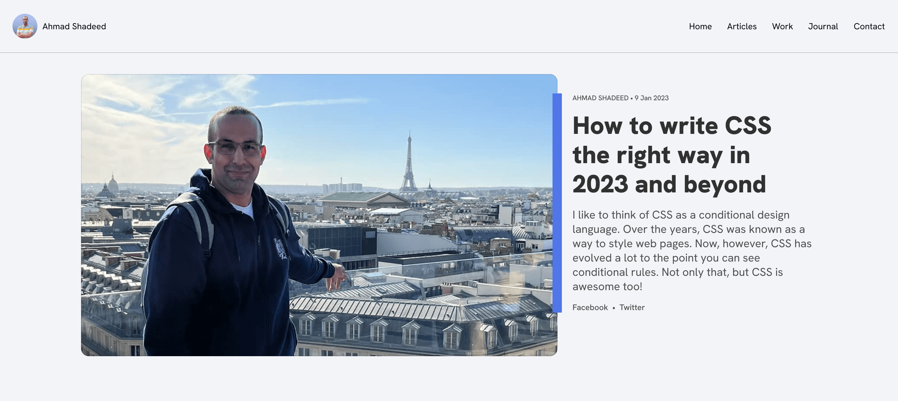
As with the previous example, flexbox works perfectly for that as a foundation. Assuming that I wrote the basic styling for the title, image, spacing.. etc, we can end up with something like the following:
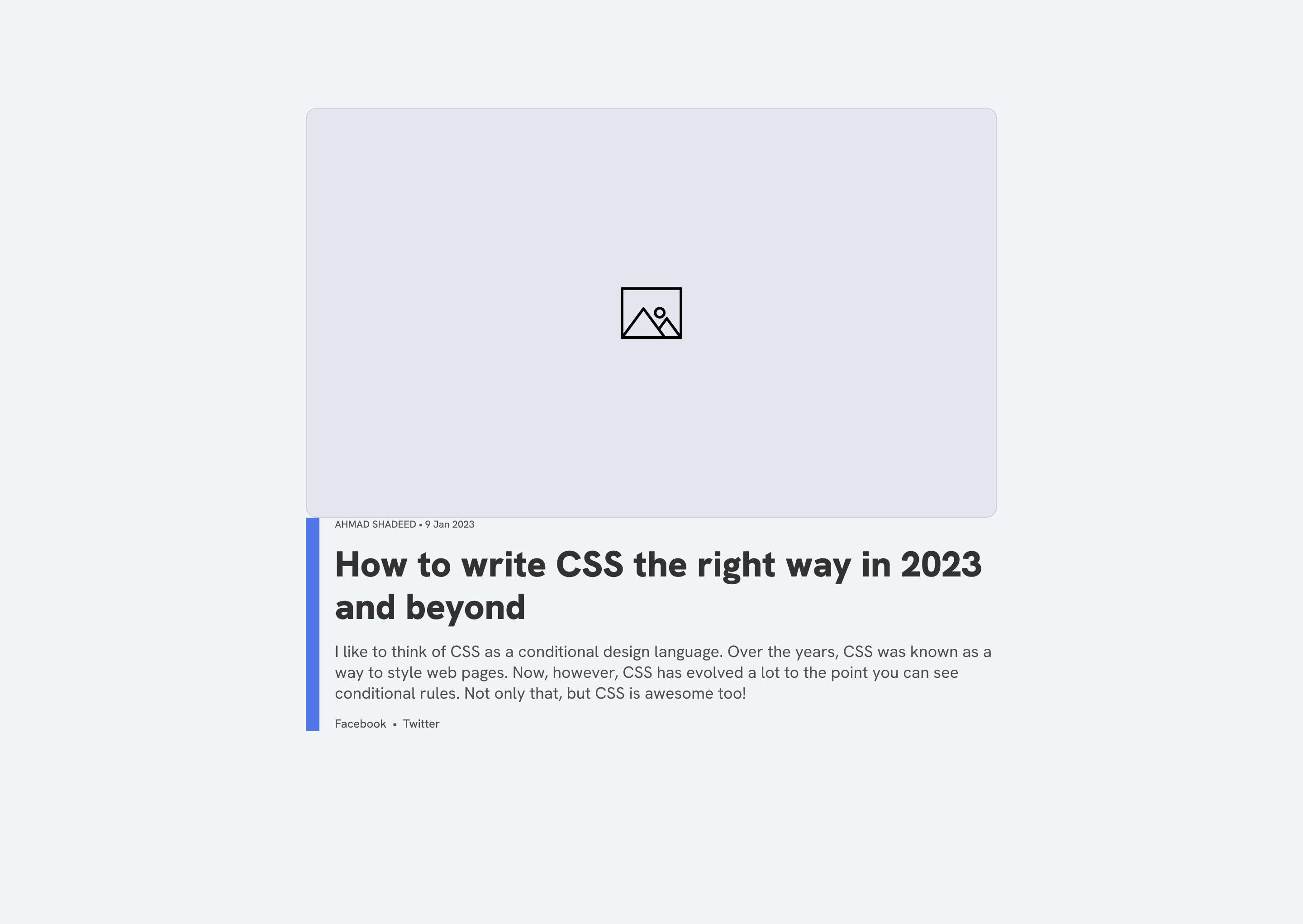
Next, we can start working on the layout for that. I will default to flexbox to get the benefit of the wrapping.
.c-card {
  display: flex;
}
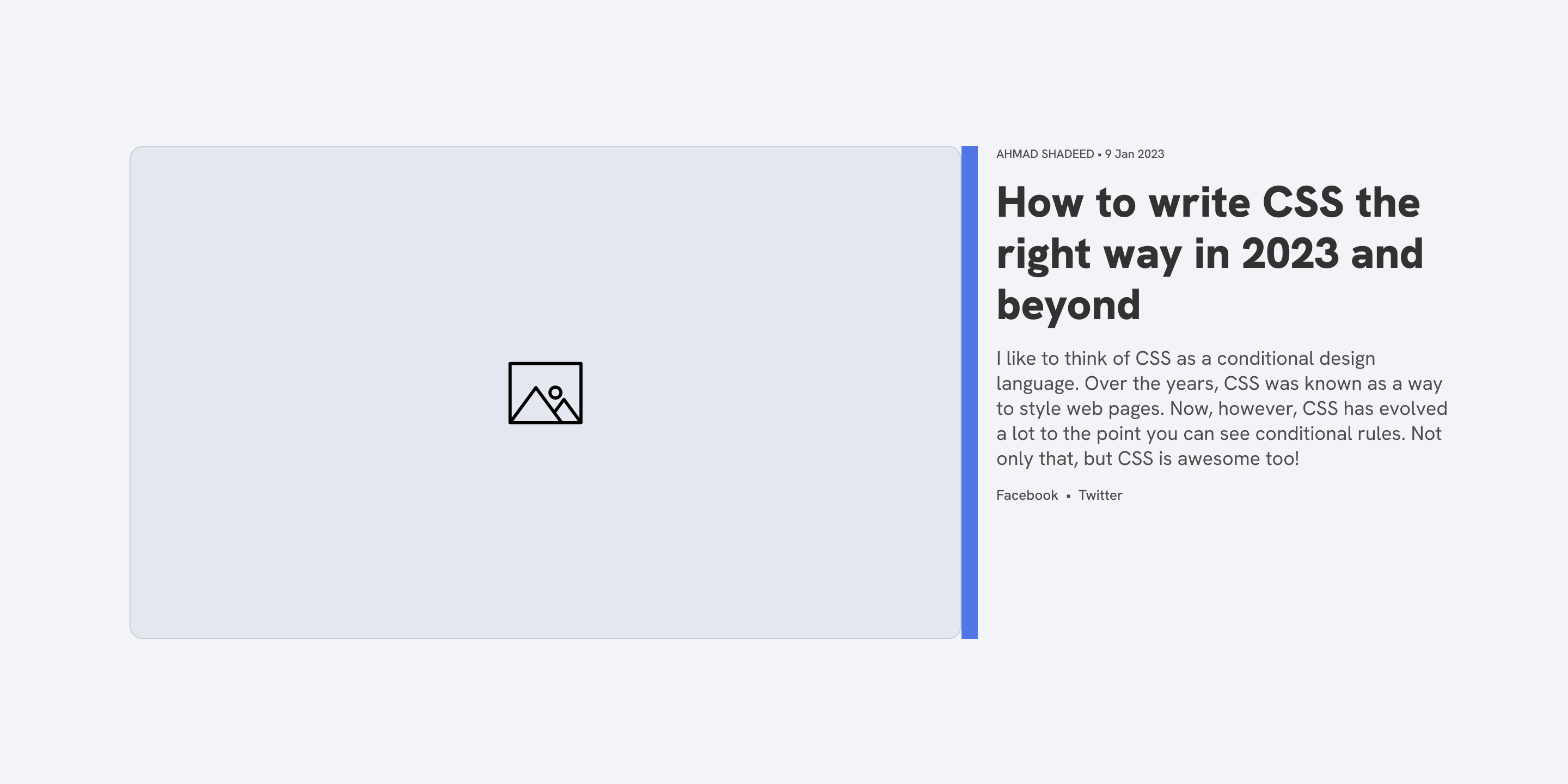
Cool, now we have the card’s thumbnail and content next to each other. Next is to allow wrapping and reset the default alignment.
.c-card {
  display: flex;
  flex-wrap: wrap;
  align-items: flex-start;
}
We are back to the same initial result! That’s fine, we’ll fix it.

That happens because the image is too big and as a result, it is wrapped into a new line.
What we need to do next is to instruct the browser on when to wrap the items by using the powerful flex property.
.c-article__thumb {
  flex: 1 1 550px;
}

.c-article__content {
  flex: 1 1 350px;
}
The idea is that we can use flex to let an item grow or shrink based on the available space.
Do you see that? Responsive design isn’t about media queries anymore.
.c-card {
  display: flex;
  flex-wrap: wrap;
  align-items: flex-start;
}

.c-article__thumb {
  flex: 1 1 550px;
}

.c-article__content {
  flex: 1 1 350px;
}
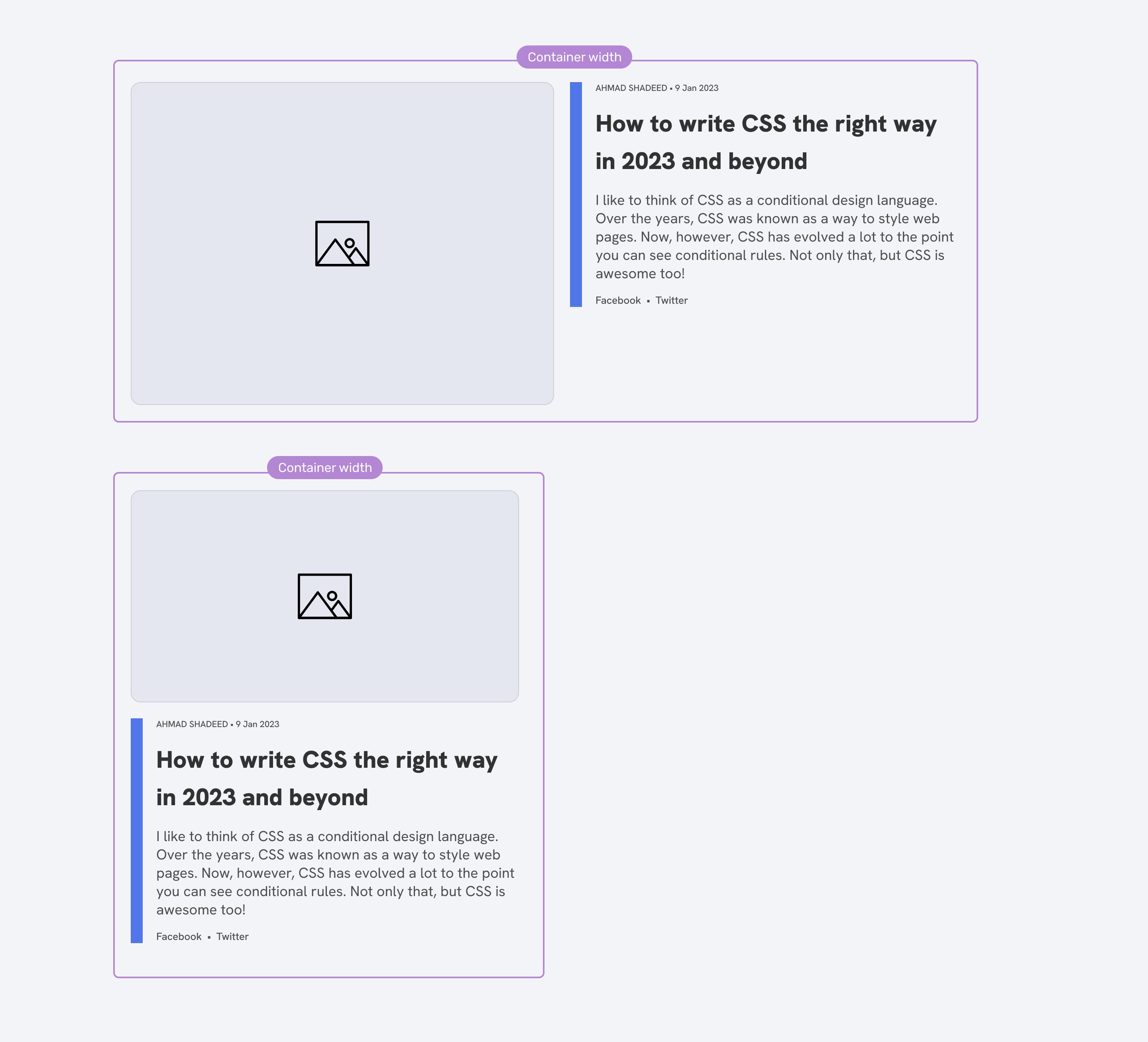
We can also use wrap-reverse to reverse the order of the thumbnail vs the content.
.c-card {
  display: flex;
  flex-wrap: wrap-reverse;
  align-items: flex-start;
}
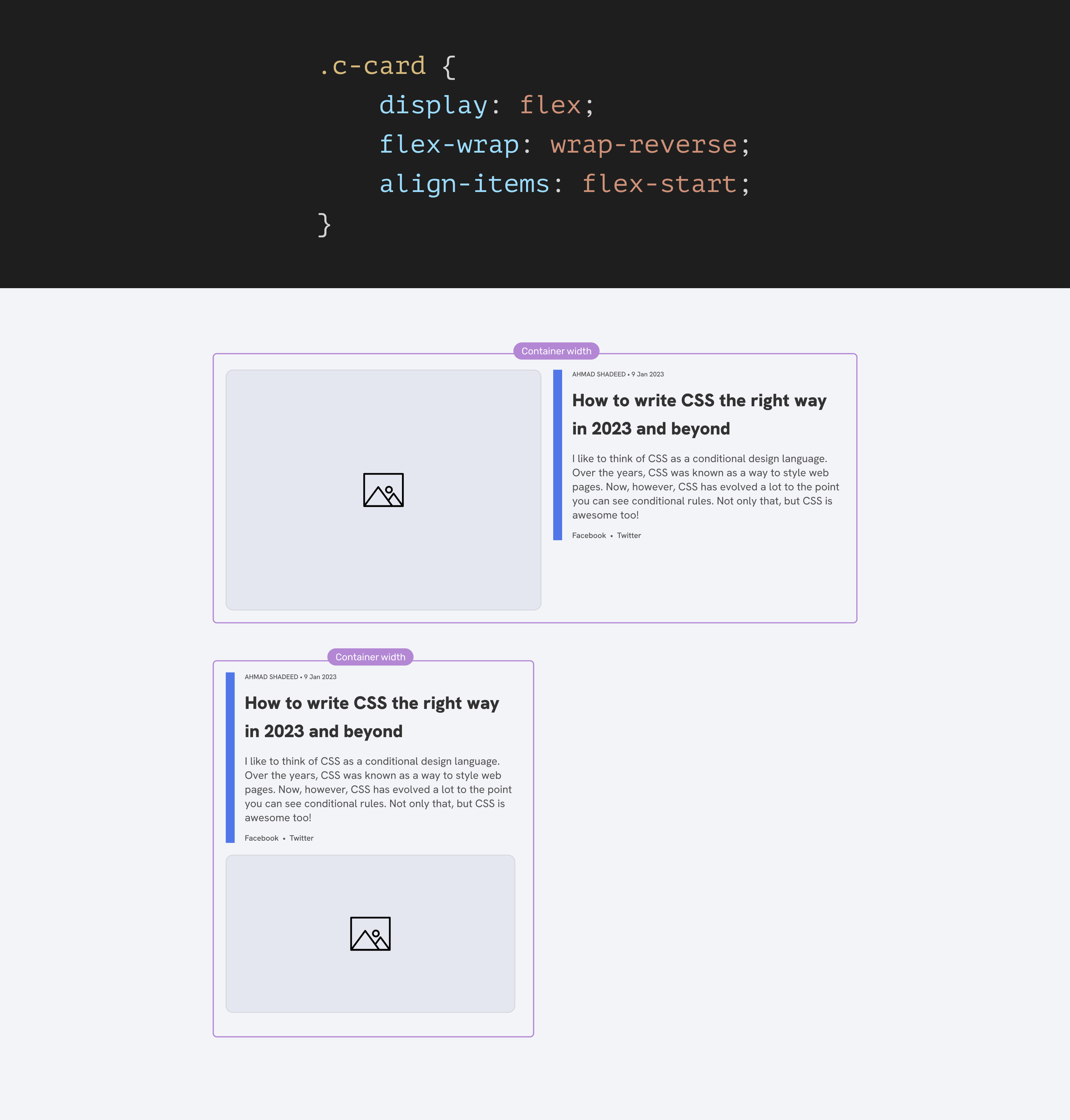
Not only we can use the same approach for cards, but it can be used for literarily anything else.
Section header
Chris Coyier called that Alignment Shifting Wrapping in his great article. Consider the following example inspired by Chris’s article.
We have a section with a section header that contains a title and a link.

When the space isn’t enough, we want the title to wrap into a new line. Here is all we need:
.section-header {
  display: flex;
  flex-wrap: wrap;
  gap: 1rem;
}

.section-header__title {
  flex: 1 1 400px;
}
The 400px value for the title is the custom breakpoint that will make the wrapping happen. When the title is 400px or less, it will wrap into a new line.
With a media query, this could be done like that:
@media (min-width: 650px) {
  .section-header {
    display: flex;
    /* No wrapping is needed */
  }
}
This will work nicely until we need the section header to be used in different wrappers. For example, in a main section and an aside.
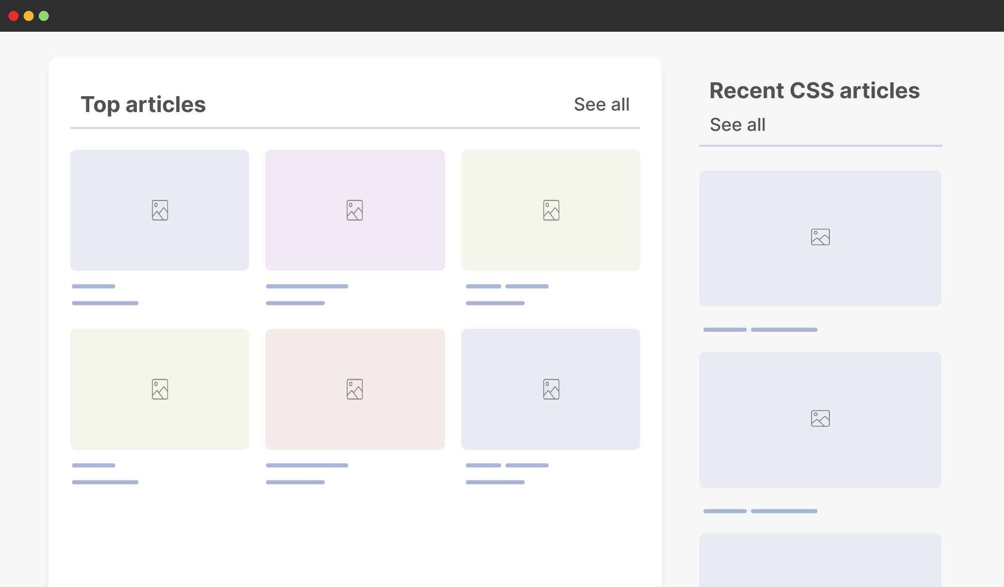
With the flex-wrap solution, the section header can work even when used in small containers like an aside.
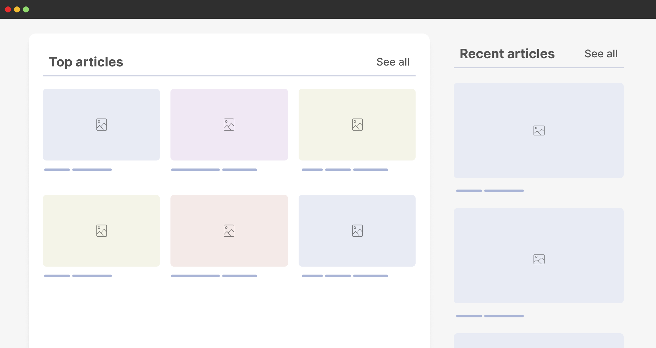
If items are too close to each other, they will wrap dynamically and nothing odd will happen in the layout.
While in media queries, we need to use a variation class to target the section header within an aside element.
@media (min-width: 800px) {
  .section-header--aside {
    display: flex;
    /* No wrapping is needed */
  }
}
This is considered a hack for me. It won’t work in all cases. The moment we change the aside width, it might break.
Note: this can be solved even better with container queries, I will come to it later on in the article.
CSS grid layout
We can build highly customizable grid layouts today. I won’t explain everything about CSS grid because I might end up writing a book, but I will share a few things that are supported in all browsers now.
Consider the following example.
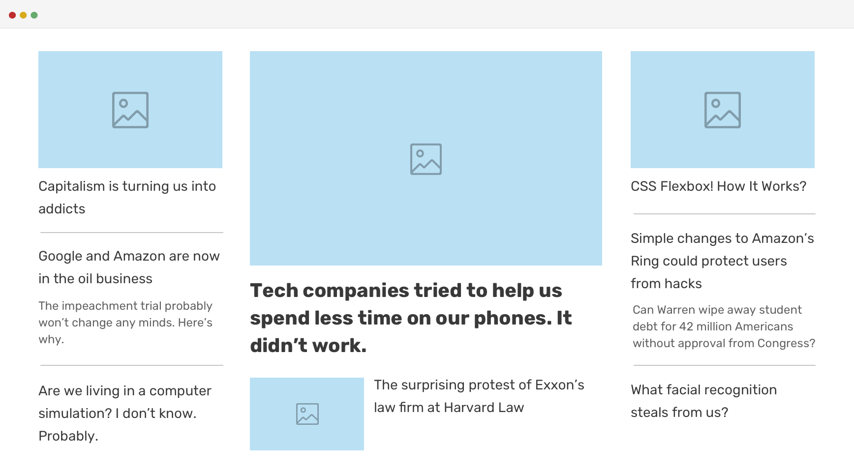
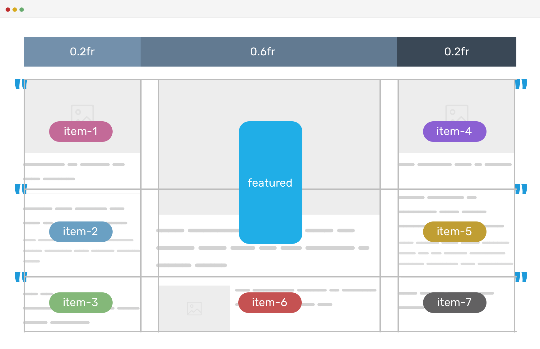
This is an example from my article on CSS grid areas. This is from a project that I worked on years ago. The team needed to have two variations of the layout, and couldn’t think of something better than CSS grid for the job.
<div class="c-newspaper">
  <article class="c-article c-article--1"></article>
  <article class="c-article c-article--2"></article>
  <article class="c-article c-article--featured"></article>
  <article class="c-article c-article--3"></article>
  <article class="c-article c-article--4"></article>
  <article class="c-article c-article--5"></article>
  <article class="c-article c-article--6"></article>
  <article class="c-article c-article--7"></article>
</div>
.c-newspaper {
  display: grid;
  grid-template-columns: 0.2fr 0.6fr 0.2fr;
  grid-template-areas:
    "item-1 featured item-2"
    "item-3 featured item-4"
    "item-5 item-6 item-7";
  grid-gap: 1rem;
}

.c-article--1 {
  grid-area: item-1;
}

.c-article--2 {
  grid-area: item-2;
}

/*..And so on for other elements.. each one has a grid-area..*/

.c-article--7 {
  grid-area: item-7;
}

.c-article--featured {
  grid-area: featured;
}
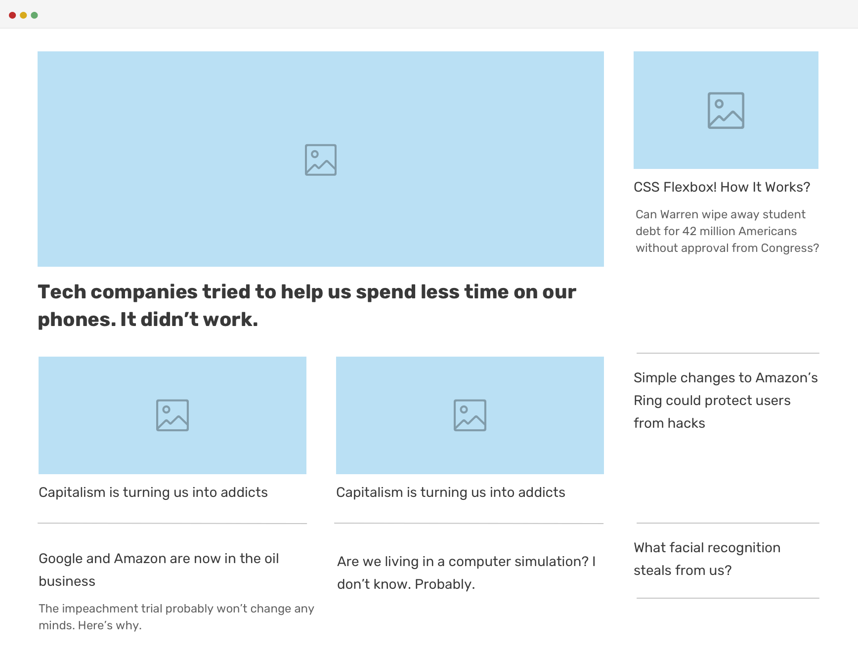
For the second variation, all we need to do is to change the template areas.
.c-newspaper.variation-1 {
  grid-template-areas:
    "featured featured item-3"
    "item-1 item-2 item-4"
    "item-5 item-6 item-7";
}
On smaller viewports, we will need a media query to alter the template areas, but this is powerful. With a bit of guidance, we can create an unlimited set of options for this featured editorial layout.
The other useful feature in CSS grid is the minmax() function. In short, it allows us to create a grid that changes the width of the columns dynamically without any media queries.
Consider the following CSS.
.wrapper {
  display: grid;
  grid-template-columns: repeat(auto-fill, minmax(290px, 1fr));
  grid-gap: 1rem;
}
We have a grid with 3-columns, and we want them to resize when the viewport size gets smaller. The minmax() function mixed with auto-fill is perfect for that.
Without the minmax() function, we have no option but to use media queries to change the columns according to the viewport width.
A simple example:
@media (min-width: 992px)
	.wrapper__item {
		width: 33%;
	}
}
You can learn more about minmax() in my article.
Fluid sizing
One of my favorite aspects of today’s responsive design is building fluid layouts. At first, this was possible using the viewport units, but it wasn’t that perfect. We needed a way to add a limit otherwise a font size can blow up to be huge on large screens.
h2 {
  font-size: calc(1rem + 5vw);
}

/* If the viewport width is 2000px or more, limit
* the font size to 4rem.
*/
@media (min-width: 2000px) {
  font-size: 4rem;
}
Almost three years ago, we got support for CSS comparison functions. They are a game changer in building truly fluid layouts without the need for media queries.
Consider the following example.
h2 {
  font-size: clamp(1rem, 0.5rem + 2.5vw, 3rem);
}
The font size will change as per the viewport width. If I want to visualize this, it can be something like the following figure.
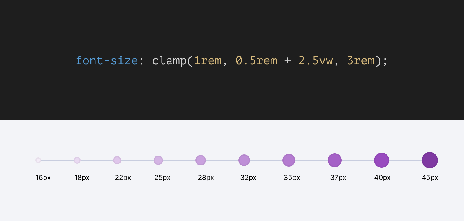
If we want to do that with media queries, we will end up with 9 queries. Can you imagine that? It’s not practical at all. Imagine doing that for many use cases within a website, it’s a nightmare!
I used to do something like this in the old days.
h2 {
  font-size: 1rem;
}

@media (min-width: 800px) {
  h2 {
    font-size: 2.5rem;
  }
}

@media (min-width: 1400px) {
  h2 {
    font-size: 5rem;
  }
}
With fluid sizing, we’ll shift our thinking from having fixed values to fluid ones. I imagine it as providing the browser with a minimum and a maximum value and letting it do the rest of the work.
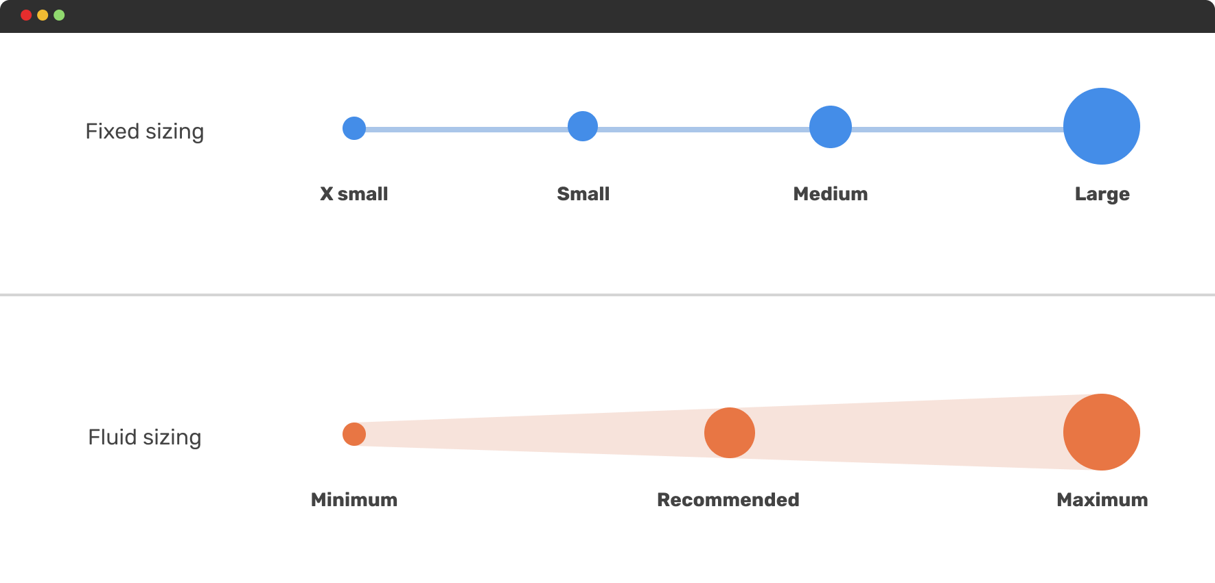
Let’s explore a few examples where fluid sizing really shines.
Dynamic gap
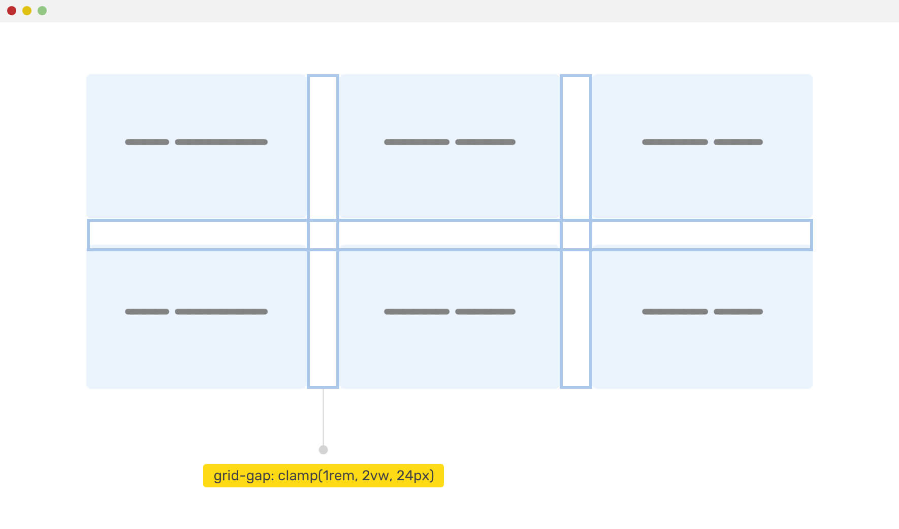
With the gap property, we can create a dynamic spacing that changes based on the viewport or container size.
.wrapper {
  display: grid;
  grid-template-columns: repeat(auto-fit, minmax(200px, 1fr));
  gap: clamp(1rem, 2vw, 24px);
}
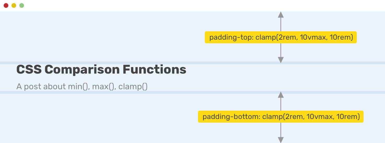
For a hero section, we might need to change the vertical padding based on the viewport size. CSS clamp() with viewport units is perfect for that.
.hero {
  padding: clamp(2rem, 10vmax, 10rem) 1rem;
}
Size container queries
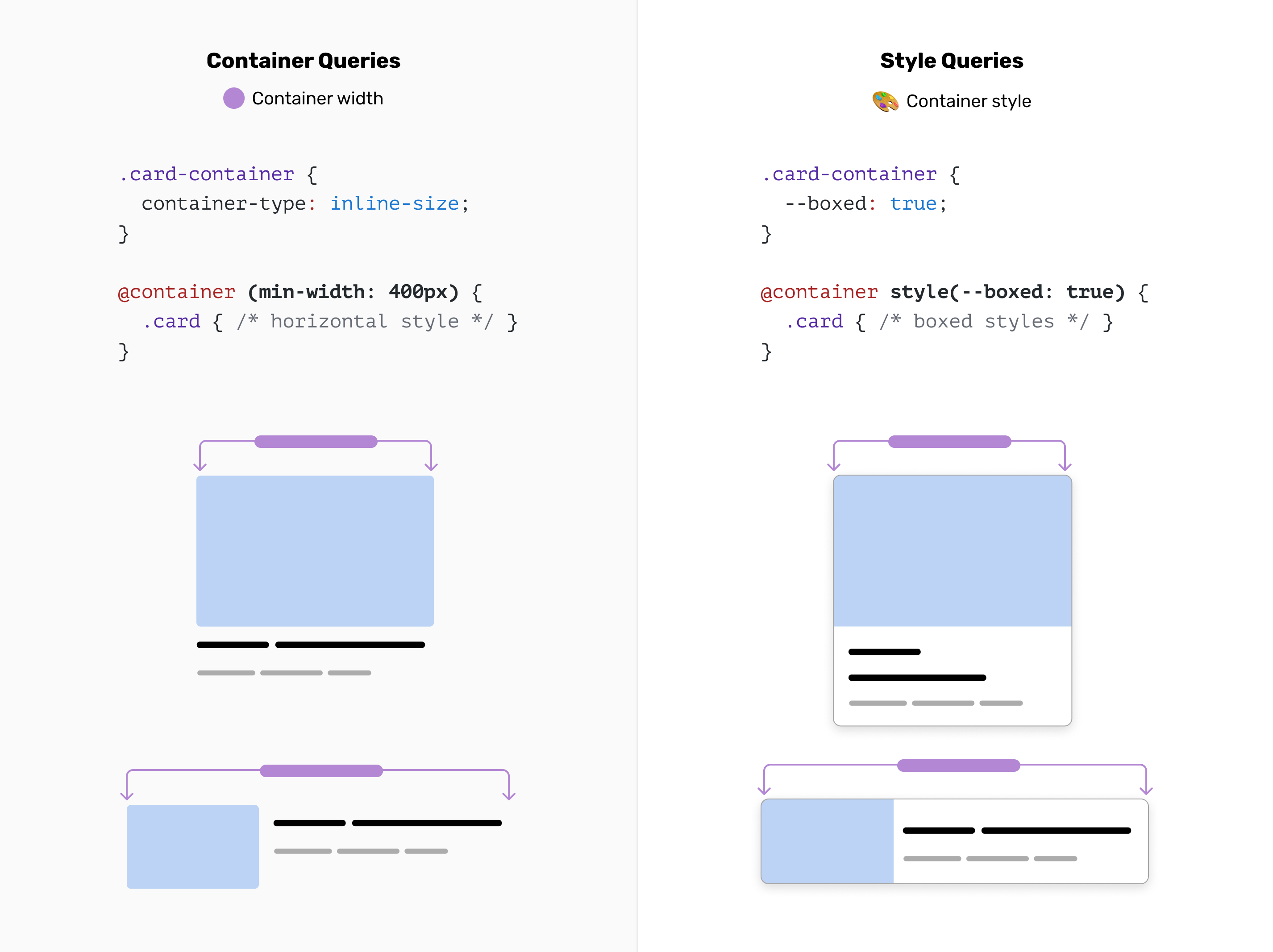
CSS container queries are supported in all browsers now. They became stable in Chrome back in Aug 2022. They are called “Size” because they work based on the width of the container, and also because now we have style container queries.
This is a game-changer and I can’t contain my excitement while writing about it. In short, it provides us with ways to query the container width of a component.
Consider the following figure.
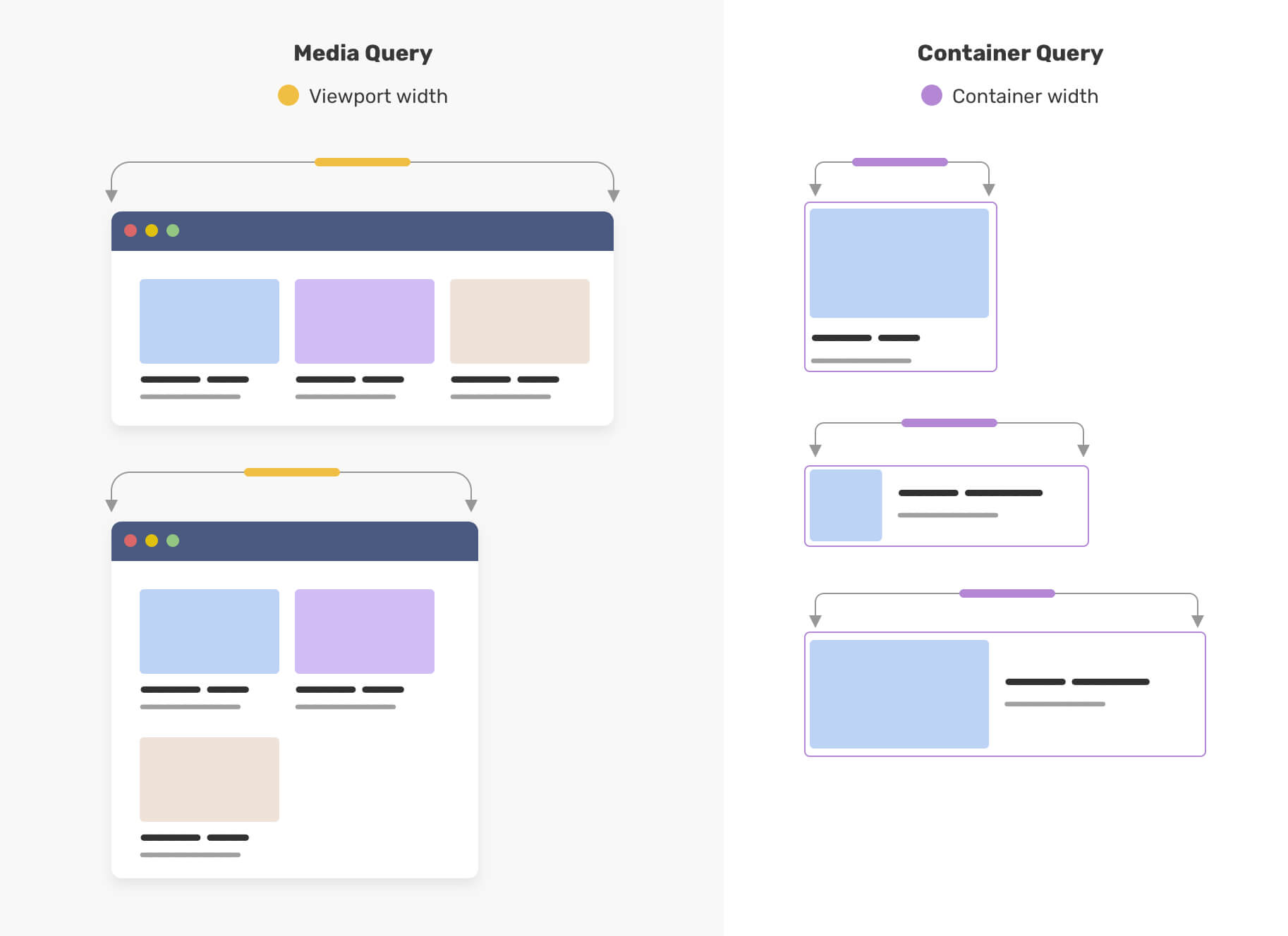
Notice how on the left, the cards are being changed based on the viewport width, while on the right, they’re being changed based on the container width.
Let’s explore a few use cases.
Article component
One of my favorite use cases for container queries is the article component. We can have 4 different styles based on the container width:
- The default, a card-like look.
- A horizontal card with a small thumbnail.
- A horizontal card with a large thumbnail.
- If the parent is too large, the style will a hero-like to indicate that it’s a featured article.
Check out the demo.
Pagination component
We can toggle different versions of a pagination component based on the container width. This provides us with more certainty on when to switch from one variation to another.
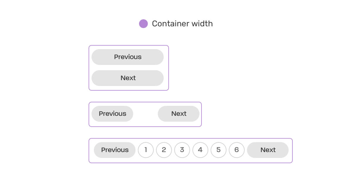
.wrapper {
  container-type: inline-size;
}

@container (min-width: 250px) {
  .pagination {
    display: flex;
    flex-wrap: wrap;
    gap: 0.5rem;
  }

  .pagination li:not(:last-child) {
    margin-bottom: 0;
  }
}

@container (min-width: 500px) {
  /* Styles when container >= 500px */
}
Explore more use-cases for container queries in my CSS lab.
Size container queries units
What happens if I want to have fluid sizing based on the container, not the viewport? This is possible now with container queries.
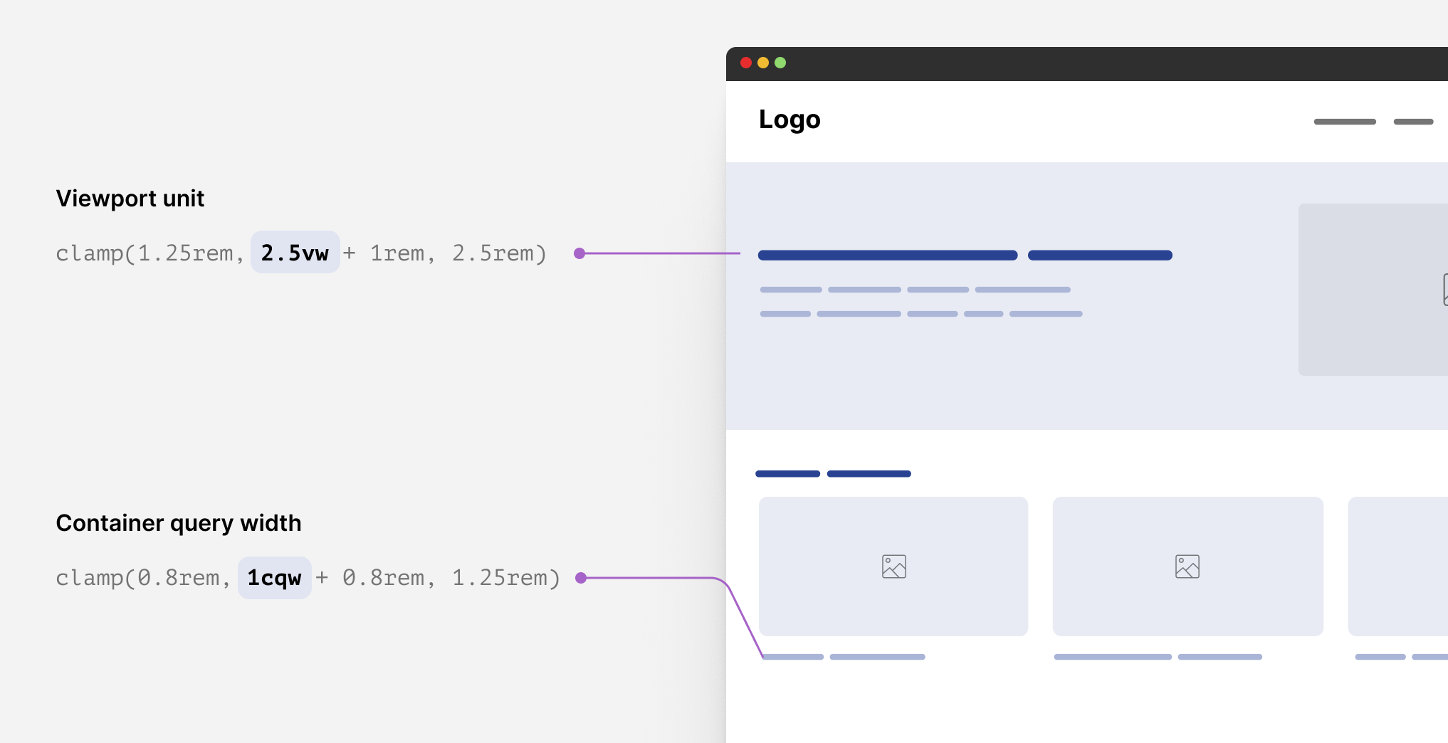
We can do that by simply replacing the vw with cqw.
.c-article__title {
  font-size: clamp(1.25rem, 2.5cqw + 1rem, 2.5rem);
}

.c-article__content > * + * {
  margin-top: clamp(0.8rem, 1cqw + 0.8rem, 1.5rem);
}
Container query units work based on the container width. As a result, the values we get are even more fluid and expected. That way, we can use them in any component we want.
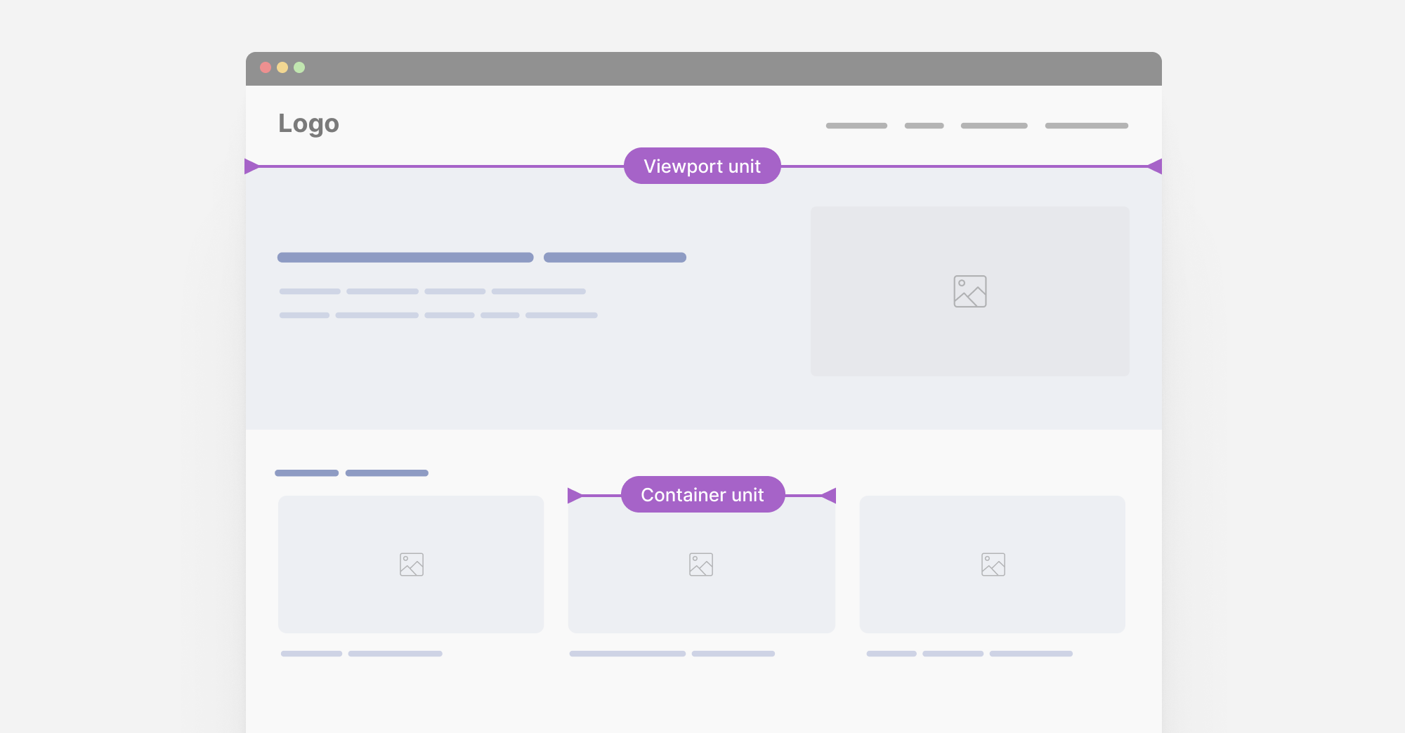
This is so powerful.
Style container queries
This still didn’t get stable in a browser, but it’s coming soon to Chrome. In short, we’ll be able to check if an element has a specific CSS variable and style its child items based on that.
Component-Level Theme Switching
In some cases, we might need to switch the theming of a component based on where it lives.
In the following example, I want the stats component to change its theme to dark if it lives in the 2nd section.
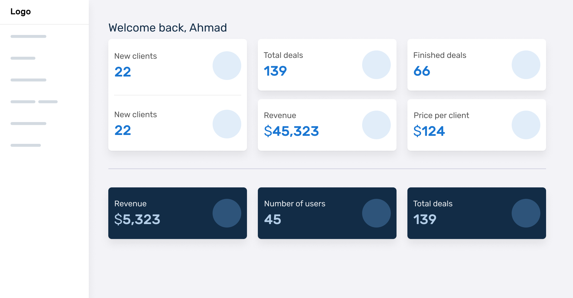
We can do something like this:
.special-wrapper {
  --theme: dark;
  container-name: stats;
}

@container stats style(--theme: dark) {
  .stat {
    /* Add the dark styles. */
  }
}
Learn more about style queries.
Article component
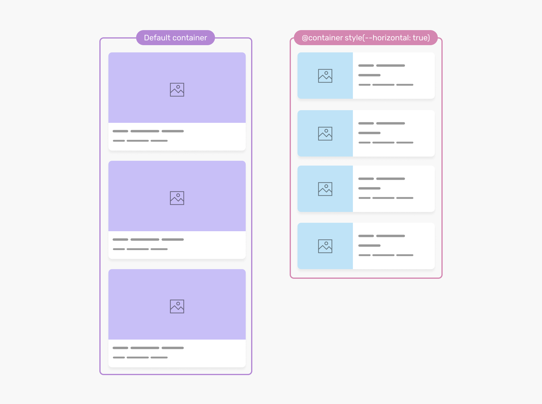
Switching an article style based on the container width is useful, but sometimes we need to allow that only when needed. Style queries can do it!
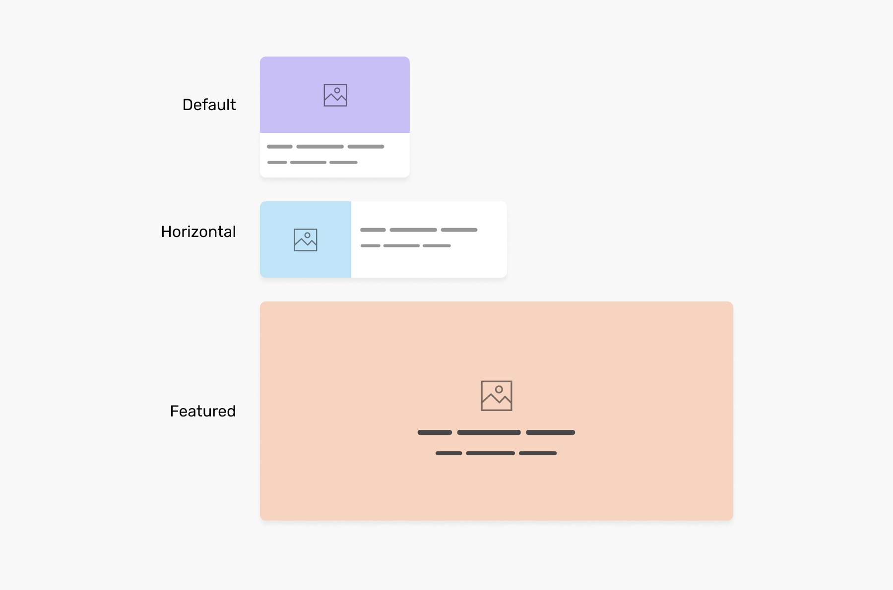
What we need to do is to add a CSS variable, and check if it’s there. If yes, then we need to have that specific style we want.
.o-grid__item {
  container-type: inline-size;
  --horizontal: true;
}

@container (min-width: 400px) and style(--horizontal: true) {
  /* Horizontal style */
}
That way, the article will change based on its container width only if the --horizontal variable is set to true.
User preferences media queries
An example of a user preference media query is the one that checks for the preferred color scheme.
This media query, makes the styles responsive to the user preference.
:root {
  color-scheme: light dark;
}

@media (prefers-color-scheme: dark) {
  /* dark mode styles */
}
Even better, adding the color-scheme will switch the default form controls theme from light to dark (Supported only in Safari).
Logical properties
When working on multilingual websites, we need to support both left-to-right (LTR) and right-to-left (RTL) layouts.
Consider the following example.
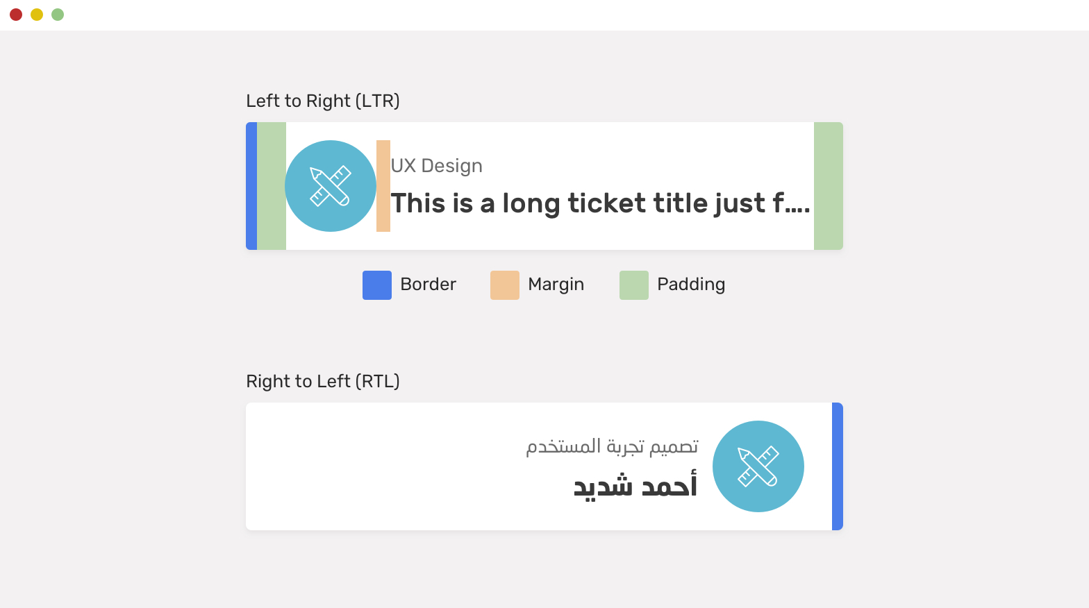
We have a component with the following:
- Padding (left and right)
- A border on the left side
- A margin for the icon
With CSS logical properties, we can write the CSS once, and it will be responsive to the user’s preferred language.
.card {
  padding-inline-start: 2.5rem;
  padding-inline-end: 1rem;
  border-inline-start: 6px solid blue;
}

.card__icon {
  margin-inline-end: 1rem;
}
You can learn more about CSS logical properties in my article, and my extensive guide on writing CSS for RTL websites.
Defensive CSS
The CSS we write should also be responsive to the user content. If it’s too long, what should happen? We need to decide on these decisions early on.
My project Defensive CSS is all about that. Make sure to have a look at it!
Conclusion
Responsive design isn’t about media queries. It’s about time we change our mindset and take the full potential of modern CSS. I look at a future where we might need media queries for general things like a website header, and the rest can be responsive with size container queries, fluid sizing, and who knows whatever new features will land.
Responsive design is good now.
Further reading
- I like how Una Kravets called it the new responsive. This article is a must-read if you haven’t already.
- Be the browser’s mentor, not its micromanager is a great way of thinking of how to design websites now by Andy Bell.

