The Layout Maestro
A message from the author!
A few days ago, I published a new design for my website. Ever since I first created it, it didn’t have enough attention from my end. I kept writing articles and thought it was working.
In this article, I will discuss why I redesigned it, the process, and a few highlights from the design in general.
The why
Good design is about solving problems. I have different reasons why I redesigned my blog, here are a few of them:
Doesn’t represent who I am
I discovered lately that my website doesn’t represent me at all. If a reader opens an article on my website and tries to browse the home page, for example, they will assume that I’m a “content creator”. I don’t like to be represented as that.
I’m a designer and developer, writing articles on the side. For a new reader for one of my articles, I will be positioned as a content creator.
No personal touch
The website doesn’t include a clear personal touch. The design was boring and not that engaging. Adding a personal touch will make it feel like a website created by a person.
Lack of promoting myself
My work depends on how I promote myself. I haven’t shared any workpieces on my blog for a long time. This isn’t good. Adding selected work will help to shed light on what I can do professionally.
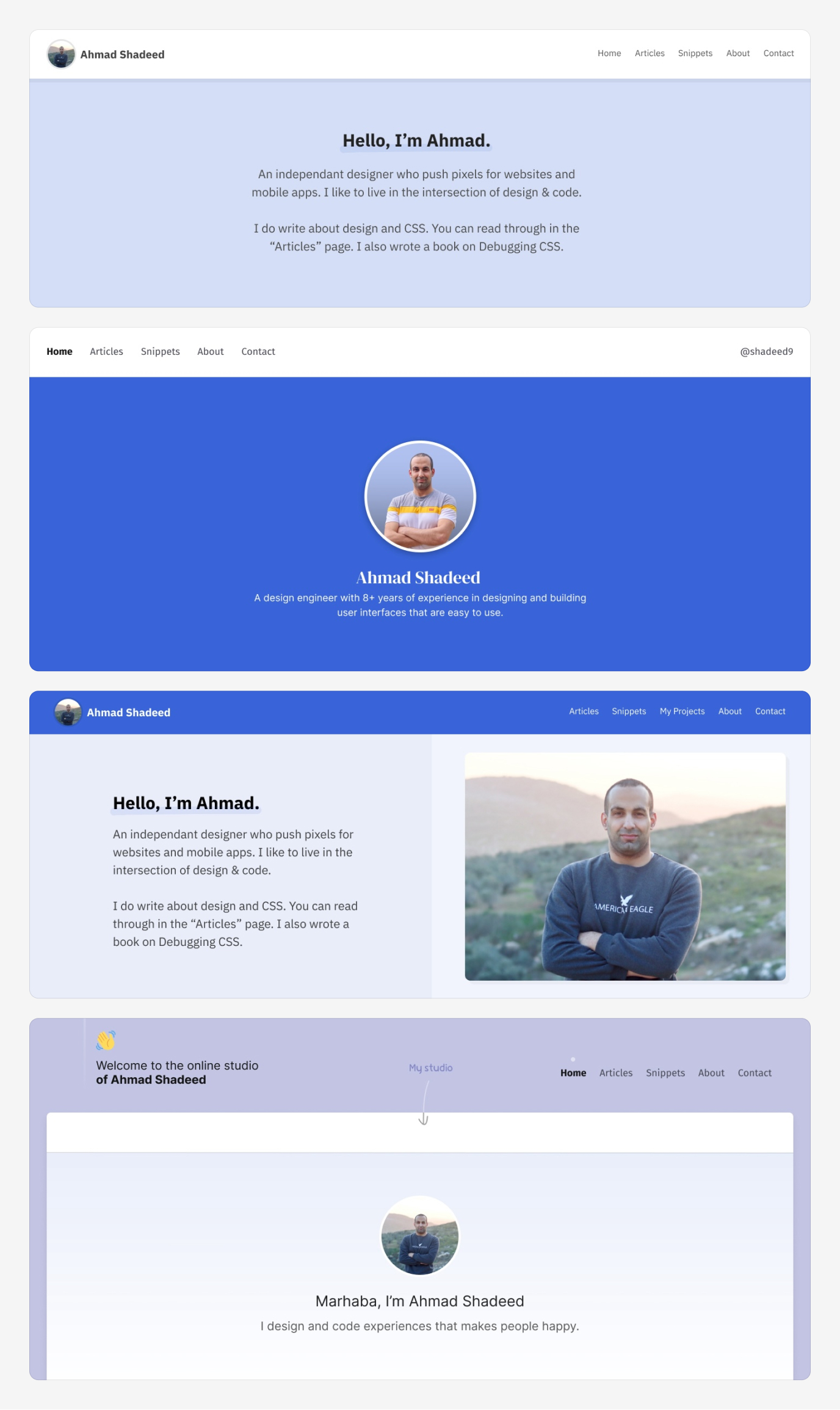
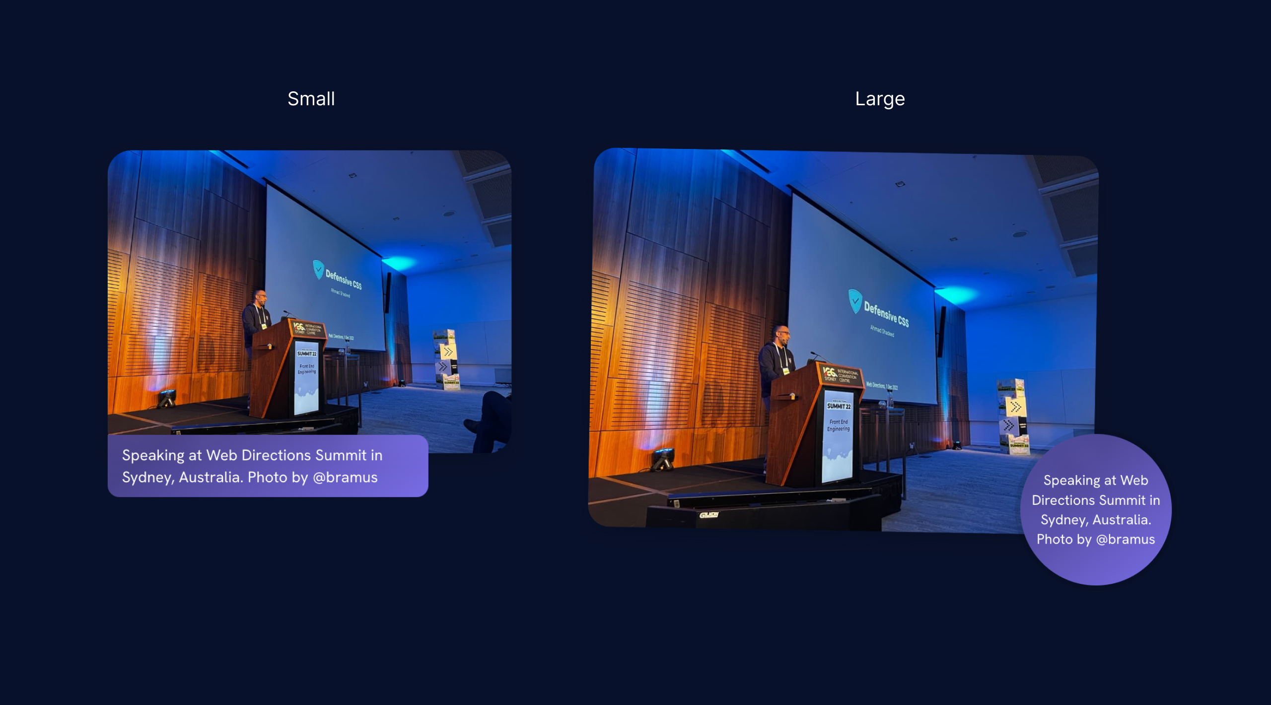
Old and new comparison
Before diving into the details of the new design, let’s see a comparison for the top part of the home page.
The old design:
The new design:
Side-by-side comparison:
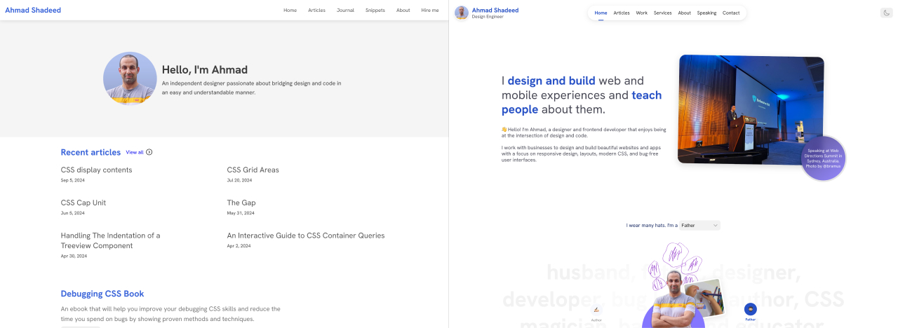
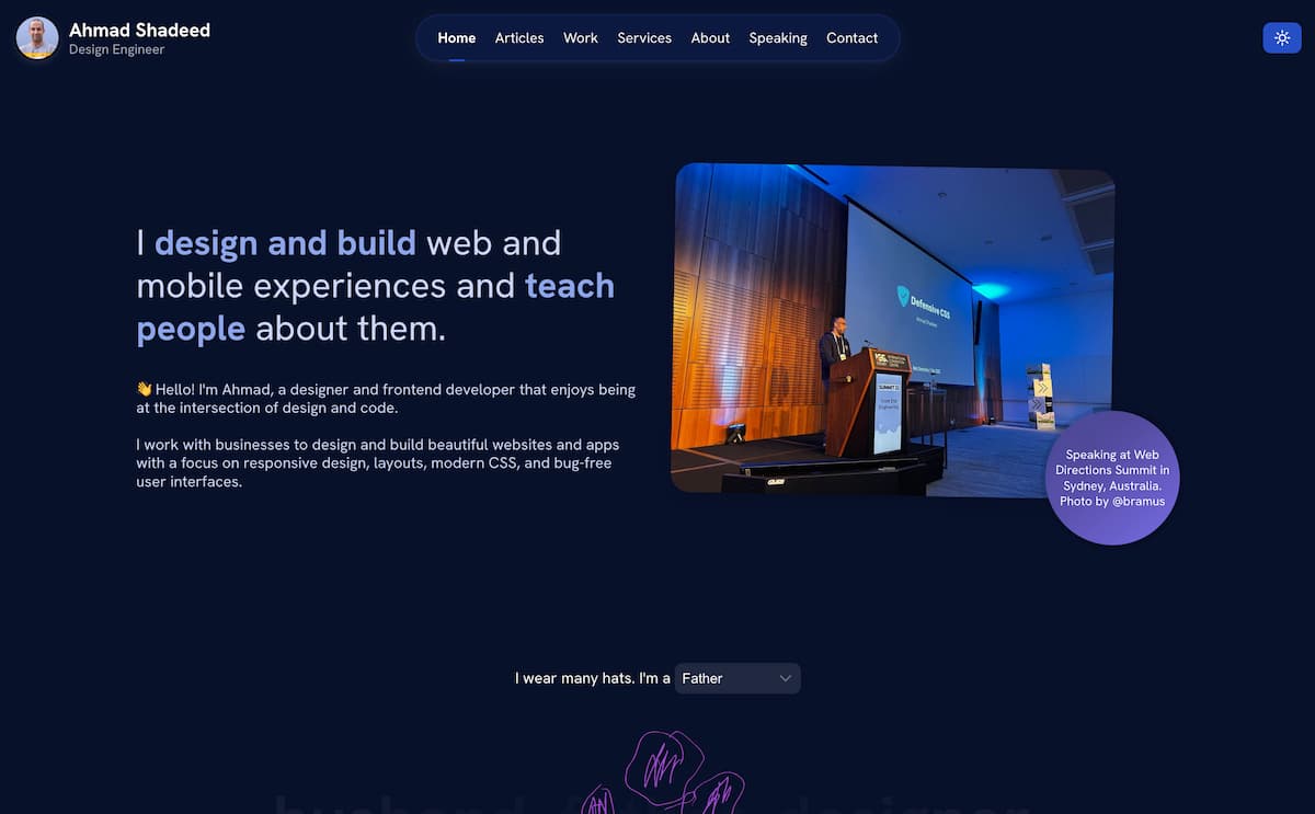
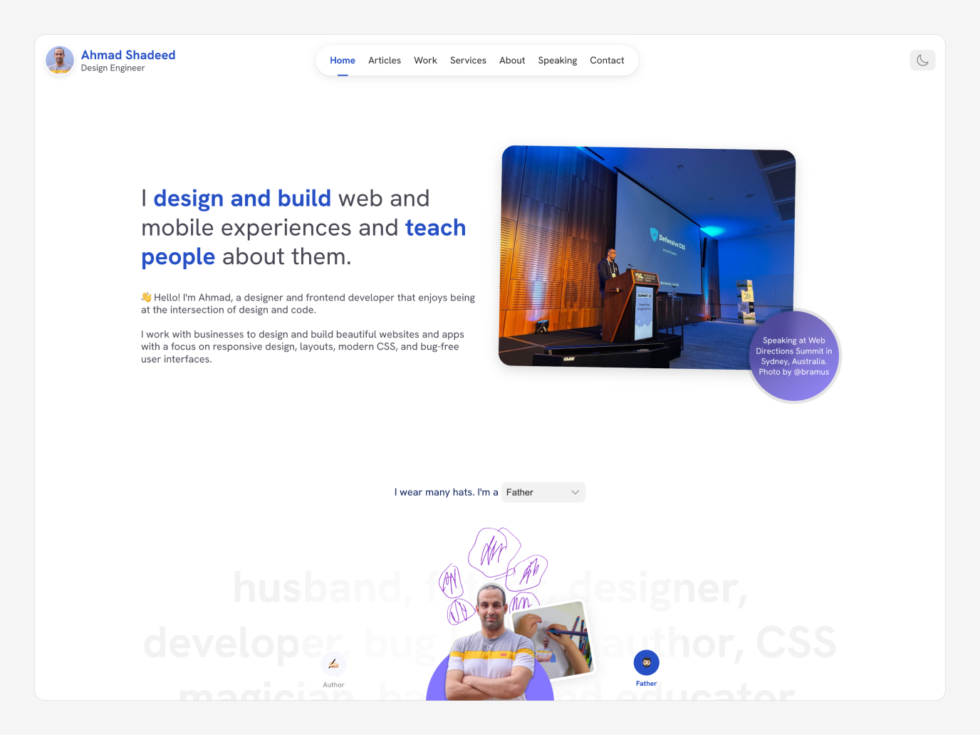
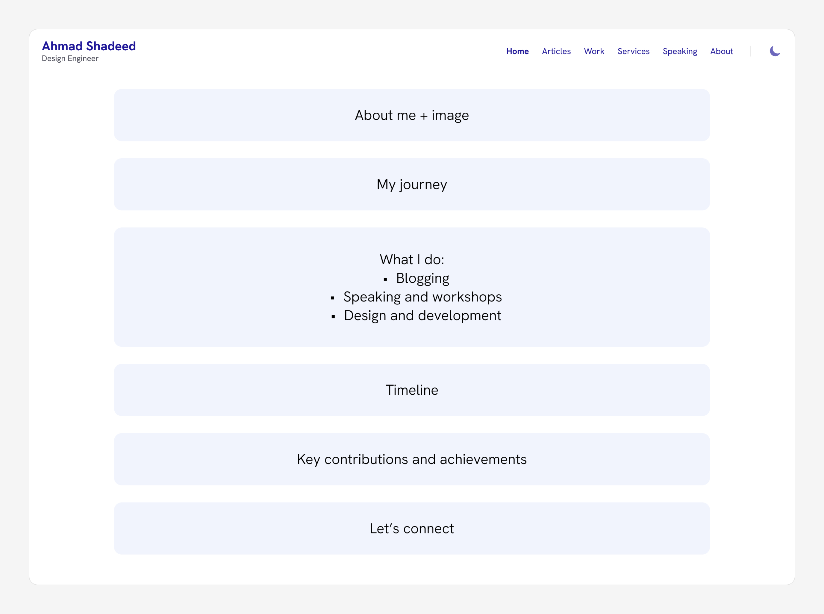
Home page design
Given that this is a personal website, I didn’t have a branding or a clear logo that I used in the design. However, over the years, I used the blue color as my brand color. Based on that, I started exploring design ideas.
Here are some explorations for the header and hero section.
I didn’t like any of them. I didn’t feel that the above design concepts would solve my problem. I kept exploring. After some time, I landed on a design that I generally feel good with.
I thought it was enough to do that. I used this design to update my website header early this year.
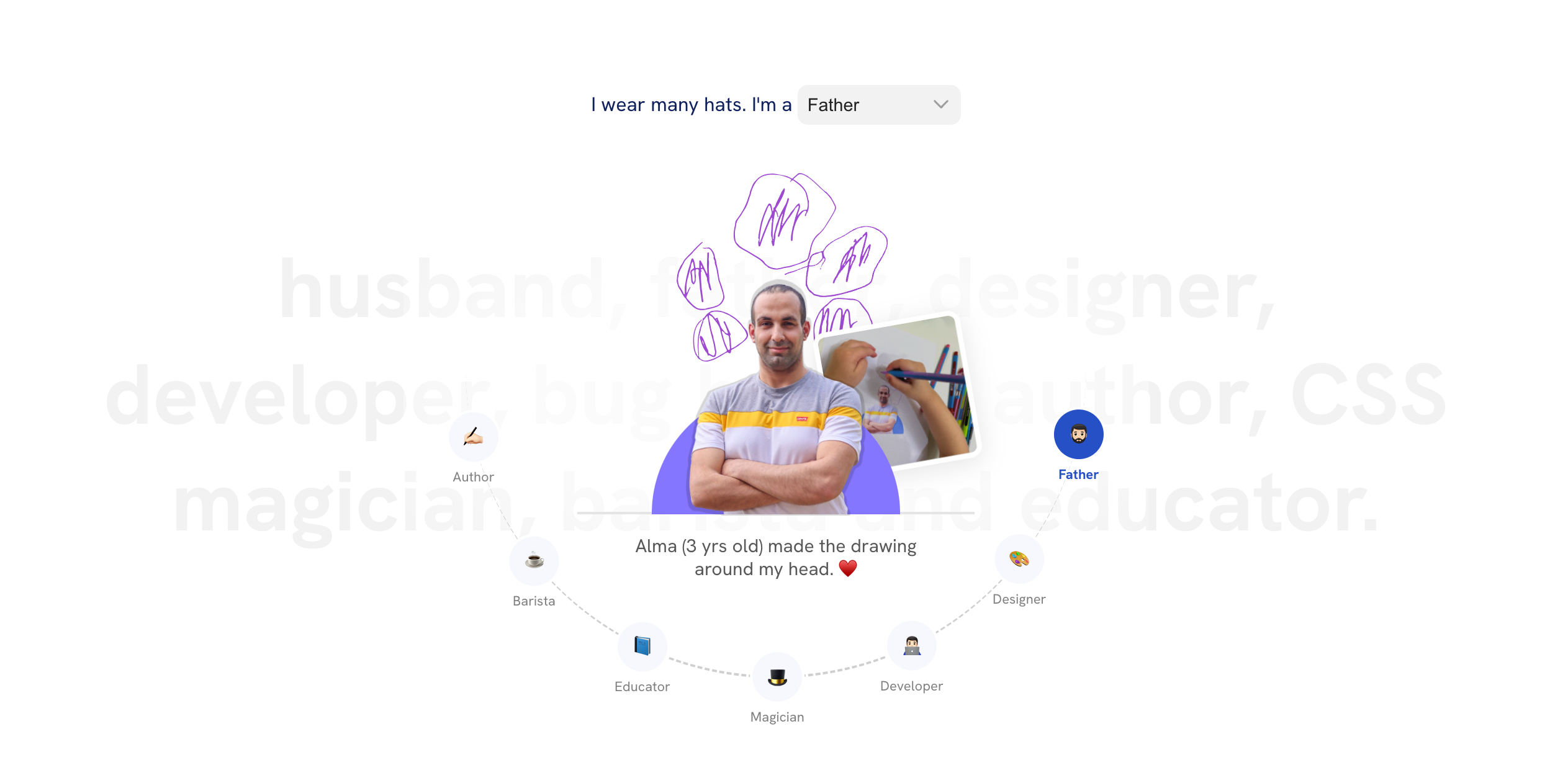
I got an idea for the hero section
At this time, I felt that my mind was like the light bulb emoji (💡). I finally got an idea for something that might be unique and special.
I thought about using my photo in a section where it represents how I wear many hats. Here is the initial design:
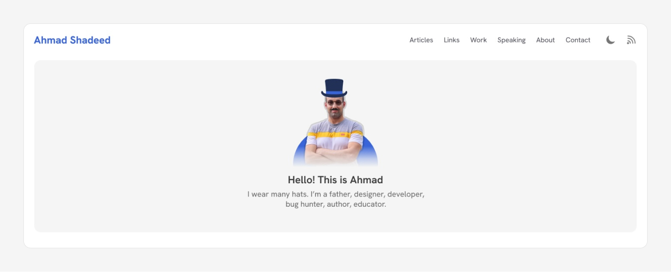
I thought about including it in the hero section like this. While looking at it, I thought that I should include the following hats:
- Father
- Designer
- Developer
- Author
- CSS Magician
- Educator
I took my photo printed it and asked my daughter (Alma) to draw something on my photo.
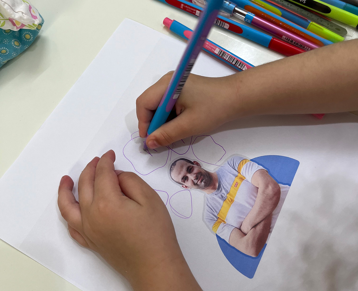
Here is how I extracted the above drawings from Alma:
- Scanned the paper
- Used Adobe Illustrator’s “Image Trace” feature
- Exported the result as SVG
Then, I worked on all the hat variations, here they are:
I liked them a lot and thought they needed to be more consistent (design-wise).
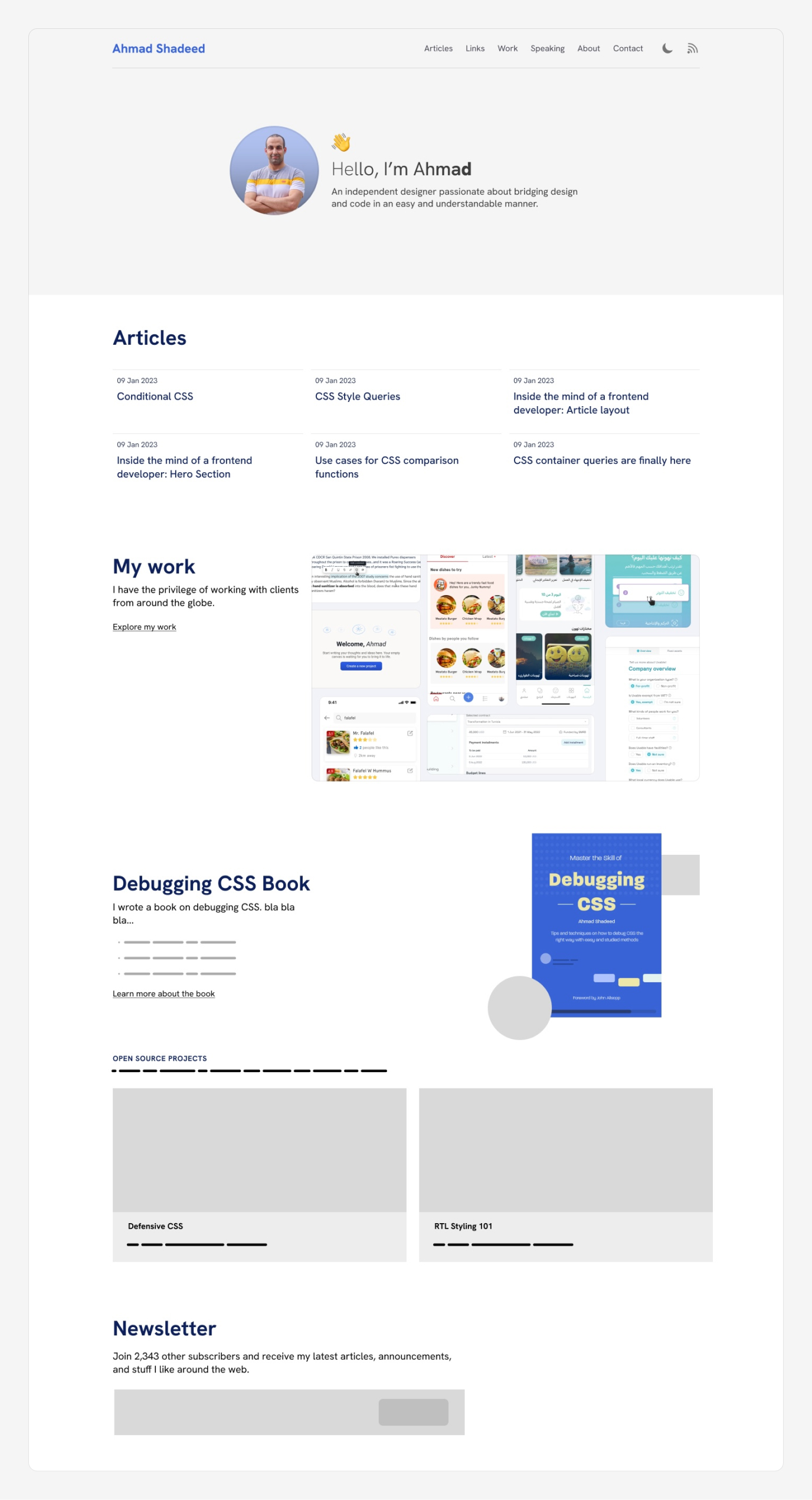
Moving to the rest of the home section
At this point, here is what the home page design looks like:
It’s not bad, there are a couple of things I don’t like here:
- I felt that placing the section that contains the picked article, my book, and the coffee is out of place.
- I wasn’t sure about having left and right arrows for the hats section. Also, its placement is a bit odd to me.
- The book section design is boring.
First, I updated the hero section with two main goals:
- Add a photo of me speaking at a conference.
- Move the hats into their section.
That was a good base that opened the way for the next design ideas.
I kept iterating the page and ended up with the following result:
Moving to the browser
At this point, I started implementing the design in the browser as the design direction started shaping up.
I built the home page and modified the design there.
Main header
I designed the header in the browser as it’s easier for me there, especially for mobile.
At first, I thought about creating a toggle button for mobile, but I didn’t like that. The total number of header items is 6, so why have a toggle button?
I ended up displaying the navigation directly on mobile.
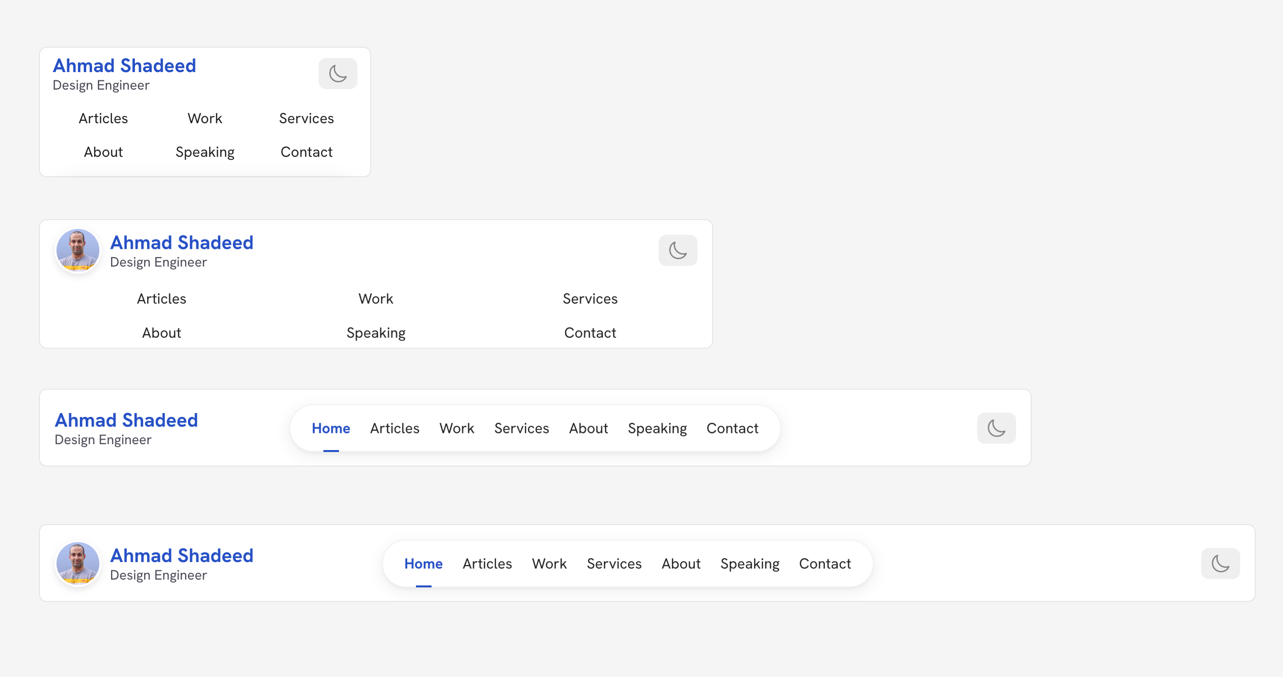
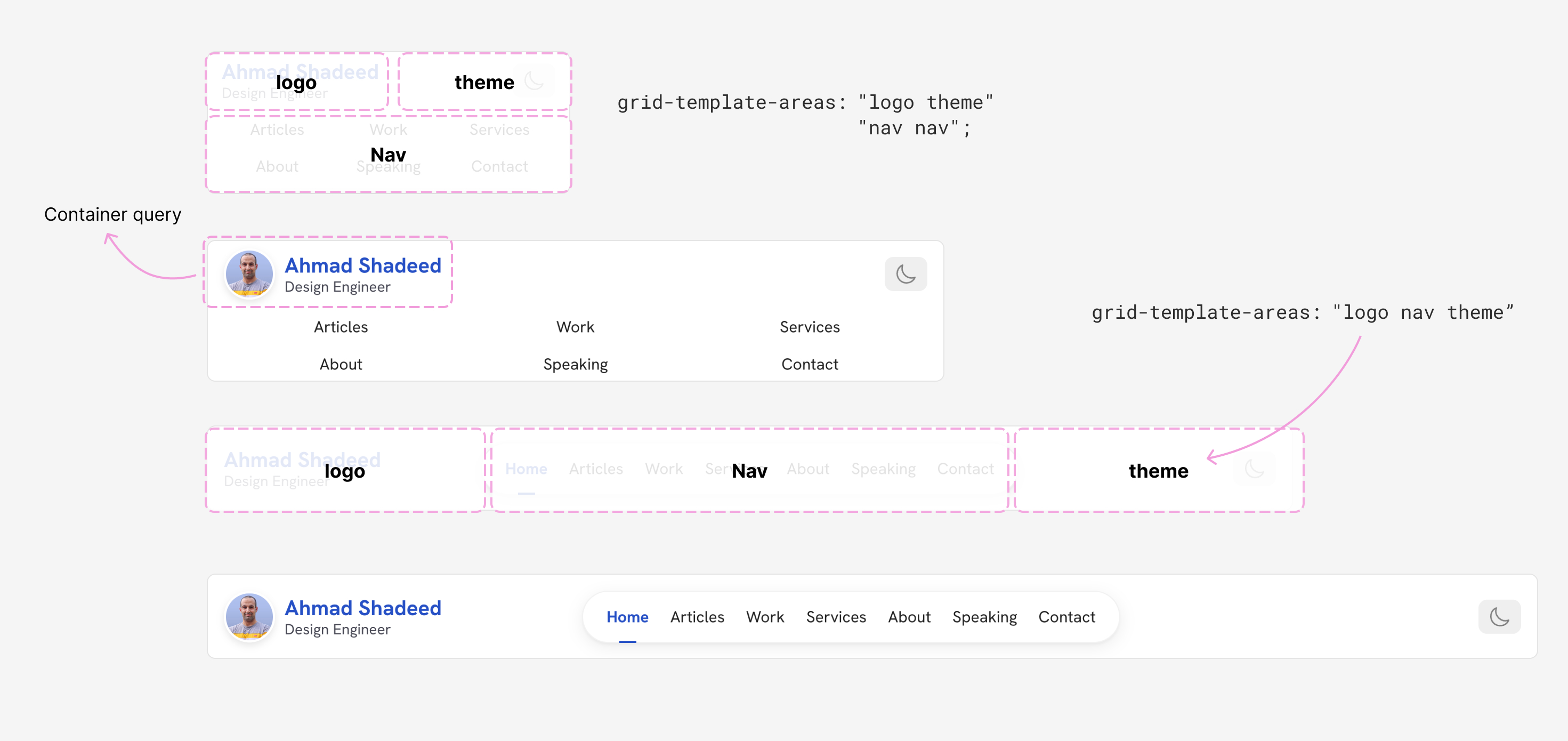
The logo is a container query. If there is enough space, the avatar is shown.
.header__start {
  container-name: header-start;
  container-type: inline-size;
  grid-area: logo;
}

.logo {
  @container header-start (min-width: 210px) {
    img {
      display: block;
    }
  }
}
The header layout is built with a CSS grid. I used grid-template-areas to make it easier.
.header {
  --dynamic-col: clamp(12.5rem, 3.125rem + 15.63vw, 18.75rem);
  display: grid;
  grid-template-areas:
    "logo theme"
    "nav nav";

  @media (min-width: 960px) {
    grid-template-areas: "logo nav theme";
    grid-template-columns: var(--dynamic-col) 1fr var(--dynamic-col);
  }
}
See the following figure.
The hats section
I already have Framer Motion on my blog as I use it for my interactive articles. The hats section is a React component that uses Framer Motion.
First, I created a React state to handle the current selected hat.
const Hats = (props) => {
  const [hat, setHat] = useState(hats[0]);
};
For example, if the selected hat is “Father”, it will load certain elements for that state.
<AnimatePresence>
  {hat === "father" && (
    <>
      <Alma />
      <motion.img
        initial={{ x: 50, y: 0, rotate: "10deg", opacity: 0 }}
        animate={{ x: 30, y: -10, rotate: "-10deg", opacity: 1 }}
        exit={{ x: 100, y: 0, rotate: "10deg", opacity: 0 }}
        transition={{ duration: 0.4 }}
        className={styles.fatherImage}
        src="/assets/general/hats/alma-in-progress.png"
        alt=""
      />
    </>
  )}
</AnimatePresence>
And the same for the rest of the states. What I like about using React and Framer Motion is:
- The browser will only load what it needs in the first load.
- I can easily control the relation between the JS and the animation itself.
- Using CSS modules. I want the styles of this section to be isolated from the rest of the page to avoid styling conflict.
- It’s fun. I learned something that I haven’t done before.
Cool, right?
The hats can be changed in three different ways:
- The select menu
- Clicking on a hat button
- Using the left/right keyboard keys
The hats navigation
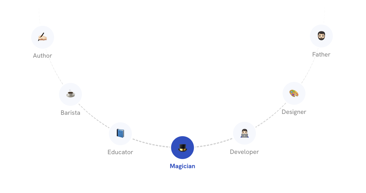
I need to place a button for each hat circularly. How to do that? First, we need to use position: absolute to get the circle out of the flow.
.wrapper {
  position: relative;
}

.circle {
  position: absolute;
  inset: 0;
  margin: auto;
}
Now the circle is positioned at the center of the circle. Take a look:
How to make this circle rotate around the center of the dashed one? To do that, we need to change the x position of the circle.
.circleItem {
  transform: translateX(var(--radius));
}
We need to shift the circle by the value of the radius. Play with the slider in the following demo:
transform: translateX(0px)
After changing the translateX, we can rotate the circle by any degree we want. Notice how when the translateX is increased, the line increases in size. This is a representation of where the circle will rotate around the big circle orign.
Translate (50px)
Rotate (50deg)
transform: translateX(50px) rotate(50deg)
Let’s say that we increased the number of circles. Now each one of them will need a different angle.
To accomplish that, we need to:
- Define the index of each circle
- Know the number of items
- Define a fraction value for each circle item by dividing the index by the total circles
- Multiply the fraction with the full angle
See the following CSS:
.circle {
  --numOfItems: 5;
  --radius: 100px;
}

.circleItem {
  --fraction: calc(var(--i) / var(--numOfItems));
  --rotationAngle: calc(360deg * var(--fraction));
  transform: rotate(var(--rotationAngle)) translateX(var(--radius));

  &:nth-child(1) {
    --i: 0;
  }

  &:nth-child(2) {
    --i: 1;
  }

  /* and so on.. */
}
Here is an interactive demo that shows it in action. Play with the translate value. Each circle is 100px away from the center and has an incremental angle.
Translate (100px)
In my case, I needed to distribute the circles in the bottom half only. All I need to do is to change the full circle 360deg to a half one.
.circleItem {
  --fraction: calc(var(--i) / var(--numOfItems));
  --rotationAngle: calc(180deg * var(--fraction));
  transform: rotate(var(--rotationAngle)) translateX(var(--radius));
}
After changing the total angle from 360deg to 180deg, now the items are positioned in half a circle.
If you notice, they are not centered perfectly. We need to add an offset to fix that.
.circleItem {
  /* The offset value */
  --offset: 16deg;
  --fraction: calc(var(--i) / var(--numOfItems));
  --rotationAngle: calc(180deg * var(--fraction) + var(--offset));
  transform: rotate(var(--rotationAngle)) translateX(var(--radius));
}
Try to toggle it in the following demo:
Translate (100px)
When we add content to the items, it’s rotated along with the item itself. This isn’t good in my case.
To fix that, I will revert the --rotationAngle at the end of the transform.
.circleItem {
  /* The offset value */
  --offset: 16deg;
  --fraction: calc(var(--i) / var(--numOfItems));
  --rotationAngle: calc(180deg * var(--fraction) + var(--offset));
  transform: rotate(var(--rotationAngle)) translateX(var(--translate)) rotate(calc(-1 *
          var(--rotationAngle)));
}
Play with it in the demo below:
Translate (100px)
We can take this and build upon it to create a circular navigation, just like what’s on my home page now.
Here is the final result:
I would like to credit this Codepen demo, it helped me to build a proof of concept for the hats navigation.
The book section
I used CSS scroll-driven animation to add an eye-catching scroll effect. When you scroll down, the rows will animate in different directions.
I chose to include pages from the book as it will make the reader curious to explore my book. I can confirm that it worked! My book sales in the last few days equal the sales of the last two months, combined.
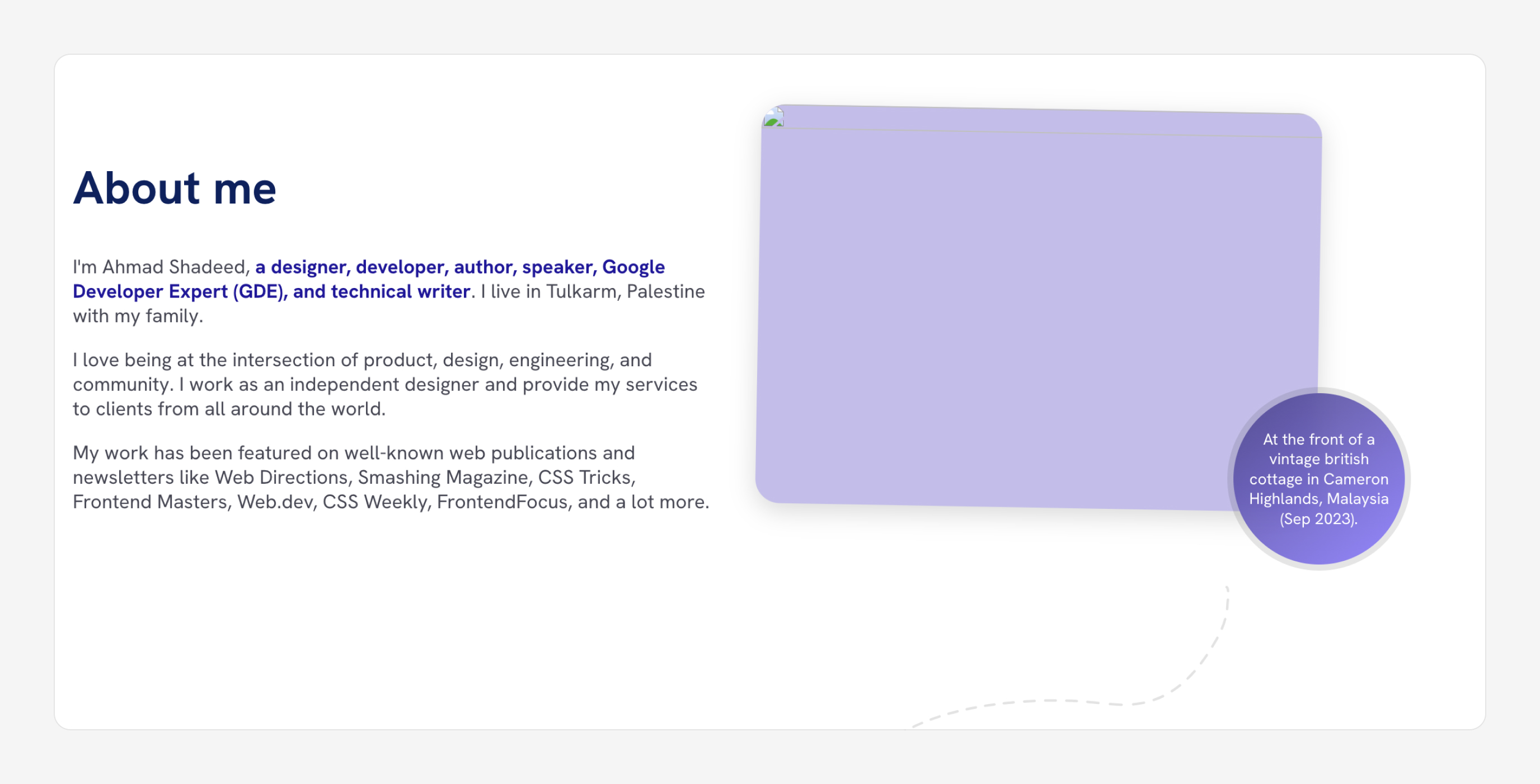
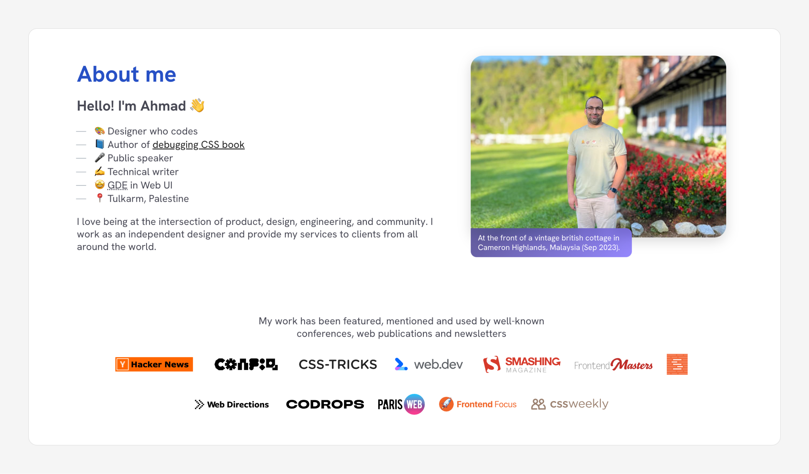
About page
This is where the 50% effort went. I spent a lot of time working on this page. I wanted it to reflect who I am as a person.
I brain-dumped all the content I need to put in this page.
After that, I started with a design and ended up with the following:
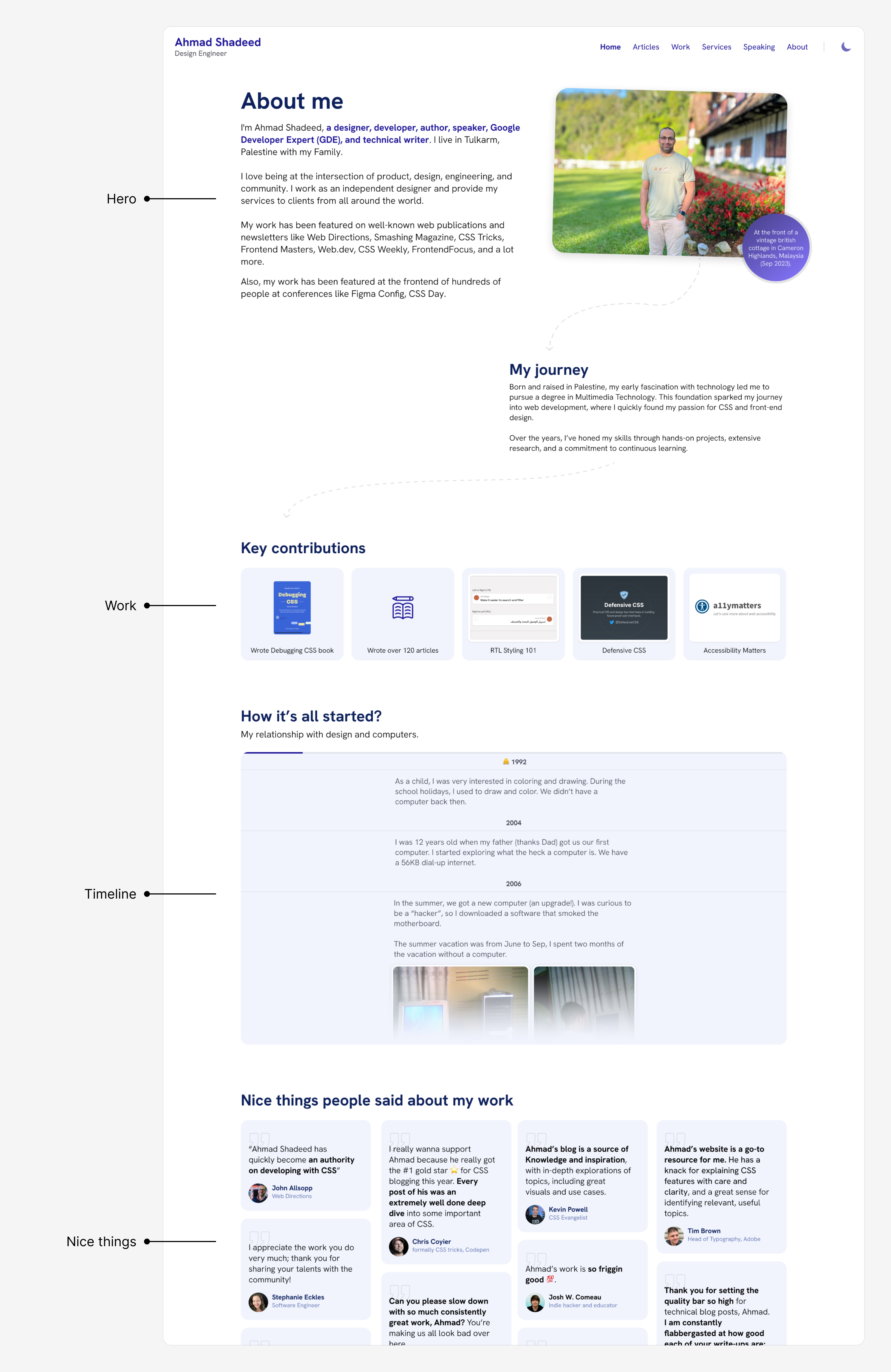
The design includes the hero, contributions, timeline, and the nice things sections.
Initially, it was okay but each time I look at it later, I notice that I’m not happy with it. It needs a personal touch!
The coffee corner
I love coffee, a lot. I thought about why not have a coffee corner on my About page. I did that. Here is the initial design:
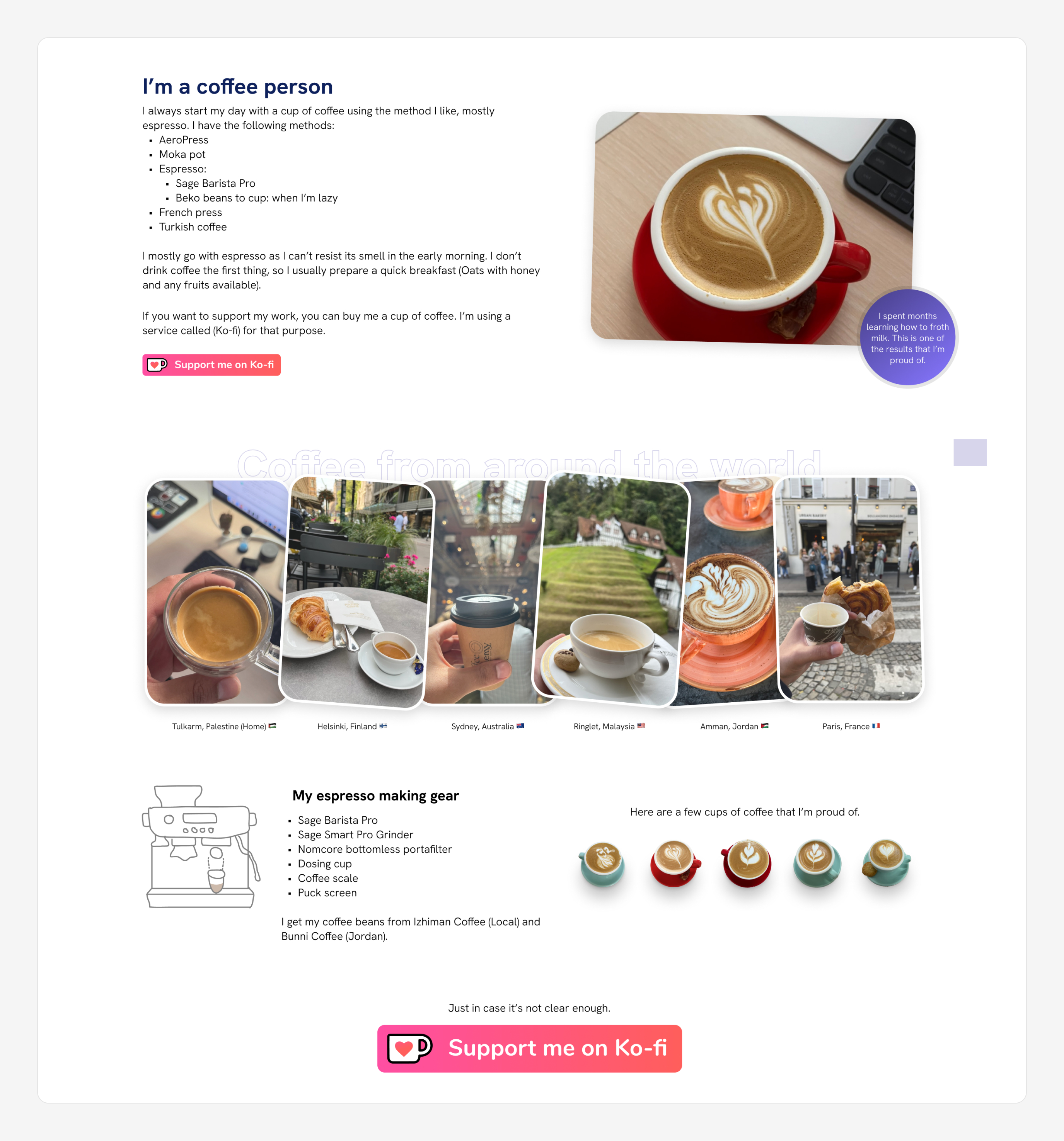
Now the about is a bit more personal, I think. From now on, all the changes to this section happen in the browser.
After that, I tried a fun experiment which was to include an AeroPress animation on scroll. I did it! Here is a video:
I left it for weeks then came back and removed it all together. It just met the level of fun and detail I usually do.
I decided to give it another try but with a new design. I drew an espresso machine with the steps to making a cup. I thought about animating it.
Here is the illustration I made:
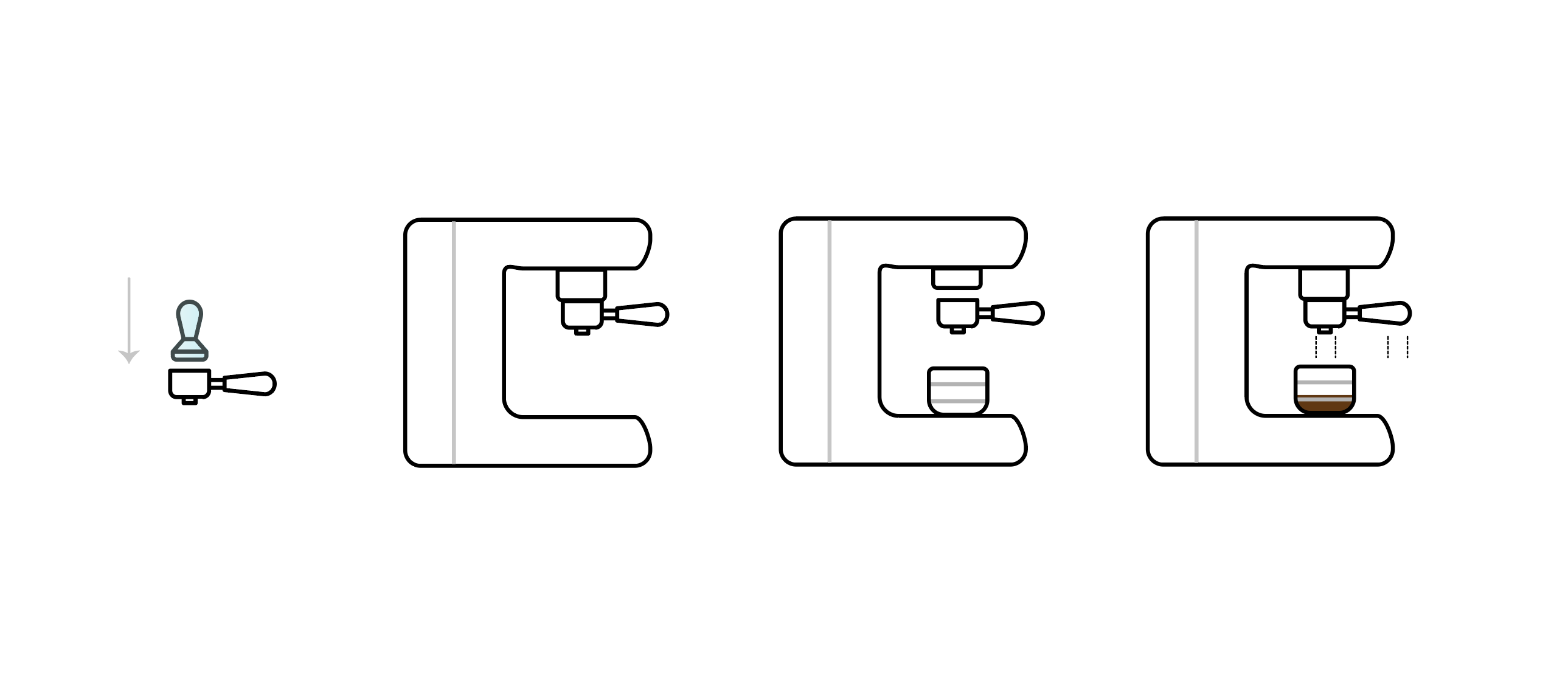
Curious to know what happened next? I will explain more in the CSS highlights section.
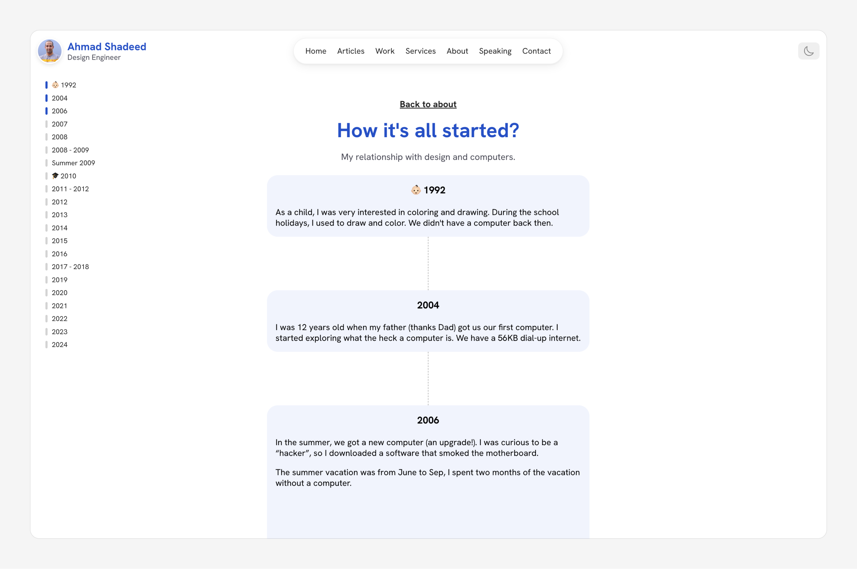
The timeline
As part of the About page, I included a section I called “timeline”. It’s an organized list of events of my interest in design since 2004 till today.
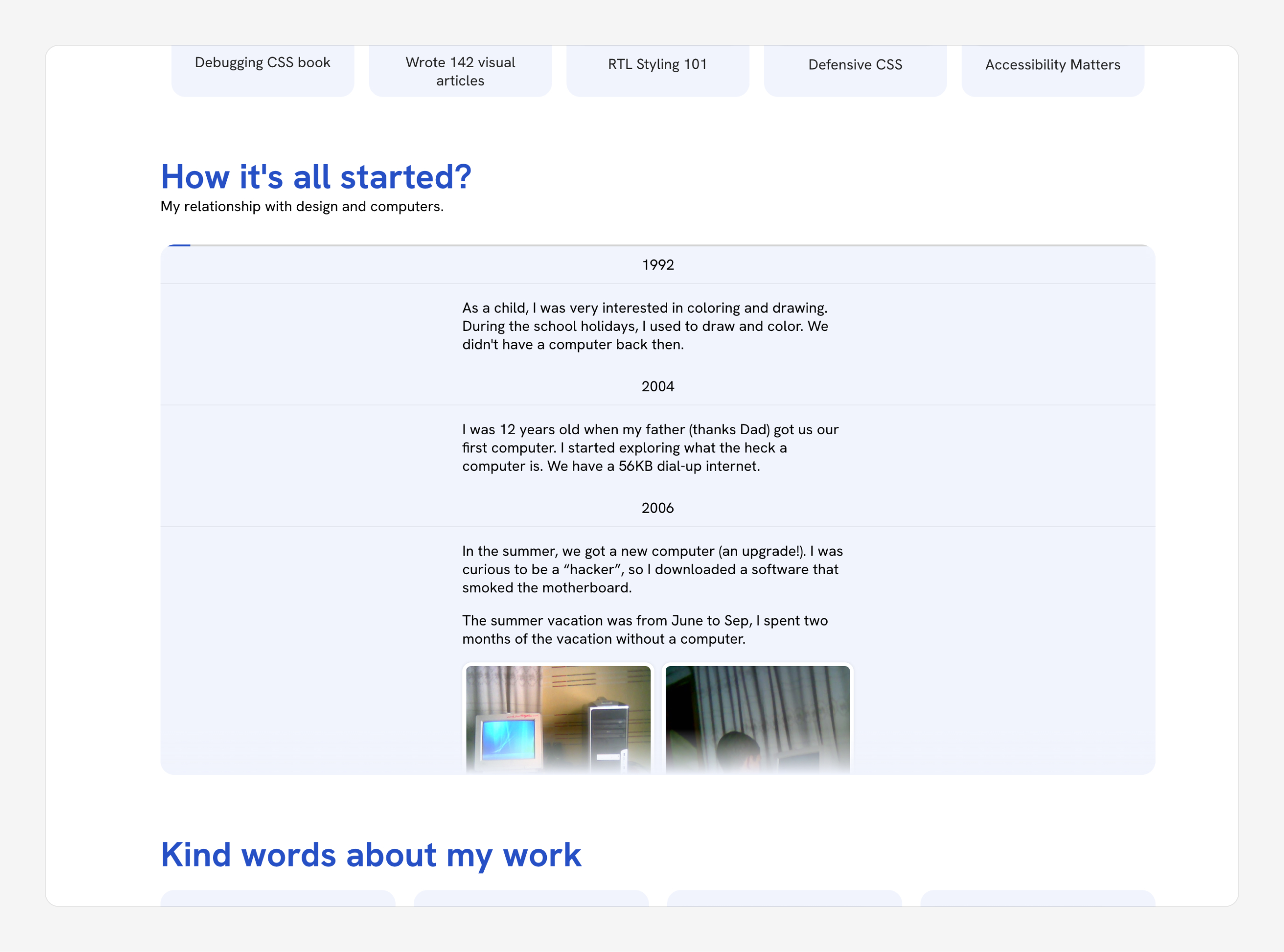
Initially, I thought about including it in the About page and letting the user scroll within the section. See the following video:
This introduced a few problems:
- It can be hard to keep track of where you reached in the timeline.
- The browser will download all the text content, even if the reader didn’t scroll down.
- I don’t want to force such a section for all readers. Only a few will be interested to read that.
As a result, I moved the section to its page and replaced it with a title, description, and call to action.
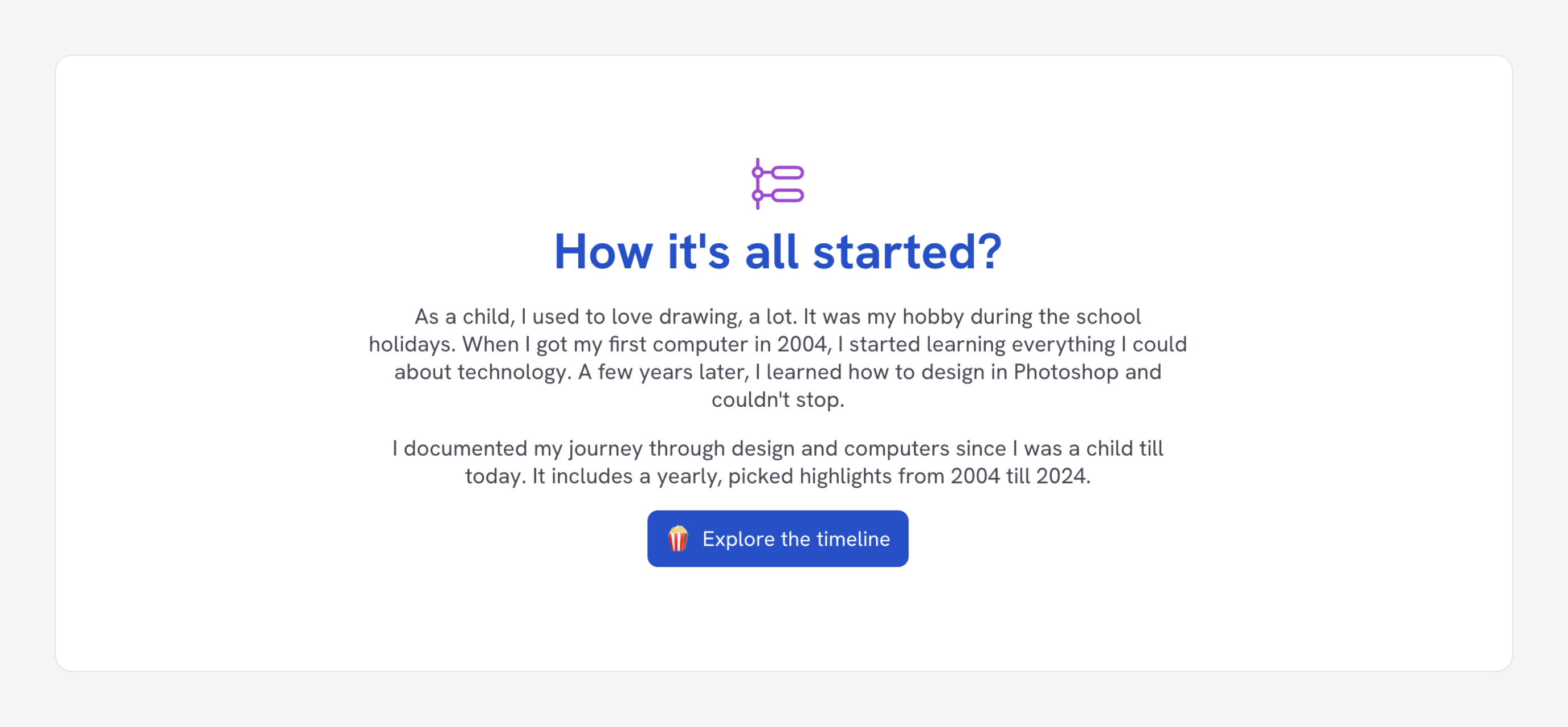
When the reader clicks on “Explore the timeline”, they will see the following page.
Hero
Each time I look at the hero section, I feel that it contains too much text and just looks boring. A few days before the design release, I got feedback from friends confirming that.
To solve that, I thought about converting the paragraphs to something more visual.
- For the first two paragraphs, I made it into a bullet list with emojis.
- For the last one, I moved into a new section and included logos of the mentioned websites.
This is much better, at least for me.
CSS highlights
Scroll-driven animations
I still didn’t fully grasp scroll-driven animations, but thought about using it for my new website when suitable. That being said, the following are use cases of where I used them.
Currently, all the demos work in Chromium browsers only (Chrome and Edge). I used `@supports: animation-timeline` but that was true in Firefox Nightly even though their implementation isn't completed yet.
I got help from Bramus in updating the @supports query to only target Chromium browsers for now.
Fading header
The website’s header will fade on a scroll and appear again when scrolling to the top. I didn’t want to use JavaScript as I’m only interested in it fading on the initial scroll.
.c-header {
  @supports ((animation-timeline: scroll()) and (animation-range: 0% 100%)) {
    position: sticky;
    top: 0;
    animation: moveHeader linear both;
    animation-timeline: scroll();
    animation-range: 0 300px;
  }
}

@keyframes moveHeader {
  to {
    transform: translateY(-100%);
    opacity: 0.2;
  }
}
See it in action in the following video:
Coffee machine
On the About page, I added a coffee corner section. I needed to create an interesting scroll animation at the beginning of the section.
See the following video:
How do I build this? All the moving elements are separate SVGs. On scroll, each will animate as I need. Let’s explore how I added the scroll animation for some items.
First, I needed the animation to run when the coffee machine crossed the viewport. To do that, I need to use animation-timeline: view(). Then, to control when each animation should work, I played with the start and end for the animation-range values.
For the coffee tamper, I needed two animations: one for tamping the coffee puck, and the other to remove it.
.tamper {
  animation:
    tamp linear both,
    removeTamp linear both;
  animation-timeline: view();
  animation-range:
    5vh 15vh,
    15vh 25vh;
}

@keyframes tamp {
  to {
    transform: translateY(43px);
  }
}

@keyframes removeTamp {
  to {
    opacity: 0;
  }
}
Notice how I used two animations for the CSS animation property. Also, the animation-range contains a set for each animation.
If you notice, the machine brews coffee in the cup. I did that by animating stroke-dasharray for the SVG.
/* Coffee drops */
line {
  stroke: #8f5f35;
  stroke-dasharray: 151;
  stroke-dashoffset: 151;
  animation: brew linear both;
  animation-timeline: view();
  animation-range: 30vh 40vh;
}

@keyframes brew {
  to {
    stroke-dasharray: 165;
  }
}

/* Filling the coffee cup */
.cup:after {
  animation: fillCup linear both;
  animation-timeline: view();
  animation-range: 30vh 40vh;
}

@keyframes fillCup {
  to {
    transform: scaleY(0.65);
  }
}
At the end, there is a big arrow that draws itself and points to the following section. I exported it as an SVG path and animated both the line and the arrow handle.
path {
  /* Arrow line */
  &:first-child {
    stroke-dashoffset: 522;
    stroke-dasharray: 522;
    animation: showArrow linear both;
    animation-timeline: view();
    animation-range: 50vh 60vh;
  }

  /* Arrowhead */
  &:nth-child(2) {
    stroke-dashoffset: 19.5;
    stroke-dasharray: 19.5;
    animation: showArrow linear both;
    animation-timeline: view();
    animation-range: 60vh 61vh;
  }
}

@keyframes showArrow {
  to {
    stroke-dashoffset: 0;
  }
}
I wanted the arrowhead to appear a bit after the line was finished, so I changed the animation range from 50vh 60vh to 60vh 61vh.
It’s fun, isn’t it? If you are curious to see all the CSS, I recommend to inspect the section and see how it works.
Newsletter
I designed this section in the browser as I couldn’t experiment freely in Figma. When you scroll down, a paper will slide up and show the newsletter card.
To make that work, I used a view() scroll timeline. See the following CSS:
.newsletter-card {
  transform: translateY(100%) rotate(5deg);
  animation: showNewsletter linear both;
  animation-timeline: view();
  animation-range: 0vh 70vh;
}

@keyframes showNewsletter {
  to {
    transform: translateY(10%) rotate(-2deg);
  }
}
To ensure that the card will be hidden, we need to use CSS overflow. Be careful to use overflow: clip and not overflow: hidden.
If you use hidden, the scroll animation will not work because the browser will create a scroll container that breaks the scroll animation. Learn more in this article by Bramus.
Books
Here is how it works in CSS:
.pages-row.start {
  view-timeline: --row-a block;

  @supports (animation-timeline: view()) {
    animation: pages-default linear both;
    animation-timeline: --row-a;
    animation-range-start: 10%;
  }
}
Also, when you hover over a page, the rest of the pages will fade. I used CSS :has() for that.
.rows-wrapper {
  &:has(img:hover) {
    img:not(:hover) {
      opacity: 0.3;
    }

    img:hover {
      opacity: 1;
      transform: rotate(0deg) scale(1.05);
    }
  }
}
Here is a video of it in action:
Photography
Given that I love photography, I needed to show that in a simple way. On my last birthday, Alma (3 years old) gifted me a rope that contained photos of us on our recent trip to Malaysia.
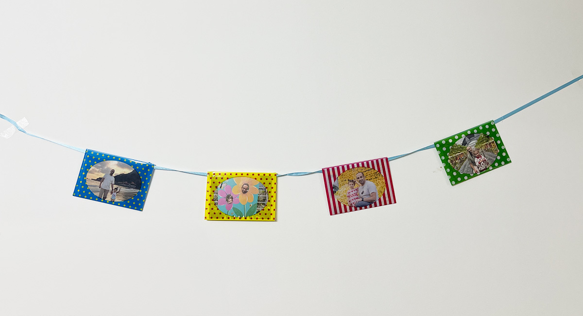
I got an idea to convert that into a UI design. I started exploring design ideas in Figma just to get a sense of it.
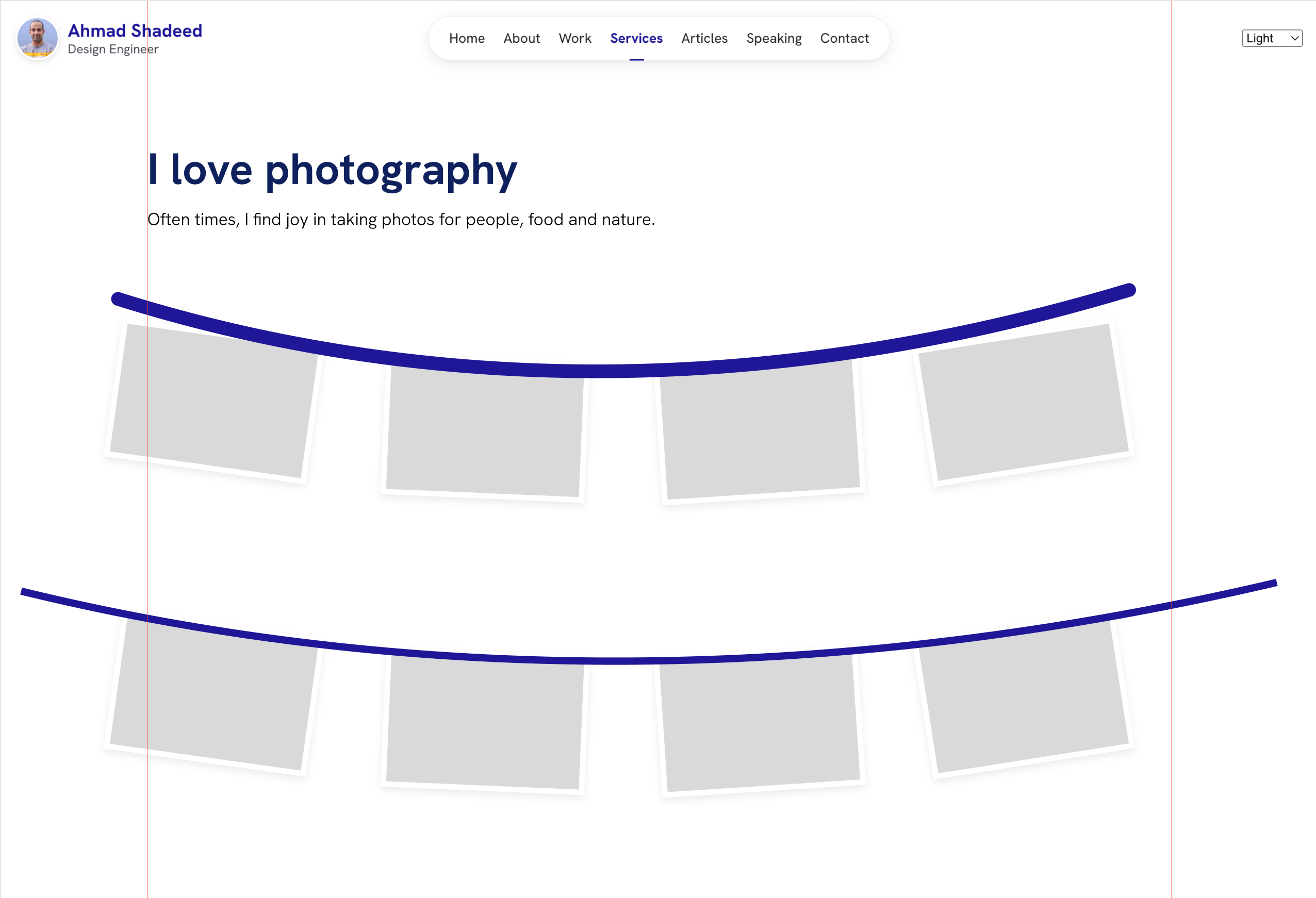
How can I build that in CSS? At first, I exported the path as an SVG and positioned the items manually like this:
.photos__item:nth-of-type(2) {
  transform: rotate(3deg) translateY(85px);
}

.photos__item:nth-of-type(3) {
  transform: rotate(-4deg) translateY(81px);
}
This wasn’t a solution that I’m happy about. Luckily, I remembered that there is something in CSS called offset-path. The idea is that we can position elements on a path and control their position with the offset-distance property.
.photos__item {
  offset-path: path("M8 17.8164C271.314 100.481 648.167 148.013 1114 8");
}

.photos__item:nth-of-type(2) {
  offset-distance: 16%;
}
In the following interactive demo. I positioned a rectangle on a path:
- We can control its position via
offset-distance. - We can also change it’s anchor point.
Play with it yourself.
Building on the above, I used scroll animations to change the offset-distance on the scroll.
.photos {
  view-timeline: --photography;
}

.photos__item:nth-child(1) {
  offset-distance: 100%;
  animation: moveImage1 linear forwards;
  animation-timeline: --photography;
  animation-range: 0 45vh;
}

@keyframes moveImage1 {
  from {
    offset-distance: 100%;
  }

  to {
    offset-distance: 81%;
    opacity: 1;
  }
}
Here is the final result:
Timeline table of contents
On the timeline page, I have a table of contents with position: fixed. On scroll, I need to push it back to the top as the header isn’t sticky.
.toc-wrapper {
  @media (min-width: 960px) {
    animation: moveUp linear both;
    animation-timeline: scroll(root);
    animation-range: 0 300px;
  }
}
Here is a video:
I used the Scroll-Driven Animations Debugger to show you how it works behind the scenes.
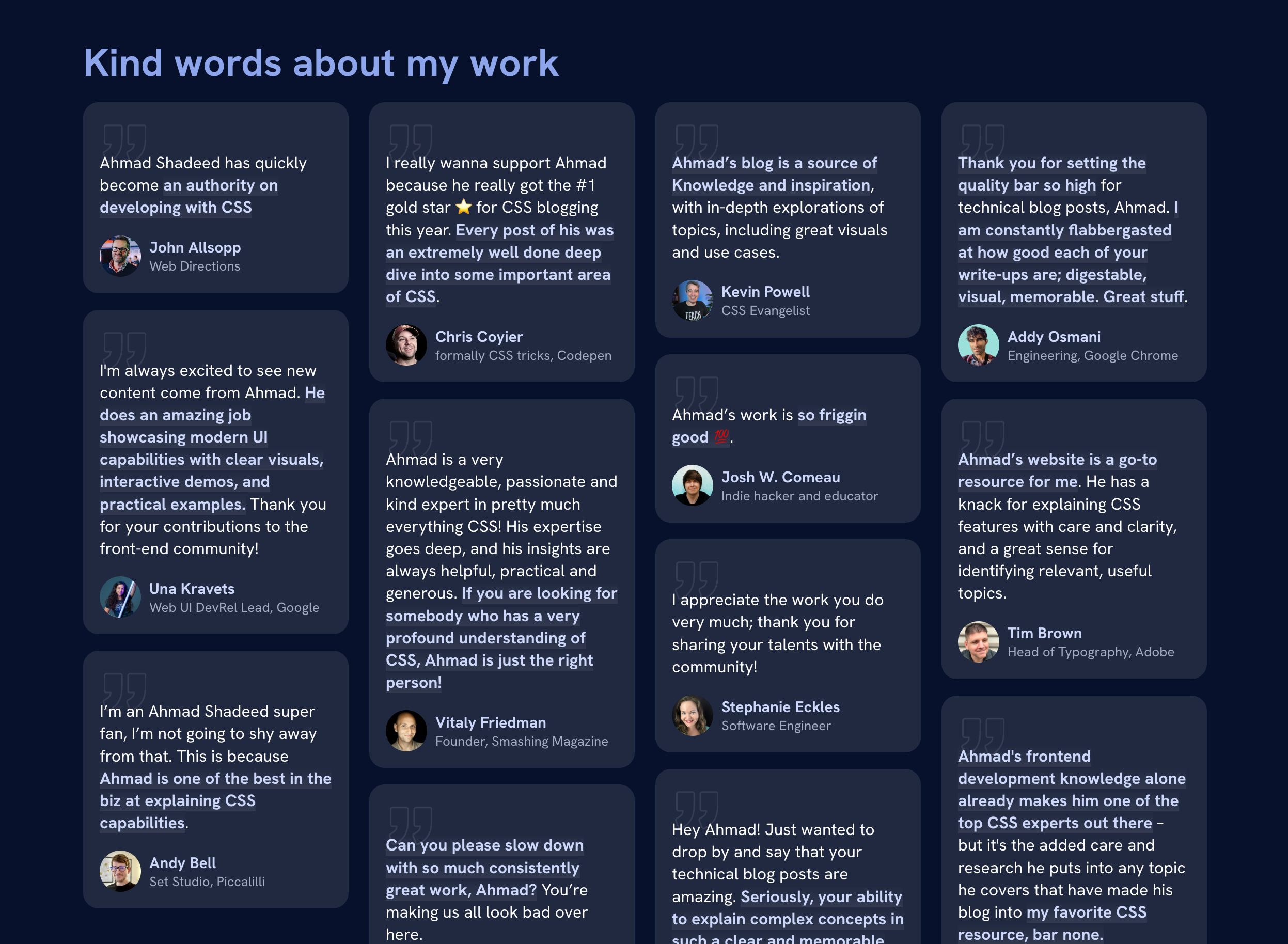
Fake masonry layout with CSS grid and display contents
I need a masonry layout to show the nice things said about my work. At first, I tried CSS columns but I didn’t like the result.
Instead, I divided the quotes into 4 wrappers.
<div class="quotes">
  <div class="quotes__wrapper">
    <!-- quotes -->
  </div>
  <div class="quotes__wrapper">
    <!-- quotes -->
  </div>
  <div class="quotes__wrapper">
    <!-- quotes -->
  </div>
  <div class="quotes__wrapper">
    <!-- quotes -->
  </div>
</div>
Here is how it works:
- By default, each quote item should be at least 200px on small screens.
- The
.quotes__wrapperelement is flattened withdisplay: contents. That means the quotes within it will join the.quoteselement’s grid. - On larger screens, the grid columns are changed and the
.quotes__wrapperis converted into a flex container.
.quotes {
  display: grid;
  grid-template-columns: repeat(auto-fit, minmax(200px, 1fr));
  gap: 1.25rem;

  @media (min-width: 950px) {
    grid-template-columns: repeat(4, 1fr);
  }
}

.quotes__wrapper {
  display: contents;

  @media (min-width: 950px) {
    display: flex;
    flex-direction: column;
    gap: 1rem;
  }
}
I like this solution to my problem. I wrote about display contents recently.
Container queries
I used container queries for a couple of components in the design. Here are a few of them.
Figure
The figure caption style changes based on the container width.
Take a look at the CSS:
@container figure (min-width: 440px) {
  img {
    transform: rotate(1deg);
  }

  figcaption {
    position: absolute;
    right: 0;
    bottom: 0;
    width: var(--figcaption-size);
    height: var(--figcaption-size);
    border-radius: 50%;
  }
}
Social buttons
The social buttons on the About page rely on container queries to change between the two styles.
.social-link {
  @container link (min-width: 280px) {
    flex-direction: row;
    padding: 1rem;
  }
}
See the following video:
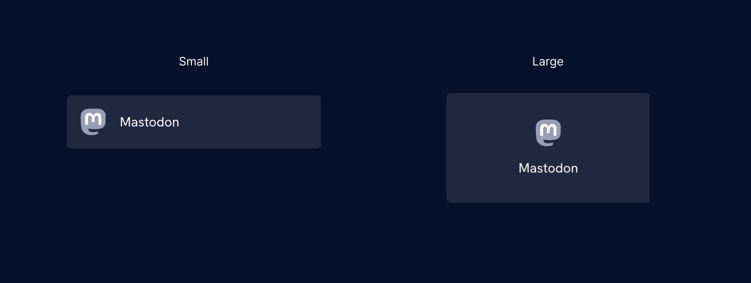
Logo
In the header, if there is not enough space for my avatar, it will be hidden.
@container header-start (min-width: 210px) {
  img {
    display: block;
  }
}
See the following video:
If you want to learn more about container queries, I wrote a complete interactive guide on them.
CSS :has
Article card
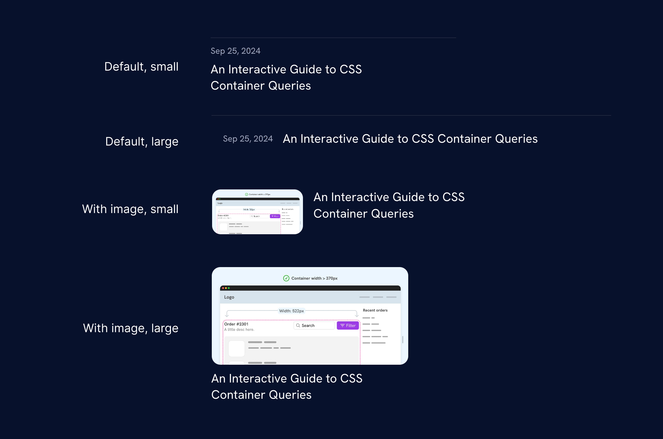
I used CSS :has to conditionally style the article card component. If there is an image, I want a style stacked. If not, the article’s date and title will appear next to each other as long as there is enough space.
Here is a sample from the CSS:
.c-article {
  &:has(img) {
    flex-direction: row;
    border-top: 0;
    padding-block: 0;

    a {
      display: flex;
      gap: 1rem;
    }

    img {
      display: block;
      width: 150px;
    }

    h3 {
      flex: 1;
    }

    time {
      display: none;
    }

    .interactive-tag {
      display: none;
    }

    @container articles (max-width: 400px) {
      a {
        flex-direction: column;
        gap: 0;
      }

      img {
        width: 100%;
        min-width: 0;
      }
    }
  }
}
Learn more about CSS :has() in this CSS :has interactive guide.
Fun bits to explore
- See how I used the
[src*=""]thing in the about page, contribution items, and logos section. - Explore how I used CSS
clamp()for the books and the hat buttons. - How the hover effect works for the work page cards. Make sure to hover on both English and Arabic designs, do you notice something?
- Contact page, uhm.
Feedback
I’m thankful enough that the new design received great feedback from the community. One feedback I want to highlight is the article Ahmad Shadeed has a nice new website by Andy Bell. Thank you, Andy!