The Layout Maestro
A message from the author!
When was the last time you heard the term “Pixel Perfection”? Depending on who you work with, the last time could range from today or years ago. Pixel perfection is a term coined by designers and clients as they request that their design mockups must reflect the design and be an exact copy of it. For me, I’m still hearing this term until this day from some clients. Should we pixel-perfect an implementation of a design mockup?
I will compare the old scene of the web, and the new one. This comparison will give you an idea about what has changed over the years, and why we need to think far away from the pixel perfection thing. This article is targeted for designers, front-end developers, and clients, or product managers.
What is pixel perfection?
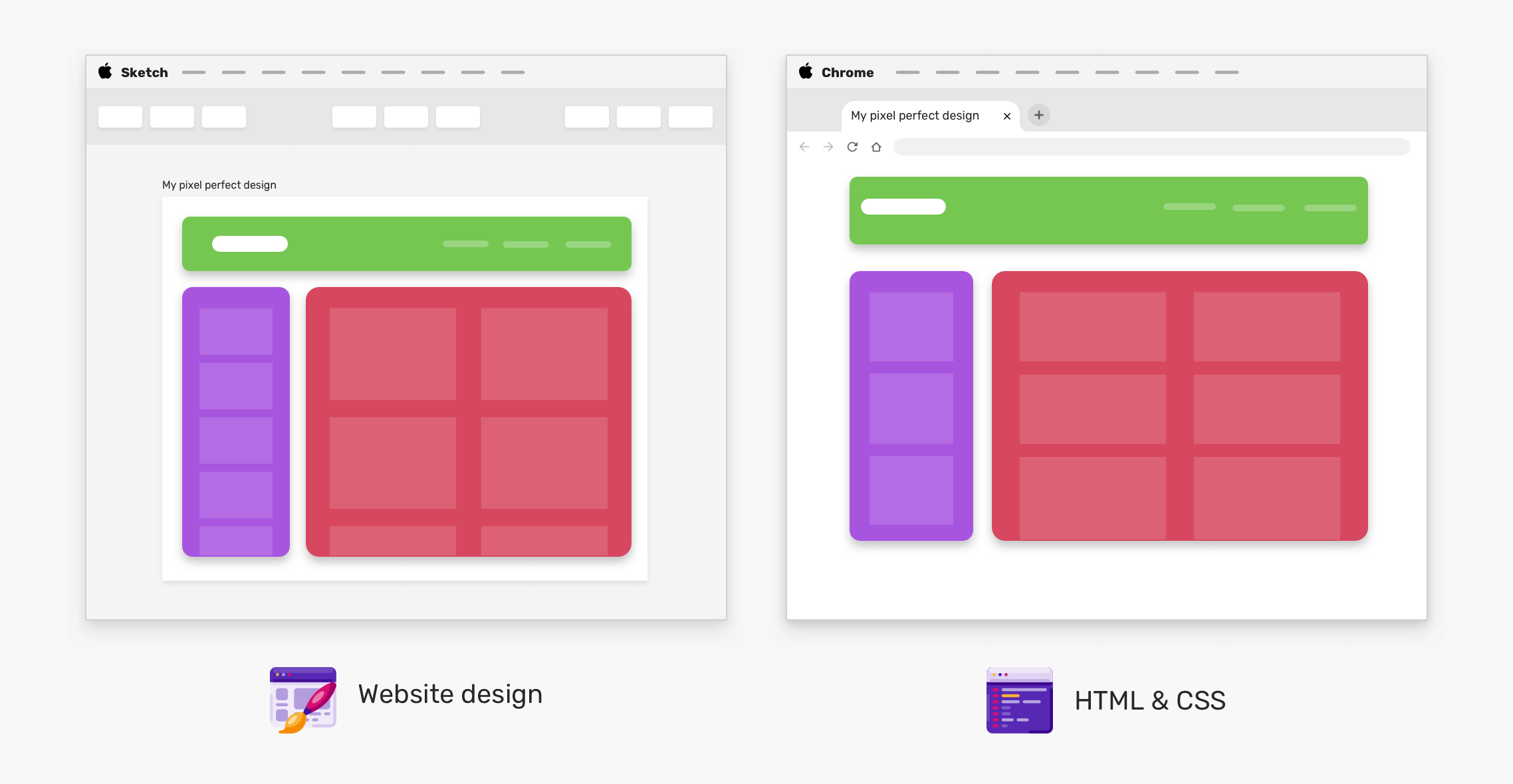
Pixel perfection is the process of implementing a web design mockup in HTML and CSS, taking into consideration that the coded result must be an exact match of the design mockup. Consider the following figure:
The original design was made on Sketch app, and the coded implementation is being viewed on Google Chrome browser. Do you notice any differences? Here are some of them:
- The header height
- The spacing below the header
- The number of cards per row
Such differences can affect the final result, and can easily be considered as imperfect implementation. In reality, is it imperfect? I will answer this question in an upcoming section.
The scene in 2010
If we go back 10 years in, the iPhone 4 was unveiled by Apple on June 7, 2010. According to statista, the number of smartphones sold in 2010 was 296.65 million devices. In 2020, the number is 1.56 billion! In 2010, it might be okay for a designer or a client to request that design should be a pixel perfection implementation. The number of laptops was way less than we have now, and the iPad was just released in April 2010.
The number of screen sizes a developer has to account for wasn’t that much. Single desktop design with 1024*768 size might be more than enough. However, this can’t be done today with the vast amount of devices available.
To summarize, pixel perfection was possible in 2010 because of the lack of multi-screen devices. However, with thousands of devices (smartwatches, phones, tablets, laptops, desktops, TVs), pixel perfection won’t work as you might expect.
Look & Feel
A few years ago, I learned the term look & feel, which means, in the context of web design, how a website looks in terms of a UI perspective, and how it feels in terms of functionality and interactivity.
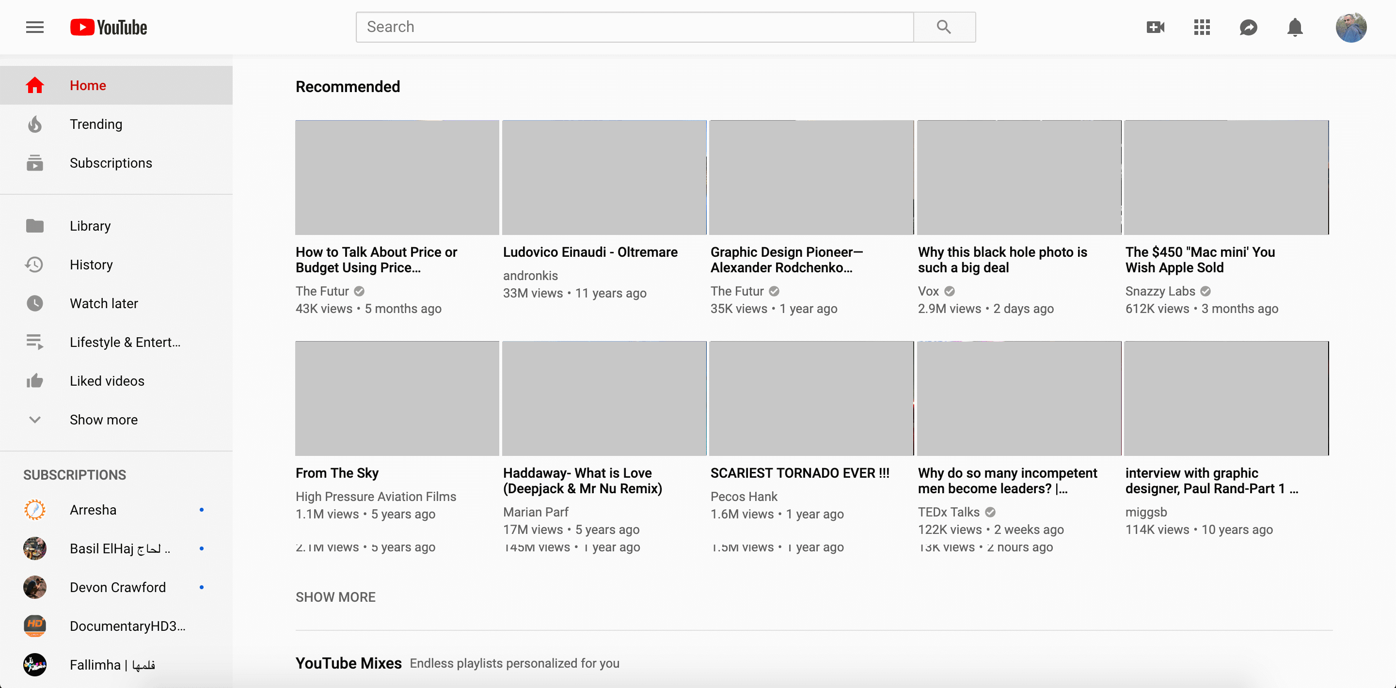
Before diving into examples, let me show you the following two figures. The first one is YouTube. In the second one, I tweaked the look & feel and tried to make it like Twitter.
Youtube
Youtube with Twitter Style
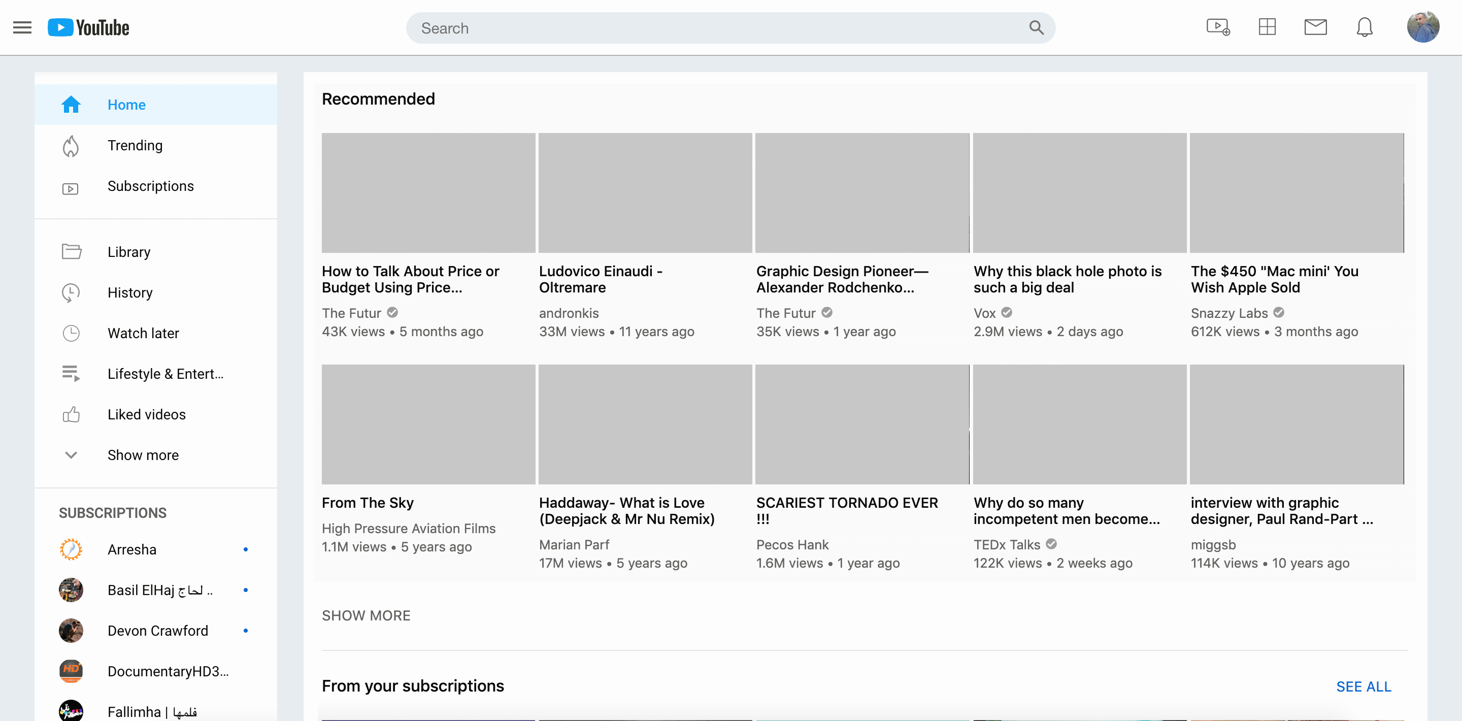
What I changed is the following:
- Header background and shadow
- Search input
- Iconography
- The primary color
Those small changes can fool you if you’re not focused enough. This is what I mean by look & feel. Let’s dive into more detailed examples.
Consider the following figure which shows various design components for a website.
What do you feel when you look at the components? For me, here are some things that I noticed:
- It has a bold and uncommon typography
- The colors are bright and fresh
- Almost every element as a shadow. E.g: form inputs, and buttons.
- Rounded corners are everywhere
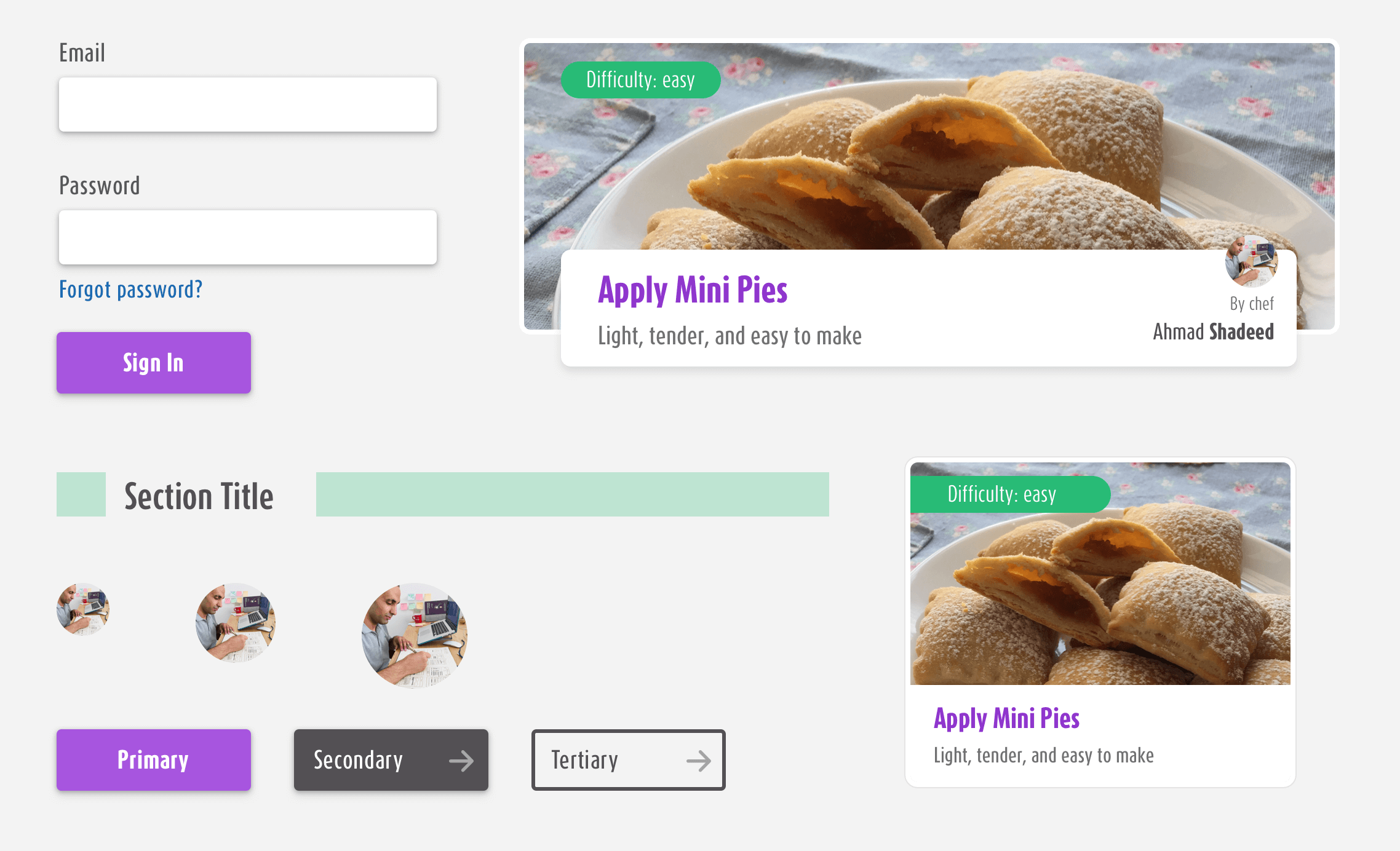
Let’s take the card component as an example, and show a good and a bad implementation of it.
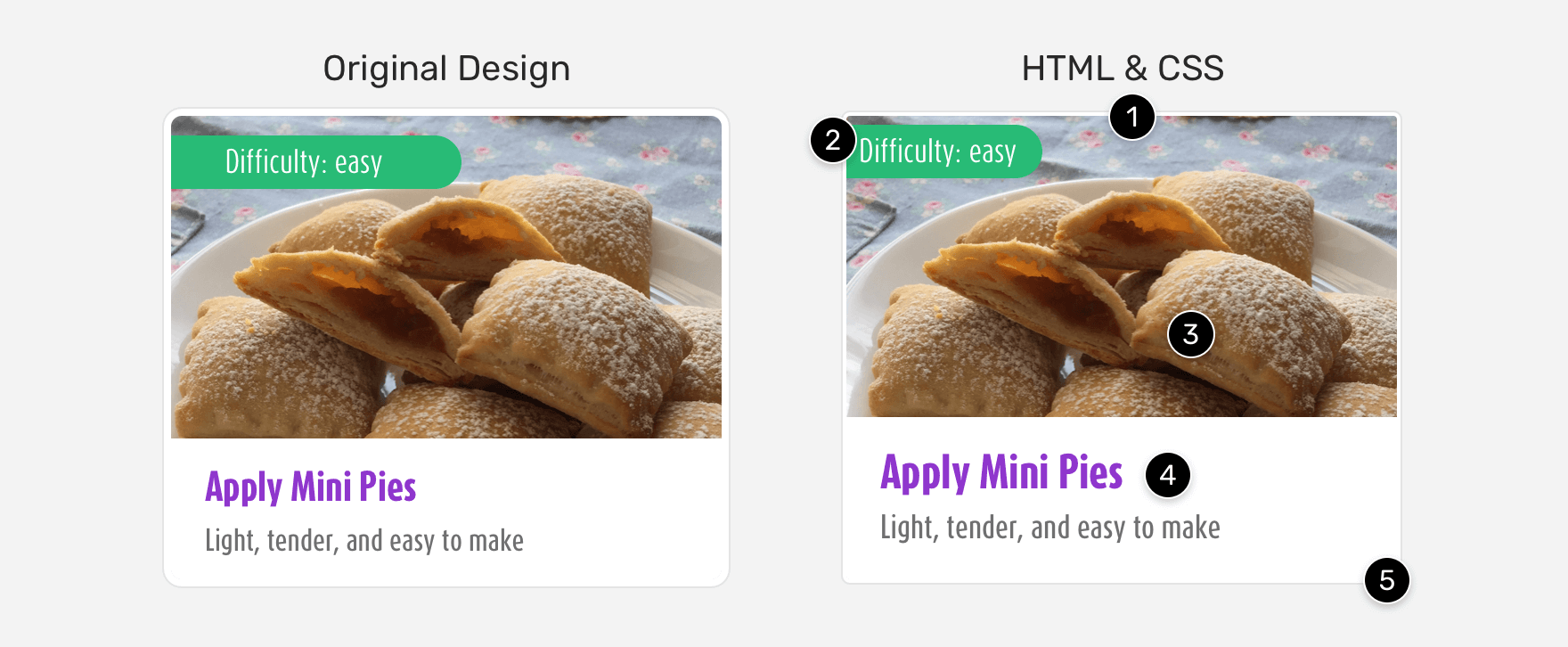
Did you notice the differences between the two cards? If you don’t see any difference between them, then you’re in for a treat. Let’s explore that!
- The border thickness is different
- The difficulty tag is closer to the top and left edges
- The image height is smaller
- Different font sizes (Larger)
- Inconsistent
border-radius
The above differences significantly affected the result, and they are only for one component, the card. Your developer friend might say that these differences are subtle and they don’t matter. For one component, that might be correct. However, can you imagine these subtle changes on a large scale? Eventually, you will end up implementing an imperfect result.
Consider the below interactive figure. Switch between the design and code results to see the differences.
{% include /pixel-perfection/comparison.html %}
As a UI designer, you can’t ignore those differences, and I agree with you. You worked hard on the spacing, sizes, and alignment. Adding to that, the above differences are easy to fix. However, the reason developers make UI mistakes and inconsistencies can differ depending on:
- The design
- Project timeline
- The developer’s design and CSS skills
- Good attention to detail
I don’t think the developer doesn’t know how to do such fixes that can make the final result closer to the original design. For me, I consider that every developer has a mindset. When the developer know both design and development, you will notice fewer design differences. On the contrary, if the developer has no design skills at all, then expect that the differences will be higher.
Deciding if a coded result is perfect or not
Let’s get to the real question. How to decide if a coded result is perfect without being too picky? The reason I explained about the look & feel concept previously is that we can follow it. Instead of aiming for a perfect coded result, we can aim for matching the look & feel of the design.
Let’s get back to the card component, but for this time, the differences are acceptable.
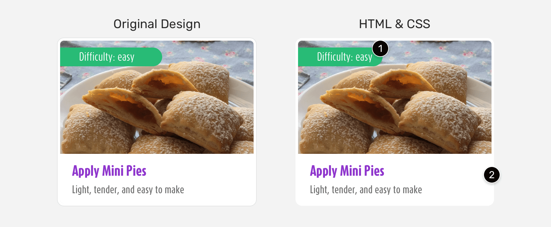
The differences are subtle (The card on the right):
- The difficulty tag is smaller, which is fine
- The grey border is gone
Such details don’t matter that much, and they are fine. What’s even important is agreeing on the look & feel of the design. Let’s explore that in detail.
As someone who does design and front-end development, there is a moment that draws a smile on my face while coding a design that I built. It’s the moment where I have two tabs opened:
- The first one is for the original design (as an image). This could be in InVision or Figma Preview.
- And the second tab is for the localhost of my machine
When I reach the moment where I can’t differentiate between the design and the localhost tabs, I can be sure that the look & feel is the same, and my coded result is ready. By ready, I don’t mean that the exact measures and widths are 100% identical, but the general look & feel that can fool you easily while moving between the two tabs.
Variations and context
At the end of the day, a component’s width can vary depending on the container element that it lives in. That means, a card component, for example, can have multiple variations and should have limitations as well.
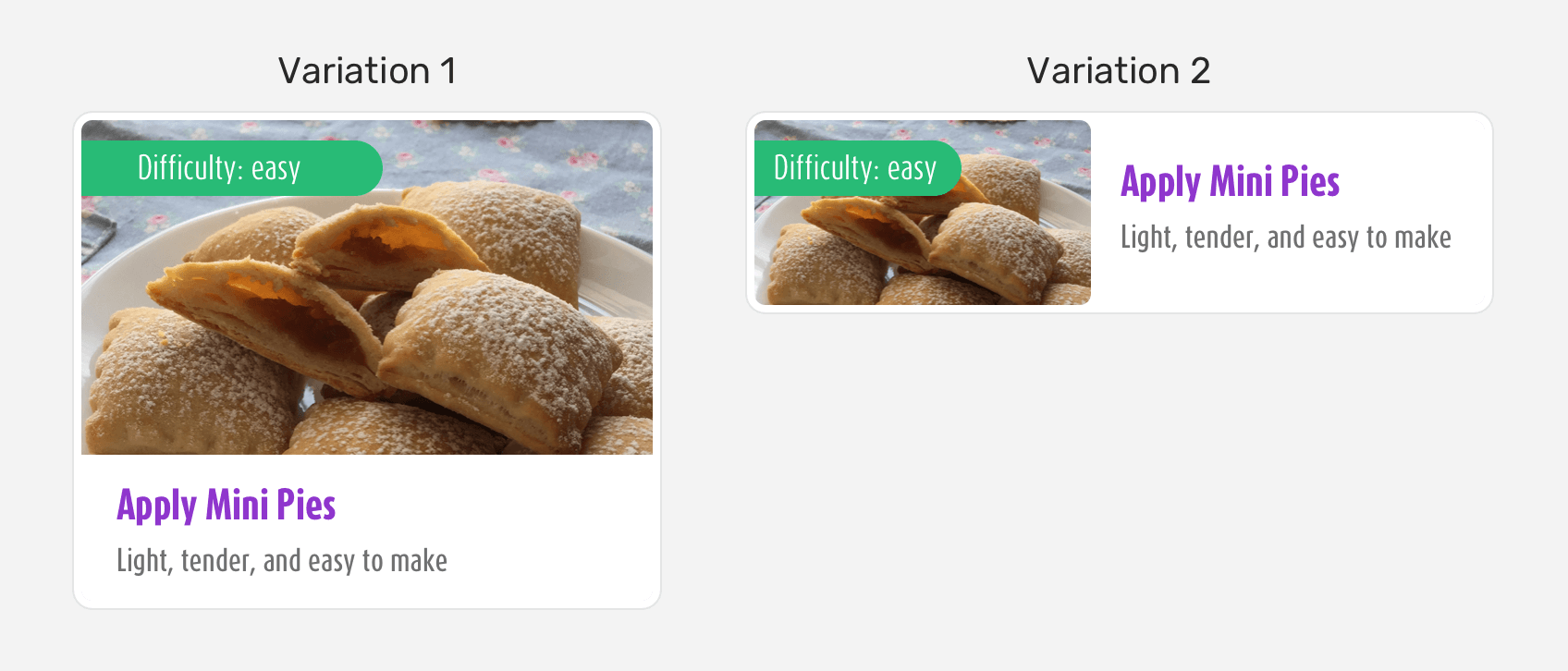
Notice how the second variation is still related to the first one. The look and feel is similar, but the only thing changed is that the display became horizontal instead of a vertical stack.
On the other hand, a component should have limitations that the design team has to communicate with the development. Consider the following:
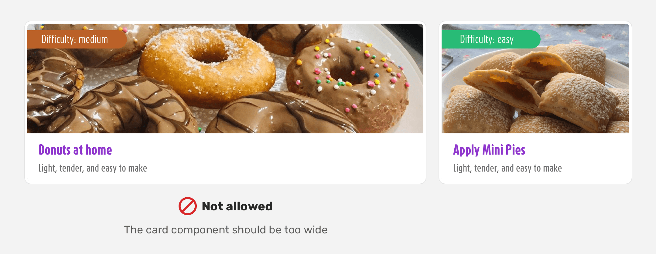
When the card component became too wide, the image inherited that, too. For a cooking website, the recipe image is very important and should be clear with most of its details. When the card is too wide, some details might be cropped or lost. It might not be the case for that component at all, but my point is that when a designer works on website design, there should be limitations. By doing so, we can set expectations for the implemented result without too many surprises, you know.
Today’s scene
CSS has developed a lot in the last 10 years, giving us web developers a lot of ways to implement a certain layout. Responsive design has become a default for web design today. When working on a responsive website, you can’t use the term pixel perfection. It’s not logical!
Thinking in terms of look & feel is more logical. You have a certain style for the website, and your goal as a front-end developer is to implement it across different screen sizes with the same style/look & feel. In the last year, I wrote a 3-part article about implementing a web design from scratch, and during the development work of the website header, I stumbled upon how implementing the header on various screen sizes.
Notice how many header variations a front-end developer has to work on for only one component. In that context, you can’t use the term pixel perfection, as it’s meaningless.
Modern CSS
In this section, I will highlight some of the modern CSS techniques that are available today, which allows us to build flexible and fluid websites. Feel free to ignore this section if you know them.
CSS Grid
With CSS grid being supported since March 2017, we have a very powerful tool that we can use easily to establish a grid.
.wrapper {
  display: grid;
  grid-template-columns: repeat(auto-fit, minmax(200px, 1fr));
}
With the two lines above, we just created a grid that is dynamic and can resize the items within it based on the available space.
Viewport units
Sizing an element font-size based on the viewport width in CSS, was a dream 10 years ago. Today, it’s possible thanks to CSS viewport units.
.page-title {
  font-size: calc(14px + 1vw);
}
CSS Comparison Functions min(), max(), clamp()
Since the CSS comparison functions are now supported in all major browsers, we can use them to set a minimum and maximum value for a component, and it can fluidly changing depending on a specific rule.
Consider for example, that we want to change the border-radius of an element across different screen sizes.
.element {
  border-radius: clamp(7px, 2vw, 20px);
}
The minimum border-radius is 7px, and the maximum is 20px. The middle value 2vw is called the recommended value. When the viewport width is resized, the border-radius will change accordingly.
The above CSS techniques are just a few of what we have today. If I want to sum up the differences from 10 years ago until today, here is a figure that represents that.
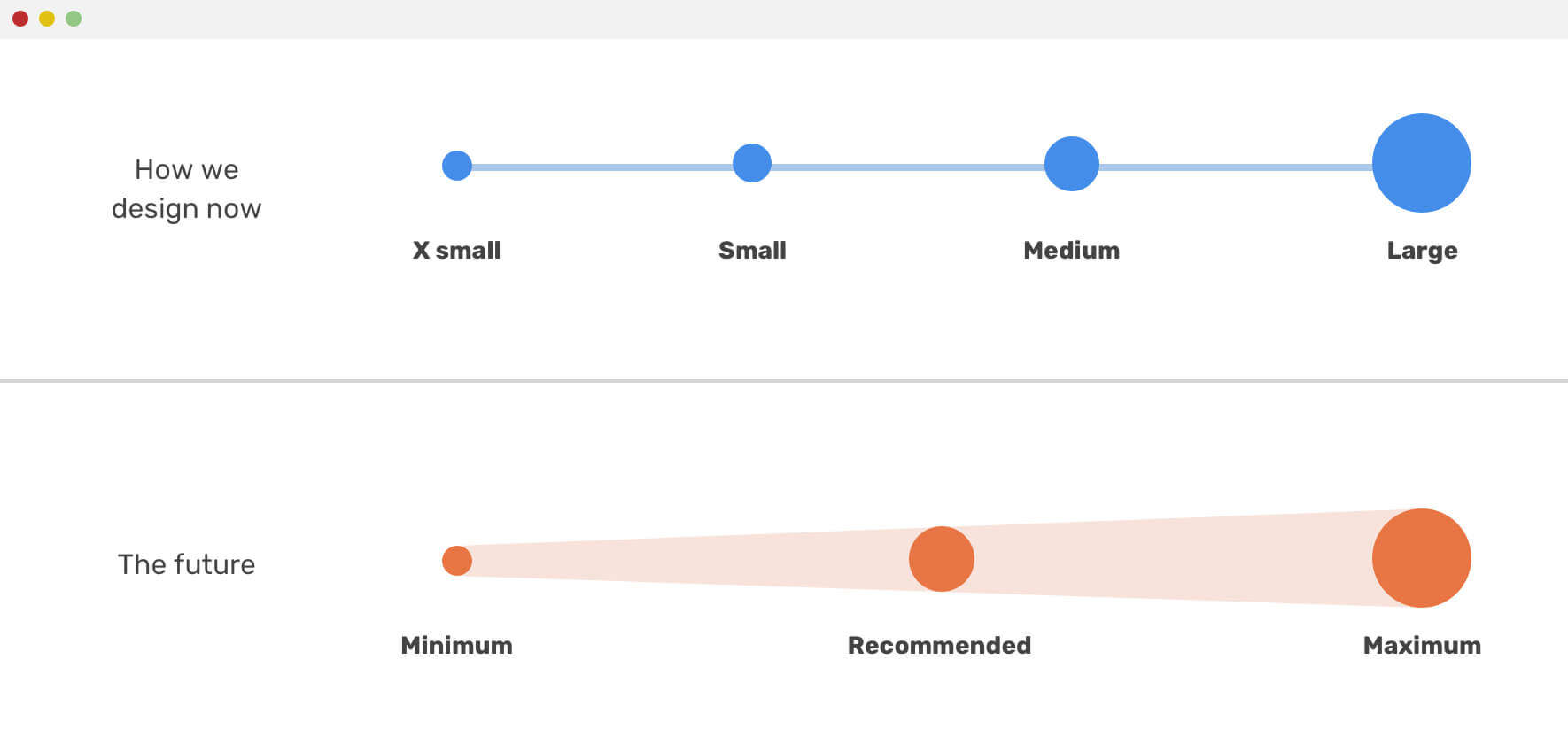
We tend to do design for a fixed size of screens that are expected to be implemented by developers as a pixel-perfect websites. That doesn’t relate to the modern techniques we have now.
The Effect Of CSS Frameworks
Let’s say that you delivered a complete web application design, and the development team wants to implement it in a Bootstrap CSS framework. Once you see the first pages implemented from the development team, you will see that some design elements inherited design details from Bootstrap.
Consider the following example, where we have a custom button designed, and the other one is the coded implementation.
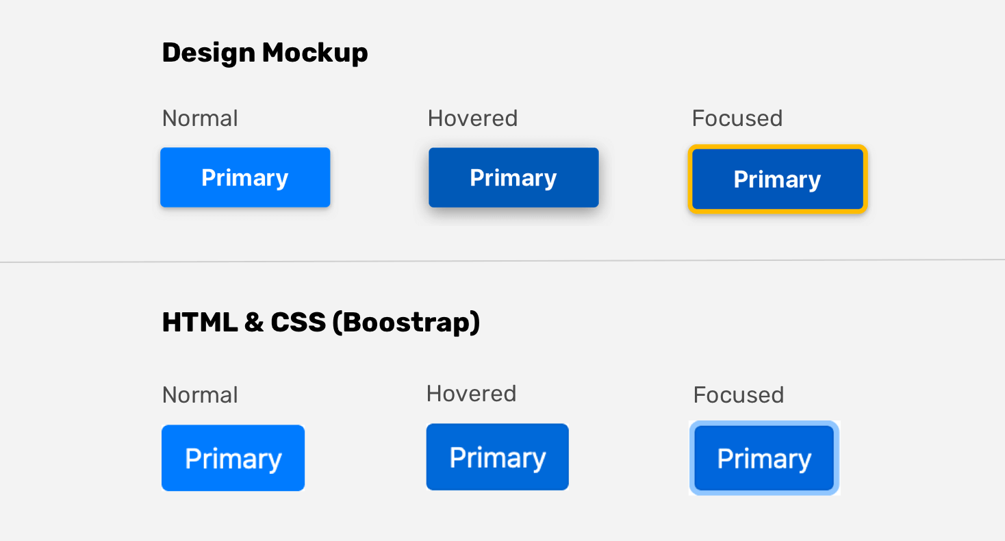
Some developers think that it’s fine to ignore the original button design details, and he just changes the button’s background and depends on Bootstrap’s hover and focus style. Even if the details are simple, but those can differentiate a website from another. It’s easy to customize the style but I don’t know the reason if ignoring such details. Laziness, maybe? Or the designer didn’t provide enough states for the components?
Just to be clear, using frameworks isn’t a bad thing at all. If they work for you, then it’s great. What’s more important is the ability to customize and use them per your needs, without leaving the little details.
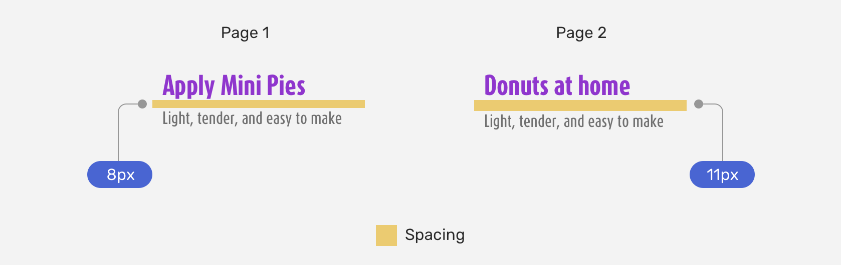
It’s not about pickiness, it’s about expectations
As a designer, when you set a 32px spacing between a component and another, it’s very clear and obvious. Some developers use 30px, and they call it a day. 32px is 32px, when developers use 30px, it’s laziness and theirs not really an excuse to not use the correct spacing.
Thanks to Håvard for reminding me about that point.
General tips for Designers
Decision making
As a developer, you will need to decide on how to build a certain component. Consider the following.
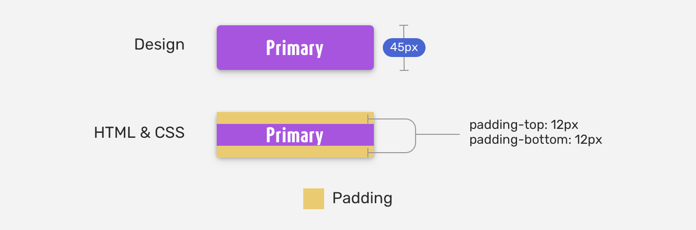
The designer provided you with a button that has a height of 45px. How would you build it? I witnessed a lot of developers doing it like the below:
.button {
  height: 45px;
}
Using as a fixed value in that case is not correct. Instead, we can use vertical padding, or min-height to create a button that its computed height is 45px. It’s more about thinking and mindset, rather than equal pixel values.
Again, thanks to Håvard for reminding me about that point.
Keep spacing and sizes consistent
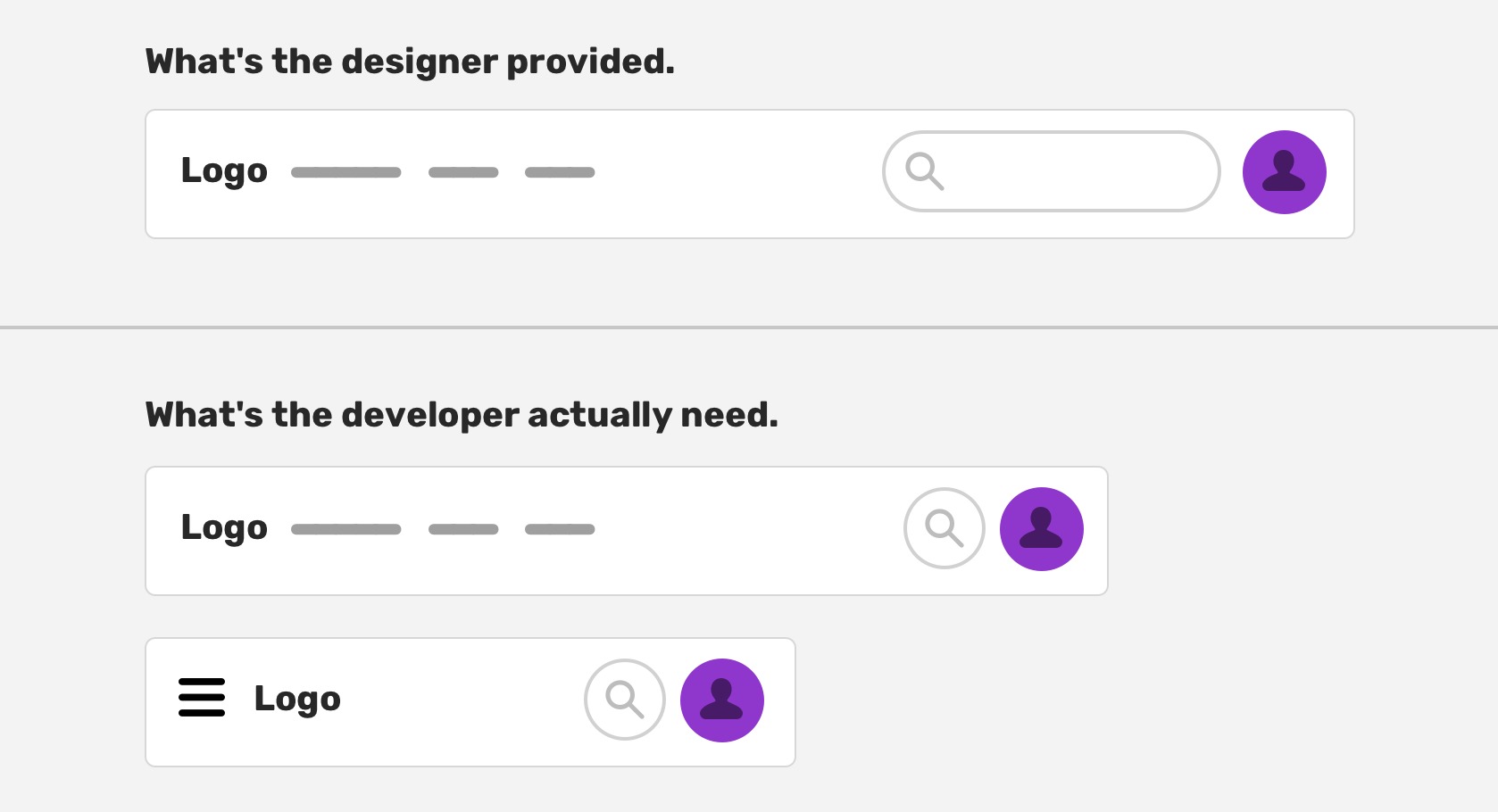
It’s not fair to be too picky about the coded result of the design you worked on, and at the same time, you don’t give much attention to spacing and sizes. Consistency is very important. Here is an example that can confuse the front-end developer.
Why the spacing is inconsistent? That issue happens a lot when I got design files from designers. It’s confusing, and time-wasting for a front-end developer.
Work on the states of a component
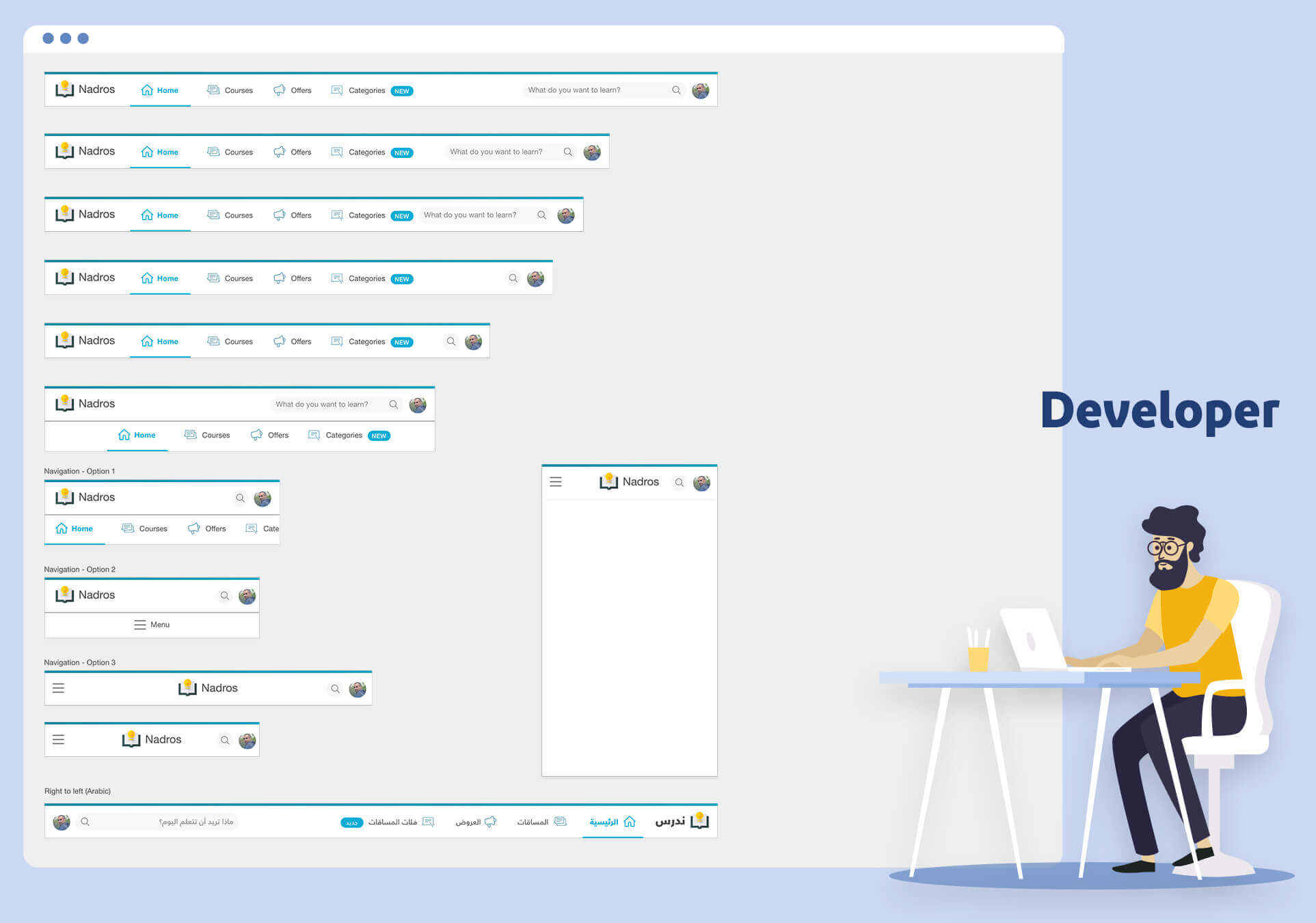
A component could have many states. The developer needs them all, while you might only work on one version. A good example of this is a website header. The designer provided the mobile and desktop version of it, and he thought that this is enough.
What about the in-between state? In other words, how the header should look between the mobile and desktop size? I wrote an article about the in-between design cases, I recommend checking it out.
Use real content as often as possible if you can
If you want to make a developer happy, then you should use real content, and also account what should happen in case the user used a very long text, for example.
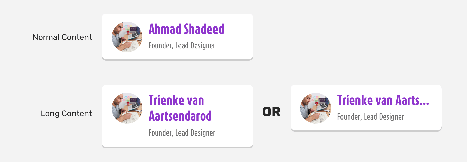
In the example above, the person’s name is long. How the design should handle that? Should it wrap into a new line or truncate the text? Providing such decisions ahead of time can help.
Communicate as early as possible
If you have doubts about something you’re working on, ask the client, the developer, or whoever responsible for it. Don’t keep questions to the end of the project. The more you communicate, the fewer problems you will have, and the more time you will save ahead.
General tips for Developers
Train your eye to attention for detail
Since it’s not possible to train yourself to catch little UI details overnight. Training yourself can help you get better much faster. Here are some ideas:
- Clone a UI of a popular website like Twitter, for example, and try to make it as close as possible. Make sure to get feedback on the accuracy of it.
- Practise makes perfect. The more you implement designs in HTML & CSS, the more your eye will learn about the details.
- Play Can’t Unsee game. It’s a fun game that will challenge your UI design detail knowledge.
Use a Ruler in the browser
Checking for alignment in the browser is still not provided by default. However, you can use some browser extensions that provide the ability to add guides. Grid ruler for Chrome and Firefox can do the job.
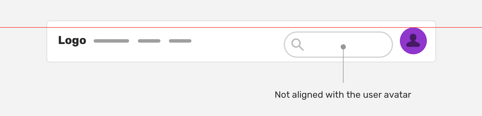
Notice how the search input is not aligned with the user avatar. The reason could be an unneeded margin or padding. Whatever the reason, not everyone can notice such issues.
The End
Phew! That was a lengthy article. For me, pixel perfection is dead and not relevant today. Instead, I focus on using consistent sizing and spacing, and keeping the look & feel as per the design mockup. I hope you found it useful! Please spread the word and feel free to hit me on Twitter (@shadeed9) for questions or feedback.
I’m writing an ebook
I’m excited to let you know that I’m writing an ebook about Debugging CSS.
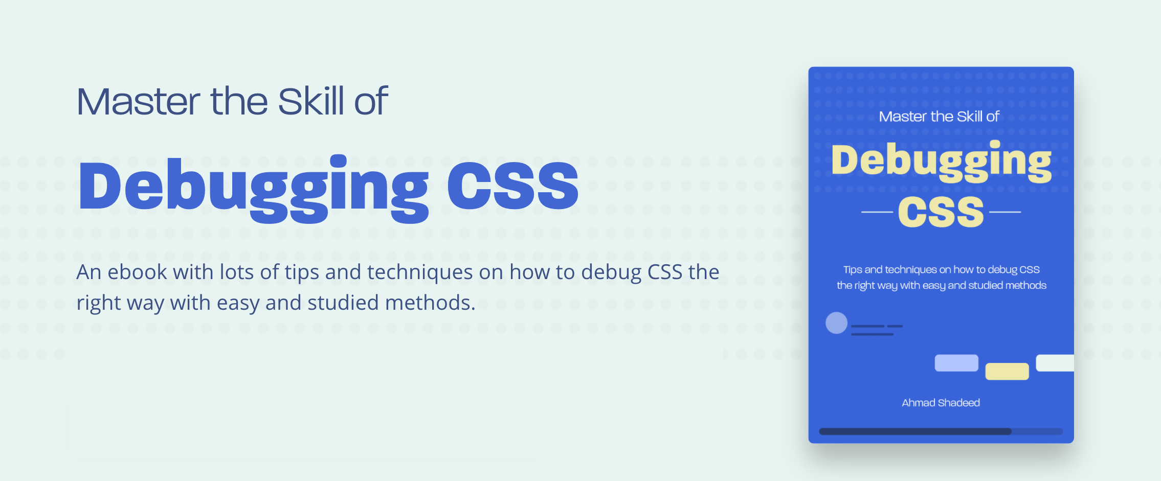
If you’re interested, head over to debuggingcss.com and subscribe for updates about the book.
Credits
- Icons by Adib Sulthon, flaticon
