Oftentimes, we want to limit the width of an element relative to its parent, and at the same time, to make it dynamic. So having a base width or height with the ability to make it extend based on the available space. Let’s say, for example, that we have a button that should have a minimum width, where it shouldn’t go below it. This is where the maximum and minimum properties become handy.
In this article, we will go through the maximum and minimum CSS properties for width and height, and to explain each one in a detailed way with possible use cases and tips.
Table of Contents
- Width Properties
- Height Properties
- Use Cases for Min and Max Properties
- Tags List
- Buttons
- Setting Min Width/Height to Zero With Flexbox
- Mixing Min Width and Max Width
- Page Wrapper
- Max Width and The
chUnit - Animating An Element With An Unknown Height
- Min Height For Hero Elements
- Modal Component
- Min Height and Sticky Footers
- Fluid Ratio with Max Width/Height and Viewport Units
- HTML/Body with 100% height
- Notes
min-width and max-width Properties
The first thing to discuss is width-related properties. We have min-width and max-width, and each one of them is important and has its use cases.
Min Width
When setting the value of min-width, its benefit lies in preventing the used value for width property from becoming less than the specified value for min-width. Note that the default value for min-width is auto, which resolves to 0.
Let’s take a basic example to demonstrate that.

We have a button with a varying text within in. The text might range from one word to multiple. To guarantee that it will have a minimum width even if it has one word only, min-width should be used. The minimum width is 100px so that even if the button has a very short content, like “Done” word, or an icon only, it will still be big enough to be noticed. This is very important when working with multilingual websites like Arabic. Consider the below example from Twitter:

In the before case, the button has the word “تم”, which means Done. The button width is too small, so I increased the min-width of it as you notice in the after case.
Min Width and Padding
While min-width can extend the button width in case its content is longer, padding on the horizontal sides should be added to achieve a proper looking button.

Max Width
When setting the value of max-width, its benefit lies in preventing the used value for width property from becoming more than the specified value for max-width. The default value for max-width is none.
A common and simple use case for max-width is using it with images. Consider the below example:
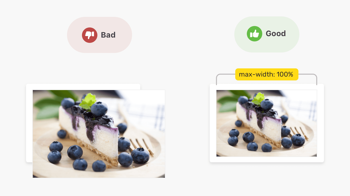
The image is larger than its parent element. By using max-width: 100%, the width of the image won’t exceed the width of its parent. In case the image is smaller than its parent, max-width: 100% won’t have an actual effect on the image, because it’s smaller than its parent.
Using Min Width and Max Width
When both min-width and max-width used for an element, which one of them will override the other? In other words, which one has a higher priority?
If min-width value is larger than max-width, then the min-width value will be taken as the width for the element. Consider the following example.
<div class="wrapper">
  <div class="sub"></div>
</div>
.sub {
  width: 100px;
  min-width: 50%;
  max-width: 100%;
}
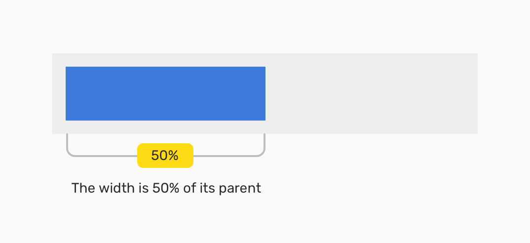
The initial width value is 100px, and adding on that, there is min-width and max-width values. The result is that the element width hasn’t exceeded 50% of its containing block/parent element.
See the Pen Min Width - Example 2 by Ahmad Shadeed (@shadeed) on CodePen.
min-height and max-height Properties
In addition to the minimum and maximum width properties, we have the same properties as the height.
Min Height
When setting the value of min-height, its benefit lies in preventing the used value for height property from becoming less than the specified value for min-height. Note that the default value for min-height is auto, which resolves to 0.
Let’s take an example to demonstrate a simple use case.
We have a section with a description text. The goal is to have a minimum height for the section, so it can handle short or long content. Consider the below basic case:
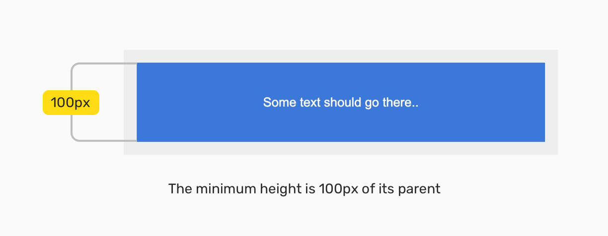
.sub {
  display: flex;
  align-items: center;
  justify-content: center;
  padding: 1rem;
  min-height: 100px;
  color: #fff;
  background: #3c78db;
}
The minimum height is 100px, and with flexbox, the content is centered horizontally and vertically. What would happen if the content were longer? For example, a paragraph?
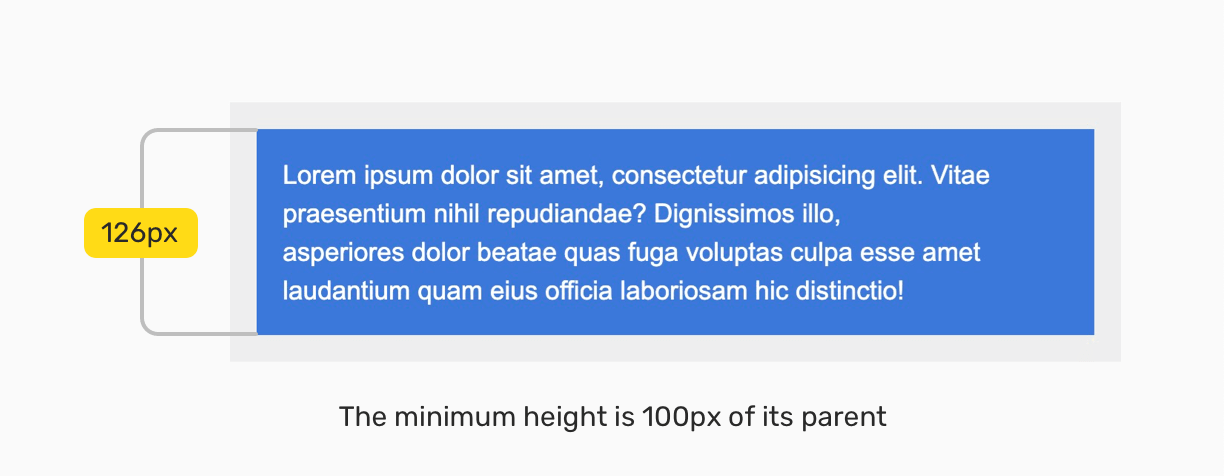
Yes, you guessed it! The height of the section will expand to contain the new content. By having that, we can build components that are fluid and responsive to its content.
See the Pen Min Height - Example 1 by Ahmad Shadeed (@shadeed) on CodePen.
Max Height
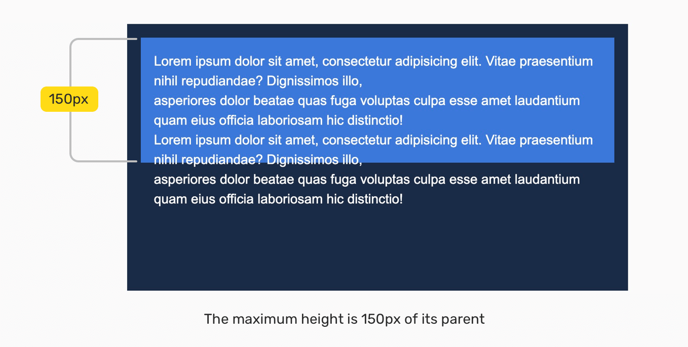
When setting the value of max-height, its benefit lies in preventing the used value for height property from becoming more than the specified value for max-height. Note that the default value for max-height is none.
Consider the below example where I set max-height for the content. But, because it’s bigger than the specified space, there is an overflow. The text is out of its parent boundaries due to that.
Use Cases for Min and Max Properties
We will go through some common and uncommon use cases for min-width, min-height, max-width, and max-height.
Tags List
When having a list of tags, it’s recommended to constraint a minimum width for a tag so that if its content is short, the look of it won’t be affected.

By having that flexibility, the tag will look good no matter how short the content is. But, what will happen in case the content author entered a very long tag name, and the content management system he uses doesn’t have a maximum character’s length for a tag? We can use max-width as well.
.c-tag {
  display: inline-block;
  min-width: 100px;
  max-width: 250px;
  overflow: hidden;
  white-space: nowrap;
  text-overflow: ellipsis;
  /*Other styles*/
}
By using max-width, the tag width will be constrained to a specific value. However, that’s not enough. The tag name should be truncated.
See the Pen Min Width - Use case 1 by Ahmad Shadeed (@shadeed) on CodePen.
Buttons
There are different use cases for the minimum and maximum values with buttons since there are multiple variations of a button component. Consider the following figure:
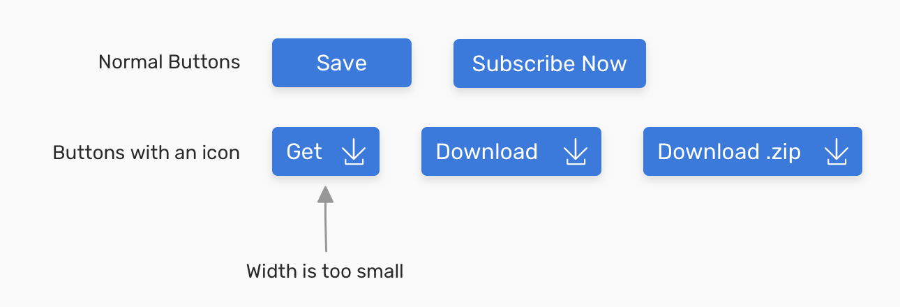
Notice that the button’s “Get” width is too small. Without setting a minimum width, this can get worse in case there was no text for any reason. Setting a minimum width is important in that case.
Setting Min Width to Zero With Flexbox
The default value for min-width is auto, which is computed to zero. When an element is a flex item, the value of min-width doesn’t compute to zero. The minimum size of a flex item is equal to the size of its contents.
According to the CSSWG:
By default, flex items won’t shrink below their minimum content size (the length of the longest word or fixed-size element). To change this, set the min-width or min-height property.
Consider the following example.
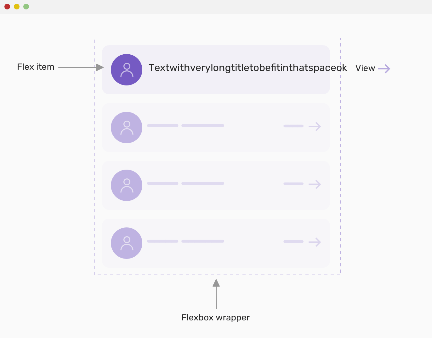
The person’s name has a very long word which caused an overflow and horizontal scrolling. Though, I added the below CSS to the title to truncate it:
.c-person__name {
  white-space: nowrap;
  overflow: hidden;
  text-overflow: ellipsis;
}
Since the title is a flex item, the solution is to reset min-width and force it to become zero.
.c-person__name {
  /*Other styles*/
  min-width: 0;
}
Here is how it should look when fixed:
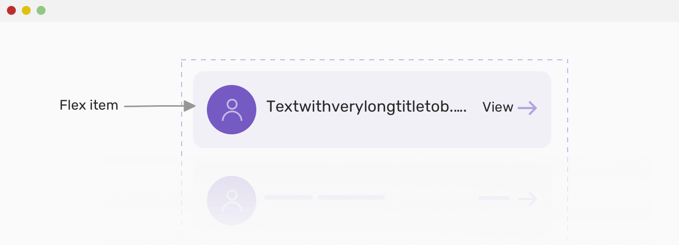
According to the CSSWG:
On a flex item whose overflow is visible in the main axis, when specified on the flex item’s main-axis min-size property, specifies an automatic minimum size.
That means, setting overflow to other than visible value can result in the min-width to be computed to zero, which solves our problem without setting min-width: 0.
See the Pen Min Width and Flexbox Issue by Ahmad Shadeed (@shadeed) on CodePen.
Setting Min Height to Zero With Flexbox
While this is a less common issue compared to min-width, but it can happen. Just to confirm, the issue is related to a flex item that cannot be shorter than its content. As a result, the min-height value is set to as long the content is.
Consider the following example:
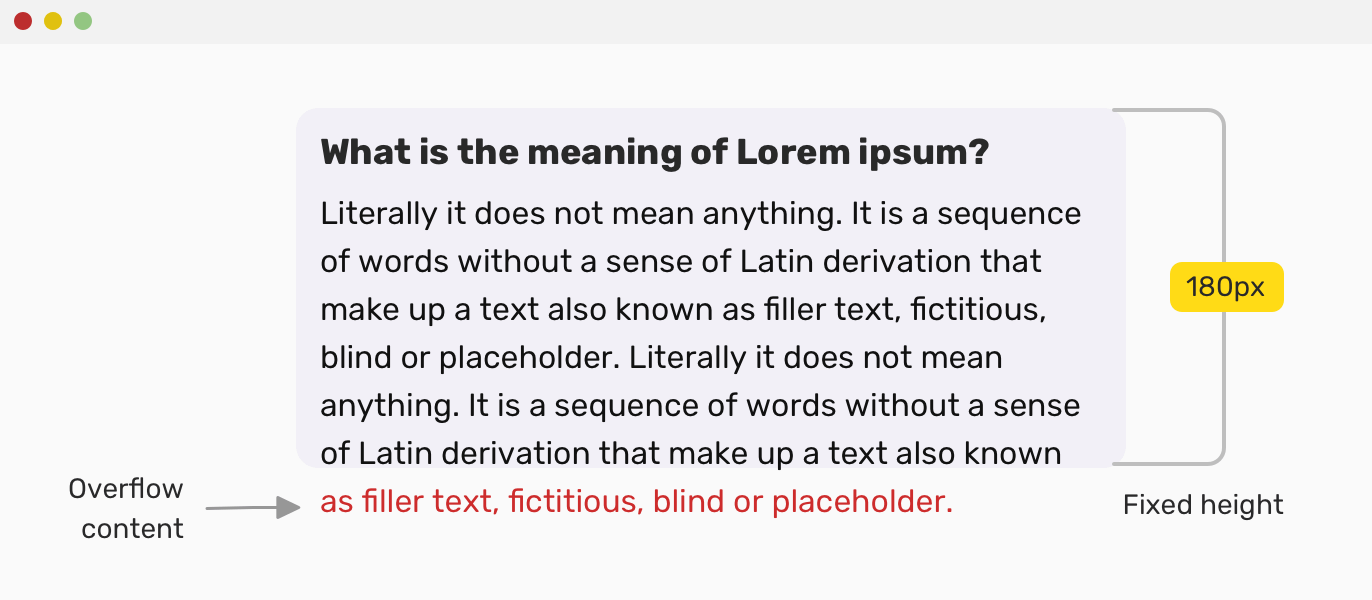
The text colored in red should be clipped in its parent. Because the panel body is a flex item, it’s min-height is as equal as its content. To prevent that, we should reset the minimum height value. Let’s see how the HTML and CSS:
<div class="c-panel">
  <h2 class="c-panel__title"><!-- Title --></h2>
  <div class="c-panel__body">
    <div class="c-panel__content"><!-- Content --></div>
  </div>
</div>
.c-panel {
  display: flex;
  flex-direction: column;
  height: 180px;
}

.c-panel__body {
  min-height: 0;
}

.c-panel__content {
  overflow-y: scroll;
  height: 100%;
}
By adding min-height: 0 to the panel body, this will reset the property and it should work as expected now.
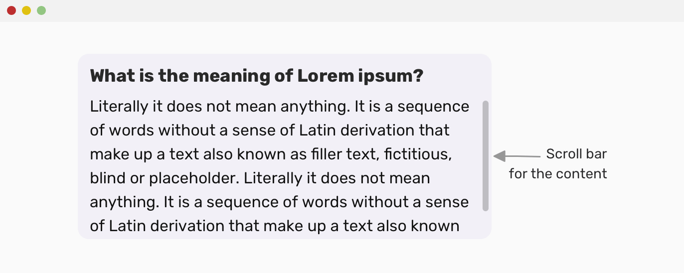
Mixing Min Width and Max Width
In some cases, we have an element with minimum width, but at the same time, it doesn’t have a maximum width. This might result in the component being too wide without the author intended to do so. Consider the following example:
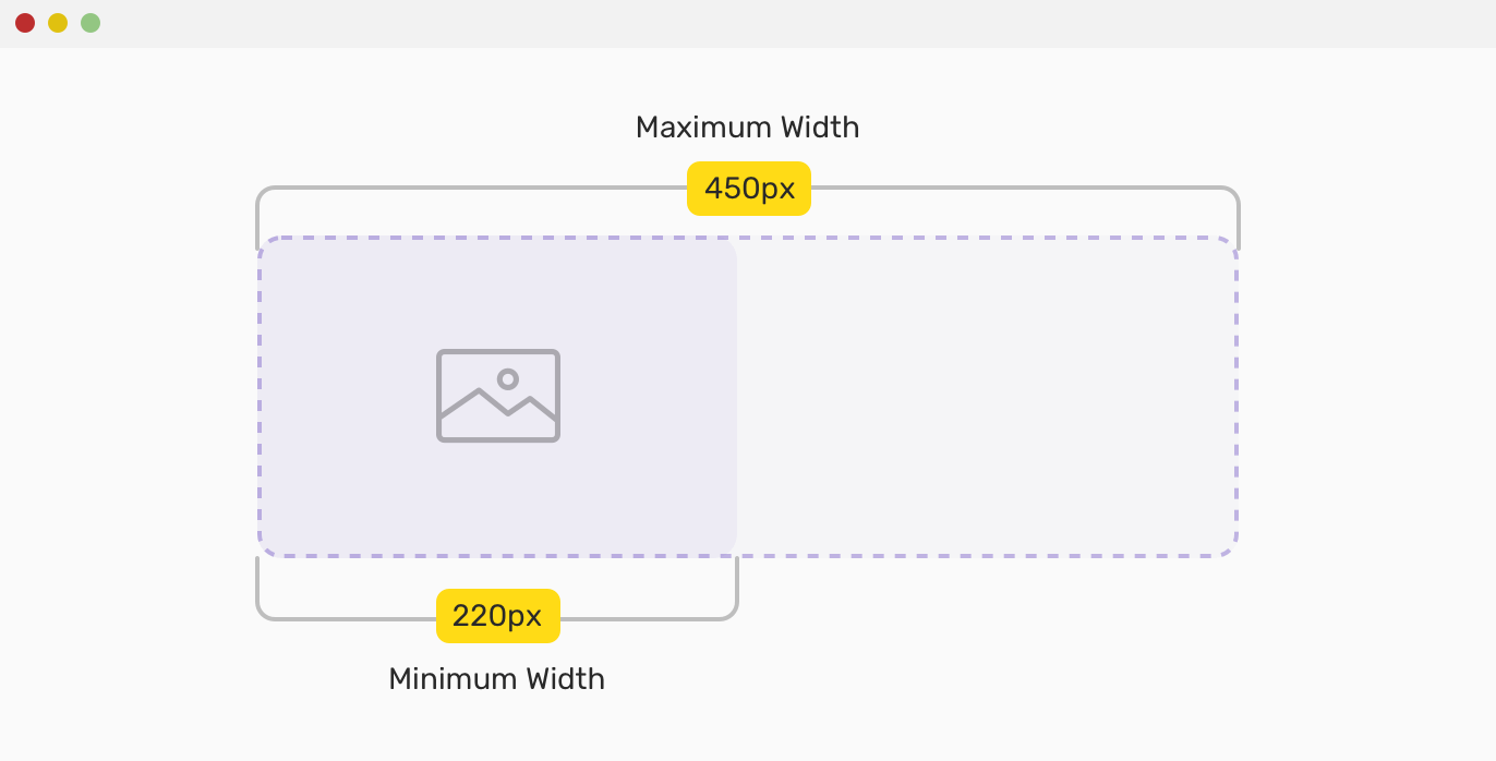
Since the width is defined in pixel, the above is not guaranteed to work for a mobile viewport. To solve that, we can use percentages instead of pixels for the minimum and maximum properties. Consider the below example that has an article body.
I added the following CSS for the image:
img {
  min-width: 35%;
  max-width: 70%;
}
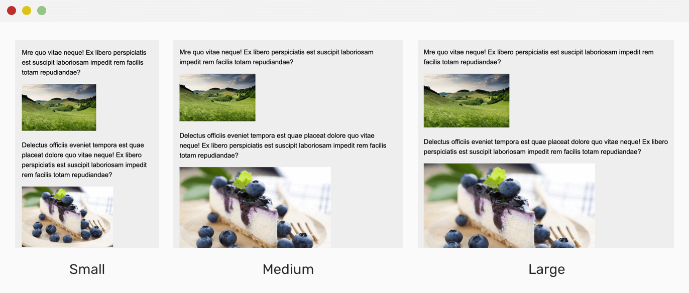
See the Pen Mixing Min Width and Max Width by Ahmad Shadeed (@shadeed) on CodePen.
Page Wrapper/Container
One of the top useful use cases for max-width is for page wrapper or containers. By adding a maximum width to the page, we can be sure that the content will be readable and easy to scan for the user.
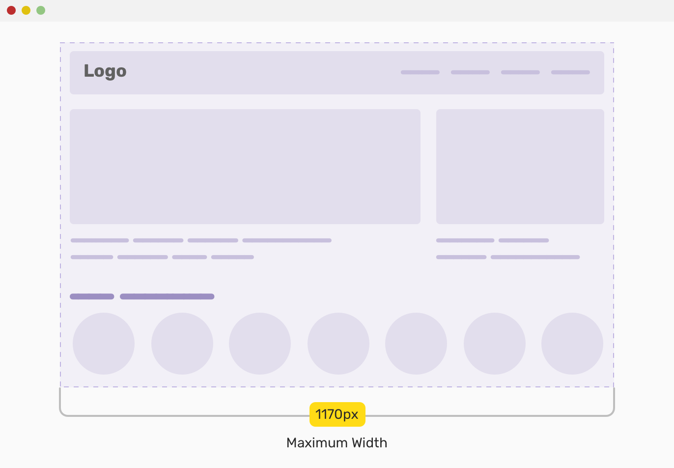
Below is an example of a wrapper that is centered, and has horizontal padding on the left and right sides.
.wrapper {
  max-width: 1170px;
  padding-left: 16px;
  padding-right: 16px;
  margin-left: auto;
  margin-right: auto;
}
Max Width and The ch Unit
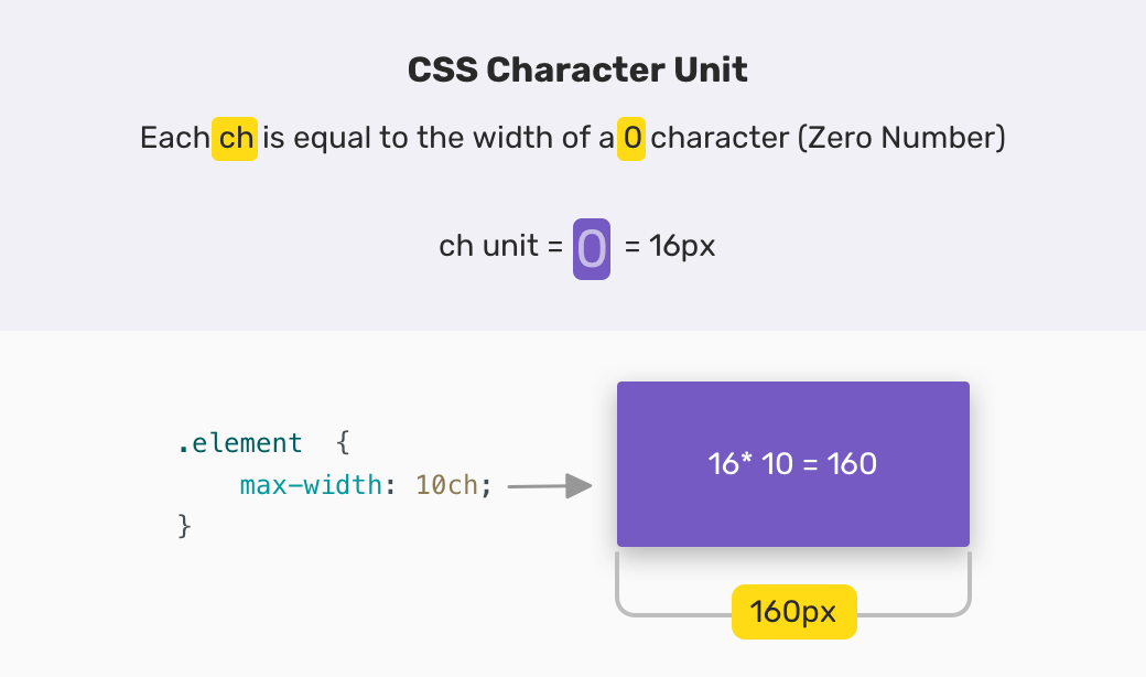
The ch unit is equal to the 0 (zero) character width in the element’s font. By combining this unit with max-width. As per this article on Smashing Magazine, the recommended line length is 45 to 75 characters per line.
In the previous example for the wrapper element, we can get the benefit of the ch unit, since it’s an article body.
.wrapper {
  max-width: 70ch;
  /* Other styles */
}
Animating An Element With An Unknown Height
In some cases, we face the challenge of animating accordion or a mobile menu with unexpected content height. In such a case, max-height can be a good solution.
Consider the following example:
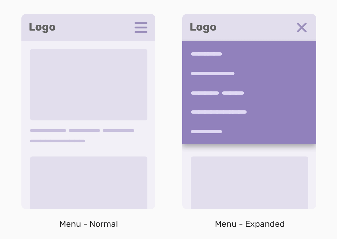
When the menu button is clicked, the menu should slide from top to bottom with an animation. Without having a fixed height for it (which is not recommended), this is not possible unless JavaScript is used. However, with max-height, this is possible. The idea is to add big value for the height, for example, max-height: 20rem, which probably won’t be reached, then we can animate from max-height: 0, to max-height: 20rem.
.c-nav {
  max-height: 0;
  overflow: hidden;
  transition: 0.3s linear;
}

.c-nav.is-active {
  max-height: 22rem;
}
Click the menu button to see the animation in action.
See the Pen Max Height Animation by Ahmad Shadeed (@shadeed) on CodePen.
Min Height For Hero Elements
In general, I don’t like to add a fixed height to elements. I feel that by doing that, I’m going against making the web fluid and build components that are fluid as water. Adding a minimum height to a hero section is useful in cases where a very long content is added (It happens).
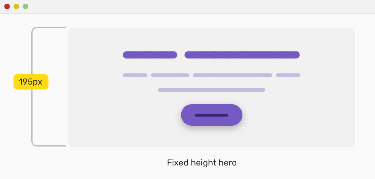
Consider the following example, where we have a hero section with a fixed height set. Everything looks good.
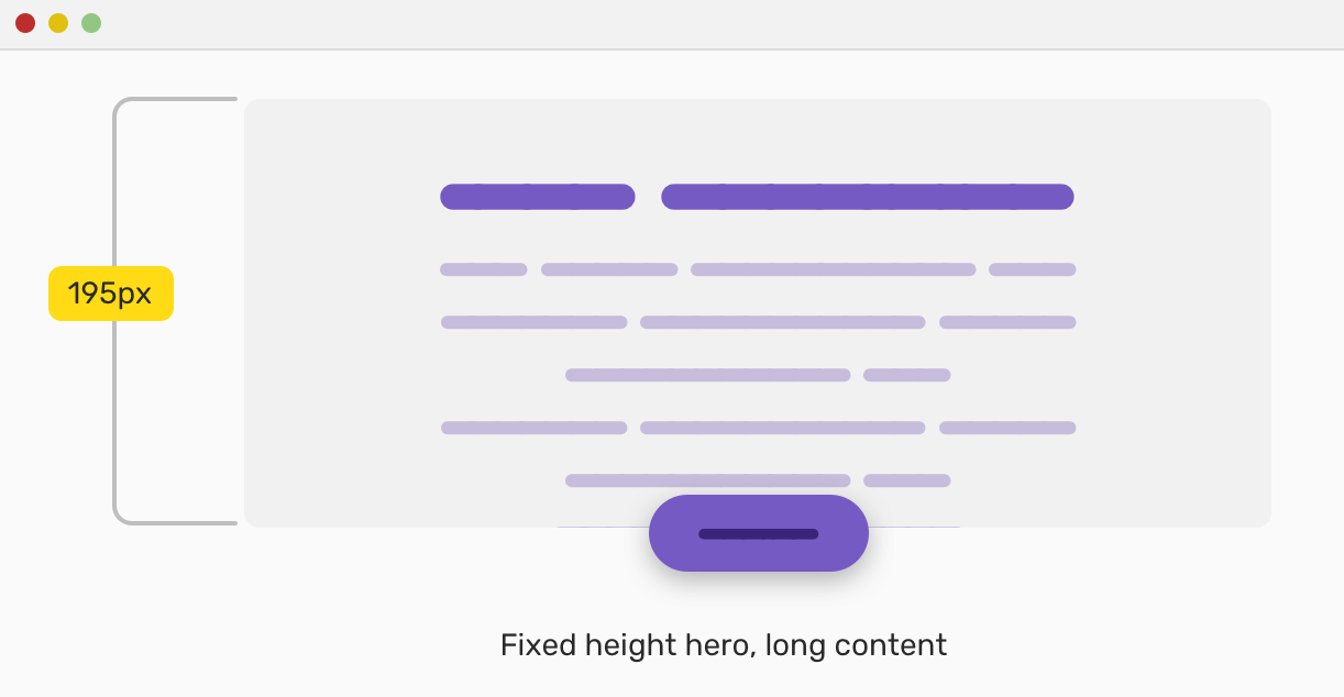
When the content is longer, though, it overflows and goes out of the hero wrapper. This is not good.
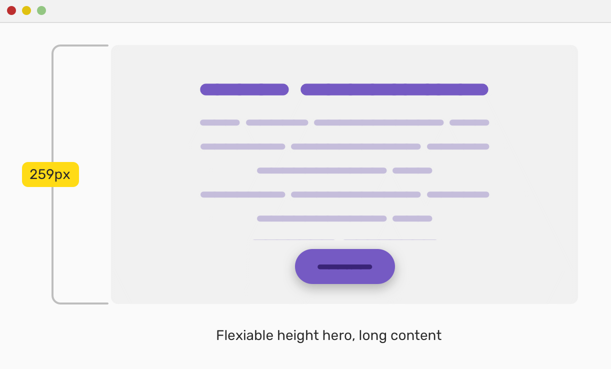
To fix that issue upfront, we can add min-height instead of height, and we at least do that to salve our conscience. Even though this might cause a page to look weird, but I think such a thing should be prevented from happening in the content management system (CMS) in the first place. With that, the issue is fixed and it looks good.
The issue of overflowing content is not only about the content being bigger than the fixed hero height. It could happen on screen resize as a result of text wrapping.

If min-height were used instead, the above won’t happen at all.
Modal Component
For a modal component, it needs a minimum and maximum width so it can work on screens from mobile to desktop. In this regard, I recall an interesting article on CSS Tricks that discussed what to use for that purpose.
Concept 1
.c-modal__body {
  width: 600px;
  max-width: 100%;
}
Concept 2
.c-modal__body {
  width: 100%;
  max-width: 600px;
}
For me, I prefer the second concept as I only need to define max-width: 600px. The modal is a <div> element so it already has 100% width of its parent, correct?
Consider the below-reduced test case for a modal design. Notice how the width changes to 100% of its parent, in case the available viewport space is not enough.
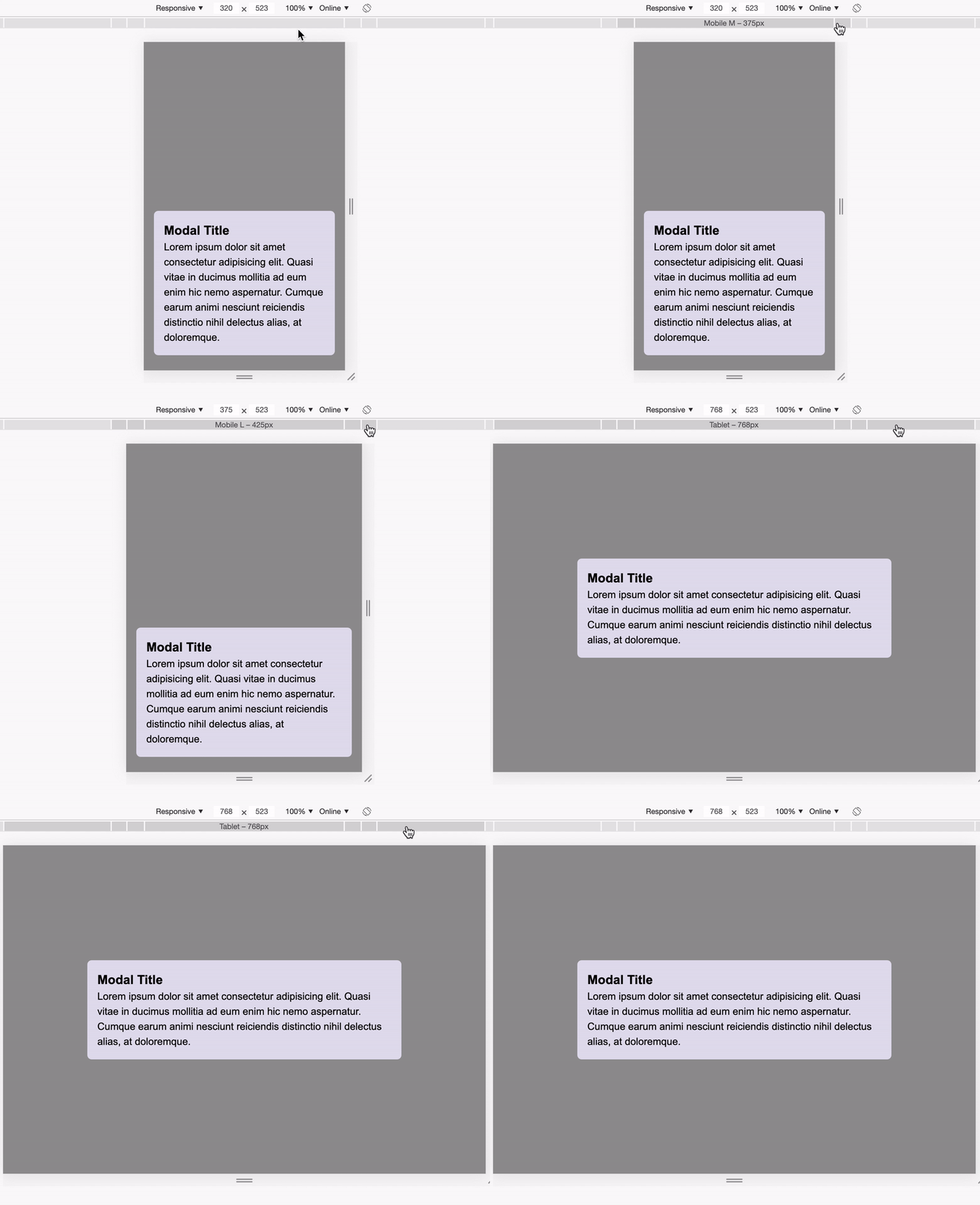
See the Pen Max Width Modal by Ahmad Shadeed (@shadeed) on CodePen.
Min Height and Sticky Footers
When the content of a website is not long enough, it’s expected to see the footer not sticked to the bottom. Let’s take a visual example to show that better.
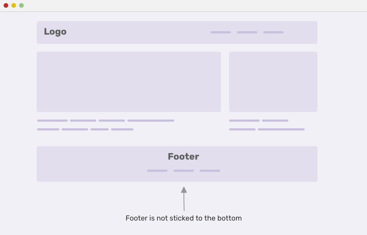
Notice that the footer is not sticked at the end of the browser window. That’s because the content is not enough to be as long as the browser window height. When fixed, it should look like the below:
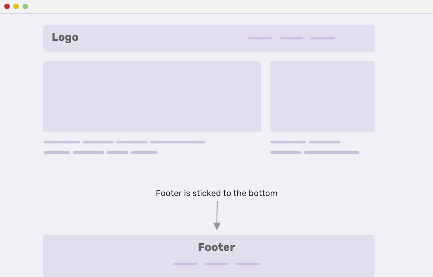
First, I made the body element as a flexbox container, then I set the minimum height of it to be 100% of the viewport height.
body {
  display: flex;
  flex-direction: column;
  min-height: 100vh;
}

footer {
  margin-top: auto;
}
I recommend checking this article about sticky footers.
Fluid Ratio with Max Width/Height and Viewport Units
To make a proportional container that scales responsively based on the viewport size, the padding hack were introduced. Now, we can mimic the same behaviour by combining viewport units and max width/height in CSS.
Based on an article by Miriam Suzanne, I want to explain how it works.
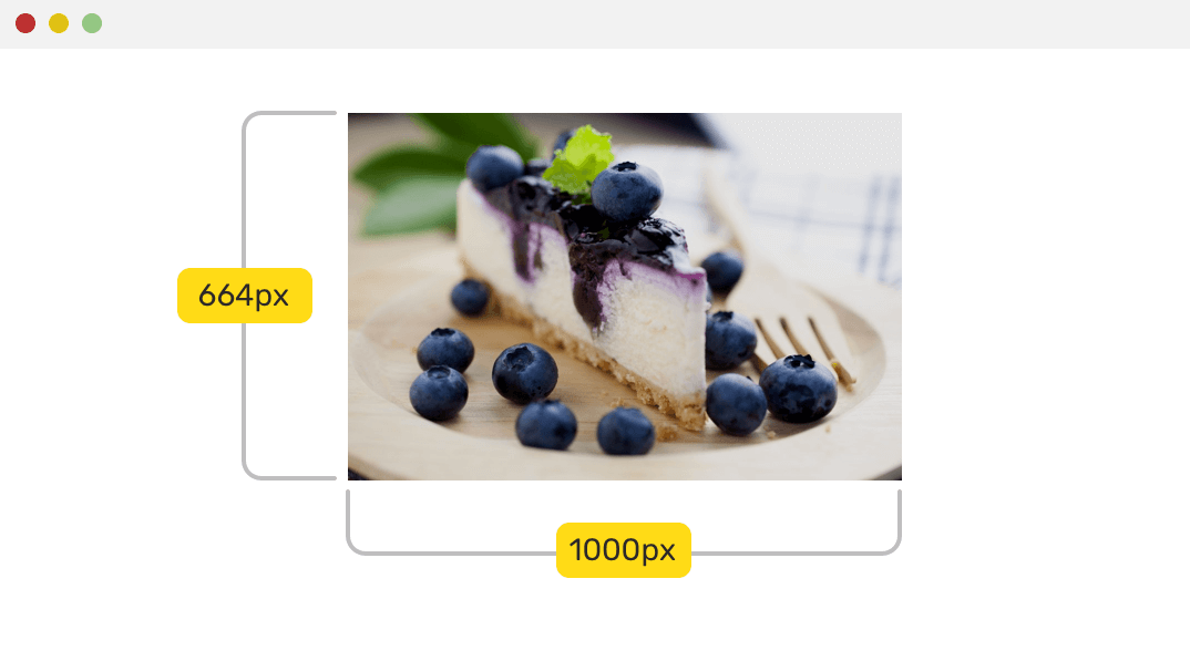
We have an image with the dimensions 644*1000 pixels. To make it fluid, we need the following:
- Aspect ratio: height/width
- The width of its container: it can be a fixed number, or dynamic (100%)
- Set the
heightwhich is 100% of the viewport width multiplied by the aspect ratio - Set the
max-heightwhich is the container width multiplied by the aspect ratio - Set the
max-widthto be equal to the container width
img {
  --ratio: 664 / 1000;
  --container-width: 30em;
  display: block;
  height: calc(100vw * var(--ratio));
  max-height: calc(var(--container-width) * var(--ratio));
  width: 100%;
  max-width: var(--container-width);
}

See the Pen Fluid Ratio with Max Height/Width by Ahmad Shadeed (@shadeed) on CodePen.
HTML/Body with 100% height
When we want the <body> element to take 100% height of the viewport. How we can do it? This is a common question/use case in the web community as in this question on StackOverflow.
First, we need to add height: 100% to the <html> element. This will guarantee that the root element has 100% height. Then, we add min-height to the <body> element, and the reason min-height is used, because this can allow the body height to be dynamic, no matter how long its content is.
html {
  height: 100%;
}

body {
  min-height: 100%;
}
Notes
Min Width and Block Elements
In some cases, we forgot that the element we’re trying to apply min-width to is a block element. As a result, this might be confusing and it won’t affect the element. Make sure that the element is not a block-level one.
CSS Comparison Functions
While researching about pain points and issues people face in StackOverflow, I stumbled upon this question, where the author asked the following:
Is it possible to do something like this
max-width: calc(max(500px, 100% - 80px))ormax-width: max(500px, calc(100% - 80px)))
The behaviour wanted is that to keep the element’s width 500px and it should not exceed that. If the viewport width is not enough to contain the element, then its width will be 100% - 80px.
As for the above solutions from the question, I tried the second one and it works in the latest Chrome (v79) and Safari (v13.0.3), as the time of writing this article. Since this is out of the scope of this article, and I might write about it soon, I will explore a solution suggested in the question.
.yourselector {
  max-width: calc(100% - 80px);
}

/* UppubDate: I changed the max-width from 500px to 580px. Thanks @fvsch */
@media screen and (max-width: 580px) {
  .yourselector {
    max-width: 500px;
  }
}
Resources and Further Reading
- Flex items and min-width:0 by Dominic McPhee
- CSS: Flex and “min-width” by Dominik Schöler
- Flexbugs by Philip Walton
The End
And that’s a wrap. Do you have a comment or a suggestion? Please feel free to ping me on @shadeed9.

