The Layout Maestro
Sometimes, while building a component, you suddenly notice a weird horizontal scroll bar. You keep trying and fixing the wrong thing, only to realize later that the cause is something else. How many times have you been there?
In this article, I will explain a tricky issue that might ruin hours of trial and error. It’s related to CSS grid layout, and I thought that it’s worth a write-up.
Before I kick the article off, I want to add some context first. Here are a few things to take into consideration:
- You faced the issue in the middle of a working day. You’re exhausted, and you have lots of work to get done.
- You’re hungry.
- It’s easy to miss the root cause of the issue since it’s not related to the component you’re working on.
Given the above, let’s dive into the problem.
What I need to achieve
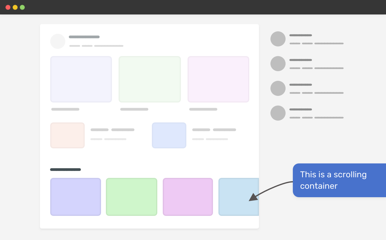
To give you a bit of context, here is the layout that I’m trying to achieve. Notice that there is a scrolling container at the end of the main section.

Defining The Problem
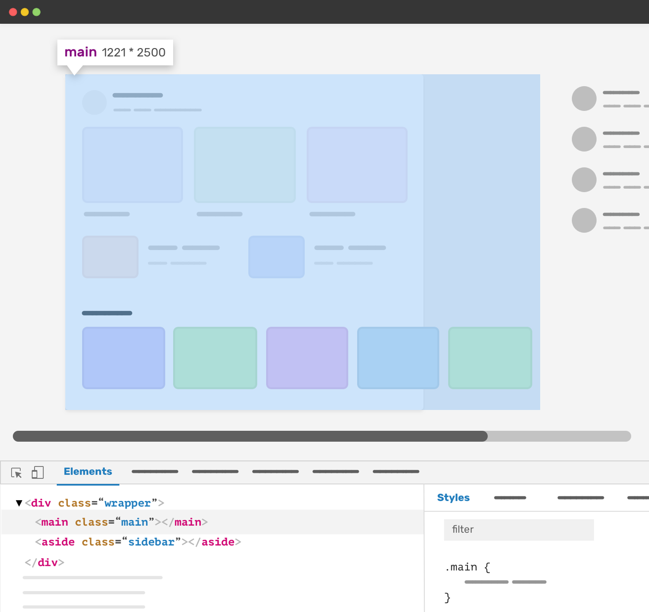
While working on a section with a scrolling container, I noticed horizontal scrolling on the whole page, which wasn’t expected.

The section has display: flex without wrapping, so the content can stay on the same line. Adding on that, I used overflow-x: auto to allow scrolling on the x-axis.
.section {
  display: flex;
  overflow-x: auto;
}
However, this didn’t take an effect. It was confusing as I’m sure that this is the way to make a scrolling container.
I opened the browser DevTools to inspect the main section, and I noticed that its width is so big. The main section width expanded due to the scrolling container.

This is weird, isn’t it? When I first saw this issue, I asked myself the following questions:
- Did I forget to add
overflow-x: hidden? - Is it something wrong with flexbox?
After double-checking, everything is set and it should work as expected. At that moment, I suspected that using CSS grid for the parent element might be the cause. I checked it, and it’s confirmed. CSS grid is breaking the layout.
In such a case, the issue can be either a CSS feature (i.e: it’s expected due to a specific context) or it’s the browser has something wrong with the feature implementation.
Why It’s Happening
You might be thinking about why CSS grid is causing this? Well, here is CSS grid that lays out the main and aside sections.
<div class="wrapper">
  <main>
    <section class="section"></section>
  </main>
  <aside></aside>
</div>
@media (min-width: 1020px) {
  .wrapper {
    display: grid;
    grid-template-columns: 1fr 248px;
    grid-gap: 40px;
  }
}
The main column has a 1fr value. That means it will take the available space minus the sidebar and the gap. That’s 100% right. However, the minimum content size of a grid item is auto. That means a grid item can expand its width due to long content (In our case, the scrolling container).
How to fix the problem
The fix is to let the browser know that we need to set a minimum fixed size instead of auto. We can do this using the minmax() function.
.wrapper {
  display: grid;
  grid-template-columns: minmax(0, 1fr) 248px;
  grid-gap: 40px;
}
The issue is fixed. But it’s not only that, we can solve it on the grid item level, too. Here are two solutions that we can apply to the .main element:
- Set
min-width: 0, - Or, set
overflow: hidden.
Depending on the context, you can use one of the two solutions above. However, they might have some side-effects, especially the overflow: hidden one.
Imagine that a child of the main section has a decorative pseudo-element that is placed outside the main boundaries. In such a case, applying overflow: hidden will clip that pseudo-element.

In the figure above, we have two elements that are positioned outside the main element (The share button on the left, and the decorative shape at the bottom right).
That being said, you have to choose the solution that works best for your use-case.
Related articles
I wrote an ebook
I’m excited to let you know that I wrote an ebook about Debugging CSS.

If you’re interested, head over to debuggingcss.com for a free preview.

