
As a front-end developer, I use CSS display property in my day to day work. I can use block, grid or flex as a value for the property.
While working on a project, I needed to have a flex container and at the same time it should be inline. In other words, I needed the content inside the container to be affected by flex, but the container itself needs to act as an inline element.
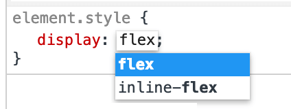
Luckily, I remembered about display: inline-flex. I’ve never used it before, but I always saw it in the browser DevTools.
Let’s see the design that I wanted to achieve:
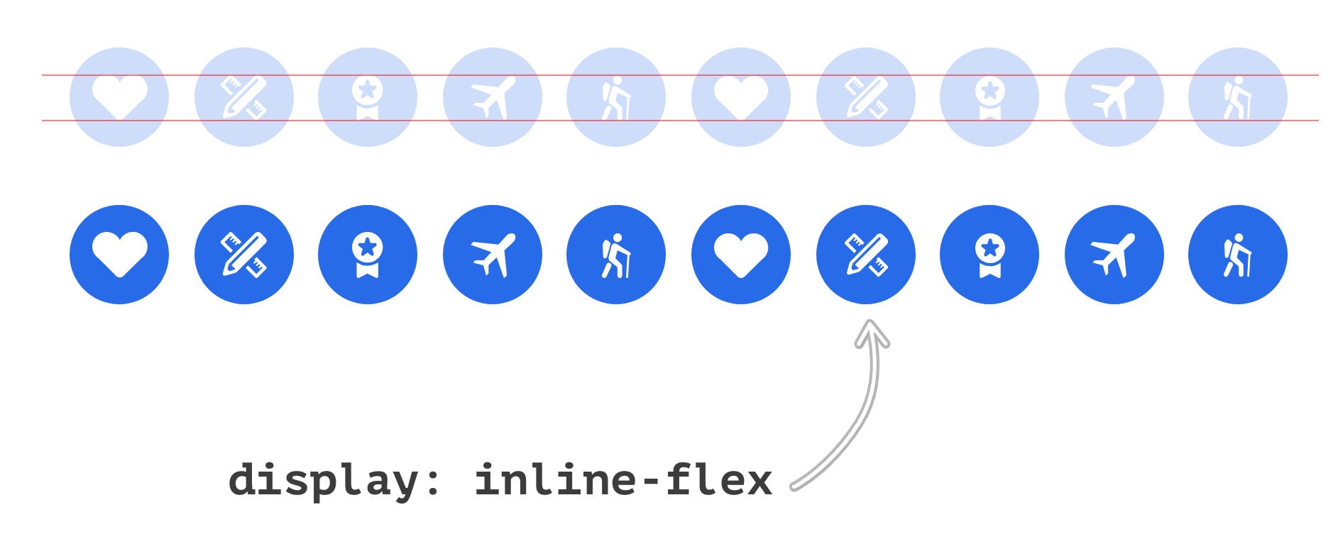
Each badge has its own icon that is centered horizontally and vertically. The centering of them is happening because of Flexbox, and all badges are inline since they have display: inline-flex.
HTML:
<div class="badges-list">
  <div class="c-badge">
    <svg class="c-icon" width="24" height="24">..</svg>
  </div>
  <div class="c-badge">
    <svg class="c-icon" width="24" height="24">..</svg>
  </div>
  <!-- More badges -->
</div>
Just to confirm, the wrapper .badges-list has nothing to do with displaying the badges inline. It’s happening because of using inline-flex on the child element .c-badge.
CSS:
.c-badge {
  display: inline-flex;
  justify-content: center;
  align-items: center;
}
Check out the demo:
See the Pen display: inline-flex by Ahmad Shadeed (@shadeed) on CodePen.
That’s all. I hope you find this useful. Have you ever used inline-flex? If so, please tweet me with the use case you’ve done.
Thank you for reading.
