Since CSS Grid became supported in the major browsers back in March 2017 (Almost three years ago), I started using it in my personal and client projects, of course, with a proper fallback for non-supporting browsers. I also made a tool called grid-to-flex which generates a flexbox fallback for a grid.
However, I have never used grid-template-areas in my projects even though I wrote about it briefly. To learn about well, I decided to write about it and explain to you what I’ve learned. Let’s dive in!
The Regular Way of Adding a Grid
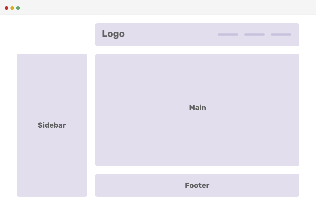
Consider the following design mockup:
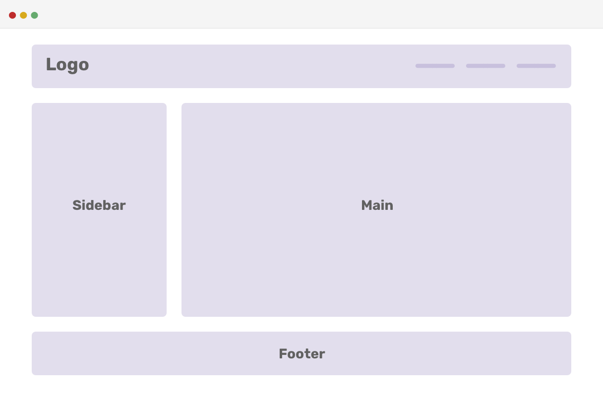
Usually, I set a grid-column for each element of the header, sidebar, main, and footer like this:
.wrapper {
  display: grid;
  grid-template-columns: 200px 1fr;
  grid-gap: 1rem;
}

header {
  grid-column: 1 / 3;
}

footer {
  grid-column: 1 / 3;
}
This works perfectly if the structure of the website or the layout you are working on will never change. However, this is not quite possible on the web. The web is fluid and thus the layouts we build should be like so.
For instance, we changed our mind and decided to make the sidebar span to the end of the page, and the footer should has the same width as the main element. To do that, we need to change the value of grid-column for the main, aside, and footer elements.
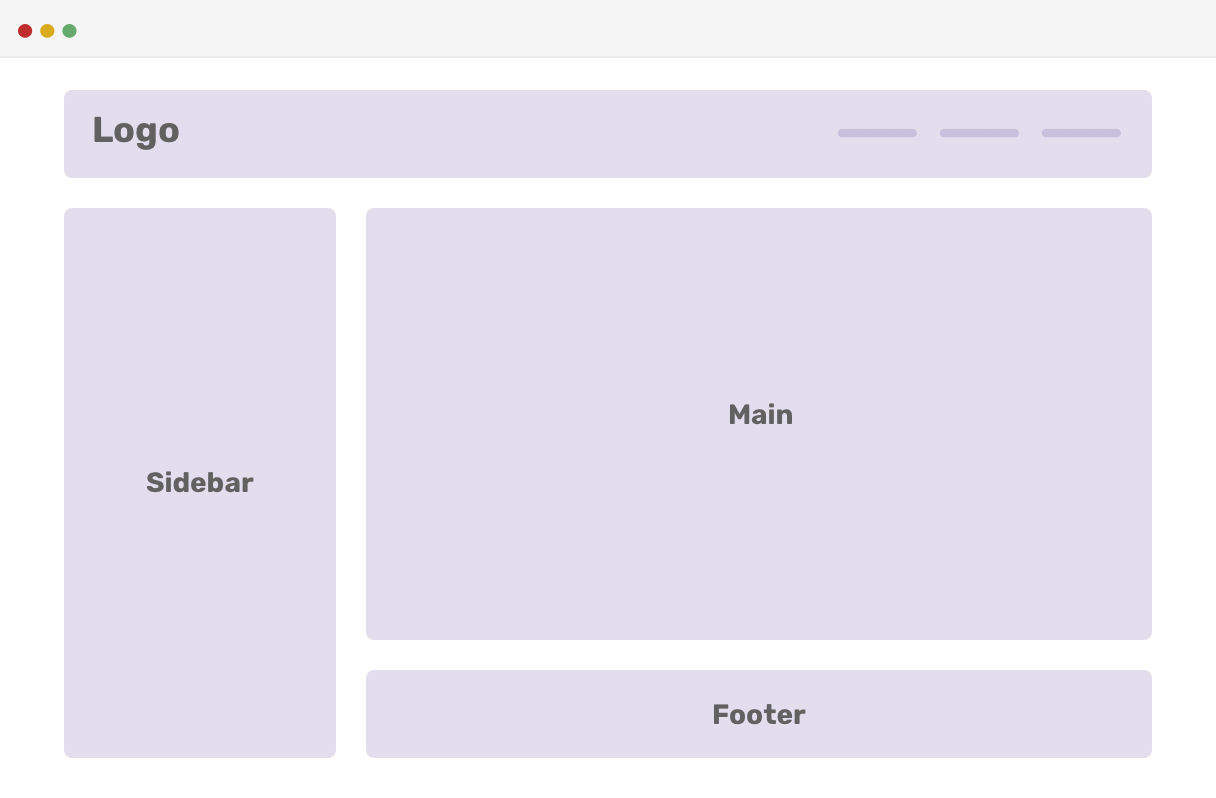
And the CSS:
header {
  grid-column: 1 / 3;
}

main {
  grid-column: 2 / 3;
}

aside {
  grid-row: 2 / 4;
}

footer {
  grid-column: 2 / 3;
}
Even though I’ve been working with CSS Grid for a long time, and we have great tools at our hands that shows us the grid lines numbers like Firefox DevTools below:
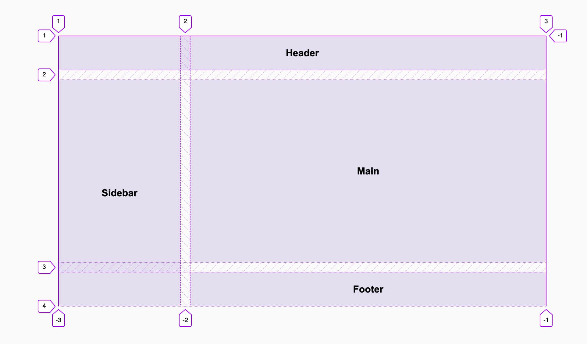
..I still find it hard to change or remember the numbers of columns and rows for each layout edit. Maybe there is a better visual way for that without getting caught in numbers every time an edit is needed? Yes, there is.
Introducing Grid Template Areas
Instead of dealing with columns and rows numbers, there is a better way by using grid-template-areas. Simply, it makes a visual representation of the grid columns and rows.
First, I want to explain the concept of areas in its simple case.
.wrapper {
  display: grid;
  grid-template-columns: 200px 1fr;
  grid-template-areas: none | <string> +;
  grid-gap: 1rem;
}
The possible value for grid-template-areas is multiple strings grouped with quotation marks. Each cell in a string represents a column, and each string represents a row in the grid. We will redo the example above to understand how it works.
.wrapper {
  display: grid;
  grid-template-columns: 200px 1fr;
  grid-template-areas:
    "header header"
    "sidebar main"
    "sidebar footer";
  grid-gap: 1rem;
}

header {
  grid-area: header;
}

main {
  grid-column: main;
}

aside {
  grid-row: sidebar;
}

footer {
  grid-column: footer;
}
To understand the grid-template-areas value, see the below illustration about it.
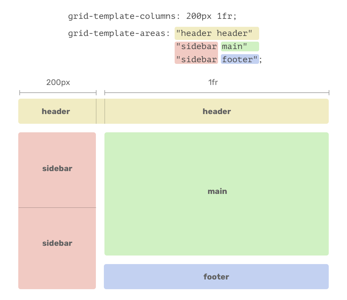
Notice that the representation of the value is similar to the layout design. Each color represents a specific component/element from the design.
Since we have two columns, 200px and 1fr, the value of grid-template-areas should be aligned with them. When I wrote “header header”, it means that the header width will be 200px + 1fr, which is actually 100% of the parent width.
Empty Areas
Sometimes, we want a cell in the grid to be empty. To do that, a “dot” should be added inside the grid-template-areas definition.
.wrapper {
  display: grid;
  grid-template-columns: 200px 1fr;
  grid-template-areas:
    ". header"
    "sidebar main"
    "sidebar footer";
  grid-gap: 1rem;
}
The dot placed means that this cell is empty and the head should be placed on the second column. The result is as below:
Use Cases and Examples
While learning, I tried to come up with use cases for grid-template-areas that can be useful. I hope you will like them, and please feel free to share your ideas or suggestions in case I missed something.
1. Featured Article
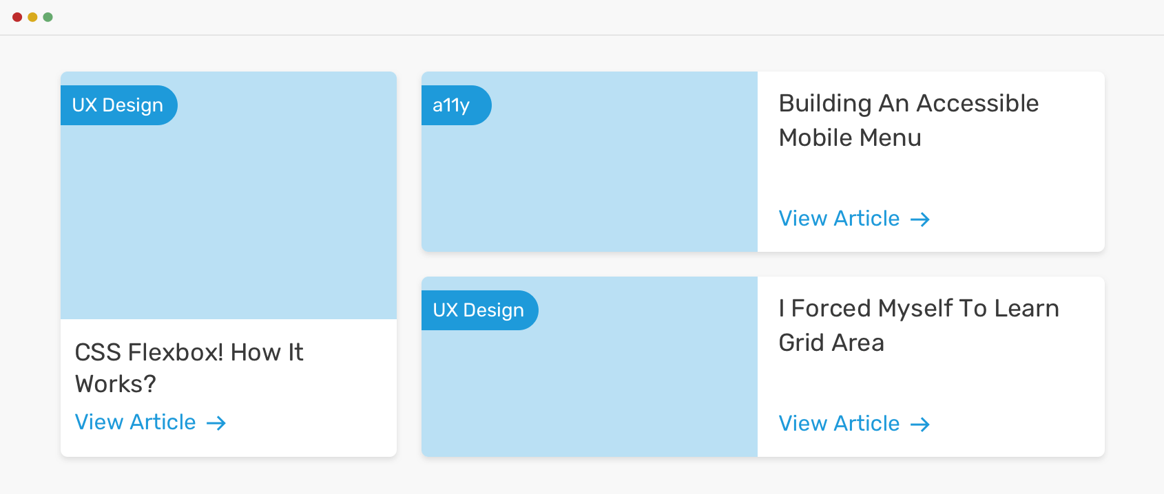
We have a section with a featured article that spans the height of two rows. To accomplish that, we will need three columns and two rows. Here is the HTML structure:
<main class="wrapper">
  <div class="item featured"></div>
  <div class="item item-2"></div>
  <div class="item item-3"></div>
</main>
And the basic CSS:
.wrapper {
  display: grid;
  grid-template-columns: 1fr 1fr 1fr;
  grid-gap: 1.25rem;
}
With the above, we will have the following grid:

Here is how I visually think about the grid-template-areas for this layout.
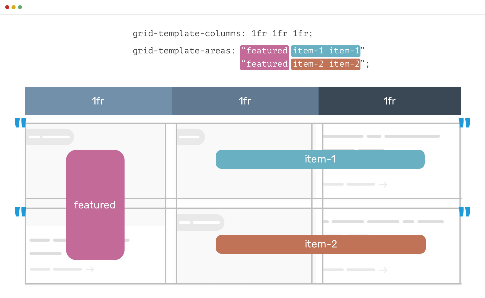
Now, we will have two strings for the grid-template-areas. See below CSS:
.wrapper {
  display: grid;
  grid-template-columns: 1fr 1fr 1fr;
  grid-template-areas:
    "featured item-1 item-1"
    "featured item-2 item-2";
  grid-gap: 1.25rem;
}

.item.featured {
  grid-area: featured;
}

.item-2 {
  grid-area: item-1;
}

.item-3 {
  grid-area: item-2;
}
Isn’t that easy and straightforward instead of dealing with columns and rows numbers? It is. Well, at least for me, if you don’t agree.
2. Responsive Design and Grid Areas
Based on the previous example, we will see how to handle it for smaller screen sizes. Since each element already has grid-area applied to it, the change will be only for the grid-templates-areas value.
In the smallest size, the elements should stack above each other. Then, if the viewport width is more than or equal to 600px, a 3-column layout will be triggered. Finally, if the viewport width is more than or equal to 900px, the regular layout will be triggered.

Here is how I added the grid areas for the wrapper:
/* Stacked Layout */
main {
  display: grid;
  grid-template-columns: 1fr 1fr 1fr;
  grid-template-areas:
    "featured featured featured"
    "item-1 item-1 item-1"
    "item-2 item-2 item-2";
  grid-gap: 1.25rem;
}

/* 3-col Layout */
@media (min-width: 600px) {
  main {
    grid-template-areas:
      "featured item-1 item-2"
      "featured item-1 item-2";
  }
}
/* Featured Layout */
@media (min-width: 900px) {
  main {
    grid-template-areas:
      "featured item-1 item-1"
      "featured item-2 item-2";
  }
}
See the Pen Grid Areas - 2 by Ahmad Shadeed (@shadeed) on CodePen.
Form Elements
A good use case for grid areas is form elements. Let’s say that we want a form to show the left layout for mobile size, and the right one for desktop size.
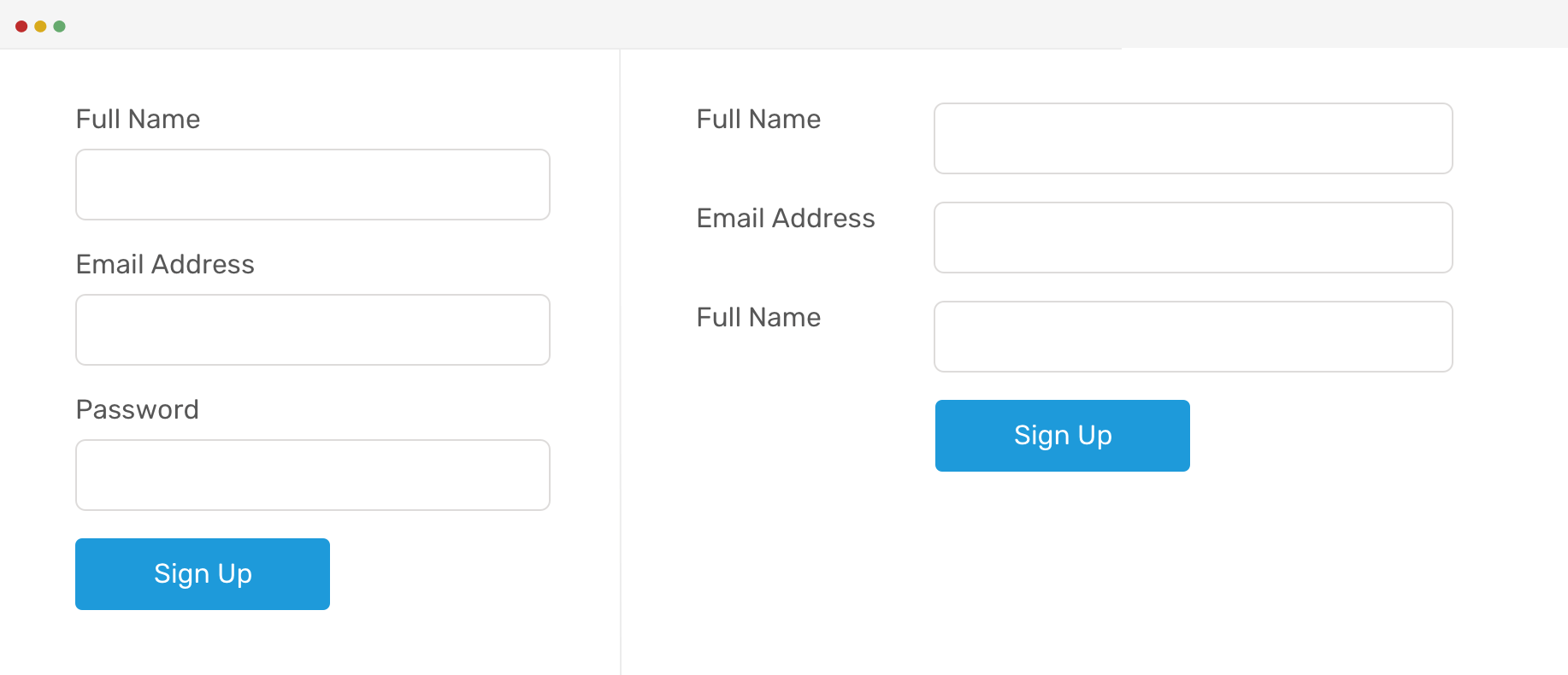
To do that, I will make the input group wrapper as a grid wrapper.
<form>
  <p class="input-group">
    <label for="">Full Name</label>
    <input type="email" name="" id="" />
  </p>
  <!-- Other form elements -->
  <p class="input-group">
    <button class="c-button">Sign up</button>
  </p>
</form>
.input-group {
  display: grid;
  grid-template-columns: 0.7fr 2fr;
  grid-template-areas: "col-1 col-1" "col-2 col-2";
  margin-bottom: 1rem;

  @media (min-width: 700px) {
    grid-template-areas: "col-1 col-2";
  }
}

label {
  grid-area: col-1;
}

input {
  grid-area: col-2;
}

.c-button {
  grid-area: col-2;
  justify-self: start;
}
Based on the above, here is how the form is expected to look at large viewports.

See the Pen Grid Areas - 3 by Ahmad Shadeed (@shadeed) on CodePen.
Reusability and Design Systems
I thought about extending the use of grid areas to have set guidelines for a design project. For example, a section with different layout variations.
1. Editorial Layout

This editorial layout is a part of a design system. The team has agreed to work on two variations of this layout by adding or removing a CSS class. Let’s see how to work on the first variation with grid areas.
<div class="c-newspaper">
  <article class="c-article c-article--1"></article>
  <article class="c-article c-article--2"></article>
  <article class="c-article c-article--featured"></article>
  <article class="c-article c-article--3"></article>
  <article class="c-article c-article--4"></article>
  <article class="c-article c-article--5"></article>
  <article class="c-article c-article--6"></article>
  <article class="c-article c-article--7"></article>
</div>
.c-newspaper {
  display: grid;
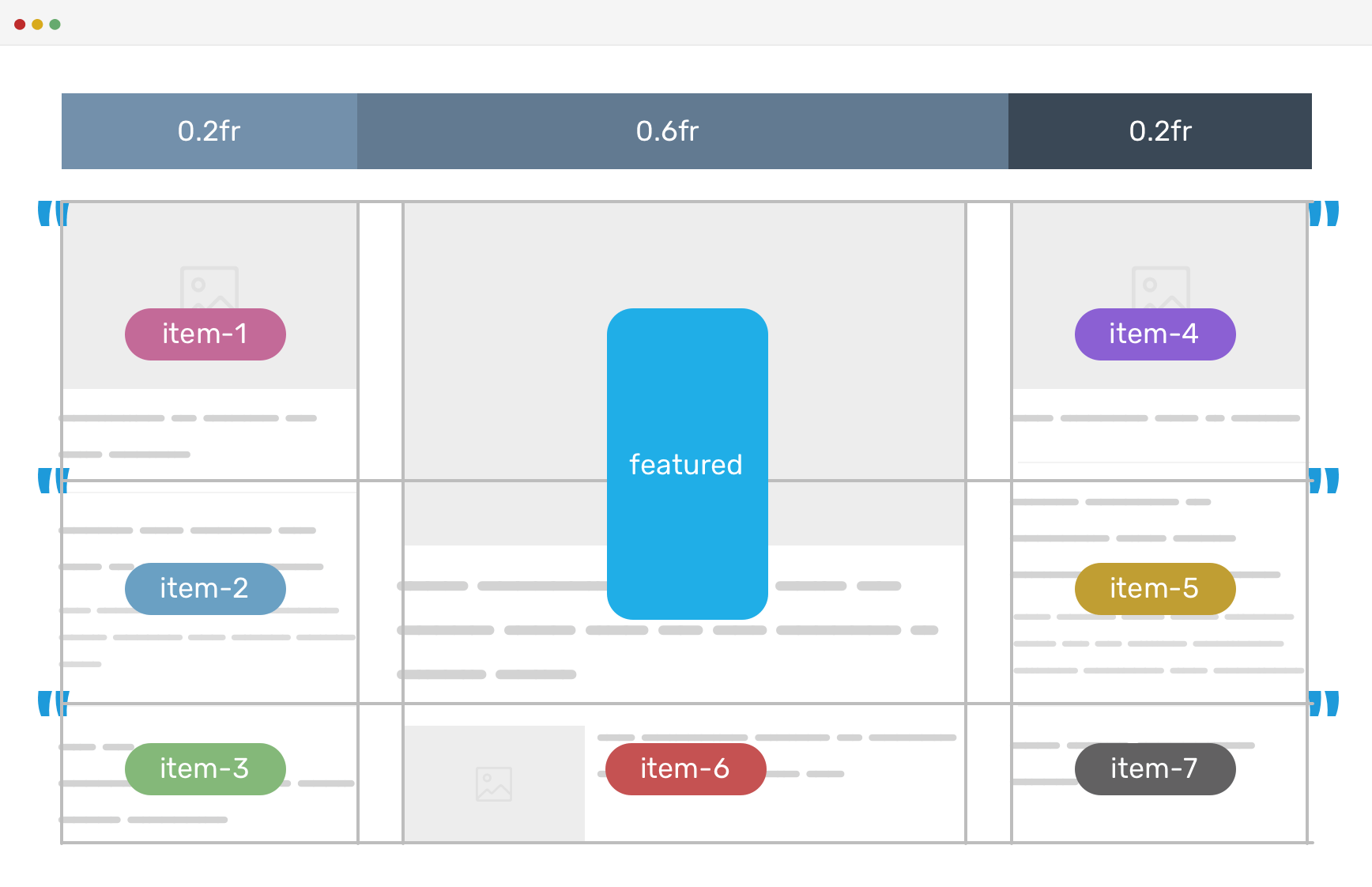
  grid-template-columns: 0.2fr 0.6fr 0.2fr;
  grid-template-areas:
    "item-1 featured item-2"
    "item-3 featured item-4"
    "item-5 item-6 item-7";
  grid-gap: 1rem;
}

.c-article--1 {
  grid-area: item-1;
}

.c-article--2 {
  grid-area: item-2;
}

/*..And so on for other elements.. each one has a grid-area..*/

.c-article--7 {
  grid-area: item-7;
}

.c-article--featured {
  grid-area: featured;
}
To make it more clear, I will visualize the grid area in the below figure.
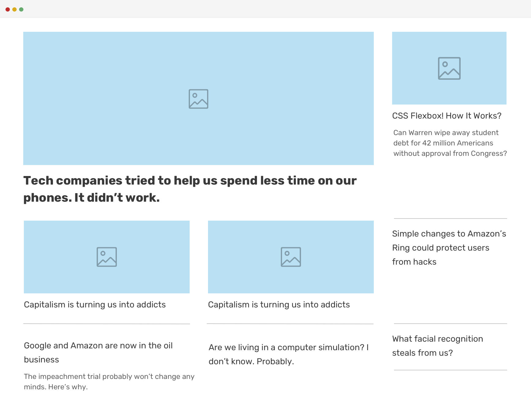
And for the second variation, I changed the grid areas to be like the below:
.c-newspaper.variation-1 {
  grid-template-areas:
    "featured featured item-3"
    "item-1 item-2 item-4"
    "item-5 item-6 item-7";
}
Imagine if this concept spread across different components and sections in a design system. The outcome will be easy to use and modify CSS codebase. Even more, anyone using that design system can make a custom layout by just playing with the value of grid-template-areas.
Progressive Enhancement
The HTML structure for the above example works only when CSS Grid is supported. How can we use flexbox for fallback, and enhance with Grid? Let’s explore that.
First, I wrapped the articles in three columns as below:
<div class="c-newspaper">
  <div class="c-newspaper__column">
    <article class="c-article c-article--1"></article>
    <article class="c-article c-article--2"></article>
    <article class="c-article c-article--featured"></article>
  </div>
  <div class="c-newspaper__column">
    <article class="c-article c-article--3"></article>
    <article class="c-article c-article--4"></article>
    <article class="c-article c-article--5"></article>
  </div>
  <div class="c-newspaper__column">
    <article class="c-article c-article--6"></article>
    <article class="c-article c-article--7"></article>
  </div>
</div>
Once we have the above, we can use flexbox to create a 3-column layout as per the original design.
.c-newspaper {
  display: flex;
  flex-wrap: wrap;
}

.c-newspaper__column--1 {
  flex: 0 0 20%; /* First Column Takes 20% width */
}

.c-newspaper__column--2 {
  flex: 0 0 60%; /* Second Column Takes 60% width */
}

.c-newspaper__column--3 {
  flex: 0 0 20%; /* Third Column Takes 20% width */
}

.c-newspaper__item {
  margin-bottom: 1rem; /* Spacing below each article */
}
With that, we have a 3-column layout that works for the browser that doesn’t support CSS Grid. The next step is to enhance based on that, and add the CSS grid code.
Positioning Each Grid Item Individually
Now that we wrapped the articles in three columns containers, how to position each grid item individually? We want a way to mimic the idea of hiding the column containers and keep everything inside them. CSS display: contents to the rescue!
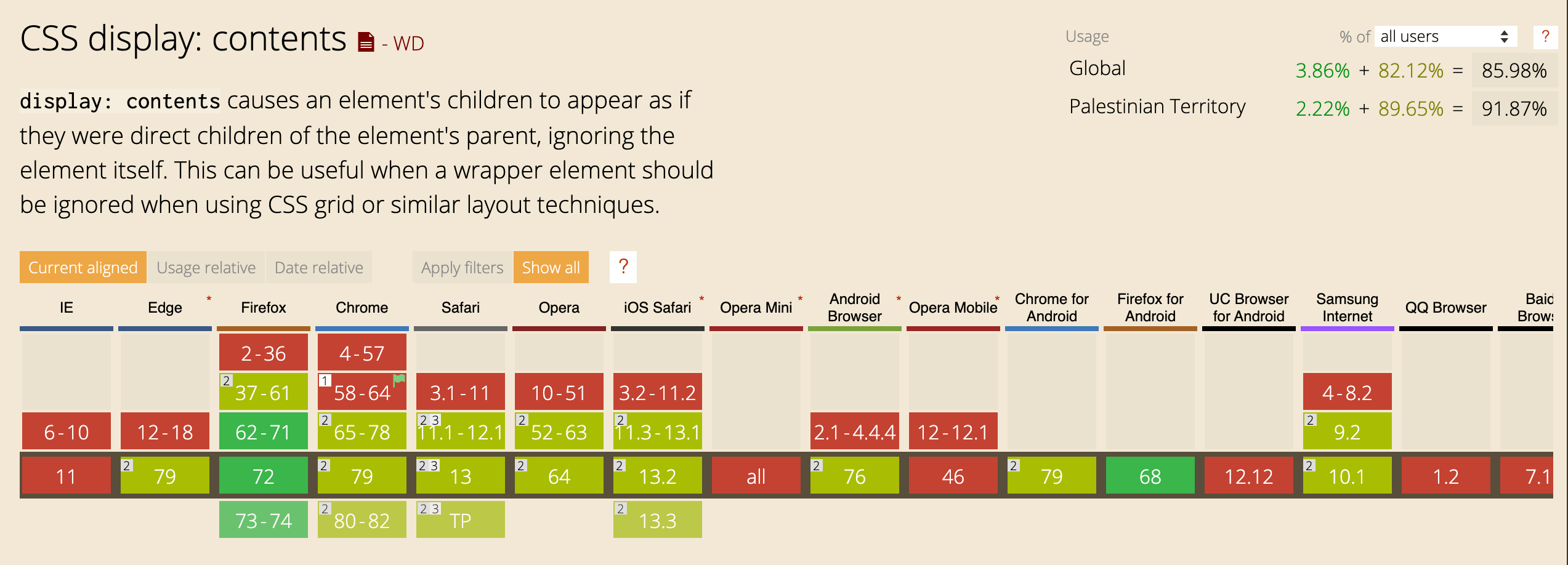
I like that definition of it on CSS Tricks:
a magical new display value that essentially makes the container disappear, making the child elements children of the element the next level up in the DOM.
@supports (display: contents) {
  .c-newspaper__column {
    display: contents; /* Each column has disappeared */
  }

  .c-newspaper {
    display: grid;
    grid-template-columns: 0.2fr 0.6fr 0.2fr;
    grid-template-areas:
      "item-1 featured item-2"
      "item-3 featured item-4"
      "item-5 item-6 item-7";
    grid-gap: 1rem;
  }
}
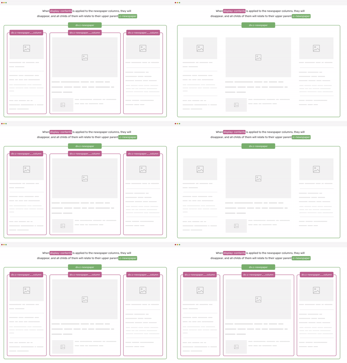
To make it more clear, I made the below GIF that shows the effect of applying display: contents to each of .c-newspaper__column containers.
Media Component
The media component is a good use case for grid areas. Let’s say that we want to switch the placement of the media and the content. Grid area is perfect for that.
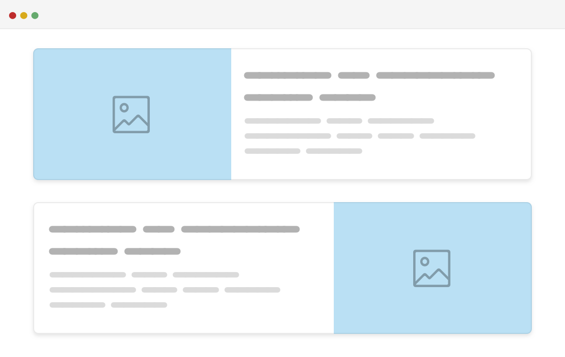
.c-media {
  display: grid;
  grid-template-areas: "thumb content";
  grid-gap: 1rem;
}

.c-media.flipped {
  grid-template-areas: "content thumb";
}

.c-media__thumb {
  grid-area: thumb;
}

.c-media__content {
  grid-area: content;
}
See the Pen Media Object by Ahmad Shadeed (@shadeed) on CodePen.
Debugging Grid Area
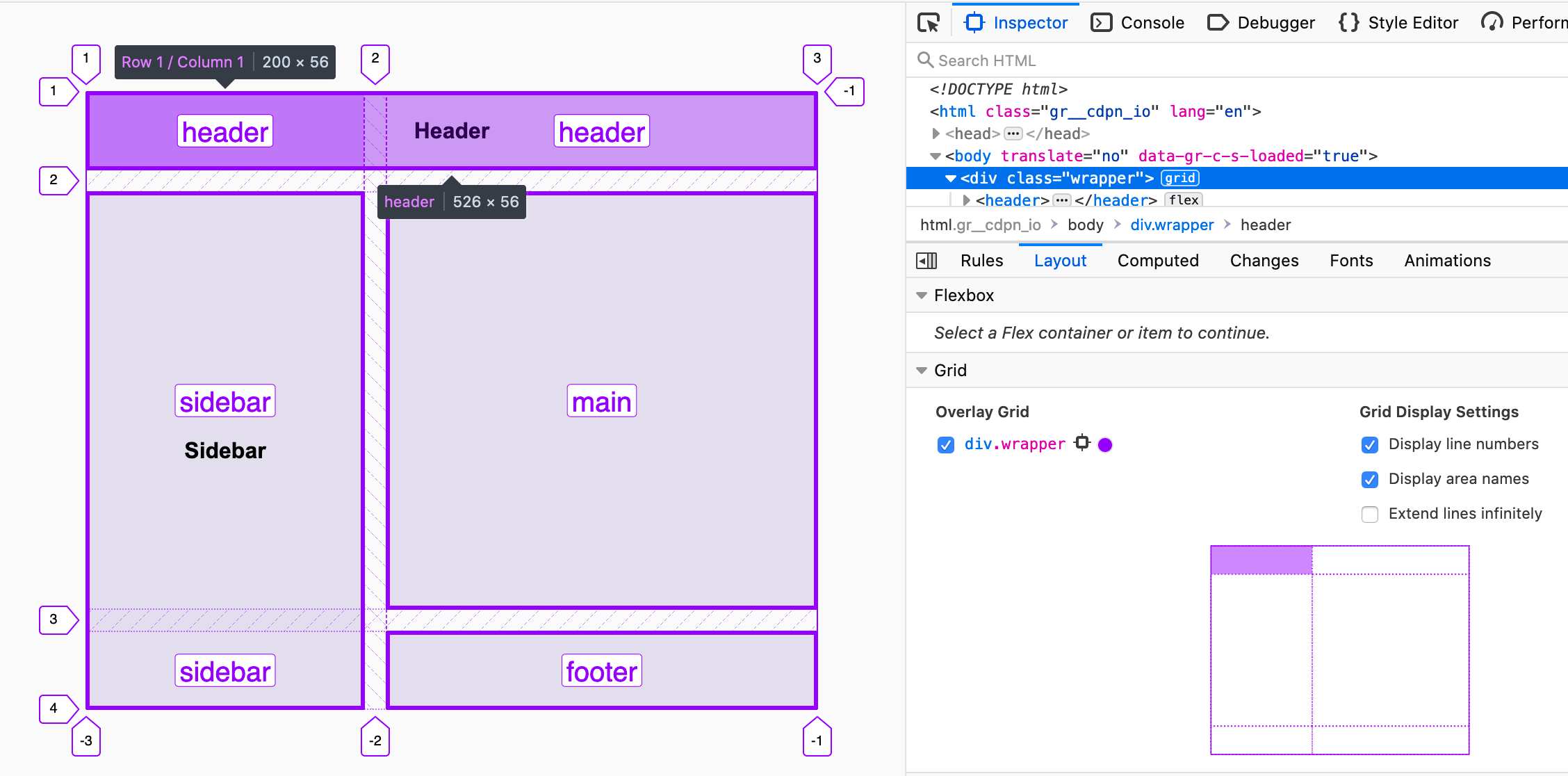
My favorite browser to work with CSS grid is Firefox. Its DevTools has some great options for debugging CSS. For example, it shows the grid area names, and it even shows a little representation of the grid-template-areas value on the bottom right corner.
The End
And that’s a wrap. Do you have a comment or a suggestion? Please feel free to ping me on @shadeed9.

