While working on a UI, I needed to add a line separator between two sections. Here it is:

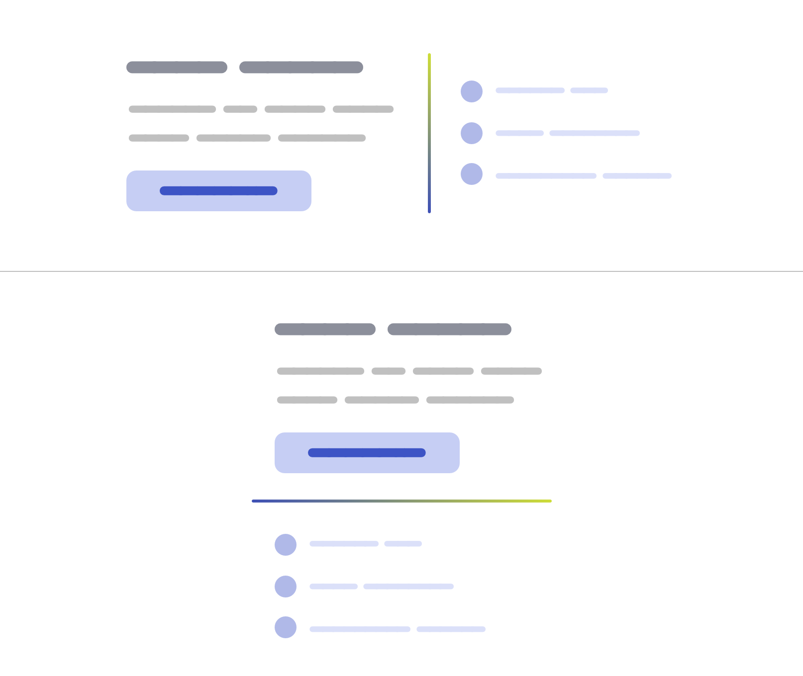
On smaller viewports, the line will become horizontal:

Let’s take a look at the HTML.
<section class="section">
  <div class="section__item section__item--start">
    <!-- Content -->
  </div>

  <div class="section__item section__item--end">
    <!-- Content -->
  </div>
</section>
We have a section, with two main child items. Between them, we will have a line separator.
In CSS, I will use flexbox to handle the layout.
.section {
  display: flex;
  gap: 1rem;
  max-width: 700px;
  margin: 2rem auto;
}

.section__item {
  flex: 1;
}
I added a 1rem gap between each one, and also each child item should fill 50% of its parent. Here is the result:

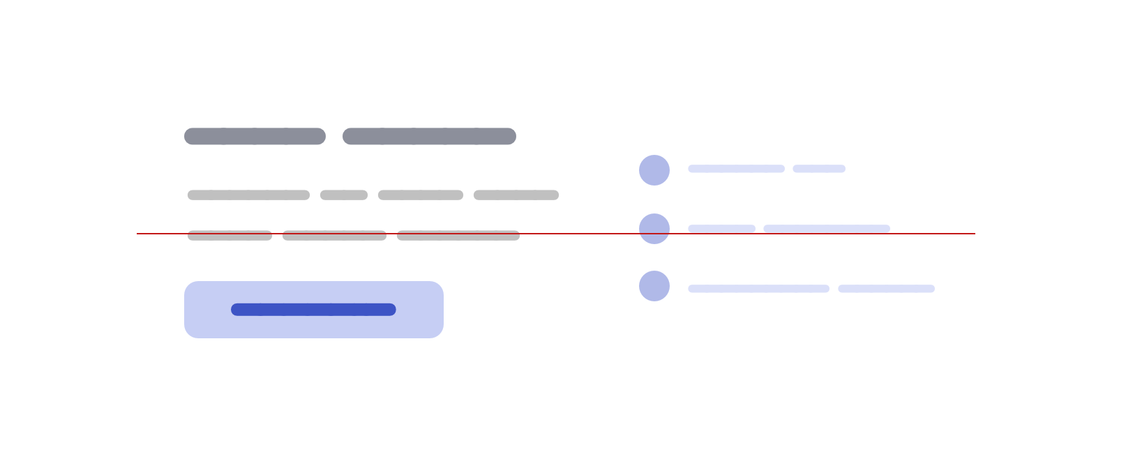
Next step, I want to center the two items vertically, so I will use align-items on the parent.
.section {
  display: flex;
  align-items: center;
  gap: 1rem;
  /* other styles */
}

.section__item {
  flex: 1;
}
Now the two items are centered (I added the red line to make it easy to spot that). You might be asking, what does that have to do with the separator? I totally understand, let’s keep going.
Adding the separator
I wanted to add this as a pseudo-element, so I wrote this CSS. Can you expect the visual result of this without scrolling down?
.section:before {
  content: "";
  border: 1px solid #d3d3d3;
}
Oh, what is that little square doing over here? Since the pseudo-element is only a 1px border from all sides, the result will be 2*2` square.
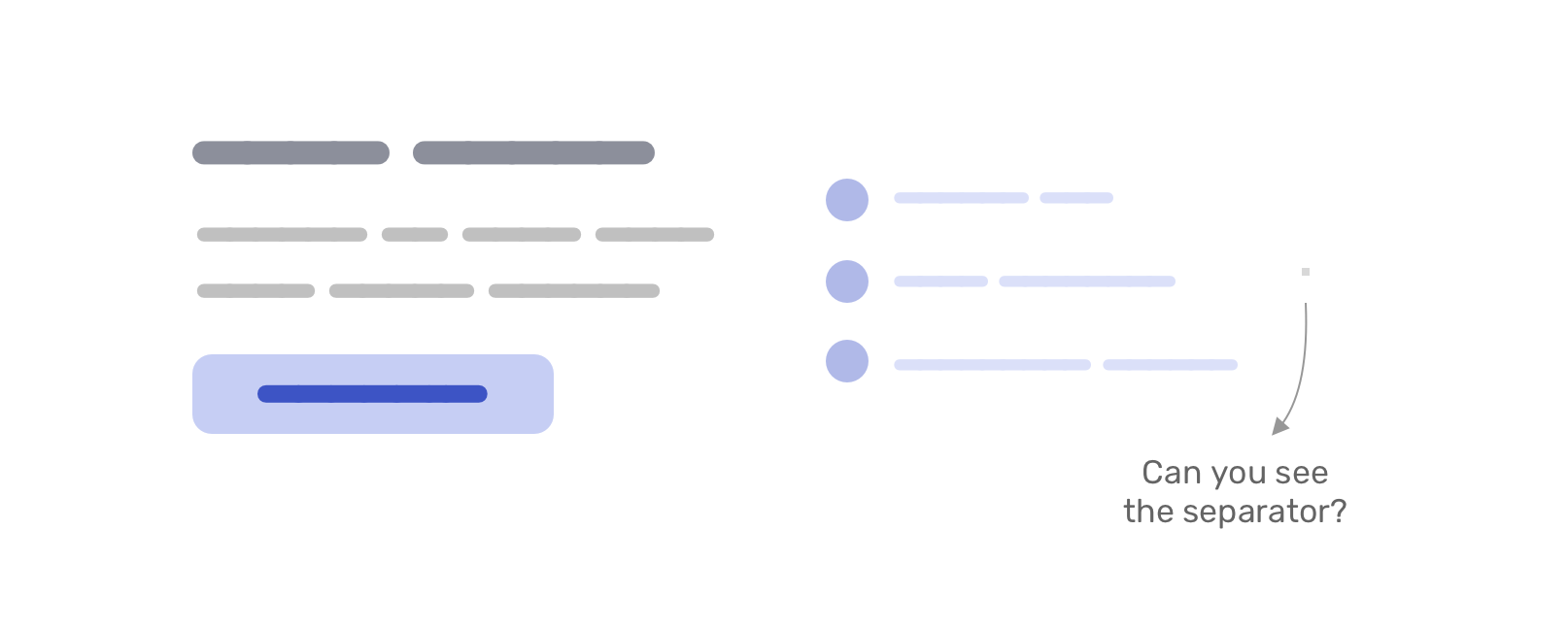
Let’s focus a bit here. This is the core of this little CSS trick.
The square comes from using the same color for each border. With different colors, it can look like this.
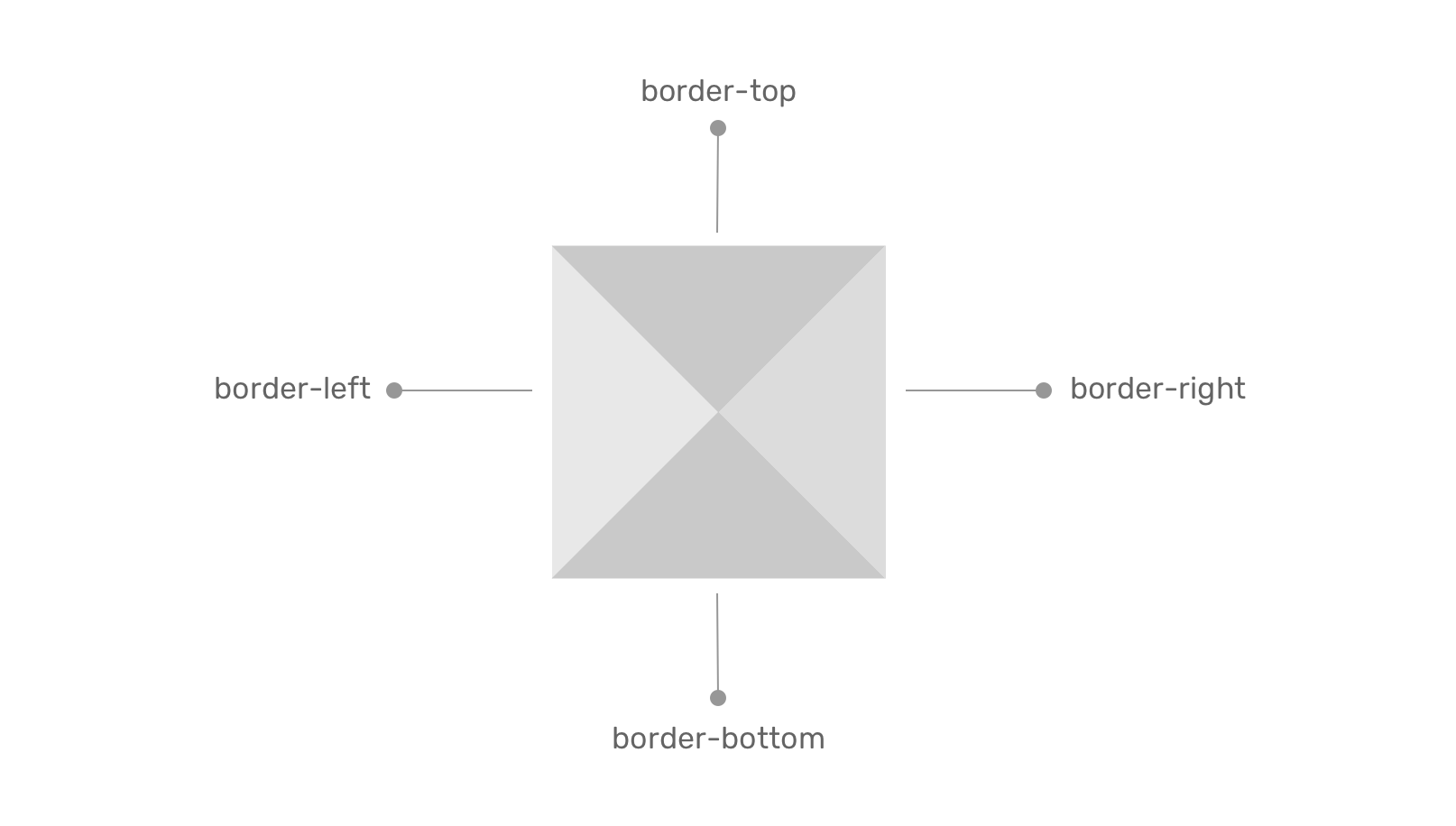
Why the separator looks like a square?
Since we added align-items: center to center the child items vertically, we removed the default behavior of flexbox stretching child items (stretching vertically, in this case).
To fix that, we need to reset the alignment of the pseudo-element to stretch.
.section:before {
  content: "";
  border: 1px solid #d3d3d3;
  align-self: stretch;
}
Now it looks like the following visual:

Next, I need to reorder the flex items to make the divider appears between them.
.section__item--start {
  order: -1;
}
And we’re done!

To make this work on all screen sizes, we need to have the flex-direction: column mobile and flex-direction: row for larger screens.
.section {
  display: flex;
  flex-direction: column;
  gap: 1rem;
}

.section:before {
  content: "";
  border: 1px solid #d3d3d3;
  align-self: stretch;
}

@media (min-width: 700px) {
  .section {
    align-items: center;
    flex-direction: row;
  }
}
Here is a video of changing the flex-direction. Notice how the separator changes!
This works like magic because it’s a flexbox behavior.
When flex-direction: row is set, the cross-axis is vertical thus the pseudo-element stretches vertically.
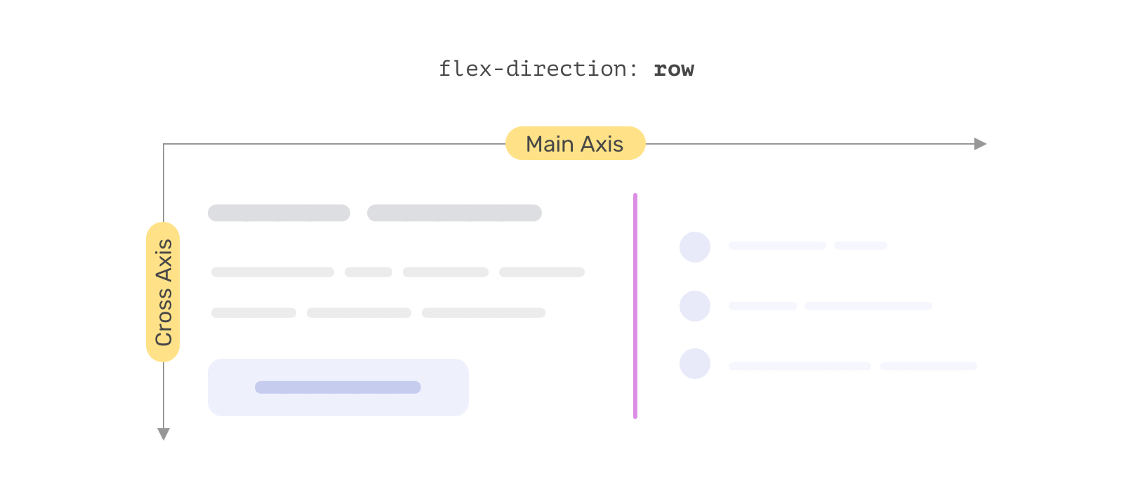
And when the cross-axis is set to flex-direction: column, it will be horizontal and so the pseudo-element stretches horizontally.
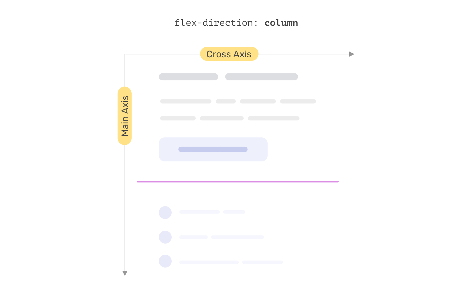
Isn’t that neat? No need to use width, height, or anything else! It’s just a border being stretching via flexbox.
The separator thickness
Since the border value contributes to the four directions, we need to use 0.5x of the thickness we want. For example, if we want a 1px separator, then the border should be like the following:
.section:before {
  content: "";
  border: 0.5px solid #d3d3d3;
  align-self: stretch;
}
Gradient separators
This is another reason for me to pick the border solution above others. We can use gradients via border-image.
.section:before {
  content: "";
  align-self: stretch;
  border: 1px solid #d3d3d3;
  border-image: linear-gradient(45deg, #3f51b5, #cddc39) 1;
}
Dashed separators
Given that we’re using borders, we can also have a dashed separator.
.section:before {
  content: "";
  border: 1px dashed #d3d3d3;
  align-self: stretch;
}

Another way of doing it
If I haven’t taken the time to think about implementing this, then I might have used width and height. I’m not saying the following is a bad solution, but it’s good to step out of solutions we took for granted and think of other ways of solving UI problems.
/* On small sizes */
.section:before {
  content: "";
  height: 2px;
  background-color: lightgrey;
}

@media (min-width: 700px) {
  .section:before {
    width: 2px;
    height: 150px;
  }
}
See the Pen Untitled by Ahmad Shadeed (@shadeed) on CodePen.
I hope you’ve learned something new. Thank you for reading!

