
Introduction
Oftentimes, when working with flexbox and wrapping is enabled, you might end up in a situation where the items are wrapping, but at some point, only one item is wrapping (an orphan item).
This often causes web designers and developers to trigger a media query to avoid that behavior, which is not ideal at all and can break easily if the content changes.
Let’s look at an example to see the problem.
.list {
  display: flex;
  flex-wrap: wrap;
  justify-content: center;
  gap: 0.5rem;
}
Here is the demo:
- Home
- About
- Contact
- Works
- Services
- Speaking
The last item wrapped alone into a new line. This doesn’t feel right.
Flex wrap balance
Thankfully, we now have flex-wrap: balance and it’s shipped in Chrome 150. With it, the result will look much more balanced.
Toggle flex-wrap: balance and see how it will work just fine (Chrome only).
- Home
- About
- Contact
- Works
- Services
- Speaking
Let’s take a common example and try to solve it without using flex-wrap: balance at first because flex-wrap: balance is still Chrome only.
Real world example: Buffer.com social connect section
In this section we have two main elements:
- The title
- A list of social media icons
Take a look:
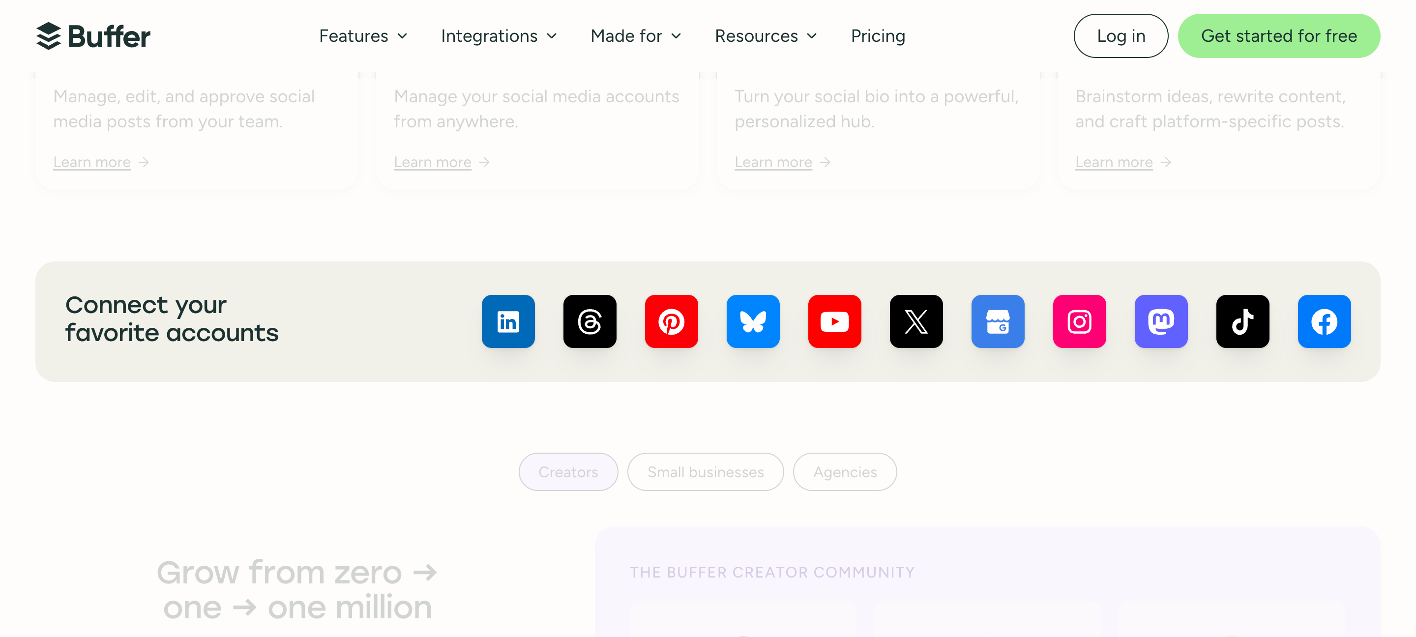
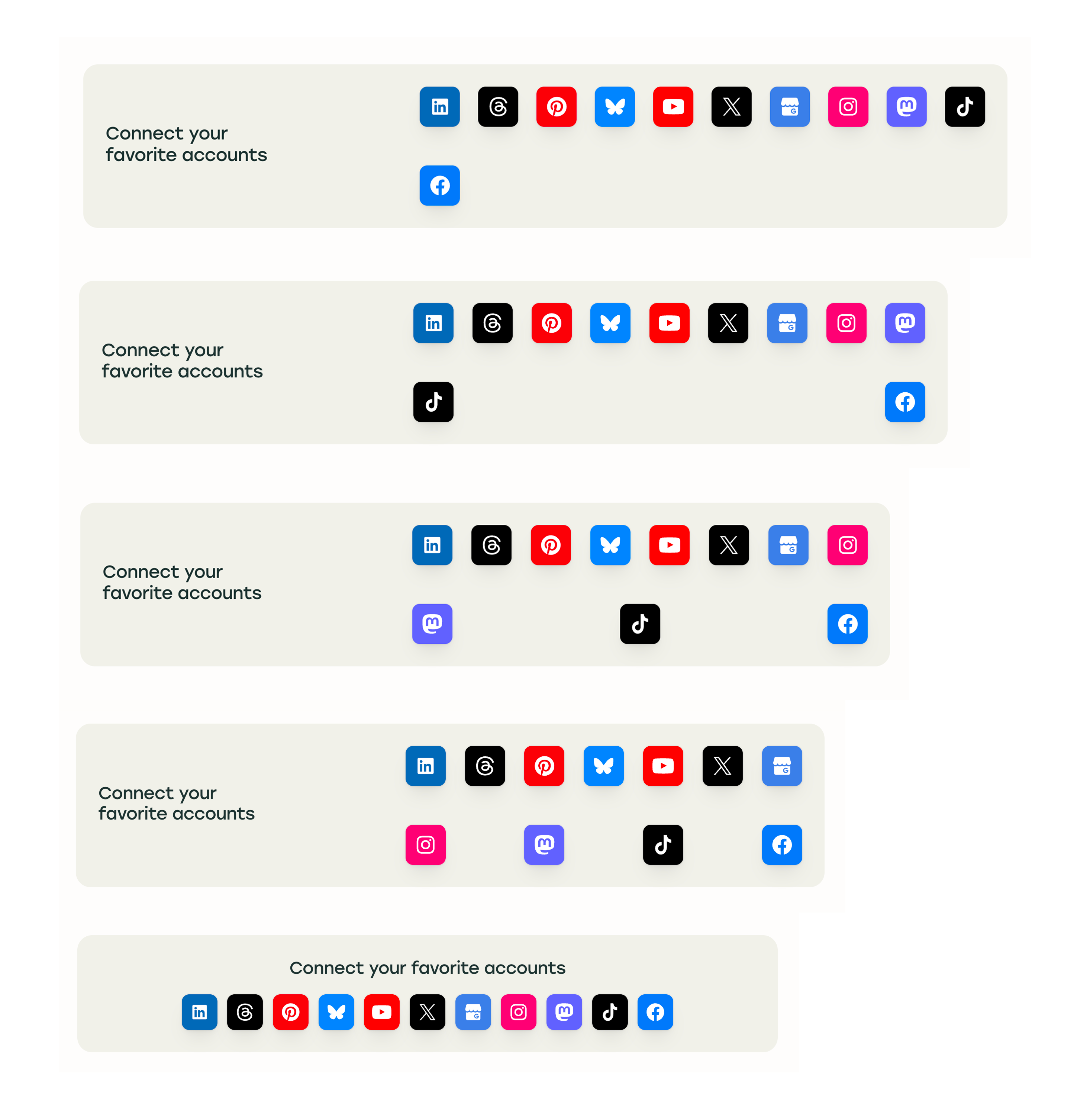
From the first glance, it looks okay. However, upon resizing the viewport, the layout starts to break. See the video below:
The icon’s wrapper is a flexbox container, which is using justify-content: space-between. This is what’s causing the icons to wrap, and then having two icons in a line at a far distance from each other.
I don’t think this is intentional.
Let’s fix it. I replicated the section in the demo below so we can check how to solve that layout problem.
Solution 1: Container queries
First, I set the flex container to wrap normally and used justify-content: center to center the icons.
.channels {
  display: flex;
  flex-wrap: wrap;
  justify-content: center;
}
I thought about the following:
- Define a container for the channels.
- Calculate the width of each social channel plus the gap in between.
- If the container width is less than or equal the calculated channels width, we’ll force the layout to wrap.
This solution should work in any browser that supports container queries. The idea is to set the max-width on small container sizes to show a pre-defined number of channels per row, I set it to 5.
.section-wrapper {
  container-type: inline-size;
  container-name: demo;
}

.section {
  --size: 44px;
  --gap: 1rem;
  --count: 8;
  --width: calc(var(--size) * var(--count) + var(--gap) * (var(--count) - 1));
  --items-row: 5;
  --max-width: calc(
      var(--size) * var(--items-row) + var(--gap) * (var(--items-row) - 1)
    );
}

.channels {
  max-width: var(--max-width);

  /* --width is 464px. We can't use a CSS variable inside a media query. */
  @container (width >= 464px) {
    max-width: initial;
    background-color: rgba(from deeppink r g b / 0.3);
  }
}
Resize the range slider, or the container, and see how the layout changes.
Solution 2: using max-width with a conditional clamp
In this solution, I defined a container on the parent element, then used max-width to handle the layout.
.section-wrapper {
  container-type: inline-size;
  container-name: demo;
}

.section {
  --size: 44px;
  --gap: 1rem;
  --count: 8;
  --items-row: 5;
  --width: calc(var(--size) * var(--count) + var(--gap) * (var(--count) - 1));
  --min: calc(
    var(--size) * var(--items-row) + var(--gap) * (var(--items-row) - 1)
  );
  --max-width: clamp(var(--min), (100cqw - var(--width)) * 999, 100%);

  .channels {
    max-width: var(--max-width);
  }
}
We have to know the following in advance:
- Size of the social channel (44px)
- Gap
- Total count
- Number of items to show per row
From those, we can calculate the minimum number of items to show per row, and the maximum width.
Here is the working demo:
If you’re wondering, this solution is using a conditional clamp, I wrote about it on my blog before here.
Solution 3: display contents
In this solution, I divided the items into two groups. On smaller sizes, the groups are flattened with display: contents. On larger sizes, the groups are visible to mimic the balanced wrapping behavior.
<div class="channels">
  <div class="group-1">
    <!-- first half of the channels -->
  </div>
  <div class="group-2">
    <!-- second half of the channels -->
  </div>
</div>
.channels {
  display: flex;
  flex-wrap: wrap;
  justify-content: center;
  gap: 1rem;

  > div {
    /* Omit the groups on small sizes. */
    display: contents;

    @container (width >= 500px) {
      display: inherit;
      flex-wrap: inherit;
      justify-content: inherit;
      gap: inherit;
      background-color: rgba(from deeppink r g b / 0.3);
    }
  }
}
While this works, it’s not my favorite solution, but it’s much better than just using justify-content: space-between.
I have an article about display: contents, if you want to learn more about it.
Solution 4: A flex item in between
This solution didn’t work well, but I want to show it anyway. The idea is that we add a pseudo element and use the order property.
The idea is to force the pseudo element to take the full space, and to place it in the middle of the list by using --count property.
ul {
  &:before {
    content: "";
    order: calc(var(--count) / 2 + 1);
    flex: 0 0 100%;
  }
}

li {
  &:nth-child(1) {
    order: 1;
  }
  /* and so on.. */
}
Solution 5: Flex wrap balance
After all the above solutions, I will show you how easy it is to just use flex-wrap: balance.
.channels {
  display: flex;
  flex-wrap: balance;
  justify-content: center;
  gap: 1rem;
}
That’s it!
Flex line count
While researching about flex-wrap: balance, I discovered that there is a new CSS property, which is flex-line-count.
This property let us set a minimum number of lines for the wrapped flex items. Even if the space is enough and the items are not wrapping, we can force a minimum number of lines for wrapping.
.list {
  display: flex;
  flex-wrap: balance;
  flex-line-count: 2;
  gap: 0.5rem;
}
I forced the flex wrapping to start from at least two lines, even if the space is big enough for the items to stay in one line.
- Home
- About
- Contact
- Works
- Services
- Speaking
This feels like magic, and I believe it will open up a new world of use cases that weren’t possible before. How can we benefit from this?
Navigation demo
Here is an example where we have a header and we want the navigation to always wrap into two lines. Normally, we would restrict the navigation by:
- Setting a maximum width.
- Defining a grid with a fixed width for the navigation.
- and more…
In the following demo, I used the classic max-width solution, take a look:
.nav ul {
  max-width: 320px;
  margin-inline: auto;
  display: flex;
  justify-content: center;
  flex-wrap: wrap;
  gap: 0.5rem;
}
While this works, we lost the ability to style the navigation wrapper. For example, if we want to add a background color, it will be restricted to the max-width.
With flex-line-count, we can define the minimum number of lines for the wrapped flex items, and the navigation wrapper width will stay as is.
.nav ul {
  display: flex;
  justify-content: center;
  flex-wrap: balance;
  flex-line-count: 2;
  gap: 0.5rem;
}
Masonry layout with flex-line-count
Can we do a masonry layout with flex-line-count? The short answer is yes, let’s find out.
First, I will use a simple example to test the idea, then move to one with real content.
.layout {
  display: flex;
  flex-direction: column;
  flex-wrap: balance;
  flex-line-count: 4;
  gap: 1.5rem;
}
Short, intense, and served in a small cup.
A kettle, a filter, and a bit of patience.
Steep coarse grounds in cold water overnight, then strain. The result is smooth, low-acid, and easy to keep in the fridge for a few days.
Stovetop classic, ready before the toast pops.
Coarse grind, four minutes, then plunge. Full-bodied and a little silty, which is either a feature or a bug depending on who you ask.
Small, light, and hard to get wrong.
Equal parts espresso and steamed milk.
Finely ground beans, water, and sugar go into the cezve together. Served unfiltered, with the sediment settling at the bottom while you drink.
From the first glance, it looks good. However, when resized, the number of columns will stay the same, which will cause the items to look very small.
How to fix that? I thought about the following:
- Assign a container to the layout.
- Define the card width.
- Divide the container width by the card width to get the number of columns.
- Use
round()function to get the nearest integer.
.layout {
  --line-min: 190px;
  --line-count: clamp(1, round(down, 100cqw / var(--line-min)), 4);
  display: flex;
  flex-direction: column;
  flex-wrap: balance;
  flex-line-count: var(--line-count);
  gap: 1.5rem;
}
Check out the demo below:

How to brew a pour over that actually tastes like the origin notes on the bag
A kettle, a filter, and a bit of patience.

Steep coarse grounds in cold water overnight, then strain. The result is smooth, low-acid, and easy to keep in the fridge for a few days.
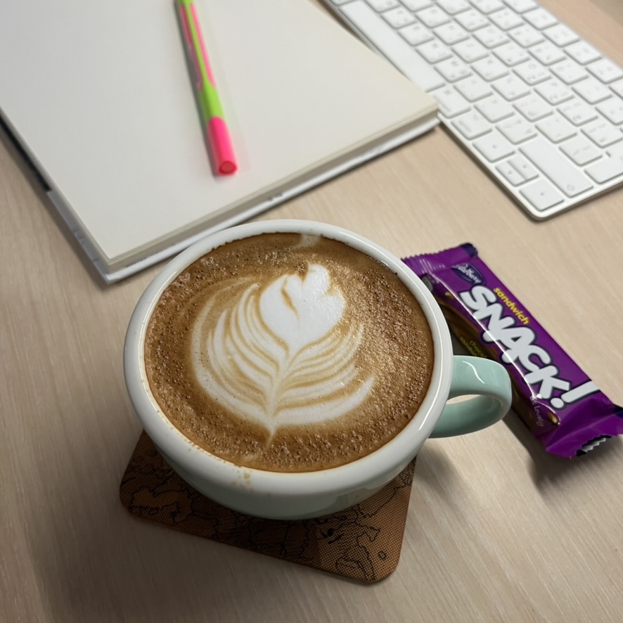
Coarse grind, four minutes, then plunge. Full-bodied and a little silty, which is either a feature or a bug depending on who you ask.
AeroPress, travel mug, hotel kettle: the whole routine in one bag
Small, light, and hard to get wrong.

Turkish coffee, boiled with the grounds left in the cup
Finely ground beans, water, and sugar go into the cezve together. Served unfiltered, with the sediment settling at the bottom while you drink.
This demo is just an experiment, and I want to mention that the reading order isn’t the same as the visual order, but at least, I took the flex-line-count to its full potential here (hopefully).
Outro
Flex wrap balancing is a great new feature that I look forward to using more. Honestly, I didn’t expect to enjoy using the flex-line-count property! I look forward to seeing what you come up with.
Thank you for reading!
Learn more about CSS layouts
Building layouts can be a challenging task, specially if you don’t know the core mental model of CSS layouts. You don’t have to worry about that anymore. I released an interactive CSS layout course, and I called it, The Layout Maestro.
Checkout The Layout Maestro course and level up your CSS layout skills.