
When I see an interesting layout, I can’t stop myself from opening the DevTools and seeing how it’s built. Most of the time, I find the layouts are built in a hacky way. That’s when I got curious about exploring it myself, and that’s how this article was born.
The problem
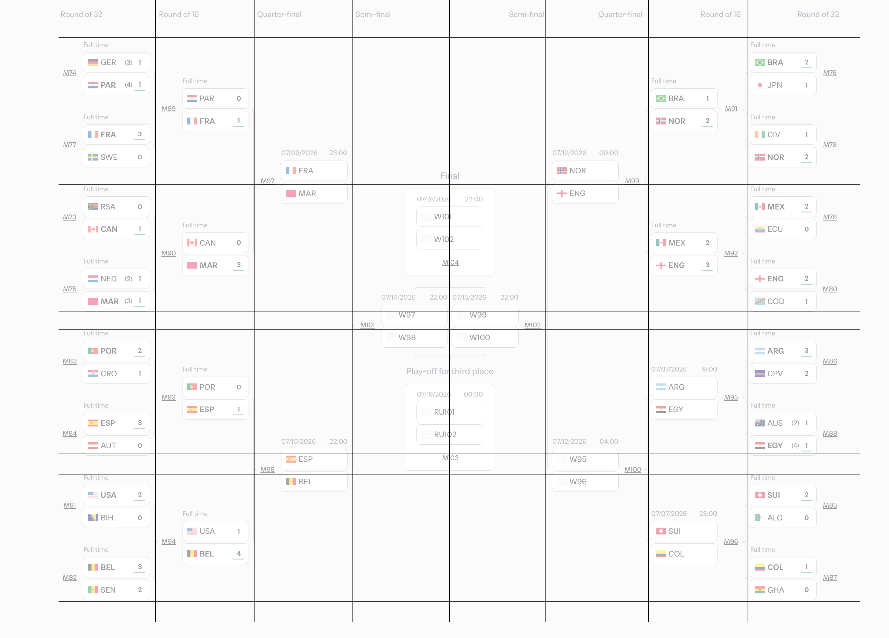
While looking at the FIFA standings page, I thought to myself: how did they build this layout in CSS? Take a look:
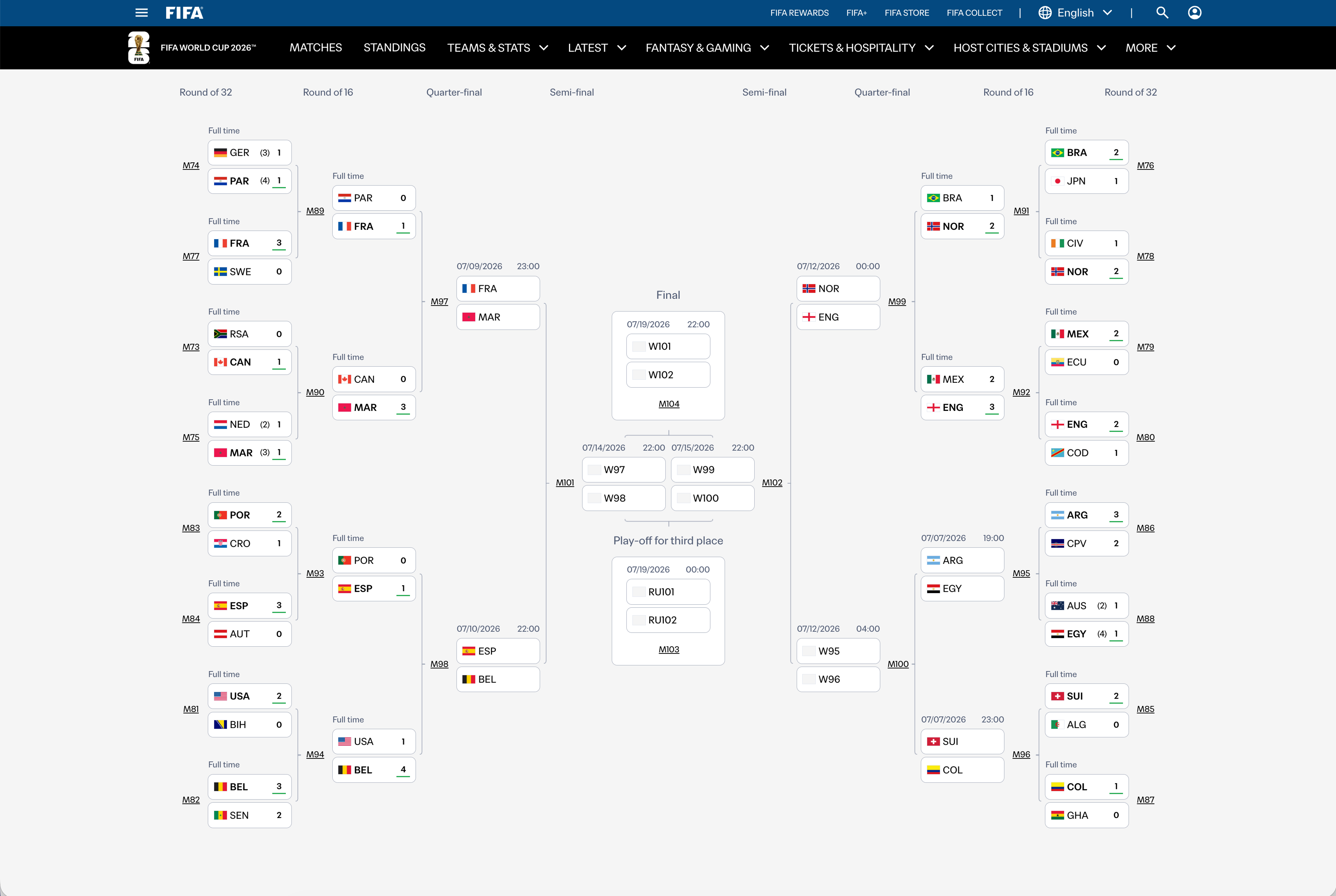
I opened the DevTools and started looking around. The standings table consists of the following rounds:
- Round of 32
- Round of 16
- Quarter-finals
- Final / Semi-finals / Third place play-off
On the FIFA website, each column is in its own element, even the ones that are related to each other, for example the round of 32 teams.
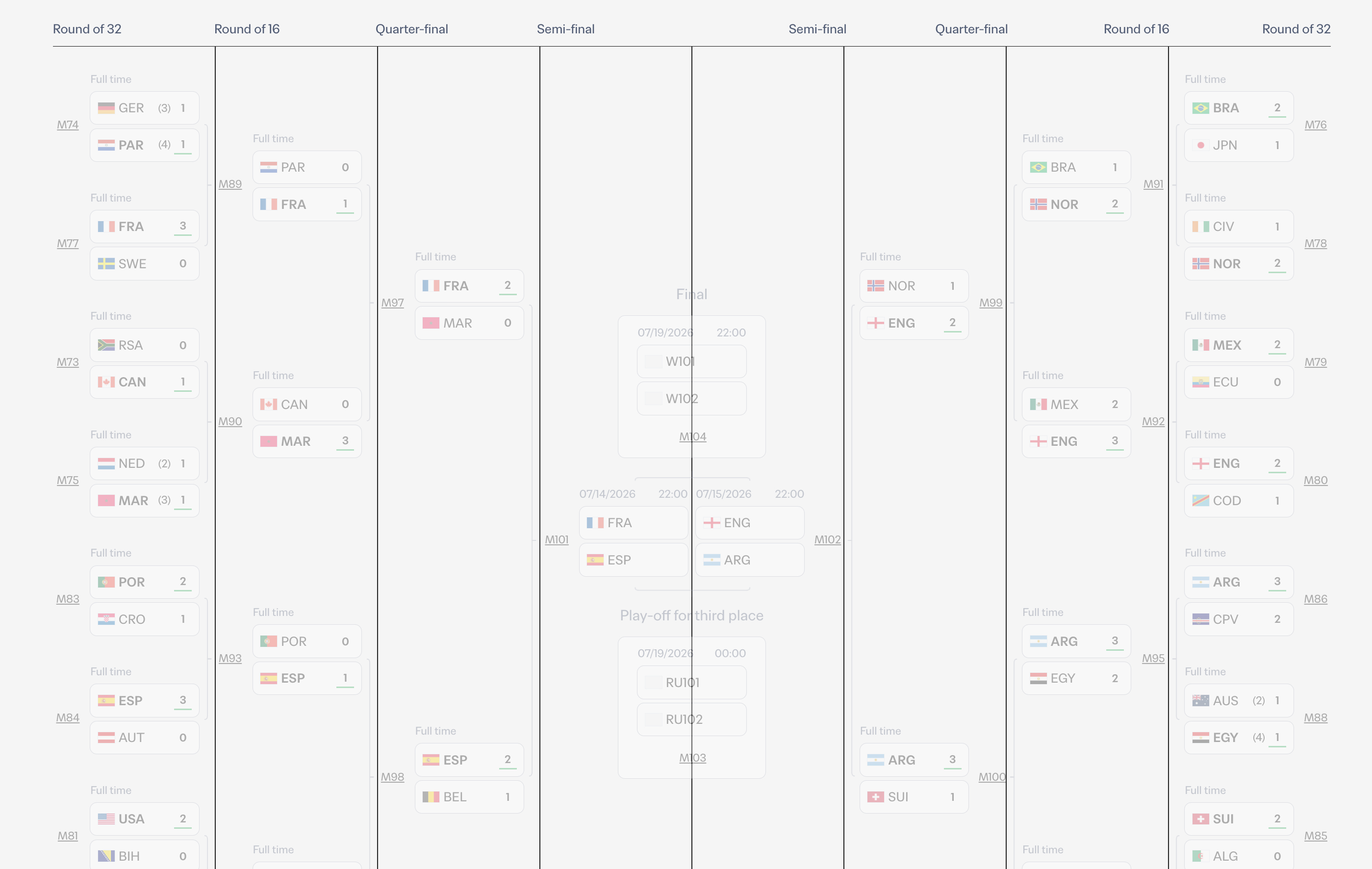
FIFA’s markup
Here is a simplified version of the markup:
<div class="rounds">
  <div class="round round-of-8 start"></div>
  <div class="round round-of-4 start"></div>
  <div class="round round-of-2 start"></div>
  <div class="round semi-finals start"></div>
  <div class="round semi-finals end"></div>
  <div class="round round-of-8 end"></div>
  <div class="round round-of-4 end"></div>
  <div class="round round-of-2 end"></div>
</div>
This is a classic example of making the markup reflect the design. To make it clearer, here is a video of the layout along with the markup.
I consider this a hack to mimic the design. If I were to write the markup, it would look like this:
<div class="rounds">
  <div class="round round-of-8">
    <div class="start"></div>
    <div class="end"></div>
  </div>
  <div class="round round-of-4">
    <div class="start"></div>
    <div class="end"></div>
  </div>
  <div class="round round-of-2">
    <div class="start"></div>
    <div class="end"></div>
  </div>
  <div class="round finals"></div>
</div>
But the question is, how can we achieve this layout in CSS given the above markup? I will explain that in the article. For now, let’s see how it behaves at smaller sizes.
How it behaves at smaller sizes
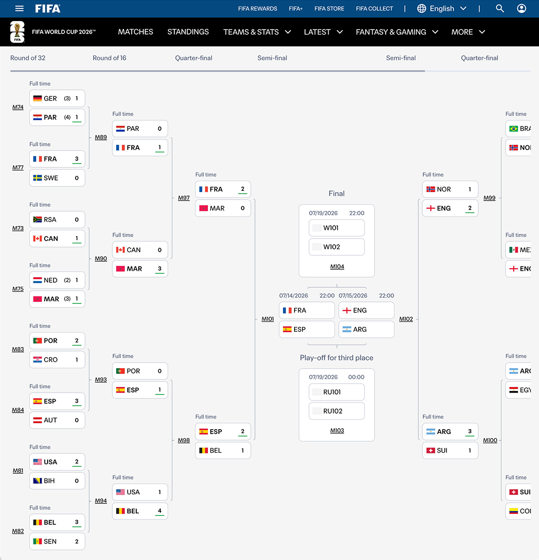
At tablet-like sizes, the layout is scrollable, but remains the same as on larger sizes.
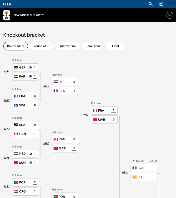
At the smallest size, all the rounds are left-aligned, from the round of 32 to the finals. For example, all the round of 32 teams are in the same column, not split between the left and right sides.
Building the layout
Before diving into my suggestion for the layout, I want to confirm the following:
- This is just a suggestion that might contain mistakes.
- I’m not handling the animations or the hover effects, as this article focuses on the layout only.
- I’m using an abstracted version of the names, so you might find
round of 8instead ofround of 32, but the idea is the same.
The first thing I thought about was using CSS Grid. I divided the layout into columns and rows.
The main grid
First, I defined a grid with a specific number of columns and rows.
.rounds {
  display: grid;
  grid-template-columns: repeat(8, minmax(30px, 1fr));
  grid-template-rows: repeat(4, 32px);
  gap: 0.5rem;
}
Here is the grid layout.
In this grid, we will need to position the start and end of each round at the opposite ends of the grid. How we can do that? CSS subgrid for the rescue!
Nesting rounds with subgrid
Thanks to subgrid, we can nest a grid on the inner items. That means we can have two children positioned at the start and end of the shared grid.
Let’s take the first round as an example. First, I want to make the round span the entire grid.
<div class="rounds">
  <div class="round round-of-8">
    <div class="start"></div>
    <div class="end"></div>
  </div>
</div>
.rounds {
  display: grid;
  grid-template-columns: repeat(8, minmax(30px, 1fr));
  grid-template-rows: repeat(4, 32px);
}

.round-of-8 {
  grid-column: 1 / -1;
  grid-row: 1 / -1;
}
Here is the current result. I highlighted the items with colors so we can identify the start and end items.
The .start and .end items are part of .round. What we want to do is make the .round-of-32 inherit the same grid, then place the .start and .end items where we need.
.round-of-8 {
  grid-column: 1 / -1;
  grid-row: 1 / -1;
  display: grid;
  grid-template-columns: subgrid;
  grid-template-rows: subgrid;
}
I added subgrid to both columns and rows, so now the .round-of-32 element inherits the grid from its parent.
It might not be totally clear, so here is a demo with controls you can play with. Change the grid-column-start and grid-column-end values to see how the nested grid behaves (Note: this will change the placement of the .round-of-32 element in the main grid).
<div class="rounds"><div class="round round-of-8"><div class="start"></div><div class="end"></div></div></div>
.round-of-8 {display: grid;grid-template-columns: subgrid;grid-template-rows: subgrid;grid-column-start: 1;grid-column-end: -1;grid-row: 1 / -1;}
Positioning start and end
Based on that, we can now position the .start and .end items where we need. For example, I want the .start element to be in the first column, and the .end element to be in the last column.
.start {
  grid-column: 1;
  grid-row: 1 / -1;
}

.end {
  grid-column: -2;
  grid-row: 1 / -1;
}
Here is what I did:
- Placed the
.startin the first column, spanning all the rows. - Placed the
.endin the last column using-2. I can manually set thegrid-columnto the actual line number (8), but if I do, I will need to change it every time the grid columns change.
Child items
<div class="rounds"><div class="round round-of-8"><div class="start"></div><div class="end"></div></div></div>
.start {grid-column: 1;grid-row: 1 / -1;}.end {grid-column: -2;grid-row: 1 / -1;}
Adding more rounds
Now that we have the layout working with the first round, it’s time to add more rounds and lay them out.
Here, I added the second round to the layout. For now, the child items are stacked, but we will fix that later.
.round-of-4 {
  display: grid;
  grid-column: 2 / -2;
  grid-row: 1 / -1;
}
The next step is to pass the parent’s grid to the .round-of-16 element again, then position the start and end items where we need.
.round-of-4 {
  display: grid;
  grid-template-columns: subgrid;
  grid-template-rows: subgrid;
  grid-column: 2 / -2;
  grid-row: 1 / -1;
}
Take a look at the following interactive demo where you can:
- Switch between rounds (the outlined round is the currently selected one)
- Once you switch, try changing the start/end values for the
.startand.enditems
Child items
<div class="rounds"><div class="round round-of-8"><div class="start"></div><div class="end"></div></div><div class="round round-of-4"><div class="start"></div><div class="end"></div></div><div class="round round-of-2"><div class="start"></div><div class="end"></div></div></div>
.round-of-8 {grid-column: 1 / -1;grid-row: 1 / -1;}.start {grid-column: 1;grid-row: 1 / -1;}.end {grid-column: -1;grid-row: 1 / -1;}
Did you see how using CSS grid and subgrid gives the layout so much flexibility? There is no need to place the child items into completely different wrappers. They can coexist in the DOM but look completely different in the UI.
Moving to real content
Adding match content
In the demo below, I added more content and items so we can explore a few details beyond the grid layout.
Take a look:
Nothing special here, I just added the teams, wrapped each two teams in a container (the match), and added unique colors for easier explanation.
Centering matches across rounds
Let’s center the match items vertically.
@container rounds (width > 680px) {
  .round {
    align-items: center;
  }

  .finals {
    justify-content: center;
  }
}
The problem with this is that the matches in different rounds are not aligned with each other, so if I need to draw a line between the matches, it will look off-center.
I added a connector between the round 6 and round 4 matches. The middle of the connector should be aligned with the middle of the first match in round 4.
Centering the matches with align-items: center is not working here. Let’s go back to the previous state. I added outlines to:
- Start and end containers
- Each match container
To make the centering work, we need to let each match take the available space equally with its siblings. We can do that by setting flexbox on the .start and .end containers, then using the flex property to distribute the space equally.
.start,
.end {
  display: flex;
  flex-direction: column;
}

.match {
  flex: 1;
  justify-content: center;
  outline: dashed 1px darkolivegreen;
  outline-offset: -2px;
}
Now the centering makes sense. Take a look at the following demo:
Making it responsive
To maintain the layout on smaller sizes, we need to keep it looking like a hierarchy. At this stage, there is no need to split the round into two columns; we can keep it as one column.
.rounds {
  display: grid;
  grid-template-columns: repeat(4, 1fr);
}
This will make the rounds flow naturally, from left to right (or from start to end if you prefer logical properties).
Toggle flex: 1 and see how the items will be centered vertically.
Putting it all together
The article’s main focus was on the grid layout, but there still so much to explore in this design. For example, how to handle the line connectors between the matches. If you like me to write about that, let me know on social media and I will consider it.
Learn more about CSS layouts
Building layouts can be a challenging task, specially if you don’t know the core mental model of CSS layouts. You don’t have to worry about that anymore. I released an interactive CSS layout course, and I called it, The Layout Maestro.
Checkout The Layout Maestro course and use the code fifa for $20 off. Available for a week from the date of this article.