The Layout Maestro
A message from the author!
I’m back again with some curiosity mixed with the discovery of Facebook messages. I got to see lots of work being done on the message bubbles only. If you ask a front-end developer about implementing a chat component, it might be tempting to quickly think that it’s simple and doesn’t have too many variations. This isn’t my first time digging into a component from Facebook, here is an article about the messenger card that I wrote earlier this year.
Once you dig deep into working with messages, you will need to tackle lots of details, especially for something large like Facebook. In this article, I will show you how the message bubble component was built with all of its variants, along with some interesting discoveries as well.
Introduction
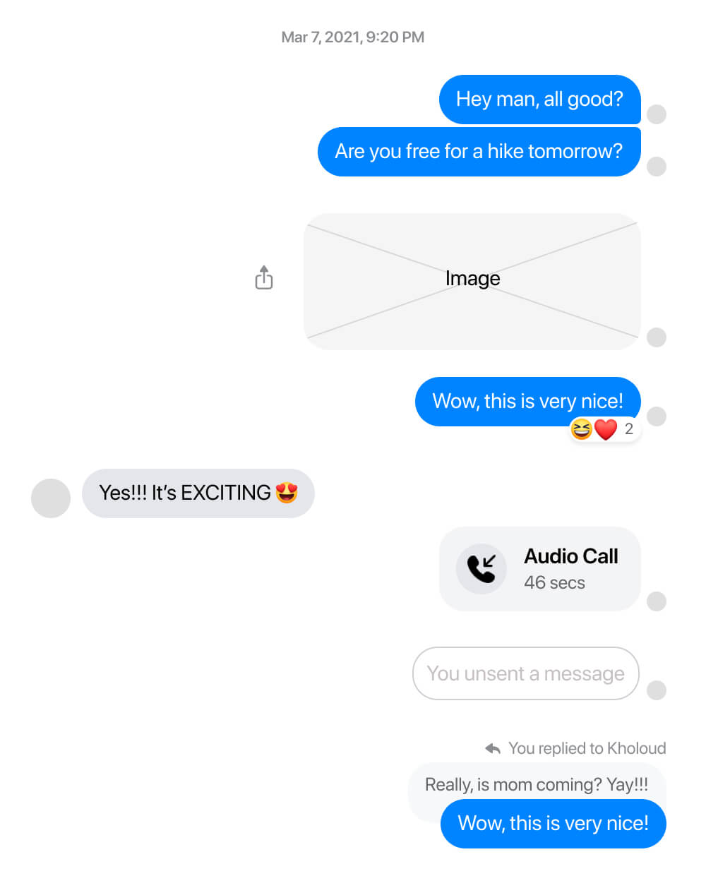
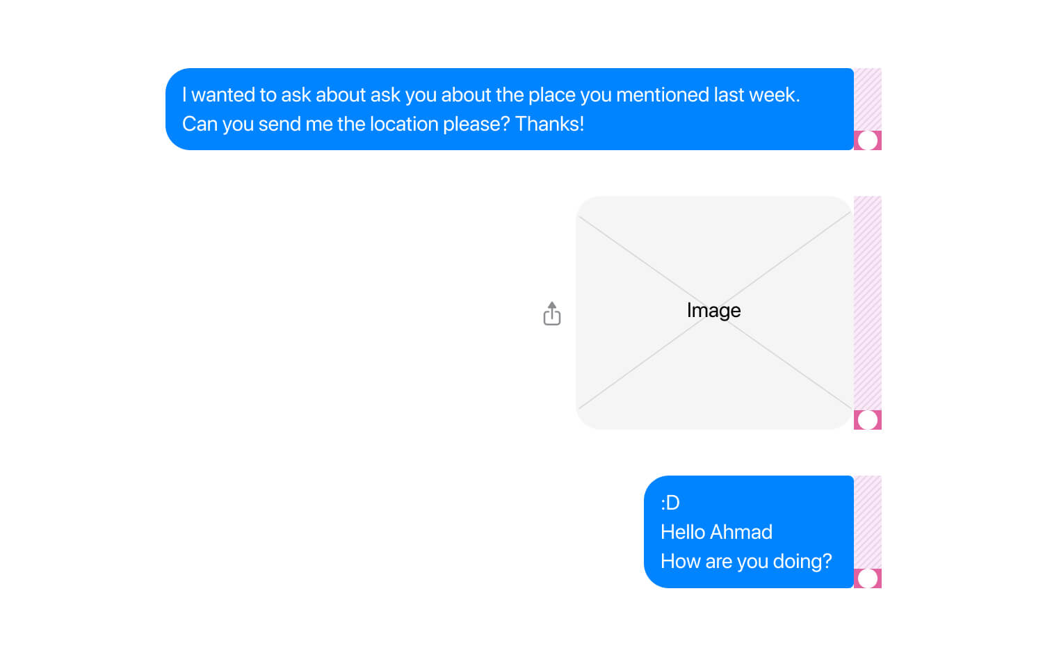
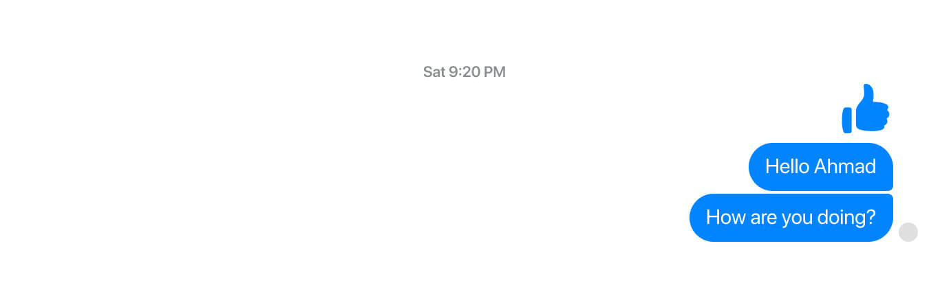
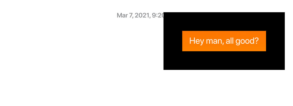
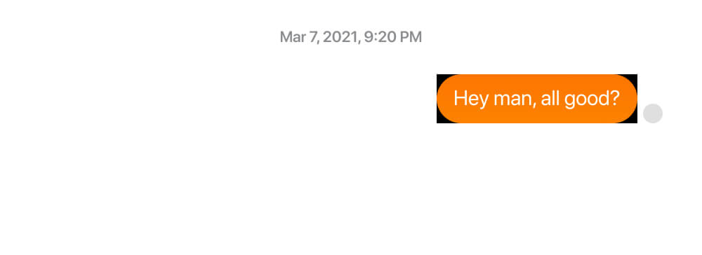
To give you a better context, the chat bubble component looks like the below figure.

At the first glance, it might look simple. However, you will discover the opposite when you dig in all its variations. I looked at all the variations and designed them in Figma to better understand the design choices.
Building the HTML and CSS for such a component is a challenging (and very interesting) job. In this case, the chat component should be dynamic to cope with the different content types, stats, bilingual support, and themes.
I won’t dig into all of them now to avoid confusion. Instead, I will show you the anatomy of a chat bubble.
The anatomy
I called it “The anatomy” because I enjoyed disassembling the UI. I literally imagined myself in a lab and looking at a microscope to see how it was built.
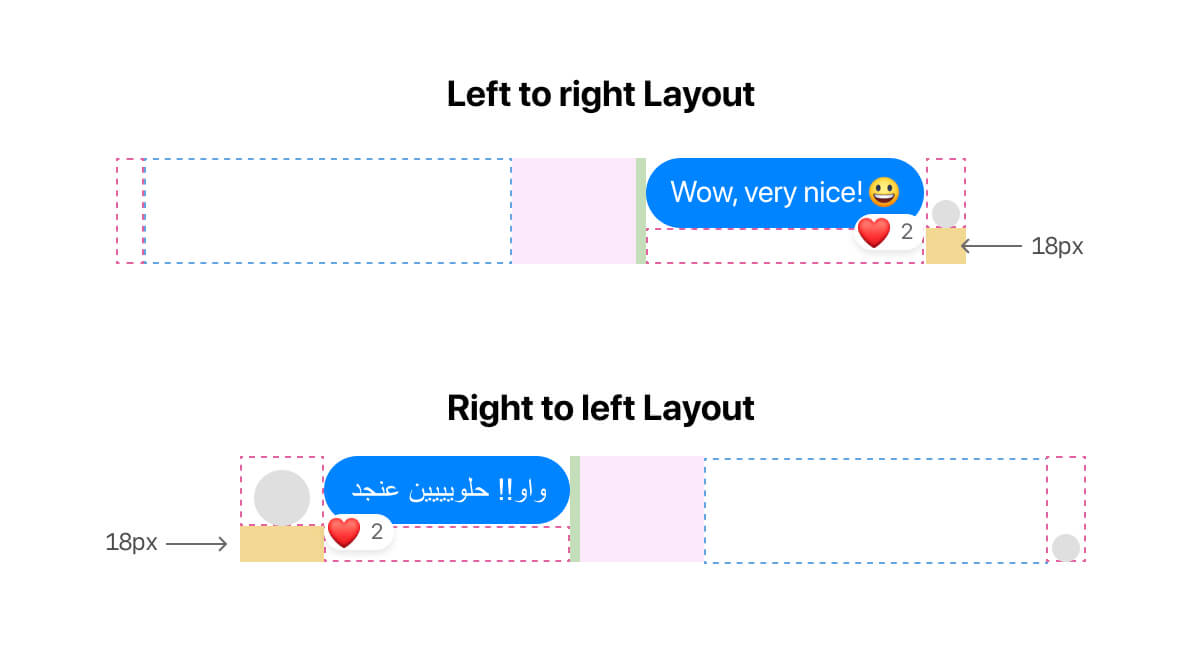
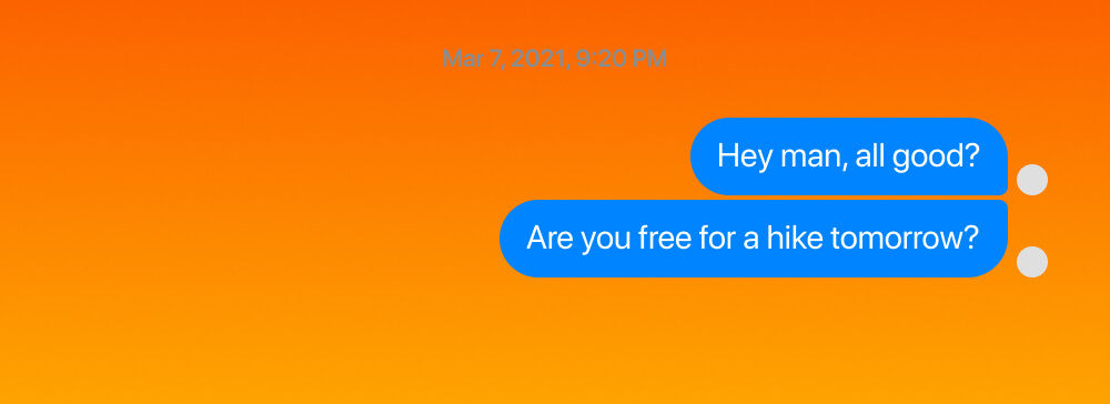
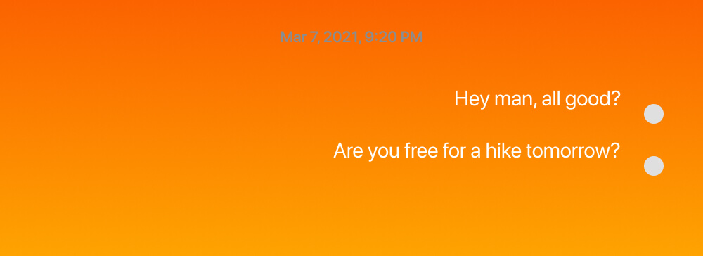
First, I want to point out an important thing. The structure differs between a message you sent and a message you receive.
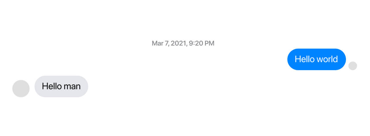
If you’re using an LTR (left-to-right) layout like English, then you are the blue bubble. The person you’re chatting with is the grey-ish one.
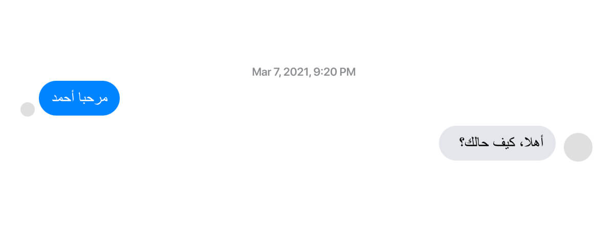
In case the layout is RTL (right-to-left) like Arabic, then it’s vice-versa. Consider the following figure:
With that being said, let’s get into the actual structure of the chat bubble component.
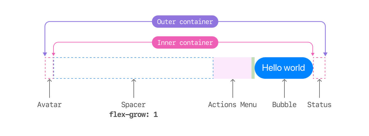
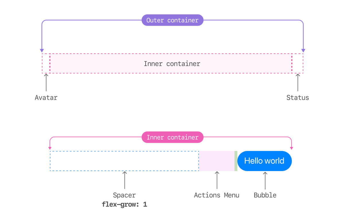
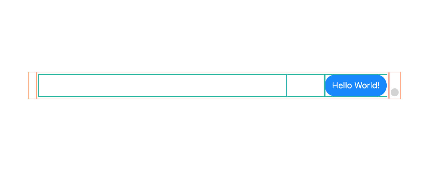
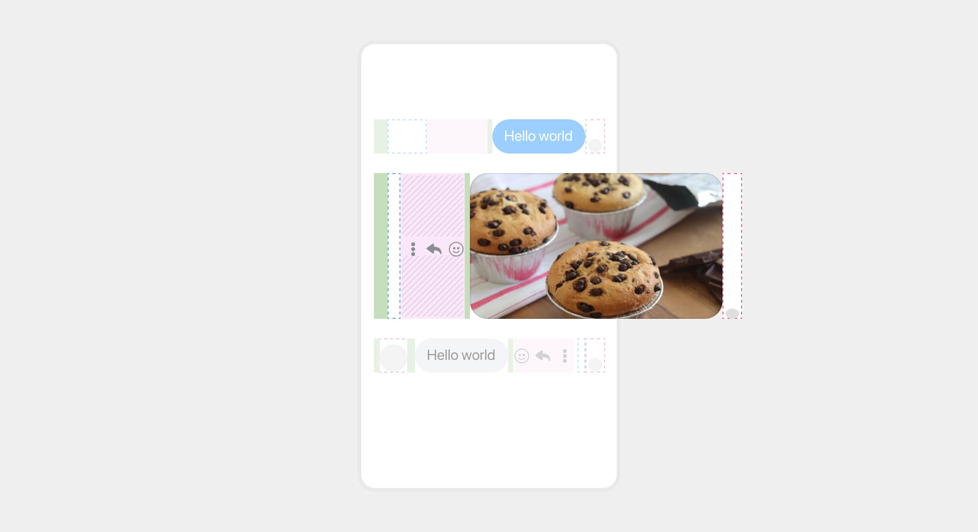
A chat bubble consistent of the following:
- An outer container that has three descendants: the status, the message, and the avatar.
- An inner container that has two descendants: the chat bubble itself, the action menu, and a spacer element.
To make it even clearer, here is the same figure above but with separated containers.
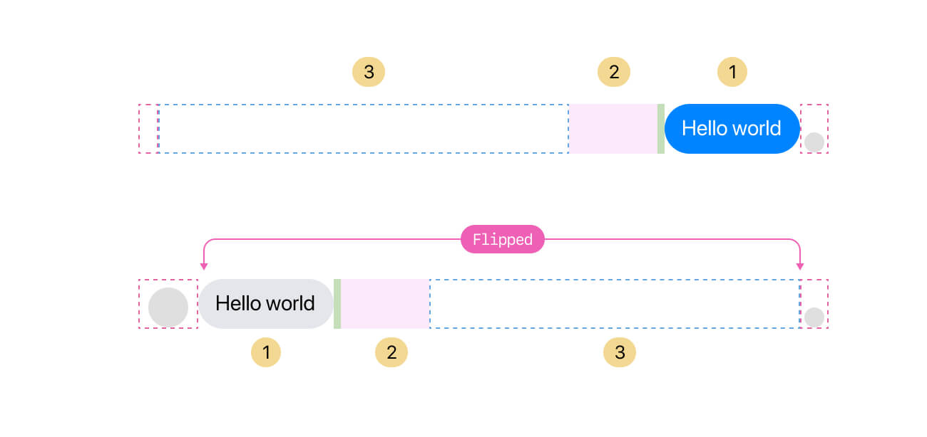
You might be wondering about the avatar, why it’s so small? And where is the avatar? That’s a good question.
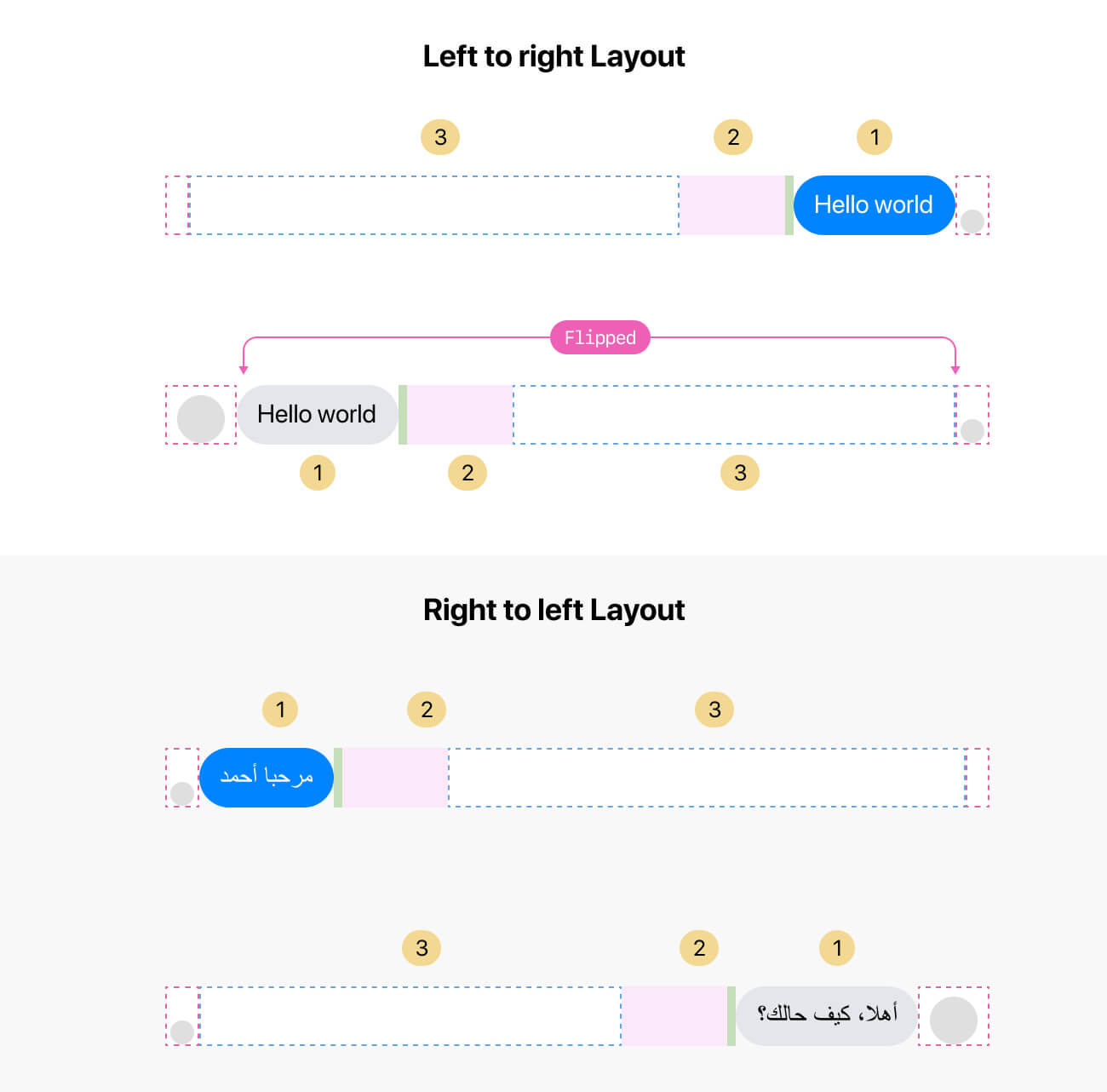
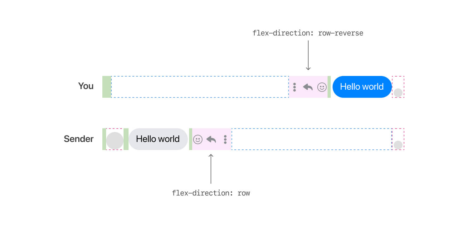
The above anatomy is for a message viewed as you. If you receive a message, it will be flipped. To avoid building a different component for the flipped message, here is what I found.
The first and last items (The avatar and status) don’t flip based on who is sending the message. They only flip if the language direction changes (e.g: LTR vs RTL). Here are a few notes:
- The avatar place is reserved, even if it’s not there. If you are sending a message, then the avatar place will be empty.
- However, when someone sends you a message, the avatar place will be filled with an image.
- The UI that flips is the middle element (The inner container) which contains the chat bubble, actions menu, and the spacer component.
What’s also powerful about this is that it works perfectly for RTL (right-to-left) layouts as well. Note that the outer container reverses automatically in RTL based on the page direction.
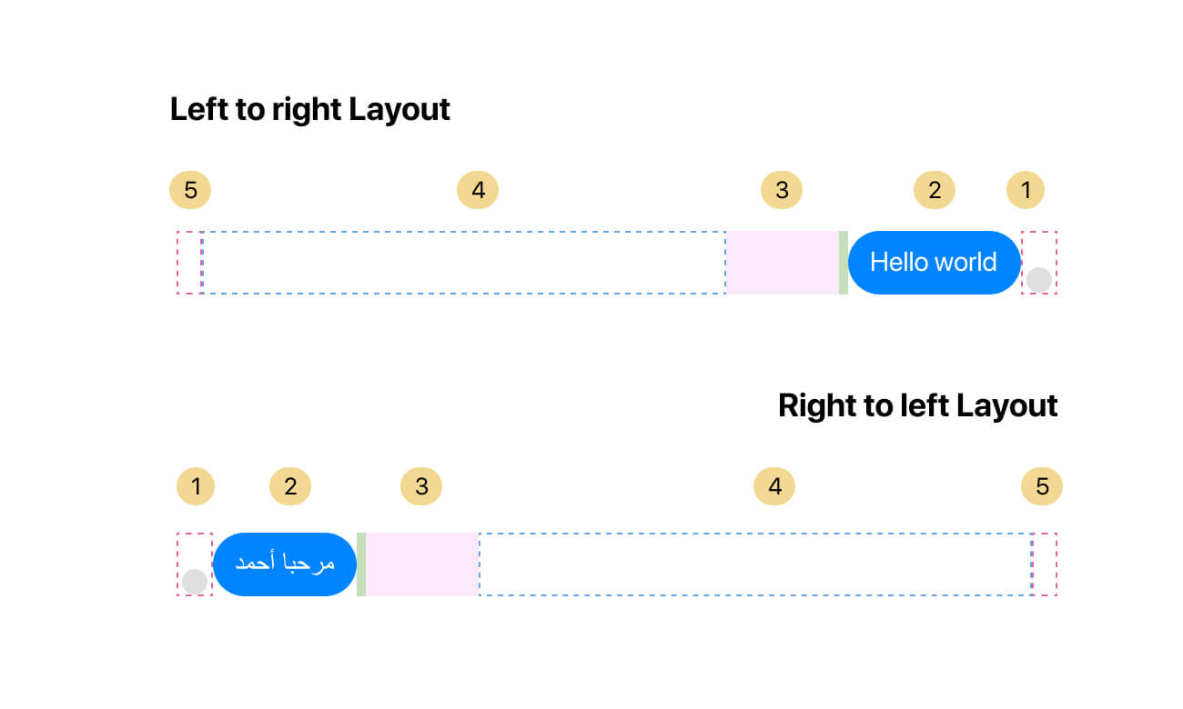
With that, here is a figure that shows how the message outer and inner container look on LTR vs RTL layouts.
I tried to explain the above without assuming that you know HTML & CSS. In the following section, you will learn how to implement the structure explained above so we can explore the different variations along the way.
The basic HTML & CSS
Here is how the basic HTML looks like for the message.
<div class="message">
  <div class="message__outer">
    <div class="message__avatar"></div>
    <div class="message__inner">
      <div class="message__bubble"></div>
      <div class="message__actions"></div>
      <div class="message__spacer"></div>
    </div>
    <div class="message__status"></div>
  </div>
</div>
And the basic CSS:
.message__outer {
  display: flex;
}

.message__inner {
  flex: 1;
  display: flex;
  flex-direction: row-reverse;
}
With this basic structure, we have the following result (I added outlines to make it more clear.

With that, we can move on to style the layout of the inner parts. We have the message, actions menu, and the spacer element.
.message__actions {
  width: 67px;
  padding-right: 5px;
}

.message__spacer {
  flex: 1;
}
I think the reasons for adding a fixed width to the actions menu are:
- Reserving a space for it to avoid layout shift.
- To have better control over the inner layout. For example, the chat bubble should have a
max-width. We might need to deduct the actions menu width from it.
To make sure that things won’t break on smaller sizes, we need to take care of the following:
- Accounting for the case when the spacer collapse due to the lack of space.
- Preventing the message actions from shrinking in smaller sizes.
- Avoid overflows by breaking very long words.
.message__bubble {
  max-width: calc(100% - 67px);
  overflow-wrap: break-word;
}

.message__actions {
  flex-shrink: 0;
}
Next, I will dig into styling the status and the avatar areas (Those are direct descendants of the outer container).
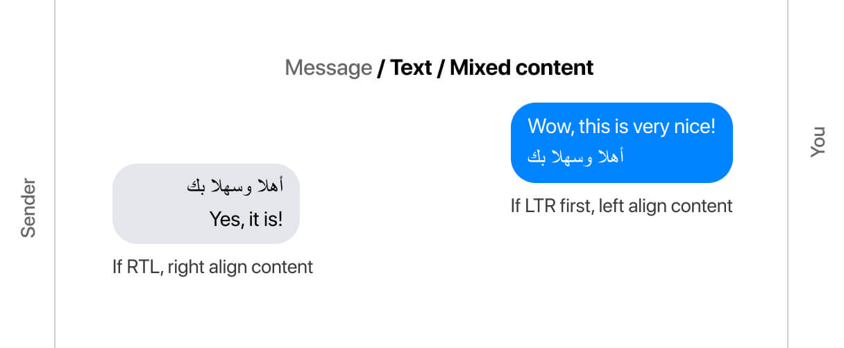
Handling mixed content
It’s worth mentioning that the message bubble can handle mixed content by using the dir=auto HTML attribute.
<div dir="auto"></div>
If the first text was written in RTL language (e.g: Arabic), the text will read from right to left, even if you enter LTR text after that.
If you enter text in LTR (e.g: English), then the text will read from left to right.
Styling the status area
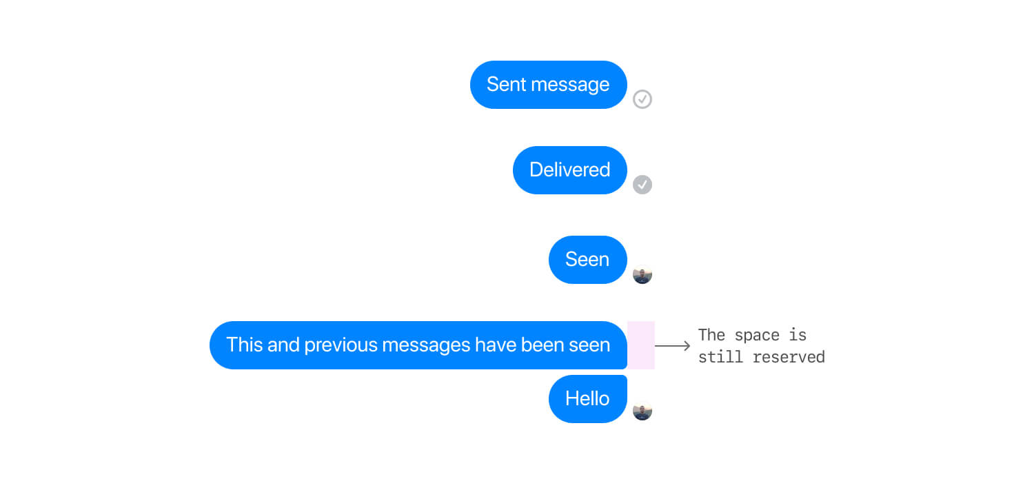
The message status element is a wrapper that might contain different status badges. Let’s take a zoomed-in look at it.
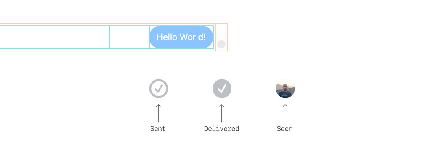
That container can have different status elements like sent, delivered, and seen. See them below:
Here is a detailed look at the markup:
<div class="message__status">
  <span class="avatar"></span>
</div>
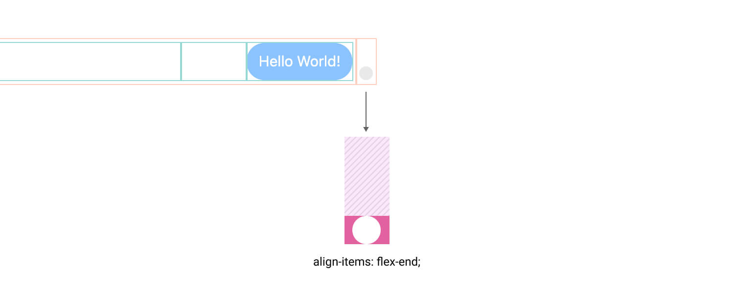
The status container uses flexbox to align the child element to the bottom. Notice that the flex-direction value is column.
.message__status {
  width: 20px;
  display: flex;
  flex-direction: column;
  align-items: center;
  justify-content: flex-end;
}
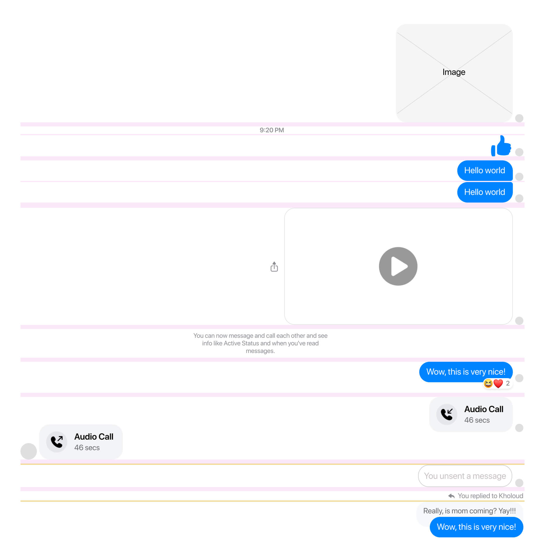
That way, the child element will always be at the bottom, even if the message height is too large. Having this is important in cases like writing a very long message, adding a new line, or sending an image.
If you use Facebook, you might probably notice how the seen badge works per message. When you send a message and the person sees it, the seen avatar will be there. Once you send another message, the status will become empty but its place will stay reserved.
Here is a figure that shows the states in action:
Styling the sender avatar
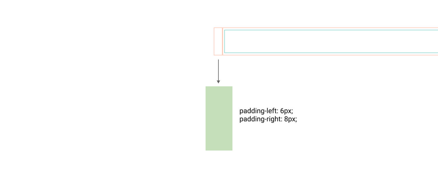
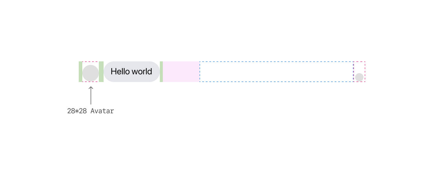
By default, the avatar wrapper has horizontal padding to reserve a space for the avatar. It’s empty in case you are sending a message, while it will have the user avatar in case you get a message from someone.
<div class="message__avatar">
  <img class="avatar" src="ahmad.jpg" alt="Photo of Ahmad Shadeed" />
</div>
.message__avatar {
  padding-left: 6px;
  padding-right: 8px;
}
When the avatar wrapper is empty, the width will be 14px (The sum of 6px + 8px padding values).
In the case of viewing a message from someone, there will be an avatar with the size of 28*28.
To make it even clearer, here is a comparison between the avatar wrapper, viewed from the perspective of you and the sender.
Styling message actions
Each message can have a set of actions that appears on hover like:
- React with an emoji
- Reply/Quote a message
- Share (For images and videos)
- More menu (With dots)
Here are a few notes about that menu:
- It has padding on the right, in case you are sending the message. Otherwise, the padding is on the left.
- It’s flipped for you with
flex-direction: row-reverse, and the default ordering for the sender message.
One particular thing that makes me happy is that the heavy usage of flexbox. I really, really like that!
Here is a figure that shows how the actions menu is flipped depending on the message direction (You vs Sender).
If the message is too long, or it’s an image or a video, then the actions menu should be vertically centered. That is possible by using flexbox alignment.
<div class="message__actions">
  <ul class="menu"></ul>
</div>
.message__actions {
  display: flex;
  flex-direction: column;
  justify-content: center;
  align-items: center;
  width: 67px;
  padding-right: 5px;
}

Why that works? When the message has a long text or an image, the .message__actions element will stretch to fill its parent height. This is the default behavior of flexbox and we can get benefit from it to center the menu vertically.
Now that I explained the basic chat bubble, let’s get into the variations of it.
Multiple bubbles
If we send multiple bubbles at once, we will have three different roundness states, and they differ for the you and the sender (the person you’re chatting with).
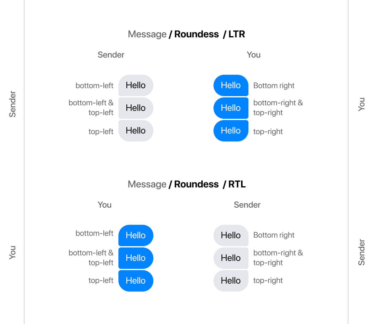
Adding on that, they will flip based on the page direction (LTR vs RTL). I wish that the support for border-radius logical properties is good enough to be used. The logical values for border-radius got supported in Chrome v89 (Came out on 1 March 2021).
If the support was there, they will be used like the following.
/* You, blue messages */

/* First message */
.message--first .message__bubble {
  border-end-end-radius: 4px;
}

/* Middle message */
.message--middle .message__bubble {
  border-start-end-radius: 4px;
  border-end-end-radius: 4px;
}

/* Last message */
.message--last .message__bubble {
  border-start-end-radius: 4px;
}
I know, the double values like end-end might be confusing at first, but I will try to explain them in the next figure. We have two axes (Block and inline), each one has start and end values.

When the layout is RTL (Right to left), the inline start and inline end will flip. That way, we don’t have to override the radius and change its direction. Notice how in the following figure, the Inline Start and Inline end are flipped.

If you want to learn more about CSS logical properties, here is an article I wrote a while ago.
Handling Images
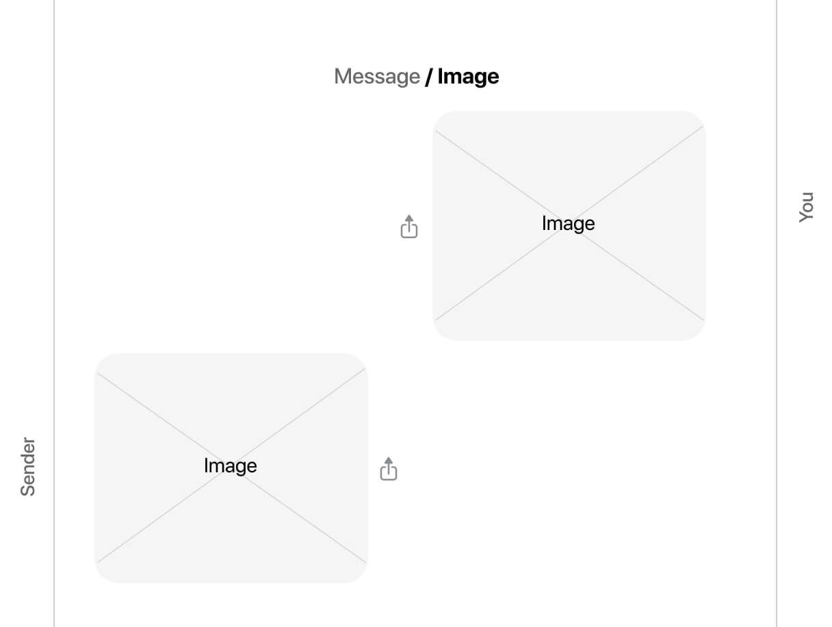
At first glance, you might think that the work needed to handle different sizes and aspect ratio of images is an easy task. You might just need to add max-width: 100% and call it a day, right? That isn’t the case for Facebook.
When the user uploads an image, its width is added as an inline CSS, and there is also like padding-bottom: 56.66% to handle the responsivity of the image (The padding hack).
<a class="image" href="#">
  <div class="image__main">
    <div class="image__element" style="width: 348.259px; ">
      <div
        class="image__aspectRatio"
        style="padding-bottom: 57.4286%"
      >
        <div class="image__wrapper">
          <img src="assets/thumb-1.png" alt="" />
        </div>
      </div>
    </div>
  </div>
</a>
.image {
  display: block;
  border-radius: 18px;
  border: 1px solid #0006;
  overflow: hidden;
}

.image__main {
  max-width: 480px;
}

.image__element {
  max-width: 100%;
  position: relative;
}

.image__aspectRatio {
  position: relative;
}

.image__wrapper {
  position: absolute;
  top: 0;
  right: 0;
  bottom: 0;
  left: 0;
  width: 100%;
  height: 100%;
}

.image__wrapper img {
  display: block;
  max-width: 100%;
  max-height: 200px;
  width: 100%;
  height: 100%;
}
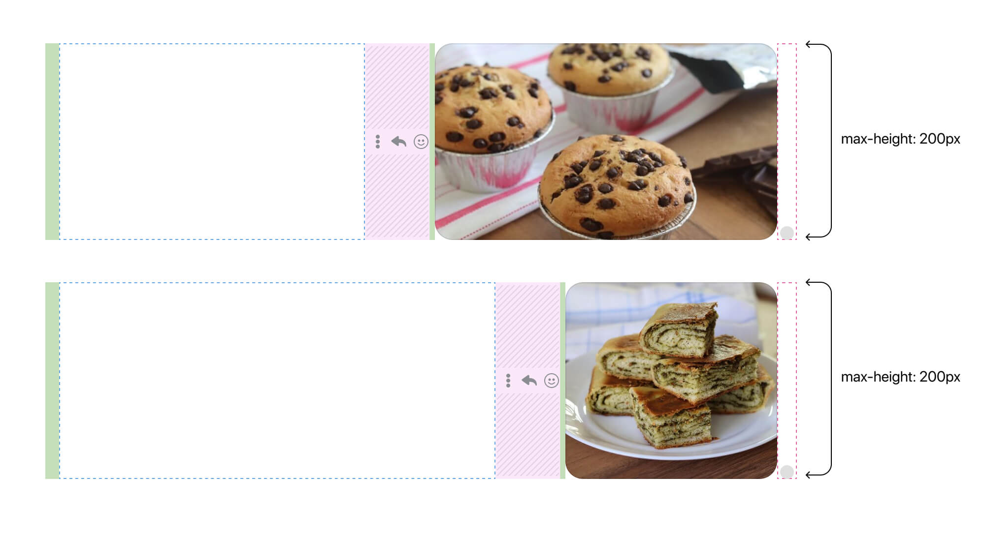
Here are the rules that each image should follow:
- The maximum width is
480px - The maximum height is
200px - An image should stay in the same aspect ratio when resized
- If the image is smaller than the maximum values, then we display it as it is
What’s cool about how the team implemented this is that the aspect-ratio is generated on the fly, based on the image used.
Adding on that, it’s important to keep in mind that flexbox won’t shrink flex items below their minimum content size. That means, if you resize the browser to a specific width, the flex item won’t shrink below its minimum content size. To fix that, we need to add min-width: 0.
In my demo code, the flex item is a direct child of message__outer, which is message__row in our case.
.message__row {
  min-width: 0;
  /* other styles */
}
Here is how it should look when everything works as planned.

Finally, some might argue on why to get the fixed width of the image and add it as inline CSS? Every small decision has a valid reason. I guess this is related to an image being loaded. Otherwise, we will notice layout shifts if we don’t set a fixed size for the image.
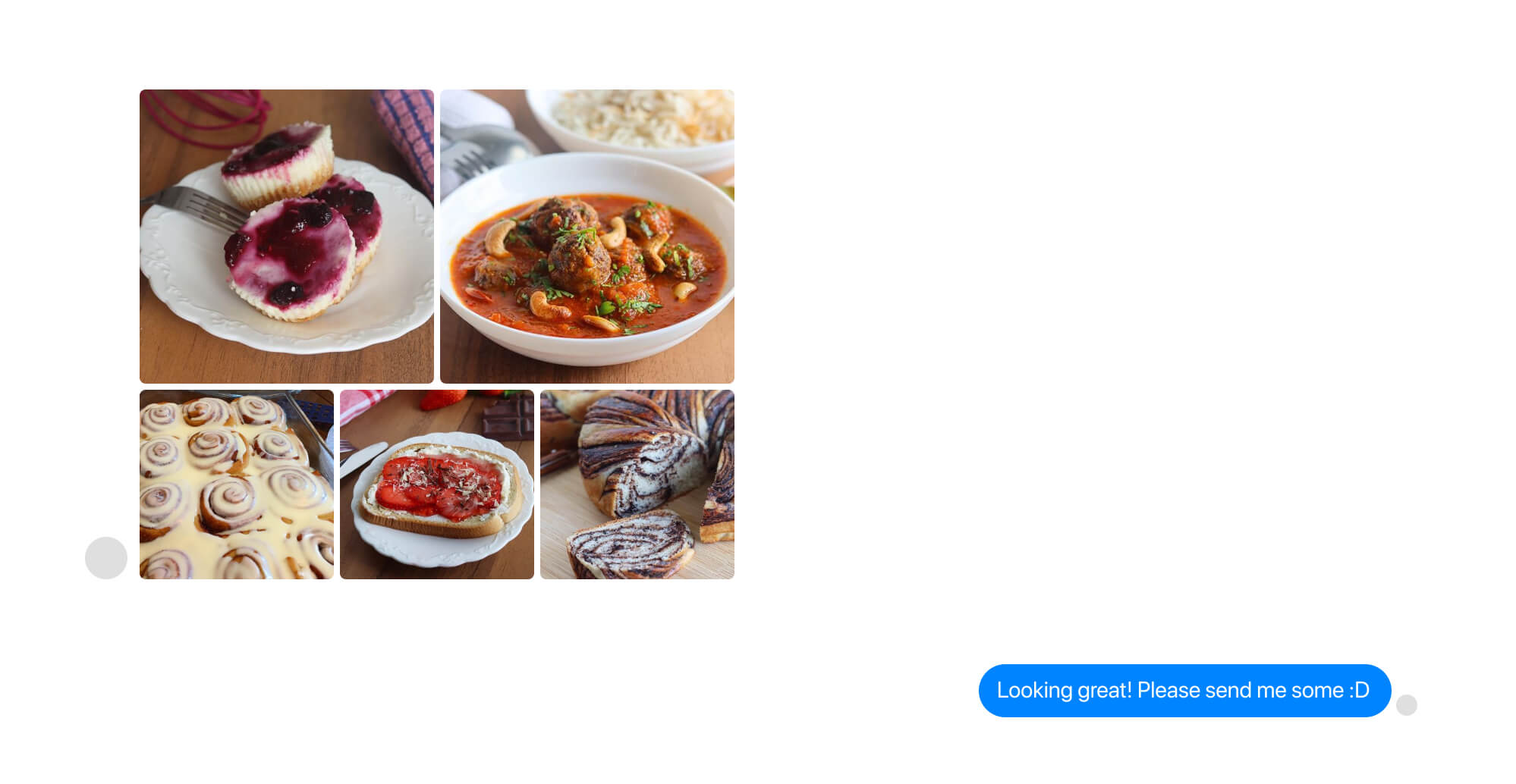
Handling multiple images
If you send multiple images, their aspect ratio won’t be respected. Instead, each image will be contained within a square and object-fit will do the magic to avoid distorting or stretching them.
.gallery {
  display: flex;
  flex-wrap: wrap;
  flex: 1;
  /* Revert the padding to make the gallery aligned
    with its siblings. */
  margin: -2px;
}

.gallery__item {
  /* Add a 2px offset around each image, will result in 4
    for two adjacent images. */
  padding: 2;
}

.gallery__item--third {
  flex: 33.33%;
}

.gallery__item--half {
  flex: 50%;
}
Here is what’s happening:
- The image grid is built with CSS flexbox.
- Depending on the number of images, an image either get a width value equal to the third or half of its flexbox container.
- The spacing is handled via padding on each image parent.
- To avoid unnecessary spacing around the edges of the gallery, a negative margin value equal to the
paddingshould be used on the flex container.
I want to emphasize the use of padding: 2px for the spacing between each item. It’s even more useful in that case because it works in both LTR and RTL directions.
If you want to learn more about spacing in CSS, here is an article that I wrote a while back.
Quoting a message
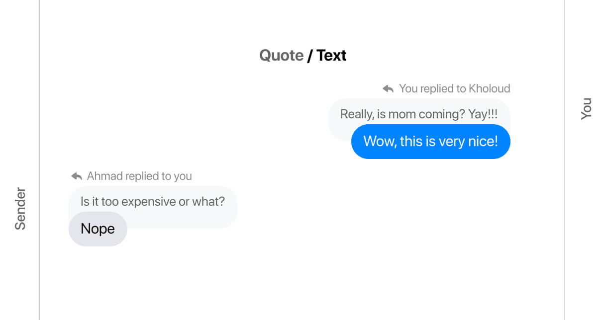
A quote message consists of three main parts:
- A header shows who replied to whom (E.g: You replied to Ahmad)
- The quoted message with a different style
- The quote itself
Let’s take a closer look at the anatomy of the quoted message.
The first part is straightforward. For the quoted message, it’s very similar to the bubble chat component, but it doesn’t have elements like actions, status.. etc.
The message (in grey) has a large padding-bottom along with a negative margin-bottom value to move the quoted message up. Finally, it has a zero radius on the bottom-right corner.
.message--washed {
  border-bottom-right-radius: 0;
  padding: 8px 12px 9px;
  margin-bottom: -17px;
}
And the part that has the padding is the text itself.
.message--washed__text {
  padding-bottom: 12px;
}

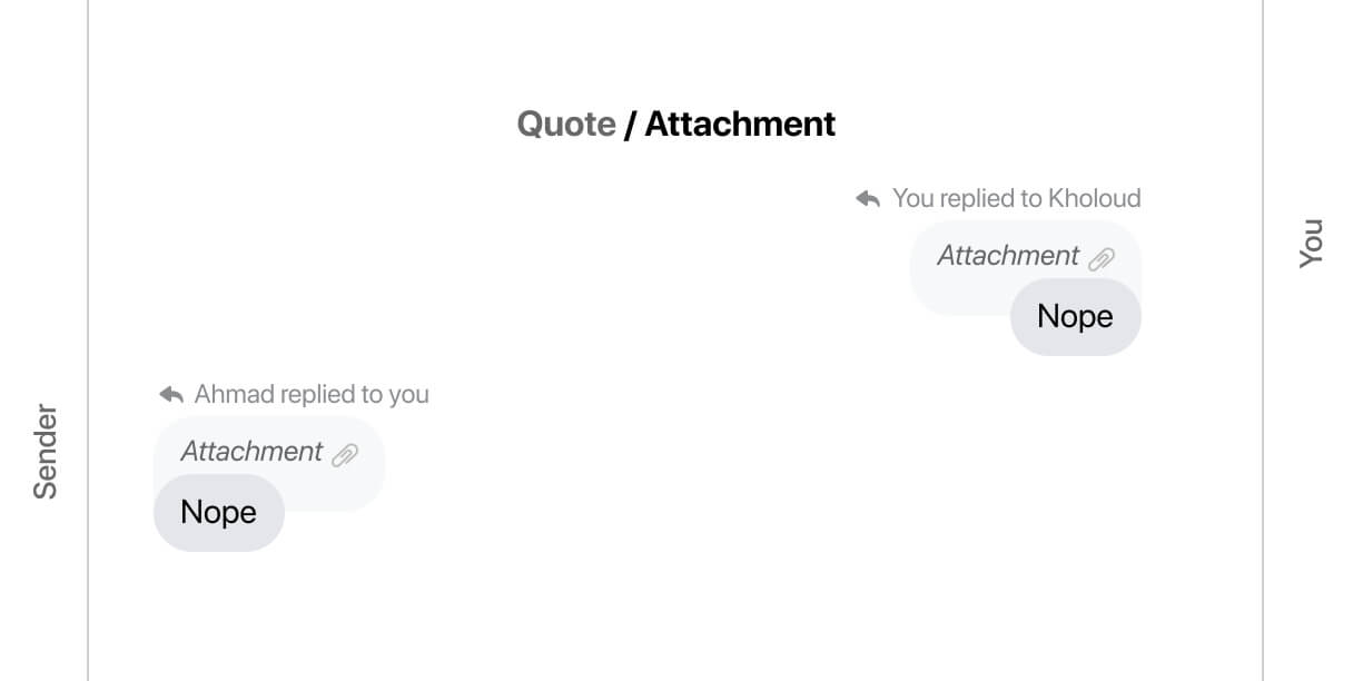
The same thing applies when an image is quoted. It looks like the following figure:
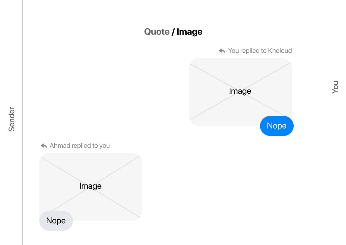
And also quoting an attachment (Like a voice message or a video):
Reactions
A reaction is when a user reacts to a message with an emoji. The reaction is added as a row under the original message.
Consider the following figure.

<div class="message">
  <div class="message__outer">
    <div class="message__avatar"></div>
    <div class="message__inner">
      <div class="msg-bubble-wrapper">
        <div class="message__bubble"></div>
        <div class="reaction">
          <div class="reaction__content">
            <img src="assets/heart.png" alt="" />
            <img src="assets/smile.png" alt="" />
            <span class="count">2</span>
          </div>
        </div>
      </div>
      <div class="message__actions"></div>
      <div class="message__spacer"></div>
    </div>
    <div class="message__status"></div>
  </div>
</div>
The element that is being pushed upwards is the reaction content, not the parent.
.reaction__content {
  display: flex;
  align-items: center;
  background-color: #fff;
  border-radius: 10px;
  padding: 1px 1px 1px 3px;
  box-shadow: 0px 2px 4px rgba(0, 0, 0, 0.1);
  transform: translateY(-7px);
}
Also, to position the elements at the start of its parent, we need to align them with flexbox from the parent level. This has to be the opposite for RTL (right-to-left) layouts.
.msg-bubble-wrapper.with-reaction {
  display: flex;
  flex-direction: column;
  align-items: flex-end;
}
To keep the avatar aligned with the bottom of the message, I noticed a div with a height of 18px to act as a spacer element.
<div class="message__status">
  <img src="avatar.jpg" alt="" />
  <div style="height: 18px;"></div>
</div>
or this, if it’s for the sender message.
<div class="message__avatar">
  <img src="avatar.jpg" alt="" />
  <div style="height: 18px;"></div>
</div>
Messages list markup
The markup for the list of messages is interesting. There is a div with role=grid and aria-label="Messages in conversation with Ahmad Shadeed".
Within that, each message has role=row, and inside each message row, there is the main element with gridcell.
<div
  class="mw_message_list"
  role="grid"
  aria-label="Messages in conversation with Ahmad Shadeed"
>
  <div role="row">
    <div role="gridcell" tabindex="0"></div>
  </div>
  <div role="row">
    <div role="gridcell" tabindex="0"></div>
  </div>
  <!-- other messages -->
</div>
We aren’t done yet. In each message, there is a visually hidden element that says “You sent” or “Person sent”, depending on who sent the message.
<div role="row">
  <div role="gridcell" tabindex="0">
    <h4 class="sr-only">You sent</h4>
    <!-- other elements -->
  </div>
</div>
What I noticed here is that one of the CSS properties used for hiding the text visually is clip-path: inset(50%).
Here is the full properties used:
.sr-only {
  position: absolute;
  height: 1px;
  width: 1px;
  overflow: hidden;
  clip: rect(0px, 0px, 0px, 0px);
  clip-path: inset(50%);
}
Spacing between messages
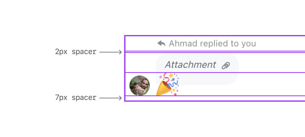
Now that you know how the markup looks for each message row, let’s go into how the spacing is handled between messages. The spacing is handled via spacer components, not margins or anything else.
Each message row will have either a spacer with 2px height, or 7px, or both in some cases. In the following figure, the pink elements are 7px spacers, and the yellow one is 2px spacers.
The top-level container of each message is a flex container with column direction.
For instance, here is a screenshot of a quoted message. It has both spacers. Also, the top-level parent is a flexbox container with flex-direction: column.
Dividers / Separators
A divider can either have a text or a time. I will focus on the time one for the article.
When you chat with someone after a while, you will notice that there is a centered element with a day and time.
The markup for the day and time is interesting. Here it is:
<h2>
  <div class="sr-only">October 28 at 6:12 PM</div>
  <div aria-hidden="true">Thu 6:12 PM</div>
</h2>
The first one is for screen readers. You can tell that from the sr-only class (Hint: they are using utility classes and I added sr-only for clarity purposes). The second one is hidden from screen readers and is meant to be displayed visually. Interesting, no?
Custom theming
Even though I see this product feature unnecessary thing to do. In short, The user can customize the color of their messages to gradient colors.

When the user browses the messages, the gradient will look like it’s being animated on scroll. Here is a video:
From the first glance, you might think that this is done via Javascript and each message has a custom background image that changes its position based on scrolling, but no. This is all in CSS, and I will tell you how.
The gradient you saw is added to the messages container background. That means, the whole white background you see between the messages will be colored. Consider the following figure:
.messages-parent {
  background-color: #3a12ff;
  background-image: linear-gradient(#faaf00, #ff2e2e, #3a12ff);
}
The next step is to remove the background color and border-radius from each message bubble. (Yes, you read that right).
Next step, we need to add a white background to literally everything in the UI except the chat bubbles. (Again, you read that right).
.message__actions,
.message__status,
.spacer-xs,
.spacer-lg,
.message__spacer,
.message__avatar {
  background-color: #fff;
}
And to prove that, here is me inspecting Facebook and breaking the theming. Notice that when I changed the background to a gradient, there are too many elements that got affected by that. All those elements should be in white, to cover the gradient.
Now that we’ve isolated the chat bubbles, how can we add the rounded corners back? pseudo-elements to the rescue.
.custom-theming .message__bubble {
  position: relative;
  border-radius: 0;
  background: transparent;
}

.custom-theming .message__bubble::after {
  content: "";
  position: absolute;
  left: -36px;
  right: -36px;
  top: -36px;
  bottom: -36px;
  border: 36px solid #fff;
}
With the above, we’ll have the following result:
Next, we need to edit the corners. How we can create an inner rounded corner? Well, it turned out that the inner corner is based on the following formula:
Inner radius = border-radius - border-width
That means, even if add border-radius: 36px to the above, the inner corner will still be zero. Without the custom theming, the border-radius is 18px. To reflect that on the inner radius, we need to increase the border-radius for the pseudo-element.
Inner radius = 54px - 36px = 18px
.custom-theming .message__bubble {
  position: relative;
  border-radius: 0;
  background: transparent;
}

.custom-theming .message__bubble::after {
  content: "";
  position: absolute;
  left: -36px;
  right: -36px;
  top: -36px;
  bottom: -36px;
  border-radius: 54px;
  border: 36px solid #fff;
}

Finally, we need to contain the pseudo-element within the message bubble wrapper.
.custom-theming .message__bubble {
  position: relative;
  border-radius: 0;
  background: transparent;
  overflow: hidden;
}
The final step is to change the border-color to white, as nothing happens.
In case you’re still wondering how the on-scroll animation happens for the messages, it’s via background-attachment: fixed. Not only that but there is also a 2px border on the sides with white color. I think this is on purpose to make it work with the custom theming background.
.messages-parent {
  background-color: #3a12ff;
  background-image: linear-gradient(#faaf00, #ff2e2e, #3a12ff);
  background-attachment: fixed;
  border-left: 2px solid #fff;
  borfer-right: 2px solid #fff;
}
Conclusion
It was an interesting journey to dig into how Facebook messages was built. I enjoyed the process very much. Here are some key takeaways:
- CSS flexbox is the best thing that happened to UI design.
- Don’t underestimate if building a component is easy or not by only looking at one variation.
- Frankly, I didn’t expect to write that much about that topic. When I started, I thought like “Hey, this is gonna be a quick write-up”. I was wrong, and I’m happy about that.
- In some way, you need to trade off some things. For example, the theming on scroll thingy can totally be done via Javascript, but the team opted-in for a CSS only solution, and I think it’s for performance reasons.
- Working on an international product means that we need to handle different language directions from the start, and I enjoyed seeing these things in their work, specially that I wrote a guide about RTL styling.
That’s the end. If you’ve reached here, thank you very much.
Do you have feedback or a comment? Please feel free to ping me via Twitter @shadeed9.
