I like it when people share what they wish for CSS. In the last few weeks, I read two awesome wishlists by Dave Rupert and Eric Meyer. In 2022, we got many new CSS features, my favorite of them are container queries, CSS :has, and subgrid.
I thought about brain-dumping all the things that I want CSS to have one day.
Flex wrapping detection
When I use flex-wrap: wrap, sometimes I wish there is a way to detect if the flex items are wrapped into a new line.
For example, say I have a section header that contains a title and a link. We can make this little component responsive with flex-wrap: wrap. The cherry on top will be to know when the items wrap into a new line.
I might need to add switch the position of a visual effect. For example, a border that is on the bottom by default, and is on the left when the times are wrapped.
.section-header {
  display: flex;
  flex-wrap: wrap;
}
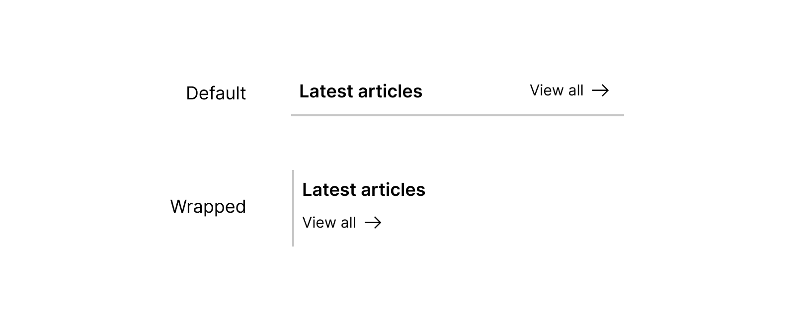
Currently, we can’t detect when the items are wrapped. The only way is by using media queries to do the changes we want.
I wish we can have something like this:
.section-header {
  container-type: style flex-wrap;
  display: flex;
  flex-wrap: wrap;
}

@container style(wrap) {
  /* do the things you should do when the flex items are wrapped. */
}
The above isn’t the best readable CSS syntax, but you get the idea.
Flexbox gap support
Currently, there is no way to test if gap is supported when used with a flexbox container.
I haven’t dinged into the reason(s) but it’s a bummer. I want to check with @supports, just like this:
@supports (gap: 10px) {
  .element {
    display: flex;
    gap: 10px;
  }
}
The above doesn’t work now.
Logical CSS gradients
CSS logical properties are great for building multilingual websites. Since Arabic is my native language, I build lots of right-to-left experience, and each time I use logical properties, I wish we have them in gradients.
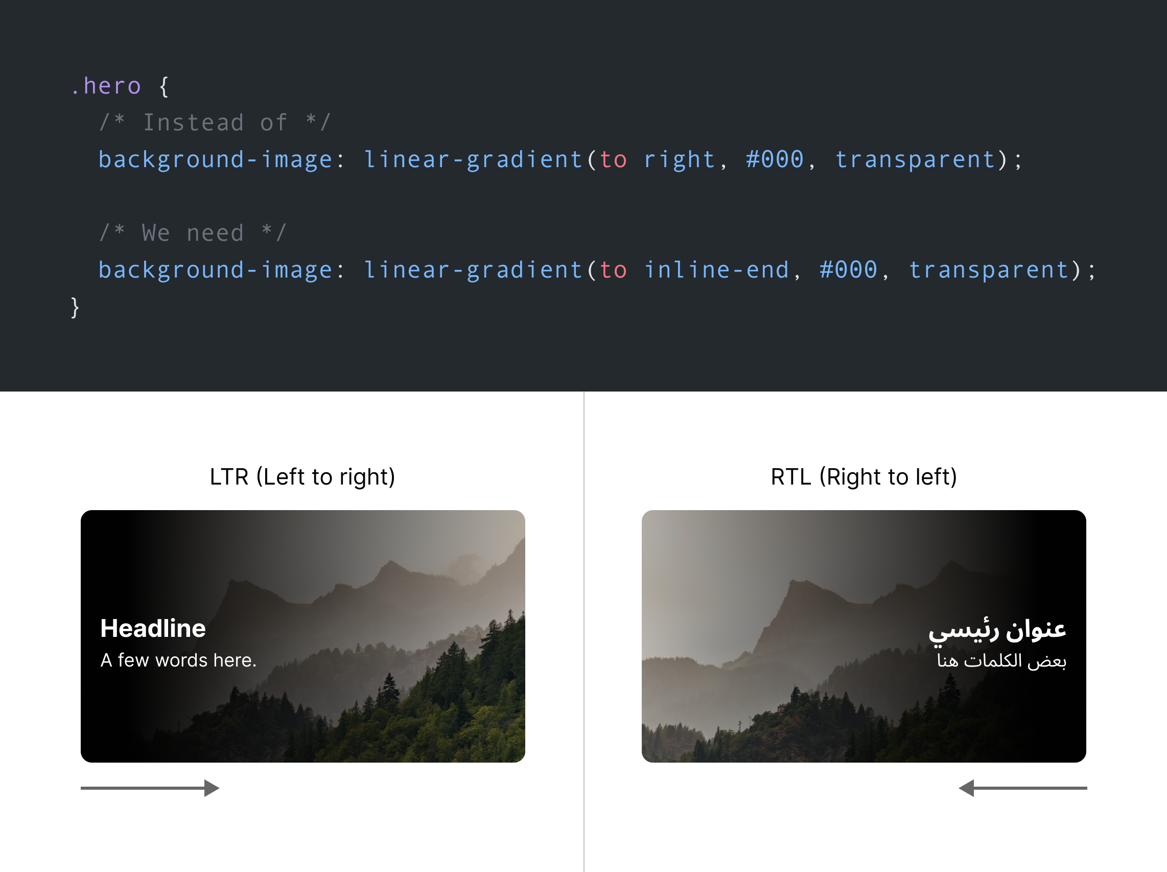
Can we get that, please?
.hero {
  background-image: linear-gradient(to inline-end, #000, transparent);
}
Detect when sticky is active
I can think of a simple usage where I want to know when position: sticky is active. In other words, when an item is stuck.
.site-header {
  position: sticky;
  top: 0;
}

.site-header:sticky {
  box-shadow: 0 3px 5px 0 rgba(0, 0, 0, 0.1);
}
Easing gradients
Let’s face that, CSS gradients on their own don’t look smooth. Each time I use one, I have to modify it to have a bit of easing.
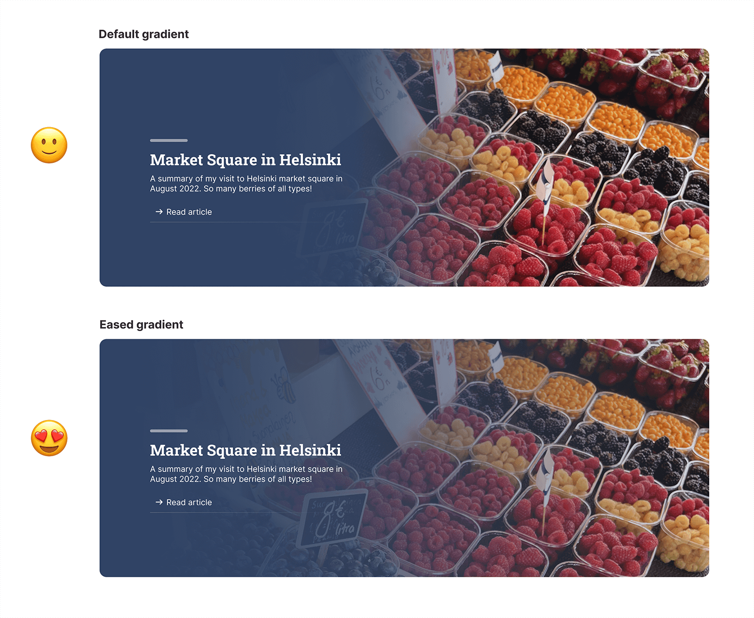
I rely on this great tool to generate eased gradients.
.hero {
	linear-gradient(to bottom, #304365, ease-in-out, transparent);
};
The easing syntax is currently a CSSWG proposal, but no browser picked it up yet.
Animate text-decoration
I wish that we have a way to animate link underlines without using CSS background or pseudo-elements.
Why not have something like text-decoration-size?
a {
  text-decoration-size: 0%;
  transition: text-decoration-size 0.3s;
}

a:hover {
  text-decoration-size: 100%;
}
Leading trim
One of the challenges when working with some typefaces is having a different leading value which might result in inconsistent spacing before and after a font.
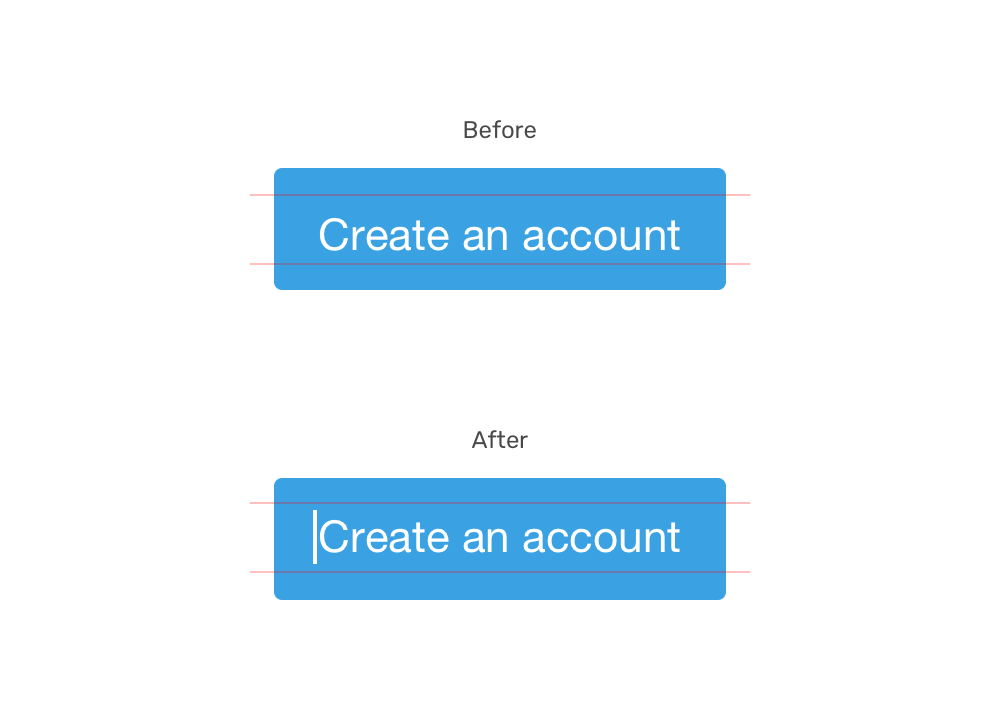
Currently, there is a hack that I [wrote about]((https://ishadeed.com/article/button-label-alignment/), which is to use a pseudo-element and vertically align it.
.button:before {
  content: "";
  display: inline-block;
  height: 16px;
  vertical-align: middle;
}
What’s better is to use leading-trim, a suggested CSS property that didn’t see the light till today.
.button {
  leading-trim: both;
}
Here is the article that I remember about leading-trim.
Force Overscroll behavior
Currently, we can prevent scroll chaining by using overscroll-behavoir: contain. Imagine having a modal, and when scrolling, the body element will scroll too.
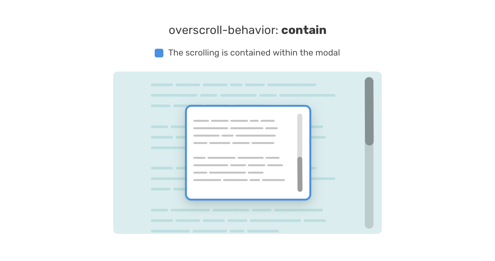
This is supported now, but one thing I don’t like about it is that it won’t work if the element has short content.
That’s it. What are the CSS features that you wish to have today?

