
CSS variables (AKA custom properties) have been supported in web browsers for almost four years. I like to use them depending on the project and the situation. They are very useful and easy to use, but oftentimes, a front-end developer might misuse or misunderstand them.
The main purpose of this article is that I wanted to have a place where I can dump all the information I know about CSS variables, and even learn more and document them. You will learn about everything you need to know about CSS variables with lots of examples and use-cases.
Are you ready? Let’s dive in.
Introduction
CSS variables are values that are defined in a CSS document with the goal of reusability and reducing redundancy in CSS values. Here is a basic example.

.section {
  border: 2px solid #235ad1;
}

.section-title {
  color: #235ad1;
}

.section-title::before {
  content: "";
  display: inline-block;
  width: 20px;
  height: 20px;
  background-color: #235ad1;
}
In this snippet, the value #235ad1 is used three times. Imagine this for a large project, different CSS files, and you got asked to change the color. The best thing you can do is the good old Find & Replace.
With CSS variables, this can be made much better like so. Let’s learn how to define one. First, you need to add the double hyphen -- before a variable name. As a start, we will define the variable in the :root or the <html> element for now.
:root {
  --color-primary: #235ad1;
}

.section {
  border: 2px solid var(--color-primary);
}

.section-title {
  color: var(--color-primary);
}

.section-title::before {
  /* Other styles */
  background-color: var(--color-primary);
}
Isn’t that much, much cleaner than the previous snippet? The variable --color-primary is a global variable, because we defined it in the :root element. However, we can also scope variables to certain elements throughout the document.
Naming variables
Similar to naming variables in programming languages, naming CSS variables are not that different. The valid naming for a CSS variable should contain alphanumeric characters, underscores, dashes. Also, it’s worth mentioning that CSS variables are case sensitive.
/* Valid names */
:root {
	--primary-color: #222;
	--_primary-color: #222;
	--12-primary-color: #222;
	--primay-color-12: #222;
}

/* Invalid names */
:root {
	--primary color: #222; /* Spacings are not allowed */
	--primary$%#%$#
}
Scoping
What’s useful about CSS variables is that we can scope them. The concept is similar to what we have in other programming languages. Take Javascript, for example.
let element = "cool"

function cool() {
  let otherElement = "Not cool"
  console.log(element)
}
The variable element is global, and so it can be accessed inside the cool() function. However, the variable otherElement can only be accessed within the cool() function. Let’s apply the above concept to CSS variables.
:root {
  --primary-color: #235ad1;
}

.section-title {
  --primary-color: d12374;
  color: var(--primary-color);
}
The variable --primary-color is global and can be accessed from any element in the document. By redefining it within the scope of .section-title declaration block, its new value only works there.
Here is a visual example that explains it better.
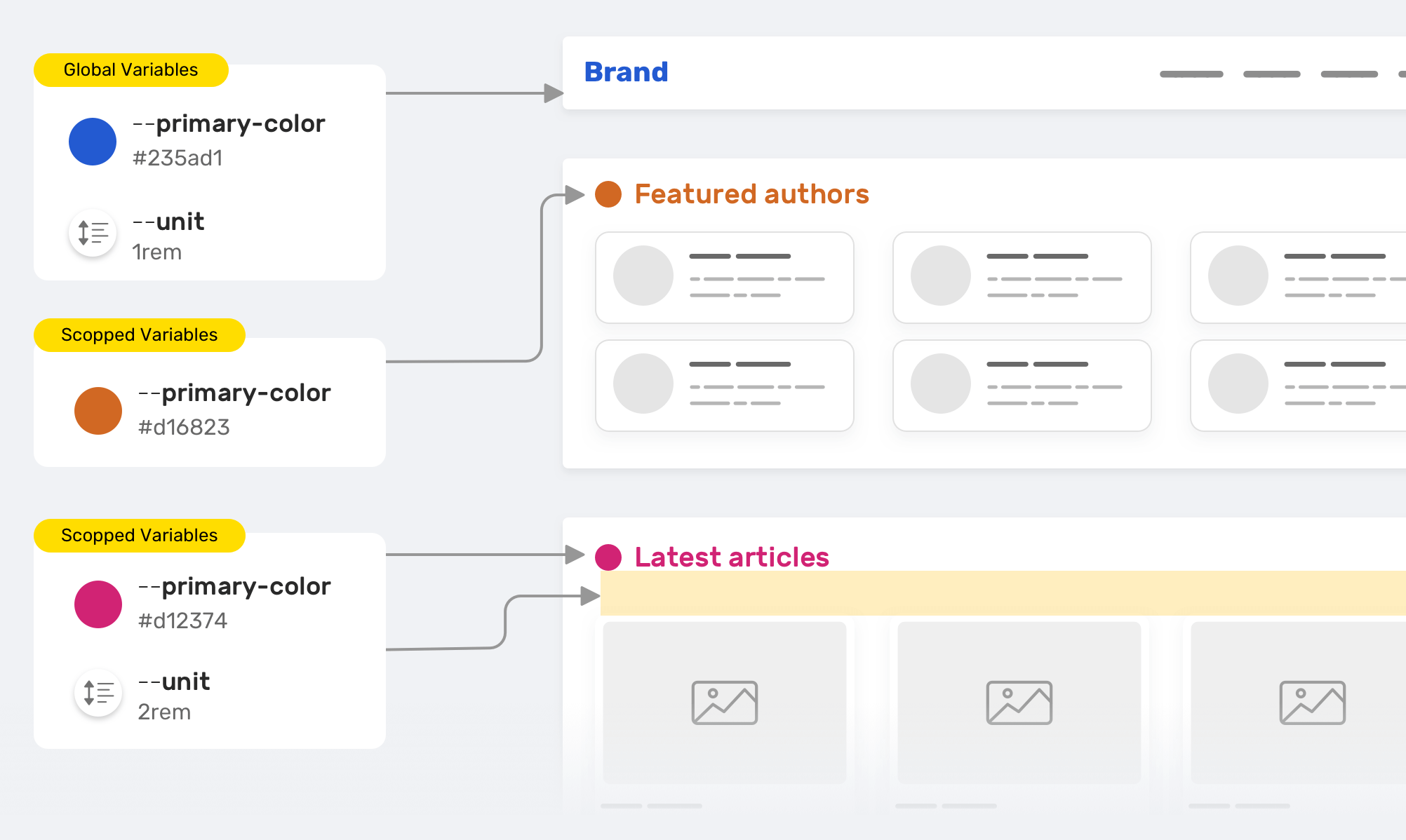
We have --primary-color that is used for the section title color. We want to customize the color for the featured authors and the latest articles sections, so we override it. The same thing applies to the --unit variable. Here is the CSS version for the figure above.
/* Global variables */
:root {
  --primary-color: #235ad1;
  --unit: 1rem;
}

/* Section title default color and spacing */
.section-title {
  color: var(--primary-color);
  margin-bottom: var(--unit);
}

/* Overrding the section title color */
.featured-authors .section-title {
  --primary-color: #d16823;
}

/* Overrding the section title color & spacing */
.latest-articles .section-title {
  --primary-color: #d12374;
  --unit: 2rem;
}
Providing fallback
By fallback, this doesn’t mean to provide a fallback to a browser that doesn’t support CSS variables. The fallback is a feature that we can use with CSS variables. Consider the following example:
.section-title {
  color: var(--primary-color, #222);
}
Notice that the var() has multiple values. The second one #222 will only work in case the variable --primary-color is not defined for some reason. Not only that, we can nest a var() inside another one.
.section-title {
  color: var(--primary-color, var(--black, #222));
}
This feature can be useful in cases where a variable value depends on a certain action. When the variable doesn’t have a value, it’s important to provide a fallback for it.
Use cases and examples
Controlling the size of a component
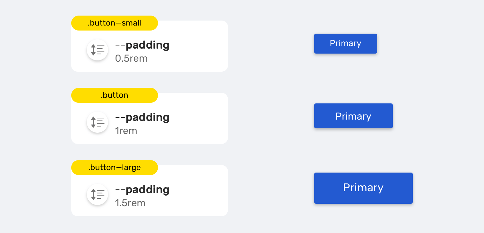
It’s common to have multiple sizes for a button in a design system. Usually, a button can have three sizes (Small, normal, large). It hasn’t been easier to implement this with CSS variables.
.button {
  --unit: 1rem;
  padding: var(--unit);
}

.button--small {
  --unit: 0.5rem;
}

.button--large {
  --unit: 1.5rem;
}
By changing the variable --unit within the scope of the button component, we created different variations of the button.
CSS variables and HSL Colors
HSL stands for hue, saturation, brightness. The hue value determines the color. The saturation and brightness values can control how dark or light the color is.
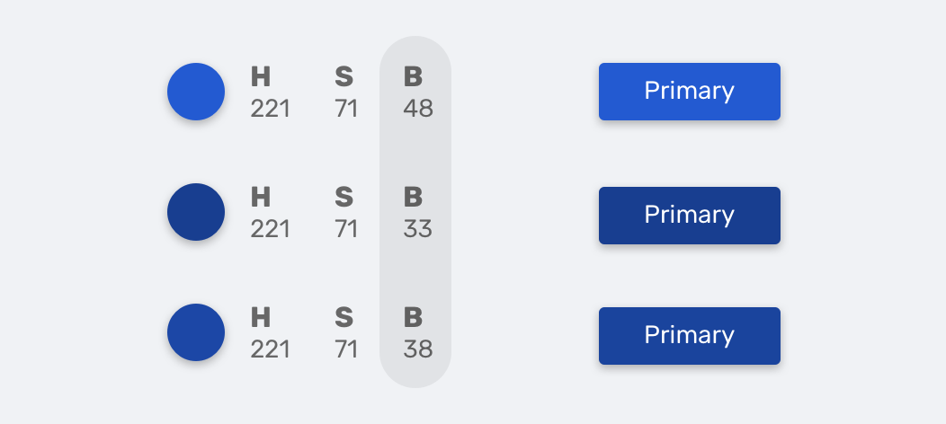
:root {
  --primary-h: 221;
  --primary-s: 71%;
  --primary-b: 48%;
}

.button {
  background-color: hsl(
    var(--primary-h),
    var(--primary-s),
    var(--primary-b)
  );
  transition: background-color 0.3s ease-out;
}

/* Making the background darker */
.button:hover {
  --primary-b: 33%;
}
Notice how I made the button darker by decreasing the variable --primary-b.
If you want to learn more about colors in CSS, I wrote a detailed article about them.
Proportional resizing
If you have worked with a design program like Photoshop, Sketch, Figma, or Adobe XD, then you might have an idea about holding the Shift key while resizing an element to avoid distorting it.
In CSS, there is no direct way to do this, but we have a simple workaround that uses, you guessed it, CSS variables.
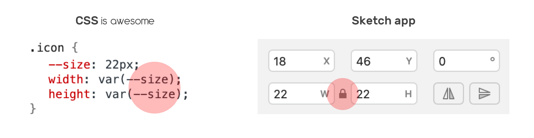
Suppose that there is an icon and its width and height should be equal. I defined the variable --size and used it for both the width and height.
.icon {
  --size: 22px;
  width: var(--size);
  height: var(--size);
}
That’s it! Now you can mimic the Shift resizing effect by only changing the value of --size variable. You can read more about this in this snippet by yours truly.
CSS Grid
CSS variables can be extremely useful for grids. Imagine that you want a grid container to display its child items based on a defined preferred width. Instead of creating a class for each variation and duplicating CSS, it’s easier to do that with variables.
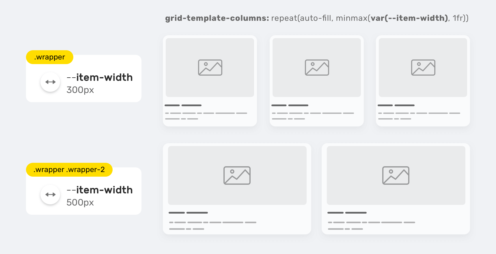
.wrapper {
  --item-width: 300px;
  display: grid;
  grid-template-columns: repeat(
    auto-fill,
    minmax(var(--item-width), 1fr)
  );
  grid-gap: 1rem;
}

.wrapper-2 {
  --item-width: 500px;
}
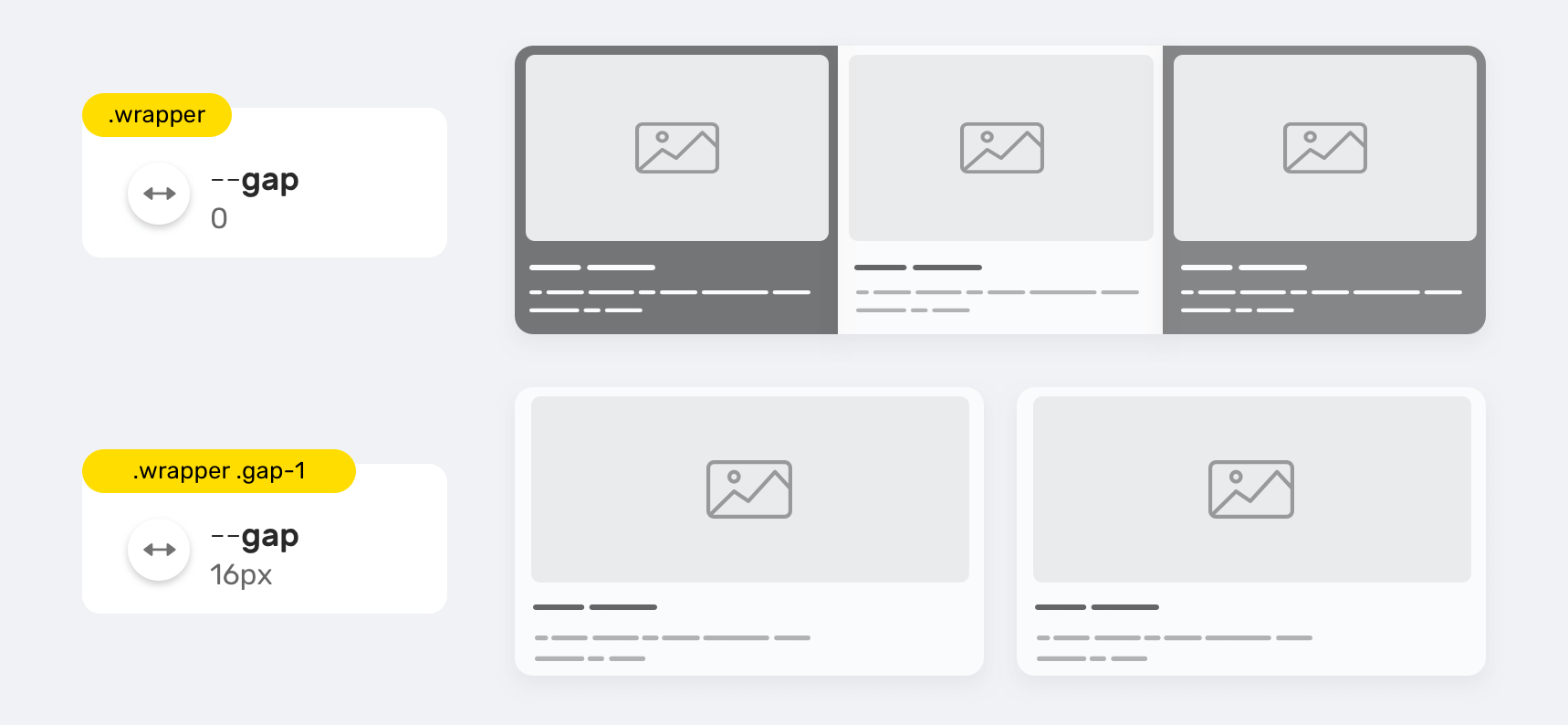
With that, we can create a full grid system that is flexible, easy to maintain, and can be used in other projects. The same concept can be applied to the grid-gap property.
.wrapper {
  --item-width: 300px;
  --gap: 0;
  display: grid;
  grid-template-columns: repeat(
    auto-fill,
    minmax(var(--item-width), 1fr)
  );
}

.wrapper.gap-1 {
  --gap: 16px;
}
Storing full values
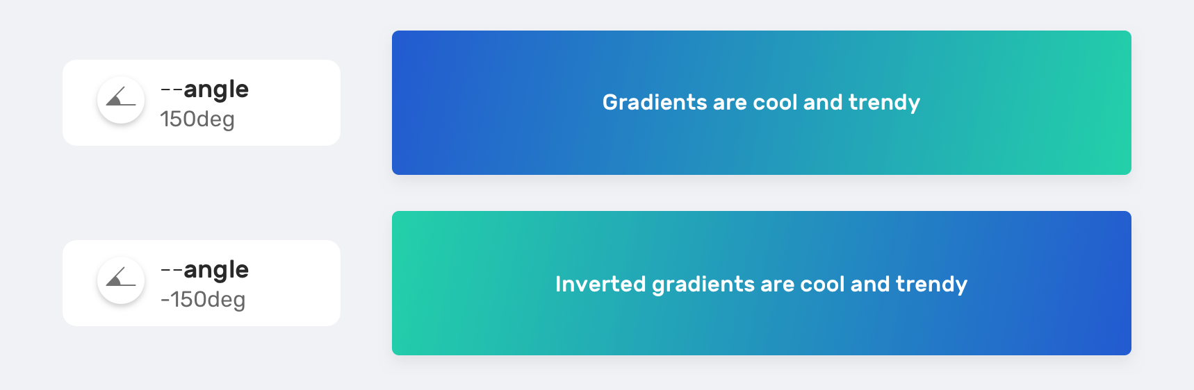
CSS Gradients
By full values, I mean things like a gradient, for example. If you have a gradient or a background that is being used across the system, storing it into a CSS variable might be a good thing to do.
:root {
  --primary-gradient: linear-gradient(150deg, #235ad1, #23d1a8);
}

.element {
  background-image: var(--primary-gradient);
}
Or we can store a single value. Take the gradient angle, for example.
.element {
  --angle: 150deg;
  background-image: linear-gradient(var(--angle), #235ad1, #23d1a8);
}

.element.inverted {
  --angle: -150deg;
}
Background position
We can include multiple values inside a CSS variable, and this is helpful in case we have an element that needs to be positioned differently based on a specific context.
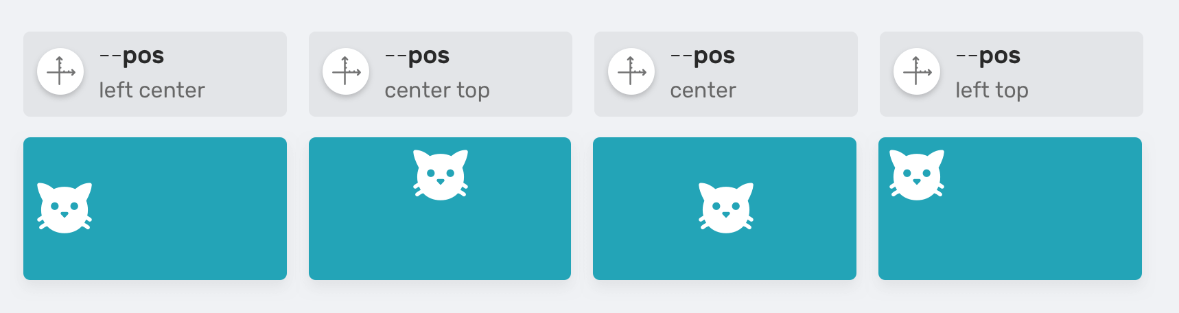
.table {
  --size: 50px;
  --pos: left center;
  background: #ccc linear-gradient(#000, #000) no-repeat;
  background-size: var(--size) var(--size);
  background-position: var(--pos);
}
Switching between dark and light mode
The dark and light modes are requested now more than ever for websites. With CSS variables, we can store two versions of them, and toggle between them based on the user or system preference.

:root {
  --text-color: #434343;
  --border-color: #d2d2d2;
  --main-bg-color: #fff;
  --action-bg-color: #f9f7f7;
}

/* A class added to the <html> element*/
.dark-mode {
  --text-color: #e9e9e9;
  --border-color: #434343;
  --main-bg-color: #434343;
  --action-bg-color: #363636;
}
Setting a default value
In some cases, you will need to set a CSS variable with JavaScript. Let’s suppose that we need to get the height of an expandable component. I learned about this technique from an article by Michael Scharnagl.
The variable --details-height-open is empty and it will be added to a specific HTML element. It will contain a pixel value. When Javascript fails for some reason, it’s important to provide a proper default or fallback value.
.section.is-active {
  max-height: var(--details-height-open, auto);
}
The auto value is the fallback value in case Javascript fails and the CSS variable --details-height-open is not defined.
Controlling a wrapper width
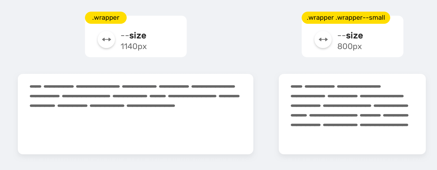
A website wrapper can have multiple variations. You might need a small wrapper for a page, and a larger one for another. In such a case, incorporating CSS variables can be useful.
.wrapper {
  --size: 1140px;
  max-width: var(--size);
}

.wrapper--small {
  --size: 800px;
}
Inline styles
Using CSS variables with inline styles can open a lot of new possibilities that you might not be aware of. I wrote a complete article just about that, but I will mention some of the interesting use-cases here.
This might not be the perfect approach for production websites, but it can be useful for prototyping and testing different ideas.
Dynamic grid items
We can add the variable --item-width insides the style attribute, and that’s all. This approach can help in prototyping grids, for example.
<div class="wrapper" style="--item-width: 250px;">
  <div></div>
  <div></div>
  <div></div>
</div>
.wrapper {
  display: grid;
  grid-template-columns: repeat(
    auto-fill,
    minmax(var(--item-width), 1fr)
  );
  grid-gap: 1rem;
}
User avatars
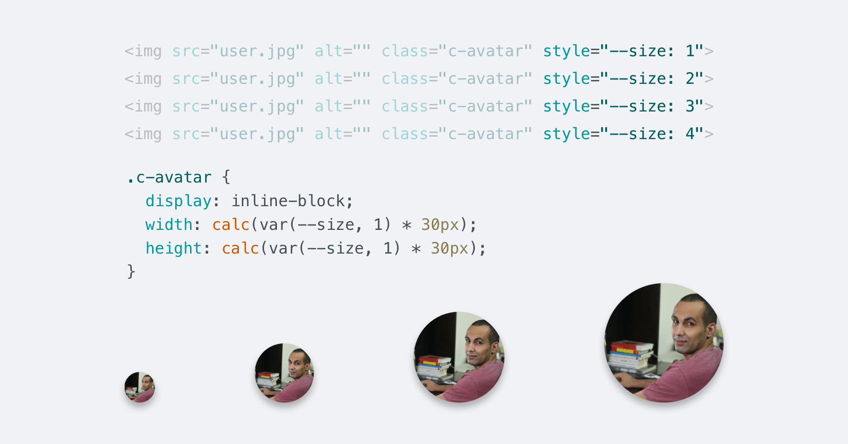
Another useful use-case is sizing elements. Say you need four different sizes of a user avatar with the ability to control their size with only one variable.
<img src="user.jpg" alt="" class="c-avatar" style="--size: 1" />
<img src="user.jpg" alt="" class="c-avatar" style="--size: 2" />
<img src="user.jpg" alt="" class="c-avatar" style="--size: 3" />
<img src="user.jpg" alt="" class="c-avatar" style="--size: 4" />
.c-avatar {
  display: inline-block;
  width: calc(var(--size, 1) * 30px);
  height: calc(var(--size, 1) * 30px);
}
Let’s analyze the above CSS:
- First, we have
var(--size, 1). I added a fallback value in case the value wasn’t added in the style attribute. - The minimum size of an avatar is
30px * 30px.
Media queries
Combining CSS variables and media queries can be very useful to tweak variables that are used across the whole website. The simplest example I can think about is changing the spacing value.
:root {
  --gutter: 8px;
}

@media (min-width: 800px) {
  :root {
    --gutter: 16px;
  }
}
Any element using the --gutter variable will change its spacing depending on the viewport size. Isn’t that awesome?
Inheritance
Yes, CSS variables do inherit. If a parent has a CSS variable defined within it, then the descendant elements will inherit the same CSS variable. Let’s take the following example.
<div class="parent">
  <p class="child"></p>
</div>
.parent {
  --size: 20px;
}

.child {
  font-size: var(--size);
}
The .child element will have access to the variable --size as a result of inheriting it from its parent. Interesting, no? You might be wondering about how can we get the benefit of this? Well, here is a real-life example.
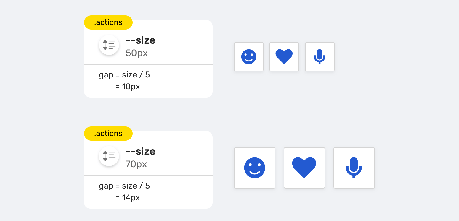
We have a group of action items with the following requirements:
- The ability to change the size of all items by only changing one variable
- The spacing should be dynamic (Shrinks when the item’s size is decreased and grows when the item’s size is increased)
<div class="actions">
  <div class="actions__item"></div>
  <div class="actions__item"></div>
  <div class="actions__item"></div>
</div>
.actions {
  --size: 50px;
  display: flex;
  gap: calc(var(--size) / 5);
}

.actions--m {
  --size: 70px;
}

.actions__item {
  width: var(--size);
  height: var(--size);
}
Notice how I used the variable --size for the flexbox gap property. That means, the spacing can be dynamic and it will depend on the --size variable.
Another useful example is using CSS variables inheritance to customize CSS animations. The following is an example from this article by Sandrina Pereira on CSS Tricks.
@keyframes breath {
  from {
    transform: scale(var(--scaleStart));
  }
  to {
    transform: scale(var(--scaleEnd));
  }
}

.walk {
  --scaleStart: 0.3;
  --scaleEnd: 1.7;
  animation: breath 2s alternate;
}

.run {
  --scaleStart: 0.8;
  --scaleEnd: 1.2;
  animation: breath 0.5s alternate;
}
That way, we don’t need to define the @keyframes twice, and it will inherit the customized CSS variable for the .walk and .run elements.
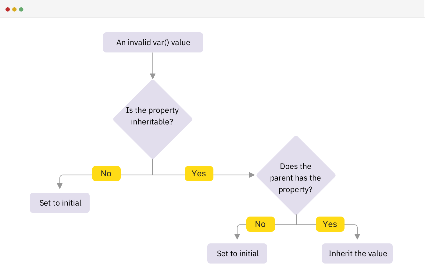
How validation works for CSS variables
When the CSS variable inside the var() function is invalid, the browser substitute with the initial or inherited value based on the property used.
:root {
  --main-color: 16px;
}

.section-title {
  color: var(--main-color);
}
I used 16px is a value for the color property. This is completely wrong. Since the color property is inherited, the browser will do the following:
- Is the property inheritable?
- If yes, does the parent has the property?
- Yes: inherit the value
- No: set to initial
- If no, set to initial
- If yes, does the parent has the property?
Here is a flowchart that explains the browser’s work.
Invalid at computed-value time
The above is technically called invalid at computed-value time, which happens when the var() references a CSS variable with its initial value or it’s using a valid CSS variable with an invalid value for the CSS property.
Consider the following example that I learned about from this article by Lea Verou.
.section-title {
  top: 10px;
  top: clamp(5px, var(--offset), 20px);
}
If the browser doesn’t support the clamp() function, will the top: 10px work as a fallback? The short answer is no. The reason is that because by the time the browser discovered an invalid property value, it has already thrown away the other cascade values. That means, it will ignore the top: 10px.
According to the CSS spec:
The invalid at computed-value time concept exists because variables can’t “fail early” like other syntax errors can, so by the time the user agent realizes a property value is invalid, it’s already thrown away the other cascaded values.
As a result, if you want to use a CSS feature that isn’t widely supported and there is a CSS variable within it, you need to use CSS @supports for that reason. Here is how Lea Verou used that technique in her article:
@supports (top: max(1em, 1px)) {
  #toc {
    top: max(0em, 11rem - var(--scrolltop) * 1px);
  }
}
Interesting findings
URL values
You might not have control over all the resources in a web page, and some of them must be hosted online. In that case, you can store the link’s URL value in a CSS variable.
:root {
  --main-bg: url("https://example.com/cool-image.jpg");
}

.section {
  background: var(--main-bg);
}
But, you might wonder if it’s possible to interpolate CSS variables with url(). Consider the following:
:root {
  --main-bg: "https://example.com/cool-image.jpg";
}

.section {
  background: url(var(--main-bg));
}
It’s not possible as var(--main-bg) is treated as the url itself, which is invalid. By the time the browser has computed the value, it’s no longer valid and it won’t work as expected.
Storing multiple values
What’s useful is that you can store multiple values regardless of the variable value. If they are valid, then it should work. Consider the following example:
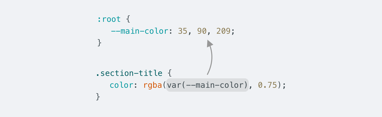
:root {
  --main-color: 35, 90, 209;
}

.section-title {
  color: rgba(var(--main-color), 0.75);
}
In the example, we have a rgba() function, and the RGB values are stored in CSS variable, separated by a comma. This can provide flexibility in case you want to tweak the alpha value depending on the element.
The only downside of this is that it won’t be possible to tweak the rgba value using the DevTools color picker. If this is important to your use-case or project, then you might need to reconsider using the rgba as explained above.
Another example is using this with the background property.
:root {
  --bg: linear-gradient(#000, #000) center/50px;
}

.section {
  background: var(--bg);
}

.section--unique {
  background: var(--bg) no-repeat;
}
We have two sections, and one of them requires the backgrounds to not repeat across the x and y axes.
Animating variables inside a @keyframes rule
If you have read the spec for CSS variables, you might read the term animation-tainted. The idea is that when using a CSS variable inside a @keyframes rule, it can’t be animated.
<div class="box"></div>
.box {
  width: 50px;
  height: 50px;
  background: #222;
  --offset: 0;
  transform: translateX(var(--offset));
  animation: moveBox 1s infinite alternate;
}

@keyframes moveBox {
  0% {
    --offset: 0;
  }
  50% {
    --offset: 50px;
  }
  100% {
    --offset: 100px;
  }
}
The animation won’t work smoothly. It will animate the box only for the values (0, 50px, 100px). According to the CSS spec:
..any custom property used in a @keyframes rule becomes animation-tainted, which affects how it is treated when referred to via the var() function in an animation property.
If we want the above animation to work, we should do it the old-school way. That means, we need to replace the variable with the actual CSS property we want to animate.
@keyframes moveBox {
  0% {
    transform: translateX(0);
  }
  50% {
    transform: translateX(50px);
  }
  100% {
    transform: translateX(100px);
  }
}
See the Pen CSS Variables - Keyframes - 1 by Ahmad Shadeed (@shadeed) on CodePen.
UppubDate: 9 Oct 2020
Dannie Vinther pointed out that it’s possible to animate CSS variables inside keyframes by registering them using the @property. That is supported in Chromium browsers for now.
@property --offset {
  syntax: "<length-percentage>";
  inherits: true;
  initial-value: 0px;
}
See the Pen CSS Variables - Keyframes - 1 by Dannie Vinther (@dannievinther) on CodePen.
Calculations
You might not know that you can do calculations with CSS variables. Consider the following example that I explained previously.
.c-avatar {
  display: inline-block;
  width: calc(var(--size, 1) * 30px);
  height: calc(var(--size, 1) * 30px);
}
We might have variations of the avatar. I set the default value to 1, and so the default size is (30px * 30px). Notice the different class variations and how changing the --size value results in changing the size of the avatar.
.c-avatar--small {
  --size: 2;
}

.c-avatar--medium {
  --size: 3;
}

.c-avatar--large {
  --size: 4;
}
Devtools and CSS variables
There are some useful tricks that we can use in the browser DevTools to make it easier for us to work with CSS variables. Let’s explore them!
The ability to see the color value
Isn’t it useful to see a visual indicator for the color or background value when you’re using a CSS variable? Chrome and Edge show that.
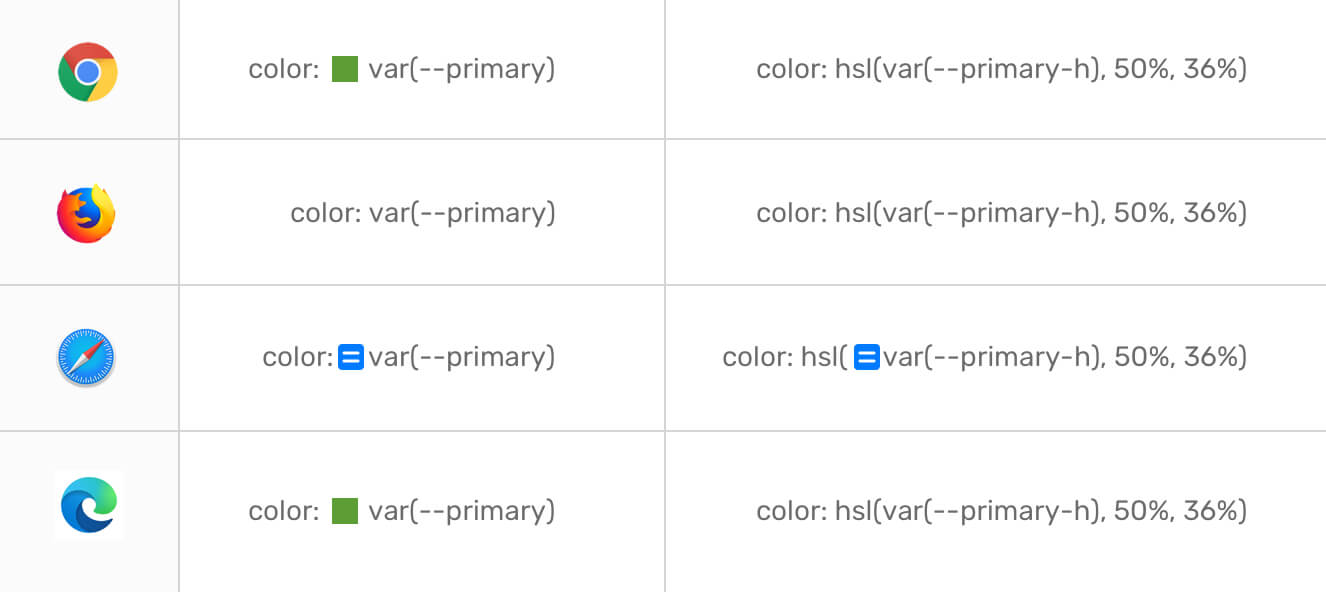
Computed values
To see the computed value of a CSS variable, you need to hover or click, based on the browser.
All computed values can be revealed on hover, except for Safari, you need to click on the two-lines-button.
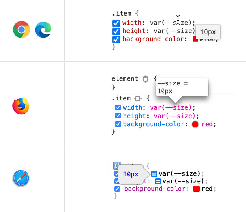
Autocomplete for CSS variables
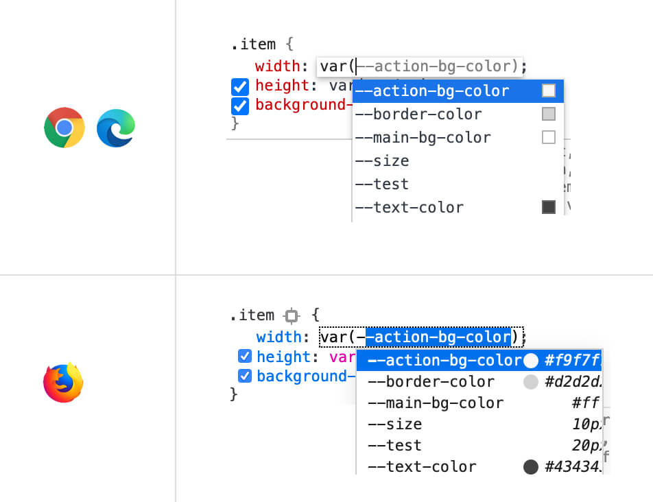
In a large project, it’s hard to remember all the variable names. You got covered! You can type -- some characters and you will get a list with CSS variables on the page. This works for Chrome, Firefox, and Edge.
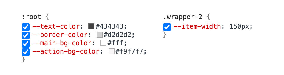
Disabling a CSS variable
When you need to disable a CSS variable from all elements that are using it, this is possible by unchecking it from the element it’s defined to. See the figure below:
The End
That was a lot about CSS variables. I’m now happy that I finally have a dedicated page for them. I hope you found this useful, and if yes, please do spread the word. Thank you for reading!
I’m writing an ebook
I’m excited to let you know that I’m writing an ebook about Debugging CSS.

If you’re interested, head over to debuggingcss.com and subscribe for updates about the book.
