CSS Comparison Functions (min(), max(), clamp()) become supported in Firefox on 8 April 2020, which means that they are now supported in all major browsers. Those CSS functions will provide us with ways to have dynamic layouts and more flexible design components. They can be used for container sizes, font-size, padding. and a lot more. Even more, web designers might need to think differently while designing layouts because of these exciting CSS functions.
In this article, I will try as much as I can to make them clear, explain all the points of confusion that might happen, and provide some practical examples and use-cases.
Browser Support
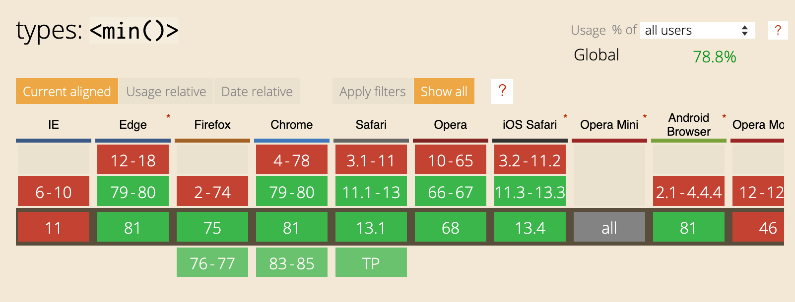
The first thing I want to highlight is the browser support since this is a new thing. The support for min and max is equal:
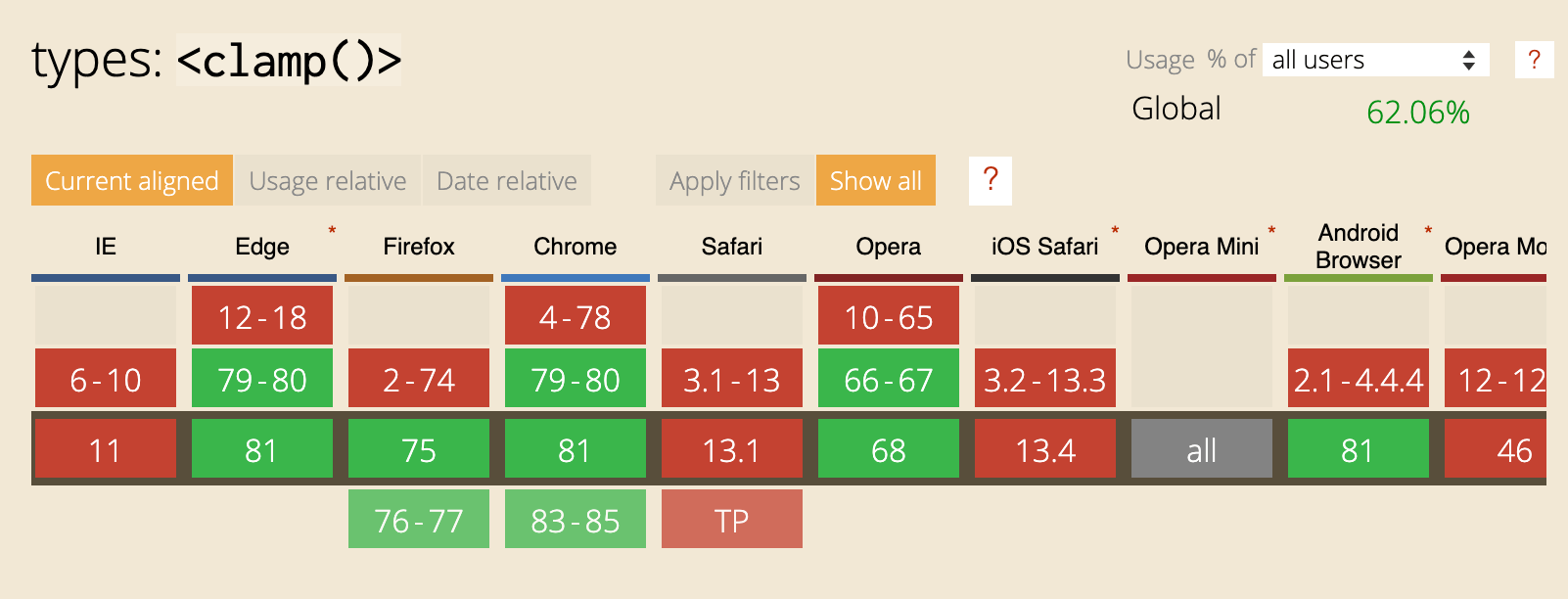
And here is the support for clamp():
CSS Comparison Functions
As per the CSS spec, it’s all about comparing multiple values and representing one of them based on the function used. Let’s explore the functions.
The min() Function
The min() function contains one or more comma-separated calculations and represents the smallest value of them. We use the min() to set a maximum value.
Consider the following example. We want the element to have a maximum width of 500px.
.element {
  width: min(50%, 500px);
}
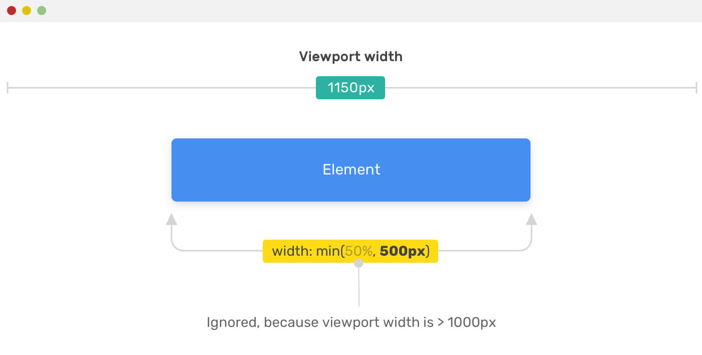
The browser has to choose the smallest of the values (50%, 500px). Choosing that depends on the viewport width. If 50% computes to a value more than 500px, then it will be ignored and 500px will be used instead.
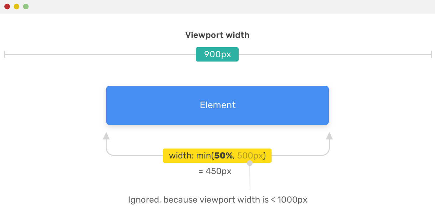
Otherwise, if the 50% computes to a value less than 500px, then the 50% will be used as a value for the width. Can you guess the viewport width that will make that happen? (The 50% of X = 500px). The viewport width is 1000px.
I hope the above point is clear. I scratched my head a lot while trying to understand how it works so I need to make sure that my explanation is clear. To achieve that, I made you an interactive demo to play with:
Check the interactive demo. Make sure to resize the browser window to see the changes!
The max() Function
The max() function contains one or more comma-separated calculations and represents the largest value of them. We use the max() to set a minimum value.
Consider the following example. We want the element to have a minimum width of 500px.
.element {
  width: max(50%, 500px);
}
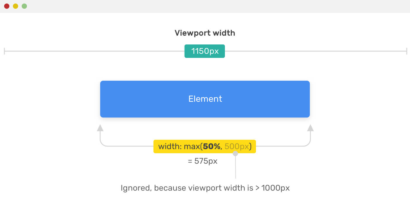
The browser has to choose the largest of the values (50%, 500px). Choosing that depends on the viewport width. If 50% computes to a value less than 500px, then it will be ignored and 500px will be used.
Otherwise, if the 50% computes to a value more than 500px, then the 50% will be used as a value for the width. It’s the opposite of min() function.
Make sure to check out the interactive demo.
The clamp() Function
What clamp() do is that it clamps a value between two defined values, minimum and maximum. It takes three parameters (min value, preferred value, max value).
Consider the following example.
.element {
  width: clamp(200px, 50%, 1000px);
}
We have an element with a minimum width of 200px, a preferred value of 50%, and a maximum value of 1000px. Let’s visualize that!
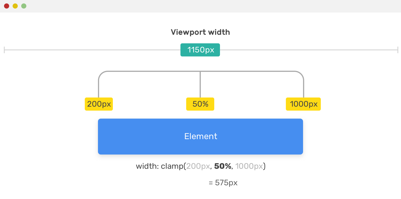
Here is a recap for the example above:
- The width will never go below
200px - The central (preferred) value is
50%and will only work if the viewport width is greater than400pxand less than2000px. - The width won’t go above
1000px
The clamp() is similar to the physical tool we have. It clamps a value based on two provided values at the edges (min, max).
How clamp() is calculated?
As per Mozilla Developer Network (MDN), when clamp() is used as a value, it’s equivalent to using max() and min() functions. Consider the below example:
.element {
  width: clamp(200px, 50%, 1000px);
  /* Is equivalent to the below */
  width: max(200px, min(50%, 1000px));
}
The value 50% depends on the browser viewport width, let’s assume that the viewport width is 1150px.
.element {
  width: max(200px, min(50%, 1000px));
  /* Assuming the viewport width is 1150px */
  width: max(200px, min(575px, 1000px));
  /* Resolves to */
  width: max(200px, 575px);
  /* Resolves to */
  width: 575px;
}
The Context Matters
The computed value depends on the context. It could be a %, em, rem, vw/vh. Even the percentage value can be either based on the viewport width in case the element is directly in the <body> or it could be based on its parent.
Math Expressions
It’s worth mentioning that math calculations are available so there is no need to use calc(). As per the spec:
Full math expressions are allowed in each of the arguments; there’s no need to nest a calc() inside! You can also provide more than two arguments, if you have multiple constraints to apply.
Consider the following example.
.type {
  /* Force the font-size to stay between 12px and 100px */
  font-size: clamp(12px, 10 * (1vw + 1vh) / 2, 100px);
}
What CSS comparison functions will change in how we design?
It’s often that the designer works on the mobile and desktop sizes when designing a web page, and for some projects, this could be more. What’s the effect of having comparison functions today?
For me, I see that as the below illustration.
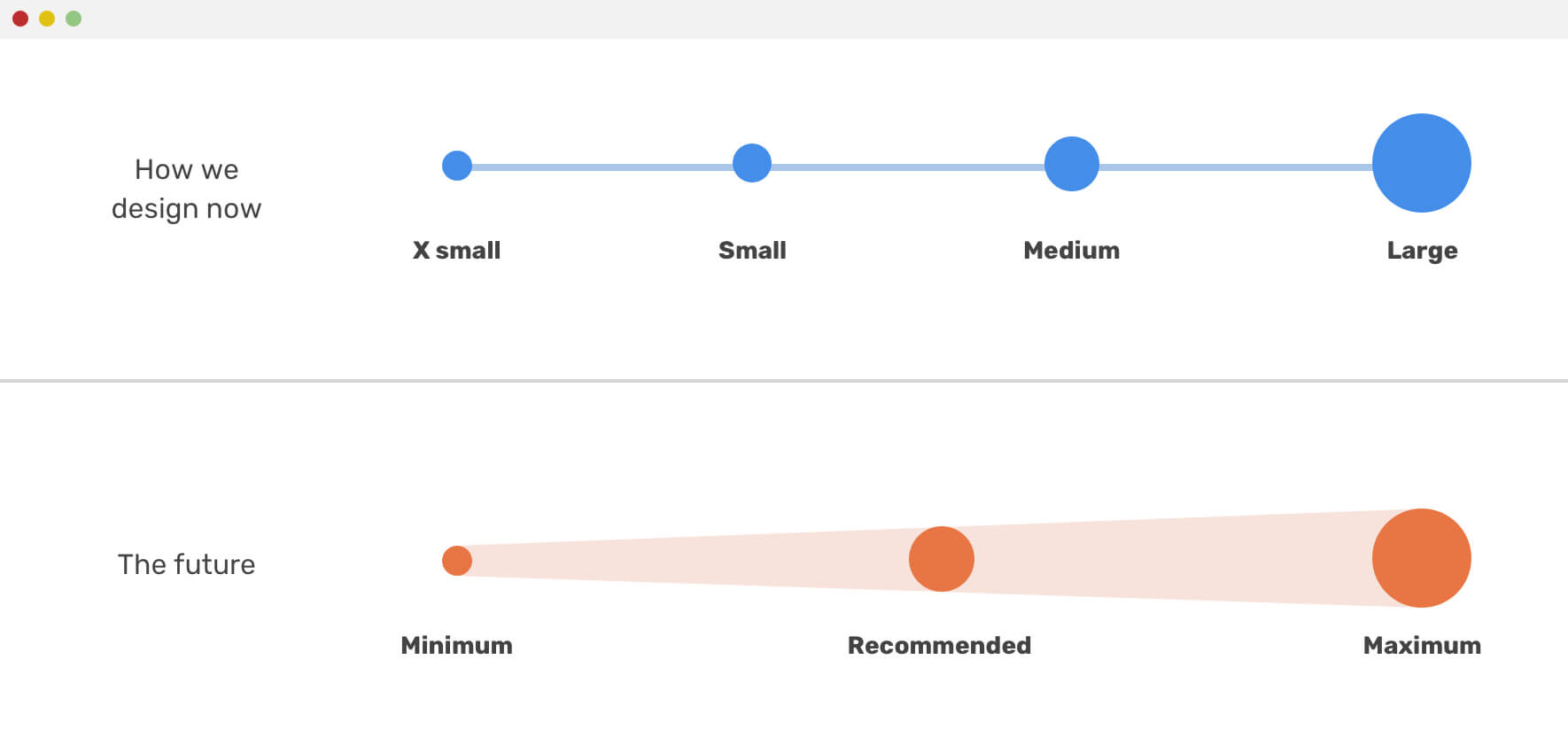
The first one shows the current way we’re designing, there are clear spots for the design sizes or viewports. However, the second one is gradual which indicates the use of a minimum and maximum value for a design property. I imagine that designers in the future will do something like this:

Isn’t that exciting? For me, it is! I’m very excited to work on web projects that requires an amount of flexibility in its components. Of course, not every component needs to be dynamic, but some of them could be.
Use Cases
Sidebar and Main
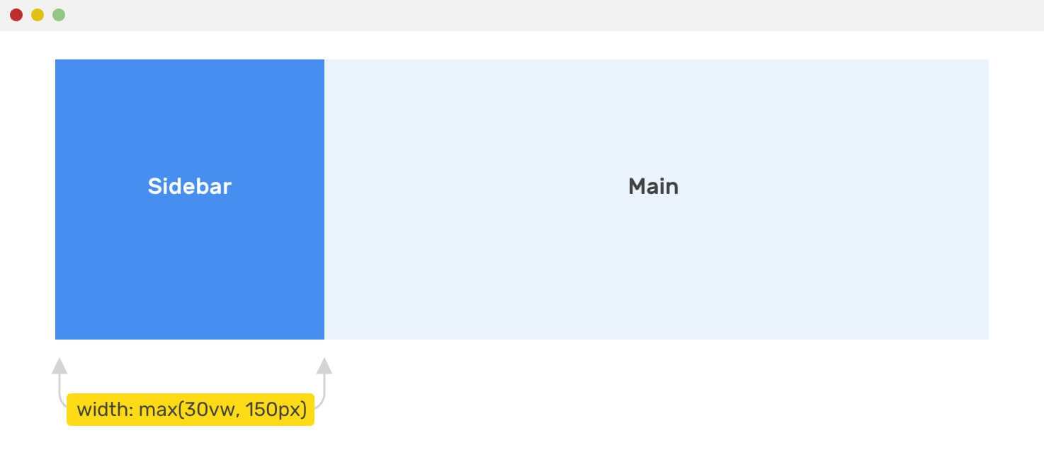
Usually, the sidebar of a page has a fixed with and the main width is flexible. We can enhance the sidebar and make it more dynamic and occupy more space if the viewport is large enough. To achieve that, I need to set a minimum width for it using max() function.
Consider the below example.
.wrapper {
  display: flex;
}

aside {
  flex-basis: max(30vw, 150px);
}

main {
  flex-grow: 1;
}
The aside minimum width is 150px, and it will be 30vw if the viewport width is greater than 500px (500 * 30% = 150).
Headings Font Size
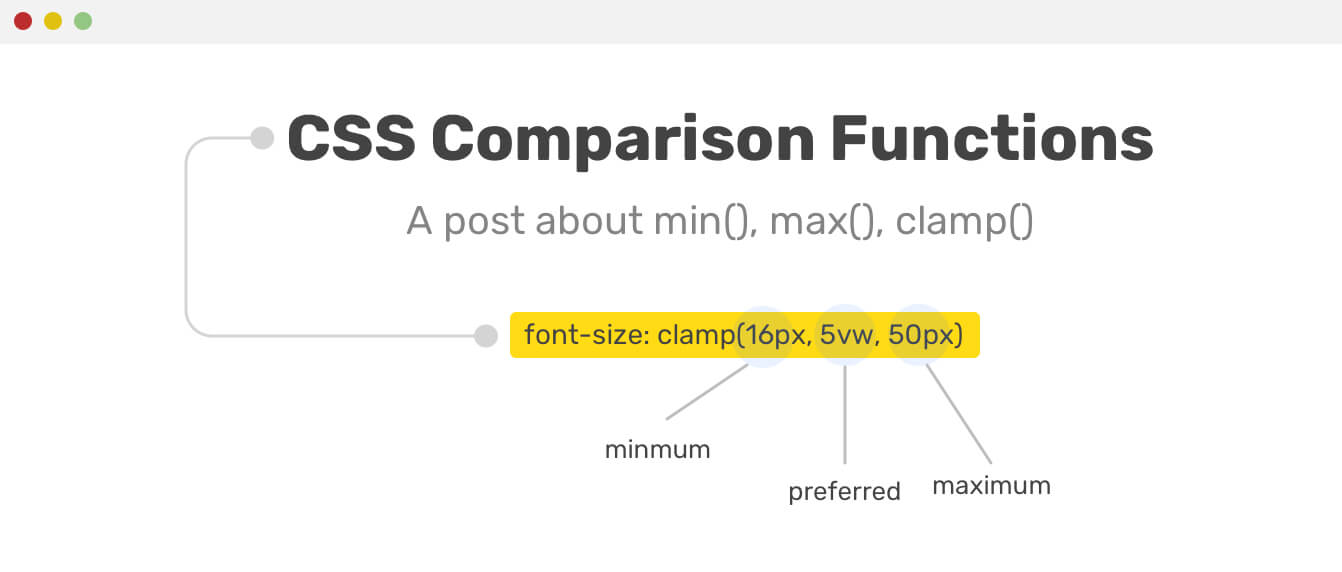
A great use case for clamp() is for headings. Suppose that you want a heading with a minimum size of 16px, and a maximum size of 50px. The clamp() function will give us an in-between value without going below or over the minimum and maximum, respectively.
.title {
  font-size: clamp(16px, 5vw, 50px);
}
Using clamp() here is perfect because it ensures that the font size used is accessible and easy to read. If you will use min() to set maximum font size, then you can’t control the font on small viewports.
.title {
  font-size: min(
    3vw,
    24px
  ); /* Not recommended, bad for accessibility */
}
See the figure below for a visual explanation.
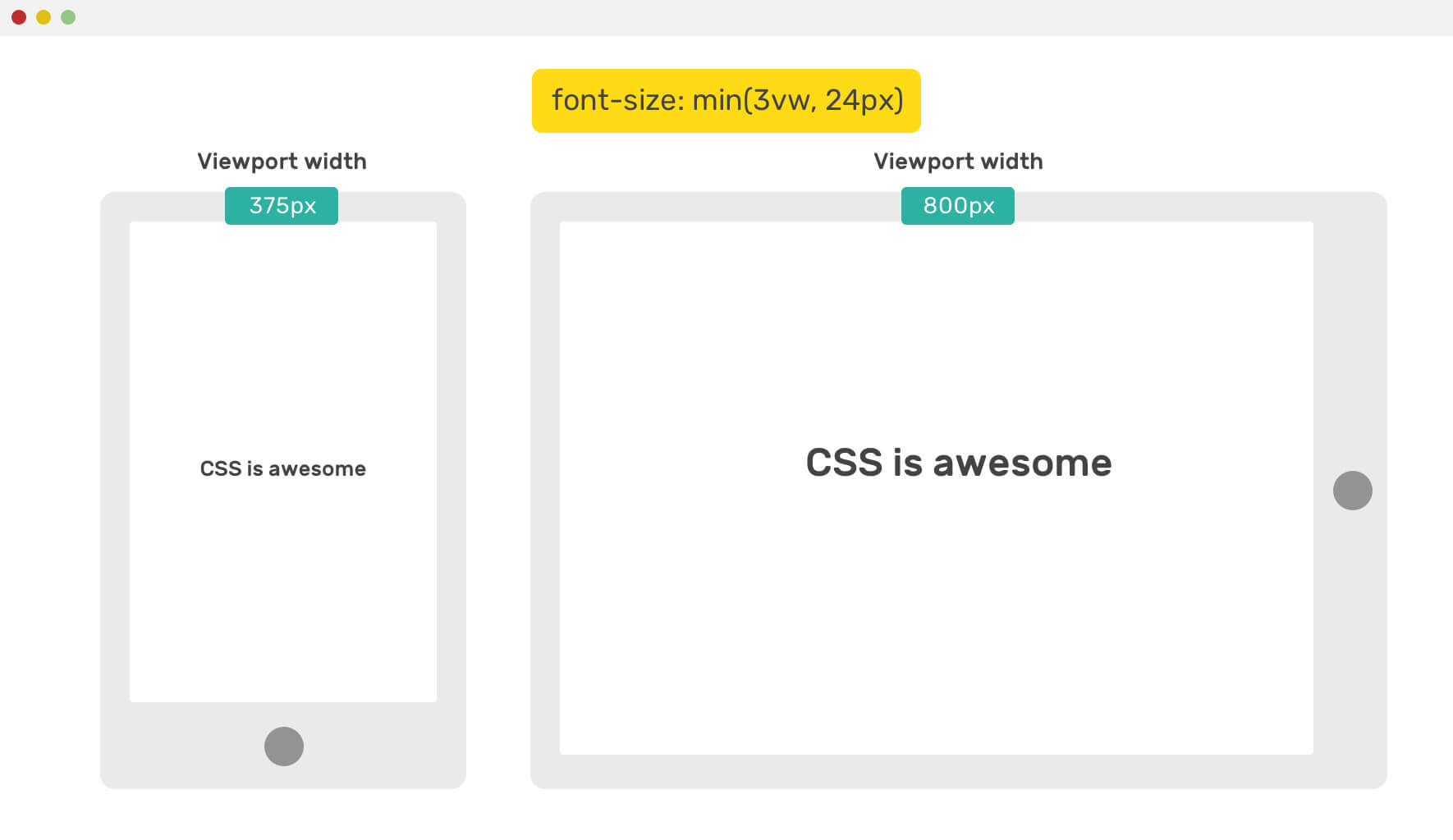
On a mobile viewport, the font size is tiny. For that reason, don’t use min() function only for the font size. Of course, you can cancel or add it with a media query, but then you missed the whole point of using CSS comparison functions.
As I mentioned previously, you can nest a min() inside a max() function, which will mimic the clamp() function. See below:
.title {
  font-size: max(16px, min(10vw, 50px));
}
Update: 7 May 2020
After a discussion on Twitter, it turned out that using 10vw alone as the preferred value for font-size is not good. It will cause an accessibility issue when the user zoom in the browser.
.title {
  font-size: clamp(16px, (1rem + 5vw), 50px);
}
In the example above, I added an expression (1rem + 5vw) that will fix the problem.
Decorative Headings
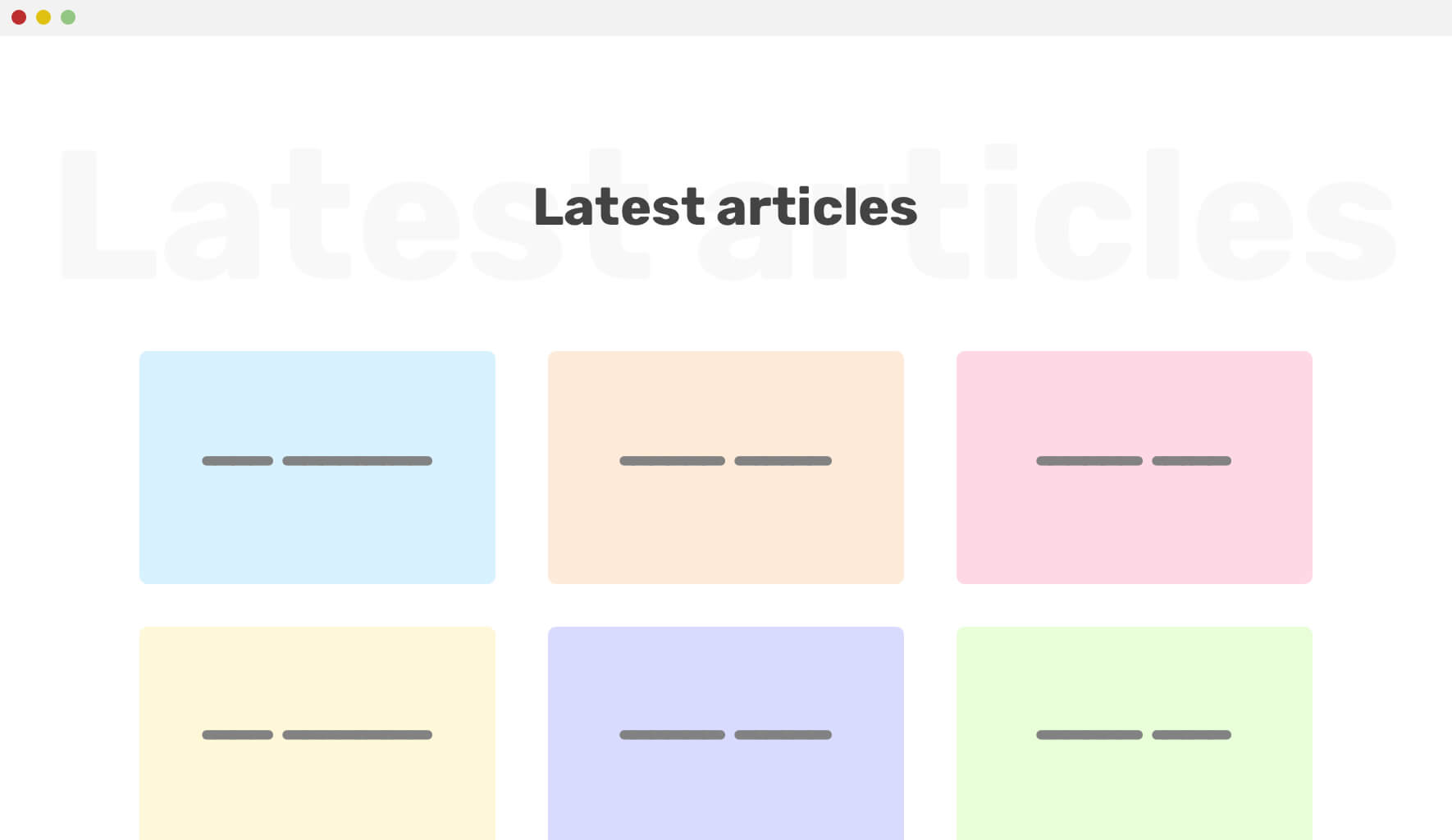
Do you see that big transparent text below the section title? That is a decorative text that should scale based on the viewport size. We can use a max() function with CSS viewport units to set a minimum value for it.
.section-title:before {
  content: attr(data-test);
  font-size: max(13vw, 50px);
}
Smoothing Gradients
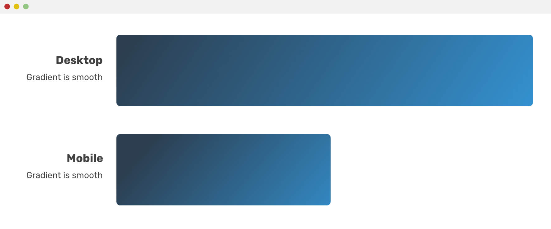
When using a gradient in CSS, you might need to tweak it a bit for mobile by making the transition between colors a bit smoother. Let me show you an example. We have the following gradient:
.element {
  background: linear-gradient(135deg, #2c3e50, #2c3e50 60%, #3498db);
}
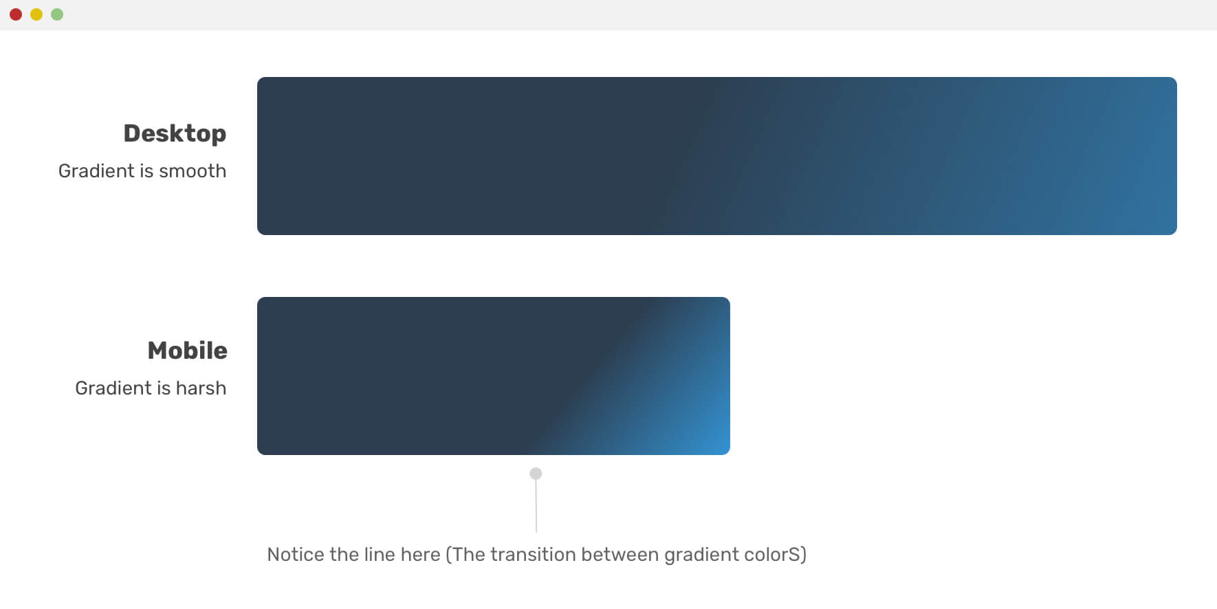
Notice how the transition in mobile is visible and there is a line separating the colors, which is not good. We can fix that by using the good old media query (Oh, did I just said that the media query is a ‘good old’ thing?).
@media (max-width: 700px) {
  .element {
    background: linear-gradient(
      135deg,
      #2c3e50,
      #2c3e50 25%,
      #3498db
    );
  }
}
While this works, we can use the min() CSS function to make this thing more dynamic. See the below:
.element {
  background: linear-gradient(
    135deg,
    #2c3e50,
    #2c3e50 min(20vw, 60%),
    #3498db
  );
}
Transparent Gradient
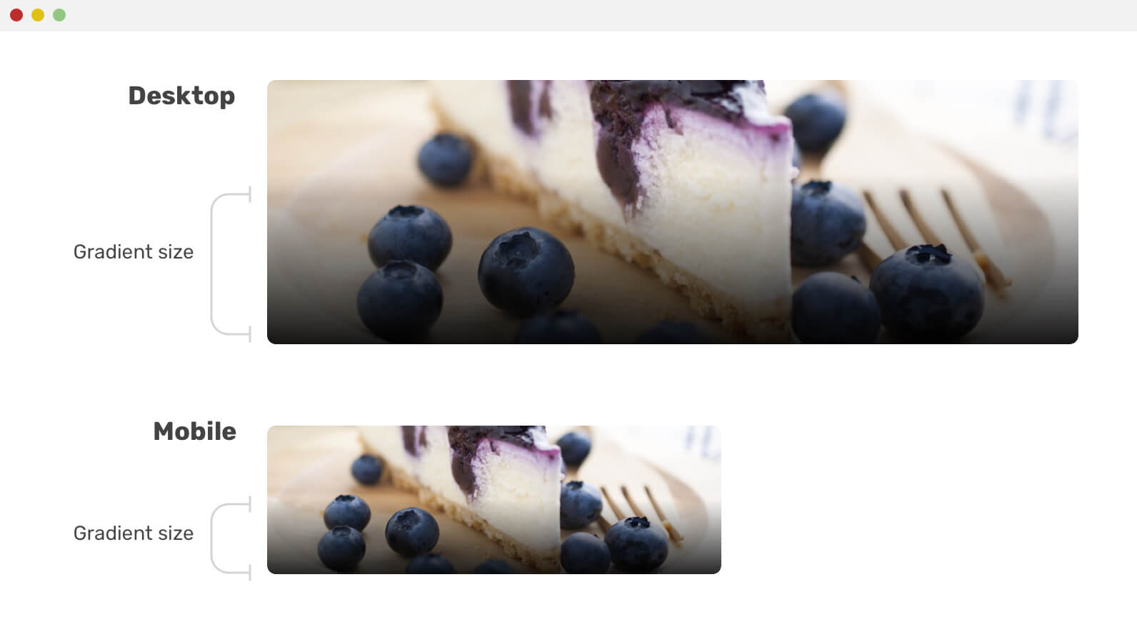
When you need to place text over a photo, you should have a gradient below it to make the text readable. Similar to the previous example, the gradient size should vary between small and large viewports. See the below figure:
.element {
  background: linear-gradient(
    to top,
    #000 0,
    transparent max(20%, 20vw)
  );
}
That little enhancement can make the gradient look more logical on mobile. If the gradient size is 50% of its parent on desktop, this should be around ~30% for mobile. By using the max() function, we can set a minimum value for it.
Dynamic Margin
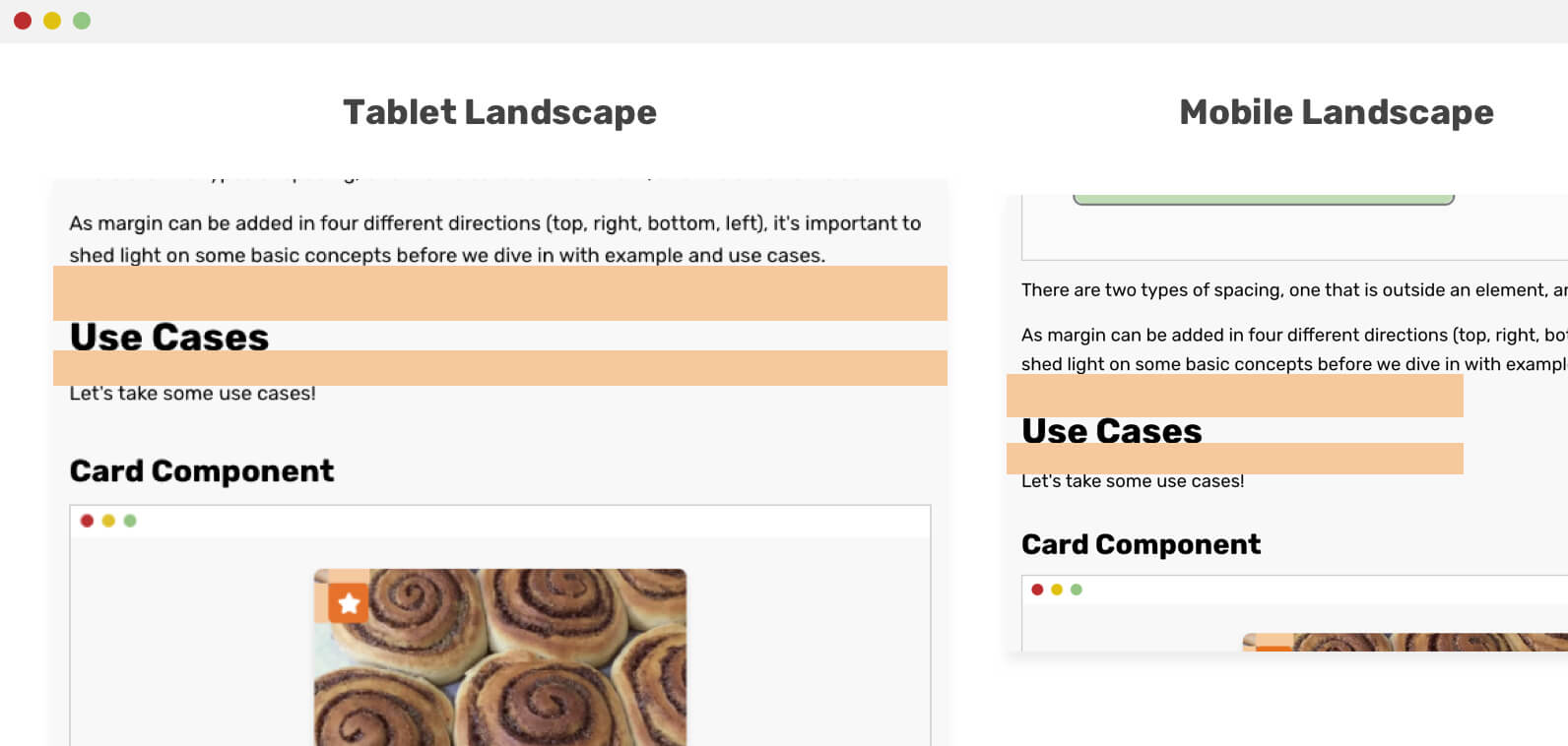
We can have a dynamic margin between design elements by using CSS viewport units. However, that might not be always a good solution since the user might view the design from a rotated screen with a long vertical height. Here is how we do this with media queries:
h1,
h2,
h3,
h4,
h5 {
  margin: 7vh 0 1.05rem;
}

@media (max-height: 2000px) {
  h1,
  h2,
  h3,
  h4,
  h5 {
    margin: 2.75rem 0 1.05rem;
  }
}
While the above solution works, we can do the same with one line of code only!
h1,
h2,
h3,
h4,
h5 {
  margin: min(7vh, 2.75rem) 0 1.05rem;
}
By using min(), we set a maximum value for the margin 2.75rem that shouldn’t be exceeded. Simple and easy!
Container Width
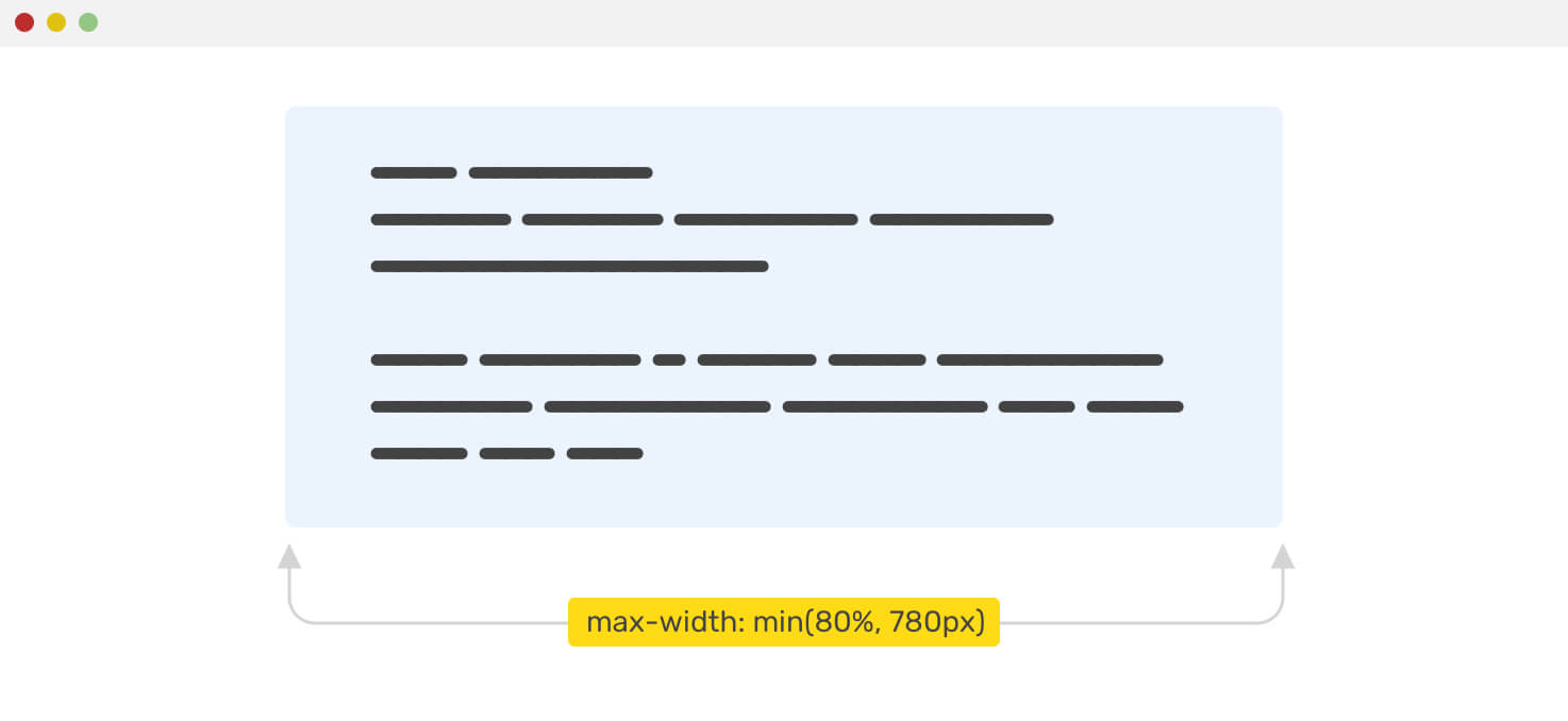
In case you have a container that should take 80% width of its parent, and the width shouldn’t exceed 780px, what would use? Usually, it might be something like this:
.container {
  max-width: 780px;
  width: 80%;
}
However, with the min() function, it’s possible to set a maximum value like this:
.container {
  max-width: min(80%, 780px);
}
Section Vertical Padding
What I liked about clamp() is that it’s perfect for setting a minimum and maximum padding for a section. Consider the example below, where we have a hero section.
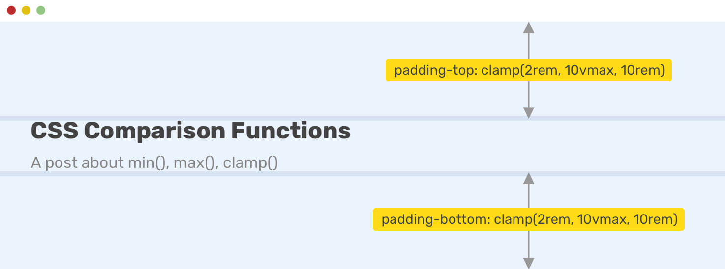
With one line of CSS, we can achieve the flexibility mentioned above.
.hero {
  padding: clamp(2rem, 10vmax, 10rem) 1rem;
}
Border and Shadow
For some design cases, there are elements with big border width and radius that should be smaller on mobile. By using clamp(), we can make them dynamic as per the viewport width.
.element {
  box-shadow: 0 3px 10px 0 red;
  border: min(1vw, 10px) solid #468eef;
  border-radius: clamp(7px, 2vw, 20px);
  box-shadow: 0 3px clamp(5px, 4vw, 50px) 0 rgba(0, 0, 0, 0.2);
}
Grid Gap
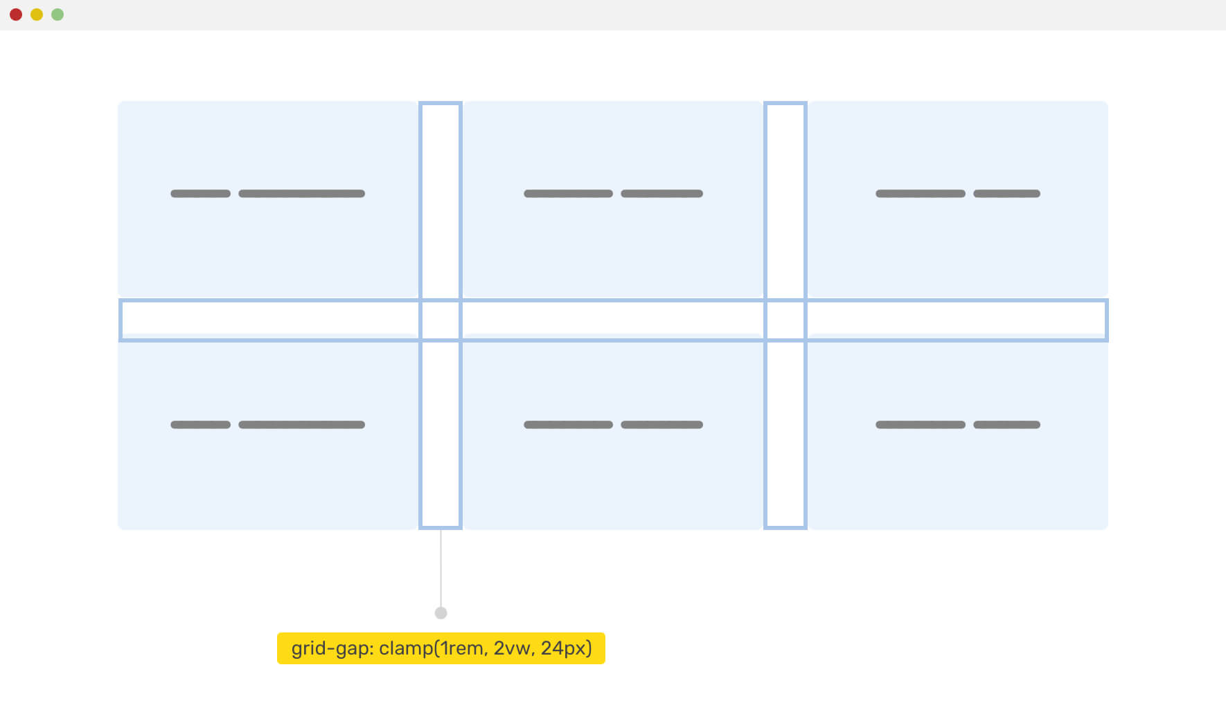
A lovely use-case is when we have a grid-gap using CSS grid, and we want to make smaller for mobile viewports. With clamp(), this is fairly easy.
.wrapper {
  display: grid;
  grid-template-columns: repeat(auto-fit, minmax(200px, 1fr));
  grid-gap: clamp(1rem, 2vw, 24px);
}
If you want to dig more in grid and comparison functions, here is a great article by Dannie Vinther.
CSS Comparison Function Breaks With Unitless Values
I was trying things and wanted to set 0 as a minimum value for clamp(). See the below CSS:
.element {
  width: clamp(0, 10vmax, 10rem);
}
That CSS is invalid as it seems that unitless numbers shouldn’t be used there.
How to Add Fallback For Non-Supporting Browsers
As with any new CSS feature, it’s important to provide a fallback. To achieve that, we can either use on the of the below:
1. Add fallback manually
It means that we should provide a fallback by adding the property before the CSS comparison one. See the example below:
.hero {
  padding: 4rem 1rem;
  padding: clamp(2rem, 10vmax, 10rem) 1rem;
}
Supporting browsers will ignore the first one. While non-supporting ones will use the first padding.
2. Using CSS @supports
We can use @supports feature query to detect if the CSS comparison functions are supported. I prefer this on the manual solution because any browser that supports the comparison functions should have support for the @supports feature query.
.hero {
  /* Default, for non-supporting browsers */
  padding: 4rem 1rem;
}

@supports (width: min(10px, 5vw)) {
  /* An enhancement for supporting browsers */
  .hero {
    padding: clamp(2rem, 10vmax, 10rem) 1rem;
  }
}
Accessibility Concerns
While CSS comparison functions provide us with a new way to make more dynamic web pages, we need to be more careful about how to use them. For example, using min() to set a font-size is not enough as it will be too small for mobile. You should set a minimum and maximum values for things that are vital to the user experience.
The End
That’s a wrap. Do you have a comment or a suggestion? Please feel free to ping me on @shadeed9.

