
In the design world, masking is a popular technique to achieve unique design effects. As a designer, I’ve used it many times, but my usage of it on the web is rare. I think that the reason that kept me from not using a CSS mask is the browser support, they are partially supported in blink browsers (Chrome and Edge) and fully supported in Safari and Firefox.
The great news is that CSS masking will be part of Interop 2023, which means we should expect cross-browser support (Yay!!).
In this article, I will go through what CSS masking is, how it works, and a few use cases and examples for it.
Let’s dive in.
Table of contents
- What is masking?
- How to mask in CSS
- Masking with CSS gradients
- Practical use cases & examples
- Outro
- Further resources
What is masking?
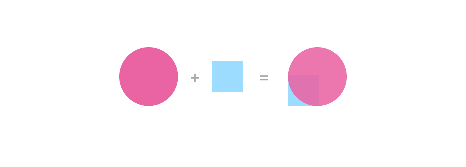
In simple words, masking works in a way that hides part of an element without erasing it.
Consider the following figure:
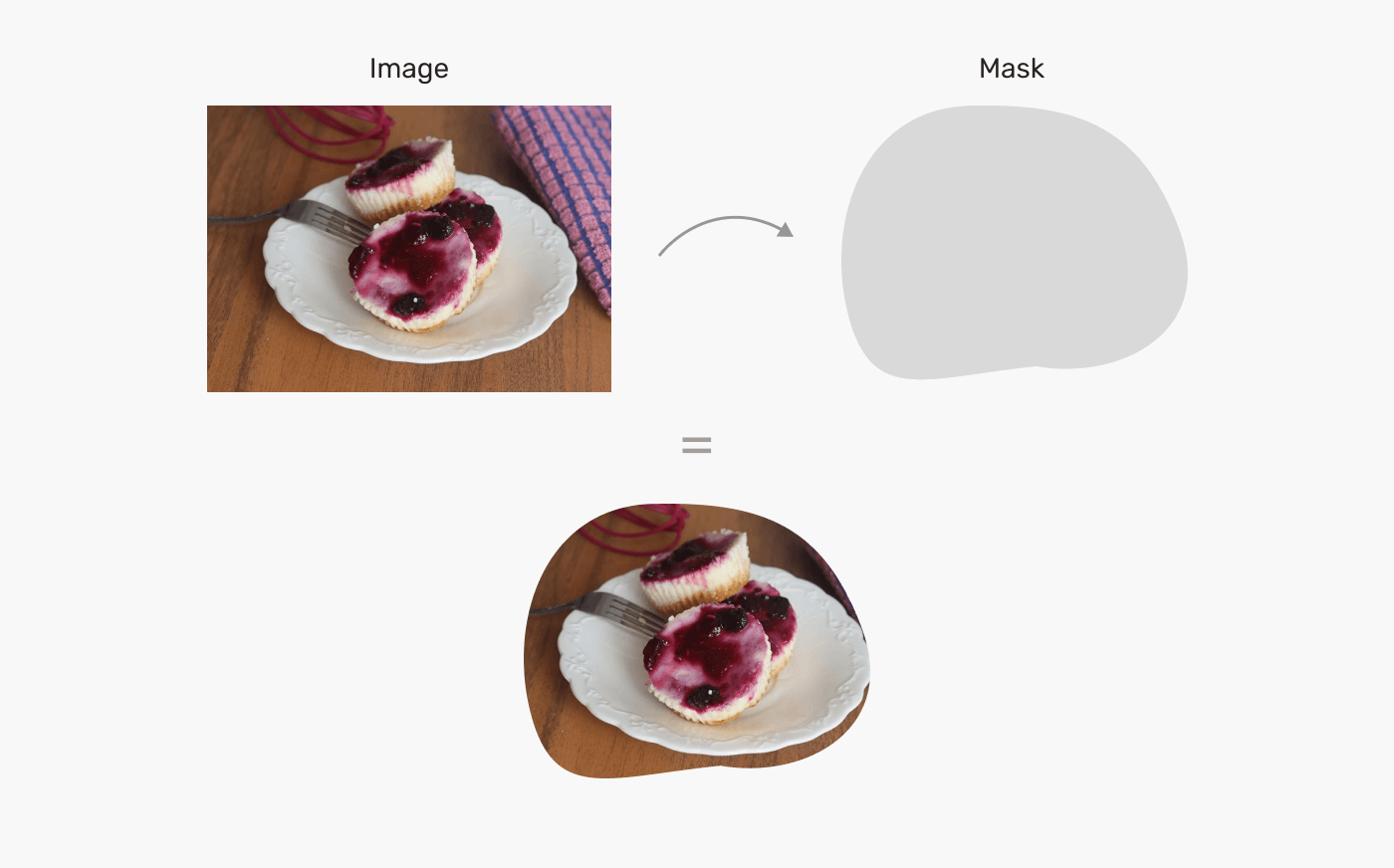
We have an image, and we have a mask. In design apps like Photoshop, we can insert the image inside the grey shape, and it will result in a masked image.
The way that works is that it hides some parts of the image without erasing it (They are still there, but hidden).
This is the core concept of masking, which is to use a shape to show and hide parts of an element. We can take that further and explore even further and more unique ways to mask content.
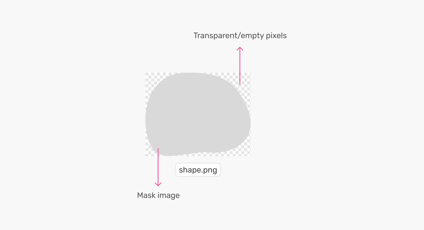
For example, we can create a gradient mask like the following one.
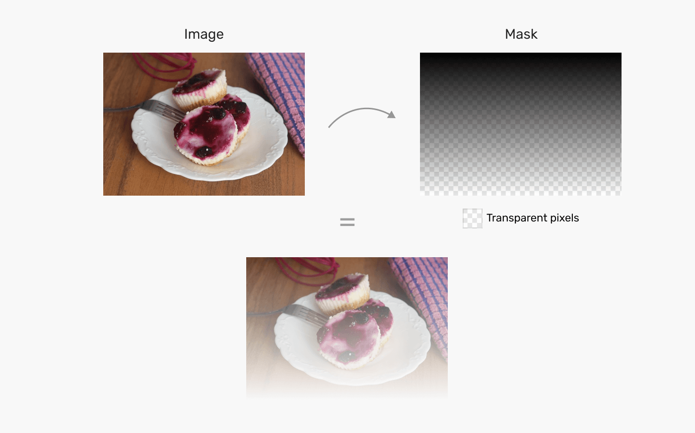
In a gradient, there are filled and transparent pixels. The filled ones are where the element’s part will be visible, and the transparent one is where the hidden parts are.
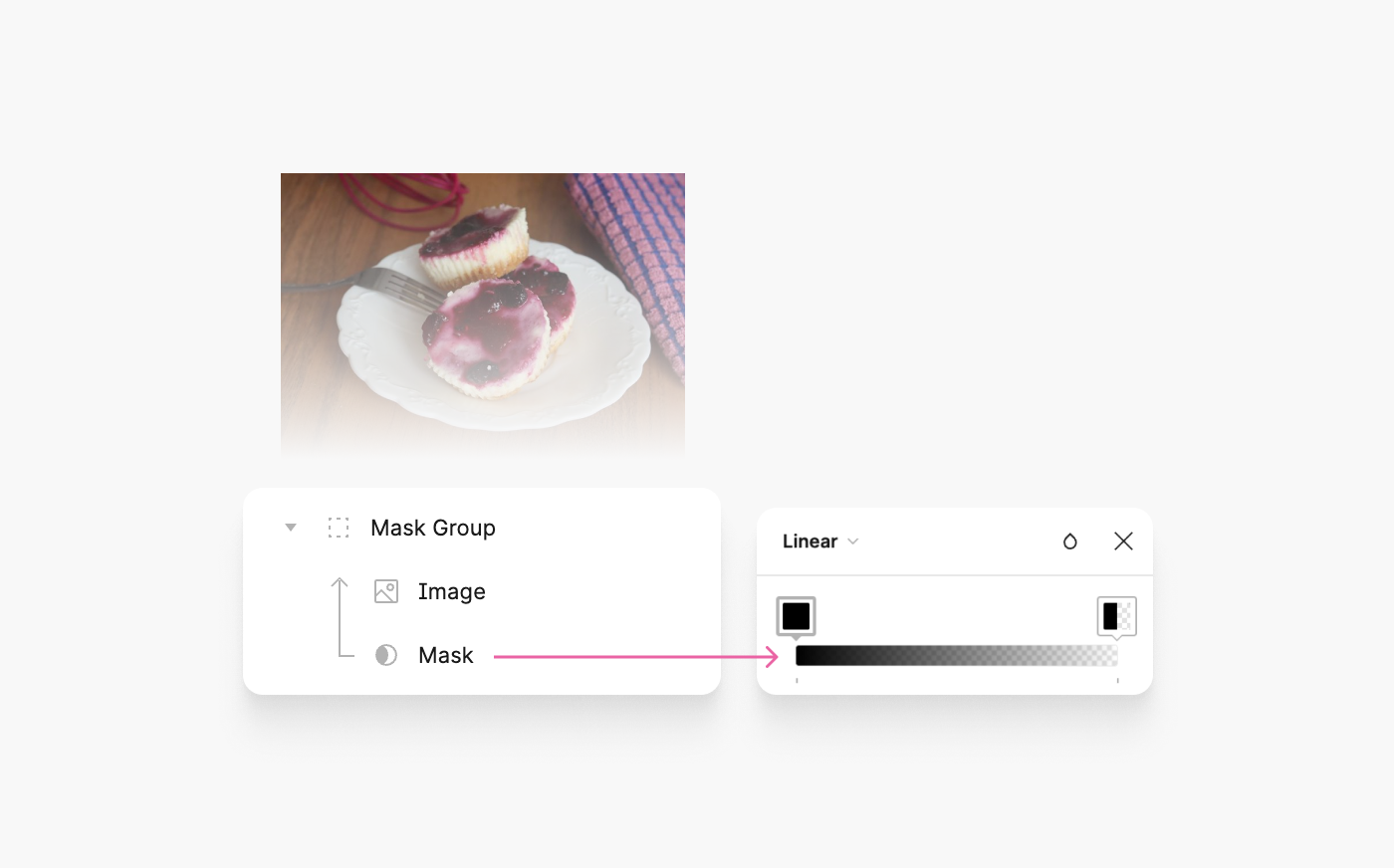
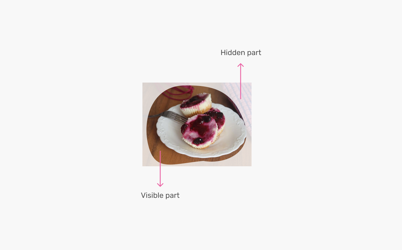
In Photoshop, we can add a layer mask to a group of layers, and the content within that group will be masked within it. The way it works is by using the brush tool to hide a part of the group, and it will get masked.
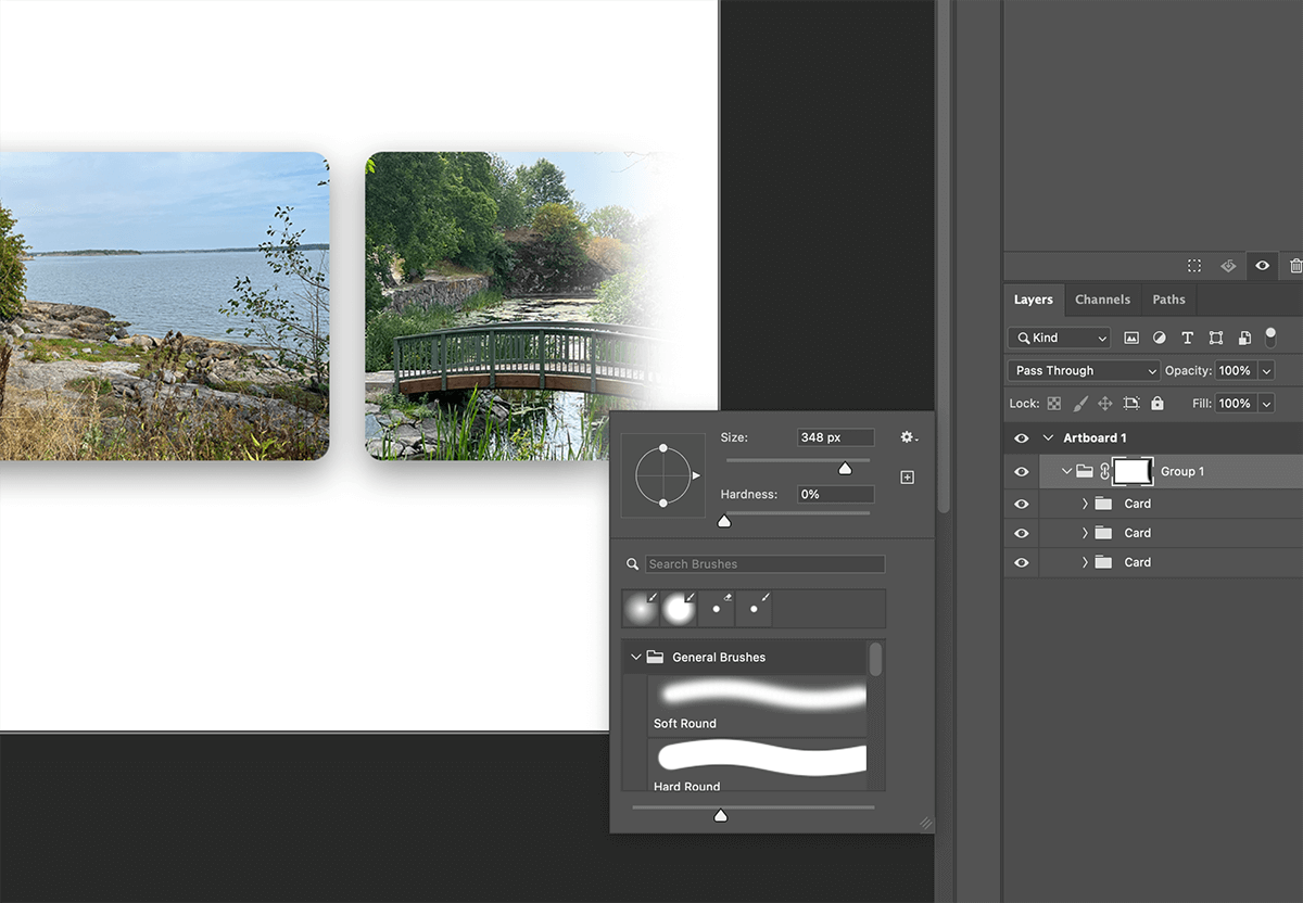
The content that is masked isn’t erased, it’s just hidden (Notice the group items).
Alright, enough theory. In the following sections, I will look into the CSS ways of masking.
How to mask in CSS
In CSS, there are several ways to mask elements:
- The
maskproperty - The
clip-pathproperty - SVG
<mask>
The main difference between the mask property and clip-path is that the first is used for images and gradients, and the latter is used for paths. For this article, the focus will be on the mask property.
In CSS, we have the shorthand property mask, which is similar to the background property. YES, you read that right. That’s why I think it’s easy to remember the syntax, because it’s literarily the same as the background property, but with few additional properties.
Instead of listing all the CSS masking properties, I will walk through an example that adds a mask feature gradually so you can spot the difference visually.
A CSS background look like this:
.card__thumb {
  background-image: url("hero-cool.png");
}
..and a CSS mask look like this:
.card__thumb {
  mask-image: url("hero-cool.png");
}
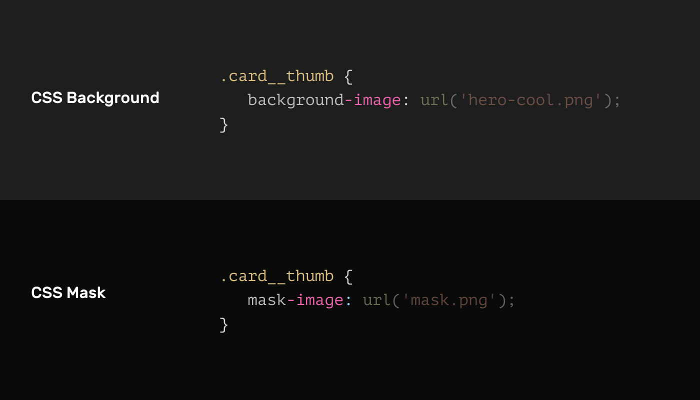
That is cool, right? It will make understanding and memorizing CSS masks much easier.
Let’s redo the initial example with CSS.
First, I need to export the shape as a png image.
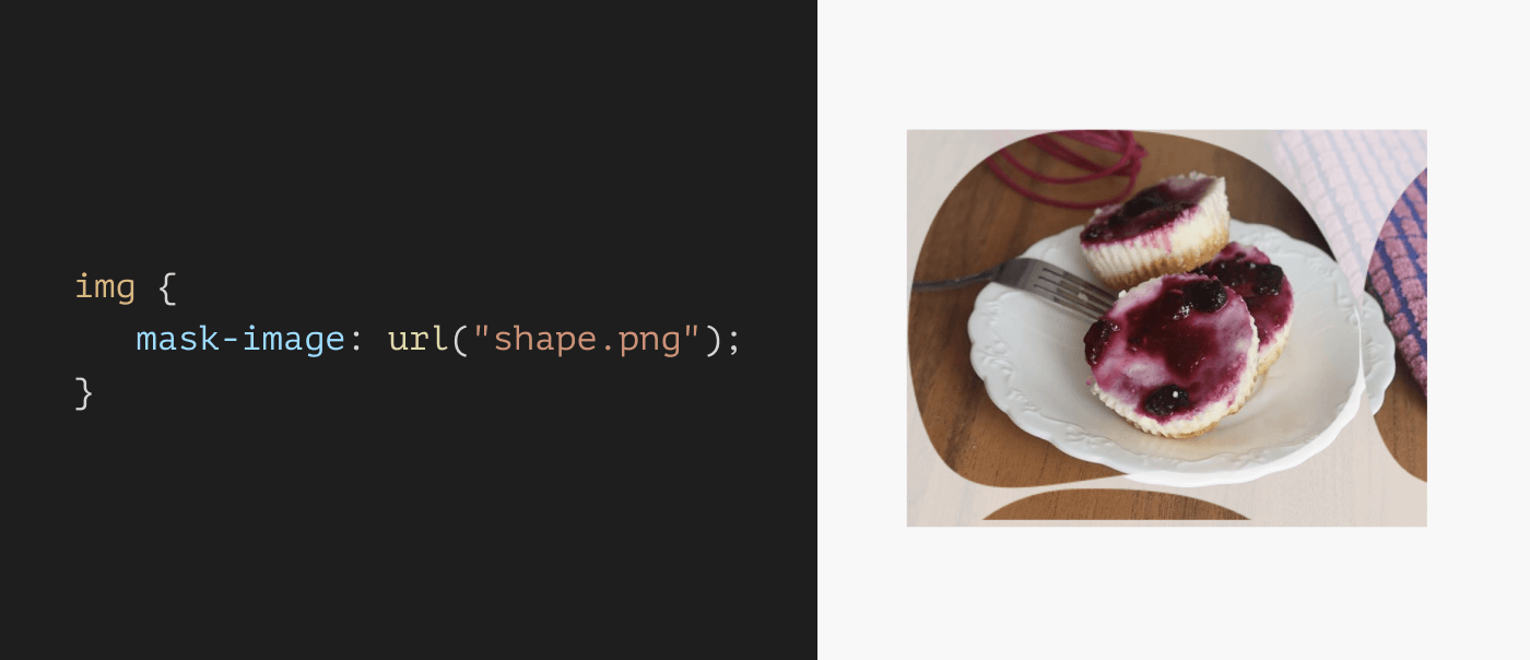
Let’s assume that I want to apply the mask to an image.
<img src="ahmad-shadeed-web-directions.jpg" alt="" />
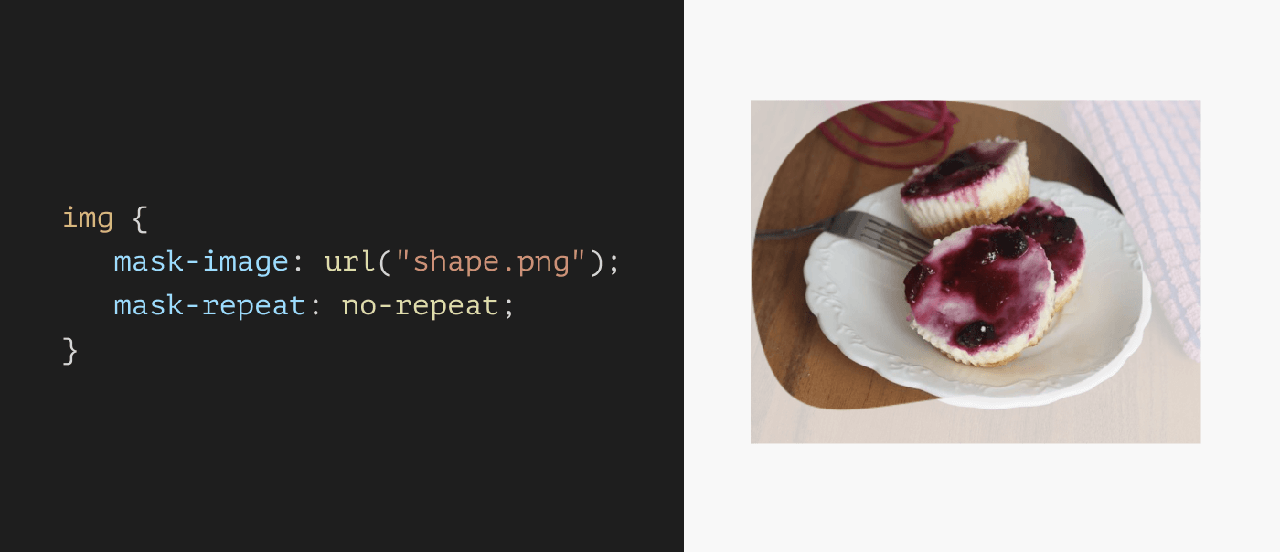
img {
  mask-image: url("shape.png");
}
Can you expect the result? By default, a mask will repeat and its size will be equal to the mask image itself. Currently, the result looks like this:
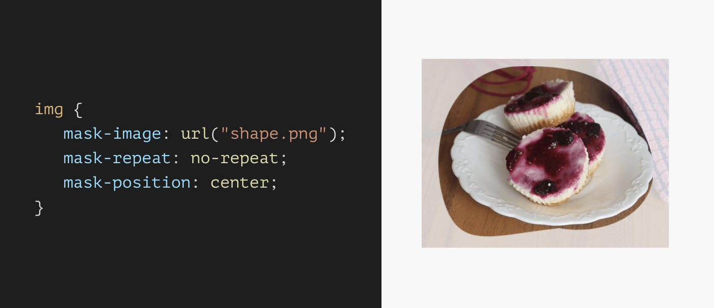
To revert that, we need to set the mask-repeat to no-repeat, just like CSS background images.
img {
  mask-image: url("shape.png");
  mask-repeat: no-repeat;
}
Awesome! Notice that the mask is positioned at the top left corner. We can change that via mask-position. Again, notice how the syntax is identical to CSS background images!
img {
  mask-image: url("shape.png");
  mask-repeat: no-repeat;
  mask-position: center;
}
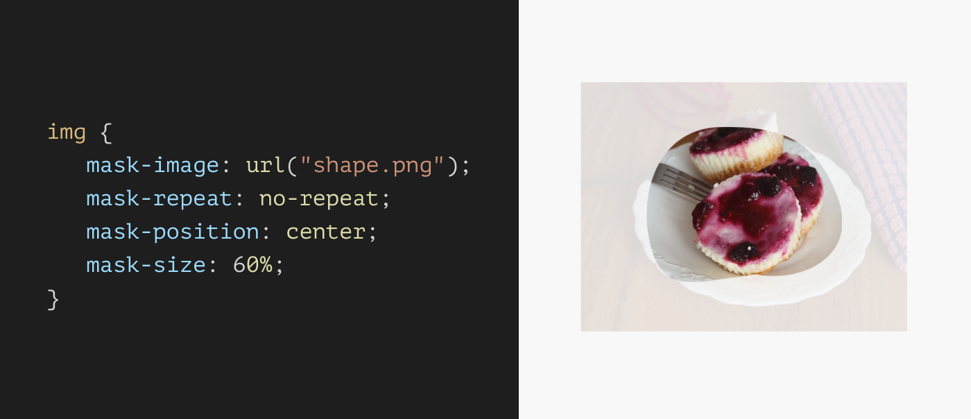
In addition to the position, we can also change the mask size. This is useful in making a mask image responsive to the element’s size.
img {
  mask-image: url("shape.png");
  mask-repeat: no-repeat;
  mask-position: center;
  mask-size: 60%;
}
There are a few more mask properties but I don’t want to overwhelm you with them now, I will come to them later with real use cases.
Masking with CSS gradients
CSS masking isn’t just about using an image, we can also leverage gradients to create powerful and useful masking effects.
I will show a few useful use cases later on, but for now, I want to focus on the core fundamental of how gradients work with masking.
In the following example, the mask-image consists of a CSS linear gradient from full black to transparent.
img {
  mask-image: linear-gradient(#000, transparent);
}
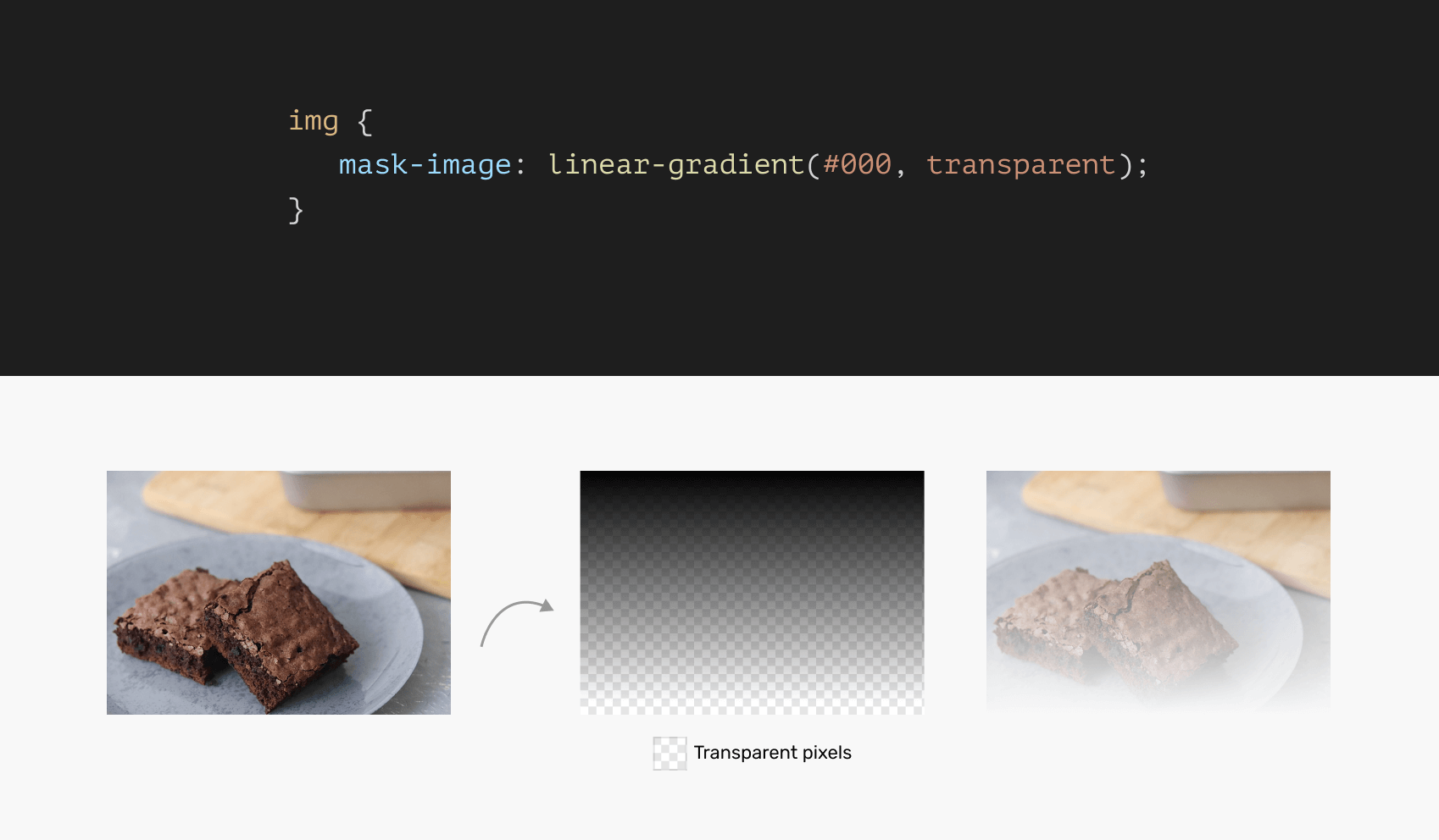
According to MDN:
By default this means the alpha channel of the mask image will be multiplied by the alpha channel of the element. This can be controlled with the mask-mode property.
That means, you can use any color other than black, and the mask will still work because the default masking mode is set to alpha (I will come back later to this in detail).
img {
  mask-image: linear-gradient(red, transparent);
}
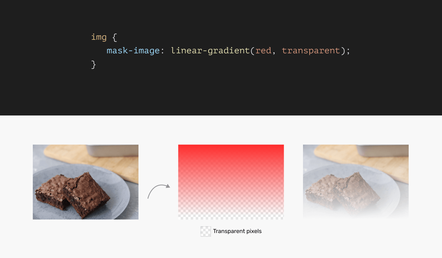
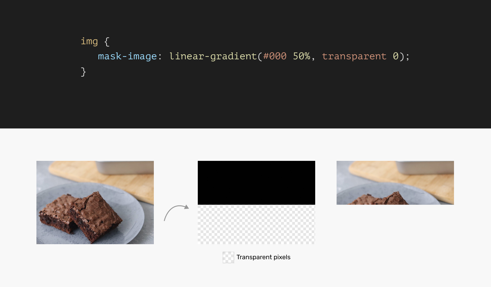
Again, the concept of masking is that a transparent pixel will be hidden. Here is a simplified example of a gradient with hard color stops:
img {
  mask-image: linear-gradient(#000 50%, transparent 0);
}
Cool! Now that the core masking concepts are clear (I hope so), let’s explore a few practical use cases for CSS masks.
Practical use cases & examples
Fading an image
An interesting usage of masking is when we want to fade an image and make it blend with the background underneath it.
Consider the following figure:
css-masking-use-case-fade-image-light.png
At the first glance, you might think about adding a gradient with the same color as the background. Something like this:
.hero__thumb:after {
  position: absolute;
  inset: 0;
  background: linear-gradient(to top, #f1f1f1, transparent);
}
While this might work, it will fail when the main background color is changed. Notice how the hero image has a hard stop now:

With CSS masking, we can mask the hero image and make it work with any background color.
.hero__thumb {
  mask-image: linear-gradient(#000, transparent);
}
That’s it! Now the fade-out effect is real, and won’t fail when the main page background is changed. See the following example:
Masking text content: example 1
When we want to display a long text but the space isn’t enough to display it in full, a solution would be to fade out the text at both the beginning and end. Then, the text will animate in either direction to show the remaining content.
Consider the following figure:
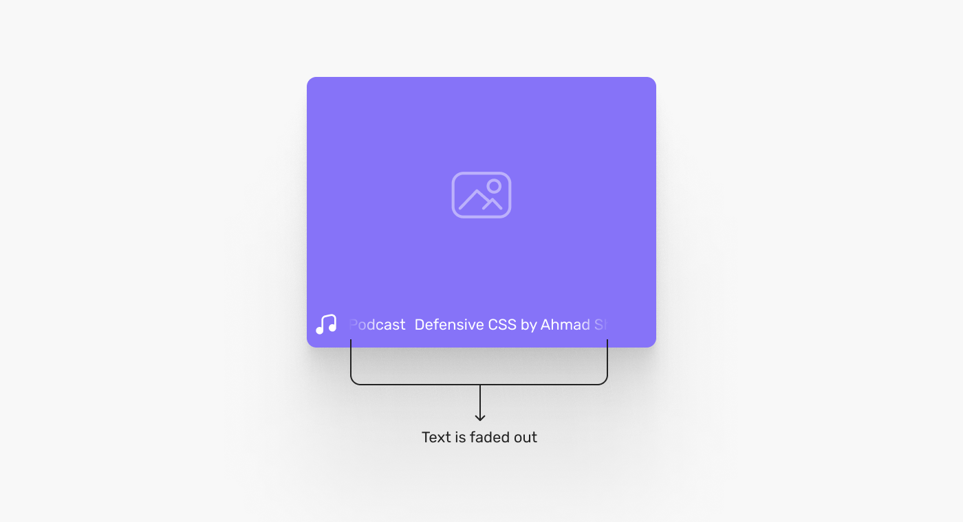
Again, using the hack of a gradient won’t work because the background underneath the content will change. It can be a solid color or an image.
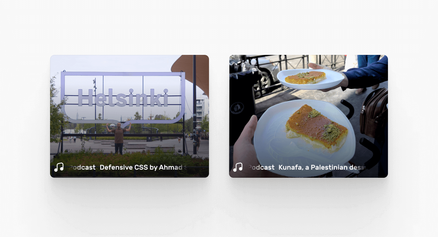
To implement that in CSS, we need to add a gradient mask that fades out the content at the beginning and the end.
I like to do that in CSS gradients first and see the result, then apply it as a mask. That helps in visualizing the gradient before using it as a mask.
.c-card__footer {
  background-image: linear-gradient(
    90deg,
    transparent,
    #000 15%,
    #000 85%,
    transparent 100%
  );
}
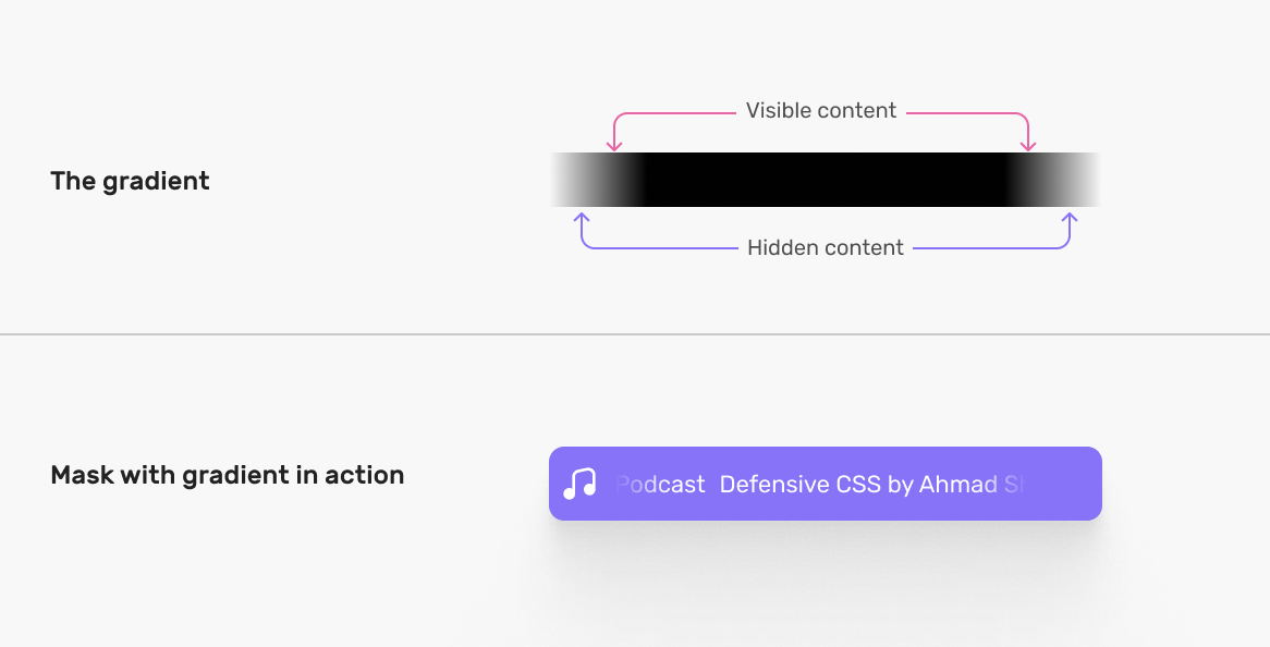
With the above in hand, we can apply it as mask.
.c-card__footer {
  mask-image: linear-gradient(
    90deg,
    transparent,
    #000 15%,
    #000 85%,
    transparent 100%
  );
}
Still not perfect? We can tinker with the gradient values until the result is perfect.
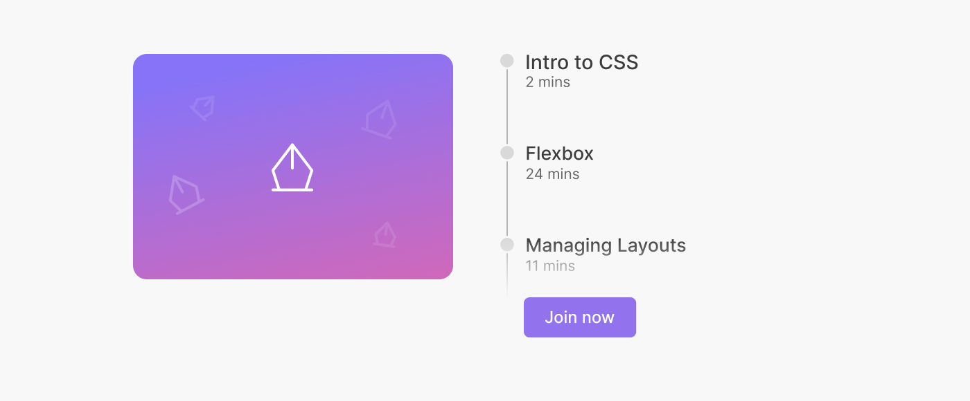
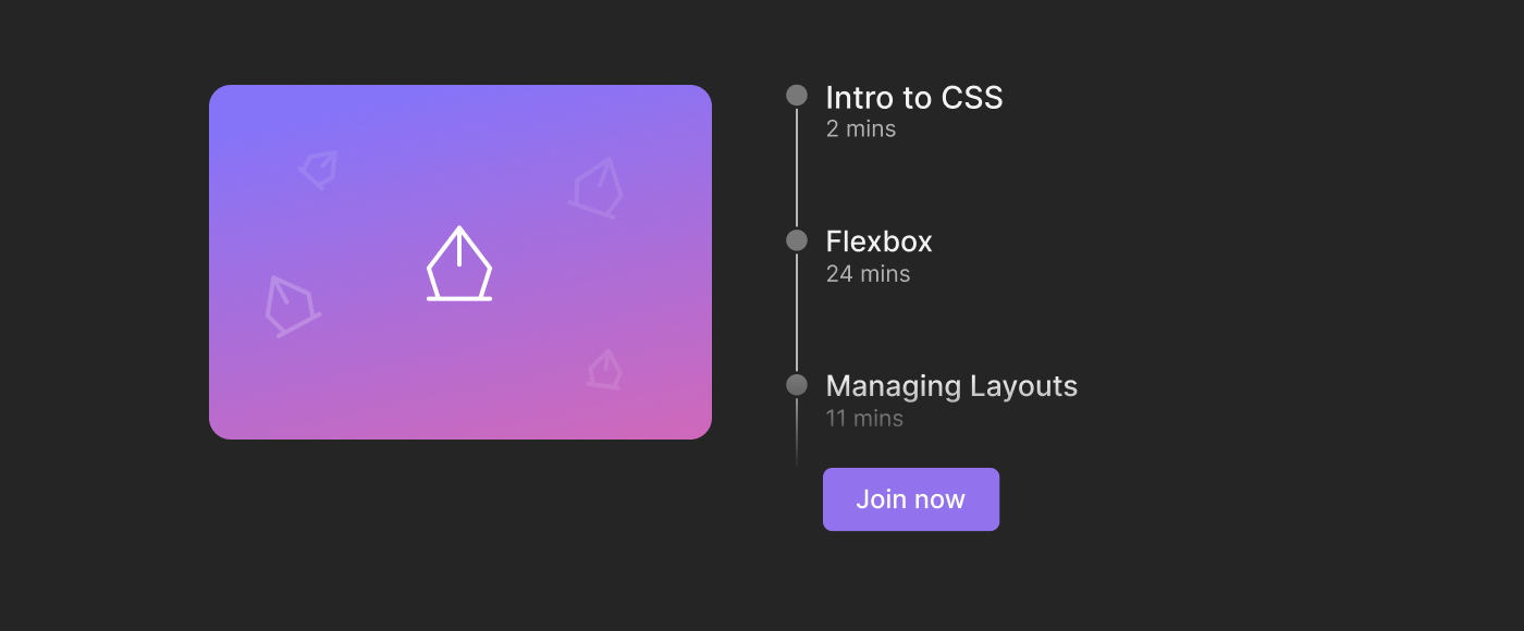
Masking text content: example 2
This is the same as the previous example but applied vertically. I have seen this in live videos on Instagram.
Consider the following figure:
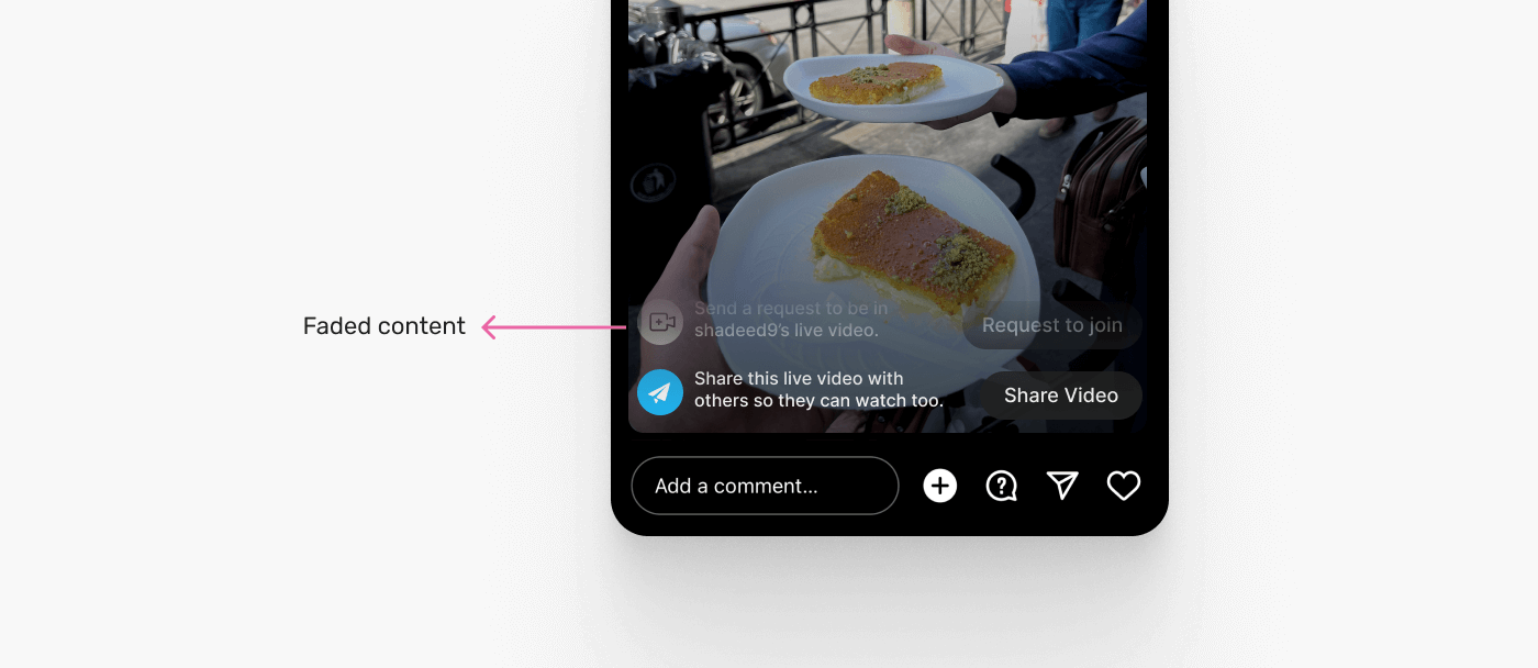
Notice how the content is being washed out from the top? This little place can have the feed comments, actions, and other things. Using a CSS mask is perfect for that.
First, let’s take a look at the gradient.
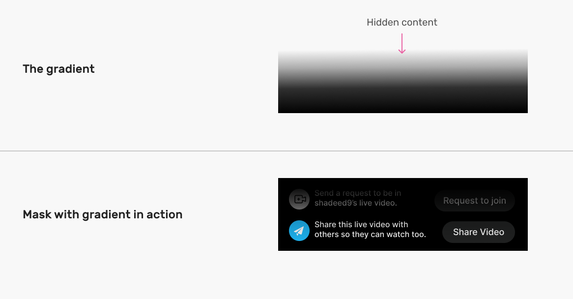
In CSS, it can be something like this:
.whatever-the-class-name {
  mask-image: linear-gradient(to bottom, transparent, #000);
}
Masking lists
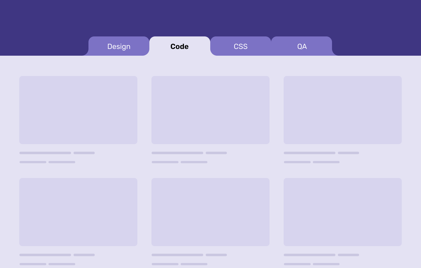
I saw this cool example by Scott Tolinski while doing my research on CSS masks. The idea is that we have a list of features, lessons, or whatever it is. We want to fade out the text to make the user more curious about what’s in there.
Consider the following example:
As you see on the left, we have a list, and at the very bottom, it’s faded out. Using CSS masking for that is perfect, as it can blend with the underneath background, be it an image, or a dark background.
Let’s take a look at the mask gradient to understand how it works.
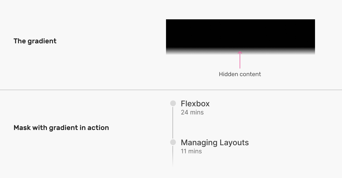
In CSS, it looks like this:
.list {
  mask-image: linear-gradient(to bottom, #000, transparent 95%);
}
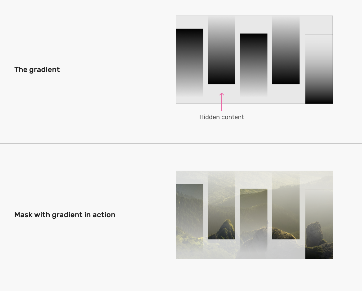
Interesting image effects
With CSS masking and gradients, the possibilities to create visual effects are endless. This is a simple example of how we can create a visual effect for an image.
Here is a quick design that I made for this demo.

The image effect you see consists of 5 linear gradients. By adding different positions to each one, we can something similar.
Let’s take a closer look at the gradient:
.thumb {
  mask-image: linear-gradient(to bottom, #000, #000), linear-gradient(
      to bottom,
      #000,
      #000
    ), linear-gradient(to bottom, #000, #000), linear-gradient(
      to bottom,
      #000,
      #000
    ), linear-gradient(to bottom, #000, #000);
  mask-size: 18% 70%;
  mask-position:
    0 100%,
    25% 25%,
    50% 50%,
    75% 0,
    100% 50%;
  mask-repeat: no-repeat;
}
Visually, the mask looks like this:

To create the fading effect on each rectangle of the mask, we need to update each gradient and include the transparent keyword.
.thumb {
  mask-image: linear-gradient(to bottom, transparent, #000),
    linear-gradient(to bottom, #000, transparent), linear-gradient(
      to bottom,
      transparent,
      #000
    ), linear-gradient(to bottom, #000, transparent), linear-gradient(to
        bottom, transparent, #000);
  mask-size: 18% 70%;
  mask-position:
    0 100%,
    25% 25%,
    50% 50%,
    75% 0,
    100% 50%;
  mask-repeat: no-repeat;
}
We can also animate the mask size or position on hover.
This is powerful. Imagine combing that with a scroll-based animation. Things can go out of control (in a nice way, though).
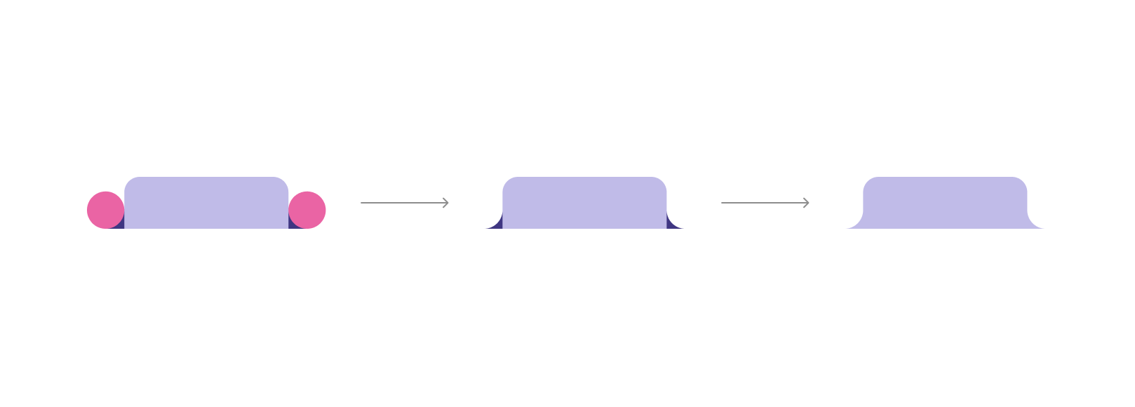
Round out tabs
I thought about trying CSS masks for a UI treat called Round out corners.
The idea is that we want to round out the sides of an element in a way that blend with the border-radius the element has.
In this blog post, Chris Coyier explained a trick for achieving that by using multiple pseudo-elements. A more dynamic solution would be by using a CSS mask.
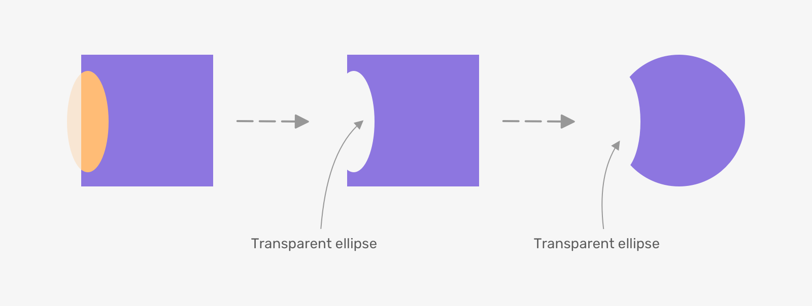
First, let’s take a closer look at the shape that I want to achieve.
The shape consists of a square and a circle. What we need is the intersection of them.
How to achieve that? We can use multiple-layer masks along with the mask-composite property to perform a composting operation on them.
First, we need to create an element to hold the mask.
.nav-item.active:before {
  content: "";
  position: absolute;
  left: 100%;
  bottom: 0;
  width: 24px;
  height: 24px;
  background-color: var(--active-bg);
}

Within that space, we need to draw a circle and a square to composite them. Luckily, we can do that by mixing linear and radial gradients.
.nav-item.active:before {
  content: "";
  position: absolute;
  left: 100%;
  bottom: 0;
  width: 24px;
  height: 24px;
  background-color: var(--active-bg);
  background-image: linear-gradient(to top, #000, #000),
    radial-gradient(circle 15px at center, #000 80%, transparent 81%);
  background-size:
    12px 12px,
    100%;
  background-position:
    bottom left,
    center;
  background-repeat: no-repeat, repeat;
}
Notice the following:
- I added
12px 12pxas a size for the square. - The square is positioned at the
bottom leftcorner. - No background-repeat is needed for the square shape.

The above is just to visually illustrate how the two gradients will look like. The next step is to make them! In CSS masking, we can use the mask-composite property to composite two shapes.
.nav-item.active:before {
  content: "";
  position: absolute;
  left: 100%;
  bottom: 0;
  width: 24px;
  height: 24px;
  background-color: var(--active-bg);
  mask-image: linear-gradient(to top, red, red), radial-gradient(circle
        15px at center, green 80%, transparent 81%);
  mask-size:
    12px 12px,
    100%;
  mask-position:
    bottom left,
    center;
  mask-repeat: no-repeat, repeat;
  mask-composite: subtract;
}
Here is the result of the above:
The above was the CSS for the shape on the right side. For the other one, we can simply change the mask-position and it will flip.
.nav-item.active:after {
  /* other styles */
  mask-position:
    bottom right,
    center;
}
Multiple avatars cut-out
In my article about the cut-out effect, I explored different ways to create a cut-out in CSS.
One of the examples was good for CSS masking.
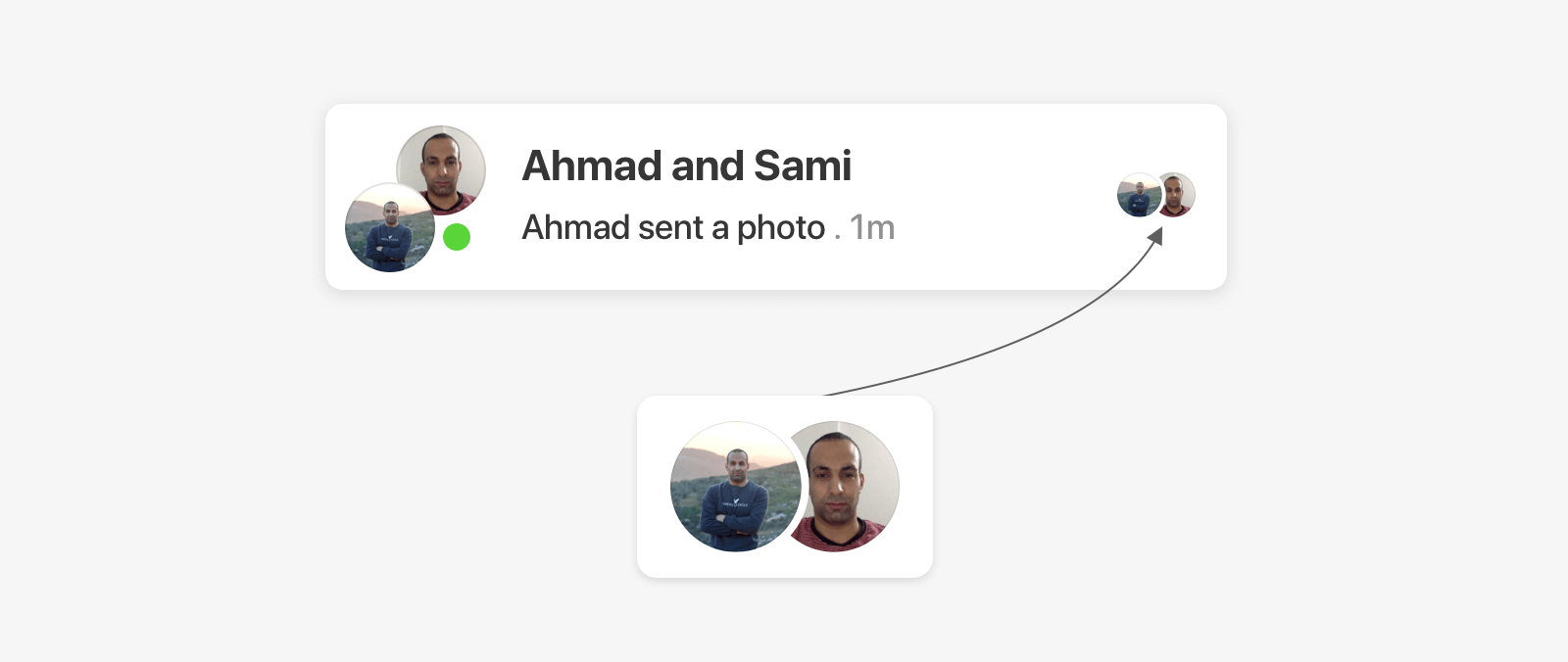
With CSS masking, we can use a radial gradient to achieve that effect.
.avatar {
  -webkit-mask-image: radial-gradient(
    ellipse 54px 135px at 11px center,
    #0000 30px,
    #000 0
  );
}
I highly recommend giving the article a read as there are a lot of detailed examples like that one.
Outro
When I started learning more about masking in CSS, the resources were limited. More importantly, there were very few practical use cases that we can use in our day-to-day workflow. I hope that by the end of this article, you now have an idea of where to use CSS masking in your next project.
By the way, I didn’t go deep into properties like mask-mode, because I honestly didn’t find a problem to solve with them (until now). I will update the article when I have a more convincing example of using such a property.
Further resources
If you want to sharpen your skills in even more examples of CSS masking, then you must have a look at the following:
- A Fancy Hover Effect For Your Avatar by Temani Afif
- Mask Compositing: The Crash Course by Ana Tudor
- CSS only Speech Bubble by Temani Afif
- Fancy gradient border on hover by Temani Afif
Thank you for reading.
