The Layout Maestro
Intro
We always wanted a way in CSS to style an element based on its descendants. It wasn’t possible until CSS :has() became supported in all major browsers.
In this article, I will explore the problem and shed the light on some of the interesting use cases for CSS :has().
The problem
Say we have a <figure> and we want to style it differently if it has a <figcaption>. How to achieve that in CSS?
<figure>
  <img src="thumb.jpg" alt="" />
  <figcaption>A great looking tart.</figcaption>
</figure>
See the following demo. Try to toggle the “Show caption”.
See the following figure:
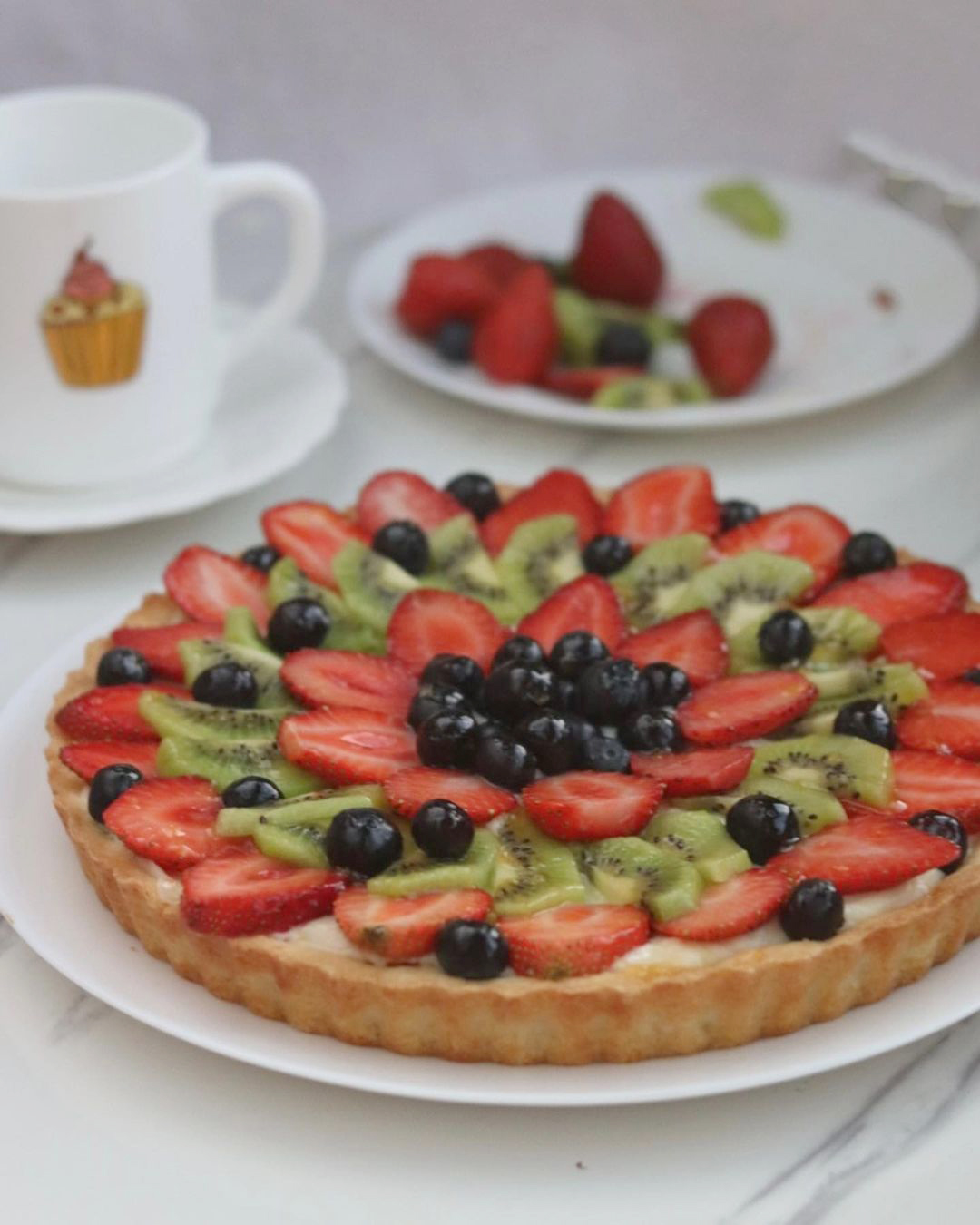
When there is a caption, I want the figure to have the following:
- Padding
- Background
- Shadow
The only possible way in CSS is to give a class to the <figure>, and then select the <figcaption> from that class.
figure.with-caption {
  padding: 0.5rem;
  background-color: #fff;
  box-shadow: 0 3px 10px 0 rgba(0, 0, 0, 0.1);
  border-radius: 8px;
}
This is not doable when we have generated HTML content (e.g: an article body).
The solution
With the CSS :has() selector, this is possible. We can do the following. It’s like saying if the <figure> contains a <figcaption>, style it that way.
Can you guess the solution? Try to type it below and see the result in action. As a reminder, you need to type :has and the selector you want.
Write the CSS selector needed to style the figure only if it has a figcaption.
background-color: #fff;
border-radius: 8px;

<figure><img src="thumb.jpg" alt="" /><figcaption>A great looking tart.</figcaption></figure>
Reveal the solution
figure:has(figcaption) {
  padding: 0.5rem;
  background-color: #fff;
  box-shadow: 0 3px 10px 0 rgba(0, 0, 0, 0.1);
  border-radius: 8px;
}
In the following demo, notice how when the <figcaption> is commented, the CSS :has() takes action.
See the following figure:

<figure><img src="thumb.jpg" alt="" /><figcaption>A great looking tart.</figcaption></figure>
This is just scratching the surface of problems we can solve with CSS :has().
CSS selectors recap
Before diving into some interesting CSS selectors with :has(), let’s do a quick recap on them.
Adjacent sibling selector
To select the next sibling of an element, we can use the adjacent sibling selector (+) for that.
.book {
  opacity: 0.2;
}

.frame + .book {
  opacity: 1;
}
Try it yourself in the demo below.
Select the book that is next to the frame
General sibling selector
To select all the next siblings of an element, we can use the general sibling selector (~) for that.
.book {
  opacity: 0.2;
}

.frame ~ .book {
  opacity: 1;
}
Select all the books that are after the frame
The previous sibling selector
With CSS :has(), we can take the above further and select the previous sibling of an element.
In the following snippet, the :has() makes it possible to select a book that is followed by a frame.
.book {
  opacity: 0.2;
}

.book:has(+ .frame) {
  opacity: 1;
}
Select the previous element before the frame.
Adding on the above, we can select all of the previous elements of a specific element. In our case, we want to select all the .books before the .frame element.
.book {
  opacity: 0.2;
}

.book:has(~ .frame) {
  opacity: 1;
}
Select all the .book elements before the .frame.
The child combinator
The > selector selects an element if it’s the direct child only. For example, using .section > h1 will select an <h1> only if it’s a direct child of the section.
Review your knowledge with the demo below.
Select the .book that are inside the .box
The :not pseudo-class
The :not() selector in CSS is useful to exclude an element from a selection. For example, .section:not(.featured). Try the demo below and select all books except the .blue one.
Select all books except the .blue
That’s it for the selectors recap. It was important to set clear expectations and make sure that any upcoming example that explains them is clear to you.
CSS :has() selectors matching
Learning to read a CSS :has() selector is useful. In this section, I will go through a few examples and show you how to analyze them.
The following are general examples for you to practise.
Card with image
In this example, we have a card with an image as a child element. We can check that with CSS :has().
Try to toggle the checkbox and see how the CSS selector works only when there is an image.
<div class="card"><div class="card-content"></div></div>
What if we want a selector that should match only if the image is a direct child of the card? When the .card-thumb element is there, it won’t match.
Try it yourself.
<div class="card"><div class="card-thumb"><img src="thumb.jpg" alt="" /></div><div class="card-content"></div></div>
Card without an image
CSS :has() can be combined with the :not() selector. In this case, the card selector will match only if it doesn’t have an image.
<div class="card"><img src="thumb.jpg" alt="" /><div class="card-content"></div></div>
Adjacent sibling and :has
See the following demo. We want to select the .shelf that contains the frame that is followed by a purple book.
By default, the frame comes after the book. Toggle the checkbox and see how the CSS :has() selector will work.
Select a shelf if it only contains a box
In this example, the CSS :has() selector tries to match if there are books inside the box container only.
Select a box without a blue book
Combining :has() and :not() is one of the many possible things to do in CSS :has(). In this example, the selector will match only if the box doesn’t have a blue book.
Select the box with 3+ books
Change the book order based on the number
An interesting way is to change the book ordering from stacked to stand-up based on their number. In the following demo, if the number of books is 5+, they will change to a standing-up order.
Try to add more books and see what happens.
By using the :nth-last-child(), this is possible.
.shelf:has(.book:nth-last-child(n + 5)) {
  flex-direction: row;

  .book {
    height: 100%;
    width: 22px;
  }
}
Add spacing to each 3rd items if 5+ books
This is the same previous example, but we took it further. If the number of items is 5+ books, we need to add a space to each 3rd item for better shelf organization.
The bookshelf
A fun example where I have the following conditions with CSS :has():
- Change the books from stack to stand based on their number
- Hang the frame to the wall if certain number of books is there
- Throw the plant and earth on the ground
Play with the demo.
Change books ordering
The first thing is that I want to change the books from stack to stand, if there are 5+ books.
.shelf:has(.book:nth-last-of-type(n + 5)) {
  /* Change the book from stack to stand */
  flex-direction: row;

  .book {
    height: 100%;
    width: 22px;
  }
}
Hang the frame to the wall
If there 6+ books, the frame should be moved to the wall.
.shelf:has(.book:nth-last-of-type(n + 6)) {
  .frame {
    position: absolute;
    left: calc(50% - (75px / 2));

    top: -165%;
  }
}
Throw the plant and earth
No space at all? Simple, throw the plant and earth to the ground, but I’m not responsible for any mess.
.shelf:has(.book:nth-last-of-type(n + 9)) {
  .plant {
    animation: movePlant 0.6s forwards;
  }

  .earth {
    animation: moveEarth 0.6s forwards;
  }
}
Logical operators with CSS :has
With CSS :has(), we can replicate the logical operators like ”&&” and ”||”. In the following demo, we have the conditions:
- Select the shelf if it contains the purple and yellow book.
- Select the shelf if it contains the purple or the yellow book.
Try the following:
- Toggle the books on or off
- Change the option in the menu between “and” / “or”
In CSS, here is what’s happening:
/* OR */
.shelf:has(.bookPurple, .bookYellow) {
  outline: dashed 2px deeppink;
}

/* AND */
.shelf:has(.bookPurple):has(.bookYellow) {
  outline: dashed 2px deeppink;
}
It’s amazing what we can do with logical operators in CSS :has().
I hope that you learned how the CSS :has() works. Now, let’s move into interesting use cases for CSS :has().
Use cases for CSS :has
File download
This is one of my favorite use cases in this article. Say we have a file component that shows the following:
- File image
- Name
- Meta info (pages, size, etc)
If there is no image for the file, we want to check the file extension and change the icon. We can do that with :has().
.file:not(:has(img)) .thumb:before {
  content: "";
  /* Sizing and display stuff */
  background-image: var(--bg, initial);
}

.file:has([href$=".pdf"]) {
  --bg: "icon-pdf.png";
}

/* And so on for other file types. */
Try to toggle the image, then change the file type and see what happens. This is magic, isn’t it?
<div class="file"><div class="thumb"><!-- <img src="file-cover.jpg" alt="" /> --></div><div><a href="file.docx"></a></div></div>
Sidebar width
What if we have a sidebar and need to increase its width if it contains a widget? This is possible with CSS :has.
.layout {
  display: grid;
  grid-template-columns: max-content 1fr;
}

.sidebar:has(.widget) {
  width: 180px;
}
Try it in the interactive demo. I recommend to view this on a large screen.
Please fill the following:
<div class="page"><div class="sidebar"><h2>Selected period</h2><!-- Form input --><div class="widget"></div></div><div class="main"></div></div>
Cookies Banner
This is a common layout issue that I see a lot. Say you have an Intercom widget, and a cookies banner. How the UI will react?
Toggle the banner in the demo below. Notice how the widget is hidden under the banner. This isn’t good.
CSS is awesome. Isn't it?
We can use CSS :has() to move the widget if the banner is shown.
body:has(.banner) .fab {
  bottom: 6rem;
}
Play with the demo and toggle the CSS :has() checkbox.
CSS is awesome. Isn't it?
Dashboard banner
In this example, I want to show an additional visual clue if the page has an alert.
.main:has(.alert) .header {
  box-shadow:
    inset 0 2px 0 0 red,
    0 3px 10px 0 rgba(#000, 0.1);
  background-color: #fff4f4;
}
Toggle the alert and what happens.
Logo
Something is wrong. Please fix here!
Quantity queries with CSS :has
I first learned about quantity queries via this article by Heydon Pickering on A List Apart. The good thing is that we can use them with CSS :has().
The idea is to use the CSS :nth-last-child like this:
li:nth-last-child(n + 5),
li:nth-last-child(n + 5) ~ li {
  width: 50%;
  display: flex;
  flex-direciton: column;
}
This will select all <li>s if there are 5 or more. The problem is that it’s limited to the child elements only. We can’t select the parent.
With CSS :has(), this is possible.
Here is an example:
.wrapper {
  --item-size: 300px;
  display: grid;
  grid-template-columns: repeat(
    auto-fit,
    minmax(var(--item-size), 1fr)
  );
  gap: 1rem;
}

.wrapper:has(li:nth-last-child(n + 5)) {
  --item-size: 200px;
}
I used a CSS variable to represent the item width in the minmax() function. Let’s play with that in CSS :has().
See the interactive demo below. Here is what’s happening:
- There is a quantity query with CSS
:has(). I have 3 of them. - When the number of items changes, the matching query will work.
Select title that comes after a link
We can select an element if it’s followed by another. In this example, I want to select the <a> only if it’s followed by <h3>.
Without CSS :has(), we’re limited to the following only:
.prose a + h3 {
  /* Selects the h3 */
}
With CSS :has(), we can straightforwardly do that.
/* Style the <a> only if an <h3> is after it. */
a:has(+ h3) {
  display: inline-flex;
  background-color: var(--brand-1);
  color: #fff;
  padding: 0.5rem 1rem;
  border-radius: 8px;
  /* other styles */
}
Play with the interactive demo below.
HTML
<div class="prose"><h2 >Main heading</h2><p>Description text</p><a href="#">Read more here</a><p>CSS is awesome.</p><h3>Sub title in here</h3></div>
Card with a disabled button
In this example, we have a product card with a stock element. When the stock element has the class of .out-of-stock, we want to change the card style.
We can hide the “add to cart” button, or show a “Notify me when available”. Whatever works best for your case.
.card:has(.out-of-stock) .button {
  display: none;
}
Another option for the same case is to add a tag at the top of the product card. Those are purely design decisions and the demo just showcases one of the many possible solutions.
.card {
  &:has(.outOfStock) {
    position: relative;

    &:after {
      content: "Not available";
      position: absolute;
      inset-inline: 0;
      top: 0;
      color: #fff;
      background-color: rgb(255 0 0 / 76%);
      /* other styles */
    }
  }
}
Try to toggle “out of stock” and see what happens.
Toggle the checkbox.

The Barista Pro
Be a barista at home.
5 items left
Card with hovered button
We can add a hover effect to a card if a button is hovered.
Try to hover on the button and see how the card shadow changes. This is all with CSS :has().
For me, this is like :focus-within. Maybe I should call it :hover-within?
.card:has(.button:hover) {
  box-shadow:
    0 2px 4px 0 rgba(#000, 0.15),
    0 3px 25px 0 rgba(#000, 0.15);
}
Toggle the 2nd style and see a different styling option. This is all done with CSS :has().
.card {
  &:has(.button:hover) {
    color: #fff;
    background-color: var(--brand-1);
    box-shadow:
      0 0 0 7px var(--brand-1),
      0 2px 20px 0 rgba(#000, 0.25),
      0 3px 45px 0 rgba(#000, 0.25);

    .button {
      color: inherit;
    }

    h3,
    p {
      color: inherit;
    }
  }
}
Modal
In a modal, we might need to change the title color if it’s about a critical action, like deleting something important.
See the following demo. We have a modal with action buttons.
What I want is that when there is a .btn--danger class, the modal title should be red. Normally, we’ll need to add a class like this to the modal header:
<div class="modal modal--danger">
  <div class="modal-header">
    <h2>Edit project</h2>
  </div>
</div>
And then style it like so:
.modal--danger h2 {
  color: red;
}
With CSS :has(), all we need to do is the following:
.modal {
  &:has(.btn--danger) {
    .modal-title {
      color: red;
    }
  }
}
See the interactive demo.
Modal buttons
In this example, we have a modal with multiple action buttons. The problem here is that we want to change the layout based on the number of buttons.
Try to toggle the checkbox and see what happens.
Notice how the layout changed? This happened with CSS :has() only. It’s wild of what we can do with it!
See the following HTML.
<div class="modal-actions">
  <a href="#" class="btn btn--secondary">Cancel</a>
  <a href="#" class="btn btn--ter">Save draft</a>
  <a href="#" class="btn btn--primary">Submit</a>
</div>
In CSS, we need to check if the number of buttons is three. If yes:
- position the last one on the far right
- change
justify-contenttostretch
.modal-actions {
  display: flex;
  justify-content: center;
  gap: 0.5rem;

  &:has(.btn:nth-last-child(n + 3)) {
    justify-content: stretch;

    .btn:last-child {
      margin-inline-start: auto;
    }
  }
}
We can even go further and make more styling changes. For example:
- Change the background color
- Add a border
- Add padding
- Reset paddings with negative margins (kind of a hack)
Here is the CSS:
.modal-actions {
  &:has(.btn:nth-last-child(n + 3)) {
    justify-content: stretch;
    border-top: 1px solid #d3d3d3;
    background-color: #f5f5f5;
    padding: 0.75rem;
    margin-inline: -1rem;
    margin-bottom: -1rem;

    .btn:last-child {
      margin-inline-start: auto;
    }
  }
}
Section empty state
In this example, CSS :has() is used to detect if a section contains an element with empty content. If yes, then the layout will change.
Before CSS :has(), this needed to be done in Javascript. Now, with CSS :has() help, we can reduce the Javascript needed significantly.
Here is the section with the content.
Products listing
Your products will appear here.
When there is no content, it should look like this:
Products listing
Your products will appear here.
We can check the :empty pseudo-class on the parent and do the styles we need.
.section:has(.sectionContent:empty) {
  /* If the selector matches, we can apply CSS here
  and on any child within .section */
}
Here is the complete CSS:
.section:has(.sectionContent:empty) {
  display: flex;
  flex-direction: column;
  justify-content: center;
  min-height: 150px;

  .sectionHeader {
    p:first-child {
      display: flex;
      flex-direction: column;
      align-items: center;
      gap: 0.5rem;

      &:before {
        content: "";
        --size: 3rem;
        display: block;
        width: var(--size);
        height: var(--size);
        background-color: lightblue;
        border-radius: 50%;
      }
    }

    p:last-child {
      display: block;
    }
  }
}
Play with the demo below.
Products listing
Your products will appear here.
Input states
With CSS :has(), we can check the input state like a checkbox, radio button or <select> menus. There are some interesting use cases when mixing :has() with input states.
Checkbox and CSS :has
We can check the value of a checkbox and do something as a result of it. See the following demo:
If the checkbox is checked, the button will be enabled.
Try to hover on the box or the button.
Terms and conditions
Before moving to the next step, please make sure you agree with our terms of services.
It’s like an if statement in Javascript, or a React state. Interesting, right?
Radio button and CSS :has
What if we want to change the CSS based on the selected radio button? This is also possible. In the following example, a note will be displayed if the user picks “standard shipping”.
See the following demo:
Try to hover on the box or the button.
Delivery options
Pick a delivery option.
Standard shipping may take up to 10 business days. Works only within the US.
NextSelect menu and CSS :has
We can also check the currently selected option of a <select>. One common example is to display an input field conditionally.
For example, if the user selects “other”, we want to show input to let them fill in more info.
Tell us a bit about you
Pick a delivery option.
HTML attributes
Disabled attribute
If a button has the disabled attribute, we can show additional information to let the user understand that something is missing.
Create a new profile
Pick a delivery option.
Before creating a profile, you must verify your account first. Kindly check your email.
You cannot create a profile.
This example is inspired by this Great article by Vitaly Friedman on Smashing Magazine.
Dual hover with data attributes and :has
By combining data attributes and CSS :has(), we can create a really interesting effect. You can trigger an item by hovering on another and they don’t need to be in the same parent.
I first saw this by Rodrigo Pombo and I was like 😱.
The idea is to add a data attribute for two elements or more, and then use :has() to know when one of the items is hovered and trigger other items with the same data attribute.
<div class="wrapper">
  <ul class="tags">
    <li data-name="css">CSS</li>
    <li data-name="design">Design</li>
  </ul>

  <div>
    <article data-name="css"></article>
    <article data-name="design"></article>
  </div>
</div>
.wrapper:has([data-name="css"]:hover) [data-name="css"] {
  outline: 2px solid;
}
See the following demo:
- CSS
- Design
Dual hover example
Say we have a widget that contains a sample of my work. I want to have links to each and at the same time to connect the items to images. We can add the images as pseudo-elements, but that is a hack.
With CSS :has(), we can have the images in a separate element and add a shared data attribute for each link and image.
<div class="work">
  <p>
    I wrote a book on
    <a data-name="book" href="https://debuggingcss.com/">
      Debugging CSS </a
    >.
  </p>
  <div>
    <img data-name="book" src="book.jpg" alt="" />
  </div>
</div>
Try to hover on one of the links.
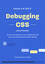
👋I wrote a book on Debugging CSS and coined the Defensive CSS methodology.
.work:has(a[data-name="book"]:hover) {
  img[data-name="book"] {
    transform: scale(1.1);
  }
}
The possibilities are endless.
The download attribute
By checking for the download attribute in a link, we can add a download icon to indicate that. See the following:
.content:has(a[download]):before {
  /* The download icon */
}
Here is an interactive demo. Notice how when there is a link with download. The design changes (Toggle the checkbox).
Food guide.
If you are interested, your can Read more about the guide.
<div class="content"><p>Food guide</p><p>You can <a href="#">Read more</a> about the guide.</p></div>
Reversed list
In HTML, we can add the reversed attribute to a list and this will reverse the numbering. Why not add an icon if the list is revered?
Here you go:
.content:has(ol[reversed]) h3:before {
  /* The arrow */
}
Upcoming confs
- CSS day
- Web directions summit
- Smashing Conf
<div class="content"><ol reversed><!-- items --></ol></div>
Question quiz
This is an interesting usage of CSS :has(). I used it for:
- Changing the header color based on whether the answer is correct or not
- If the answer is wrong, the correct one will flash in green.
Play with the demo below:
- Pick the wrong answer (the first and last)
- Pick the correct answer (the second one)
What's the topic of the current article?
Here is the HTML:
<div class="question">
  <div class="questionHeader"></div>
  <div class="list">
    <div class="answer">
      <input type="radio" data-correct="false" />
      <label for="option-0">Responsive design</label>
    </div>
    <!-- other options -->
  </div>
</div>
Each option in the answers list has a data-correct HTML attribute. This will be useful to detect the correct answer.
In CSS, we query the .question container and see if there is an answer that matches for the following:
- Checked by the user
- Has the
data-correct=falseordata-correct=true
If it’s false, then we add the red color.
.question:has(input[data-correct="false"]:checked) {
  .questionHeader {
    box-shadow: inset 0 7px 0 0 var(--wrong);
    background-color: var(--wrong-bg);
  }
}
And if it’s correct, the color is green.
.question:has(input[data-correct="true"]:checked) {
  .questionHeader {
    box-shadow: inset 0 7px 0 0 var(--correct);
    background-color: var(--correct-bg);
  }
}
For the flashing animation, we need to detect if an answer is wrong, and then add a CSS animation to the correct answer.
.question:has(input[data-correct="false"]:checked) {
  input[data-correct="true"] + label {
    animation: flash 1s infinite alternate;
  }
}

@keyframes flash {
  from {
    background-color: white;
  }

  to {
    background-color: #5ed235;
  }
}
Header wrapper
How you ever come across a use case where you need to conditionally wrap a header?
For example, in the main landing page for non-logged users, the header is taking the full width of the viewport. For the logged user, the header’s content is within a wrapper with a maximum width.
See the following demo and try to toggle the checkbox on and off.
Logo
- Home
- About
- Works
HTML
<div class="header"><!-- Flex --><a href="#">Logo</a><nav><!-- Nav items --></nav></div>
Notice how when there is a wrapper, the content is contained. The indicators on the left and right represent the space.
Say we want to apply Flexbox to the header. If there is no wrapper, then flexbox is applied on the header itself. If there is a wrapper, then we apply flexbox to the wrapper.
/* If there is NO wrapper */
.siteHeader:not(:has(.headerWrapper)) {
  display: flex;
  justify-content: space-between;
  align-items: center;
}

/* If the header contain a wrapper */
.siteHeader:has(.headerWrapper) {
  .headerWrapper {
    display: flex;
    justify-content: space-between;
    align-items: center;
  }
}
That way, flexbox will be applied conditionally based on the presence of a wrapper.
Card thumb
A card might not always have an image. We can change the styling a bit if the card doesn’t have an image.
.card:not(:has(img)) {
  /* Add the border */
}
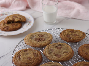
Yummy cookies
Learn how to make great cookies at home.
Card thumb - horizontal
Or we might need to change the card to a horizontal style if there is an image.
<article class="card"><!-- <img src="cookies.jpg" alt="" /> --><div><h3>Yummy cookies</h3><p>Learn how to make great cookies at home.</p></div></article>
Yummy cookies
Learn how to make great cookies at home.
Navigation sub-menu
In the following example, we have a navigation. When one of the <li> items have a secondary menu, we want to use :has() to add an arrow to the <li>.
li:has(.subMenu) {
  display: flex;
  justify-content: space-between;
  align-items: center;
}

li:has(.subMenu) a:after {
  /* Add arrow icon */
}
iShadeed
<ul class="nav"><li><a href="/products">Products</a><!-- <ul class="subMenu"></ul> --></li><li></li><li></li></ul>
Dynamic menu layout with quantity queries
Based on the previous example, say we have a submenu with a dynamic number of items. We can change the menu grid based on the number of items.
Play with the add and remove buttons in the demo to see it yourself.
iShadeed
<ul class="nav"><li><a href="/products">Products</a><ul class="subMenu"><li><a href="#">Item 1</a></li><li><a href="#">Item 2</a></li><li><a href="#">Item 3</a></li><li><a href="#">Item 4</a></li><li><a href="#">Item 5</a></li></ul></li></ul>
This is done via the :nth-last-child
/* 6+ items */
.submenu:has(li:nth-last-child(n + 6)) {
  display: grid;
  grid-template-columns: 1fr 1fr;
  width: 250px;
}

/* 8+ items */
.submenu:has(li:nth-last-child(n + 8)) {
  grid-template-columns: 1fr 1fr 1fr;
  width: 350px;
}
Articles section
This example is inspired from Jen Simmons CSS :has() article on webkit. The idea is to change the CSS grid if an article contain an image.
.grid {
  display: grid;
  grid-template-columns: 1fr 1fr 1fr;
  gap: 1rem;
}

/* Where the :has() magic happens! */
.article:has(img) {
  grid-column: span 2;
  grid-row: span 2;
}
Play with the demo below:
Fruit Tart Mastery
Perfecting the art of fruity tart creation.
Ultimate Brownie Bliss
Elevate your baking with irresistible brownies
Fruit Tart Mastery
Unlock the secrets to perfect Focaccia baking.
<div class="grid"><article><!-- <img src="thumb.jpg" alt="" /> --><p>Fruit Tart Mastery</p><p>Perfecting the art of fruity tart creation.</p></article><article></article></div>
We can take that further and make a lot of variations. For example, I want to style the grid differently if:
- There is a grid with two items
- Both items have photos
Hero section
In this example, we have a hero section. When there is no image, the content should be centered. When there is an image, it will display both text and image next to each other.
.hero {
  text-align: center;
}

.hero:has(img) {
  grid-template-columns: 2fr 1fr;
  text-align: start;
}
Fruit tart.
Learn how to make the best tart.
<section><div class="sectionContent"></div><div class="sectionThumb"><!-- <img src="thumb.jpg" alt="" /> --></div></section>
Card actions
In this demo, we have a card with two possible states for the actions:
- One link “view recipe”
- Multiple actions: “Like, share, context menu”
We can use CSS :has() to check if one of the start or end elements is there and change the UI accordingly.
.card:not(:has(img)) {
  background-color: color-mix(in srgb, var(--brand-1), #fff 95%);
  border-left: 4px solid var(--brand-1);
  max-width: 250px;
}

.cardActions:has(.start, .end) {
  display: flex;
  justify-content: space-between;
  align-items: center;
}
See the demo below:

<article class="card"><img src="thumb.jpg" alt="" /><div class="content"><div class="cardActions"><!--<div class="start"><a href="#">Like</a><a href="#">Share</a></div><div class="end"><a href="#">Menu</a></div>--><a href="#">View recipe</a></div></div></article>
Outro
CSS :has() is a powerful feature that opens a lot of possibilities that weren’t possible before. It literally gives us CSS superpowers! I recommend you start using it today and experiment with it.
