
CSS Grid support has been widely available since March 2017 in all major browsers. Yet, here we are in 2024, and I still see few people using the grid template areas feature.
It’s no surprise that many avoid template areas as making sense of the grid is challenging enough. In this interactive article, I aim to shed light on this feature and, hopefully, convince you to use it more often. Once you see the simplicity and power of template areas, you may reach for them much more frequently.
Introduction
In the following example, we have a grid layout with three columns.
.page {
  display: grid;
  grid-template-columns: 1fr 1fr 1fr;
  gap: 1rem;
}
If I need to position child items within the grid, I need to specify the line number for each item by using grid-column.
.item-1 {
  grid-column: 1 / 3;
}

.item-2 {
  grid-column: 3 / 4;
}
Here is the result.
At first glance, it seems fine and works as expected. But have you thought about how I came up with the line numbers? I don’t always like to open the DevTools and turn on the line numbers so I can place the items where I need them.
The line numbers look something like this:
You can’t see the line numbers until you inspect the element in the browser DevTools. Let’s take a quick quiz.
Consider the following CSS grid:
.page {
  display: grid;
  grid-template-columns: 1fr 1fr 1fr 1fr 1fr;
  gap: 1rem;
}
Write the line numbers needed to place the second item in the last three columns.
⚠️ Don’t open the DevTools, guess it yourself.
If you guessed it from the first time, it’s great. However, for me, I sometimes miss the correct line number and have to open the DevTools to get it right.
See the below example with the line numbers activated.
Looking at the line numbers, it sounds easier, right? I agree too. This can become more challenging if we need to place both the columns and rows.
Let’s take it further.
In the following demo, we have a layout with 5 columns and 2 rows.
.page {
  display: grid;
  grid-template-columns: 1fr 1fr 1fr 1fr 1fr;
  grid-template-rows: 1fr 1fr;
  gap: 1rem;
}
Can you guess what’s the correct line numbers to place “Item 1” in the first three columns?
item 1
Cool, the next step is to position the second item in the last 3 columns. Try to guess the line numbers value.
item 1
item 2
Good work! For me, dealing with line numbers is possible only if the DevTools are active. Oftentimes, my brain is handling lots of details while building a layout and “imagining” the line numbers isn’t one of them.
CSS named grid areas
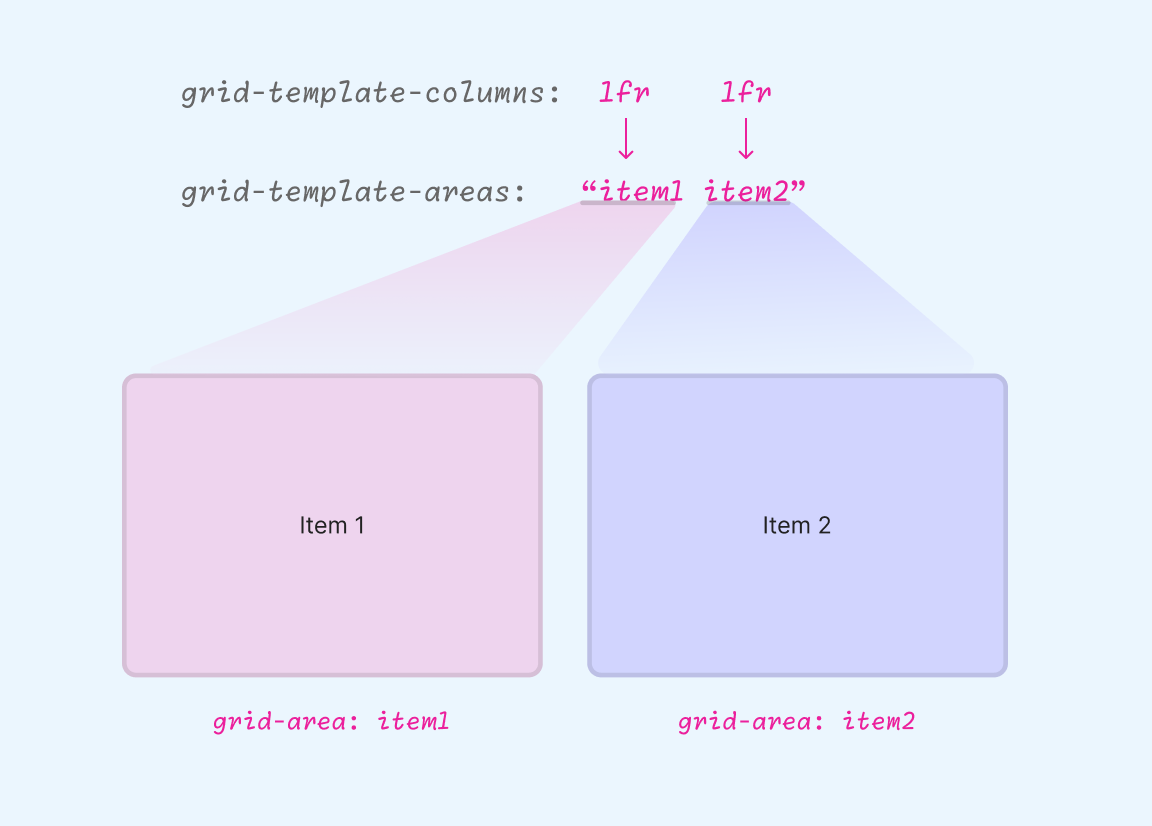
In CSS grid, we can name each grid area and reference it throughout the CSS. Let’s take the following basic example.
Example 1: Basic problem
We have a two-column grid. I used grid-template-areas to define an area for each item I have.
.page {
  display: grid;
  grid-template-columns: 1fr 1fr;
  grid-template-areas: "item1 item2";
  gap: 1rem;
}
Then, I can map the names of each item, respectively:
.item-1 {
  grid-area: item1;
}

.item-2 {
  grid-area: item2;
}
By using a grid-area, it’s like mapping each element in the grid to its designated area. In the following example, see how each column is mapped to a grid area name.
Don’t worry if it’s still not clear, I will explain it in more detail in the following examples.
Example 2: Card layout
In the following example, we have a grid of 3 columns.
.wrapper {
  display: grid;
  grid-template-columns: 1fr 1fr 1fr;
  grid-template-areas: "featured featured article";
  gap: 1rem;
}
I mapped the named grid lines in a way that gives:
- 2 columns for the featured article
- 1 column for the normal article
Let’s suppose that we have a card component. We can place the card either in the “featured” or the “article” grid areas.
See the following demo and try to play with the toggles in the grid-area.
Grid template areas
Ahmad Shadeed
Notice how the card changes its position and size? We are changing the line numbers by using the named grid-area only.
In the following sections, I will explain the grid area syntax in detail and then walk you through different examples and use cases.
Grid template area rules
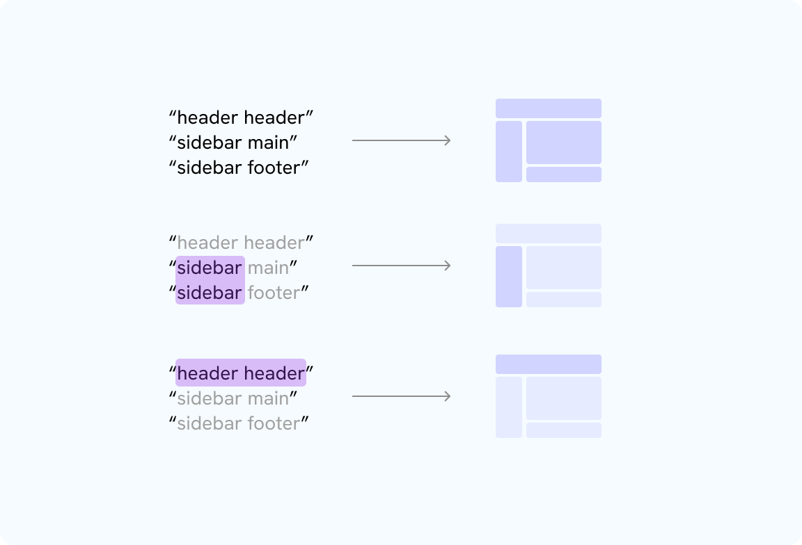
The defined area should be like a rectangle
A defined area must have a rectangle-like shape in the code.
/* This is invalid */
.layout {
  grid-template-areas:
    "header header"
    "sidebar main"
    "header footer";
}

/* This is valid */
.layout {
  grid-template-areas:
    "header header"
    "sidebar main"
    "sidebar footer";
}
See the following figure:
All areas must be defined
When using grid-template-areas, all areas must be defined even if you won’t need them all.
/* This is invalid */
.layout {
  grid-template-areas:
    "header header"
    "sidebar main"
    "header";
}

/* This is valid */
.layout {
  grid-template-areas:
    "header header"
    "sidebar main"
    "sidebar footer";
}
Grid template syntax
To use CSS grid template areas, we need to define the grid areas via grid-template-areas property. The main things you need to know for now:
- It can take multiple area strings
- One string means having a one-dimentional layout (column only)
- Multiple area strings means having a multi-dimentional layout (column and rows)
What I like about grid areas is that they provide us with a visualization of the grid in CSS.
Grid area syntax, example 1
In this example, we have one-dimensional grid with two columns. The first one is fixed and the other is fluid to the available space.
.element {
  display: grid;
  grid-template-columns: 200px 1fr;
  grid-template-areas: "aside main";
  gap: var(--gutter-1);
}
See the following figure:
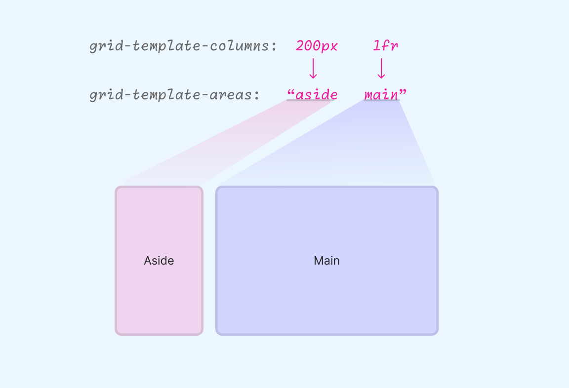
Once the template areas are defined, we can reference them in CSS and assign each named area to its designated element by using the grid-area property,
.aside {
  grid-area: aside;
}

.main {
  grid-area: main;
}
The above is a basic example that lays the foundation for the article. Keep reading to discover why named areas are powerful in the following examples.
Grid area syntax, example 2
Building on the previous example, I need to add a footer to the grid layout. What should we do?
We can add another area string to the grid-template-areas.
When we define multiple area string values for grid template areas, implicit grid rows are created automatically.
.element {
  display: grid;
  grid-template-columns: 200px 1fr;
  grid-template-areas: "aside main" "footer footer";
  gap: var(--gutter-1);
}
Try to visualize the grid based on the defined areas above. Can you guess it?
When we add multiple area strings in grid-template-areas, it’s a good practice to stack them into multiple lines as it will help us to visualize them better.
.element {
  /* other styles */
  grid-template-areas:
    "aside main"
    "footer footer";
}
Each area string represents a row in the grid. Imagine it like a table.
Grid area syntax, example 3
We can change the layout by just changing the grid-template-areas for the main wrapper. The following CSS is constant, we just need to change the grid area string.
.aside {
  grid-area: aside;
}

.main {
  grid-area: main;
}

.footer {
  grid-area: footer;
}
See the following demo and try to change the layout.
Pick a layout
.page {grid-template-areas:"aside main""footer footer";}
By changing the grid-template-areas string, the whole layout updates automatically, using the same unique grid-area names (aside, main, footer). This centralizes layout control, making adjustments easy and efficient.
In the following example, we can change the UI elements layout by just updating the grid-template-areas string(s).
Try to change the dropdown value and see what happens. Notice how it looks like a mapping for the layout.
Empty grid cells
We can define an empty cell by adding one or multiple dots. For example:
.element {
  /* other styles */
  grid-template-areas:
    "aside main"
    "... footer";
}
The dots ”…” here represent an empty grid cell. Let’s see that in action:
An example showing an empty grid cell
CSS grid named grid lines
Intro
When I first learned about named grid lines, I saw things like the following:
.layout {
  grid-template-columns:  [full-start] 1fr
                          [content-start] 2fr
                          [content-end] 1fr [full-end];
}
I didn’t understand if the *-start or *-end were custom names by the author, or maybe the browser generated them. Generally speaking, this syntax is confusing but it is helpful in some use-cases. I will try to explain it clearly in this section.
In the following example, we have a grid with three columns.
.layout {
  display: grid;
  grid-template-columns: 1fr 2fr 1fr;
  gap: 1rem;
}
In grid, the number of lines is equal to the columns plus one. If we have 3 columns, then we will have 4 grid lines.
See the following example:
Say that we want to position an item from line 2 to line 3. We can do that:
.item {
  grid-column: 2 / 3;
}
With named grid lines, the idea is that we can name each grid line with a unique name instead of the default line numbers.
.layout {
  /* Before */
  grid-template-columns:  1fr
                          2fr
                          1fr;

  /* After */
  grid-template-columns:  [full-start] 1fr
                          [content-start] 2fr
                          [content-end] 1fr [full-end];
}
It's important to keep in mind that the line numbers are still there for you to use. Naming the lines doesn't replace the line numbers.
Say that we want to position the item the same as we did in the previous demo, but with named grid lines.
.item {
  grid-column: content-start / content-end;
}
Sounds clearer, right?
Maybe we want to place it on one of the sides.
.item {
  grid-column: full-start / content-end;
}
In the following demo, you can toggle the line numbers on and off. Try it yourself and see what happens.
If it’s still not clear yet, don’t worry. I will explain the concept below in another way.
Grid tracks
In CSS grid, we have a term called “track size”, which represents the size of the column or row. See the following example:
.layout {
  display: grid;
  grid-template-columns: 1fr 1fr;
}
The 1fr and 1fr are track sizes. With named grid lines, we care about naming the lines around those tracks.
Remember that we are naming grid lines.
See the following figure:
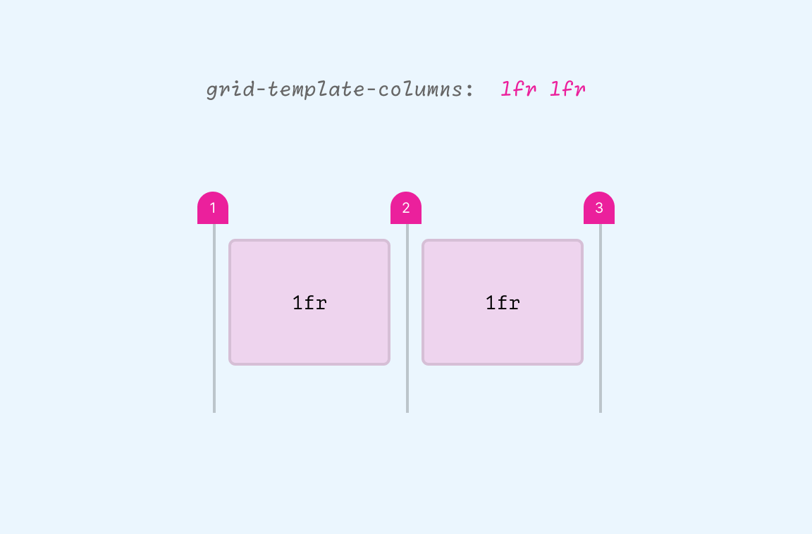
Notice how the line numbers are around the tracks. We have two tracks, so we have three lines.
In this example, we have an aside and a main section.
.layout {
  display: grid;
  grid-template-columns:
          [aside-start] 200px [aside-end main-start] 1fr [main-end];
}
See the following figure:
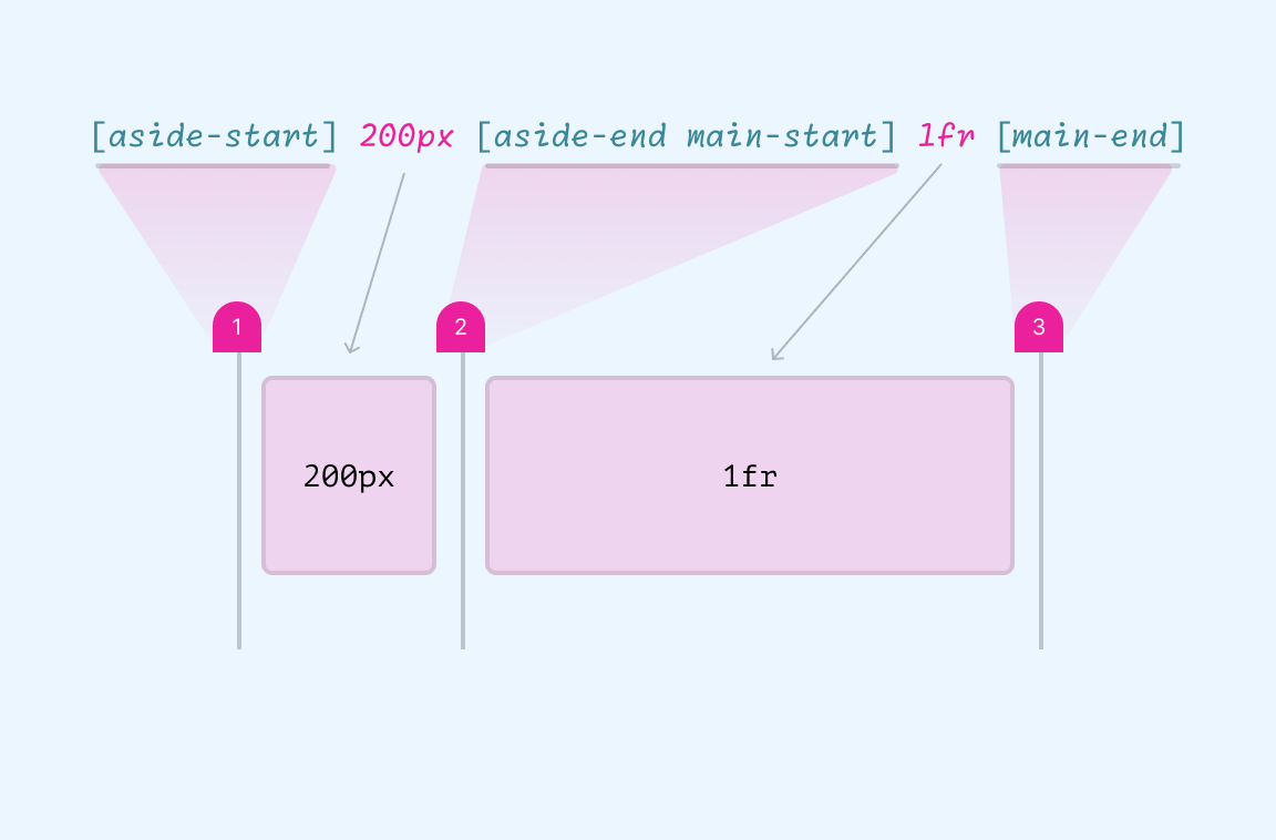
The line name must be written before the track size. Notice that the values between the brackets can share multiple line names. In our example below, the line aside-end is the same as the main-start.
What’s great about using named lines like this is that we can position the items like this:
.aside {
  grid-column: aside-start / aside-end;
}
or this:
.aside {
  grid-column: aside;
}
When defining the start and end of a line like aside-start and aside-end, this is called implicit line naming. The browser will take them and allow us to use the area (e.g: grid-column: aside);
Also, we can take this further and have two rows instead of one.
.layout {
  display: grid;
  grid-template-columns:
          [aside-start] 200px [aside-end main-start] 1fr [main-end];
  grid-template-rows:
          [aside-start main-start] auto [aside-end main-end footer-start]
          40px [footer-end];
}
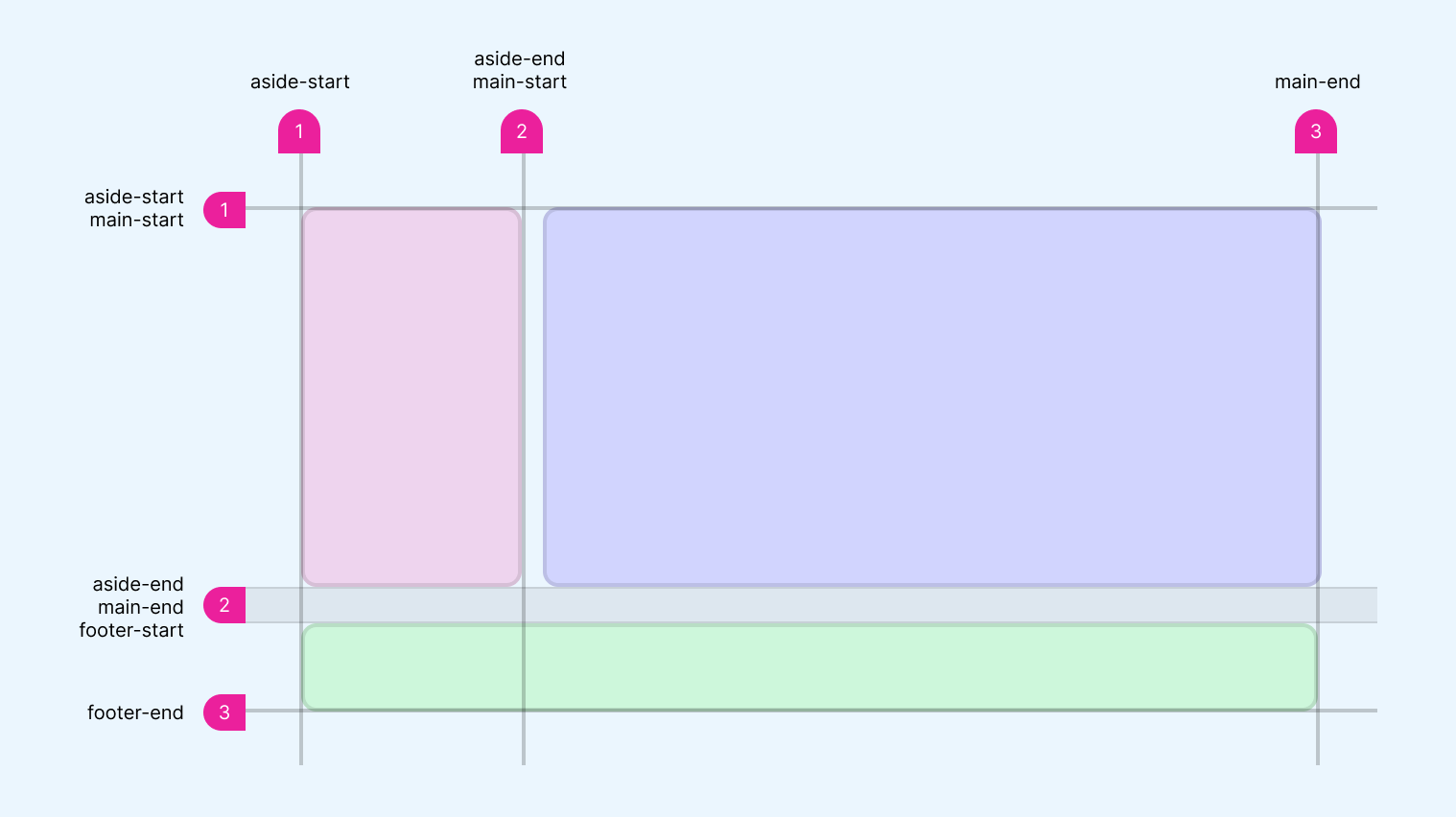
Defining the *-start / *-end names for lines will generate an implicit grid areas.
As a result, when using the custom indents ([*-start] or [*-end]), it’s the same as the following CSS:
.layout {
  display: grid;
  grid-template-columns: 200px 1fr;
  grid-template-rows: auto 40px;
  grid-template-areas: "aside main"
                      "footer footer"
}
Using grid-template-areas is easier for me, but we might need to use line names in some use cases (I will show examples in the use cases section).
Named grid lines are optional
It’s not mandatory to name all lines. We can name only the lines we care about the most in our layout.
In this example, I named only the lines for the second column.
.layout {
  grid-template-columns:  1fr
                          [content-start] 2fr
                          [content-end] 1fr;
}
Here is an example that shows it in action:
The dimmed line numbers are named.
Mixing line numbers and names
We can mix line numbers and names when placing a grid item. In the following example, I placed the item from line 1 to the line “content-end”.
.item {
  grid-column: 1 / content-end;
}
See it in action:
The dimmed line numbers are named.
I like this flexibility in CSS grid. Being able to choose whatever the solution or way of working that suits you is a blessing.
Use cases for grid template areas
Reversing Grid Direction
Say that we have a card component and we want to flip the direction of the layout. In flexbox, this is fairly easy as we just need to use flex-direction: row-reverse.
In CSS grid, we need to change each item’s placement in the grid.
Consider the following example.
.card {
  --cols: 150px 1fr;
  display: grid;
  grid-template-columns: var(--cols);
}

.card__thumb {
  grid-column: 1 / 2;
}

.card__content {
  grid-column: 2 / 3;
}
It looks like this:
Wandering in nature. Life is cool
A bit of desc
If we want to flip the layout, we will need to:
- Change the columns definition.
- Change the
grid-columnfor each child element.
.card--flip {
  --cols: 1fr 150px;
}

.card__thumb {
  grid-column: 2 / 3;
}

.card__content {
  grid-column: 1 / 2;
  grid-row: 1;
}
And here is the result:
Wandering in nature. Life is cool
A bit of desc
We can do better with by using named grid areas. In the current solution, we have to change the grid-column start and end numbers for each child item.
.card {
  display: grid;
  grid-template-columns: 150px 1fr;
  grid-template-areas: "thumb content";
}

.card__thumb {
  grid-area: thumb;
}

.card__content {
  grid-area: content;
}
To flip the layout, all we need to do is:
.card--flip {
  grid-template-columns: 1fr 150px;
  grid-template-areas: "content thumb";
}
We don’t have to think about the line numbers. This is an easier naming for the web designer who is building the layout.
Try the following demo:
Wandering in nature. Life is cool
A bit of desc
.card {grid-template-columns: 150px 1fr;grid-template-areas: "image content";}.card-image {grid-area: image;}.card-content {grid-area: content;}
We only change the columns and named areas order. Which is easier to edit, using named areas or line numbers?
Even better, we can use the grid-template shorthand property, too.
.card--flip {
  grid-template: "content image" / 1fr 150px;
}
It’s up to you on using the shorthand or not, but I prefer the longhand version as it’s more clear to scan.
Header layout
In a header layout, we can use grid areas to define the layout.
In the following design,
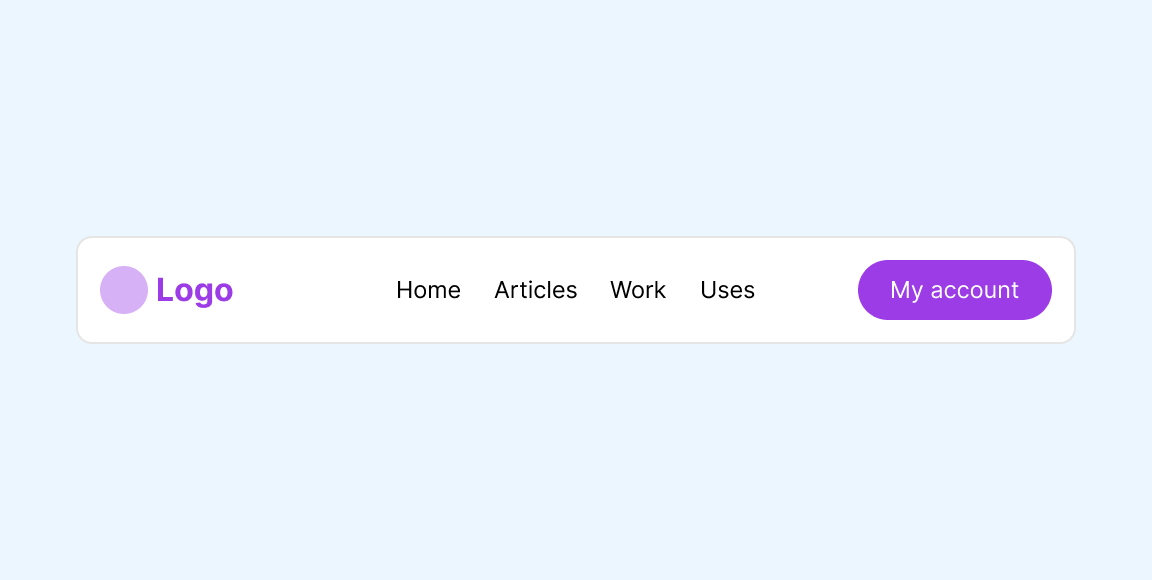
In CSS, I created a grid with three equal-size columns.
.header {
  display: grid;
  grid-template-columns: 1fr 1fr 1fr;
}
If we want to place them using line numbers, it will be like this:
.logo {
  grid-column: 1 / 2;
}

.nav {
  grid-column: 2 / 3;
}

.actions {
  grid-column: 3 / 4;
}
Here is the result:
Lorem ipsum dolor sit amet consectetur adipisicing elit. Distinctio placeat, ipsum suscipit reprehenderit nobis iusto omnis vero tempore officia accusantium minima repellendus. Blanditiis voluptatum accusantium ut et architecto ab dolorum.
Lorem ipsum dolor sit amet consectetur adipisicing elit. Quis nesciunt perspiciatis ratione sapiente est sunt pariatur hic? Accusantium asperiores quam nihil dicta tempora ipsa cum, non cumque a minus facere.
This works fine. Can we explore how to make it responsive by just using grid areas? First, I need to define each grid area for the child items.
.header {
  display: grid;
  grid-template-columns: 1fr 1fr 1fr;
  grid-template-areas: "logo nav actions";
}

.logo {
  grid-area: logo;
}

.nav {
  grid-area: nav;
}

.actions {
  grid-area: actions;
}
Here is the result. It looks the same.
Lorem ipsum dolor sit amet consectetur adipisicing elit. Distinctio placeat, ipsum suscipit reprehenderit nobis iusto omnis vero tempore officia accusantium minima repellendus. Blanditiis voluptatum accusantium ut et architecto ab dolorum.
Lorem ipsum dolor sit amet consectetur adipisicing elit. Quis nesciunt perspiciatis ratione sapiente est sunt pariatur hic? Accusantium asperiores quam nihil dicta tempora ipsa cum, non cumque a minus facere.
We can make it responsive by changing the grid-template-areas value. Let’s start with the smallest size.
/* Default layout */
.header {
  grid-template-areas:
    "logo logo actions"
    "nav nav nav";
}
Lorem ipsum dolor sit amet consectetur adipisicing elit. Distinctio placeat, ipsum suscipit reprehenderit nobis iusto omnis vero tempore officia accusantium minima repellendus. Blanditiis voluptatum accusantium ut et architecto ab dolorum.
Lorem ipsum dolor sit amet consectetur adipisicing elit. Quis nesciunt perspiciatis ratione sapiente est sunt pariatur hic? Accusantium asperiores quam nihil dicta tempora ipsa cum, non cumque a minus facere.
And the medium size:
@media (min-width: 380px) {
  .header {
    grid-template-areas:
      "logo nav nav"
      "logo actions actions";
  }

  .nav {
    justify-self: end;
  }
}
Lorem ipsum dolor sit amet consectetur adipisicing elit. Distinctio placeat, ipsum suscipit reprehenderit nobis iusto omnis vero tempore officia accusantium minima repellendus. Blanditiis voluptatum accusantium ut et architecto ab dolorum.
Lorem ipsum dolor sit amet consectetur adipisicing elit. Quis nesciunt perspiciatis ratione sapiente est sunt pariatur hic? Accusantium asperiores quam nihil dicta tempora ipsa cum, non cumque a minus facere.
The largest size:
@media (min-width: 900px) {
  .header {
    grid-template-areas: "logo nav actions";
  }
}
Have you noticed how clear it is to use grid area? It’s like a mapping of the UI right in the CSS code.
Lorem ipsum dolor sit amet consectetur adipisicing elit. Distinctio placeat, ipsum suscipit reprehenderit nobis iusto omnis vero tempore officia accusantium minima repellendus. Blanditiis voluptatum accusantium ut et architecto ab dolorum.
Lorem ipsum dolor sit amet consectetur adipisicing elit. Quis nesciunt perspiciatis ratione sapiente est sunt pariatur hic? Accusantium asperiores quam nihil dicta tempora ipsa cum, non cumque a minus facere.
In the following demo, I highlighted the currently active grid area. Try to resize and see how the layout changes.
Lorem ipsum dolor sit amet consectetur adipisicing elit. Distinctio placeat, ipsum suscipit reprehenderit nobis iusto omnis vero tempore officia accusantium minima repellendus. Blanditiis voluptatum accusantium ut et architecto ab dolorum.
Lorem ipsum dolor sit amet consectetur adipisicing elit. Quis nesciunt perspiciatis ratione sapiente est sunt pariatur hic? Accusantium asperiores quam nihil dicta tempora ipsa cum, non cumque a minus facere.
grid-template-areas:"logo logo actions""nav nav nav";
grid-template-areas:"logo nav nav""logo actions action";
grid-template-areas:"logo nav actions";
As a bonus, here is a demo with 5 different options for the layout. All I need to change is the grid-template-areas definition and the rest will just work.
Change the active option to see it yourself.
Note: this only works on large viewports.
Lorem ipsum dolor sit amet consectetur adipisicing elit. Distinctio placeat, ipsum suscipit reprehenderit nobis iusto omnis vero tempore officia accusantium minima repellendus. Blanditiis voluptatum accusantium ut et architecto ab dolorum.
Lorem ipsum dolor sit amet consectetur adipisicing elit. Quis nesciunt perspiciatis ratione sapiente est sunt pariatur hic? Accusantium asperiores quam nihil dicta tempora ipsa cum, non cumque a minus facere.
Cool, right?
Editorial layout: example 1
In this example, we have a layout that contains different types of content like a title, text, and an image.
By using CSS grid and grid-areas we can easily define the layout and change it across different viewport sizes.
In this variation, I defined the columns and rows by just using grid-template-areas and the browser will do the rest.
.section {
  display: grid;
  grid-template-areas:
    ". title title"
    "thumb content content";
  gap: 1rem;
}
Notice how the “dot” represents an empty space on the left side of the title. That “dot” is called a null cell token and is part of the CSS grid spec.
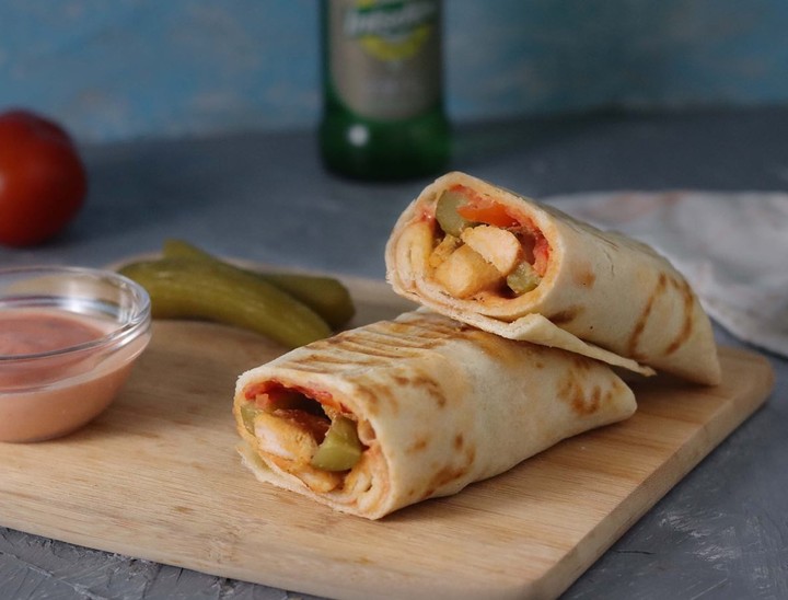
Shawarma Wrap with Homemade Bread
Enjoy the delightful flavors of Middle Eastern cuisine with our step-by-step recipe for Shawarma Wrap with Homemade Bread. Whether you're craving a hearty meal or planning a gathering with friends, this dish is sure to impress.
The combination of tender, marinated meat wrapped in soft homemade bread, complemented by fresh vegetables and a tangy sauce
Editorial layout: example 2
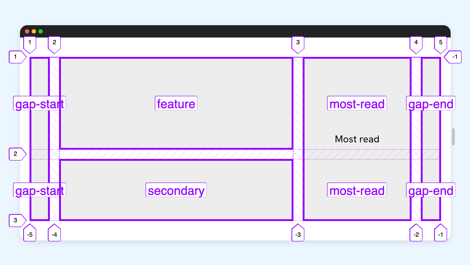
In this example, I took a look at time.com and found out that they are using CSS grid areas to handle the section layout. I will try to explain it in this section with a few modifications.
See the following figure.
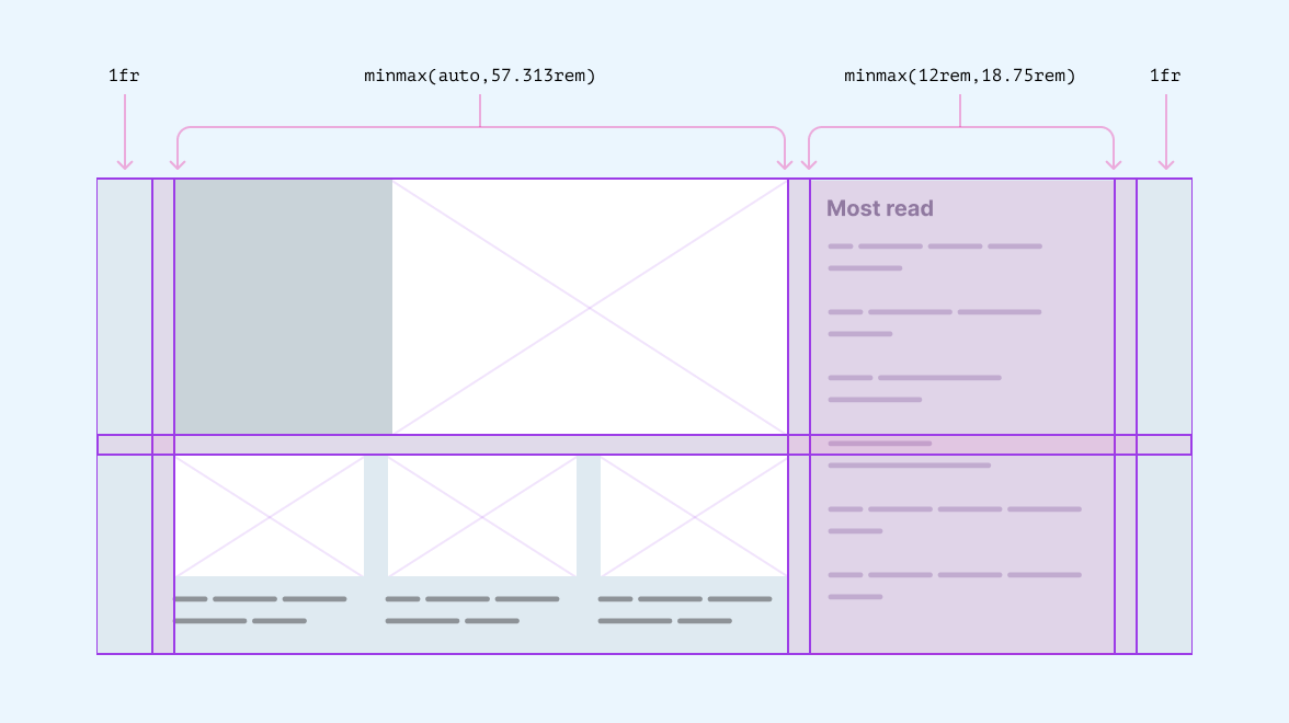
.featured-section {
  display: grid;
  grid-template-areas:
    ". feature most-read ."
    ". secondary most-read .";
  grid-template-columns: 1fr minmax(auto, 57.313rem) minmax(12rem, 18.75rem) 1fr;
  grid-template-rows: minmax(auto, 25rem) 1fr;
}
To focus on the main layout implementation, the following demos will only include the main layout and I won’t explain about coding the inner components as they are out of the scope of the article.
A few things to keep an eye on:
- There is an empty column on the start and end of the grid, mainly to work as a gap on both sides.
- Not sure of the usage of
minmax()for both the column and rows. The layout switches to the mobile design very early but I’ll keep them for now. - There is no need for
grid-template-rowsas we can define them in the grid areas definition.
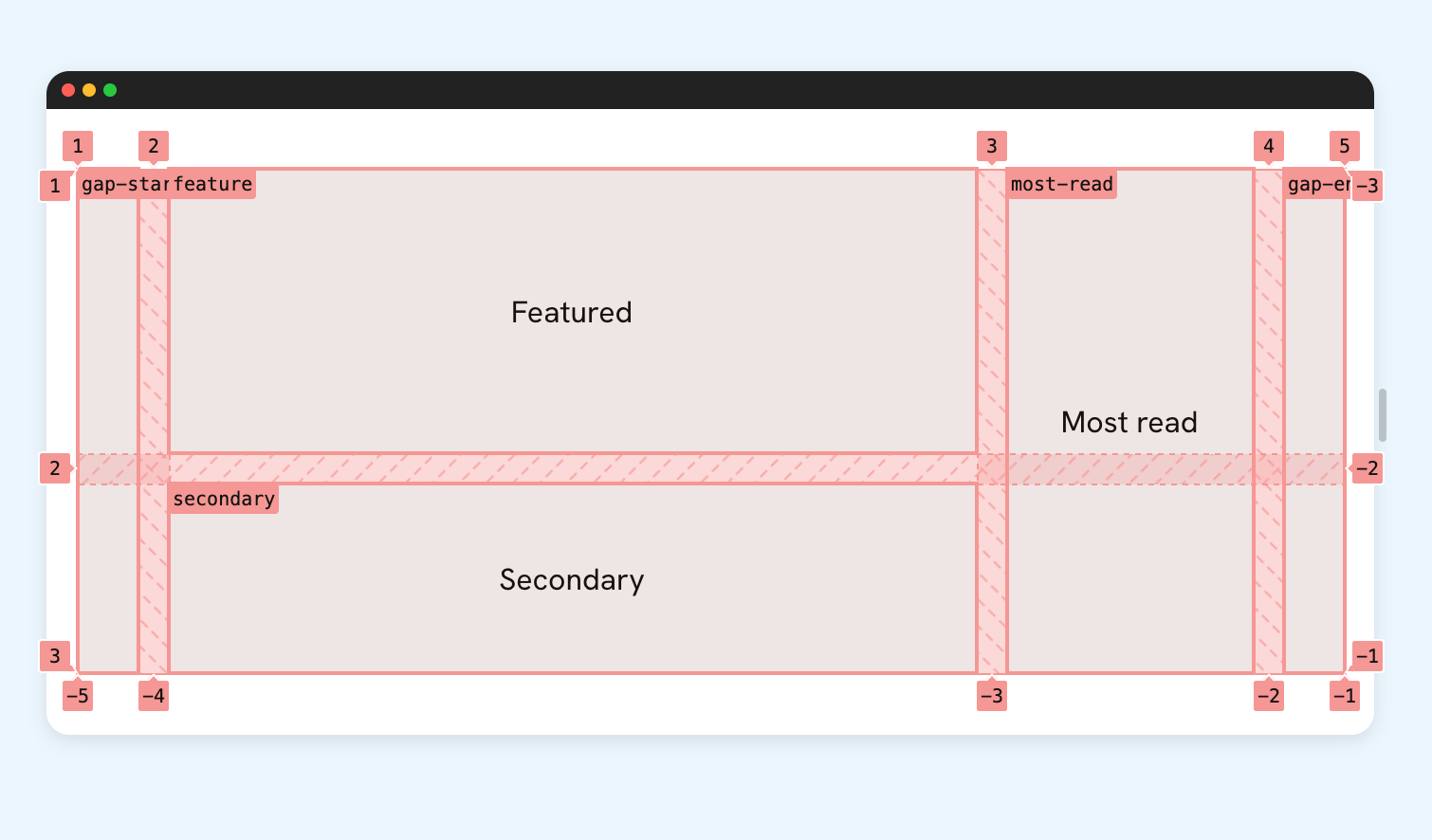
Let’s build the grid skeleton with grid areas!
Now that we have the skeleton, let’s see how to make the section responsive by changing the columns and areas definition.
.featured-section {
  display: grid;
  grid-template-columns: 32px 1fr 32px;
  grid-template-areas:
    ". feature ."
    ". secondary ."
    ". most-read .";
  gap: 1rem;

  @media (min-width: 500px) {
    grid-template-columns: 32px minmax(auto, 57.313rem) minmax(90px, 130px) 32px;

    grid-template-areas:
      ". feature feature ."
      ". secondary most-read .";
  }

  @media (min-width: 900px) {
    grid-template-areas:
      ". feature most-read ."
      ". secondary most-read .";
  }
}
See the demo below and try to resize the window:
Threads app post
While reviewing how the CSS is written on Threads app by Meta, I noticed an interesting use of CSS grid.
.post {
  display: grid;
  grid-template-columns: 48px minmax(0, 1fr);
  grid-template-rows: 21px 19px max-content max-content;
}

This is my first time trying Threads. It's cool!
To place a grid item, the team used line numbers. Here is an example:
.postBody {
  grid-column-start: 2;
  grid-row-start: 2;
  grid-row-end: span 3;
}
The post component has multiple variations. We can use grid-template-areas to define each one. For me, this is easier.
Here is how to do it in CSS:
.post {
  /* Other styles */
  grid-template-areas:
    "avatar header"
    "avatar body"
    ". body"
    ". footer";
}

.post--reply {
  grid-template-rows: 40px max-content max-content;
  grid-template-areas:
    "avatar header"
    "body body"
    "body body"
    "footer footer";
}

.post--nested {
  grid-template-areas:
    "avatar header"
    "avatar body"
    "line body"
    "footer footer";
}
Play with the variations in the following interactive demo.
This is my first time trying Threads. It's cool!
This is my first time trying Threads. It's cool!
Overlapping items with grid areas
When using grid-template-areas, we can place items in rectangular shapes. Consider the following example:
.layout {
  display: grid;
  grid-template-columns: 1fr 1fr fr;
  grid-template-areas:
    "card tag tag"
    "title title card";
}
In the example, I used card two times. This is invalid and will break the grid. The value must be similar to a rectangular shape.
Here is a visual that shows what I mean by a rectangular shape.
What to do then? Well, we can define a new area name and use it to place both the column and row for the item we need.
See the following example where we have a card component.

<div class="card">
  <img class="thumb" src="thumb.jpg" alt="" />
  <h3 class="title">Thyme Bread with Cheese and Olives<h3/>
  <p class="tag">Baking<p/>
</div>
We can stack the title and the tag over the image by using grid-template-areas as in the following example.
.card {
  display: grid;
  grid-template-columns: auto auto 1fr;
  grid-template-rows: auto auto;
  grid-template-areas:
    "thumb-1 tag"
    "title thumb-2";
}
Notice how I defined thumb-1 and thumb-2. I can use them with grid-area.
.thumb {
  grid-column: thumb-1 / thumb-2;
  grid-row: thumb-1 / thumb-2;
}
And I placed both the title and tag in their areas plus made sure they were aligned correctly.
.tag {
  grid-area: tag;
  align-self: start;
  justify-self: end;
}

.title {
  grid-area: title;
  align-self: end;
}
Please keep in mind that you will need to manage the stacking order of the child items (if needed). In my case, I didn’t need that as the source order already solved it for me.
Here is the final demo:
The previous examples were inspired by Oddbird’s Cascading Layouts page.
Conditional layouts with CSS :has()
We can take grid areas to the next level by combining it with CSS :has() selector. For example, we can change a layout based on the presence of an element.
In this example, I’m changing the layout of a <figure> element based on having a figcaption or not.
Here is the basic CSS:
figure {
  display: grid;
  grid-template-columns: 1fr 1fr 1fr;
  grid-template-areas: "img img img";
  gap: 0.5rem;
}

img {
  grid-area: img;
}

figcaption {
  grid-area: caption;
}
Thyme Bread with Cheese and Olives
Learn how to make this awesome home made bread with just a few steps. Perfect for dipping or sandwiches.
.card:has(figcaption) {grid-template-areas:"img img caption""img img .";}
Do you want to learn more? I wrote a complete interactive guide on CSS :has. Also, you can check my Conditional CSS with :has and :nth-last-child article.
Multilingual support (LTR/RTL)
It’s worth mentioning that CSS Grid will adjust the layout based on the page direction (LTR or RTL). This means the named grid areas will also follow the page direction.
Toggle the “RTL” checkbox in the demo to see how the layout will flip.
To learn more about writing CSS for RTL layouts, I wrote a complete guide on that topic called RTL Styling 101.
Grid areas and DevTools
All the major browsers have good tooling for grid areas (Chrome, Safari, and Firefox). Here is a preview of each browser:
Chrome
- I don’t particularly appreciate that it places the area name at the top left corner. It makes areas overlap.
- Not sure about the color overlay. It changed how my design looks like.
Safari
- The pink outlines help to outline the items clearly.
- I like how Safari allows us to see the line names.
Here is how Safari shows the line names.
While this is useful, the layout might need some enhancements (e.g.: stack the lines instead of showing them next to each other).
Firefox
- The area names are clearer than Chrome and Safari.
- I like that it provides an autocomplete list when typing an area name with the custom indents (
*-startor*-end).
When editing the grid-area for a child item, Firefox provides a list of all the possible line names.
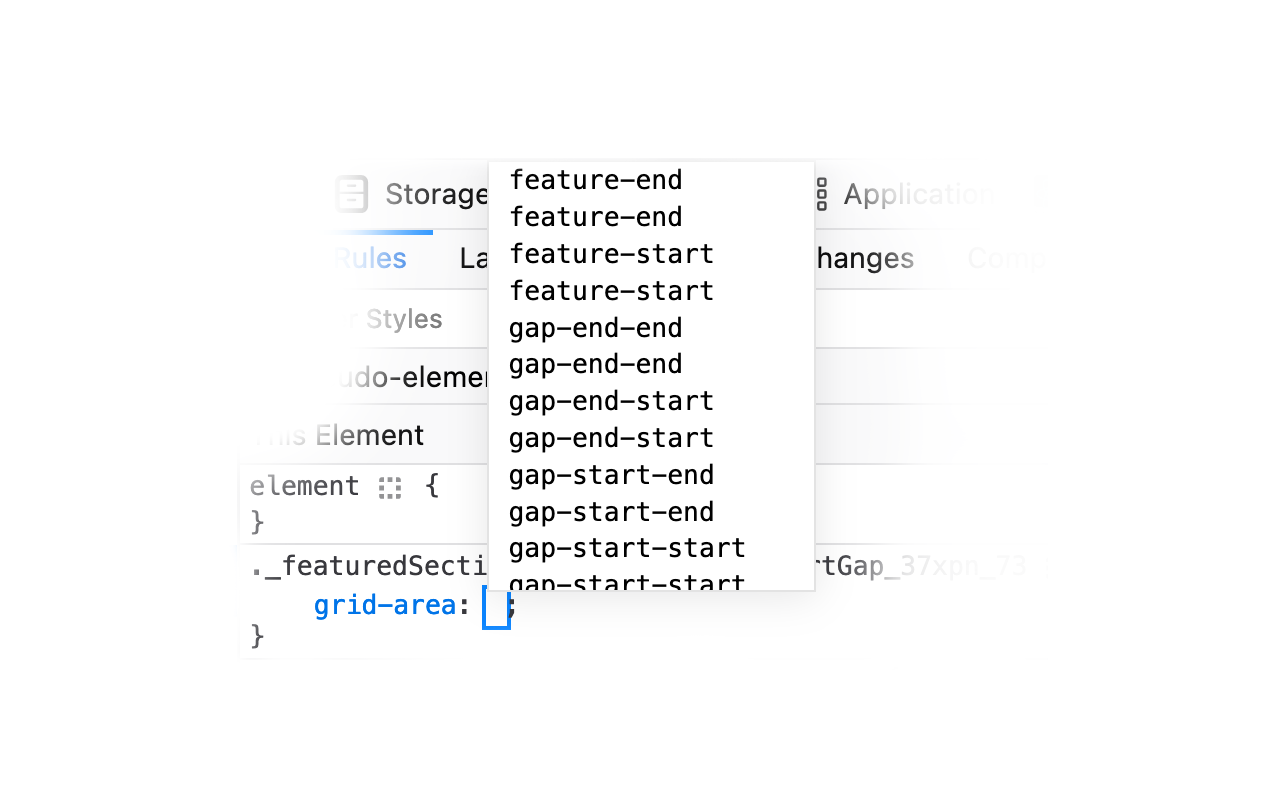
This is great feature that I appreciate in Firefox.
Outro
Using grid areas is a great way to have a visual of the grid layout in CSS. I can see it helpful for team members who might need to change a layout. I hope that this article was useful to you.
Resources
- CSS Grid Layout Module Level 2: I used this a reference, though the named grid lines explaination wasn’t that helpful.
- Naming Your CSS Grid Lines:I found this article helpful as I struggled to understand how named lines work.
Credits
Thanks to Sam Rose, Egor Kloos and Arpit Agrawal for proof reading the article and providing useful feedback.
Enjoyed the read? If you'd like to support my work, consider buying me a coffee. This interactive guide took 6 weeks, which translates to 54 coffee cups. Thanks a latte!