
The problem
I’m working on a portfolio website and stumbled upon an interesting question: can I detect when an element hits or collides with another? The initial answer in the back of my head is no! It’s not possible.
Here is an abstract version of the problem.
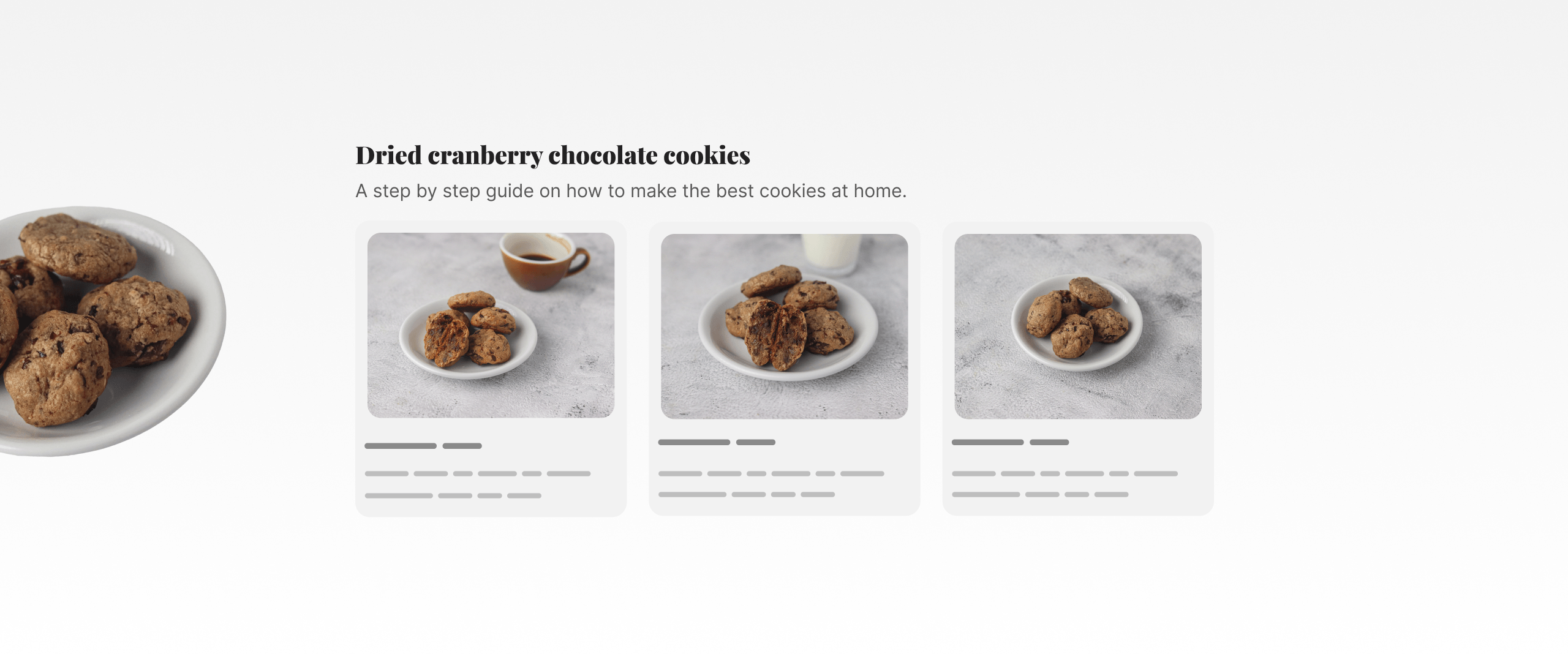
I want to know when the decorative element hits the section from the left edge, taking into consideration that the element might have a fluid position or size(changes with viewport or container size).
In short, it’s a dynamic problem. It’s not about using a media query to hide the decorative element. I want to hide it upon overlapping.
Here is a figure that shows what I need. The idea is that I want to measure the space, and if it’s less than a specified amount, it should be hidden.
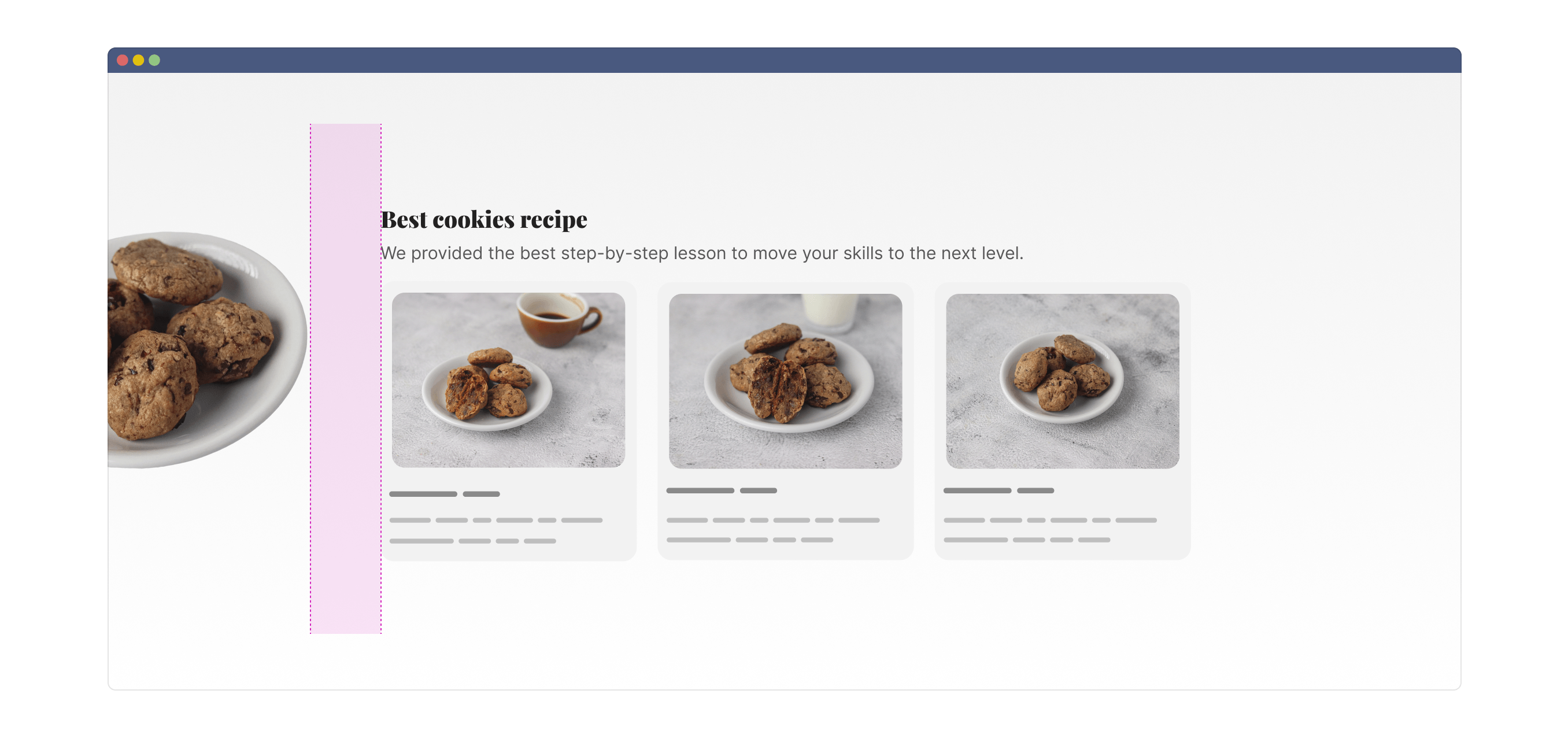
After this point, the decorative element should be hidden.
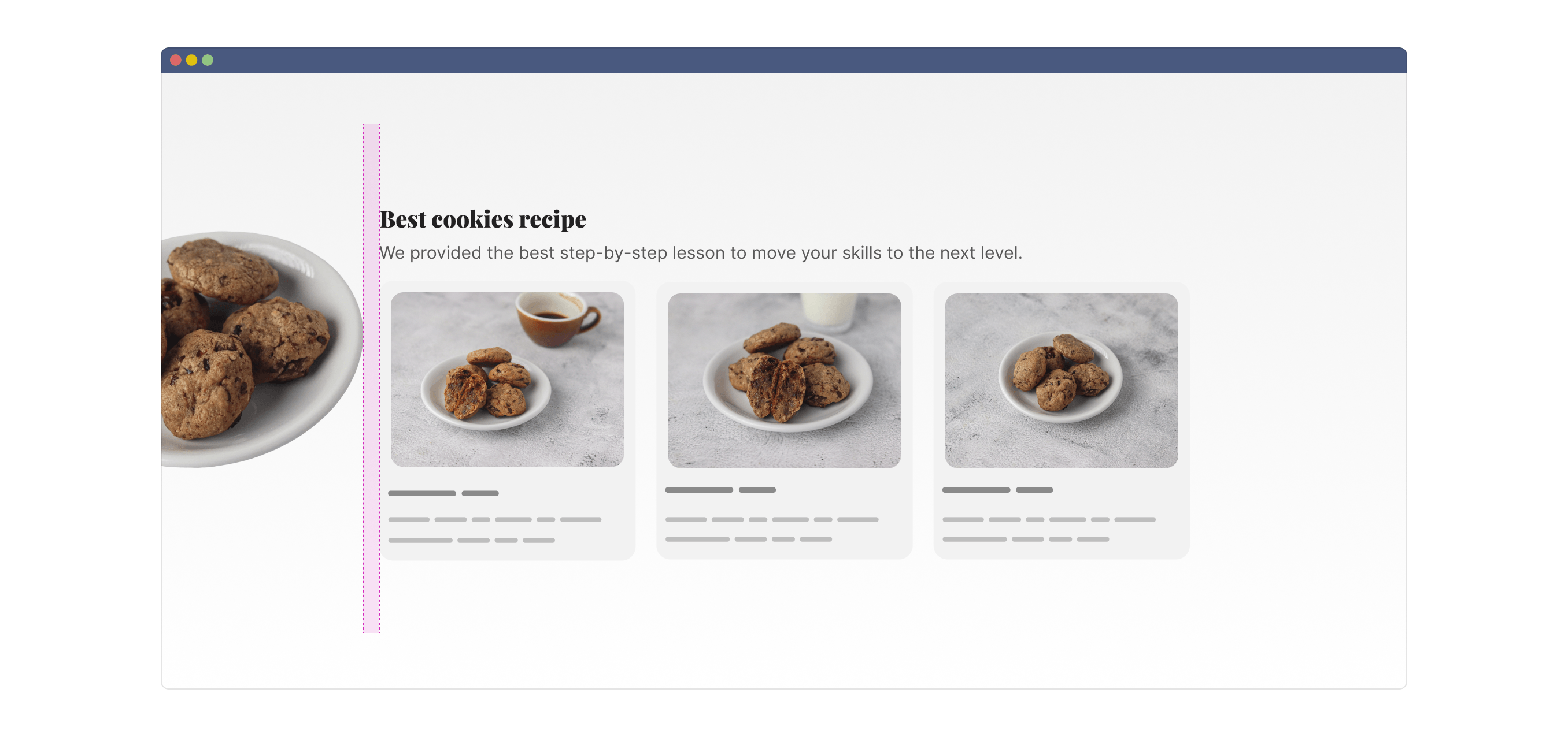
Let’s solve it
The demos in this article work in browsers that support both scroll-driven animations and anchor positioning.
Here is the demo. Resize and see how the decorative element overlaps the cards.
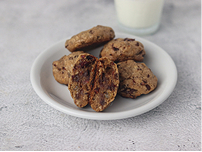
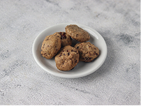
Dried cranberry chocolate cookies
A step by step guide on how to make the best cookies at home.

Section title
Some text in here to mimic nothing, just for fun.
Section title
Some text in here to mimic nothing, just for fun.
Section title
Some text in here to mimic nothing, just for fun.
First, I thought about measuring the space between the section and the decorative element. To do that, I will use CSS anchor positioning.
Using anchor positioning
I want to create an element that will be tied to:
- The right edge of the decorative element.
- The left edge of the section container.
That element is the space between both.
.decor {
  anchor-name: --line;
}

.section {
  anchor-name: --section;
}

.measure {
  position: absolute;
  left: anchor(--line right);
  right: anchor(--section left);
  top: anchor(--line top);
  bottom: anchor(--line bottom);
}
Resize the container below to see how the highlighted space will change.
Dried cranberry chocolate cookies
A step by step guide on how to make the best cookies at home.
Section title
Some text in here to mimic nothing, just for fun.
Section title
Some text in here to mimic nothing, just for fun.
Section title
Some text in here to mimic nothing, just for fun.
Now the question is, how to use the measured space to do things like hiding the decorative element?
Introducing timeline-scope
In scroll-driven animations, we can define a timeline scope. In short, it allows us to expand the scope of a scroll animation to outer containers.
In the following demo, which is inspired by MDN, scrolling the box with text will trigger the animation on the other box.
It’s like connecting an element to another.
Scroll here
scroll-timeline: --box;
Lorem ipsum dolor sit amet, consectetur adipiscing elit. Sed do eiusmod tempor incididunt ut labore et dolore magna aliqua. Ut enim ad minim veniam, quis nostrud exercitation ullamco laboris nisi ut aliquip ex ea commodo consequat. Duis aute irure dolor in reprehenderit in voluptate velit esse cillum dolore eu fugiat nulla pariatur. Excepteur sint occaecat cupidatat non proident, sunt in culpa qui officia deserunt mollit anim id est laborum.
I reveal myself upon scrolling on the left box.
animation: reveal 1ms linear;
animation-timeline: --box;
Here is the CSS for the two boxes:
.section-item-left {
  scroll-timeline: --box;
}

.section-item-right {
  animation: reveal 1ms linear;
  animation-timeline: --box;
}
This alone won’t work, as --box is only accessible to elements inside .section-item-left. To make it so, we need to lift the scope up to its parent by using timeline-scope.
.section {
  timeline-scope: --box;
}
By defining the scope, we can access the --box timeline anywhere within the .section container.
But what does that mean for our case? Let’s find out.
The measure element
In the measure element, I added a pseudo-element with a width of 20px. Also, I defined overflow-x: auto to make it scrollable.
.measure {
  overflow-x: auto;
}

.measure:after {
  content: "";
  display: block;
  width: 20px;
  height: 100%;
  background-color: deeppink;
}
The goal of using a fixed-width pseudo-element is to make the .measure element overflow. When the space is less than 20px, it will overflow (become scrollable).
But how is this related to our problem? In the following demo, we have the measure element along with the pseudo-element I added.
Resize the container and see how the measure element’s width shrinks until it’s equal to or less than the pseudo-element.
Dried cranberry chocolate cookies
A step by step guide on how to make the best cookies at home.
Section title
Some text in here to mimic nothing, just for fun.
Section title
Some text in here to mimic nothing, just for fun.
Section title
Some text in here to mimic nothing, just for fun.
If you weren’t able to resize to the exact point, here is the demo resized for you. Now the .measure element overflow kicks in. You can even scroll in that tiny space!
Dried cranberry chocolate cookies
A step by step guide on how to make the best cookies at home.
Section title
Some text in here to mimic nothing, just for fun.
Section title
Some text in here to mimic nothing, just for fun.
Section title
Some text in here to mimic nothing, just for fun.
Keep that in mind, and let’s go back to the timeline scope demo for a bit. In the timeline scope demo, if you scroll on the left box, the other box will animate.
Instead of animating the right box, I want to change a CSS variable. In the demo below, try adding more content until the blue-ish section overflows. Upon that, the right box’s background will change.
The animation here is to just flip a variable. I say animation but it’s not really an animation, you know.
Here is the CSS:
.section {
  --bg-color: lightgrey;
  timeline-scope: --bg;
}

.box-left {
  scroll-timeline: --bg;
}

.box-right {
  background-color: var(--bg-color);
  animation: change-bg 1ms linear;
  animation-timeline: --bg;
}

@keyframes change-bg {
  from, to {
    --bg-color: hsl(from deeppink h s calc(l + 30));
  }
}
Add more content.
Lorem ipsum dolor sit amet, consectetur adipiscing elit. Sed
I change bg color if content on left is long enough to scroll!
The takeaway here is that we don’t have to scroll in order to trigger the animation. We just need to have more content for a container to overflow.
This is why I have the same value for the from and to values. I don’t care about the progress here. I just want to flip the CSS variable the moment there is an overflow.
In our case, the container is the measure element. And it overflows when there is not enough space for the pseudo-element within it.
body {
  --touching: 0;
  timeline-scope: --touch;
  animation: flip-touch 1ms linear;
  animation-timeline: --touch;
}

.measure {
  scroll-timeline: --touch x;
}

@keyframes flip-touch {
  from, to {
    --touching: 1;
  }
}
With that, I listened for when there is an overflow in the measure element, then used style container queries to change the opacity of the decorative element.
.decor {
  @container style(--touching: 1) {
    opacity: 0;
  }
}
Dried cranberry chocolate cookies
A step by step guide on how to make the best cookies at home.
Section title
Some text in here to mimic nothing, just for fun.
Section title
Some text in here to mimic nothing, just for fun.
Section title
Some text in here to mimic nothing, just for fun.
That’s it. I didn’t expect to solve it with CSS, but here we go. Even if this is not supported in all browser, I can use it as an enhancement for the project I’m working on. Sometimes, you have to go to the extra mile, it might work.
Credits
This solution wouldn’t have been easy to do without the great work by Bramus on scroll-driven animations. I built my solution on top of it.
The Layout Maestro
Building layouts can be a challenging task, especially if you don’t know the core mental model of CSS layouts. You don’t have to worry about that anymore. I released an interactive CSS layout course, and I called it The Layout Maestro.

Check out The Layout Maestro course and level up your CSS layout skills.