The Layout Maestro
Article Parts
- Part 1: Building The Header Element (This one)
- Part 2: Building The Hero Element
- Part 3: Building The Grid and Course Cards
{% include note.html content = “This is Part 1 of the article: The Process of Implementing A UI Design From Scratch.” %}
There are many ways to build a layout in HTML & CSS, and every developer has his own way of doing it. Getting to know the thinking process inside a Front End Developer mind is extremely useful, as it gives us different perspectives on how to solve certain problems.
In this article, I will dive into the journey of building some of the components in a project I called “Nadros”, and write down my thought process, from the perspective of a designer and a developer.
Nadros is an imaginative idea for an online video courses platform. In this article, I’ll focus on building the header component.
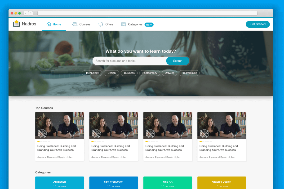
Click here to view the full design.
Design Components
I extracted all components into one page so I could look at them together. This would make it easy to find inconsistencies between UI elements. Also, having all of them at once can lead to ways for unifying some UI components, or to create a variety of specific components.
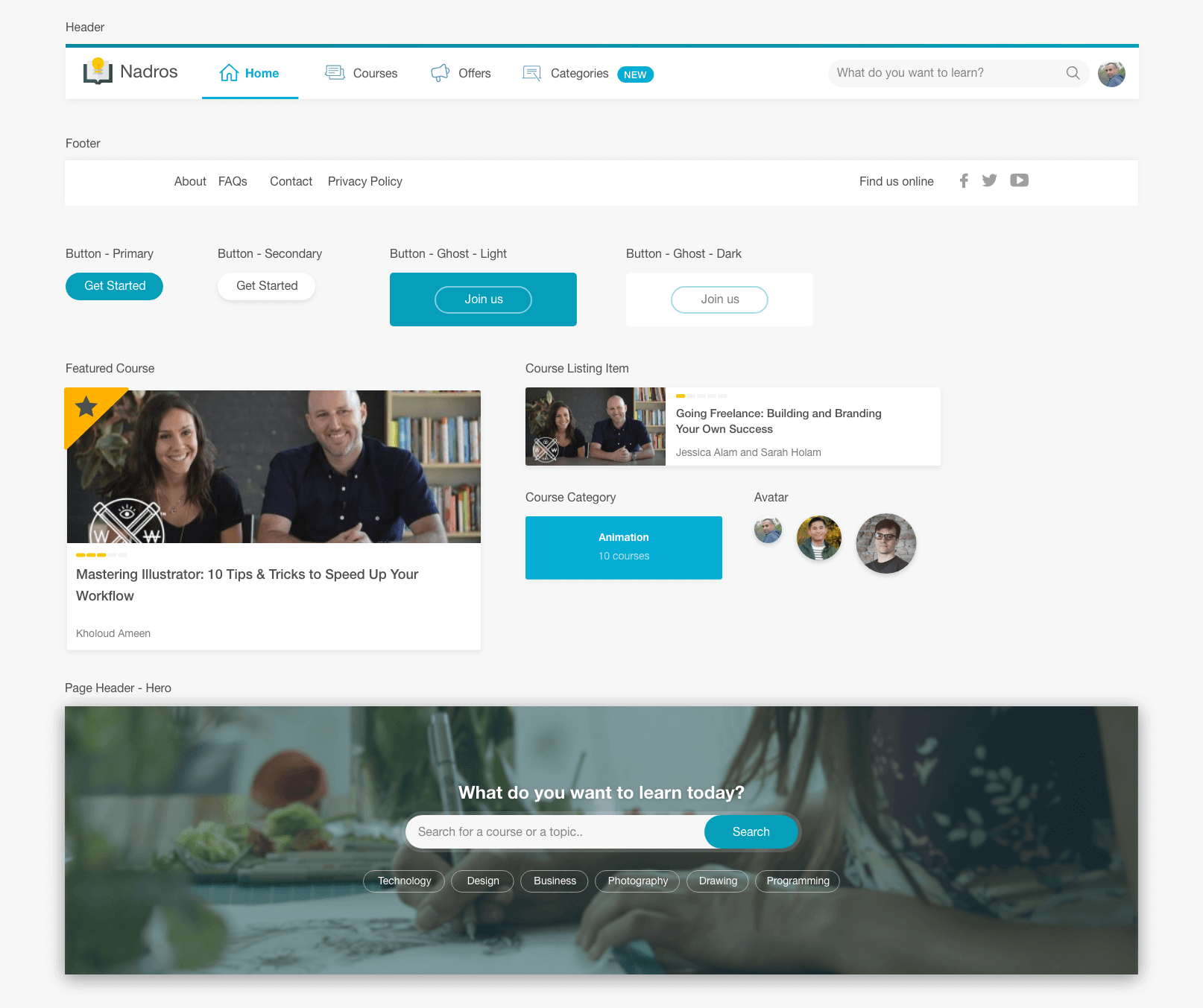
Check the full components list
Building the header component

Check out the final demo.
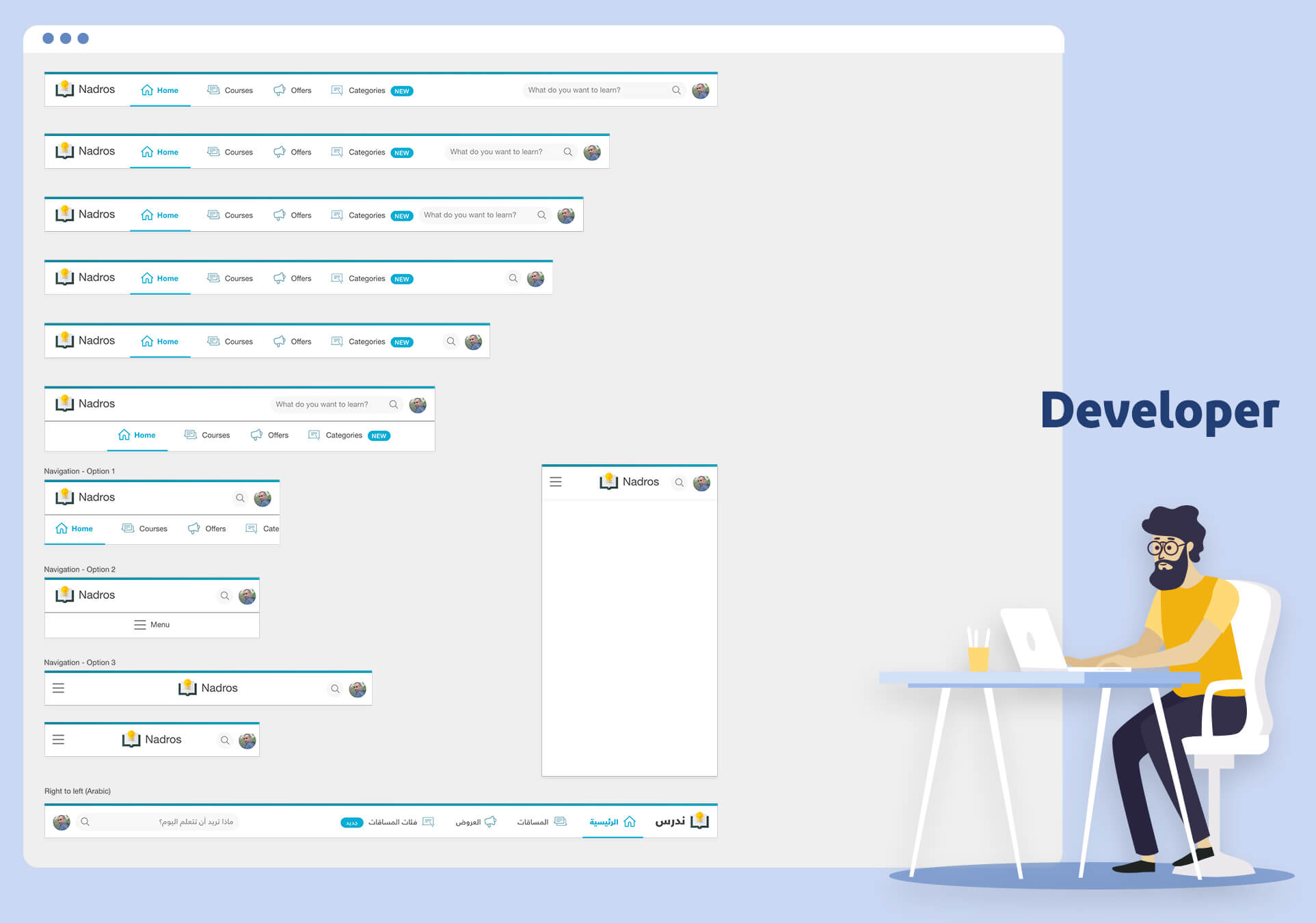
Most of the time, the header is the first component that I start thinking about in each Front End project. Usually, it takes a good amount of time to build it perfectly across viewport sizes.
Different designers have different ways of thinking. One might provide only one state of the header without considering how it would look like on smaller/bigger sizes.
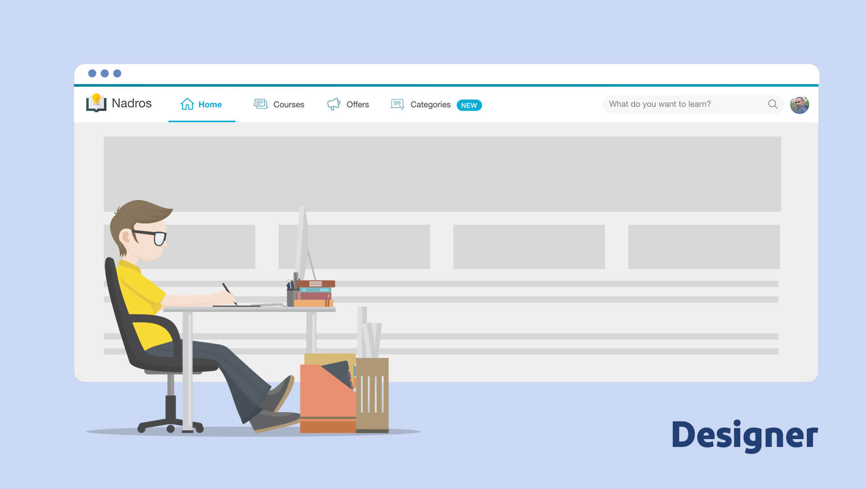
But for a developer, there are a lot of details to work on while building it in HTML and CSS. The below illustrates how a hybrid person (Designer & Developer) might think in this case.
HTML Markup

<header>
  <div class="container">
    <a href="#"><img src="img/nadros.svg" alt="Nadros" /></a>
    <nav><!-- nav elements --></nav>
    <form><!-- Search --></form>
    <a href="link-to-profile/">
      <img src="img/shadeed.jpg" alt="Ahmad Shadeed" />
    </a>
  </div>
</header>
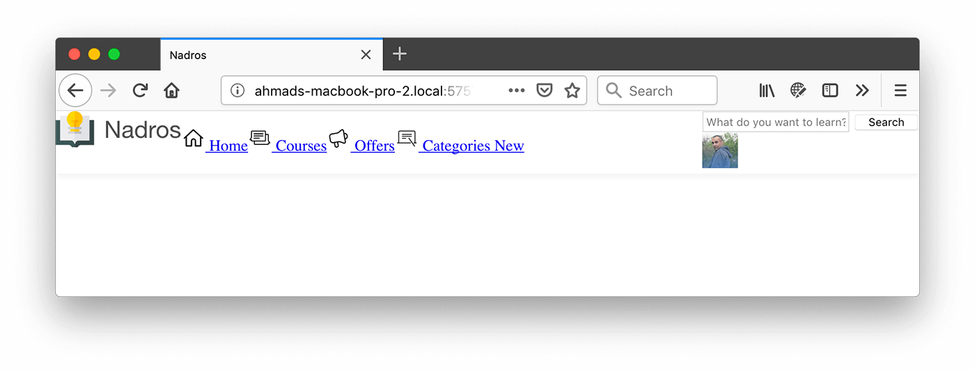
I prefer to start with the markup first. This can help in writing semantic elements before going into the design and CSS details. Here is the header without CSS:

Icongraphy
The icons will be added as below:
- Extract them as SVGs.
- Combine all icons into
<symbols>in one SVG and to reuse them across the page with the<use>element.
I wrote an article about that topic in details.
General Layout
I reset some elements styles and added the below CSS:
.site-header__wrapper {
  display: flex;
  flex-wrap: wrap;
}

.main-nav ul {
  display: flex;
}
![]()
The header started to take shape, and while thinking about placing the search and user avatar at the right side, I asked myself: What if I wanted to have a “Get Started” button there?

To account for that, I need to encapsulate the form and user avatar in a <div> that will be positioned at the right side. It’s possible to add whatever needed inside that element.
I did the below quick mockups to show some possible scenarios on the right side:
It could have a notification, messages.

It could have secondary links.

It could have a “Switch account” button.

<header class="site-header">
  <div class="container">
    <!-- Logo and Navigation -->
    <div class="site-header__section">
      <form><!-- Search --></form>
      <a href="link-to-profile/" class="user-avatar">
        <img src="img/shadeed.jpg" alt="Ahmad Shadeed" />
      </a>
    </div>
  </div>
</header>
Since the header is flex container, it’s possible to control the child items. In our case, using margin-left: auto for the form and user avatar element will push it to the far right.
.site-header__section {
  margin-left: auto;
}
Logo and Navigation Items
For this part of the header, it should be aligned and consistent as per the design mockup.
The first thing is the logo, I added the below styles to make it look better.
.logo {
  display: flex;
  align-items: center;
  margin-right: 16px;

  img {
    position: relative;
    top: -3px;
  }
}
I used Flexbox and positioning to align the logo vertically. Unfortunately, top: -3px has to be used as this is the best approach I know (This depends on the logo itself, so if the logo is different it might be removed).
Next are the navigation items, and here is what I did:
- Aligned the icon using
vertical-align: middlewhich is really handy in this case. - Added padding to the navigation items. It’s important to add padding for the
<a>elements and not the<li>items. As the first will make the whole area clickable, and the latter will only make the text clickable.
Incorrect: Padding on the <li> element

Correct: Padding on the <a> element

Current Result

Search Form
When starting with a new component, I often add outline: solid 1px red to make sure that the CSS I want to add will be applied to the correct component.
I added the below basic styles:
.search-form {
  position: relative;
  width: 350px;
  outline: solid 1px red;
}

.search-form__button {
  position: absolute;
  right: 0;
  top: 0;
}

Let’s outline the important parts that should be considered while building the search component:
- The
<input>should have a<label>attached to it. I didn’t add that in the initial HTML, but it’s important to add for accessibility reasons.
<form class="search-form">
  <label for="search">What do you want to learn?</label>
  <input
    type="search"
    name=""
    id="search"
    placeholder="What do you want to learn?"
  />
  <button class="search-form__button">Search</button>
</form>
- The
<button>will be represented as the search icon on the right side. In our case, the “Search” word should be replaced with an icon. To do it correctly, the text should be hidden visually from the document.
<button class="search-form__button">
  <span class="visually-hidden">Search</span>
</button>
.visually-hidden {
  position: absolute;
  overflow: hidden;
  clip: rect(0 0 0 0);
  height: 1px;
  width: 1px;
  margin: -1px;
  padding: 0;
  border: 0;
}
Check out CSS Tricks for more details.
After completing the style for the search form, here is the final result.

What I did is the following:
- Positioned the button absolutely to the right side.
- Added the background, padding.
- Setting the font size to
16px. This is important for iOS, as if the font size is less or greater than that, it will cause the page to zoom.
While testing it, I noticed two issues. Let’s have a look at them.
- The padding on the right side should be equal to the space occupied by the search icon. Fixed by making it
38pxwhich is equal to the width of the search button. - On focus, the search icon color should be changed, as the grey looks odd on the blue background.
How to make the icon color different when the input is focused? Well, there are two options.
Using CSS Adjacent Sibling Combinator
input:focus + .search-form__button .search-form__icon {
  fill: #fff;
}
I didn’t like how much nesting in this approach.
Or Using CSS :focus-within
.search-form:focus-within .search-form__icon {
  fill: #fff;
}
This is much better, it’s more intuitive and straight forward. For example, I can make the search form width bigger on focus.
.search-form:focus-within {
  width: 400px;
}
Avatar
Start by adding the width and height of 38px. Then, add space between the avatar and the search form without adding the margin to any of them. Below is an example:
.avatar {
  margin-left: 8px; /* Incorrect way */
}
This is an incorrect and not a future proof solution. I want to add the spacing dynamically without specifying the element for it. Here are some cases where the above CSS will fail:
- Having other components in the right section of the header.
- Removing the search form and keeping the avatar only. The space won’t have a benefit.
Once again, CSS Adjacent Sibling Combinator to the rescue!
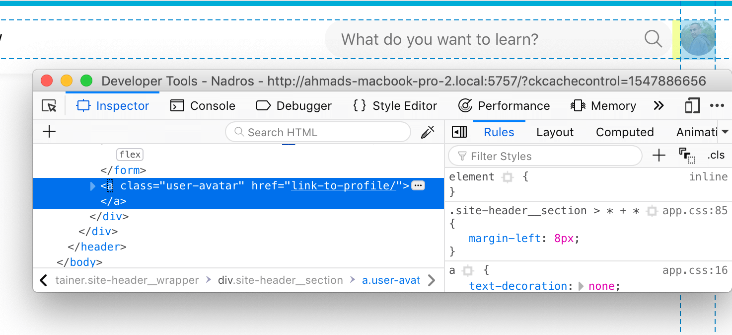
.site-header__section > * + * {
  margin-left: 8px;
}
In that case, the spacing is added dynamically and only if there is more than one element. To proof that, I will copy the avatar to the left of the search form for testing purposes.
Pill Component
It’s important to ensure that it works with short and long text. For example, it could be used as a badge for numbers and not text only.
.pill {
  background: var(--color-brand-primary);
  color: #fff;
  text-transform: uppercase;
  font-size: 13px;
  letter-spacing: 0.5px;
  border-radius: 20px;
  font-weight: 700;
  padding: 3px 7px;
}

The above demonstrates how the component will look in different cases. To make that work as expected, padding should be added to set a minimum size for it.
In case the padding was incorrect, like padding: 2px 4px, it will make the component look odd for short text.

Mobile Layout
Reduce the padding for the navigation items

To get more items fit when the viewport width is getting smaller, I reduced the padding for the links to 16px 12px instead of 20px 24px.
a {
  /*Other styles*/
  padding: 16px 12px;

  @media (min-width: 1250px) {
    padding: 20px 24px;
  }
}
After that, I thought about the idea of showing the icon only when the navigation item is active. I liked it! Since the icon is mandatory in our case, it’s ok to hide it in small views.
![]()
.main-nav__item svg {
  display: none;
  /**Other styles**/
}

/**Icon is always visible for bigger viewports (greater than 1150px)**/
@media (min-width: 1150px) {
  .main-nav__item svg {
    display: inline-block;
  }
}

/**Show the icon for the active element, when the width of viewport is less than 1150px**/
@media (max-width: 1150px) {
  .main-nav__item.is-active svg {
    display: inline-block;
  }
}
And here is the current state of the header.
But, there is an issue. Since the icon is only visible for the active navigation item, this caused the other items text to be a bit off than the active one. See below screenshot:

Embarrassing, right? :D
This is because the active page has an icon, while the others don’t, so the icon caused the text to be pushed to the bottom. A workaround is to add a negative margin to the icon.
@media (max-width: 1150px) {
  .main-nav__item.is-active svg {
    display: inline-block;
    margin-top: -4px;
  }
}
Responsive Logo
While I’m thinking about the next thing to shrink or make smaller, I got the idea to have a responsive logo. I heard about HTML <picture> but never used it.
I jumped to Adobe XD and extracted two versions of the logo, one with an icon only, and the other with both icon and text. The HTML below shows the full logo only when the viewport width is equal or more than 880 pixels, and the icon logo is shown by default for smaller viewports.
<picture class="logo">
  <source srcset="img/logo-full.svg" media="(min-width: 880px)" />
  <img src="img/logo-small.svg" />
</picture>
Search Form on Small Viewports
Until this point, I didn’t alter the search form. To get more space, the form should be hidden and replaced with a button that will toggle it once clicked.
This is the current state of the header. Notice how the form jumps to a new line.

What about getting the use of Flexbox to make the wrapper span to the available space? A video shows the header Flex wrapper using Firefox Flexbox tool.
I added flex: 1 to .site-header__section element it was a good enhancement. Now it doesn’t move to a new line unless I wanted that.
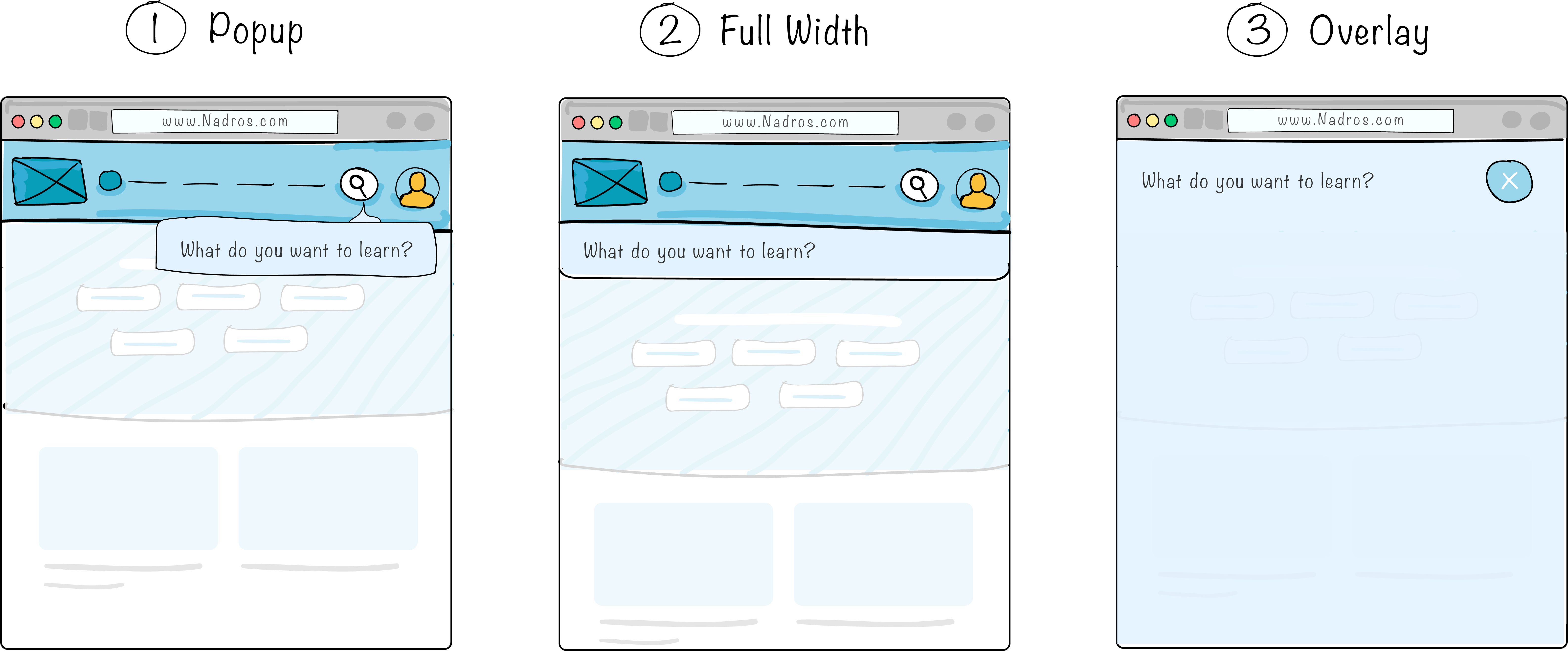
Ok, the next step is to hide the form and add a button with the search icon. How the search will look once it’s active? I got a couple of thoughts.
-
To have it as a popup with an arrow pointing to the search toggle. Even though this option makes the search form attached to the toggle button, I see that it will fail if I decided to a suggestions list while the user is typing.
-
To have it as a full width input, below the header. This option is good, I can easily add a suggestions list while typing, it will also look good on different mobile sizes.
-
To show the search as an overlay on the whole page. For the current context, this sounds like an exaggerated solution. If there is a suggestions list, it could be a great one.
Result: I will go with the 2nd solution.
How to position the search form directly below the header? The first thought I got is to position the form absolutely to the header element, and then to make it full width.
.site-header {
  position: relative;
}

.search-form {
  position: absolute;
  left: 0;
  right: 0;
  top: 100%;
  padding: 8px;
  background: #06aed5;
}

The next step is to put the search form away and hide it. I need to add a toggle button in the header and then to write the needed JavaScript code for that.
var searchToggle = document.querySelector(".search-form__toggle")
var searchForm = document.querySelector(".search-form")

searchToggle.addEventListener("click", function () {
  this.classList.toggle("is-active")
  searchForm.classList.toggle("is-active")
})
For now, the form reveals without animation and it doesn’t look natural for me. What about adding a sliding animation?
The first thought that came is to translate the form out of the viewport, and it will slide from top to bottom. In that cases, I usually jump to the DevTools and start playing around with CSS to achieve what I need.
Checkout the below video for the process of adding the animation.
@media (max-width: 700px) {
  .search-form {
    /**Position: absolute.. etc**/
    z-index: -1;
    visibility: hidden;
    transform: translateY(-100%);
  }

  .search-form.is-active {
    visibility: visible;
    transform: translateY(0);
  }
}
Final Result
Mobile Navigation

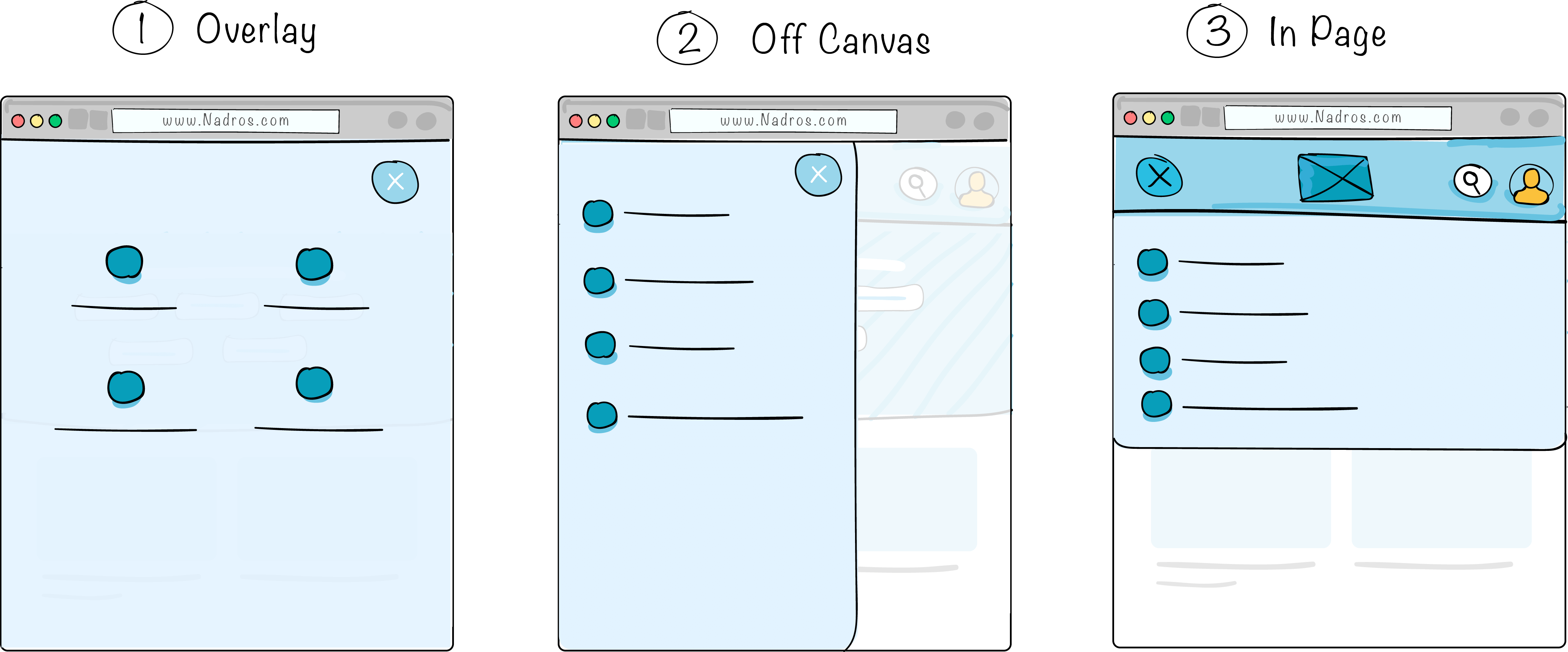
After hiding the navigation, I need to add the mobile navigation toggle which will activate the menu. The real question is, how the navigation will look once it’s opened? Ok, I got a couple of thoughts.
-
To have it as an overlay that is covering the whole page. I feel that this concept is interesting from a visual perspective, but for our case, there’re 4 navigation items only, and it’s expected to end up with an empty space below them.
-
As an off-canvas sliding menu. Once the toggle button is clicked, the navigation will slide from left to right. This concept is great and used a lot, but for our case, it’s not worth it. We’ll end up with empty space.
-
In page navigation. The concept of this navigation is similar to how the search form works. It could slide from top to bottom.
I’m leaning towards concept #3 since it’s more consistent with the search form functionality, and will save a good amount of space. Finally, it’s more suitable for the little navigation items I have.
At first, I need to hide the mobile menu. The correct way for that is to hide the <ul> element only and not the <nav> element, so screen reader users can find the navigation easily. Check out this article for more details on that.
When the <ul> is hidden, the header is looking crowded. The reason is because I depended on the top and bottom padding for the navigation links. Since they’re hidden, the spacing is gone.

.site-header__wrapper {
  @media (max-width: 570px) {
    padding: 0.5rem 0; /*Adding top and bottom padding to give some breathing space.*/
    justify-content: space-between;
  }
}
Since there is a Flex wrapper for the header, I thought about reordering the items. By adding order: -1 to the .main-nav element, it will be the first item from the left. The toggle button for the navigation is placed inside the <nav> element.
<nav class="main-nav">
  <button class="nav__toggle">
    <span class="visually-hidden">Menu</span>
  </button>
  <ul>
    ..
  </ul>
  <!-- This is hidden -->
</nav>
.main-nav {
  @media (max-width: 570px) {
    order: -1; /*Reordering the main-nav element to make it the first one from the left*/
  }
}
Also, it’s important to override some styles for the right wrapper.
.site-header__section {
  @media (max-width: 570px) {
    margin-left: initial; /*Initially, this value was auto.*/
    flex: initial; /*It was 1*/
  }
}
After adding all needed CSS, here is the current look of the header in mobile.

Next, I will work on the navigation items in mobile and build the In Page option I picked.
Check out the below video to see how I edited the navigation in DevTools. This is the result. Once all is ok, I added all the needed styles for the navigation with the animation on toggle.
Header Top Border
Since this is mostly a decoration for me, or let’s say a low priority thing, I’ll work on it now. The top border is a gradient from #07859D to #079EBA.

How can I add that to the header without creating a separated HTML element for it, or even without using a pseudo element?
CSS Backgrounds to the rescue!
.site-header {
  background-color: #fff;
  background-image: linear-gradient(to right, #07859d, #079eba);
  background-size: 100% 5px;
  background-repeat: no-repeat;
  padding-top: 5px;
}

Navigation Toggle Button
As know as the hamburger button. I need to have 3 stacking lines and once toggled, it should morph to an “x” shape.
What do I need to have 3 stacking lines? Is it possible to do it with 1 HTML element?
It turned out that I can use a span element with its pseudo elements. As a result, I have 3 stacking lines.
<button class="main-nav__toggle" aria-label="Menu">
  <span class="main-nav__toggle__icon"></span>
</button>
Since the button don’t have text label, it’s important to add aria-label to make it accessible. Otherwise, screen reader won’t announce that this is a menu button.
.main-nav__toggle__icon {
  display: block;
  height: 2px;
  background: #858585;
  border-radius: 2px;

  &:after,
  &:before {
    content: "";
    position: relative;
    display: block;
    height: 2px;
    background: #858585;
    border-radius: 2px;
    transition: 0.2s ease-out;
  }

  &:after {
    top: 4px;
  }

  &:before {
    top: -6px;
  }
}
The Result

Now that I have the button with it’s final look, I need to morph it to an “X” shape once clicked. I used a combination of CSS transforms for that.
.main-nav__toggle {
  /*Other styles*/
  &.is-active {
    background-color: var(--color-brand-primary);

    .main-nav__toggle__icon {
      background: transparent; /*Hide the middle line*/

      &:before,
      &:after {
        background-color: #fff;
      }

      &:before {
        transform-origin: right top;
        transform: rotate(-45deg) translate(-2px, -4px);
      }

      &:after {
        transform-origin: left bottom;
        transform: rotate(45deg) translate(-8px, -11px);
      }
    }
  }
}
Testing
Once all the core functionalities of the header are there, I started to randomly test everything.
Catch #1
When the search is activated and I open the navigation menu, the search stays there. Same happens for the other way around. Only one of them should be active.
To fix this, we need to close the search when the navigation is opened, and to close the navigation when the search is active.
searchToggle.addEventListener("click", function () {
  this.classList.toggle("is-active")
  searchForm.classList.toggle("is-active")
  navList.classList.remove("is-active")
})

navToggle.addEventListener("click", function () {
  navList.classList.toggle("is-active")
  searchForm.classList.remove("is-active")
})
Catch 2
When hovering on the nav items, the border looks a bit off for the items without icon. This is due to one item having an icon, and the rest is not. To fix the issue, I added a min-height: 56px to the nav item.
Fun Facts
CodeKit total actions for this component only is 600, which is the number of times I hit CMD + S to save changes.
Conclusion
And that’s a wrap. It was a great journey to document every step of building the header component. Actually, I didn’t expect all of that details, since I got used to work on it in real projects.
Next step is to build the other sections in the page, stay tuned for other parts of the article.
Hope you enjoyed it and thanks for reading! Do you have any feedback? Please let me know on Twitter @shadeed9
Thanks and Credits:
- The one and only, Kholoud. She created the awesome illustrations and read the article for a million times.
- Mohammad S. Jaber: for his help in editing and making the article better.
- Elisabeth Irgens: for providing feedback on the very first draft of the article.
- Freepik for the logo and the “Designer” and “Developer” illustrations.

