
We care about responsive design while building a web product, and this means working with media queries or container queries to have a robust end result. However, few of us think about the big picture: how a website is used by real users in real contexts. There are so many variations other than resizing the browser window or viewing a design on mobile and desktop.
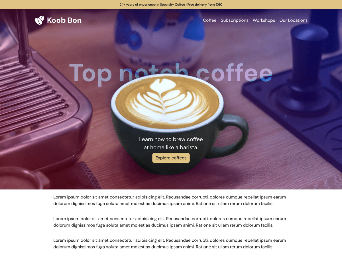
For this article, I will reference a design I made for testing purposes (Yes, I designed it by hand, if you’re wondering, and I took the photo in my home coffee corner. Weird, right?)
Introducing Site Seeing
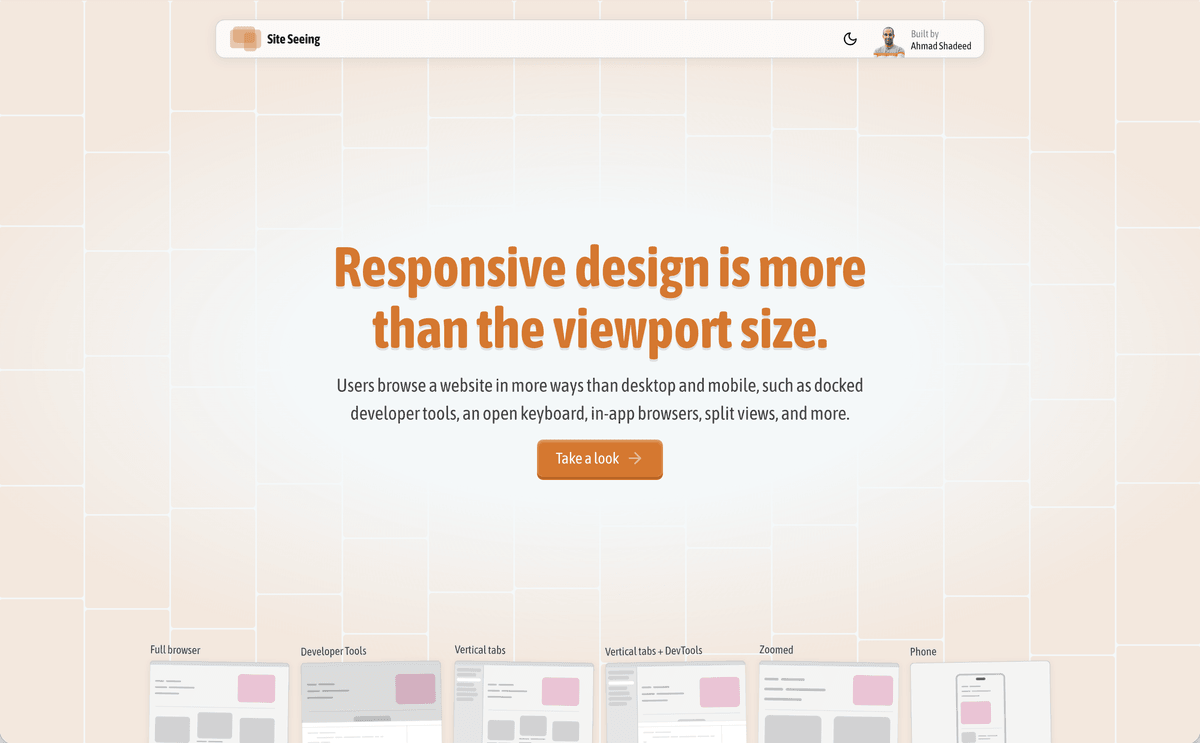
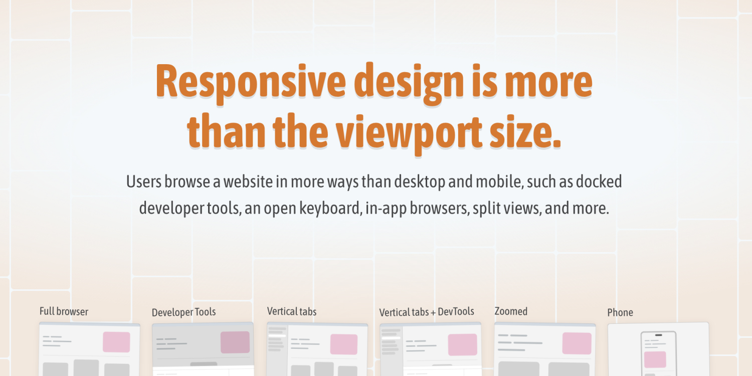
I imagined a simple tool where I can test how a design will look and behave in different contexts, so Site Seeing was born. With this tool, you can see how a web page will behave in different contexts that force unusual viewport sizes.
Let me know what you think!
Let’s take a look
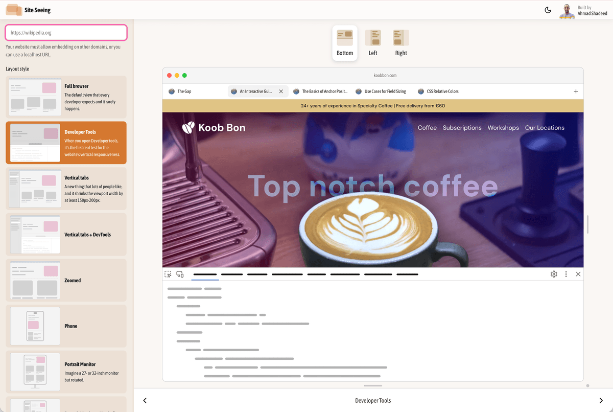
The tool lets you pick different modes or contexts for how a user might view a website. For example, here is the page with developer tools open.
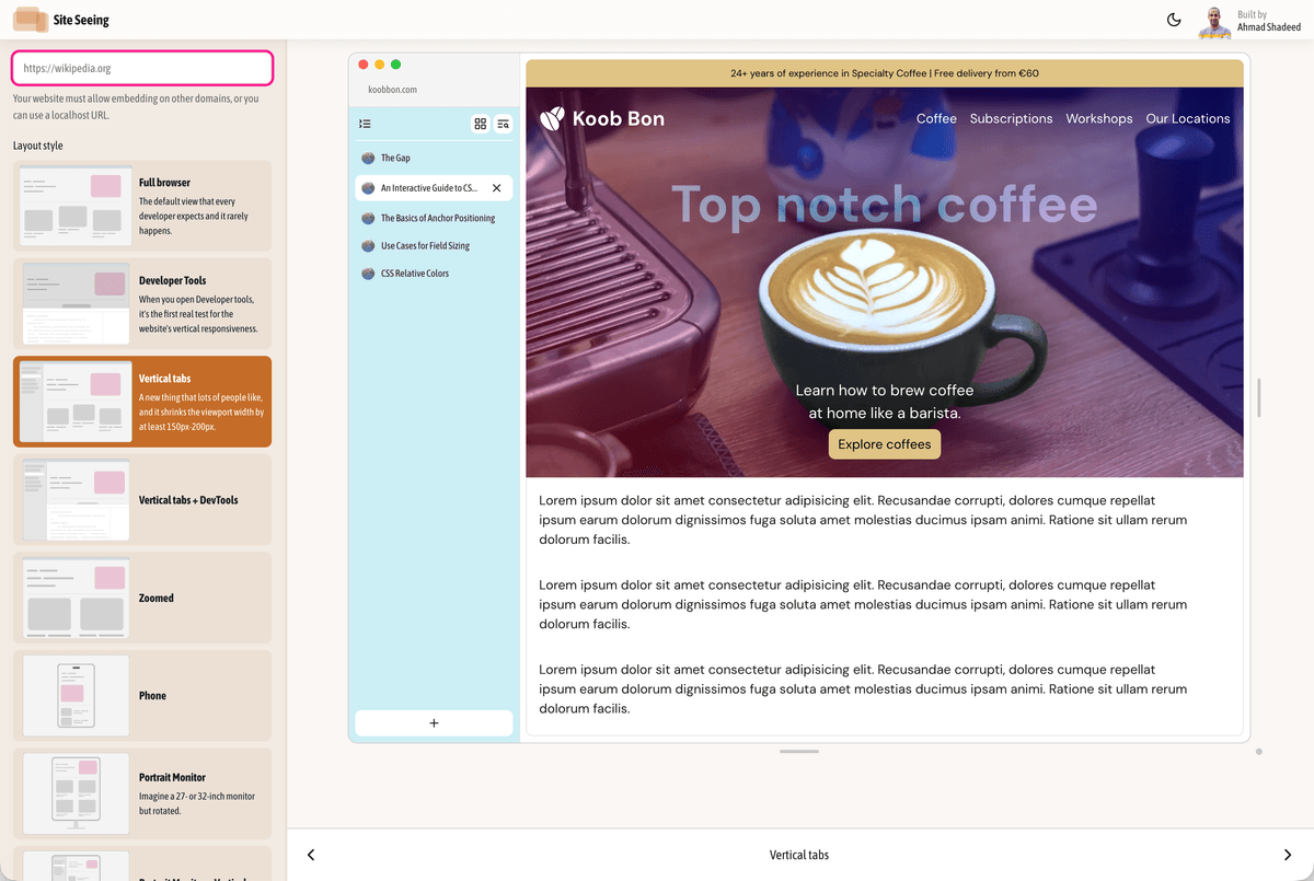
Or the design with vertical tabs.
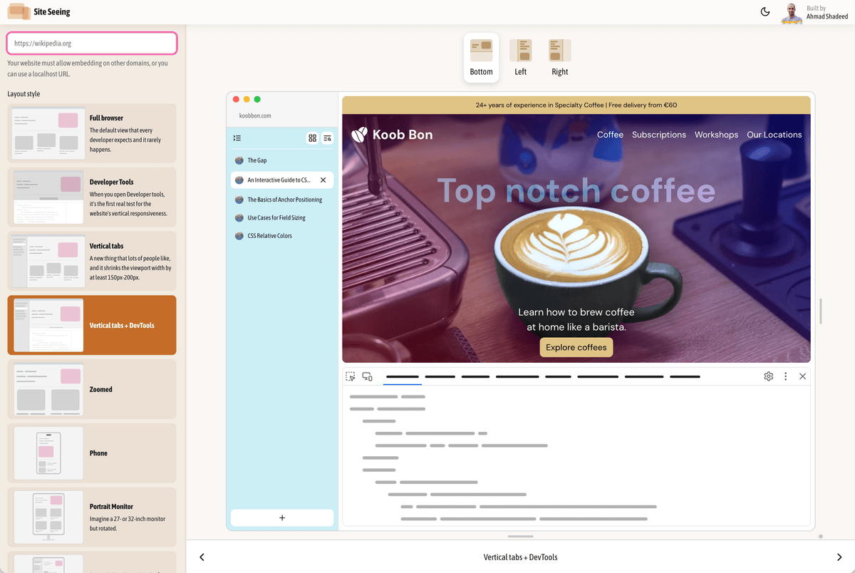
Or even more complex, with both vertical tabs and developer tools.
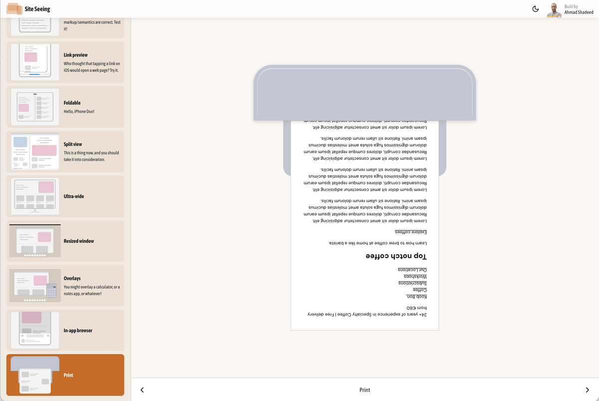
…and stuff like print styles!
These are just a few of the contexts the tool shows. I think this is much more important than just taking care of the viewport size. This tool is helpful for designers, product managers and developers who care about their craft.
Details I like
While working on the design, I put some effort to make it stand out a bit. However, I will leave this for you to discover. In the home page, try refreshing a few times in the latest Chrome or Safari and let me know what you see. If you spot it, I owe you a 45% discount of my recent course.
Credits & thanks
I would like to thank the following kind people who offered very helpful feedback:
The tool became a lot more polished with their spot-on points and suggestions.
Support my work
Building layouts can be a challenging task, especially if you don’t know the core mental model of CSS layouts. You don’t have to worry about that anymore. I released an interactive CSS layout course, and I called it The Layout Maestro.
Check out The Layout Maestro course and level up your CSS layout skills. Use the code 30USD at checkout to get $30 off.