Almost two years ago, I published an article about text-wrap: balance and how useful it is. I thought about revisiting the topic with a more solid exploration and examples that include different values of text-wrap.
The problem
Any web page consists of content. As designers and developers, we don’t have control over how to let the browser handle wrapping content.
Here is a simple example. We have a title that we’re working on. If a designer is working on this in a design tool, let’s assume that it’s Figma (because it’s the most popular design tool right now).
The designer typed the text, and it ended up like this.
Welcome to my personal blog.
What they will do to make it look more “balanced”?
- Add a new line
- Resize the text box
The above are the most common solution, but you can change the font size, font family, etc to fix that.
Here is a demo assuming that the designer will resize the text box manually. Click on “Make it better” to see the change.
Welcome to my personal blog.
That seemed to fix it, right? Later in the project, the content was changed to something else.
We are still in Figma, this isn't in the browser yet.
The content changed slightly, and now we have an orphan word. What we should do? Click on the “Make it better” and see what happens.
Welcome to my personal blog. I'm a web developer.
We increased the text box width after reducing it in the previous content. For example, translating the content to Arabic look good without changing the text box size.
أهلا بكم في مدونتي الشخصية. أنا مطور مواقع.
While this works in a design tool, it’s more challenging in the browser. Text isn’t predictable because it might change, or maybe the fancy font we’re using didn’t load for the user.
Text balancing in the browser
Now that we are in the browser, our options to solve it are different compared to a design tool. Here are the options that we used to use:
- Dividing the text into multiple lines (Add
<br>). - Add a
max-widthand fine-tune the look
Using a line break element
The <br> element can be added to produce a line break in text. In our example, we can add the line break where we see it fits.
In the following interactive example, the <br> is added in the middle of the sentence. Try to move it around with the buttons “Move left” or “Move right”.
Welcome to my personal blog. I'm a web developer.
<h1>Welcome to my personal blog. I'm a web developer.</h1>
While this works, we will need to account for a few things:
- Having more space to display the text.
- When it makes more sense to hide the
<br>. - Change in content.
More space
Notice that we have more space, the line break doesn’t make sense anymore. It makes the text look unbalanced.
Welcome to my personal blog. I'm a web developer.
<h1>Welcome to my personal blog. I'm a web developer.</h1>
Less space
On the contrary, when the space is less, the text will look weird and we will not need the line break anymore.
Welcome to my personal blog. I'm a web developer.
<h1>Welcome to my personal blog. I'm a web developer.</h1>
We can hide the <br> with CSS, but this isn’t an optimal solution for all cases.
.title br {
  display: none;
}

@media (min-width: 700px) {
  .title br {
    display: inline;
  }
}
Max width
We don’t have an easy control like in Figma. We need to set max-width, for example. In the following demo, try to change the width with the range slider.
max-width: initial;
Welcome to my personal blog. I'm a web developer.
While that might work, it’s not an optimal solution.
CSS text-wrap: balance
Meet text-wrap: balance! According to Baseline, this feature works in all major browsers since May 2024 and is a great option for progressive enhancement.
text-wrap: balance
Baseline 2024 newly available
Supported in Chrome: yes.
 Supported in Edge: yes.
 Supported in Firefox: yes.
 Supported in Safari: yes.

Since May 2024 this feature works across the latest devices and browser versions. This feature might not work in older devices or browsers.
In the example below, try to change the option to “Balance” and see what happens.
Welcome to my personal blog. I'm a web developer.
All of this happened because text-wrap: balance is applied.
.title {
  text-wrap: balance;
}
According to the CSS Spec:
Line breaks are chosen to balance the remaining (empty) space in each line box, if better balance than auto is possible.
To make it easier to understand, here is a side-by-side demo inspired by React Wrap Balancer that compared a text with and without balancing.
Default
Welcometomypersonalblog.I'mawebdeveloper.
Balanced
Welcometomypersonalblog.I'mawebdeveloper.
That fixes our problem natively without any hacks!
CSS text-wrap: pretty
While text-wrap: balance will balance the text aggressively, using text-wrap: pretty is much more forgiving and it will only balance in case there is an orphan word at the end of the sentence.
text-wrap: pretty
Limited availability
Supported in Chrome: yes.
 Supported in Edge: yes.
 Supported in Firefox: no.
 Supported in Safari: yes.

This feature is not Baseline because it does not work in some of the most widely-used browsers.
According to Baseline, it’s support is still limited (Chromium only) but it can be used as an enhancement.
In the following demo, switch between wrap and pretty.
According to Baseline, it's support is still limited (Chromium only) but it can be used as an enhancement.
The change in text wrapping isn’t major, it pushed a single word to a new line. I don’t like the value pretty, it doesn’t feel CSS-y.
According to the CSS Spec:
The necessary computations may be expensive, especially when applied to large amounts of text. Authors are encouraged to assess the impact on performance when using text-wrap-style: pretty, and possibly use it selectively where it matters most.
Text balancing limitation
For performance reasons, text balancing only works when there is a limited number of lines. In this expirement, the wrapping stops working after the 5th or 6th line.
Try to increase the number of words and see what happens.
Text balancing is not active because the number of lines is more than 6.
Lorem Ipsum is simply dummy text of the printing and typesetting industry. Lorem Ipsum has been the industry's standard dummy
I like having that limit as using text balancing for everything won’t be good.
A note on the text-wrap: stable
According to the spec, there is a value called text-wrap: stable.
I tested it and there is no difference between text-wrap: wrap and text-wrap: stable. It supported in all major browser, but I couldn’t make it work no matter how I tried.
text-wrap: stable
Baseline 2024 newly available
Supported in Chrome: yes.
 Supported in Edge: yes.
 Supported in Firefox: yes.
 Supported in Safari: yes.

Since October 2024 this feature works across the latest devices and browser versions. This feature might not work in older devices or browsers.
Now that we know about text balancing, let’s explore a few examples.
Use cases for CSS text-wrap
Balancing a hero section headline
In the following example, toggle the balance and see what happens. Also, try to resize the browser window to see how the text stay balanced at different viewport sizes.
Welcome to my personal blog. I'm a web developer.
That’s great, right?
Balancing card content
In this example, we have a grid of cards. Each card has a title and a description text. Take a look:

Rich and Bold Espresso Shot
A concentrated and flavorful coffee shot brewed under high pressure.

Classic Italian Cappuccino Delight
An espresso with steamed milk.

Latte with a Silky Texture
A smooth and milky coffee drink made with a shot of espresso and steamed milk.
Noticed how the title and description looks unbalanced? With text-wrap, we can fix that. Here is how it looks with the balance option.

Rich and Bold Espresso Shot
A concentrated and flavorful coffee shot brewed under high pressure.

Classic Italian Cappuccino Delight
An espresso with steamed milk.

Latte with a Silky Texture
A smooth and milky coffee drink made with a shot of espresso and steamed milk.
Modal title
This is a classic example of a modal title that is a bit longer that usual. On the left, this is the default style (or the first modal if you’re on mobile). On the right, this is the title with text-wrap: pretty.
.modal-title {
  text-wrap: pretty;
}
The browser you're using doesn't support text-wrap: pretty.
Default
Are you sure you want to do that?
Are you sure you want to drink all that coffee? Yes, you read that right.
pretty
Are you sure you want to do that?
Are you sure you want to drink all that coffee? Yes, you read that right.

This is a fake button, but I'm glad you're curious!
You might be wondering on why I used pretty? In that cause, using balance will create a big gap between the content and the close button. See the following:
Default
Are you sure you want to do that?
Are you sure you want to drink all that coffee? Yes, you read that right.
balance
Are you sure you want to do that?
Are you sure you want to drink all that coffee? Yes, you read that right.

This is a fake button, but I'm glad you're curious!
Tooltip
In this example, we have a tooltip content. We can’t control the exact number of words and this should work with any content.
Here is a comparison between the normal text and a version with text-wrap: balance.
.tooltip-content {
  text-wrap: balance;
}
Default
Create a new form or update the current.
balance
Create a new form or update the current.
The balanced version looks weird as there is a big gap at the right side.
Here is another a comparison between the normal text and a version with text-wrap: pretty.
.tooltip-content {
  text-wrap: pretty;
}
Much better, right?
The browser you're using doesn't support text-wrap: pretty.
Default
Create a new form or update the current.
pretty
Create a new form or update the current.
Prevent orphan icons dropping into a new line
This is a useful use-case where balance is used for link buttons with an icon. I saw it this article.
.link-button {
  text-wrap: balance;
}
Default
balance
And here is another one with text-wrap: pretty.
.link-button {
  text-wrap: pretty;
}
The browser you're using doesn't support text-wrap: pretty.
Default
pretty
This can work for a link button that doesn’t need to behave as a flexbox container. It works for simple use cases.
Using text balancing with icons
A while ago, I saw an article about using text balancing with icons by Terence Eden.
It works when we have the icons as inline elements.
.social-icons {
  text-wrap: balance;
}

.icon-wrapper {
  display: inline-block;
  padding: 0.5rem;
}
Try to switch to balance or pretty in the demo below.
While it works, we can’t use a layout mode like flexbox or grid for the container. For this technique to work, we need to use the good old inline-block or any inline method.
Real-world examples
Now that we know how text balancing works, let’s explore applying it to the real-world. In this section, I will go through several examples from popular websites.
Real-world example 1: TechCrunch
I like to check TechCrunch from time to time and see what’ve changed in their design. For this example, I took a screenshot for the header and main news section.
Play with the demo below:
- Switch between the wrapping values
- Change the opacity
- Activate “Show diff” to see the visual difference
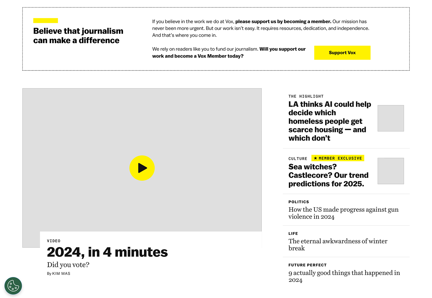
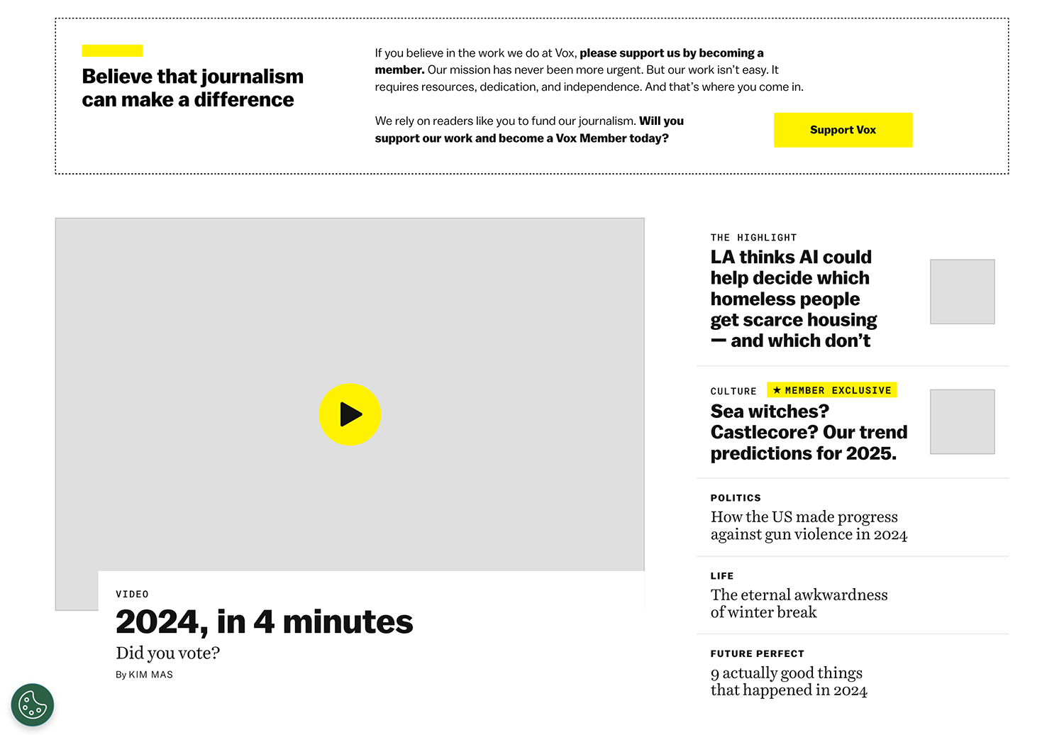
Real-world example 2: Vox
I like how switching between balance and pretty shows a big difference. Pretty tends towards soft balancing.
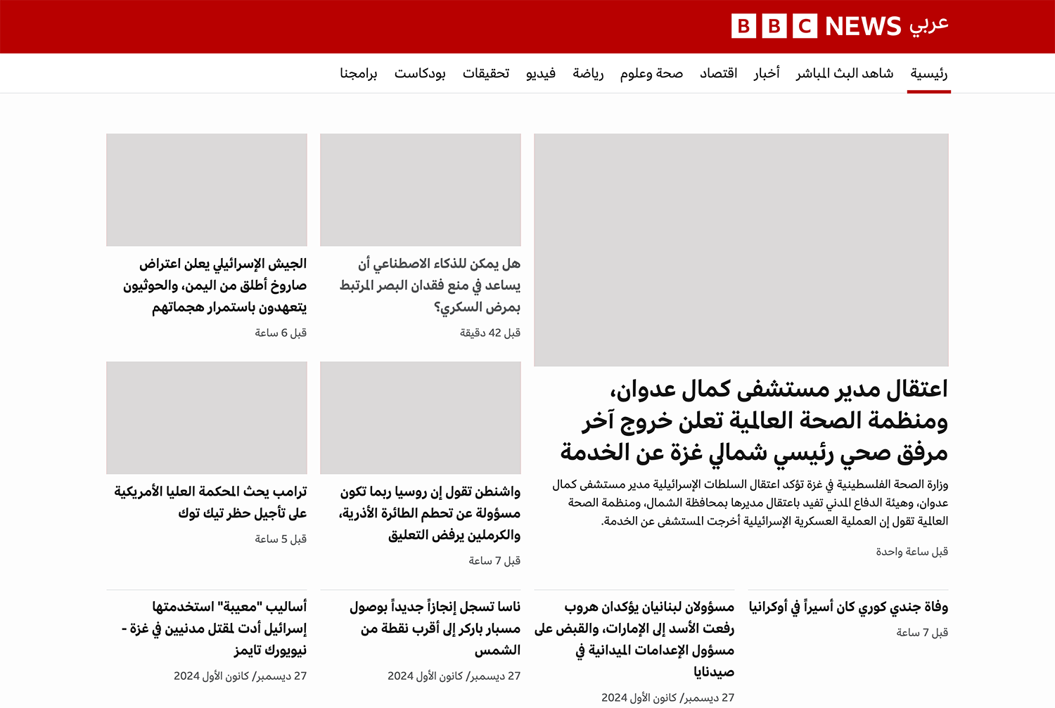
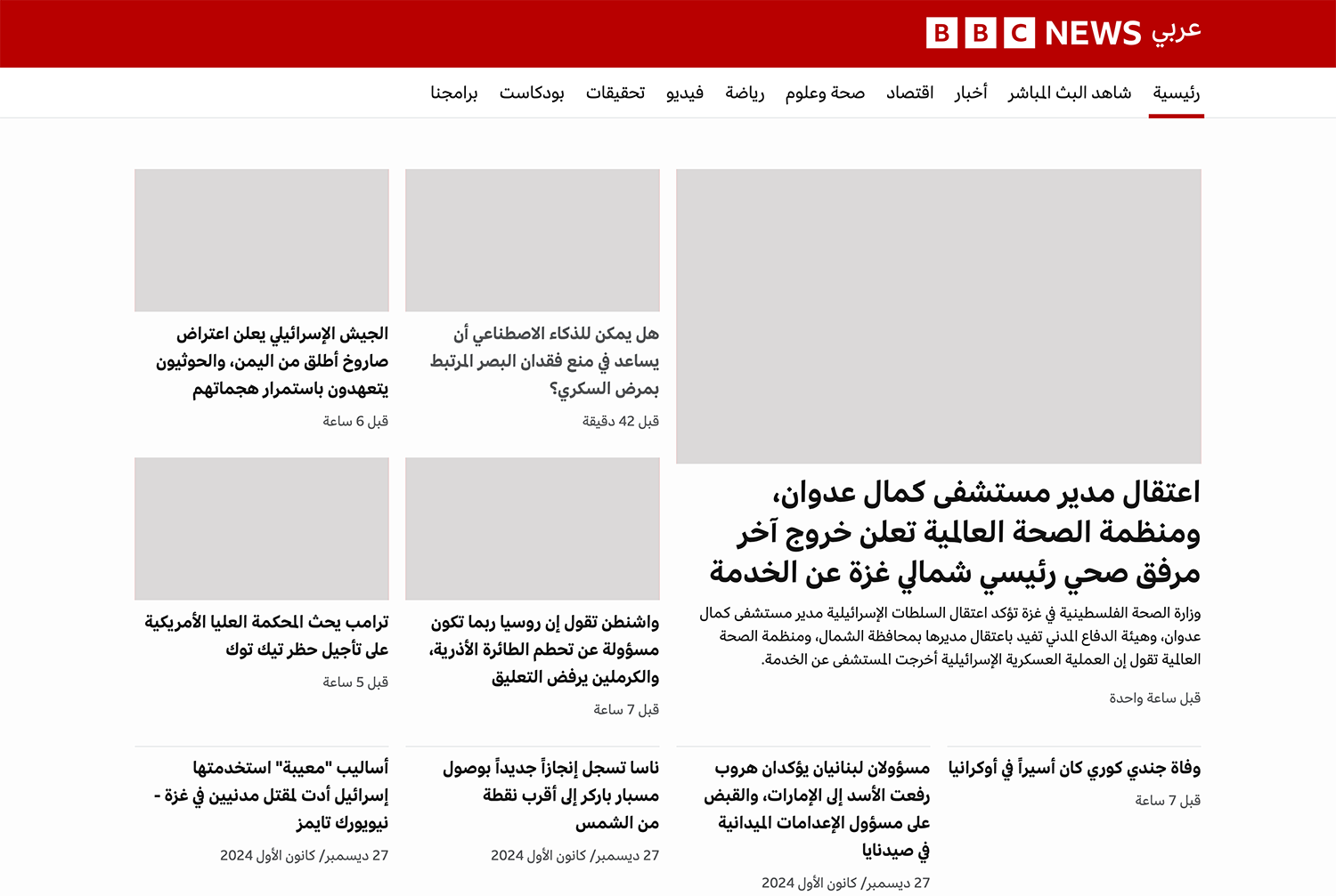
Real-world example 3: BBC
I needed an Arabic web design and picked the BBC.
That’s it for the real-world examples.
Text box size
While text-wrap: balance might make the text itself more balanced, it creates a new visual issue for us.
In the following demo, notice the pink area with the outline. This is the natural spacing between the last word in the line and the edge of the text box.
Welcome to my personal blog. I'm a web developer.
When we change the text-wrap to balance, the balanced text will create a large spacing. Notice how big it is:
Welcome to my personal blog. I'm a web developer.
Unfortunately, there is no native way to solve that in CSS. I support Adam’s idea to fix that with native CSS.
Maybe a ratio property will fix that? Read the following section to know more.
The pretty value naming
I think that the pretty value name is confusing. What does it mean? To make a text look pretty? I don’t like it before:
- We can’t control how lines will break
- Its name isn’t meaningful
We need a ratio for text wrap.
An idea: text-wrap-ratio
What if we have something like a ratio? In React Wrap Balancer, there is a ratio that we can control.
Maybe we can add text-wrap-ratio to CSS with values from 0 to 1?
.title {
  text-wrap-style: balance;
  text-wrap-ratio: 0.5;
}
In the following interactive demo, play with the ratio slider and see how the text balancing changes.
.text-with-ratio {text-wrap-style: balance;text-wrap-ratio: 0.2;}
Text balancing with ratio
Are you sure you want to drink all that coffee? Yes, you read that right.
Here is a comparison between using pretty and using the proposed text-wrap-ratio. Resize the container and increase the ratio to see what happens.
text-wrap: pretty
Are you sure you want to drink all that coffee? Yes, you read that right.
Text balancing with ratio
Are you sure you want to drink all that coffee? Yes, you read that right.
I hope that we’ll get something in CSS one day.
Conclusion
Balancing text in CSS helps make designs look cleaner and easier to read. Features like text-wrap: balance and text-wrap: pretty help us in fixing that. Thank you for reading!
Credits
- Kholoud, my wife: for her continuious support and proof reading
- Astro Baseline by Chris Swithinbank!


