As a front-end developer, you may have worked on making a section that contains logos for brands, clients, companies, you name it. That task can seem simple at first, but it brings some challenges a long with it that are related to the alignment and centering of those logos. Adding on that, some logos look horizontal and some are more vertical, let alone the different image sizes for each one.
In this article, I will tackle the task of taking a group of logos, and exploring many ways to align and position them perfectly in CSS. It’s worth mentioning that such articles will please designers, as it will make implementing their perfect-aligned logo sections much, much easier ;).
Are you ready? Let’s dive in and align those logos!
A Quick Design Introduction
Before we dive into CSS and how to better organize and style the logos of different sizes, I want to give a quick introduction of how I (as a designer) arrange logos in a design app. For this article, I will use Sketch App, but feel free to use whatever tool you want.
I have eight logos that I need to organize in a grid, so the first thing I did is that I selected them and dragged them to the Sketch canvas.

I know, the logos are looking ugly. Let’s fix this!
While selecting all the logos, make sure that the width and height are locked, and change either the width or height to 150px. In the below video, I resized the logos, and then rearranged them in a grid.
Notice how some logos look bigger than others? AirBnb is the largest one. To judge better, I usually draw a rectangle for each logo, and that rectangle will help me in deciding if the size of the logos is better, the alignment, and the spacing between other logos.
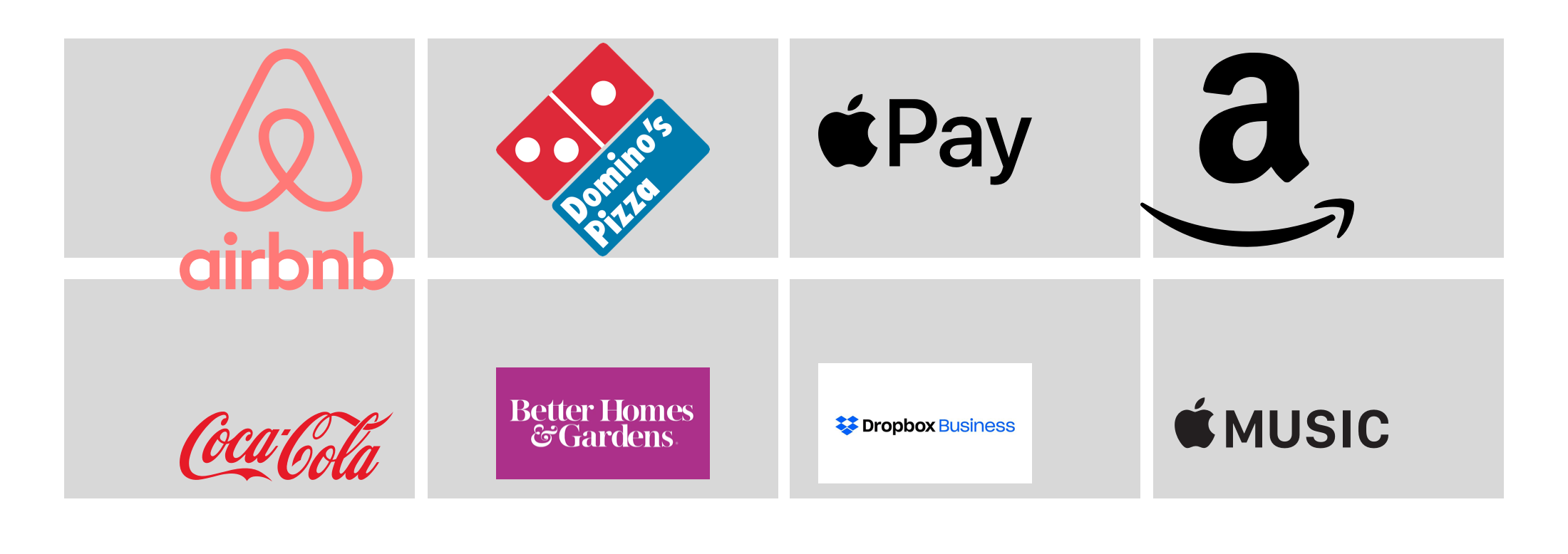
Keep in mind that the spacing between rectangles should be equal. In Sketch, you can easily do that by selecting a row, and from the top right corner, click on Tidy and adjust the spacing. Keep it at least 10px.
Now with the rectangle, some logos look misaligned, big, or completely out of the position. I will resize the logos and center them. See below:
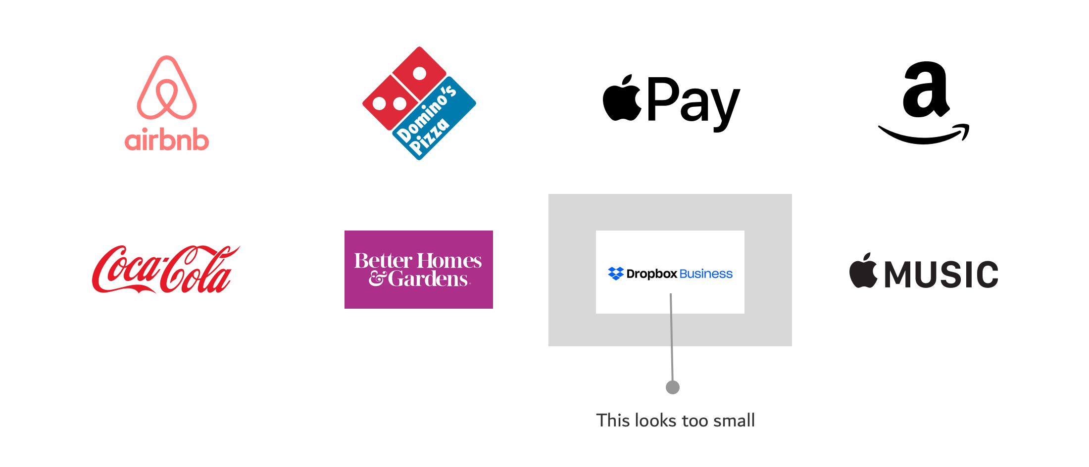
After resizing and aligning the logos, there is a problem with the dropbox business one. I kept the rectangle so you can see the problem. First, the logo is horizontal (too long), and it has a white background beneath it. We can remove that background by cropping the logo inside Sketch.
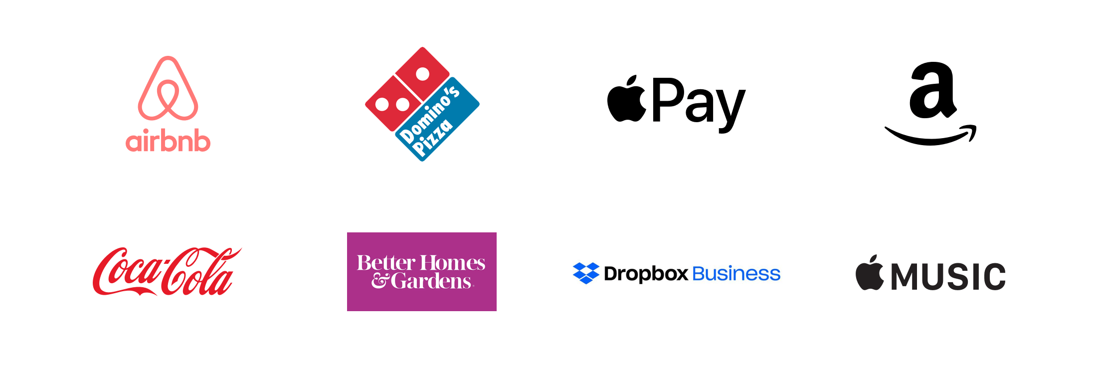
All right, now we have a good design that is ready to be implemented in HTML and CSS. Keep in mind that the following explanation will assume that you got random logos from the designer without considering their size.
Implementing the logos grid
Let’s explore how to implement the logos in HTML & CSS, considering the following:
- They should be responsive.
- Logo sizes should be close to each other. E.g: it’s not recommended to have a big logo, and another one small.
- There should be a minimum/maximum sizes defined for the logos.
<ul class="brands">
  <li class="brands__item">
    <a href="#">
      <img src="img/logo.png" alt="" />
    </a>
  </li>
  <li><!-- other logos --></li>
</ul>
For this example, I will use CSS grid for the layout. However, it’s up to you what to use, depending on your case and the browsers you want to support.
.brands {
  display: grid;
  grid-template-columns: repeat(auto-fit, minmax(150px, 1fr));
  grid-gap: 1rem;
}

.brands__item {
  background: #eee;
}

.brands__item img {
  display: block;
  /* Make sure max-width is added */
  max-width: 100%;
}

As you see, the result is that each logo is taking the full width of its parent element. The logos sizes are not consistent. As an initial step, let’s try adding a width for them.
.brands__item img {
  display: block;
  /* Make sure max-width is added */
  max-width: 100%;
  width: 100px;
}
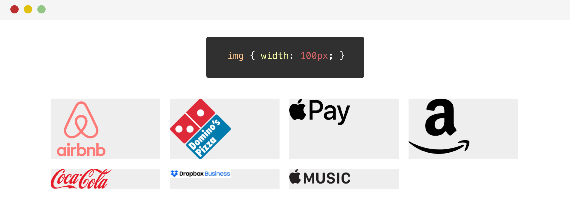
The width worked for some of the logos. However, the Dropbox one is affected badly as it’s a horizontal logo. Before diving into other solutions, let’s try to use the height for them.
.brands__item img {
  display: block;
  /* Make sure max-width is added */
  max-width: 100%;
  height: 70px;
}

Oops! The Dropbox logo is stretched in height. Why is that? Well, the logo height is relatively small compared to other logos, so the height value I provided is too big for it, which resulted in the stretching you see.
We can solve the stretching by using object-fit for the image.
.brands__item img {
  /* Other styles */
  object-fit: contain;
}
For now, I will go with the width solution. Next step, is to make sure that the logos are centered horizontally and vertically.
.brands__item a {
  display: flex;
  justify-content: center;
  align-items: center;
  height: 100%;
}
With the flexbox styles, the logos are centered. Here is how they look:
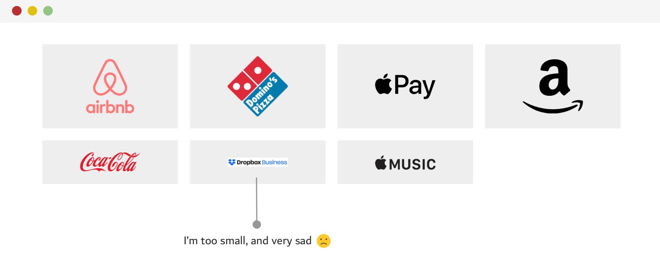
Notice how the Dropbox logo looks very small. Well, looks like the width only didn’t work out for it. What can we do further?
Another approach that I tried and worked better is to combine both width and height, but wouldn’t that stretch or compress the logo? Yes, it will do unless you use object-fit: contain.
.brands__item img {
  width: 130px;
  height: 75px;
  object-fit: contain;
}
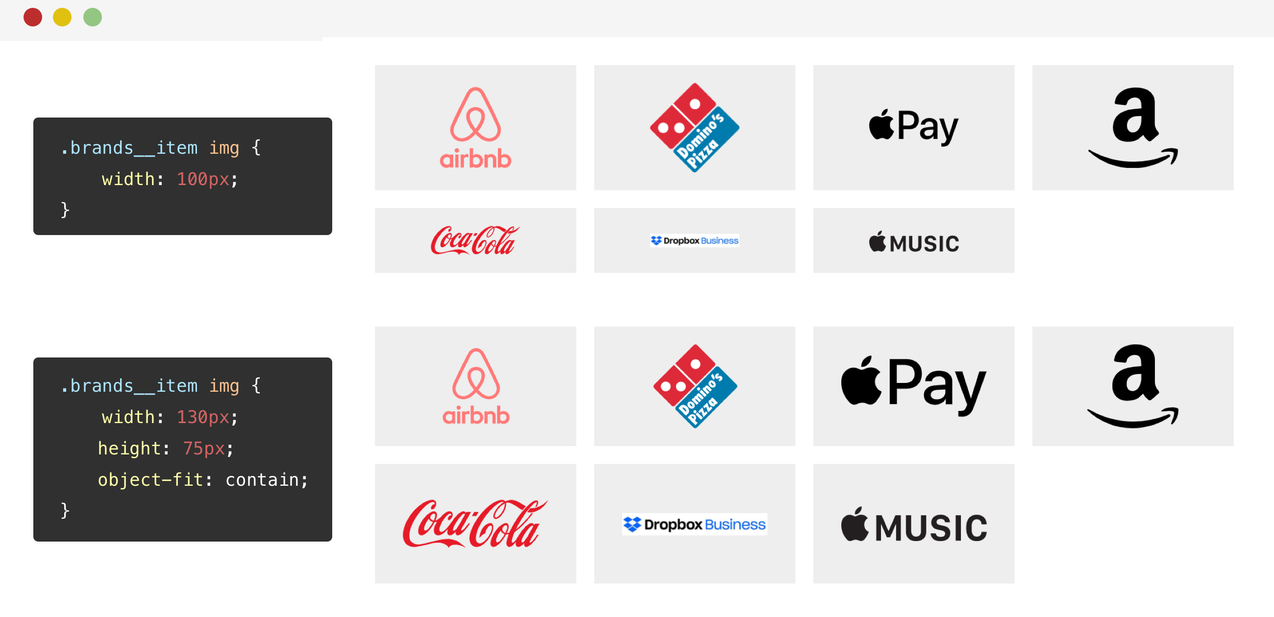
The great thing about object-fit: contain is that no matter how the width or the height is, the logo is contained within them, without distorting it.
UppubDate: 26 June 2020
I added @supports CSS to detect support for the object-fit property. If the browser supports it, it will be added along with the height. This is to avoid the logos being stretched in browsers that don’t support object-fit. Thanks to Louis for the tip.
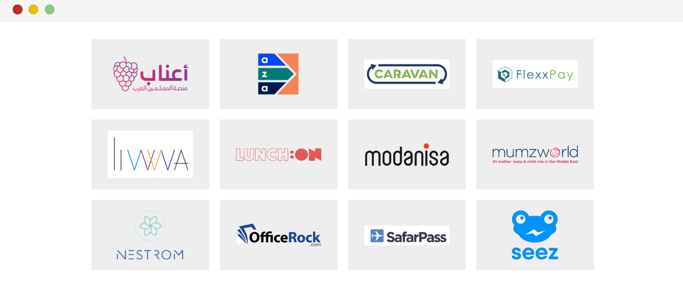
To make sure that the technique works perfectly, I tried testing it with another set of logos, and the result was great!
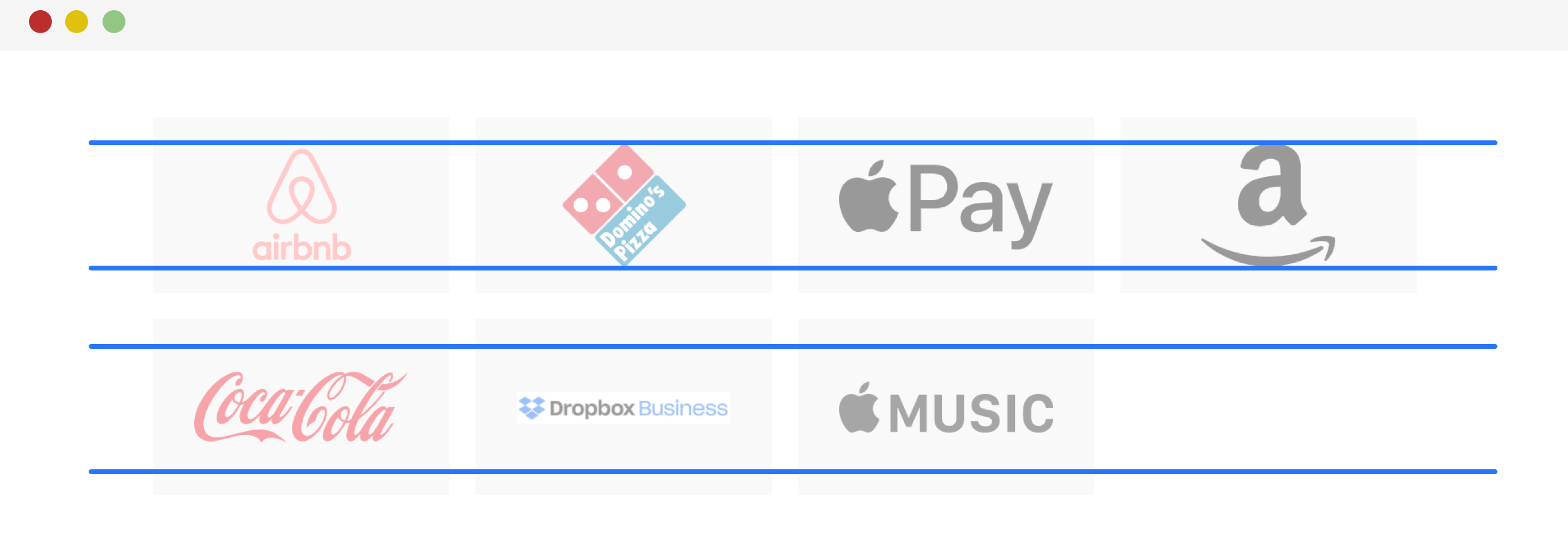
Adding on that, I want to show you a visual that will make you feel more satisfied about the technique. In the below visual, notice how the logo is contained within the two lines, and if its aspect ratio can’t fill the whole space, it will be centered.
Using CSS Blend Mode To Remove The White Background
Thanks to the grey background, we can notice that some of the logos are JPG images, thus they have a white background below them.
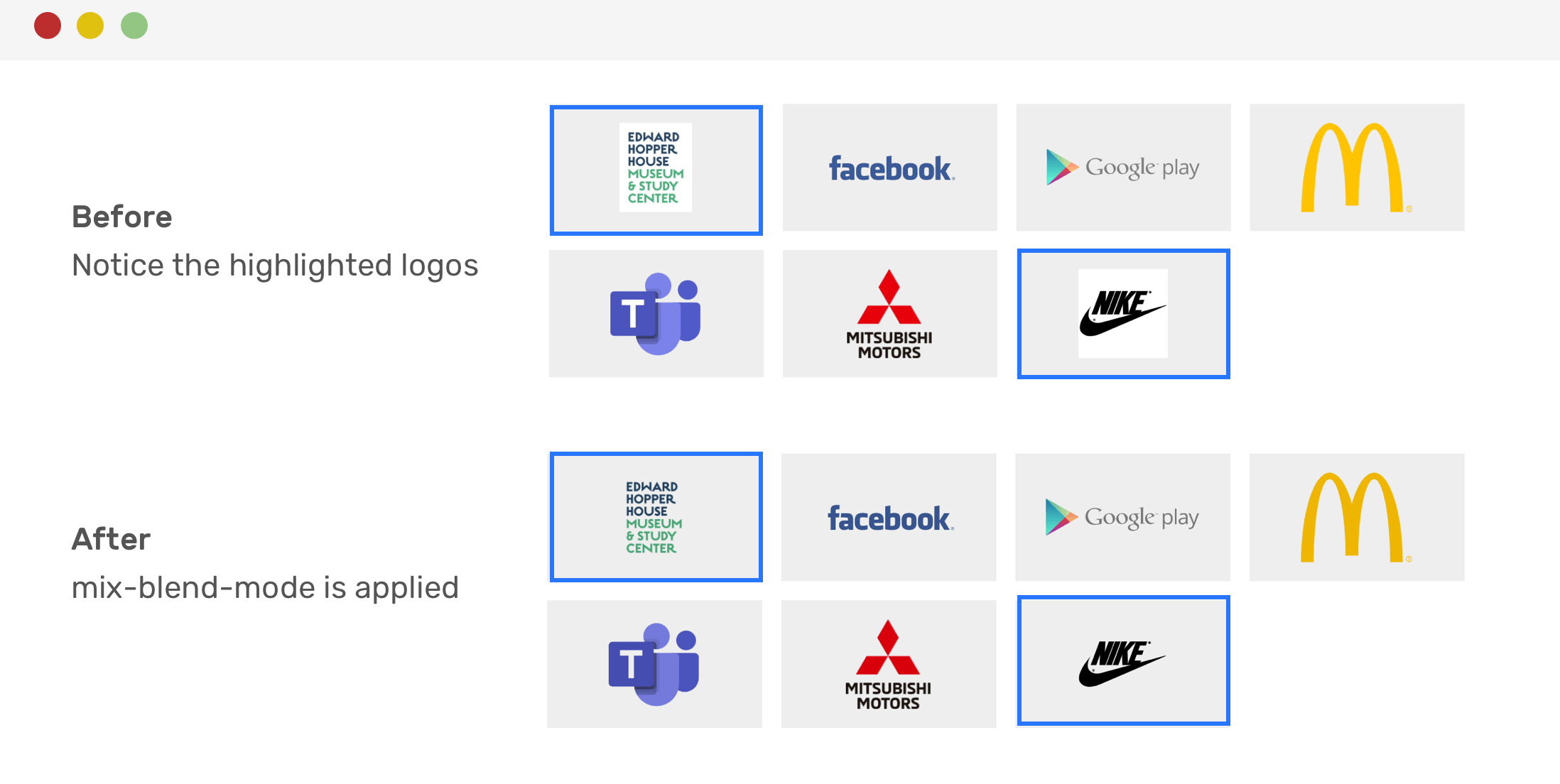
If you are unable to get a transparent version of the logo, you can use mix-blend-mode to do the job. It will remove the white background, like magic.
.brands__item img {
  width: 130px;
  height: 75px;
  object-fit: contain;
  mix-blend-mode: multiply;
}
And it’s done! Now the white background is gone. Though, it’s worth mentioning that this effect could make some logos darker in color, like the Macdonald’s one.
UppubDate: 26 June 2020
In this tweet, Christopher suggested the use of CSS attribute selectors to apply the mix-blend-mode only on .jpg and .png images.
.brands__item img[src$=".jpg"],
.brands__item img[src$=".png"] {
  mix-blend-mode: multiply;
}
Centering The Last Row Of Logos
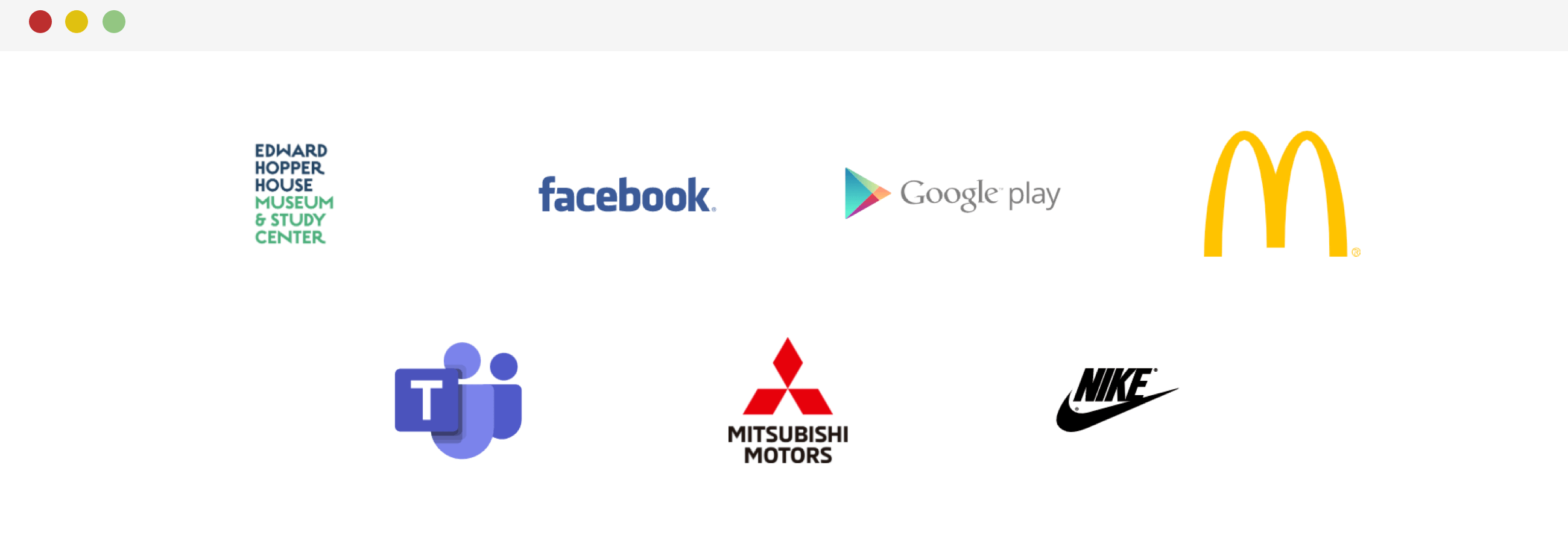
You can’t guarantee that the last row of logos will always be complete. As a result, having an empty area (just like the previous examples) might not be enough. To center the last row, it’s recommended to use flexbox instead of CSS grid.
.brands {
  display: flex;
  flex-wrap: wrap;
  justify-content: center;
}

.brands__item {
  flex: 0 0 50%;
}

@media (min-width: 700px) {
  .brands__item {
    flex: 0 0 33.33%;
  }
}

@media (min-width: 1100px) {
  .brands__item {
    flex: 0 0 25%;
  }
}
With that, the last row of logos will be centered. See the figure below:
Final Tips
Before closing with this article, I want to highlight a few tips that you can take in consideration when working on a grid of logos.
- Make sure to check the actual width and height of each logo. For example, you might be using a logo with the size (2500 _ 1200), this is very huge. Talk with the designer to resize them something consistent. For example, a size of 250 _ 100 could work.
- If you got a logo with a white background, ask the designer for a transparent version. If it’s not there, then the
mix-blend-modehack is your way to remove the background.
The End
That’s a wrap. Do you have a comment or a suggestion? Please feel free to ping me on @shadeed9.
Thank you for reading.

