The Layout Maestro
A message from the author!
For this snippet, I want to share with you something I do while resizing elements in the browser DevTools.
Let’s suppose that you’re implementing a design in HTML & CSS, and you want to experiment with an icon’s width and height. Consider the following:
.icon {
  --size: 32px;
  width: var(--size);
  height: var(--size);
}
In the browser DevTools, you can change the --size variable value, and both width and height will be affected. See the mockup below for a visual comparison between CSS and Sketch app.
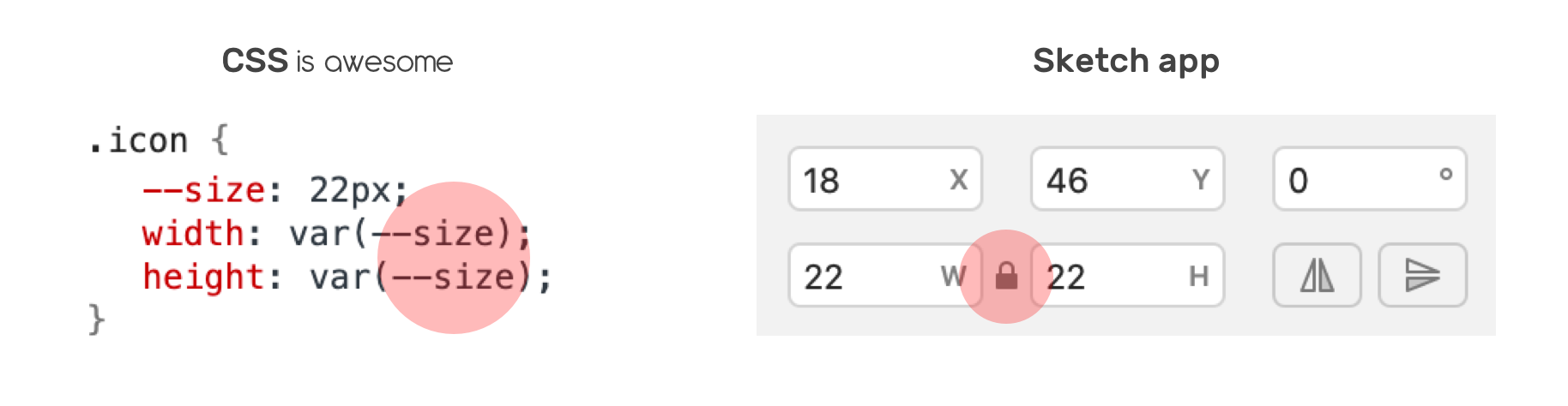
In Sketch, you need to activate lock to maintain the same value for both width and height. Here is how resizing works in the Devtools:
Different Width and Height Values
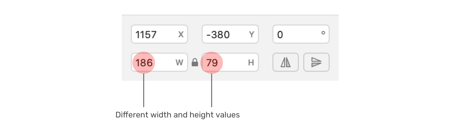
Not all shapes are perfect squares, what if you want to resize an element with different values for width and height? Well, aspect ratio to the rescue.
First, you need to calculate the aspect ratio between the width and height of the element.
In this example, we have a rectangle. It’s width is 186px and the height is 79px. The goal is to calculate the ratio between those two values.
Aspect ratio = width / height
Aspect ratio = 186 / 79 = 2.35
Then, we will substitute the ration with the help of CSS calc() function.
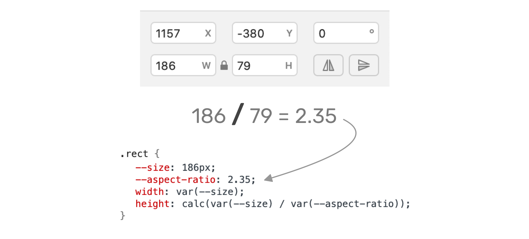
.rect {
  --size: 186px; /* [1] */
  --aspect-ratio: 2.35; /* [2] */
  width: var(--size); /* [3] */
  height: calc(var(--size) / var(--aspect-ratio)); /* [4] */
}
If you want to play with the above in the browser, here is a demo on CodePen.
I’m writing an ebook
I’m excited to let you know that I’m writing an ebook about Debugging CSS.

If you’re interested, head over to debuggingcss.com and subscribe for updates about the book.
