The Layout Maestro
A message from the author!
Every front-end developer has come across a CSS issue that works differently from a web browser to another. This was more obvious when we were trying to make layouts work the same on IE8 as they work on Chrome. I’ve scratched my head many times thinking about how to debug and fix CSS issues, but recently things have changed for the better, resulting in fewer concerns about a layout working perfectly in different browsers.
In this article, I will share my thoughts on why cross-browser development is better than in the past. Adding on that, I will also share some issues we still have these days.
Introduction
Cross-browser development is making a web page look and behave the same on different desktop and mobile browsers. Five years ago, this was a real challenge for front-end developers. Thankfully, it’s has gotten much easier now with the support for modern CSS tools like Grid and Flexbox.
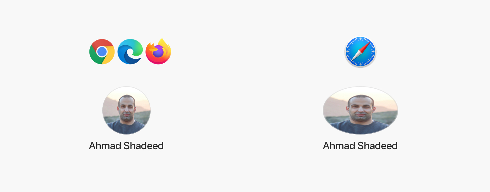
Consider the following mockup that I designed in Sketch.

Here is how it looks in four different browsers. There is no difference between them, right? That’s the goal of cross-browser development, to have something look and behave the same on different browsers.
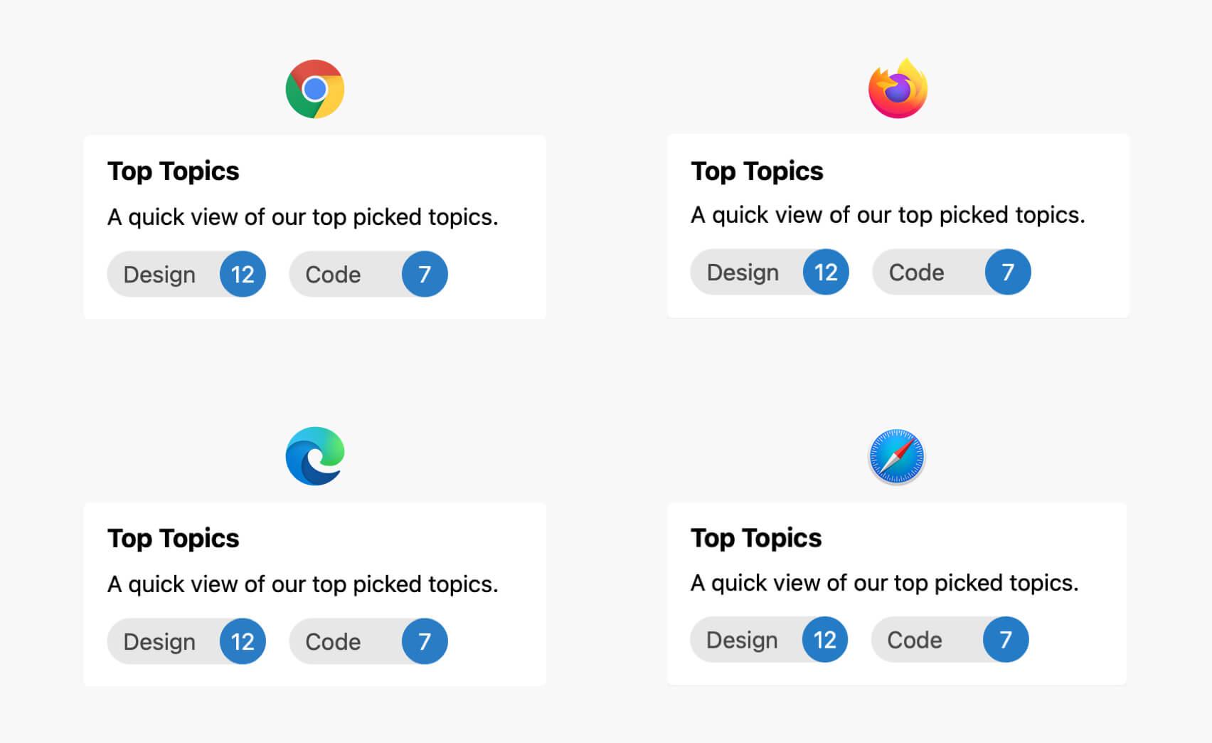
I know that it’s nothing complex, but my goal was to illustrate the idea. For years, we have struggled with a lot of browser inconsistent issues that made the front-end developer job extremely hard to the level that you will debug and fix issues more than writing actual CSS.
How CSS cross-browser development used to be
If we go back in time to 2011, IE9 was the latest version of Internet Explorer. At that time, Google Chrome was almost three years old, and developing multiple browser support was a challenge.
For new CSS comers, they might not know how developers used to build web layouts in the past. In 2011, a website was supposed to work on IE8, and in case you want to use modern CSS features at that time (e.g: CSS gradients), you need to provide an image fallback.
To provide a consistent experience for old and new browsers was quite challenging, a front-end developer needs to either use old CSS techniques to achieve the layout they need to, or to provide a proper fallback.
The concept of making a website consistent wasn’t optional. In 2010, the usage of IE was 52% (according to StatCounter. With that percentage or usage, You can’t ignore IE.
Timelapse of CSS development for the past 10 years
I want to take you on a journey from 2010 to today so you can witness and see how CSS development used to be. For me, it’s important for a developer to learn about that so they can appreciate the effort done by the web community to make cross-browser development more straightforward.
2009: Hello, responsive web design
We used to write CSS by using the parent ID, and then all the way down to the element we need. At that time, Sass was a popular thing, especially with Compass add-on.
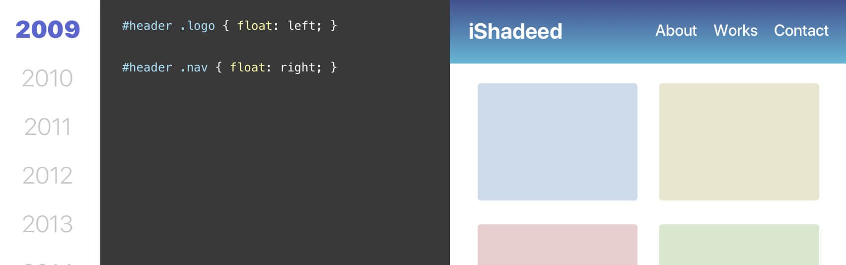
2010: Hello, responsive web design
In May 2010, Ethan Marcotte coined the term responsive web design (RWD). At that time, using float and clearfix was the only way to build layouts with great browser support.
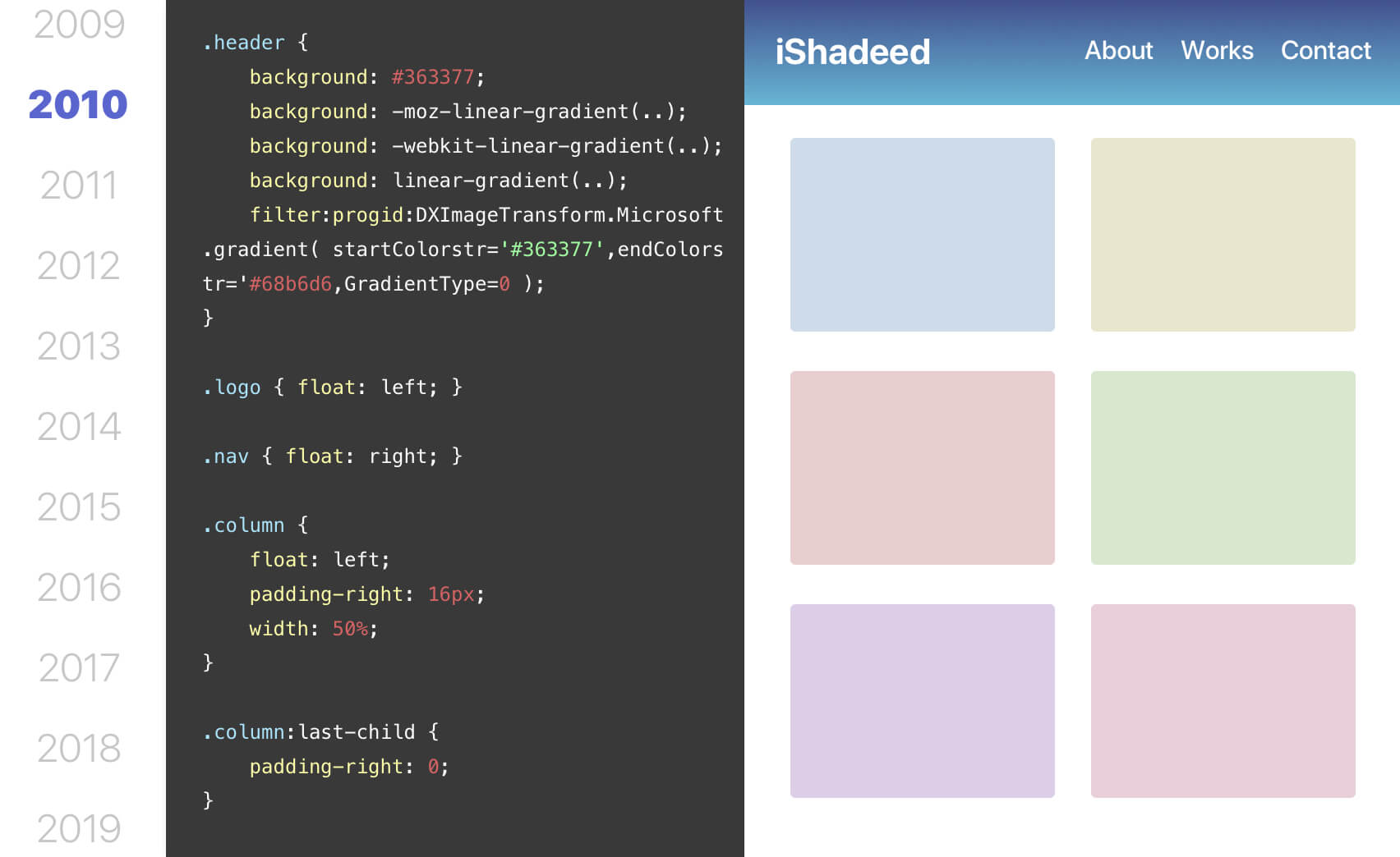
For example, to implement a grid, we need to add float to each column and specify the width if needed. Then, a component can live within each column. Consider the following example:
<div class="wrapper clearfix">
  <div class="column column-6">
    <div class="item"></div>
  </div>
  <div class="column column-6">
    <div class="item"></div>
  </div>
</div>
.column {
  float: left;
  padding-right: 16px;
}

.column:last-child {
  padding-right: 0;
}

.column-6 {
  width: 50%;
}

.clearfix {
  content: "";
  display: table;
  clear: both;
}
The old syntax of flexbox was supported in the browsers (Chrome, Firefox, and Safari) but their usage very low compared to IE, so using flexbox wasn’t an option at the time.
2011: The year of CSS3
I wasn’t even a front-end developer in 2011, but with a quick research, I see the popularity of new CSS3 features like gradients, drop shadows, and such tiny nice details.
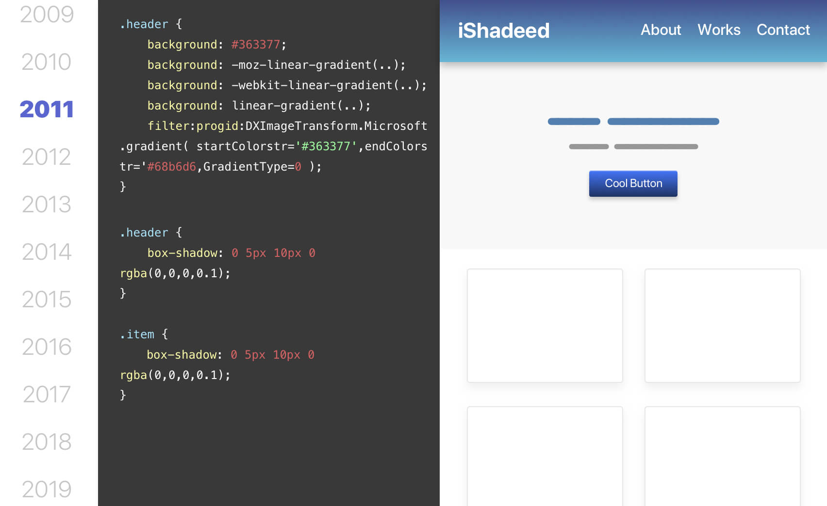
There are no big changes from 2010 except more usage of CSS3 features with a proper fallback for non-supporting browsers (Hello, IE!).
Let the action begin!
2012: Can we use flexbox?
The short answer is no. IE is still being used by almost half of the internet users, so that’s not an option. Not only that, but the supported flexbox was the old syntax which didn’t include wrapping into multiple lines, which is very important to responsive design.
As per CSS tricks, there were three different versions of flexbox.
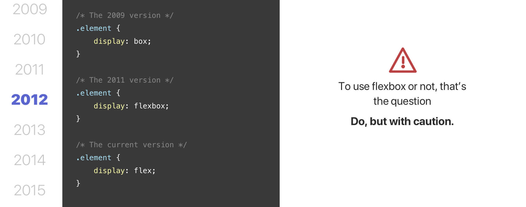
This made it a bit complex to use flexbox, but from 2012 and beyond, things started to get better.
Also, Suzy, the popular CSS layout framework was released, which allowed the idea of having a grid on demand.
Here is an example:
nav {
  @include span(3 of 12);
}
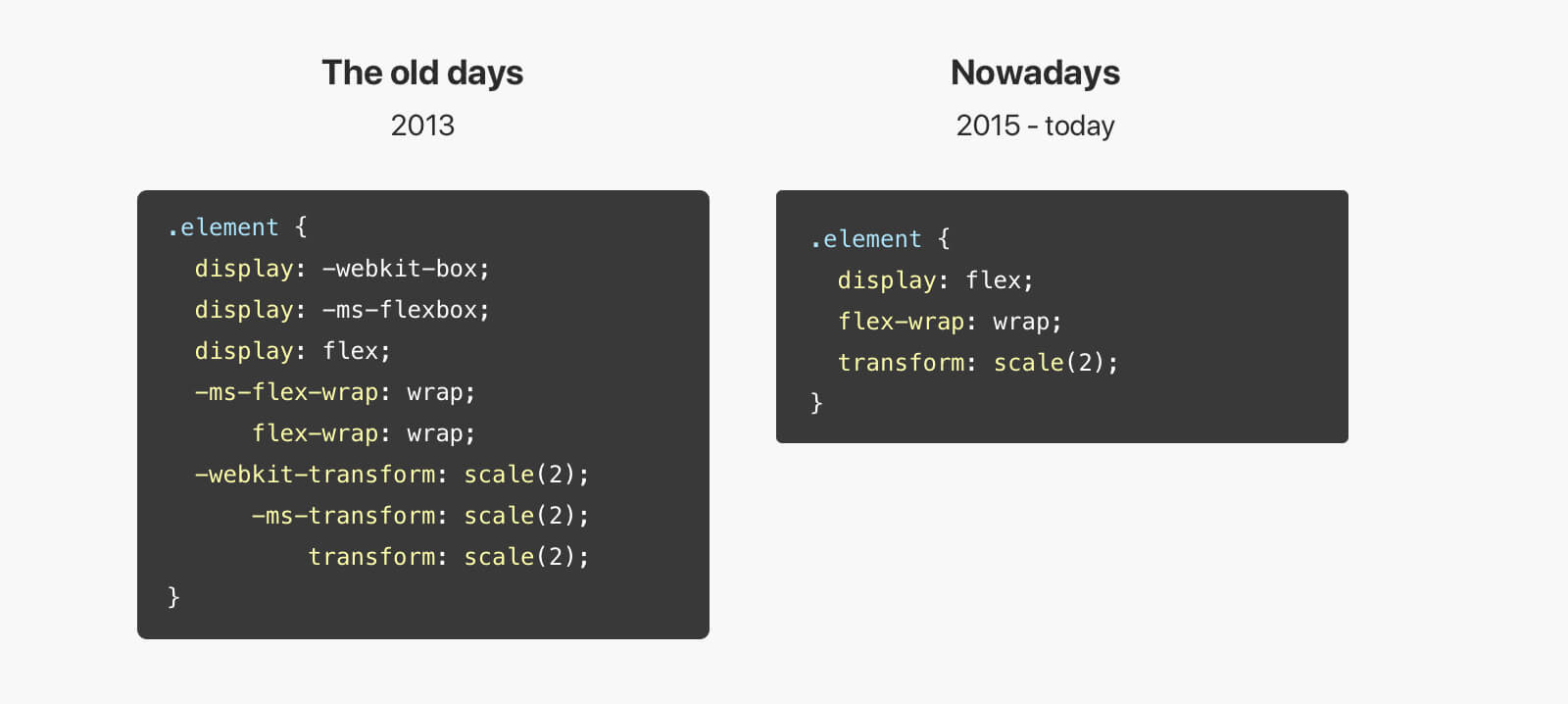
2013: Again, can we use flexbox?
Sure thing, but since there are old and new syntax, the author must provide fallback. Here is a snippet from this CSS tricks article that shows the various fallback properties:
.page-wrap {
  display: -webkit-box; /* OLD - iOS 6-, Safari 3.1-6 */
  display: -moz-box; /* OLD - Firefox 19- (buggy but mostly works) */
  display: -ms-flexbox; /* TWEENER - IE 10 */
  display: -webkit-flex; /* NEW - Chrome */
  display: flex; /* NEW, Spec - Opera 12.1, Firefox 20+ */
}
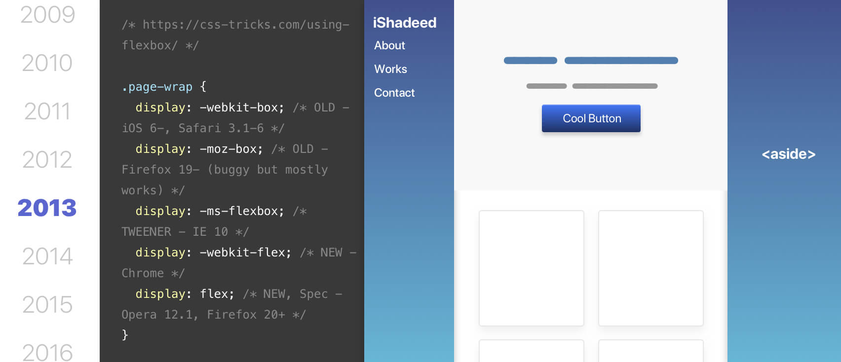
At that time, using flexbox was limited to laying out elements horizontally or vertically without wrapping. The new syntax which was fairly new supported flex-wrap.
2014 - 2016: The new flexbox syntax is supported in all major browsers (Yay!)
I entered the world of front-end development in 2014. At that time, CSS floats were the only thing I knew to build layouts. However, it turned out that the new flexbox syntax was already there, so we can finally build responsive grids with it.
Flexbox was used with the progressive enhancement approach, which means that if a browser doesn’t support the new syntax, it will fallback to something else. To achieve that, I used Modernizr.
It will add a class like .flexbox to the root HTML element, and I can then use that class to apply flexbox where needed.

At that time, providing a fallback was important. A user with a non-supporting browser for flexbox will have a broken experience.
2017: Hello, CSS grid
Thanks to Rachel Andrew, CSS grid has become more popular in 2015 and 2016. In 2017, the new grid spec was officially supported in Chrome and Firefox. CSS grid is a real game-changer for front-end development. From 2017 and beyond, CSS grid changed a lot of things about how we build for the web.
2018 - 2020: CSS grid adoption is becoming better
Even though CSS grid is supported in all major browsers, a fallback method was needed. At that time, flexbox was supported well and we can use it as a fallback method.
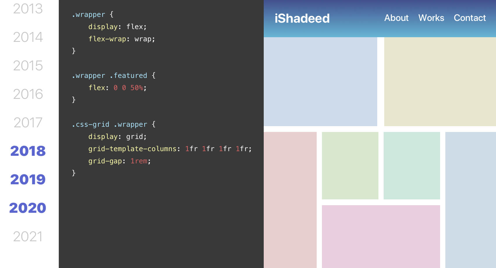
I even write a simple tool that generates CSS grid with flexbox fallback.
CSS Cross-browser development in 2021
In 2021, cross-browser development has become much easier than ever. We have flexbox, grid, and many modern CSS features that can work on browsers from the past 4 years (at least). Even though if you want to provide a fallback, we can progressively enhance it.
Adding on that, Microsoft announced that it will stop supporting IE11 (the last IE browser) on Aug 17, 2021. This will encourage a lot of folks to try new CSS features. Exciting times ahead!
CSS @supports rule
The CSS @supports rule is a great way to check for a new CSS feature. For example, CSS comparison functions became supported in late 2019 - early 2020 and we don’t have to wait for a year to use them.
@supports (width: clamp(20px, 10vw, 50px)) {
  // do something..
}
Also, in the worst cases, using a new CSS feature like this won’t break the layout. The browser will just ignore it and use the inherited or default value. Today, we can easily provide a fallback for such cases.
One thing to note though is that it’s not supported by IE, so it can’t be used in such a case.
Vendor prefixes might not be needed
We used to write CSS with Compass or Autoprefixer, but most of the CSS we write today doesn’t need prefixes at all.
For instance, the following CSS doesn’t need any prefixes at all for Chrome, Firefox, and Safari for the past 5 years.
.element {
  display: grid;
  grid-template-columns: 1fr 1fr;
  transform: scale(2);
}

.element-2 {
  display: flex;
  flex-wrap: wrap;
}
Autoprefixer is a great tool that can help in adding prefixes for CSS properties you might miss. Here is a list which contains the CSS properties that still need prefixes in 2021.
Crafting consistent front-end experiences
Since we worry less about browser inconsistent issues these days, this will give us the ability to focus more on the thing at hand, rather than trying to fix a weird layout bug in a specific browser.
This thing alone will make front-end development more exciting than ever. I still feel that some folks joke about CSS issues or bugs, but hey, things are way better now.
Browsers adoption for new CSS features
The one thing that creates browser inconsistencies is that a browser implements a feature too late. For example, flexbox gap was supported in Chrome, Firefox, and Edge (2020), but Safari released the support for April 2021. To use gap, it’s important to provide a proper fallback. This is an example of the slow adoption of new CSS features.
Thankfully, with initiatives like Compat2021, browsers are supposed to be more consistent in delivering new features (hopefully).
Less dependency on CSS frameworks
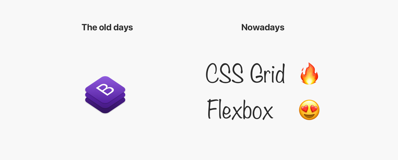
If I can recall well, one of the reasons for the popularity of frameworks like Bootstrap is the fact that they provide a consistent experience on a different browser with great community support. These days, we don’t have to worry about that. To be honest, we don’t even have a valid reason for using a framework with the tools at hand like grid and flexbox.
Just to confirm, the above comparison is for using frameworks for layouts purposes that can be solved with CSS grid and flexbox. If you want to use a framework to get its components and such, that’s totally fine.
CSS problems that still need to be fixed
Flexbox and Images
This is a common inconsistency for webkit browsers. In Safari, if you use flexbox on a parent, and it has a direct img child, there is a possibility for the image to be stretched.
Thankfully, this will be fixed soon as per this article.
Animating CSS grid
Currently, it’s not possible to animate CSS grid except in Firefox. Chrome and Safari will follow in that regard, so you should expect an update very soon as per Compat2021.
Sticky positioning
As per Compat2021, CSS position: sticky is still unstable for some uses cases. For example, if you try to make a <table> header sticky, it won’t work consistently across different browsers. Thankfully, this will be solved this year.
Multiple lines truncation
I haven’t seen a consistent way across browsers to provide multi-line truncation. The only way I know is by using -webkit-line-clamp which is supported in Chrome and Safari only.
.element {
  display: -webkit-box;
  -webkit-line-clamp: 2;
  -webkit-box-orient: vertical;
}
This is a bit weird, but at least it works.
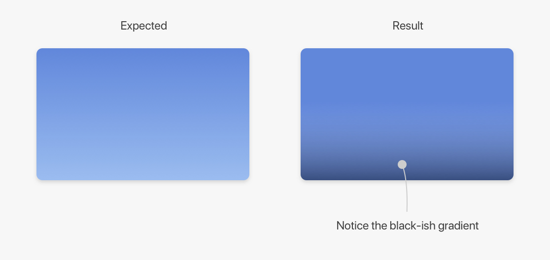
Transparent color
As far as I know, the transparent keyword doesn’t work as expected in Safari when it’s used in a gradient.
.element {
  background: linear-gradient(to top, transparent, #6187db);
}
The current workaround for this is to use rgba instead.
.element {
  background: linear-gradient(
    to top,
    rgba(255, 255, 255, 0),
    #6187db
  );
}
Viewport units
Using 100vh on mobile can cause some unexpected scrolling. This happens because the browser accounts for the address bar height. Louis Hoebregts wrote an article about that with a simple and easy fix.
Here is how to fix it:
.my-element {
  height: 100vh; /* Fallback for browsers that do not support Custom Properties */
  height: calc(var(--vh, 1vh) * 100);
}
// First we get the viewport height and we multiple it by 1% to get a value for a vh unit
let vh = window.innerHeight * 0.01
// Then we set the value in the --vh custom property to the root of the document
document.documentElement.style.setProperty("--vh", `${vh}px`)
Scrollable areas on the inline-start side
As per the CSS spec:
UAs must clip the scrollable overflow area of scroll containers on the block-start and inline-start sides of the box (thereby behaving as if they had no scrollable overflow on that side).
Imagine that we have a section with a decorative child element that is positioned with a negative value outside its parent. The expected behavior is to clip the scrolling. However, It’s not the case for Firefox when the document direction is RTL.
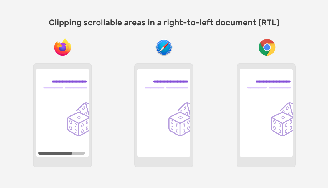
I wrote about this issue in detail, in case you’re interested.
Conclusion
Cross-browser development has become so much better than in the past. You can write CSS confidently without the fear of having a broken experience on an old browser. Make sure to build with the progressive enhancement approach, so users with an old browser can have an acceptable experience.
Thank you for reading.
Credits
Thanks to Una Kravets, Facundo Corradini, Bramus, and Kevin Pennekamp for their helpful feedback.
